Subscribe to continue reading
Subscribe to get access to the rest of this post and other subscriber-only content.

Subscribe to get access to the rest of this post and other subscriber-only content.
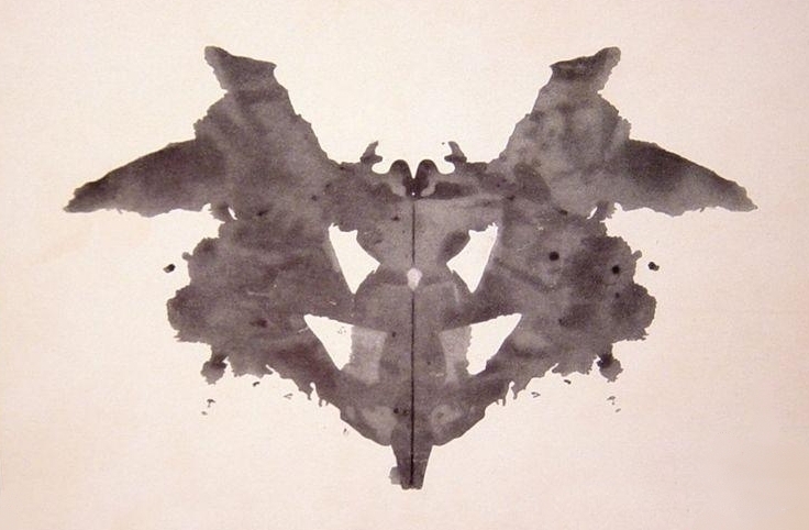
Most people are familiar with the Rorschach Test invented in 1921 by Hermann Rorschach. It‘s so often used as a gag in a cartoon or a sitcom that even youngsters get the general idea. It’s a psychological test, where a patient looks at the ink blot and describes what they see in it – often an animal, face or scene.
But I wasn’t aware that Klecksography was a thing in the late 19th century. Making images from ink blots, it’s an activity that I often enjoy as a warm-up exercise for drawing, and to create new characters. I usually call it blob drawing, which isn’t nearly as fancy, but I suppose my blobs are a bit more blobby in shape than blotty, and they lack the symmetry too.
I thought this prompt was a great opportunity to join in the Kick-About again, because I already have some artwork to begin with, and it’s not my collection of blob drawings. It’s this illustration (below) from my upcoming picture book with Kyle Mewburn, Jo and the NO. In this illustration, Jo traverses ‘lakes as still as mirrors’. So creating background mountains and their reflections from Rorschach-style inkblots seemed like a good idea.

Here the NO in the back of the punt seems to be observing itself in the still waters because I wanted to suggest self reflection as well as the physical reflection of the scenery. You’d think it would be easy to whip up a few inkblots and plonk them into the image. But it was surprisingly hard to get from the successful rough illustration (below) to a successful final illustration.
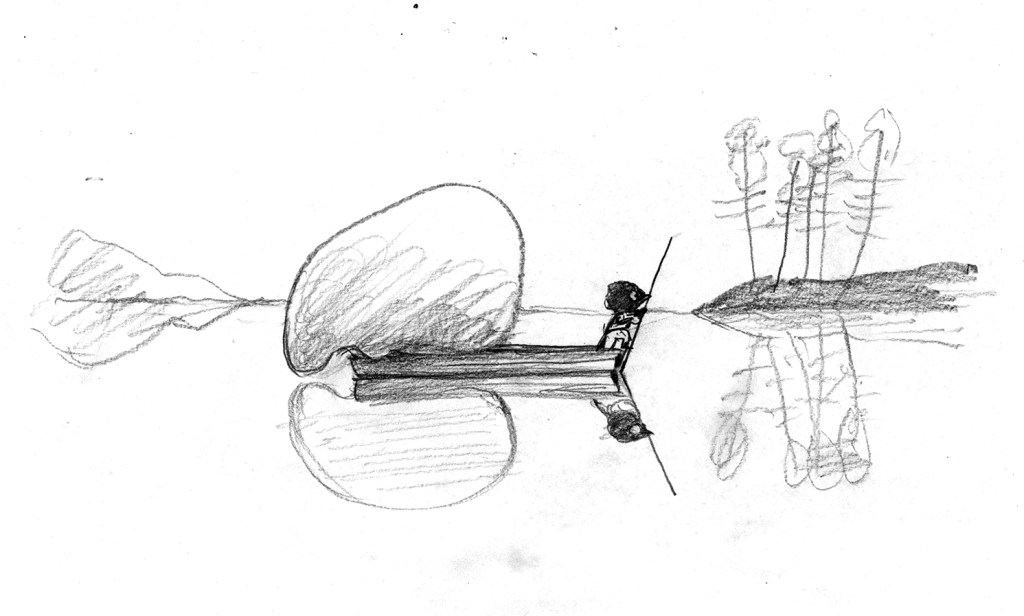
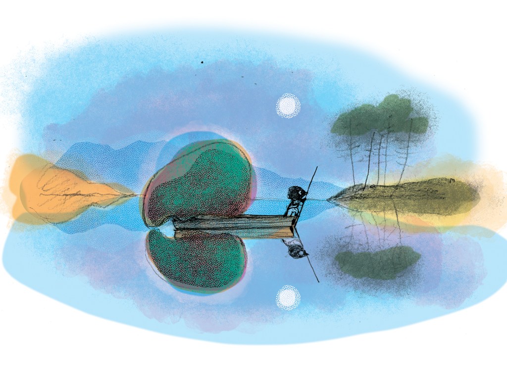
The original sketch started as a thumbnail drawing, intended to share a double page spread with three other vignettes. But when we decided that the book was going to 40 pages this scene acquired a double page spread of its own with the impediment of the gutter down the middle of the illustration. So getting the balance of the illustration to work again in a different format was a challenge. The enlarged range of mountains and trees when loaded together on the page, very quickly distracted from and overwhelmed our protagonists, instead of highlighting them and giving significance to them.
Also I didn’t want my reflections to be perfect, because imperfect things are always more interesting and have more visual energy. But I found that if they were too interesting, they became distracting. So there was a lot of trial and error involved with recreating the transparent freshness of the rough sketch within a new framework.
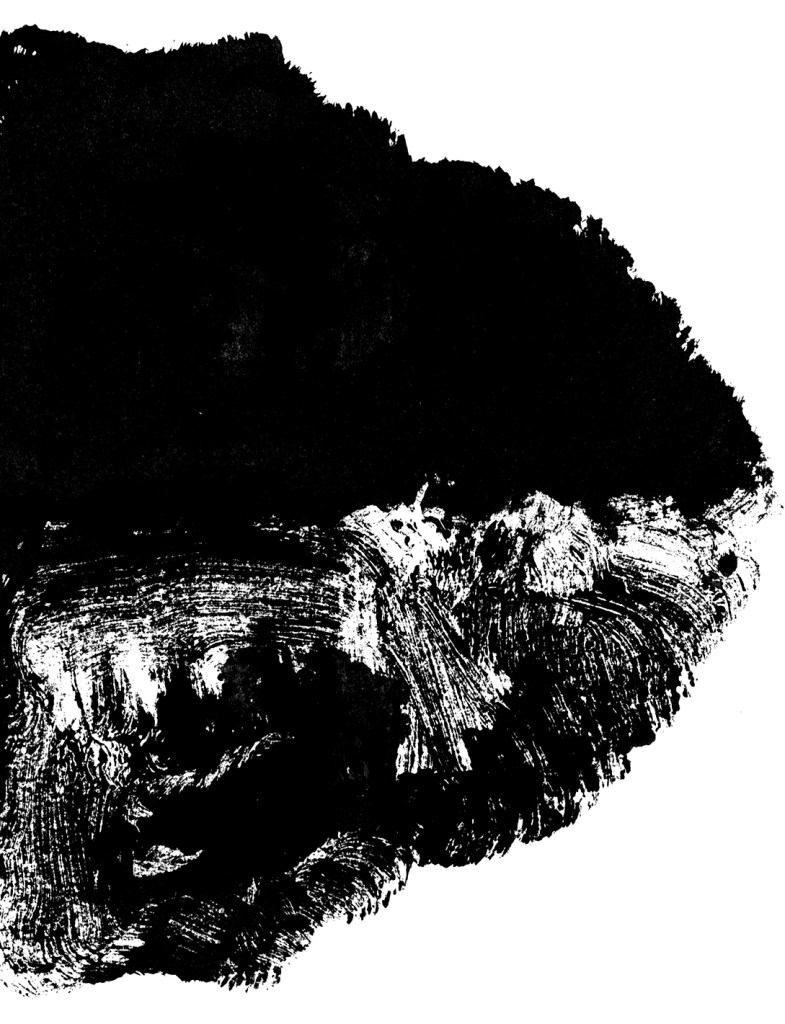
Below are a few of the monotypes I produced to create islands and mountains for the background. I painted a loose shape, suggestive of an island with vegetation, and then folded the paper in half for the reflection.



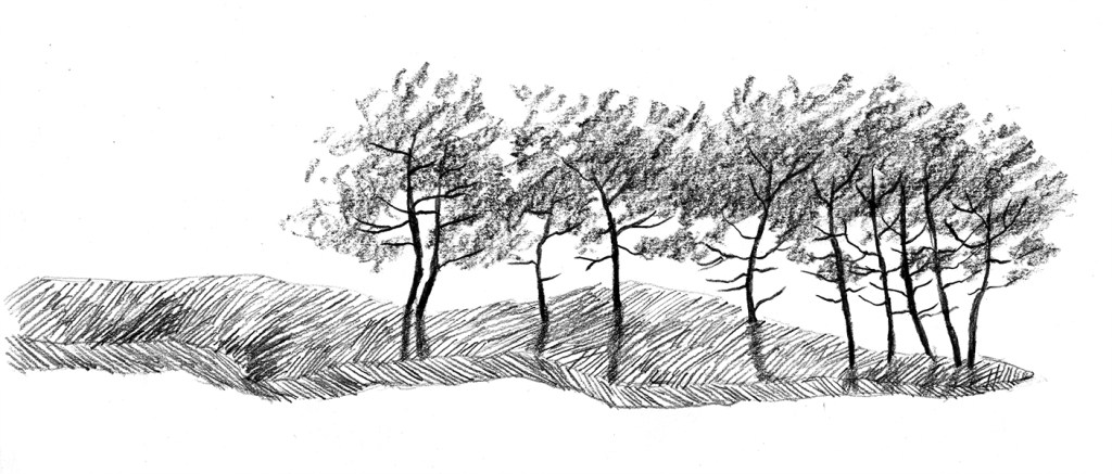
Below are some of the more detailed experiments, testing out graphite instead of paint. These fell into the too distracting category. There are always countless illustrations made for a picture book (some of them very time consuming) that don’t make the final cut. But they may be interesting in their own right.

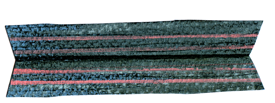
And I have to include the other hand-made element – a little collage boat made from Ingres paper and soft pastels. It’s so nice and wonky. One of my favourite bits.
For the final art, I did end up using a digital reflection for some elements, and those reflections did become ‘perfect’. But most of the tree reflections were drawn by hand and so they don’t perfectly match their right-side-up counterparts. (This brings about a nice effect used by landscape architects, where a repeating pattern with small variations is pleasing but never monotonous.) Embracing these inconsistencies was part of my journey of letting go of hard rules.
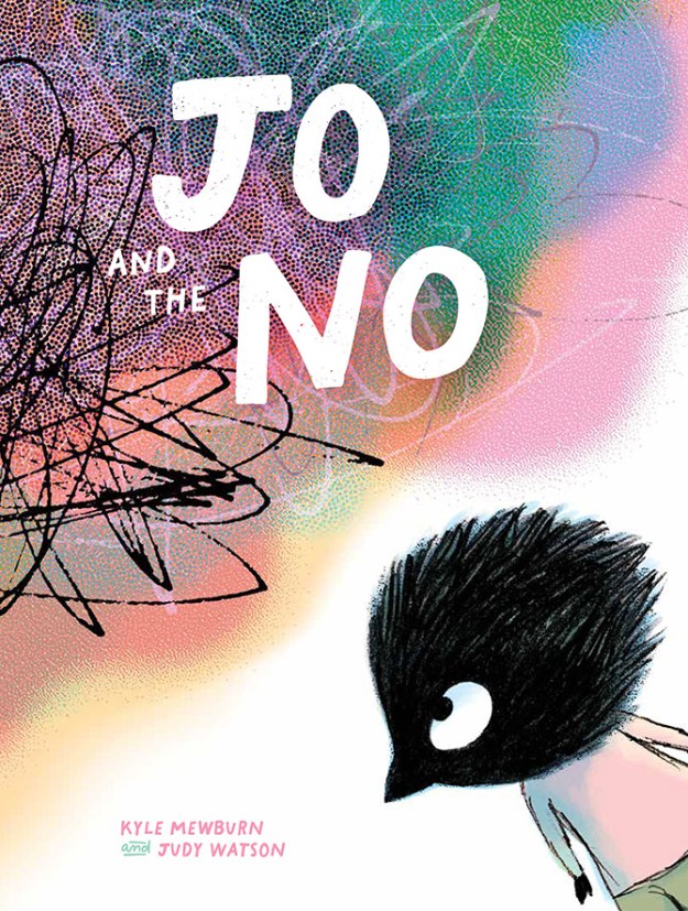
More on Rorschach ink blots in the next post. In the meantime, anyone who is interested in pre-ordering Jo and the NO, please click here or on the cover image below.
