
Subscribe to continue reading
Subscribe to get access to the rest of this post and other subscriber-only content.

Subscribe to get access to the rest of this post and other subscriber-only content.
There are only a few hours left to bid on original Australian artworks in the IBBY fundraising auction

Hello gentle readers. It’s been a while. I’ve just finished a book project, (more on that later) and I’m at the clearing up stage. Putting things to rights in the studio, starting to clear up the house, dipping my toe joyfully into the waters of recreational sewing.
I thought I’d reach out to make sure you’re aware of the IBBY fundraising auction that finishes tomorrow. You can browse all of the items for sale, here. They have been donated by Australian illustrators including me. If you’d like to contribute to this worthy cause, you will need to register to bid, (which is easy), and then go for it! Bidding closes tomorrow 28 November, at 9:00pm AEDT so you don’t have much time.
At the bottom of this post I’ve pasted in a little bit of information about IBBY, so that you can understand why IBBY might be on my radar. They’re all about young people, books for young people and supporting the creators of those books as well. But first, here’s a little background story about these rather unusual artworks.
Anyone who has been following this blog since the very beginning will know that when I started it, I was discovering the joys of altered book art. I was visiting used book fairs, collecting old books, some to read and some to cut up or draw in. After a few years, it seemed to me that altered book art was everywhere; everyone was doing it, and so it interested me less. The simple fact of a drawing being on a book page was not in itself interesting to me any more, although it had been a wonderful breakthrough for me when I was trying to find a medium, style and colour palette for Thunderstorm Dancing. (If you’re curious, go here.)

I still loved the subtle ways in which a drawing could respond to the text on the page, reinterpreting a few words, or taking an ironic look at the subject matter. And found poetry was and still is a delight to me. But I let it recede as my work went in different directions.

Later, I found myself irresistibly attracted to the cloth-covered book boards from vintage hardbound books. I began using them as substrates for drawings and paintings.

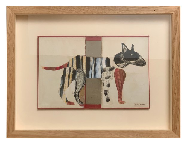
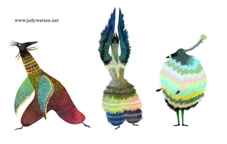
Collage has always been an important element in my work, both the paper and scissors kind, and the digital variety. In 2023, IBBY asked me to contribute a mini artwork for their Mini Masterpieces fundraiser and book boards were more or less the right scale. Some playful collages emerged. Below you see Mike, Maxine, Jennifer and Alan. They became my first Party Animals — characters who seemed so alive to me that they virtually wrote their own stories. If you’d like to read their accompanying microfiction stories I now have my Party Animals collected together on their own Instagram page https://www.instagram.com/judywatsoncollage/ and I’ll also add a page for them on this site in the coming weeks. As I make new Party Animals from time to time, they’ll be made available for sale there.

But now to the 2025 IBBY Party Animals!


These two followed their own stars. They look a little different from the 2023 partiers, but this time, they have been wrapped for travel with their own stories enclosed, so that you will know a little bit about them. I recently purchased a 1970s vintage typewriter, and I’ve been writing poetry on it, but I felt I wasn’t quite up to the challenge of typing their stories to the correct size and without a plethora of errors. Instead, I carefully chose a suitable typeface and printed their stories on good paper.


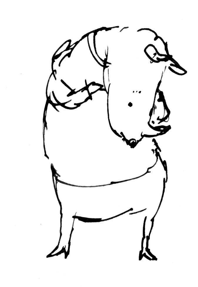
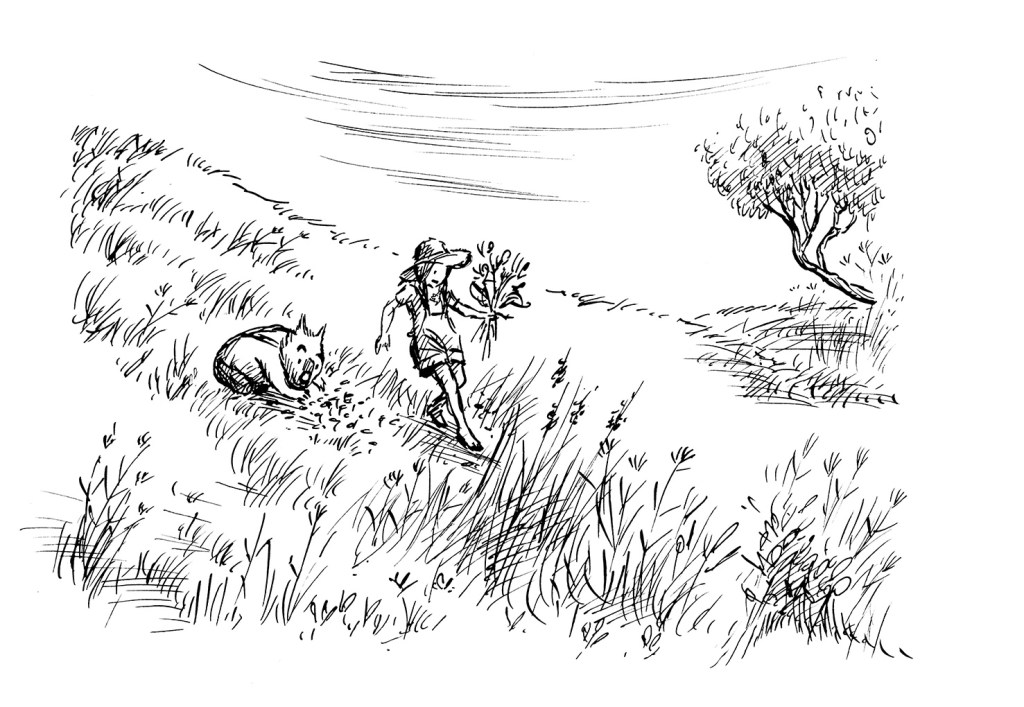
I also contributed three quick dip pen and ink sketches for the fundraiser. They’re based on reference photos of dogs and their owners that I took at a local pet day. You’ll see them here too. Below is the promised information about IBBY. If you’d like to support a wonderful organisation that supports children and the children’s literature community and if you’d like to purchase an original work of art from one of Australia’s book illustrators, then you can’t go wrong throwing in a bid for one of these artworks. Even if you don’t win the auction, you will bump up the price and help IBBY in the process. Good luck!
IBBY Australia is one of 85 National sections of the International Board on Books for Young People (IBBY), and will be turning 60 in 2026.
IBBY is a non-profit organization which helps to build bridges to international understanding through children’s books.
IBBY Australia submits authors and illustrators and their work for several IBBY administered international awards, including:
• the Hans Christian Andersen Award
• IBBY Honour Book List
• the Silent Books collection and
• the Outstanding Books for Young People with Disabilities list.
You can read more about IBBY on this web site: https://www.ibby.org, and about IBBY Australia here:
https://ibbyaustralia.wordpress.com
or join online here:
https://ibbyaustralia.wordpress.com/join-us/ – we welcome new members!
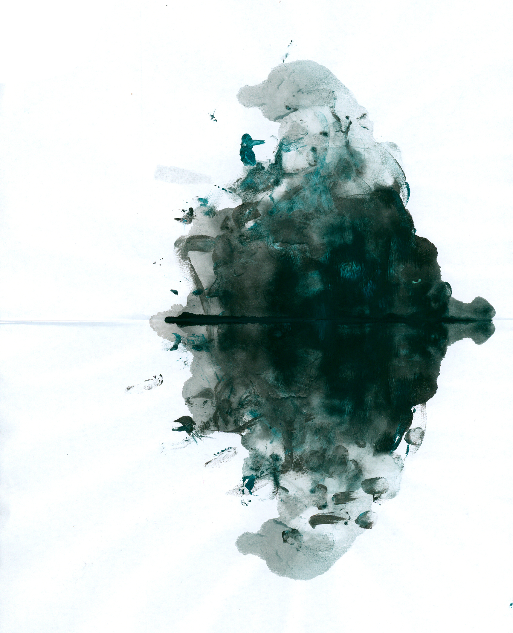
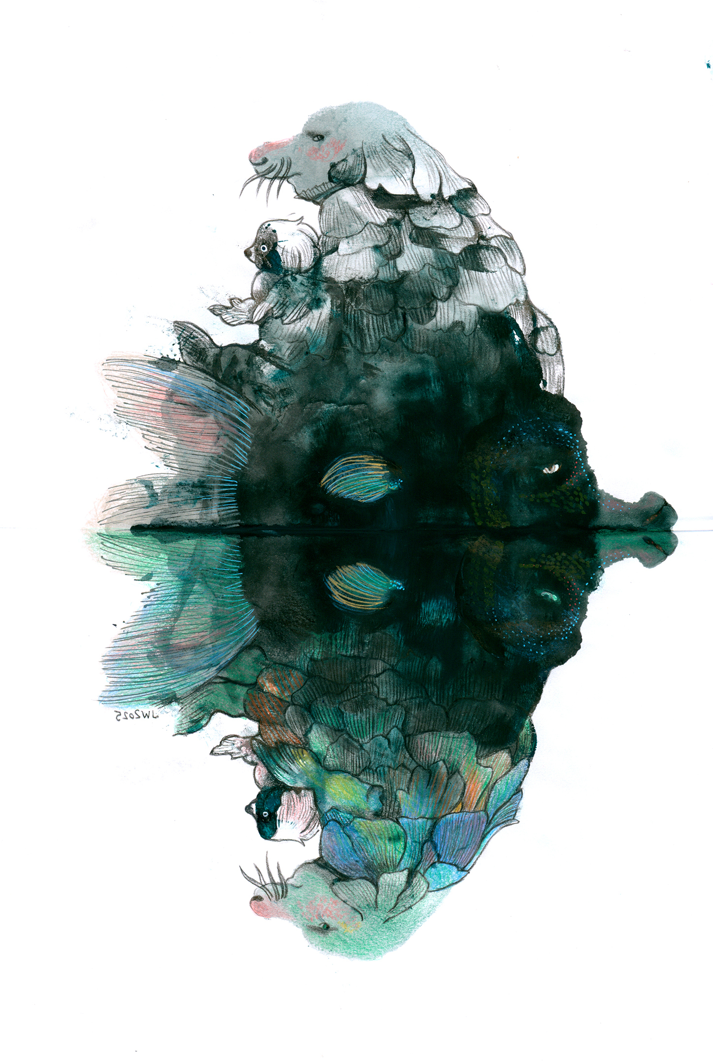
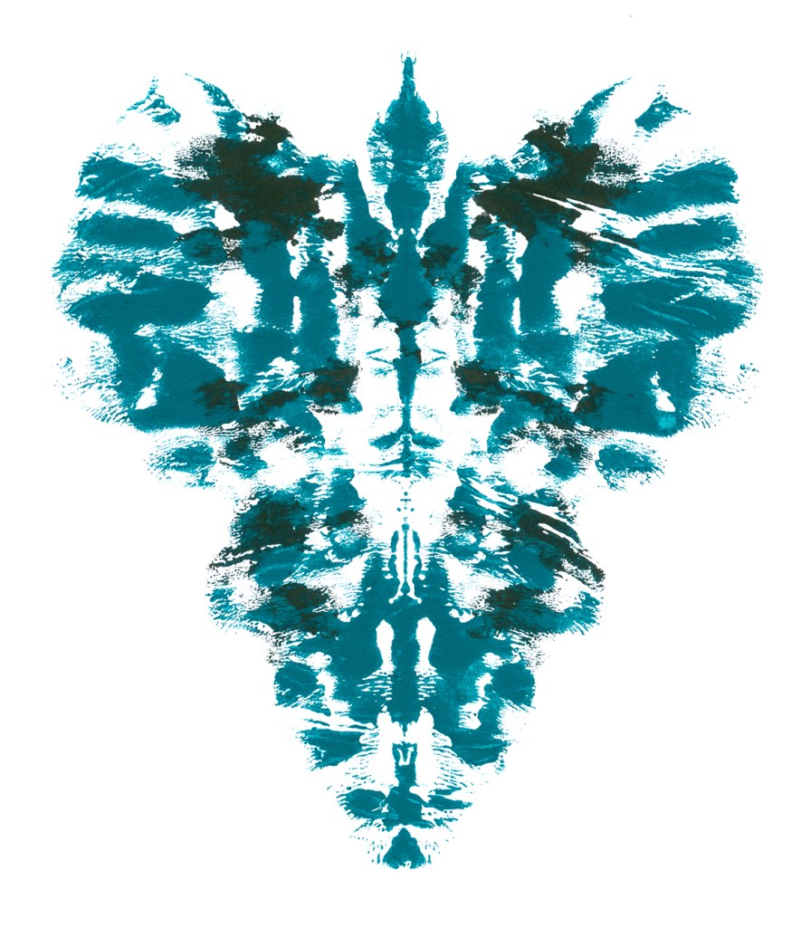
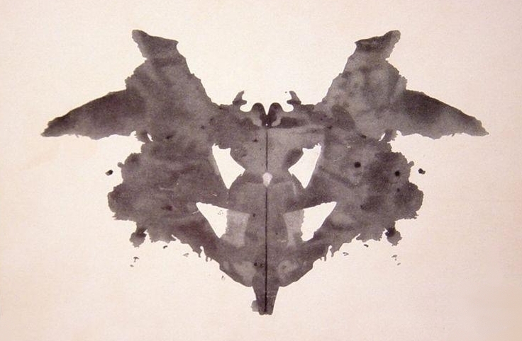
Hello again. Here is my last (I think) post in response to the Rorschach Test prompt from the Kick-About challenge hosted by Phil Gomm. This is my fully analogue response.
This inkblot looks EXACTLY like a lugubrious Long-nosed WhaleFish swimming across the surface of a lake carrying a weird, slightly menacing figure with a smaller figure on its lap.
It looks like that to you too, right?

So I tackled this one with Polychromos pencils and Posca pens. I really wanted it to be travelling left to right (English language picture book illustration is now in my bones), but when I was most of the way through, it looked better up the other way, mainly because of the colour in the water reflection.
I’ve refrained from ‘cleaning up’ the image in PhotoShop in order to remain true to its hand-made inkblottiness. All I did was dot a bit of white Posca pen to some of the more intrusively messy marks. So here it is.
Dogfish with Piebald Child riding a Long-nosed WhaleFish who is Really a Prince Under an Enchantment. If you want to rescue the prince, you’ll probably have to climb a mountain, wearing slippers made of prickly pears, and retrieve a plum from a magic tree that only fruits once every 50 years. Then come back and feed it to the fish… or something. I wish you luck. There’s no guarantee that he’ll be a nice prince when he is human again, so you’d better be on your toes, if you haven’t lost them to frostbite.

Below I’ve flipped the image so that you can compare it with the original ink blot.
Hello again. I’m not finished with ink blots for the Kick-About. And I‘m not finished with islands reflected in still water.
It’s not the first time I’ve gone down this road. I remember printing dozens and dozens of icebergs and islands for When You’re Older. In some illustrations I was conflicted because I liked the reflections on the water surface, but I was also enchanted by the creatures underneath the surface.
Question: How to have both in the one illustration?
Answer: Not easily.

But back to the current time! Yes, I did produce something new for this Kick-About prompt. The theme makes me think of (self) reflection, and it seems the world is full of people who see themselves in different ways.
Some don’t like what they see.
Some delight in it.
Some refuse to look at themselves at all.
Some see a version of themself that is invisible to others.
And the opposite is also true.
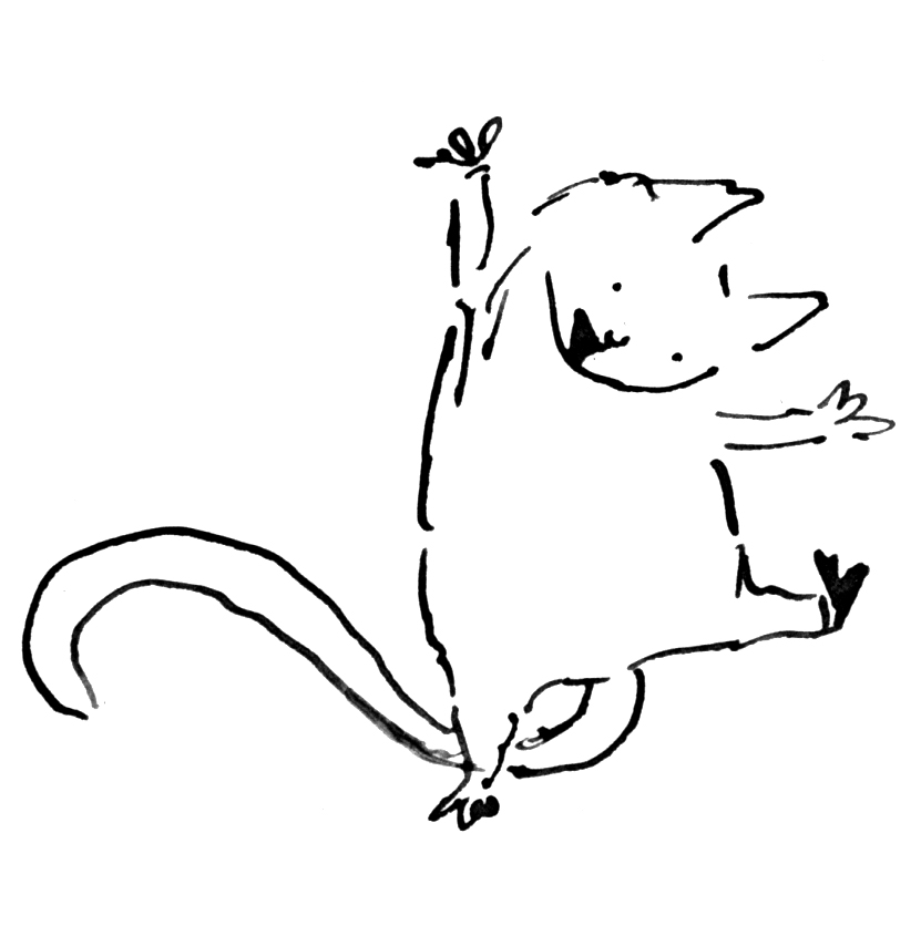
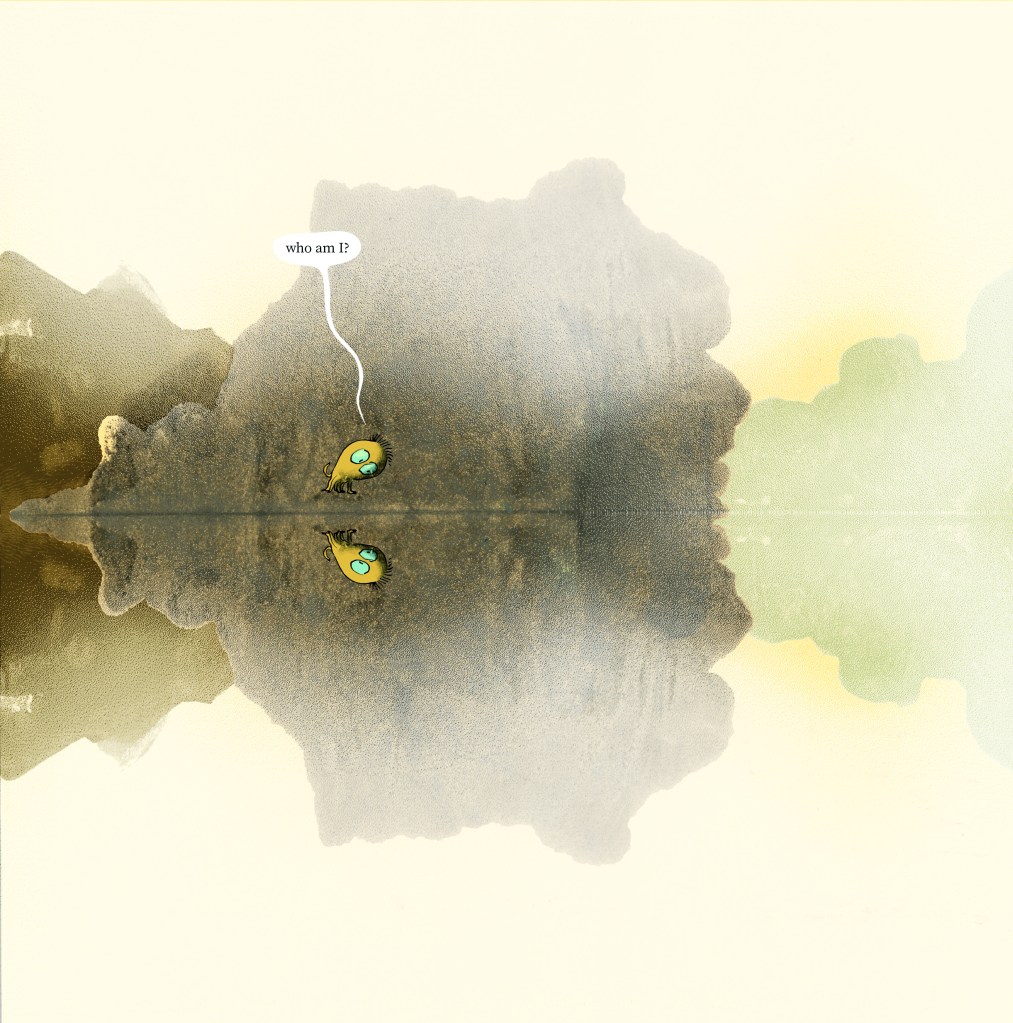
I sketched 12 small characters with dip pen and ink, to place into a scene of self reflection. Here are a few of them. (below)


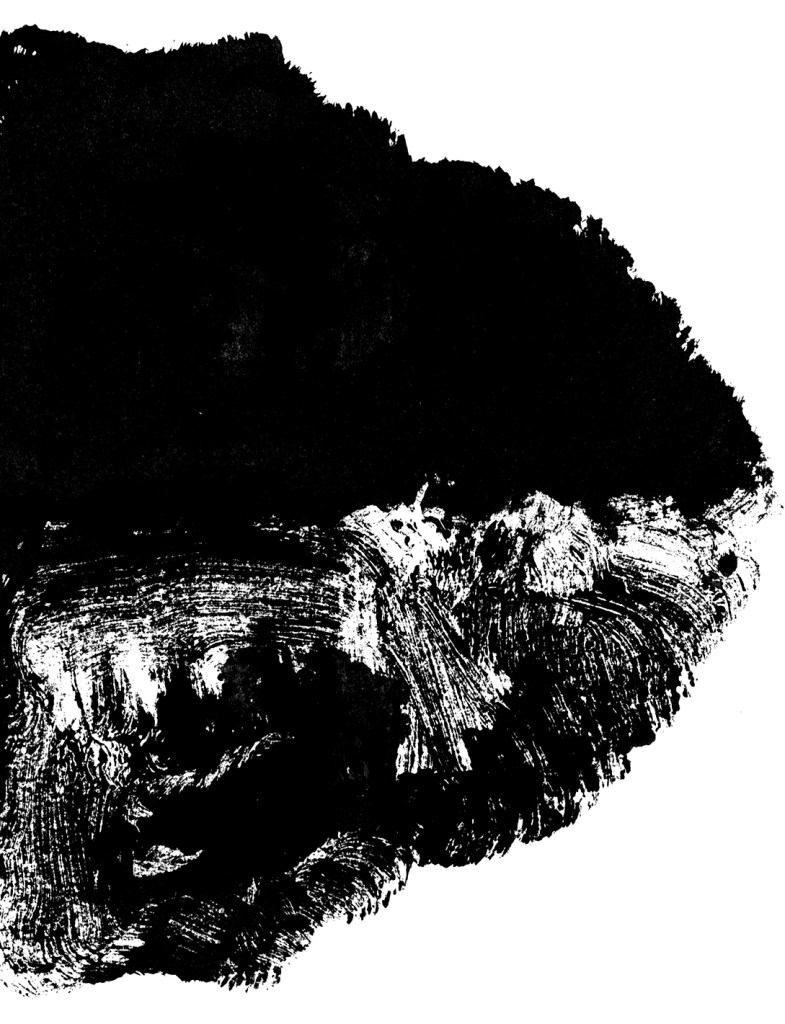
Then I printed a few ink blots. A couple really do look like very interesting moths, (I’m not sure what that means about my personality type) and they are begging to be used as collage materials for something else. But they don’t suggest islands to me, so I used the more solid results.
This ink blot on yellow paper is so evocative of a rocky island, that it didn’t need my interference at all. And the yellow just added to the atmosphere. But I wanted to use at least one of my characters, so I added some mist, and background islands, and then put my character in.

I was quite pleased with the result, and I feel for this little creature having an identity crisis, all alone. Although the text is at a scale that would work best on a full page illustration, and is probably illegible at this size.
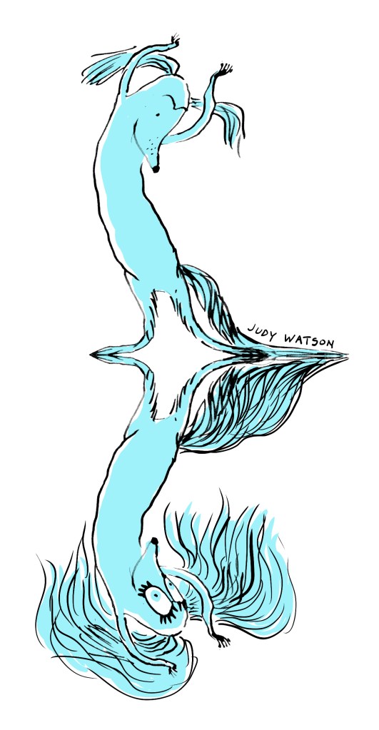
And then I played with a second character with no background at all. I think this funny little creature is a cousin of the legendary Narcissus, but if you flip the image upside down, you have the more universal experience of looking in a mirror.
Most people are familiar with the Rorschach Test invented in 1921 by Hermann Rorschach. It‘s so often used as a gag in a cartoon or a sitcom that even youngsters get the general idea. It’s a psychological test, where a patient looks at the ink blot and describes what they see in it – often an animal, face or scene.
But I wasn’t aware that Klecksography was a thing in the late 19th century. Making images from ink blots, it’s an activity that I often enjoy as a warm-up exercise for drawing, and to create new characters. I usually call it blob drawing, which isn’t nearly as fancy, but I suppose my blobs are a bit more blobby in shape than blotty, and they lack the symmetry too.
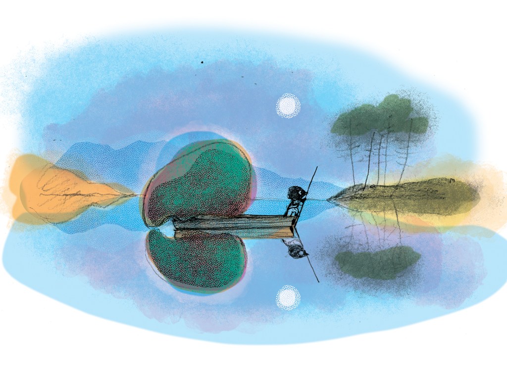
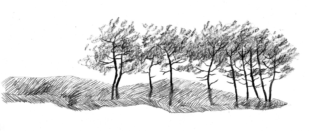
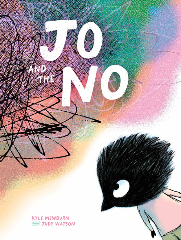
I thought this prompt was a great opportunity to join in the Kick-About again, because I already have some artwork to begin with, and it’s not my collection of blob drawings. It’s this illustration (below) from my upcoming picture book with Kyle Mewburn, Jo and the NO. In this illustration, Jo traverses ‘lakes as still as mirrors’. So creating background mountains and their reflections from Rorschach-style inkblots seemed like a good idea.

Here the NO in the back of the punt seems to be observing itself in the still waters because I wanted to suggest self reflection as well as the physical reflection of the scenery. You’d think it would be easy to whip up a few inkblots and plonk them into the image. But it was surprisingly hard to get from the successful rough illustration (below) to a successful final illustration.
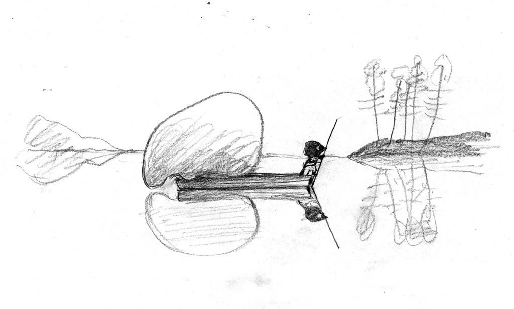
The original sketch started as a thumbnail drawing, intended to share a double page spread with three other vignettes. But when we decided that the book was going to 40 pages this scene acquired a double page spread of its own with the impediment of the gutter down the middle of the illustration. So getting the balance of the illustration to work again in a different format was a challenge. The enlarged range of mountains and trees when loaded together on the page, very quickly distracted from and overwhelmed our protagonists, instead of highlighting them and giving significance to them.
Also I didn’t want my reflections to be perfect, because imperfect things are always more interesting and have more visual energy. But I found that if they were too interesting, they became distracting. So there was a lot of trial and error involved with recreating the transparent freshness of the rough sketch within a new framework.
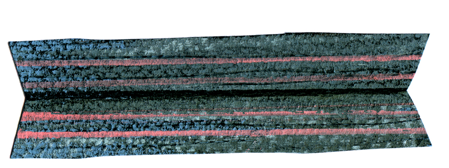
Below are a few of the monotypes I produced to create islands and mountains for the background. I painted a loose shape, suggestive of an island with vegetation, and then folded the paper in half for the reflection.


Below are some of the more detailed experiments, testing out graphite instead of paint. These fell into the too distracting category. There are always countless illustrations made for a picture book (some of them very time consuming) that don’t make the final cut. But they may be interesting in their own right.

And I have to include the other hand-made element – a little collage boat made from Ingres paper and soft pastels. It’s so nice and wonky. One of my favourite bits.
For the final art, I did end up using a digital reflection for some elements, and those reflections did become ‘perfect’. But most of the tree reflections were drawn by hand and so they don’t perfectly match their right-side-up counterparts. (This brings about a nice effect used by landscape architects, where a repeating pattern with small variations is pleasing but never monotonous.) Embracing these inconsistencies was part of my journey of letting go of hard rules.
More on Rorschach ink blots in the next post. In the meantime, anyone who is interested in pre-ordering Jo and the NO, please click here or on the cover image below.
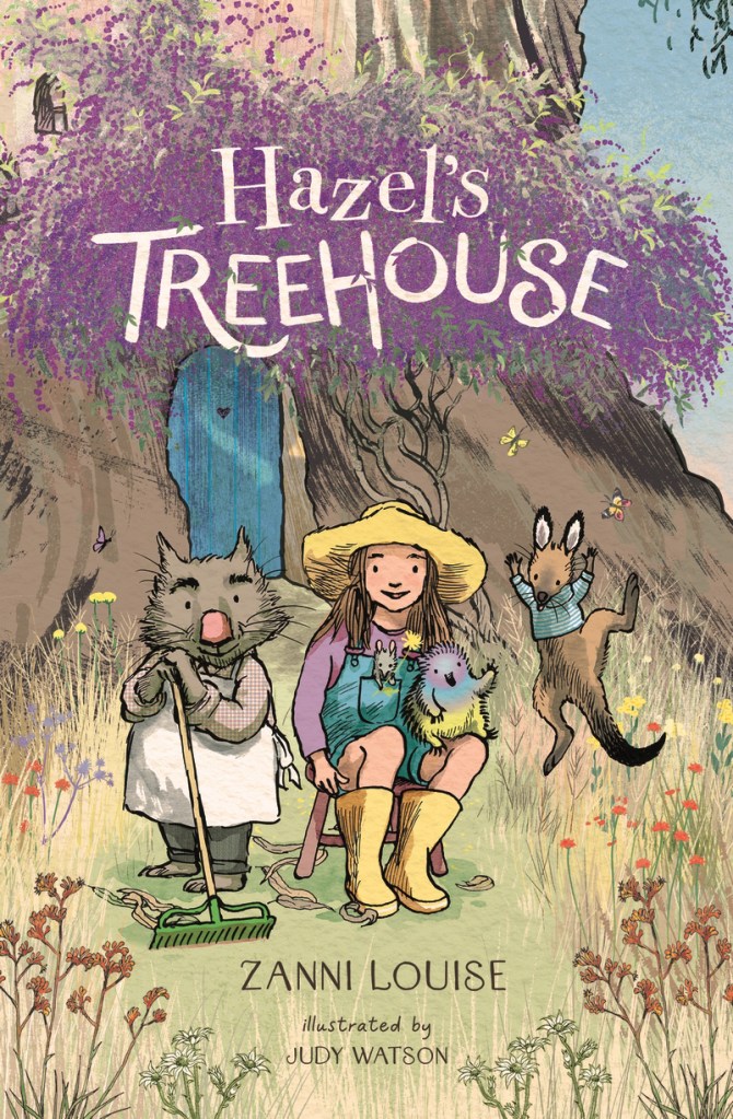
Hazel’s Treehouse is a new collection of gentle junior fiction stories from Walker Books Australia. It’s written by Zanni Louise, illustrated by me in dip pen and ink and it’s wrapped in flowers from its embossed hard cover and purple endpapers, through each of the ten stories to the creator biographies at the end.

Zanni’s a talented and prolific author across all age groups from the very young to YA, and she’s also an adept teacher. So I was delighted to be offered her stories to illustrate. You can check out her other books here if you haven’t already come across them.

The book came out at the start of November amid an exuberance of spring flowers in our garden and local surrounds, because we’re lucky enough to live opposite a creek reserve and just down the road from a retired reservoir set in native bushland. I loved taking my advance copies of the book out for walks in the bush and photographing it against whatever was in bloom. There’s a floral sampling below, including some of the show-offs and some of the delicate species that people may overlook. In much of Australia, harsh weather, shallow topsoil and unreliable rainfall have combined to evolve plants that conserve energy with small blooms and avoid dehydration with sparse leaves. These plants are quietly beautiful and tough.


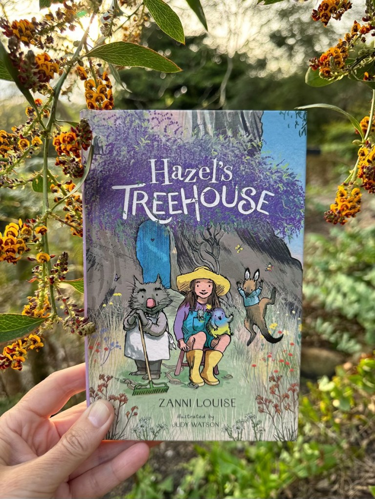


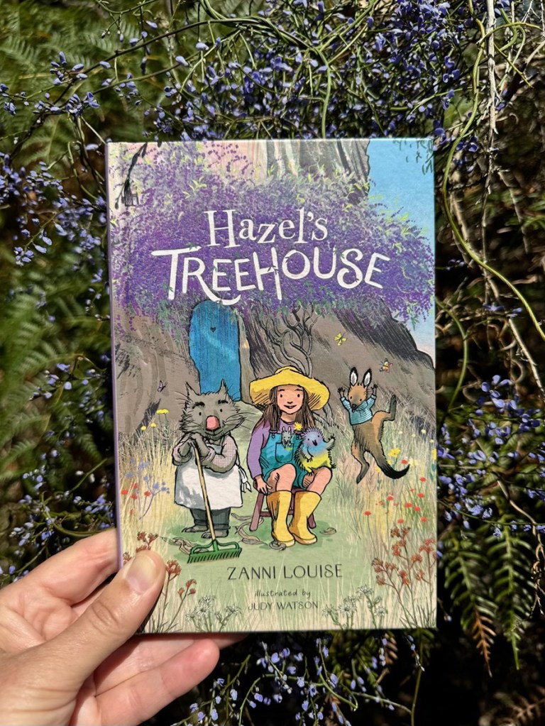
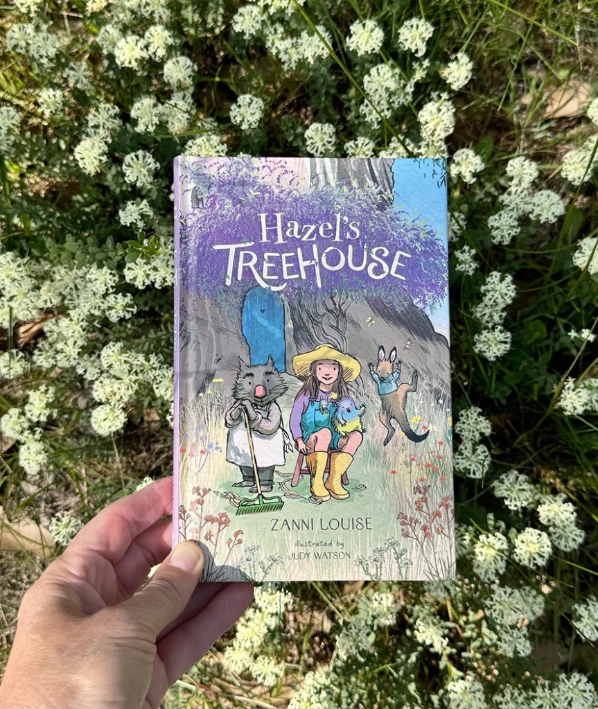
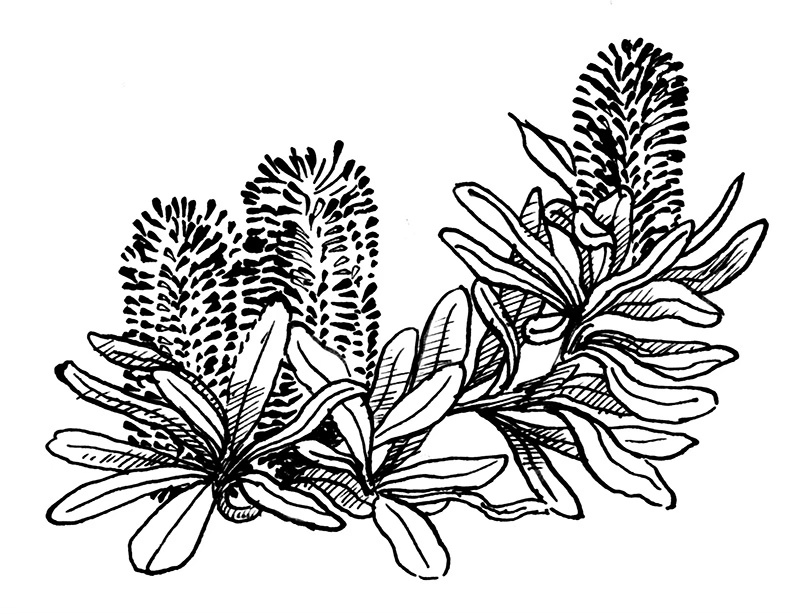
Zanni referred to several Australian flower species in her text, and because I had worked in nature conservation and had a horticultural husband brimming with indigenous plant nerdiness, it was an easy thing to embrace those references and run with them. I chose a plant to begin each story – whichever seemed the best fit (and that I felt capable of drawing!) Some of them were mentioned in the text and some were appropriate for other reasons. Christmas Orchids (Calanthe triplicata) adorned the Christmas story ‘A Very Tiny Day’. Coast Banksia (Banksia integrifolia) was used for ‘A Beach Day’ – even though the gang never made it to the beach. (You’ll have to read it to find out what they did instead, but they still managed to use their goggles and flippers.) Sometimes, if there was no obvious link, it was an opportunity for me to feature some of my personal favourites, like Hibbertia or Pimelea.


When I first noticed the plant references in the text, I was looking for clues to the location. The setting for any story is also a major ‘character’ in the story, creating an atmosphere, a flavour, and the physical framework into which our reader can immerse themself. So it’s one of the first things that I’m feeling for when I’m reading a manuscript for the first time. I thought that Zanni might have chosen plants local to a particular area where she’d prefer to see her stories illustrated. But the plants she mentioned are found all over Australia, and in some cases nowhere near each other. This told me that my setting was an imaginary location in a magical Australia, so… no rules! But for the most part, I’ve illustrated this imaginary place as a Grassy Woodland.
The NSW Office of Environment and Heritage describes Hazel’s surroundings to a tee: The Grassy Woodlands are a widespread and quintessential feature of rural Australia. Dominated by eucalypts, typically boxes and red gums, grassy woodlands have a relatively open canopy with sparsely distributed shrubs and a conspicuous and diverse ground cover of tussock grasses and herbs. Ephemeral grasses and herbs appear from seed banks following rain, while ground orchids and lilies emerge after fires to produce a spectacular floral display.
Hazel’s Treehouse has already been met with a flowering of warmth and enthusiasm from readers and reviewers. There’s much more to share about the process of illustrating it, but it seemed right to mention the flowers before the close of the last day of spring!
Oh, and here’s 54 seconds of baby Eastern Rosellas in the nest box in our garden, looking exactly like muppets.
For more details about Hazel’s Treehouse, and to read some extracts of reviews, click here.
I’m late to this Kick-about, because I’ve just arrived home in my studio after a month away. But I thought I’d throw together a quick response to the Kick-About #111, especially as it’s such a cool number.
The prompt was the Mad Potter of Biloxi, a nickname for George E. Ohr, a most excellent American ceramicist who lived from 1857-1918. His wonderful glazes and crumpled shapes, along with the seemingly weightless and wandering curlicues he attached to some of his pots, are deliciously attractive. (So was his moustache.)

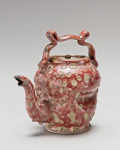
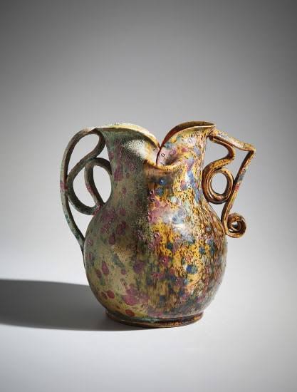
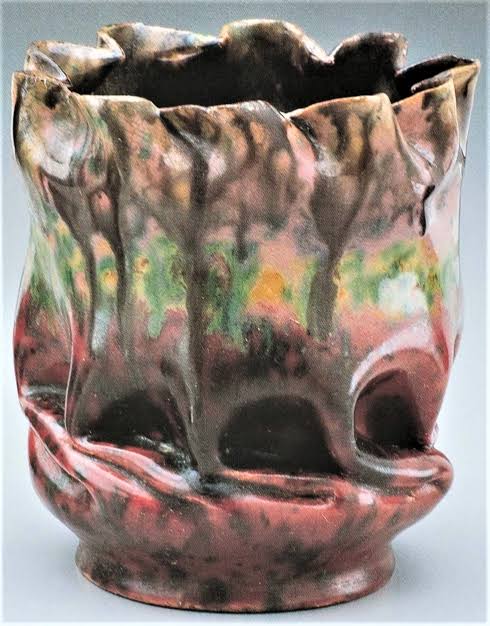
It’s very sneaky to kick-about after the other players have left the field, because I was able to take inspiration from their work before I began. You can see their fabulous stuff here. I drooled over everything first, and then I settled on Kerfe Roig’s studies with a glimmering eye. (Insert insane, evil laughter here.) I had only a couple of hours to do something with this, and although Kerfe had spent time, thought and energy exploring a range of processes to stunning effect, I brazenly ripped off a fast and cheap imitation in my own style. Sorry, Kerfe. Love your stuff.
Apologies also to George, because your colour harmonies are superb and I have gone OTT without any attempt at subtlety. But George, you’re dead, and anyway I think you wouldn’t care.
Step 1. Clamber about in the ‘catacombs’ under our house and locate one of the much used and highly versatile x-ray development trays my Dad used in his veterinary clinic.
Step 2. Place paper in the X-ray tray. In the absence of the mysteriously missing water sprayer, (What have you guys done with this since I went away?) douse some paper with water from a watering can, until fully soaked but not disintegrating.
Step 3. Pour excess water back into the watering can using the handy spout at the corner of the x-ray tray. (Thanks Dad)
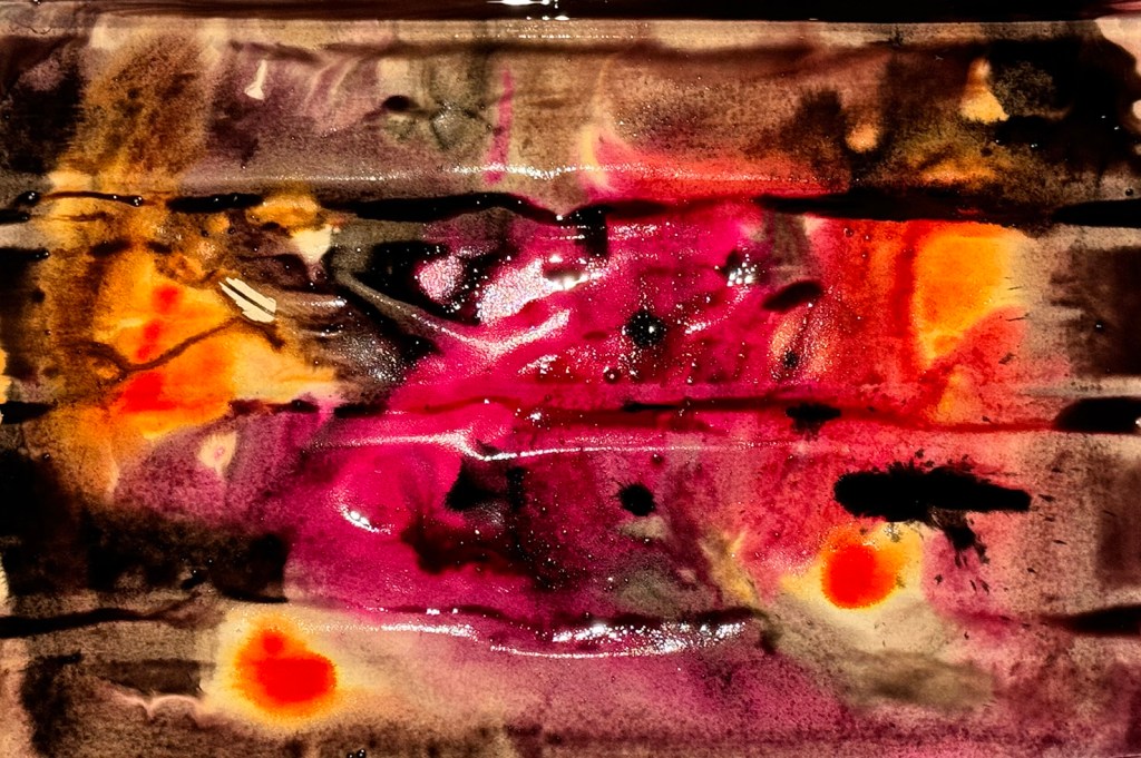
Step 4. Apply inks with abandon.
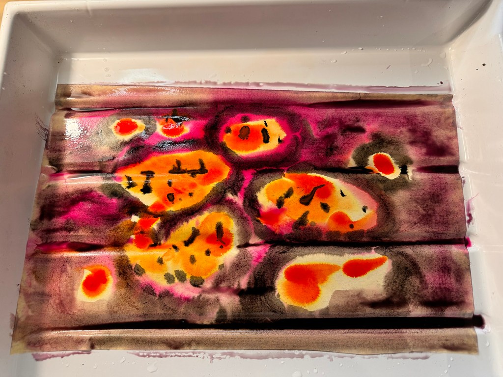
Step 5. Apply random brushes with abandon.
Step 6. Fashion paper into a horse shape, Ohr/Roig style.

Step 7. Ponder the delicate nature of wet paper, the already chaotic state of my workspace and the advantages and disadvantages of adding glue to the mix.
Step 8. Have another go, adding glue.
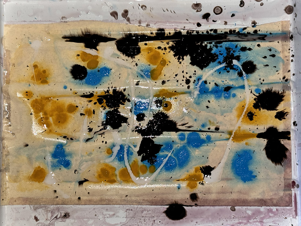
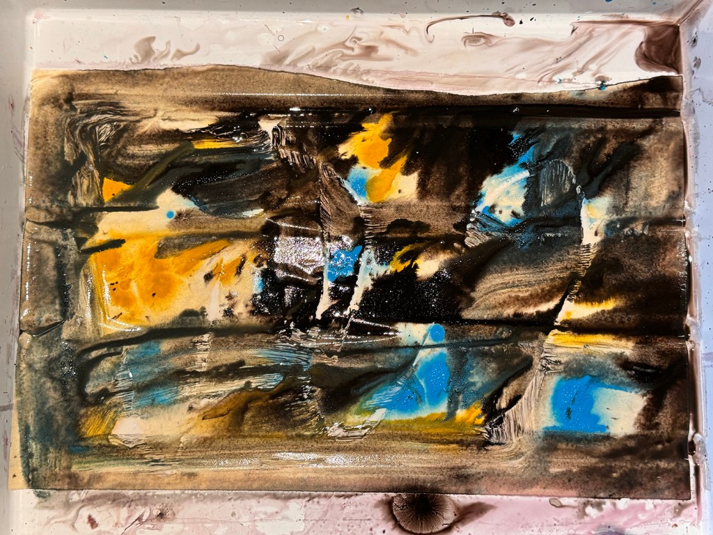
Step 9. Photograph and adjust levels / colours in PhotoShop.


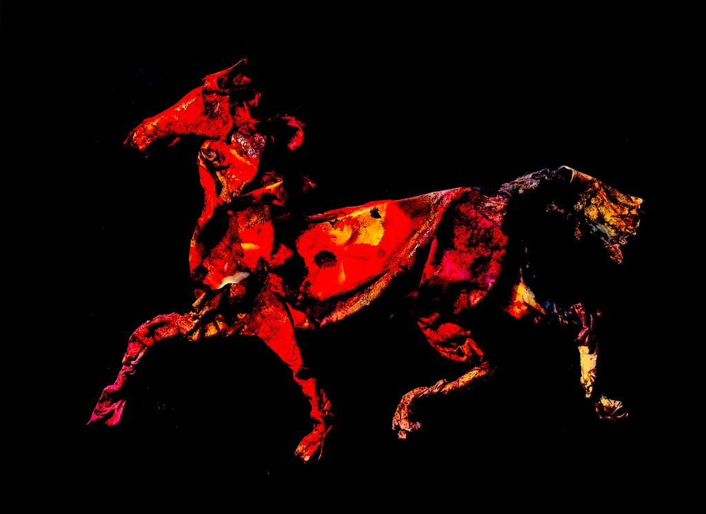

Step 10. Cook zucchini slice
I was just clearing up my art equipment for the day’s activities, and I couldn’t resist one last little go with the Big Chungus, so here are some baby birds of paradise.
By the way, writing the plural for Bird-of-paradise reminded me of seeing the stage play Shadowlands about C. S. Lewis and Joy Gresham. I remember laughing at the bit where Lewis debates whether he should be ordering gin and tonics or gins and tonic. This is just the sort of thing that delights my brain. But alas, I’m not sure these work so well as Bird-of-Paradises.

I forgot to give the Spotty-Pyjama-B-O-P a tail. By rights, there should be a stumpy one at least.

Hello Kick-About! I haven’t participated in the longest time. I’ve watched the posts flash by every two weeks. Some of them would have been a challenge indeed, but some of them were right up my alley. I nearly cried to miss ‘Kenojuak Ashevak’. But I haven’t been able to squeeze the Kick-About in.
I’m the Burrow in Adelaide on a writing fellowship during July so the demands on my time are fewer. Saturday seemed like a good day to take a break from the keyboard and play with mixed media. I’ve brought a limited selection of art equipment with me, focusing on dry media and collage to keep it cleaner. But I’ve still managed to make the kitchen table look a lot like my drawing board at home.
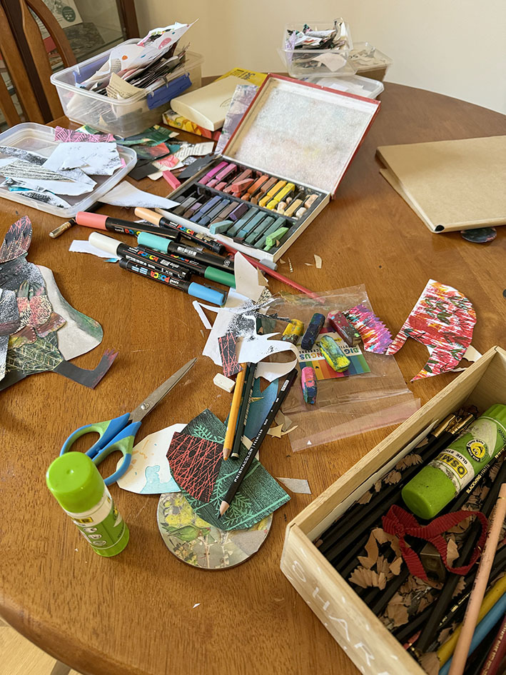
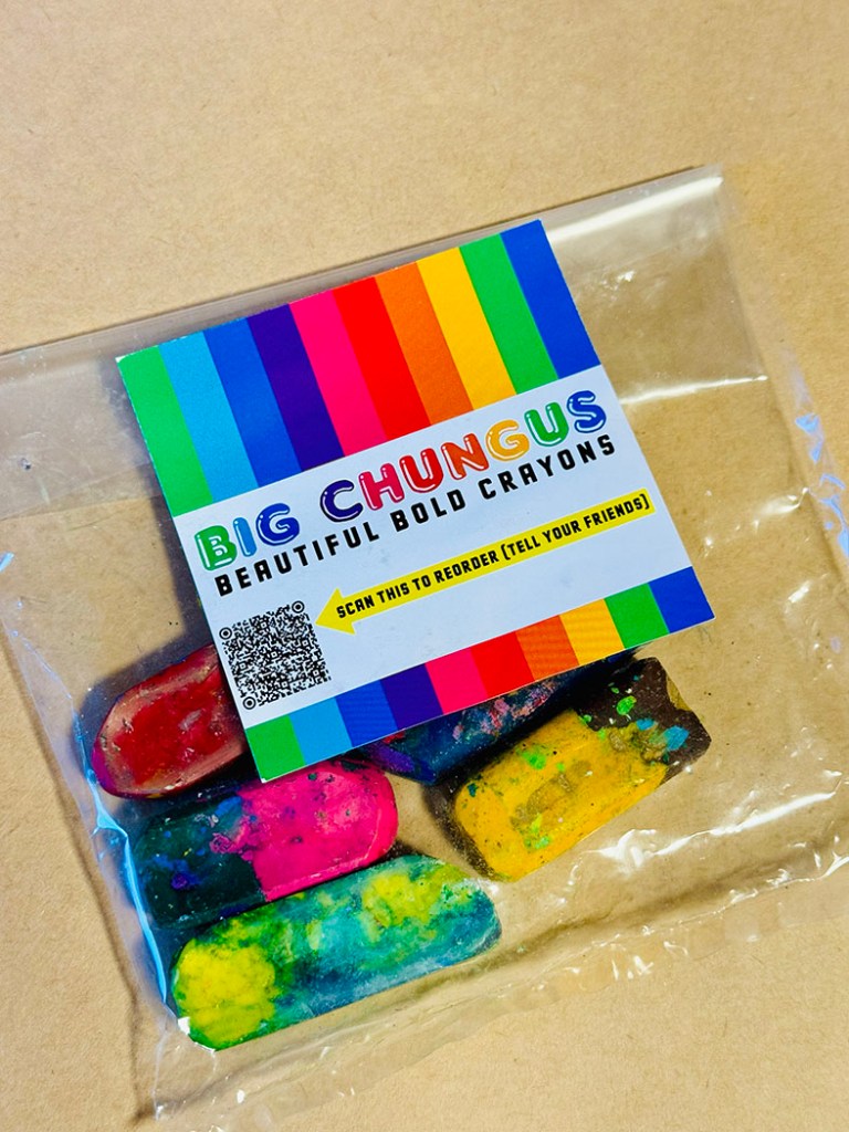
A shout out to Zoë Collins who sent me a packet of her gorgeous up-cycled crayons to use several months ago. This is the first chance I’ve had to play with them. They are really an upscaled version of what Ann James calls magic pencils, the multicoloured pencils she used to illustrate the Dirty Dinosaur series of books by Janeen Brian. (When she wasn’t using mud. See this video to watch that!)
On to the paradisaeidae! This is just the family name for the Bird-of-Paradise. And since I seem to have been drawing bird people for the longest time, it couldn’t be a more perfect prompt for a one day session using crayons, pencils and collage. It does occur to me that these pictures are equally suited to the previous Kick-About prompt ‘Chinelos’ and I seem to have blended the two in a sneaky way.
I started with the chungus crayons because I was very curious to use them. I had a ball with them. Part of their appeal is the letting go of control that goes with them. As you apply them, the colour changes, so it takes you to unexpected places. And letting go of control is about the best thing you can do if you are taking just one morning out to play with art materials. I started randomly colouring a bird shape and let it form itself as I went along. I soon felt the need of black, which wasn’t in my crayons, so I introduced soft pastels.
To give the bird a bit of dynamism I made it hurry forwards looking furtively over its shoulder. Apparently my subconscious was dwelling in the venal world of politics, elections, the patriarchy, and the progress of the Far Right, because my bird was evolving into a pompous creature, over-dressed, clutching at his medal of office whilst walking though a field of smoke and with blood on his feet! My subconscious has opinions, apparently. At least the Tories are out. Below is the unfinished collage, with pieces not yet glued down.
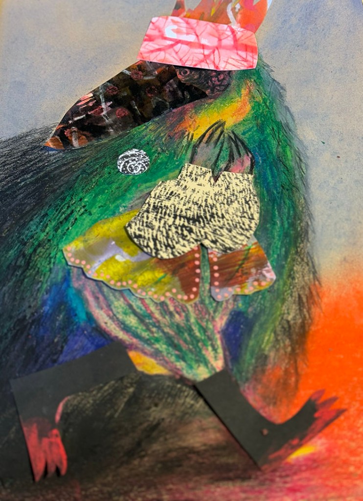
However, in terms of colour there was no focal point, so although I was enjoying the texture interactions, I started to overlay further collage pieces over sections of the bird, and ended up by cutting him away from his background. This is what he ended up looking like.

I think my subconscious was happy to have got him out of its system by this time, so I moved on to these little sketches that I had dashed off as soon as I read the Kick-About prompt earlier. My plan was to overlay digital collage on to them and to make them look like quirky dancers or mummers of some sort. They’re generally much more cheerful.

I made a bit of versatile colour and texture to clad them, using soft pastels and Posca pens. I made sure I had both light and dark areas. And then I simply dressed them up in PhotoShop without fussing too much. Mission completed!


Hello gentle followers. It’s been a while.
Firstly, an update. I’m fortunate enough to be in Adelaide for the month of July courtesy of the May Gibbs Children’s Literature Trust to undertake a Creative Time Residential Fellowship. I was awarded a Mary Wilson Fellowship, and was supposed to undertake it last year, but we had a few serious health and wellbeing issues in our family at that time and the Trust was kind enough to squeeze me in for this year instead. The Fellowship is named after Mary Wilson, a patron of the trust who has been involved since its inception in 1989 and is passionate about our natural environment, so projects undertaken should have a significant environmental theme. My original intention was to write a non-fiction picture book about an Australian animal, but things have shifted slightly since my application back in May 2022, and instead I find myself writing a verse novel about tadpoles.

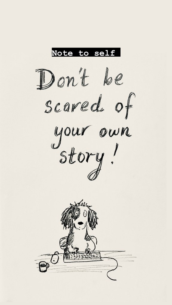
One of my other projects is a picture book with a climate theme, but I’m a bit scared of that one. Last time I worked on it the most devastating ear worm attacked me with a doggerel rhythm, and I couldn’t shake it off. I’m scared the worm will attack again, so I’m postponing that project until I’ve gained some writing muscle over the next week or so. I’ve been doing all sorts of keyboard push-ups in preparation. If that worm attacks I will be prepared.
I also made this note for myself and stuck it on the wall. It hasn’t completely worked yet.
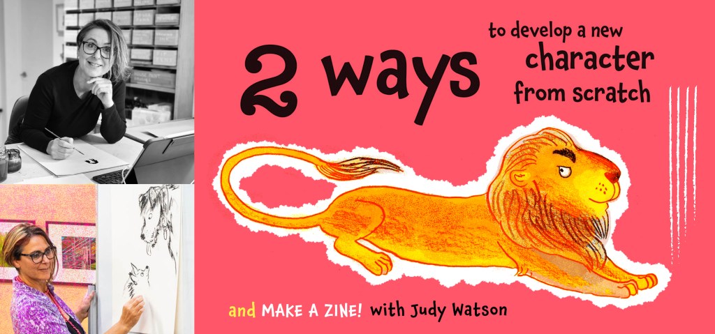
I’ll be doing a bit of teaching while I’m in Adelaide. This workshop is at the State Library.
If you’re local to Adelaide, you can click the image to read more about it or make a booking. Below is the delightful Norwood Library. I scooted out to join it the day after I arrived. I can’t survive without a library membership.

So that’s the first thing. The second is that my son Hugo is creating a website for me – a task I have been meaning to get to for years. So this blog will jump across to the website when it’s ready.
I suspect that readers who have subscribed with their email address will be transported across the techno-wilderness and stay on the mailing list. Those WordPress users who follow using the WordPress follow function will probably drop off. So if you still want to hear from me and you haven’t subscribed with an email address, you can do that now, or do it later on at my new website.
I’m planning on having two options. My blog will be about things I have been working on. My newsletter will be occasional notifications of upcoming book releases or exhibitions, for those who are interested in purchasing or attending.
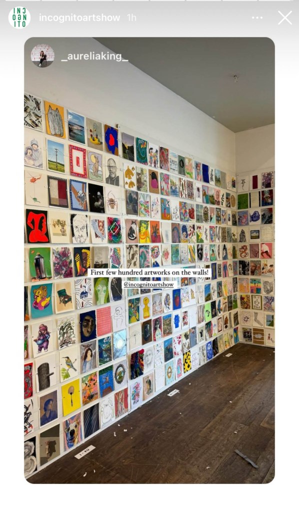
Which brings me to the third thing. For those of you who are in the vicinity of Sydney, the Incognito Art Show is coming up very soon! I am quite envious of those who can visit this show in person. It looks like quite an occasion, judging from photos of previous years. And having gone through the artwork on-line (which takes a while!) I can attest that there are STACKS of fantastic postcard sized artworks up for grabs. They are all at the one price of $100. The screenshots below from the Incognito Instagram account give you an idea of what the walls will look like.

The fun part is that all works are incognito until after purchase. You can read all about it here. And you can register your name on the website to create a wishlist of your favourites here. The best thing of all is that all proceeds go to supporting artists living with a disability.
I’ve currently got over 150 saved in my wishlist, so that says a lot about my inability to make decisions, but also a lot about the gloriousness of the artwork. And I’m not telling ANYONE what my favourites are, because the people who attend in person get first dibs, and I’ll only be in with a chance when the online sale goes live after the in person sale days.
I have three artworks in the show. I can’t show you what they look like of course. But for those who like puzzles, I am including a greyed out version of my artworks with little windows cut into the grey. If you can work out which art is mine from this, you are nothing short of a genius. I’ve only been able to find one of mine on the website so far, and I know what they look like.


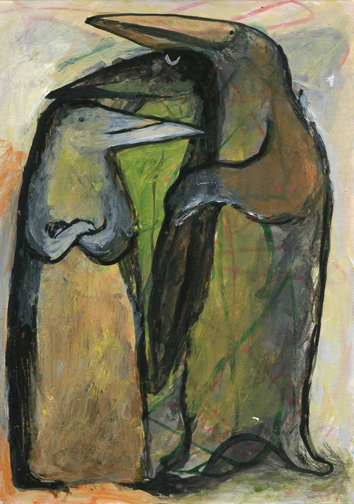
13/7/24 I’ve updated to add the actual artwork for this one which has just sold. Titled Family Group. Mixed media A5 size. So many bird people. Where do they all come from?

Believe it or not, I will post again tomorrow, because today I took a day off writing and made some art with limited materials, for the Kickabout! But also because I miss my blog, and I’m a bit disheartened by social media. Cheerio until tomorrow!
Here’s a bonus dog-bird doodle. My dog people and bird people finally met in the middle.

