There are only a few hours left to bid on original Australian artworks in the IBBY fundraising auction

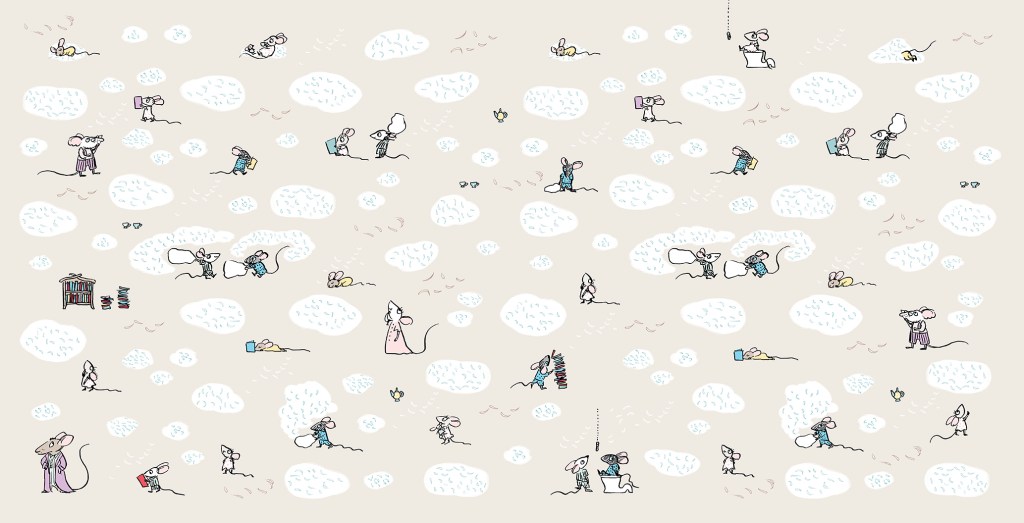
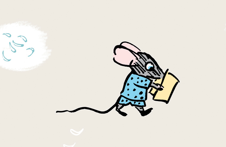
Hello gentle readers. It’s been a while. I’ve just finished a book project, (more on that later) and I’m at the clearing up stage. Putting things to rights in the studio, starting to clear up the house, dipping my toe joyfully into the waters of recreational sewing.
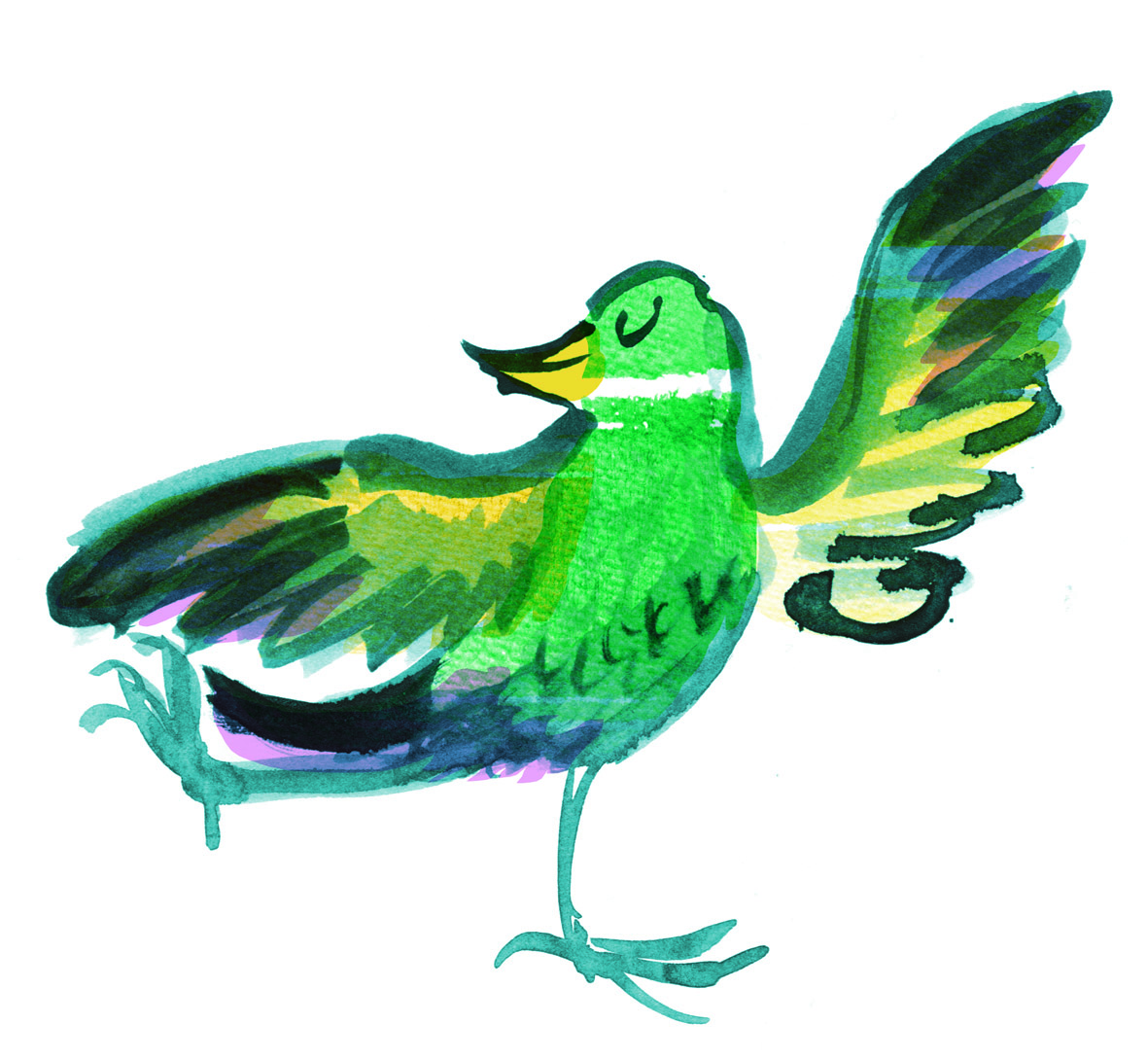
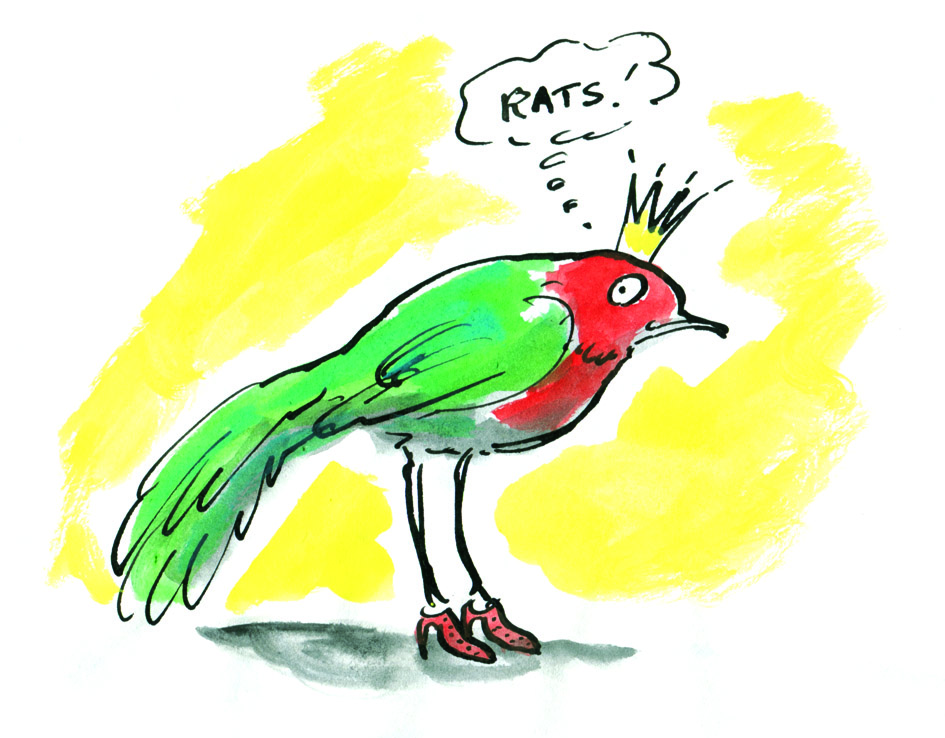
I thought I’d reach out to make sure you’re aware of the IBBY fundraising auction that finishes tomorrow. You can browse all of the items for sale, here. They have been donated by Australian illustrators including me. If you’d like to contribute to this worthy cause, you will need to register to bid, (which is easy), and then go for it! Bidding closes tomorrow 28 November, at 9:00pm AEDT so you don’t have much time.
At the bottom of this post I’ve pasted in a little bit of information about IBBY, so that you can understand why IBBY might be on my radar. They’re all about young people, books for young people and supporting the creators of those books as well. But first, here’s a little background story about these rather unusual artworks.
Anyone who has been following this blog since the very beginning will know that when I started it, I was discovering the joys of altered book art. I was visiting used book fairs, collecting old books, some to read and some to cut up or draw in. After a few years, it seemed to me that altered book art was everywhere; everyone was doing it, and so it interested me less. The simple fact of a drawing being on a book page was not in itself interesting to me any more, although it had been a wonderful breakthrough for me when I was trying to find a medium, style and colour palette for Thunderstorm Dancing. (If you’re curious, go here.)

I still loved the subtle ways in which a drawing could respond to the text on the page, reinterpreting a few words, or taking an ironic look at the subject matter. And found poetry was and still is a delight to me. But I let it recede as my work went in different directions.

Later, I found myself irresistibly attracted to the cloth-covered book boards from vintage hardbound books. I began using them as substrates for drawings and paintings.

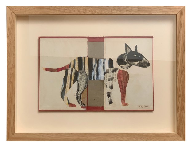
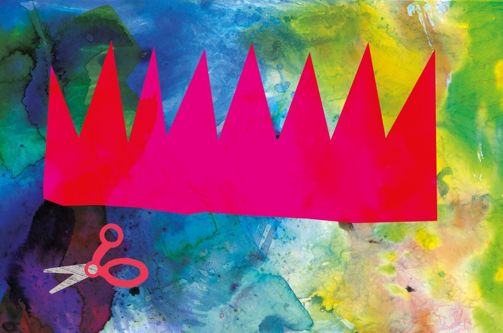
Collage has always been an important element in my work, both the paper and scissors kind, and the digital variety. In 2023, IBBY asked me to contribute a mini artwork for their Mini Masterpieces fundraiser and book boards were more or less the right scale. Some playful collages emerged. Below you see Mike, Maxine, Jennifer and Alan. They became my first Party Animals — characters who seemed so alive to me that they virtually wrote their own stories. If you’d like to read their accompanying microfiction stories I now have my Party Animals collected together on their own Instagram page https://www.instagram.com/judywatsoncollage/ and I’ll also add a page for them on this site in the coming weeks. As I make new Party Animals from time to time, they’ll be made available for sale there.

But now to the 2025 IBBY Party Animals!
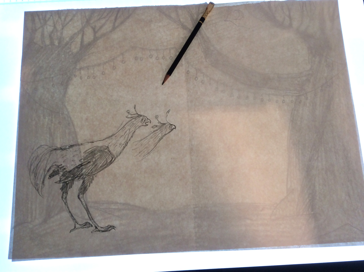
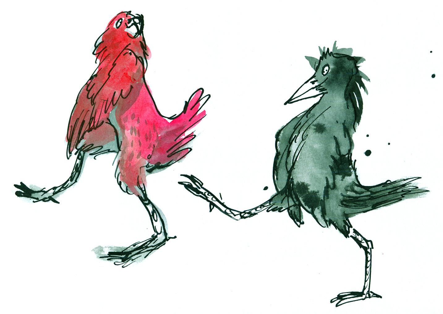
Rachel and Trent


These two followed their own stars. They look a little different from the 2023 partiers, but this time, they have been wrapped for travel with their own stories enclosed, so that you will know a little bit about them. I recently purchased a 1970s vintage typewriter, and I’ve been writing poetry on it, but I felt I wasn’t quite up to the challenge of typing their stories to the correct size and without a plethora of errors. Instead, I carefully chose a suitable typeface and printed their stories on good paper.


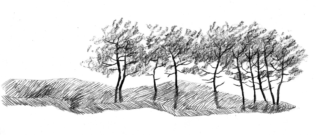
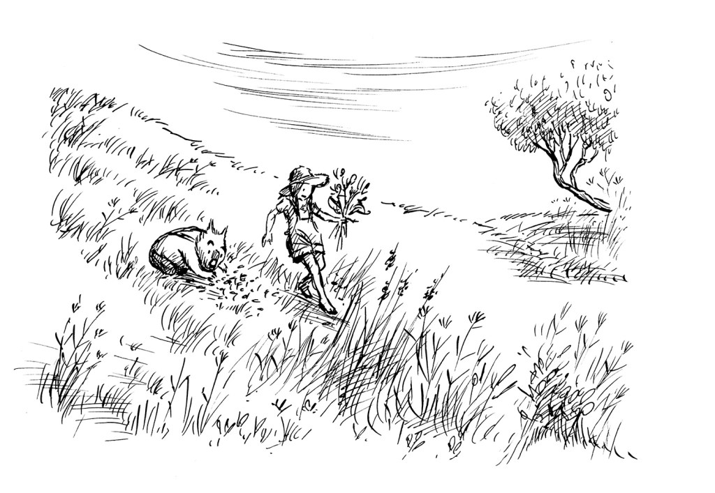
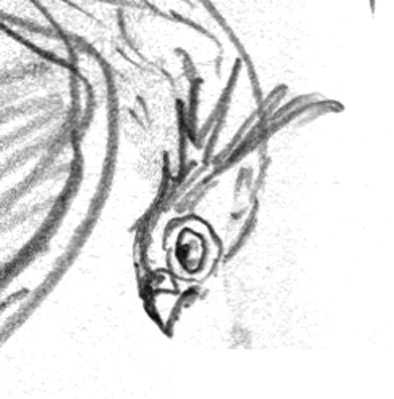
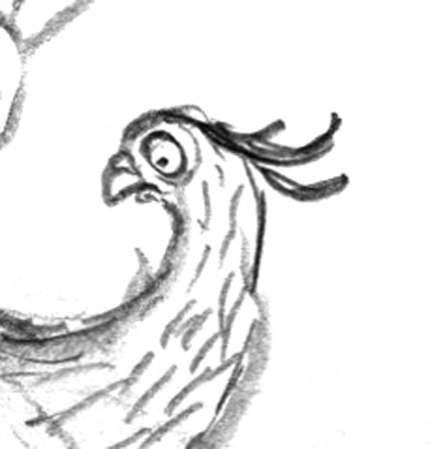
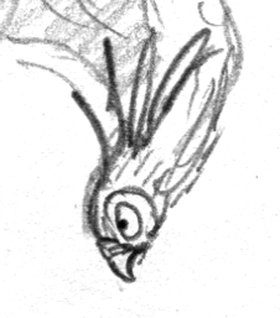
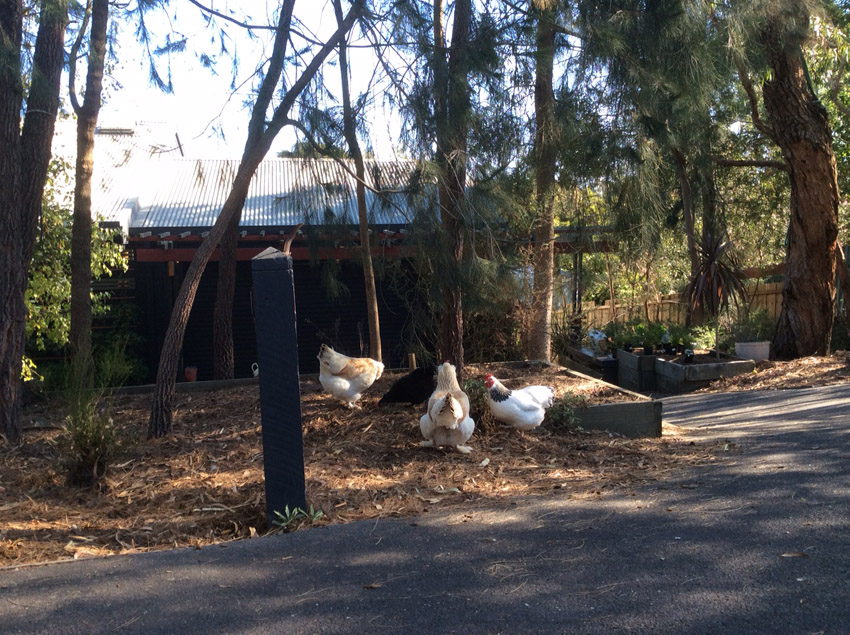
I also contributed three quick dip pen and ink sketches for the fundraiser. They’re based on reference photos of dogs and their owners that I took at a local pet day. You’ll see them here too. Below is the promised information about IBBY. If you’d like to support a wonderful organisation that supports children and the children’s literature community and if you’d like to purchase an original work of art from one of Australia’s book illustrators, then you can’t go wrong throwing in a bid for one of these artworks. Even if you don’t win the auction, you will bump up the price and help IBBY in the process. Good luck!
About IBBY Australia
IBBY Australia is one of 85 National sections of the International Board on Books for Young People (IBBY), and will be turning 60 in 2026.
IBBY is a non-profit organization which helps to build bridges to international understanding through children’s books.
IBBY Australia submits authors and illustrators and their work for several IBBY administered international awards, including:
• the Hans Christian Andersen Award
• IBBY Honour Book List
• the Silent Books collection and
• the Outstanding Books for Young People with Disabilities list.
You can read more about IBBY on this web site: https://www.ibby.org, and about IBBY Australia here:
https://ibbyaustralia.wordpress.com
or join online here:
https://ibbyaustralia.wordpress.com/join-us/ – we welcome new members!