Subscribe to continue reading
Subscribe to get access to the rest of this post and other subscriber-only content.

Subscribe to get access to the rest of this post and other subscriber-only content.
There are only a few hours left to bid on original Australian artworks in the IBBY fundraising auction

Hello gentle readers. It’s been a while. I’ve just finished a book project, (more on that later) and I’m at the clearing up stage. Putting things to rights in the studio, starting to clear up the house, dipping my toe joyfully into the waters of recreational sewing.
I thought I’d reach out to make sure you’re aware of the IBBY fundraising auction that finishes tomorrow. You can browse all of the items for sale, here. They have been donated by Australian illustrators including me. If you’d like to contribute to this worthy cause, you will need to register to bid, (which is easy), and then go for it! Bidding closes tomorrow 28 November, at 9:00pm AEDT so you don’t have much time.
At the bottom of this post I’ve pasted in a little bit of information about IBBY, so that you can understand why IBBY might be on my radar. They’re all about young people, books for young people and supporting the creators of those books as well. But first, here’s a little background story about these rather unusual artworks.
Anyone who has been following this blog since the very beginning will know that when I started it, I was discovering the joys of altered book art. I was visiting used book fairs, collecting old books, some to read and some to cut up or draw in. After a few years, it seemed to me that altered book art was everywhere; everyone was doing it, and so it interested me less. The simple fact of a drawing being on a book page was not in itself interesting to me any more, although it had been a wonderful breakthrough for me when I was trying to find a medium, style and colour palette for Thunderstorm Dancing. (If you’re curious, go here.)

I still loved the subtle ways in which a drawing could respond to the text on the page, reinterpreting a few words, or taking an ironic look at the subject matter. And found poetry was and still is a delight to me. But I let it recede as my work went in different directions.

Later, I found myself irresistibly attracted to the cloth-covered book boards from vintage hardbound books. I began using them as substrates for drawings and paintings.

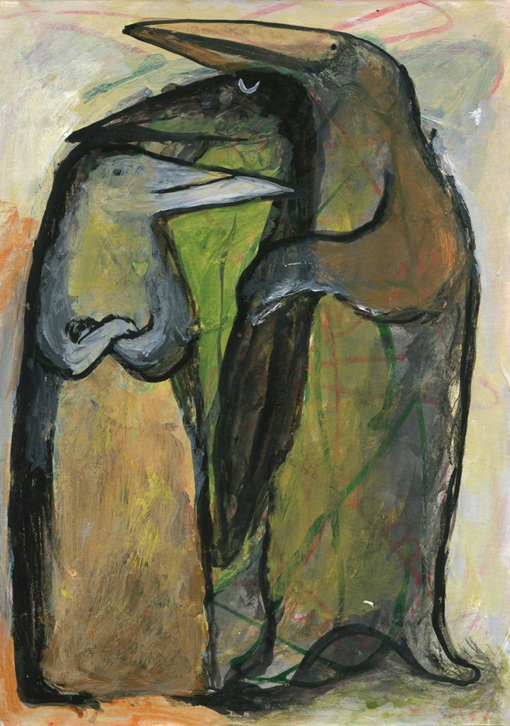
Collage has always been an important element in my work, both the paper and scissors kind, and the digital variety. In 2023, IBBY asked me to contribute a mini artwork for their Mini Masterpieces fundraiser and book boards were more or less the right scale. Some playful collages emerged. Below you see Mike, Maxine, Jennifer and Alan. They became my first Party Animals — characters who seemed so alive to me that they virtually wrote their own stories. If you’d like to read their accompanying microfiction stories I now have my Party Animals collected together on their own Instagram page https://www.instagram.com/judywatsoncollage/ and I’ll also add a page for them on this site in the coming weeks. As I make new Party Animals from time to time, they’ll be made available for sale there.

But now to the 2025 IBBY Party Animals!


These two followed their own stars. They look a little different from the 2023 partiers, but this time, they have been wrapped for travel with their own stories enclosed, so that you will know a little bit about them. I recently purchased a 1970s vintage typewriter, and I’ve been writing poetry on it, but I felt I wasn’t quite up to the challenge of typing their stories to the correct size and without a plethora of errors. Instead, I carefully chose a suitable typeface and printed their stories on good paper.


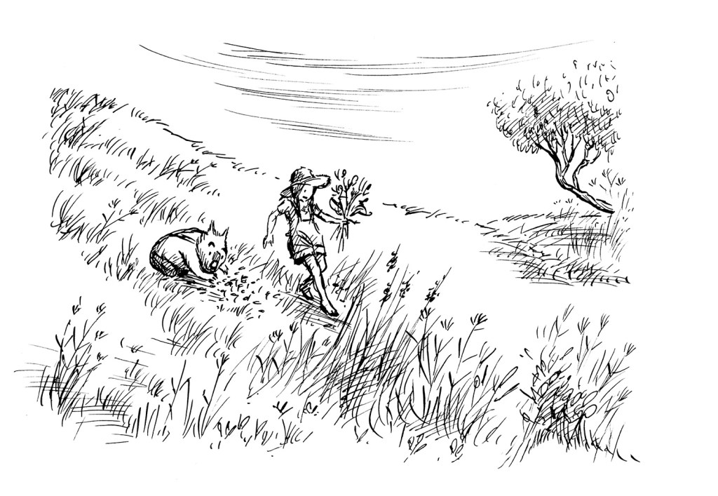
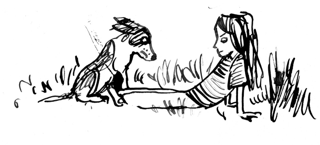
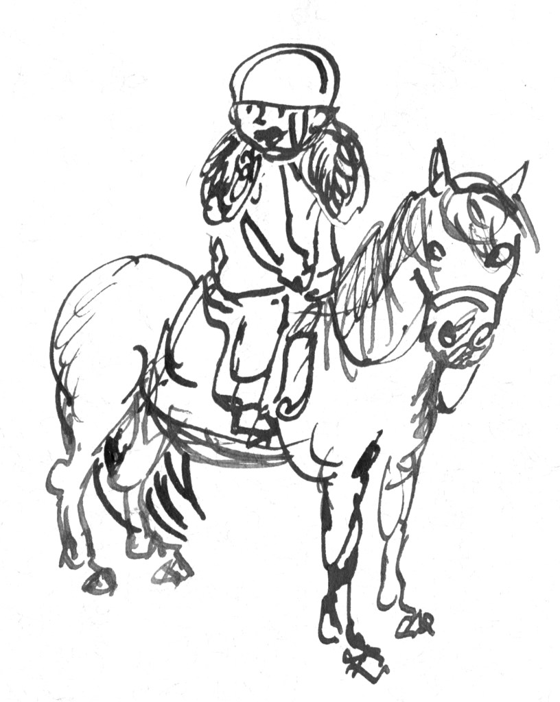
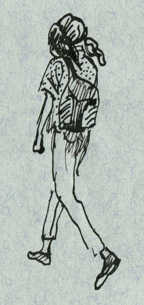
I also contributed three quick dip pen and ink sketches for the fundraiser. They’re based on reference photos of dogs and their owners that I took at a local pet day. You’ll see them here too. Below is the promised information about IBBY. If you’d like to support a wonderful organisation that supports children and the children’s literature community and if you’d like to purchase an original work of art from one of Australia’s book illustrators, then you can’t go wrong throwing in a bid for one of these artworks. Even if you don’t win the auction, you will bump up the price and help IBBY in the process. Good luck!
IBBY Australia is one of 85 National sections of the International Board on Books for Young People (IBBY), and will be turning 60 in 2026.
IBBY is a non-profit organization which helps to build bridges to international understanding through children’s books.
IBBY Australia submits authors and illustrators and their work for several IBBY administered international awards, including:
• the Hans Christian Andersen Award
• IBBY Honour Book List
• the Silent Books collection and
• the Outstanding Books for Young People with Disabilities list.
You can read more about IBBY on this web site: https://www.ibby.org, and about IBBY Australia here:
https://ibbyaustralia.wordpress.com
or join online here:
https://ibbyaustralia.wordpress.com/join-us/ – we welcome new members!
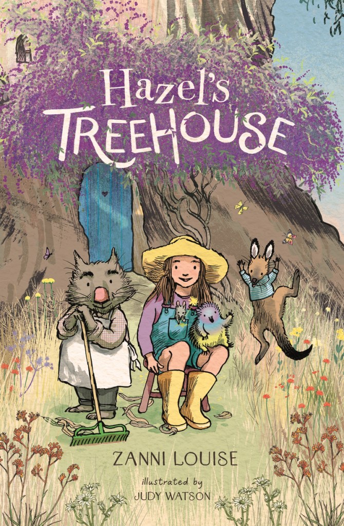
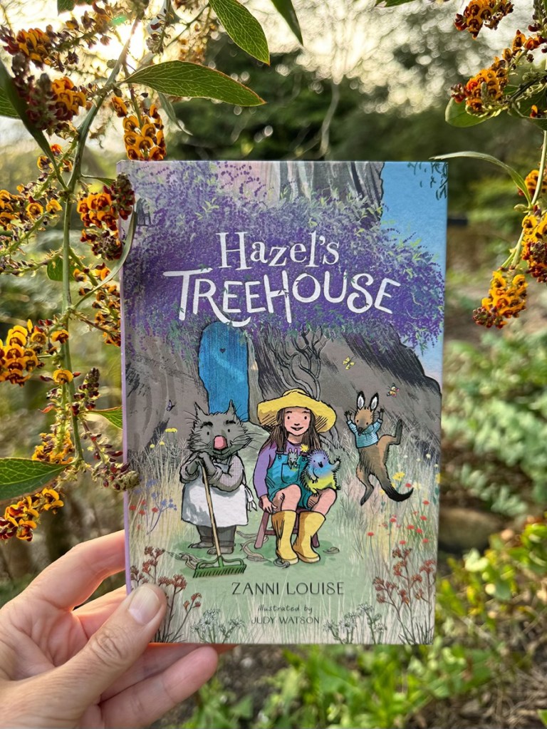
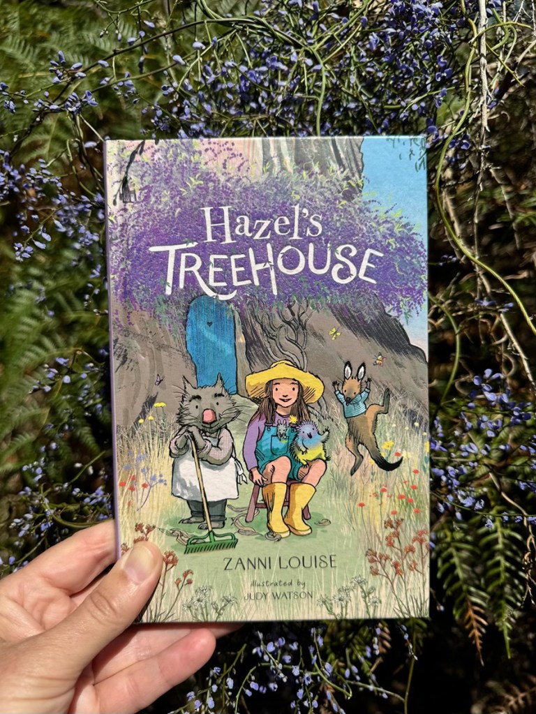
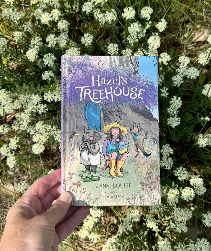
Hazel’s Treehouse is a new collection of gentle junior fiction stories from Walker Books Australia. It’s written by Zanni Louise, illustrated by me in dip pen and ink and it’s wrapped in flowers from its embossed hard cover and purple endpapers, through each of the ten stories to the creator biographies at the end.

Zanni’s a talented and prolific author across all age groups from the very young to YA, and she’s also an adept teacher. So I was delighted to be offered her stories to illustrate. You can check out her other books here if you haven’t already come across them.

The book came out at the start of November amid an exuberance of spring flowers in our garden and local surrounds, because we’re lucky enough to live opposite a creek reserve and just down the road from a retired reservoir set in native bushland. I loved taking my advance copies of the book out for walks in the bush and photographing it against whatever was in bloom. There’s a floral sampling below, including some of the show-offs and some of the delicate species that people may overlook. In much of Australia, harsh weather, shallow topsoil and unreliable rainfall have combined to evolve plants that conserve energy with small blooms and avoid dehydration with sparse leaves. These plants are quietly beautiful and tough.


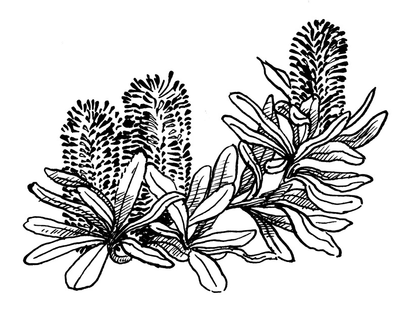
Zanni referred to several Australian flower species in her text, and because I had worked in nature conservation and had a horticultural husband brimming with indigenous plant nerdiness, it was an easy thing to embrace those references and run with them. I chose a plant to begin each story – whichever seemed the best fit (and that I felt capable of drawing!) Some of them were mentioned in the text and some were appropriate for other reasons. Christmas Orchids (Calanthe triplicata) adorned the Christmas story ‘A Very Tiny Day’. Coast Banksia (Banksia integrifolia) was used for ‘A Beach Day’ – even though the gang never made it to the beach. (You’ll have to read it to find out what they did instead, but they still managed to use their goggles and flippers.) Sometimes, if there was no obvious link, it was an opportunity for me to feature some of my personal favourites, like Hibbertia or Pimelea.


When I first noticed the plant references in the text, I was looking for clues to the location. The setting for any story is also a major ‘character’ in the story, creating an atmosphere, a flavour, and the physical framework into which our reader can immerse themself. So it’s one of the first things that I’m feeling for when I’m reading a manuscript for the first time. I thought that Zanni might have chosen plants local to a particular area where she’d prefer to see her stories illustrated. But the plants she mentioned are found all over Australia, and in some cases nowhere near each other. This told me that my setting was an imaginary location in a magical Australia, so… no rules! But for the most part, I’ve illustrated this imaginary place as a Grassy Woodland.
The NSW Office of Environment and Heritage describes Hazel’s surroundings to a tee: The Grassy Woodlands are a widespread and quintessential feature of rural Australia. Dominated by eucalypts, typically boxes and red gums, grassy woodlands have a relatively open canopy with sparsely distributed shrubs and a conspicuous and diverse ground cover of tussock grasses and herbs. Ephemeral grasses and herbs appear from seed banks following rain, while ground orchids and lilies emerge after fires to produce a spectacular floral display.
Hazel’s Treehouse has already been met with a flowering of warmth and enthusiasm from readers and reviewers. There’s much more to share about the process of illustrating it, but it seemed right to mention the flowers before the close of the last day of spring!
Oh, and here’s 54 seconds of baby Eastern Rosellas in the nest box in our garden, looking exactly like muppets.
For more details about Hazel’s Treehouse, and to read some extracts of reviews, click here.
Hello gentle followers. It’s been a while.
Firstly, an update. I’m fortunate enough to be in Adelaide for the month of July courtesy of the May Gibbs Children’s Literature Trust to undertake a Creative Time Residential Fellowship. I was awarded a Mary Wilson Fellowship, and was supposed to undertake it last year, but we had a few serious health and wellbeing issues in our family at that time and the Trust was kind enough to squeeze me in for this year instead. The Fellowship is named after Mary Wilson, a patron of the trust who has been involved since its inception in 1989 and is passionate about our natural environment, so projects undertaken should have a significant environmental theme. My original intention was to write a non-fiction picture book about an Australian animal, but things have shifted slightly since my application back in May 2022, and instead I find myself writing a verse novel about tadpoles.

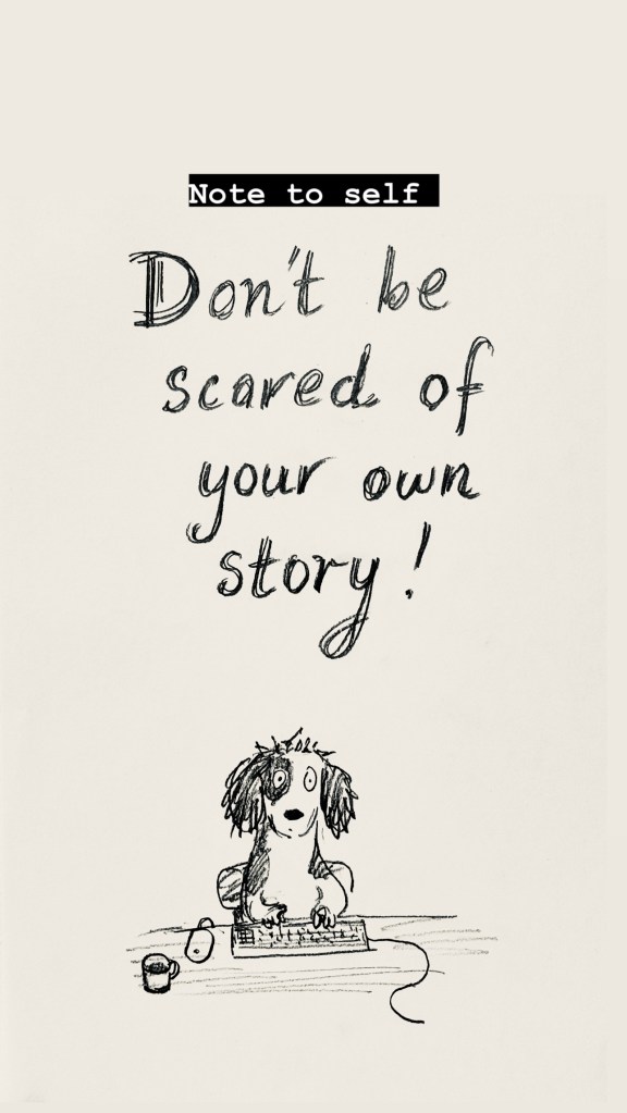
One of my other projects is a picture book with a climate theme, but I’m a bit scared of that one. Last time I worked on it the most devastating ear worm attacked me with a doggerel rhythm, and I couldn’t shake it off. I’m scared the worm will attack again, so I’m postponing that project until I’ve gained some writing muscle over the next week or so. I’ve been doing all sorts of keyboard push-ups in preparation. If that worm attacks I will be prepared.
I also made this note for myself and stuck it on the wall. It hasn’t completely worked yet.
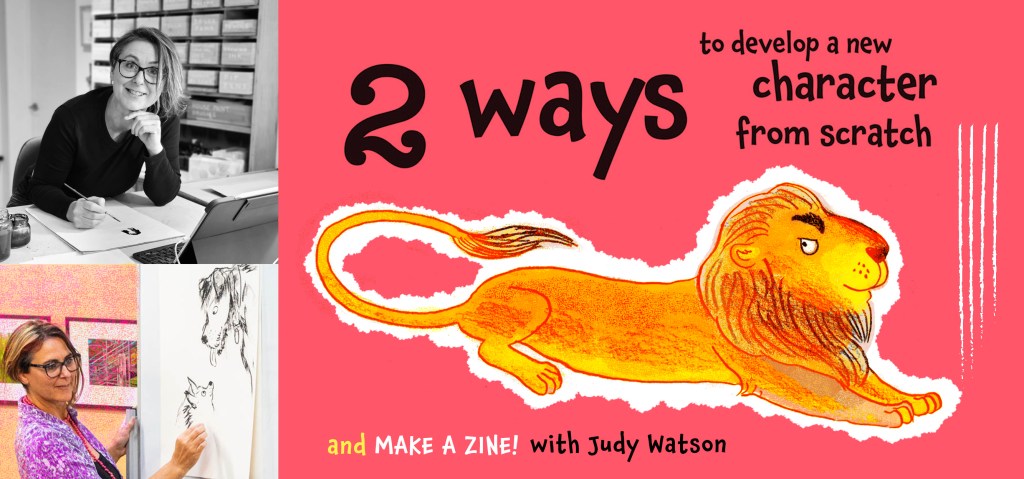
I’ll be doing a bit of teaching while I’m in Adelaide. This workshop is at the State Library.
If you’re local to Adelaide, you can click the image to read more about it or make a booking. Below is the delightful Norwood Library. I scooted out to join it the day after I arrived. I can’t survive without a library membership.

So that’s the first thing. The second is that my son Hugo is creating a website for me – a task I have been meaning to get to for years. So this blog will jump across to the website when it’s ready.
I suspect that readers who have subscribed with their email address will be transported across the techno-wilderness and stay on the mailing list. Those WordPress users who follow using the WordPress follow function will probably drop off. So if you still want to hear from me and you haven’t subscribed with an email address, you can do that now, or do it later on at my new website.
I’m planning on having two options. My blog will be about things I have been working on. My newsletter will be occasional notifications of upcoming book releases or exhibitions, for those who are interested in purchasing or attending.
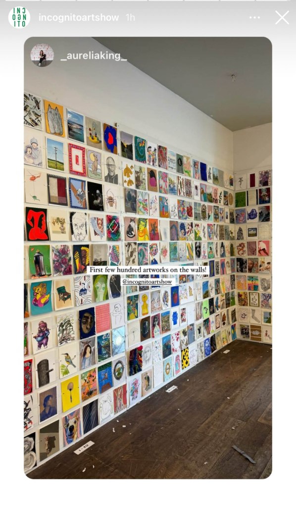
Which brings me to the third thing. For those of you who are in the vicinity of Sydney, the Incognito Art Show is coming up very soon! I am quite envious of those who can visit this show in person. It looks like quite an occasion, judging from photos of previous years. And having gone through the artwork on-line (which takes a while!) I can attest that there are STACKS of fantastic postcard sized artworks up for grabs. They are all at the one price of $100. The screenshots below from the Incognito Instagram account give you an idea of what the walls will look like.

The fun part is that all works are incognito until after purchase. You can read all about it here. And you can register your name on the website to create a wishlist of your favourites here. The best thing of all is that all proceeds go to supporting artists living with a disability.
I’ve currently got over 150 saved in my wishlist, so that says a lot about my inability to make decisions, but also a lot about the gloriousness of the artwork. And I’m not telling ANYONE what my favourites are, because the people who attend in person get first dibs, and I’ll only be in with a chance when the online sale goes live after the in person sale days.
I have three artworks in the show. I can’t show you what they look like of course. But for those who like puzzles, I am including a greyed out version of my artworks with little windows cut into the grey. If you can work out which art is mine from this, you are nothing short of a genius. I’ve only been able to find one of mine on the website so far, and I know what they look like.


13/7/24 I’ve updated to add the actual artwork for this one which has just sold. Titled Family Group. Mixed media A5 size. So many bird people. Where do they all come from?

Believe it or not, I will post again tomorrow, because today I took a day off writing and made some art with limited materials, for the Kickabout! But also because I miss my blog, and I’m a bit disheartened by social media. Cheerio until tomorrow!
Here’s a bonus dog-bird doodle. My dog people and bird people finally met in the middle.

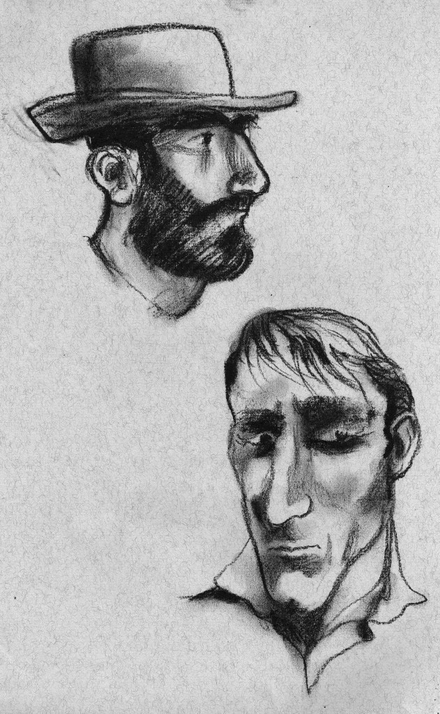
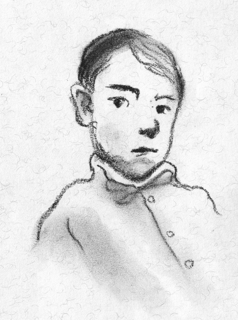
The prompt for the 57th Kick-About is the drawings of painter, illustrator, author, poet and war artist, Mervyn Peake.
Peake was the author and illustrator of the Gormenghast series which has taken on cult status since the publication of the first book Titus Groan in 1946. But for some it’s too dark, daunting. It’s usually classified as a fantasy, but it contains no magic other than the magic of Peake’s imagination.

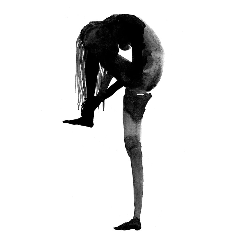
Peake was also a war artist. He was one of the first civilians to enter the German concentration camp at Belsen in 1945, an experience that had a profound effect upon him. His work was sometimes dark and grotesque. Other times his drawings expressed delicacy and softness, but they always emitted an intensity of personality and his use of light and shadow lifted even the prettiest of subjects far above anything that might be labeled saccharine. And then there are his drawings for his children. I have a copy of The Sunday Books, a collection of spontaneous creations he made on demand for his two small sons. In these, the images are flawed in the most lovely way. They are simply what flowed from his pen in the moment, with no polish, no corrections.

While thinking about Peake, I’ve been thinking about ’caricatures’. I’m not a fan of caricatures. Years ago, when a friend introduced me to someone who had no understanding of book illustration, the person said something along the lines of ’Oh you do caricatures! They are so clever!’ I confess I was horrified to be thought of as a caricaturist. (There’s something weird and fragile going on there, but we’ll leave that for now.) Some of Peake’s book illustrations are precariously close to caricatures if a caricature is something that depicts a person in a grotesque way by exaggerating their features. And yet the sophistication and delicacy of the rendering is undeniable.

And what is the purpose of illustration? It’s not to depict the banal reality of what we can see every day with our own eyes. It’s about expressing a feeling, a mood, an atmosphere. Or sparking a feeling or mood in the reader. And so it follows that a certain amount of well considered exaggeration goes with the territory.
There’s much to explore in response to Peake’s work, and I don’t think I can do it on one hit, so let us see where it takes me. But to begin with, it has taken me back to two mediums I loved in earlier years but have neglected more recently.
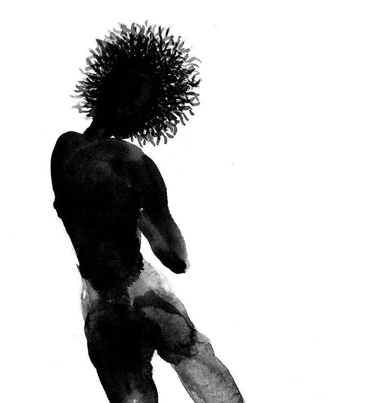
Pen and ink. Obviously this is all about the line. But it’s also about embracing a medium that can’t or won’t be fully controlled. I worked pretty small with these and just enjoyed making lots of small doodles. Perhaps some more finished work will come later.


And charcoal or soft pastel. This is less about the line and more about the tone, but really it’s a delicate balance of both. And there’s an element of mystery that comes from the smudgy indistinctness. It feeds the imagination. I haven’t found my mojo again with this quite yet, but I have been enjoying the start of the journey.

Lastly, I did a couple of tiny wash drawings with a touch of pencil detail.


Thanks again, Phil. It has been fun to provide the prompt this time around! x
Endpapers are a particular favourite of mine, both old and new. I love to create the ends for the books that I illustrate. They’re wonderfully freeing, because they’re not required to go alongside an author’s text, nor do they need to follow along in the exact same style or medium as the other illustrations. They need to feel as though they belong in the same family as the rest of the book, but they can fly off in all sorts of playful directions, and frequently do.
Sometimes it’s lovely to take a purely decorative approach, using whatever medium seems complementary to the book, without direct reference to the story at all. Decorative endpapers may just be stripes, spots or splashes and can look beautiful, as though the reader is opening a brightly wrapped present – which in a way they are!
Mostly, I am so involved with the text that I can’t resist linking the ends to what’s inside. Sometimes I like to refer to a repeating motif in the book such as seagulls, and a little black cat as we see in Thunderstorm Dancing. Or I refer to the setting of the story, such as the forest in Leonard Doesn’t Dance. Sometimes I like to tell a bonus story without words, so that when the book has been read and the story is over, there is somewhere to linger and to imagine our characters in their next adventure or in their everyday lives.
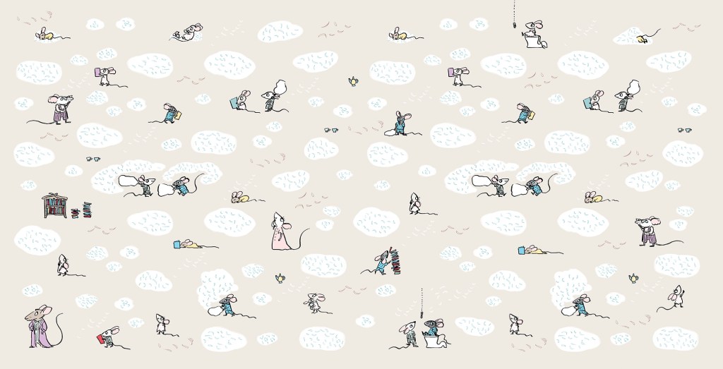
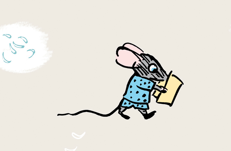
Goodnight, Mice! is a bedtime book, so the ends are muted in colour and evocative of a pyjama pattern. But I really wanted to play around a little further with these sweet mice, so I made tiny, simplified sketches of all of the family members. It was fun creating shorthand versions of each of the characters. The twins of course, are causing mayhem with a pillow fight, and there are stylised feathers floating everywhere (made by pressing down hard with my poor, mistreated dip-pen nib).


The endpapers for Thunderstorm Dancing were originally to have been printed in two colours, which is why I set them up in black and blue, (black and red for the rear ends) but Allen and Unwin decided to print in four colour process instead. In the internal illustrations, I had sneaked in a playful visual gag where the cat is greedily eyeing off all the fish. I thought it only fair that he got to eat his fish in the end. So below you see him washing up after his meal. (The seagulls are not amused.) In this case, I decided to do the reverse of what I had done for Goodnight, Mice! Instead of shrinking and simplifying the characters from the book, I enlarged them and made them more naturalistic in style.


The ends for Leonard Doesn’t Dance are mostly decorative, but they also set the scene for the story. I wanted them to be sumptuous, because I enjoyed making Leonard’s forest world so much. The front and back ends are continuations of the same setting, except that the moon is lower in the sky after the birds have been partying all night. The party lights can be seen in the distance.
These ends are mostly decorative too, but they hint that in this story we will be looking closely at the forest floor. They were a delight to make, involved a lot of glorious inky mess, and they have their very own classroom activity. You can find it here.
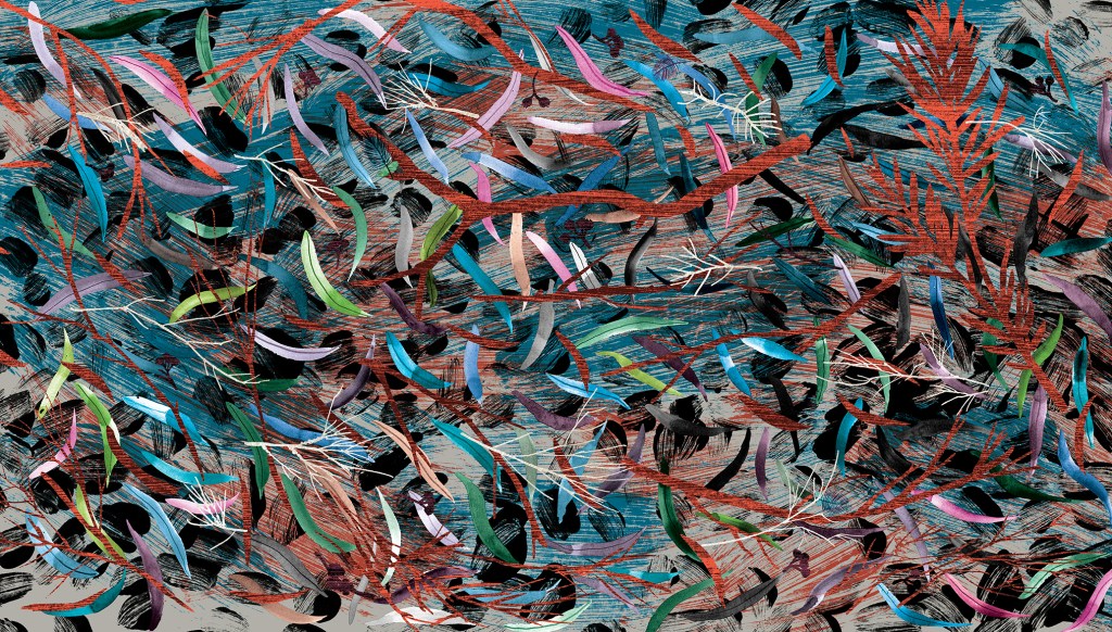
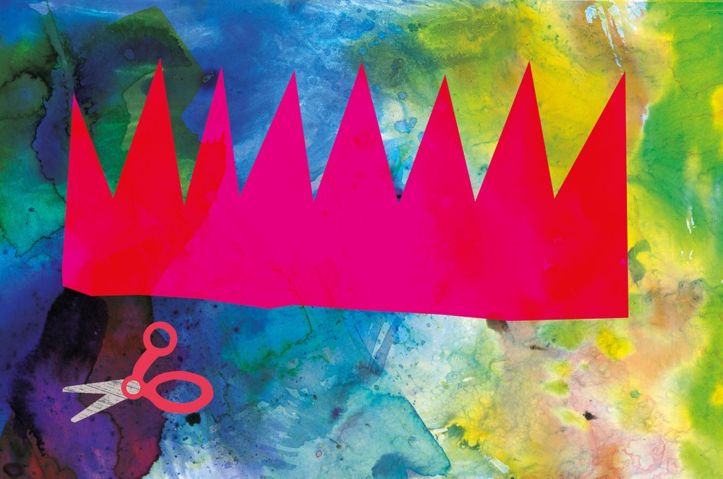
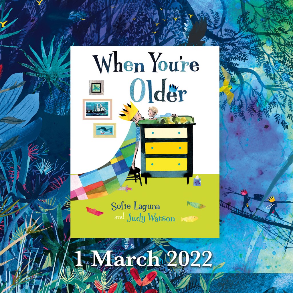
Now we get to my latest endpapers – the ends for When You’re Older.
When I was thinking about what kind of endpapers would be best for When You’re Older, one of my ideas included origami sea creatures, and one of them included a paper crown. They looked like this.

There were a few reasons why these ideas might have been fun and effective:
• Firstly, they are bright and cheerful and the scale of the images is large, which made a nice contrast with the fine detail of much of the book.
• Secondly, they are an easy way to communicate to someone choosing a book, that the story is suitable for a young child.
• Thirdly, they help set the opening scene in the homely world of the brother who is enjoying some paper craft. The crown concept shows us a close-up of what he is doing on the title and half title pages. The origami concept gives us an example of something he might do on a different day. And it leads the reader into the theme of sea creatures that repeats throughout the story.
In the end we decided that the treasure hunting scene (below) would be best, because it is truly dreamlike, and hints that we will be entering a world of the imagination. It reflects the illustration style of the adventure part of the book; full of detailed vegetation, creatures real and imagined and with our boys painted in silhouette. But it is subtly different, in that it is rainbow hued and uses blue instead of black for the details of the ship and characters. The blue has a hazy feel and helps to suggest the dream state. The feel of the endpapers is decorative, but it is really a ‘bonus story’.

I had a second idea for a bonus story and I hoped to have different ends front and back, telling two dream adventure tales. But it would have taken too long to complete. I hope to make the second illustration as a standalone, and if I do it will be available as a print. (It involves a giant squid, deep sea diving and more treasure!)
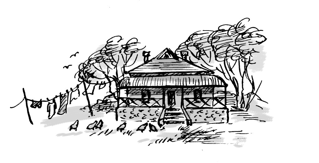
Some people can draw any building or interior with a sensitivity that invests it with warmth and personality. I truly admire them. For me, all those straight lines are problematic. I don’t feel any love for drawing architectural shapes, even though I love architecture itself. I prefer the outdoors and organic forms, including people and animals. The surface textures, the curved lines and the movement of figures or landscape are much easier for me to successfully express.
Most illustrated books require at least some built spaces to be drawn, and I’ve dealt with this in different ways for different book projects. Here are a few of them.
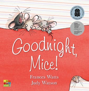
In Goodnight, Mice! By Frances Watts, I made the house organic, the walls, doorways and furniture curved. I took my inspiration from straw bale homes, wattle and daub homes, and hand-crafted furniture. Using a dip pen and ink, there was little opportunity to be overly fussy. Drawing with a dip pen sometimes feels like trying to control a half wild pony that’s running away with me.


With Thunderstorm Dancing by Katrina Germein, I was happy with the small drawing I did for the back cover (below). Perhaps it worked for me because of the loose lines of the dip pen but especially because of the small size. There’s no room to fuss with a 30mm wide building. Snuggling the building into the hill and embedding it in a stormy sky helps to give it a certain ‘rightness’. It takes on the personality of its surroundings.

The veranda was perhaps not as successful as I would have liked, being rather stiff, but I made the focus the stormy lighting; the contrast between dark clouds and the golden late afternoon glow of the beach and figures. I added texture to soften it a little. Eep!


My garden shed from Searching for Cicadas by Lesley Gibbes, was created in a similar way. Mostly pencil and wash, but with added texture and digital colour. (Note the soft red and greenish teal colour scheme!) My architecture leaves room for improvement, but hopefully the warmth of the characters on the page, the light, foliage and pets set the right tone. And on the next page, we happily marched off into the bushland away from human structures! Phew!


I also have an unpublished project, where the my buildings again reject straight lines. Based on the trulli of the Puglia region in Italy, they have lovely domed roofs and soft curving interiors. I even stayed in a glorious trullo here, and did some research for my illustrations.


But it was exciting to take a different approach to the house in When You’re Older by Sofie Laguna. Here I used the straight lines of the room and other man-made objects to my advantage. I accentuated them, taking inspiration from the marvellous Ezra Jack Keats and pared them back to simple blocks of colour that mimic paper collage. Now they acted as a foil to the scenes beginning on the next page, where the story moves into the imagination and benefits from a strong contrast in style.

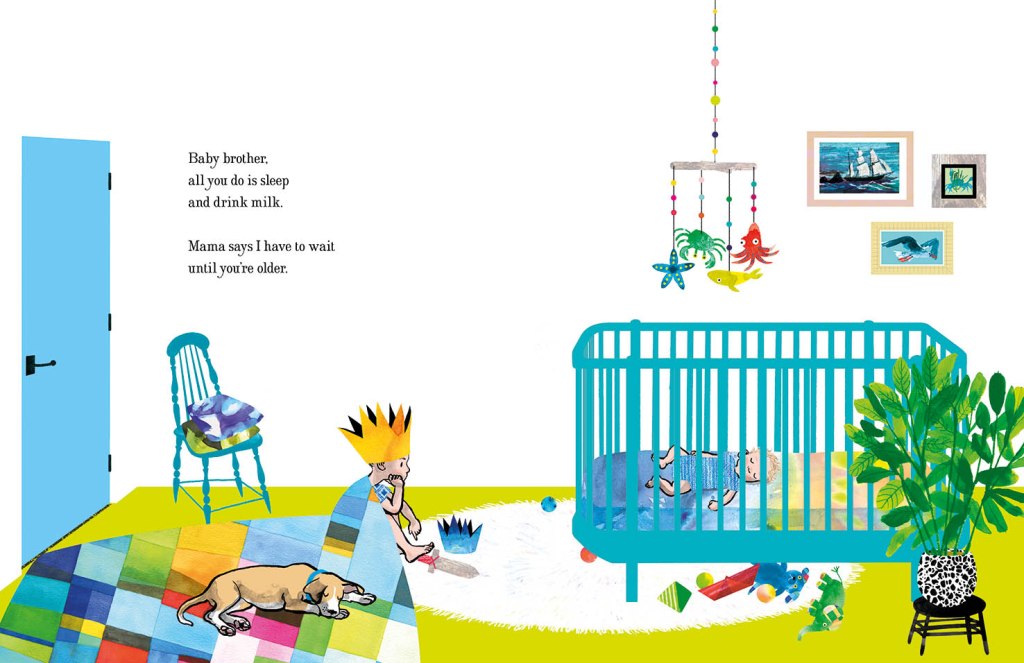
In the bedroom at the start of the narrative, we have animals and ships on wild seas contained in frames that have been reduced to a series of rectangles with no attempt to suggest a hook or a natural hanging angle. The boy too is sitting, waiting in a rectangular room like the paintings in their frames. But the small animals dotted around the room, the houseplant and the two kinds of boat (origami and painted) have fed his prodigious imagination which breaks loose as we turn the page.
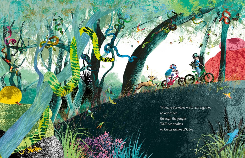
Here everything has broken out of its containment and we see the beginning of an undulating landscape, teeming with life and with an exaggerated forward slant like a slingshot that has just been released to propel our characters forward into the world.
I’ve used the solid graphic shapes here and there through the book, most often for man-made things like bikes, ladders, tents, and the fanciful double-ringed shape that suggests a view through binoculars. So the contrast between rampant texture and solid graphic shapes continues. But on the pages dedicated to the immense power of nature, it is not really in evidence at all, and expressive brushstrokes set the entire scene until we return at last to our original bedroom.

Upcoming events to celebrate When You’re Older
Wednesday 23 March to Tuesday 19 April
Colour, Line and Collage: Mixed media works in and around books.
Exhibition of original works including the patchwork paintings featured in When You’re Older. Some prints of the illustrations will also be available to order.
At Streamline Publishing and Gallery
22 Commercial Place, Eltham 3095
Open Wednesday to Saturday 11am – 4pm, Every second Sunday 1pm – 4pm.
Enter from the Town Square.
Above Eltham Bookshop
Saturday 26 March – kids’ drawing / collage workshops and signed book sales.
Frankston Library
60 Playne Street, Frankston
Phone 03 9784 1020
Sunday 3 April WORKSHOP 2.30pm – 5.30pm
STORYBOARDING – taking a text and moulding its shape on the page.
A book illustration workshop for adults and young adults.
This three hour workshop will be hosted by
Eltham Bookshop and held at Streamline Publishing and Gallery
22 Commercial Place, Eltham 3095 (Above the bookshop)
To coincide with the launch of When You’re Older and the exhibition
Colour, Line and Collage: Mixed media works in and around books.
I will take participants through my process: How I responded to Sofie Laguna’s text and, together with the publishing team, brought her words together with my ideas to create finished art for the book. After a short break, participants will use a sample text to create a storyboard of their own.
Entry $80 includes a signed copy of the book, light refreshments and all materials.
Bookings can be made through Eltham Bookshop
Tel: (03) 9439 8700
Email: books@elthambookshop.com.au
The prompt for Kick-About #25 The Age of Aquarius and it made me think of the song from the stage musical Hair.
I did go briefly down a rabbit hole to look up the meaning of the expression in astrological terms. It’s complex but predictably vague and controversial. The Age of Aquarius may have begun in 2600 BCE, or may have begun in the 20th Century or may be yet to begin. Having grown out of what limited interest I had in astrology years ago, this was not a direction that inspired art. It did lead me to quite an interesting little reading session about hippies, beatniks and the New Age movement of the 1960s and 1970s, but the complexity of this material reminded me of why I was never very good at history in school and why I admire people who are good at history!
But visually, the culture of the ’60s and ’70s is interesting. In fact I already had a digital collage with a psychedelic flavour that I made in November last year after watching the progress of the US elections with horror and dread. I had a powerful craving for the dawn of a new era, and for women to play an important role in it.
In Australia, that thirst for a change of culture, and a redistribution of power is even stronger now. If you’re interested, journalist Leigh Sales talks about it here or there’s a briefer version on her Instagram page here.
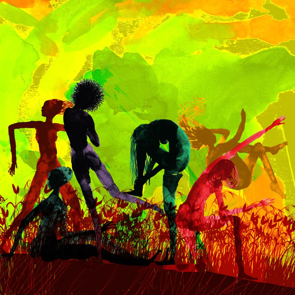
But what the heck. I had to make something new just for this prompt. So I decided that peace, love and harmony were the go, but sticking with the a secondary theme of female solidarity and friendship.
When the moon is in the Seventh House
And Jupiter aligns with Mars
Then peace will guide the planets
And love will steer the stars
This is the dawning of the age of Aquarius
Age of Aquarius
Aquarius
Aquarius
Harmony and understanding
Sympathy and trust abounding
No more falsehoods or derisions
Golden living dreams of visions
Mystic crystal revelation
And the mind’s true liberation
Aquarius
Aquarius
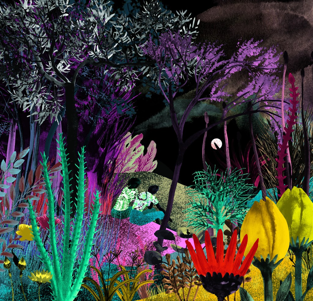
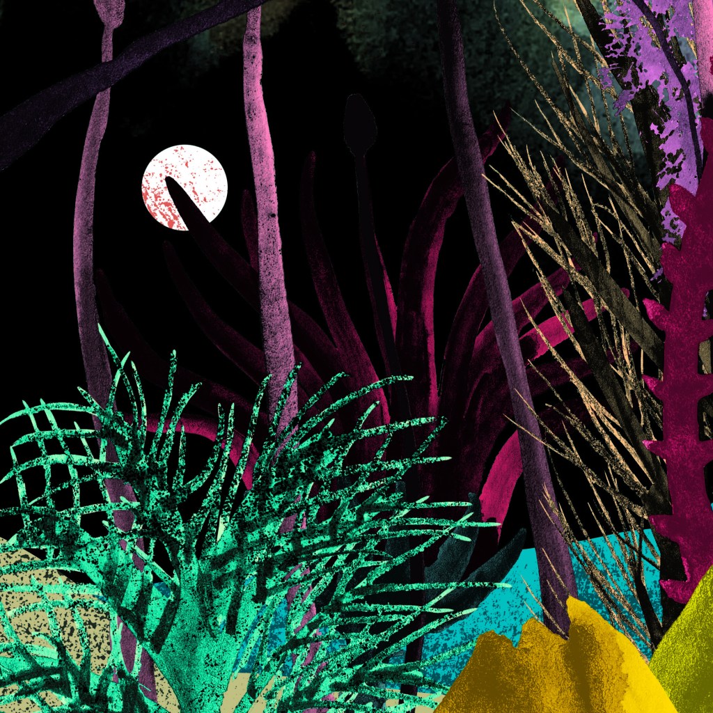
And here’s the dawning of the Age of Aquarius being celebrated in a small way between two friends. The moon is definitely in the Seventh House. Need you even ask? It is quite peaceful, but it seems to be darker than the November artwork.

A celebration of female friendship.

Naturally, I did my paper doll technique again. Draw them, then dress them. It never gets dull. I should have given the second woman another arm. But she manages ok without it. (You go, Sister!)
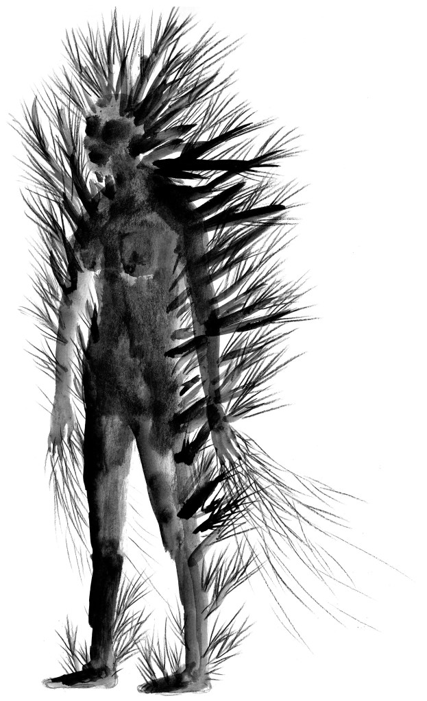
And you can hardly even see the giant pollarded woman in the forest behind them. She represents my anxiety and is taller than the tallest tree. But see how well she hides? She’s kind of cool though. She reminds me of all those centuries old mythical giants in story forests. Sometimes they’re sleeping, and they awake when they’re needed. A bit like anxiety, they have their uses. You just don’t want them hanging around at every party.
Thanks Phil. I’m looking forward to seeing what people choose for the anniversary edition.
The prompt for Kick-About #24 is a something Isadora Duncan said.

I’ve missed these kick-abouts over the last few months. So this image is pretty much how I feel about joining in again!
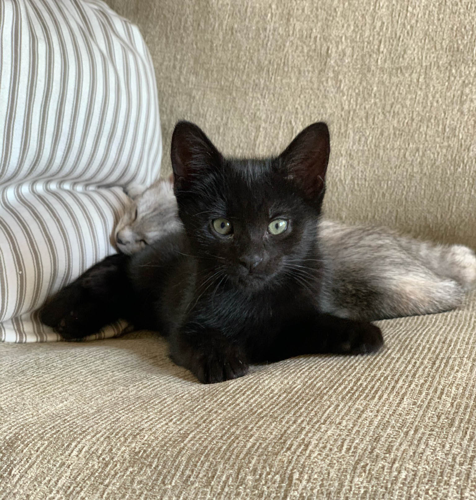
This woman, if not the actual quote, seems so infinitely suited to the kinds of figures I have been painting in ink over the last year or so. You’d think that’s the direction I’d go. But no. I’ve taken a more mundane direction. Because I’ve been fostering cats for the local RSPCA.
Cats in Australia are a problem. They’re often mistreated, rarely desexed, often dumped, and the feral population is gigantic, doing enormous damage to our wildlife. Click here to find out more. My lovely foster cat arrived painfully thin, with four bouncing babies. All five of them have now been successfully adopted. Hooray! Go well, little ones.

I was drawing them to get my cat drawing skills up. They weren’t very good at holding their modelling poses while they were awake… Ahem! They have that in common with small children. But it was certainly a delight to have them around for a few weeks.


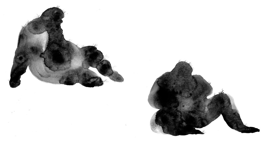
Technically these guys once were wild, having been picked up as strays. But at the same time, they were affectionate and tame. So they are not really my response to this prompt. My response was I think a little influenced by a far superior cat painting, by William Kentridge that is on the wall of my studio in postcard form. But really it was just a fun play about with ink. Fairly large scale on cartridge. Here he is below, significantly reduced in size.

I swished up a few garden plants for him to prowl in. Then combined the two in Photoshop.

I altered his head and paws a bit to bring him into a more domestic cat proportion, and away from the original, more expressionist type. He represents the suburban animal who is both wild and tame at the same time. Every time he goes outside, he becomes his own ancestor – a wild animal. Our suburban gardens are his hunting ground. It is a fascinating thing, albeit devastating to our wildlife.
Thanks again, Phil. As always, I enjoyed this little detour. And as always, it sparked off a series of new ideas. I woke up at 2 o’clock this morning and couldn’t get back to sleep. I soothed myself with thinking about painting this cat prowling in a forest and somewhere between 2.30 and dawn, a wordless picture book has been born, fully-formed in my mind. (Well, not quite fully formed.)


The prompt for Kick-About #16 is from a Robert Frost poem. You can read the entire the poem here. It’s a lovely one.
I’m pretty pushed for time at the moment, so I have been missing Kick-About challenges lately. And I’m late for this one. But I couldn’t resist doing a pretty literal interpretation of this one very hastily this morning!

I added some trolls playing chess on the lake. And who knows? Maybe Robert Frost was imagining the same thing. However, I’ve taken them out again for now. It needs more work balancing the composition than I have time for today. Another little job for January, perhaps. :-)


Thanks again, Phil! A lovely interlude in a busy time.