
Subscribe to continue reading
Subscribe to get access to the rest of this post and other subscriber-only content.

Subscribe to get access to the rest of this post and other subscriber-only content.
Endpapers are a particular favourite of mine, both old and new. I love to create the ends for the books that I illustrate. They’re wonderfully freeing, because they’re not required to go alongside an author’s text, nor do they need to follow along in the exact same style or medium as the other illustrations. They need to feel as though they belong in the same family as the rest of the book, but they can fly off in all sorts of playful directions, and frequently do.
Sometimes it’s lovely to take a purely decorative approach, using whatever medium seems complementary to the book, without direct reference to the story at all. Decorative endpapers may just be stripes, spots or splashes and can look beautiful, as though the reader is opening a brightly wrapped present – which in a way they are!
Mostly, I am so involved with the text that I can’t resist linking the ends to what’s inside. Sometimes I like to refer to a repeating motif in the book such as seagulls, and a little black cat as we see in Thunderstorm Dancing. Or I refer to the setting of the story, such as the forest in Leonard Doesn’t Dance. Sometimes I like to tell a bonus story without words, so that when the book has been read and the story is over, there is somewhere to linger and to imagine our characters in their next adventure or in their everyday lives.
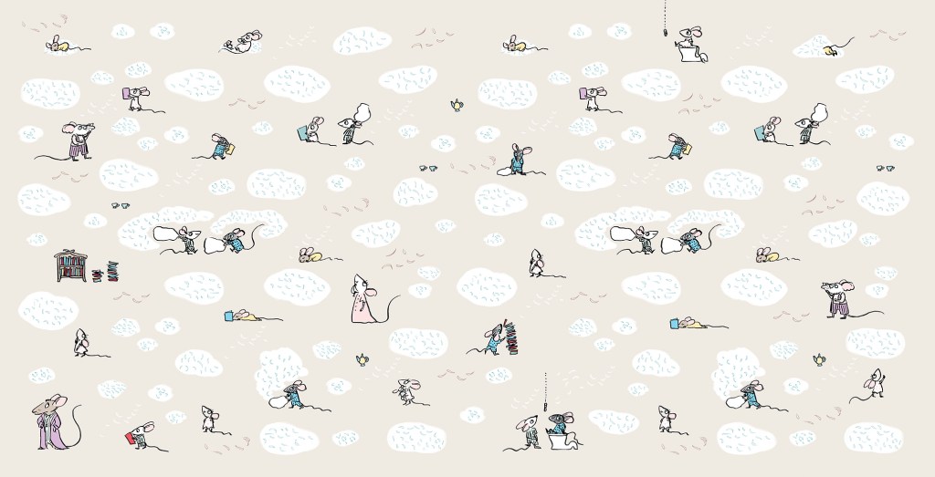
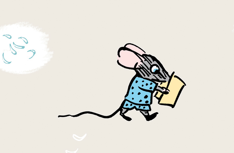
Goodnight, Mice! is a bedtime book, so the ends are muted in colour and evocative of a pyjama pattern. But I really wanted to play around a little further with these sweet mice, so I made tiny, simplified sketches of all of the family members. It was fun creating shorthand versions of each of the characters. The twins of course, are causing mayhem with a pillow fight, and there are stylised feathers floating everywhere (made by pressing down hard with my poor, mistreated dip-pen nib).


The endpapers for Thunderstorm Dancing were originally to have been printed in two colours, which is why I set them up in black and blue, (black and red for the rear ends) but Allen and Unwin decided to print in four colour process instead. In the internal illustrations, I had sneaked in a playful visual gag where the cat is greedily eyeing off all the fish. I thought it only fair that he got to eat his fish in the end. So below you see him washing up after his meal. (The seagulls are not amused.) In this case, I decided to do the reverse of what I had done for Goodnight, Mice! Instead of shrinking and simplifying the characters from the book, I enlarged them and made them more naturalistic in style.


The ends for Leonard Doesn’t Dance are mostly decorative, but they also set the scene for the story. I wanted them to be sumptuous, because I enjoyed making Leonard’s forest world so much. The front and back ends are continuations of the same setting, except that the moon is lower in the sky after the birds have been partying all night. The party lights can be seen in the distance.
These ends are mostly decorative too, but they hint that in this story we will be looking closely at the forest floor. They were a delight to make, involved a lot of glorious inky mess, and they have their very own classroom activity. You can find it here.
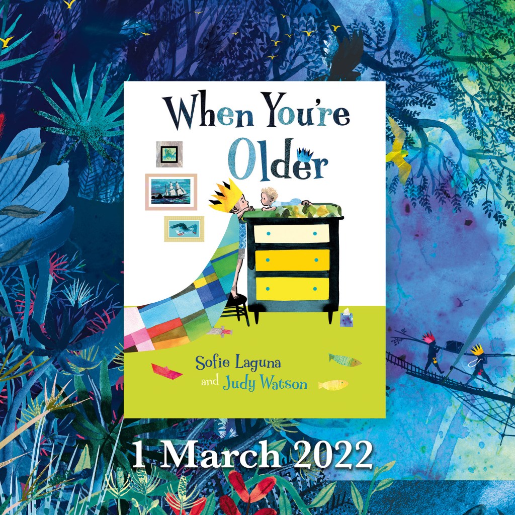
Now we get to my latest endpapers – the ends for When You’re Older.
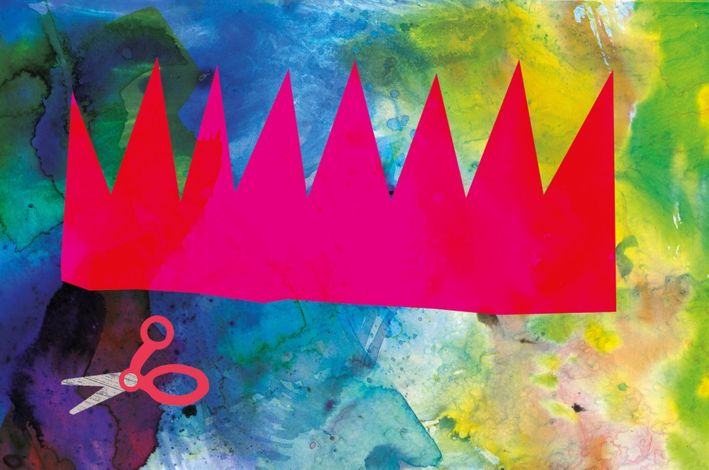
When I was thinking about what kind of endpapers would be best for When You’re Older, one of my ideas included origami sea creatures, and one of them included a paper crown. They looked like this.

There were a few reasons why these ideas might have been fun and effective:
• Firstly, they are bright and cheerful and the scale of the images is large, which made a nice contrast with the fine detail of much of the book.
• Secondly, they are an easy way to communicate to someone choosing a book, that the story is suitable for a young child.
• Thirdly, they help set the opening scene in the homely world of the brother who is enjoying some paper craft. The crown concept shows us a close-up of what he is doing on the title and half title pages. The origami concept gives us an example of something he might do on a different day. And it leads the reader into the theme of sea creatures that repeats throughout the story.
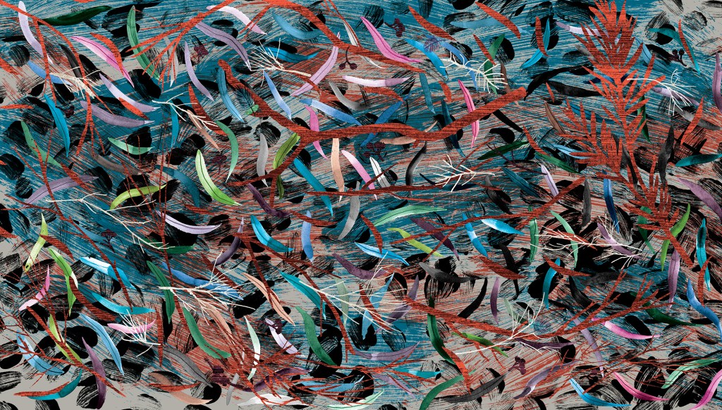
In the end we decided that the treasure hunting scene (below) would be best, because it is truly dreamlike, and hints that we will be entering a world of the imagination. It reflects the illustration style of the adventure part of the book; full of detailed vegetation, creatures real and imagined and with our boys painted in silhouette. But it is subtly different, in that it is rainbow hued and uses blue instead of black for the details of the ship and characters. The blue has a hazy feel and helps to suggest the dream state. The feel of the endpapers is decorative, but it is really a ‘bonus story’.

I had a second idea for a bonus story and I hoped to have different ends front and back, telling two dream adventure tales. But it would have taken too long to complete. I hope to make the second illustration as a standalone, and if I do it will be available as a print. (It involves a giant squid, deep sea diving and more treasure!)
Some people can draw any building or interior with a sensitivity that invests it with warmth and personality. I truly admire them. For me, all those straight lines are problematic. I don’t feel any love for drawing architectural shapes, even though I love architecture itself. I prefer the outdoors and organic forms, including people and animals. The surface textures, the curved lines and the movement of figures or landscape are much easier for me to successfully express.
Most illustrated books require at least some built spaces to be drawn, and I’ve dealt with this in different ways for different book projects. Here are a few of them.
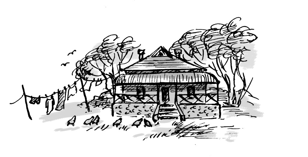
In Goodnight, Mice! By Frances Watts, I made the house organic, the walls, doorways and furniture curved. I took my inspiration from straw bale homes, wattle and daub homes, and hand-crafted furniture. Using a dip pen and ink, there was little opportunity to be overly fussy. Drawing with a dip pen sometimes feels like trying to control a half wild pony that’s running away with me.


With Thunderstorm Dancing by Katrina Germein, I was happy with the small drawing I did for the back cover (below). Perhaps it worked for me because of the loose lines of the dip pen but especially because of the small size. There’s no room to fuss with a 30mm wide building. Snuggling the building into the hill and embedding it in a stormy sky helps to give it a certain ‘rightness’. It takes on the personality of its surroundings.

The veranda was perhaps not as successful as I would have liked, being rather stiff, but I made the focus the stormy lighting; the contrast between dark clouds and the golden late afternoon glow of the beach and figures. I added texture to soften it a little. Eep!


My garden shed from Searching for Cicadas by Lesley Gibbes, was created in a similar way. Mostly pencil and wash, but with added texture and digital colour. (Note the soft red and greenish teal colour scheme!) My architecture leaves room for improvement, but hopefully the warmth of the characters on the page, the light, foliage and pets set the right tone. And on the next page, we happily marched off into the bushland away from human structures! Phew!


I also have an unpublished project, where the my buildings again reject straight lines. Based on the trulli of the Puglia region in Italy, they have lovely domed roofs and soft curving interiors. I even stayed in a glorious trullo here, and did some research for my illustrations.


But it was exciting to take a different approach to the house in When You’re Older by Sofie Laguna. Here I used the straight lines of the room and other man-made objects to my advantage. I accentuated them, taking inspiration from the marvellous Ezra Jack Keats and pared them back to simple blocks of colour that mimic paper collage. Now they acted as a foil to the scenes beginning on the next page, where the story moves into the imagination and benefits from a strong contrast in style.

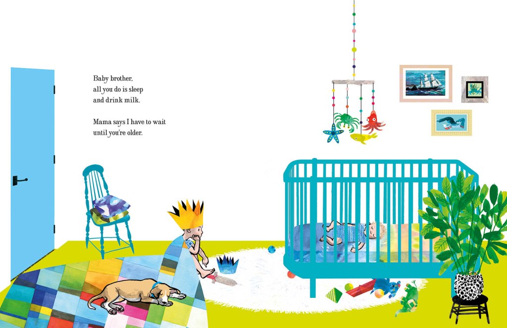
In the bedroom at the start of the narrative, we have animals and ships on wild seas contained in frames that have been reduced to a series of rectangles with no attempt to suggest a hook or a natural hanging angle. The boy too is sitting, waiting in a rectangular room like the paintings in their frames. But the small animals dotted around the room, the houseplant and the two kinds of boat (origami and painted) have fed his prodigious imagination which breaks loose as we turn the page.
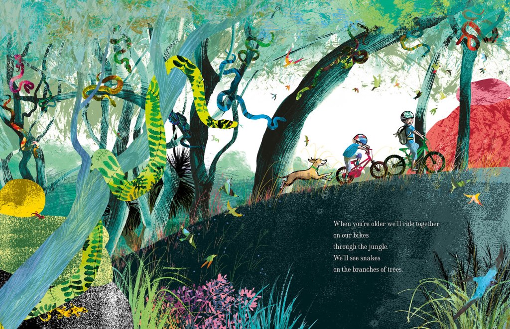
Here everything has broken out of its containment and we see the beginning of an undulating landscape, teeming with life and with an exaggerated forward slant like a slingshot that has just been released to propel our characters forward into the world.
I’ve used the solid graphic shapes here and there through the book, most often for man-made things like bikes, ladders, tents, and the fanciful double-ringed shape that suggests a view through binoculars. So the contrast between rampant texture and solid graphic shapes continues. But on the pages dedicated to the immense power of nature, it is not really in evidence at all, and expressive brushstrokes set the entire scene until we return at last to our original bedroom.

Upcoming events to celebrate When You’re Older
Wednesday 23 March to Tuesday 19 April
Colour, Line and Collage: Mixed media works in and around books.
Exhibition of original works including the patchwork paintings featured in When You’re Older. Some prints of the illustrations will also be available to order.
At Streamline Publishing and Gallery
22 Commercial Place, Eltham 3095
Open Wednesday to Saturday 11am – 4pm, Every second Sunday 1pm – 4pm.
Enter from the Town Square.
Above Eltham Bookshop
Saturday 26 March – kids’ drawing / collage workshops and signed book sales.
Frankston Library
60 Playne Street, Frankston
Phone 03 9784 1020
Sunday 3 April WORKSHOP 2.30pm – 5.30pm
STORYBOARDING – taking a text and moulding its shape on the page.
A book illustration workshop for adults and young adults.
This three hour workshop will be hosted by
Eltham Bookshop and held at Streamline Publishing and Gallery
22 Commercial Place, Eltham 3095 (Above the bookshop)
To coincide with the launch of When You’re Older and the exhibition
Colour, Line and Collage: Mixed media works in and around books.
I will take participants through my process: How I responded to Sofie Laguna’s text and, together with the publishing team, brought her words together with my ideas to create finished art for the book. After a short break, participants will use a sample text to create a storyboard of their own.
Entry $80 includes a signed copy of the book, light refreshments and all materials.
Bookings can be made through Eltham Bookshop
Tel: (03) 9439 8700
Email: books@elthambookshop.com.au

I’m very fond of that great galumphing bird. I relate to him very much. The initial enthusiasm, the self doubt, the impulse to hide away in a thorny tree, the desire to be with my friends that usually draws me out of the tree. And like Leonard, I have some fabulous friends.
My thanks to the team at Harper Collins and to Frances Watts, for patiently waiting for Leonard as he put one lanky leg in front of another (tripping over several times) and eventually became finished art; now a book.

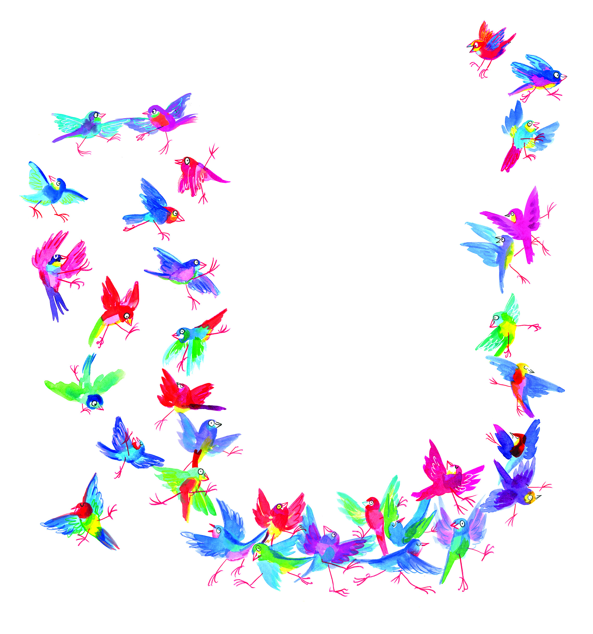
I had been initially drawn to a white cover, because black ink on white paper was a signature part of making the artwork. There was a lot of ink involved. Brushed on, drawn on, printed, wiped and smudged onto white paper. Big broad strokes, and fine textured marks. So my original idea was to have an inky black and white cover, with a pop of red on Leonard’s face, and a scattering of brilliantly coloured birds flung around it like a double handful of lollies, and wrapping around both covers.
The team at Harper Collins didn’t think the white design was indicative of what was inside: a rampant world of jungly colour. This was perfectly true, and is why editors are so great! and Hannah did a fabulous job of designing something rich and celebratory.
I visited the Grade Sixes at Derinya Primary School a few weeks back and we had a great time talking about Leonard Doesn’t Dance, story arcs, tension and making storyboards for picture books. There is just so much to talk about! A two hour session went by in a flash. I will be signing up with Creativenet Speakers’ Agency very shortly, so if any schools or groups of lovely librarians within Cooee of Melbourne would like to book a workshop and talk with me, that will be the place to go.


I have another book released this month as well! A very leafy book about cicadas. More on that soon. Enjoy your week!
I’m not sure why my book projects seem to happen at the swimming pool. Pippa who modelled for Thunderstorm Dancing was at the pool, and many of the sketches I did at the pool while the boys were having swimming lessons fed into the book.
Here are some from that time, that have been posted before.


Today I took the boys to the pool because it was pelting rain and they were stuck indoors. And there I happily began doodling for Leonard Doesn’t Dance, my new picture book project for HarperCollins, written by Frances Watts.
In truth, I set out to re-read the manuscript and ponder layouts, but I got as far as the first two lines and found I had to turn over the paper and doodle birds on the back. I think it was because Leonard was groaning. ‘Groaning’ is a very suggestive word. It conjures all sorts of pained expressions, and it wouldn’t wait.

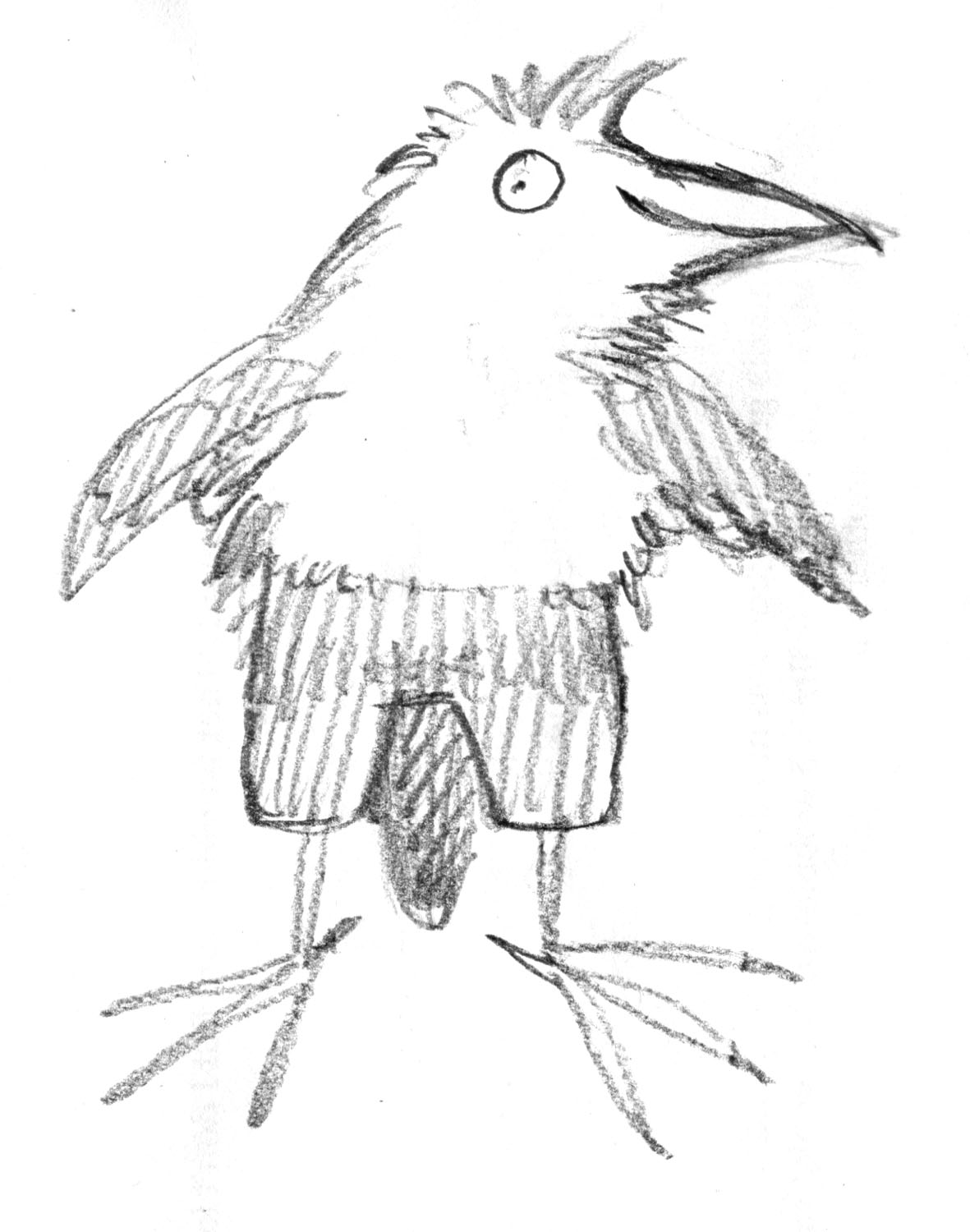
The first bird at the top is about to groan. Or has just groaned. He may have been groaning for some time. But after this, the others became more cheerful. I’m not worrying about style at the moment. Just going for Galumphing. That is my brief. It’s a brief brief.
It’s not hard to see the inspiration for these particular Galumphers.
Rose in the foreground… just in case the camera is edible.

Lily looking for something to trip over
Here are Rose and Lily, the Terrible Pteranodon Twins (Araucanas) and Lily in particular, is the most impossibly clumsy bird you could ever meet. If you were to put a champagne glass in the middle of a football field and let Lily go and graze in that field, the first thing she would do would be to trip over the glass and spill the champagne. Here she looks like she is marching, but she is really galumphing.
My Leonard bird will, I hope, not be any species of bird in the real world. There will be plenty of those in the book, but Leonard I think may dispense with such restrictions.
In the next drawings I started to exaggerate the trousers on the bird, a thing that I’ve done before with my blob birds. It occurs to me now that if we choose to make Leonard a young bird person, his trousers might be shorts. These three fellows seem to be older bird persons.

Here is a younger bird person wearing short trousers. And that is not a codpiece. (The bird tails might be tricky in some instances…)
And this drawing raises the question of whether Leonard ought to be more of a Bird Person, or a Person Bird. He will have to fly at one point, but he prefers cupcakes to cockroaches. He’s a multi-layered Bird Person. I’m sure there will be many more bird doodles in the coming weeks.
By the way, my advance copy of Thunderstorm Dancing arrived on my doorstep while we were at the pool. How appropriate, given that the rain had been bucketing down all day. We have all been looking through it with pleasure this evening. It is a very advance copy though. The book won’t be in the shops until April, I believe.

A Thundery book in the cloudy evening light.
