(a Cornish Rex of course)
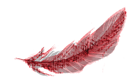
Work in progress (a fragment) for page 8/9 spread of Thunderstorm Dancing.

(a Cornish Rex of course)
Work in progress (a fragment) for page 8/9 spread of Thunderstorm Dancing.
Here’s a fragment of a spread with brindly-blue whippet. (I am so into whippets at the moment. Shame my chickens wouldn’t be.)

Answer… no.
Ha ha. Oh, well. We’re getting closer…
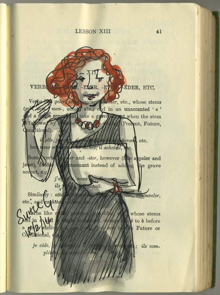
Sue Grisdale talking up the front. From this sketch you will see that the teachers put more effort into their attire than the rest of us. They had been looking after our children all day. We somehow managed to look more hot and exhausted than they…
These sketches might not be very interesting. Most of them are people’s backs. Sorry about that:-) But here they are anyway. True to my own school days, I was up the very back row drawing people… After years of practice, I may not have perfected my drawings, but I have become pretty good at drawing and listening at the same time.


This woman did not remotely look like she was wearing a night dress in real life. But in my drawing, she does. My apologies to her.

This woman was not thin. She was simply of a strikingly narrow frame. If she were a dog, she might be a Saluki. A well behaved one.
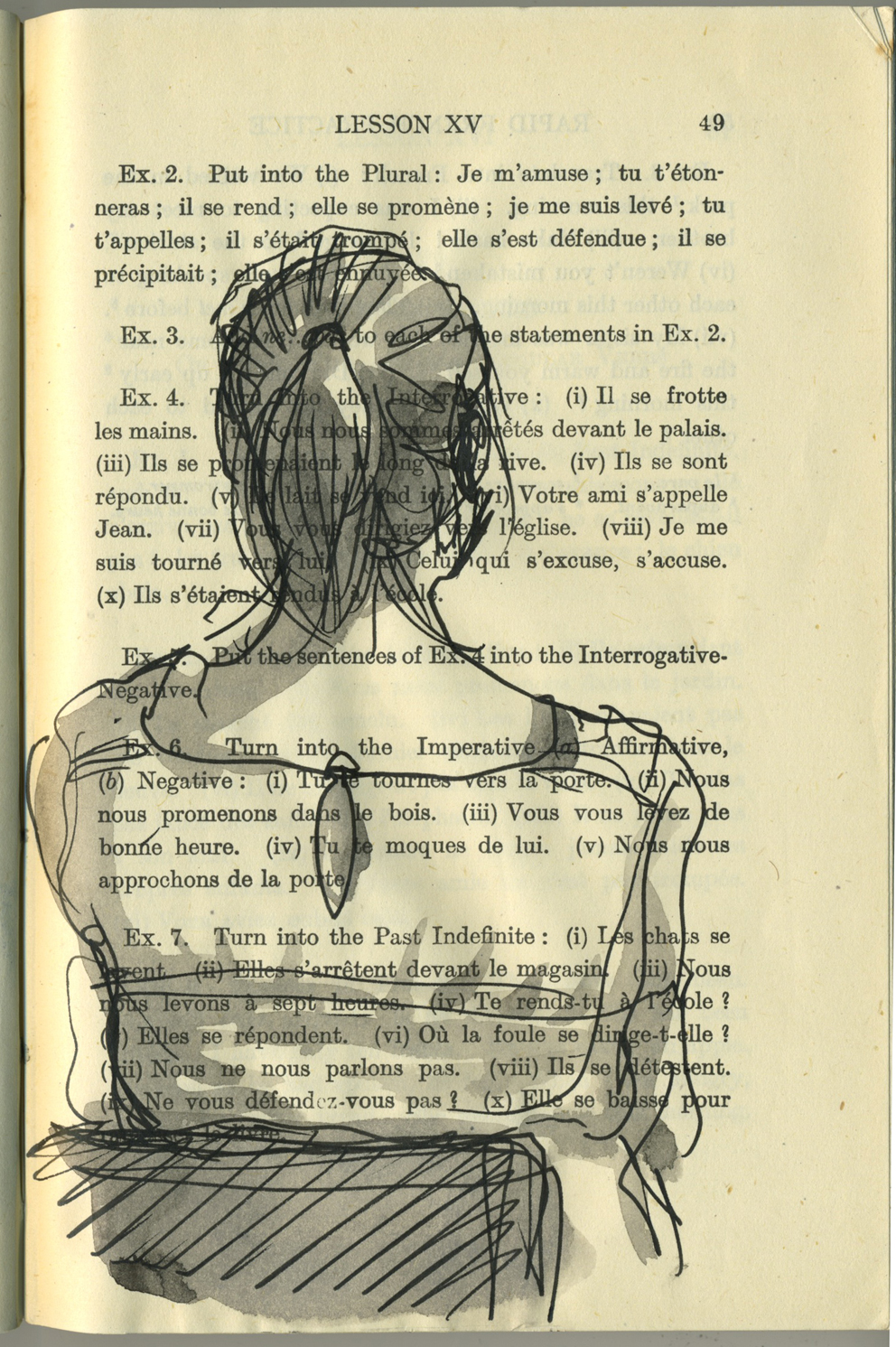
Ponytails and buns were the in thing tonight. I think it’s due to the heat and keeping hair off the neck. If I were able to arrange the back of my own head, I might have worn one too. Unfortunately I find that a bit too tricky.
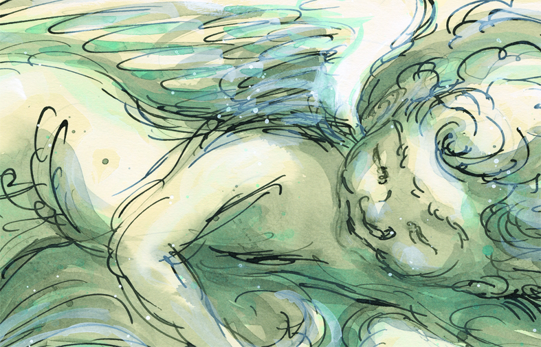
Here’s a section of the putto for one of the Thunderstorm Dancing spreads. He will have digital layers added and be incorporated into a spread design, but this is how he looks before all that happens to him.

Young actress wearing a hat – This was my warm up sketch. Fast and loose.
Waiting for the kids while they are in their drama class on Wednesday afternoons, I am in the lap of luxury for an hour in a big leisure centre. There is a huge room with large tables, very few people and a nearby change room with fresh water for painting. This week I took my altered book sketching back-pack (have ink, can travel) and did some sketches there.
When I want to launch into something without thinking too much or wasting limited time finding a subject, I sometimes like to look at vintage cabinet cards, featuring studio portrait photographs from the 19th and 20th centuries. The faces are intriguing, the costumes often more interesting than today’s garb and usually the poses are wonderfully contrived. They are in black and white so the tonal values and detail are usually good for my purposes.
Italian ballet dancer with smiling eyes. This one was done after I got home and she has a touch of collage. I cut the face first, loosely without drawing an outline, to avoid getting caught up in detail..
This woman looked like she was having a ball being photographed. She had a confident pose, uplifted chin and laughing italian eyes with Audrey Hepburn style eye make-up and brows.
There was something rather sad about this woman’s eyes that touched me. My sketch looks very little like the original woman, but it has retained the inward gaze. Although it’s not a particularly good picture, I find that I like her in a personal way, so she’s going up.
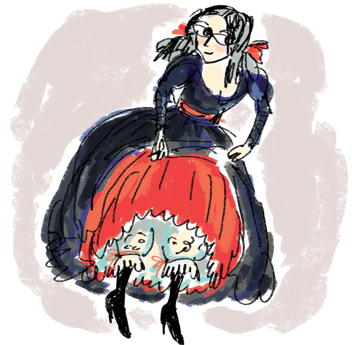
Just now as I was jotting down notes for the colour scheme of Thunderstorm Dancing, I had a vision of the book being a costume.
The book covers are the dress – deep purples, greys, blues with a flash of red.
The endpapers may be startling like a red petticoat suddenly revealed
The internal pages are creamy lace and muslin with some blue embroidery, black stockings and a red ribbon here and there.
Drawing the little wench seemed the best way of jotting down my colour scheme. So here she is, a little 3 minute PhotoShop sketch (so forgive the hands and feet). If the book turns out very different, I might have to draw her a sister in a different outfit.
Theme for this week, ‘selfie’. I am looking a bit Holly Hobbyish here with a large, collage head of differential calculus hair. It would have looked better with darker hair, but I didn’t want to lose the lovely calculus curves under a heavy load of ink. So I’ve left it lightly tinted.
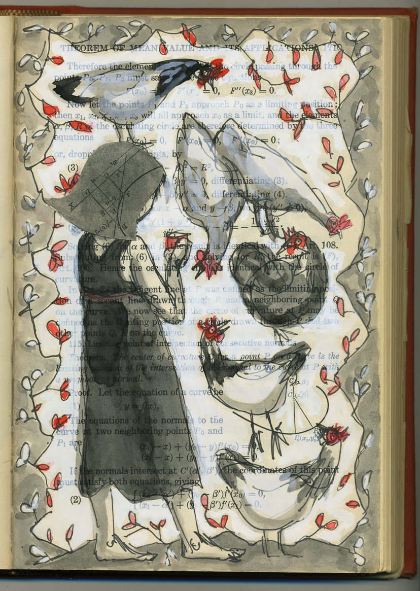
I liked the way the little numbers and mathematical figures here and there remind me of insects or seeds that the chickens are constantly seeking.
The smooth paper of a vintage book reacts completely differently from the way proper watercolour paper should react to paint. But there’s something rather nice about it. It sucks up the ink in a thirsty way, remaining very smooth and composed all the while.
Scott discovered the word ‘groke’ the other day. We all like it in this house and think it deserves constant and affectionate use. It reminds us of Tove Jansson‘s Groke and it means this: to ‘stare at someone in the hope that they’ll give you some food’. (The Groke in Jansson’s Moominpappa at Sea visits Moomintroll every night to beg him to show her his lantern flame, because she is a lonely creature craving warmth and light but unable to get either. So it’s a poignant form of groking after all.)
With six pampered chickens and a dog, we get plenty of groking around here. Speaking of which, better go and lock the girls up.
A little pick-me-up / warm-up session this morning for Tania McCartney’s 52 Week Illustration Challenge.
(funny how sometimes my post headings don’t show up… It could be just at my end. Who knows? Now that I have typed the heading into the body of the post, no doubt it will come up as a double heading. Oh well :-)A short while ago, I had to get a bit organised before going colour for Thunderstorm Dancing. Getting organised goes completely against my grain with any of my art. It’s a kind of superstitious thing. So much of my better work is on bits of scrappy paper, drawn in eyeliner or using a waitress’s pen, and so much of the work I like less (that’s for those of you who will kindly reprimand me for not liking some of my work ;-) is on expensive paper using the very best of materials… well it becomes a self-fulfilling prophecy. I only need to pick up a bit of expensive paper to get so uptight that I can’t draw to save my life. My lovely art teacher at school, Cecily Osborn, identified this problem about 30 years ago. (OMG!)
This is a little sidetrack really…. what I was going to say is that I drew (in a wonderfully organised way :-) a little menu of characters showing which watercolours I mixed to make the various characters’ skin and hair tones. I sketched a couple of options for each character to begin with and then got impulsive and drew only one of each. (From this you will know that I very logically started on the right and worked left. Ahem.)

Here it is, ink smudges and all.
Of course, in-spite-of / because-of the fact that these characters took two seconds each to draw and are imperfect, I immediately liked them more than some of the painstaking images I have drawn for the book.
This doesn’t surprise me one bit.
However, I know as well as anyone who has attempted it, how hard it is to draw a character in two seconds and get it right first go. In my case, practically impossible. Only one in about 12 drawings will look remotely right. Put eight characters together on the one illustration (dancing together) and you have a logistical challenge. Devon, you can do the maths maybe ;-)
So… interesting times. I am not, in reality illustrating the book with two-second-characters. But I am loosening the style up a bit as I go along. It has its challenges. And its rewards.
p.s. Bella may notice that I have two different skin options for Pippa. One much warmer than the other. Possibly the one on the left is a Soft Summer, the one on the right a Cool Summer. I can make his outrageous statement only because she has dot eyes, right Bella? The Pippa on the left has brown eyes, the one on the right blue eyes… in my imagination. I think I am going the warmer, Soft Summer. I may be going mad too, but that’s nothing new :-) Last time we went here, Bella was giving excellent colour advice on a family of mice...
Seems like a decade ago.