Category Archives: illustration

Kick-About #57 Mervyn Peake

The prompt for the 57th Kick-About is the drawings of painter, illustrator, author, poet and war artist, Mervyn Peake.

Peake was the author and illustrator of the Gormenghast series which has taken on cult status since the publication of the first book Titus Groan in 1946. But for some it’s too dark, daunting. It’s usually classified as a fantasy, but it contains no magic other than the magic of Peake’s imagination.

Peake was also a war artist. He was one of the first civilians to enter the German concentration camp at Belsen in 1945, an experience that had a profound effect upon him. His work was sometimes dark and grotesque. Other times his drawings expressed delicacy and softness, but they always emitted an intensity of personality and his use of light and shadow lifted even the prettiest of subjects far above anything that might be labeled saccharine. And then there are his drawings for his children. I have a copy of The Sunday Books, a collection of spontaneous creations he made on demand for his two small sons. In these, the images are flawed in the most lovely way. They are simply what flowed from his pen in the moment, with no polish, no corrections.

While thinking about Peake, I’ve been thinking about ’caricatures’. I’m not a fan of caricatures. Years ago, when a friend introduced me to someone who had no understanding of book illustration, the person said something along the lines of ’Oh you do caricatures! They are so clever!’ I confess I was horrified to be thought of as a caricaturist. (There’s something weird and fragile going on there, but we’ll leave that for now.) Some of Peake’s book illustrations are precariously close to caricatures if a caricature is something that depicts a person in a grotesque way by exaggerating their features. And yet the sophistication and delicacy of the rendering is undeniable.

illustration by Mervyn Peake

And what is the purpose of illustration? It’s not to depict the banal reality of what we can see every day with our own eyes. It’s about expressing a feeling, a mood, an atmosphere. Or sparking a feeling or mood in the reader. And so it follows that a certain amount of well considered exaggeration goes with the territory.

There’s much to explore in response to Peake’s work, and I don’t think I can do it on one hit, so let us see where it takes me. But to begin with, it has taken me back to two mediums I loved in earlier years but have neglected more recently.

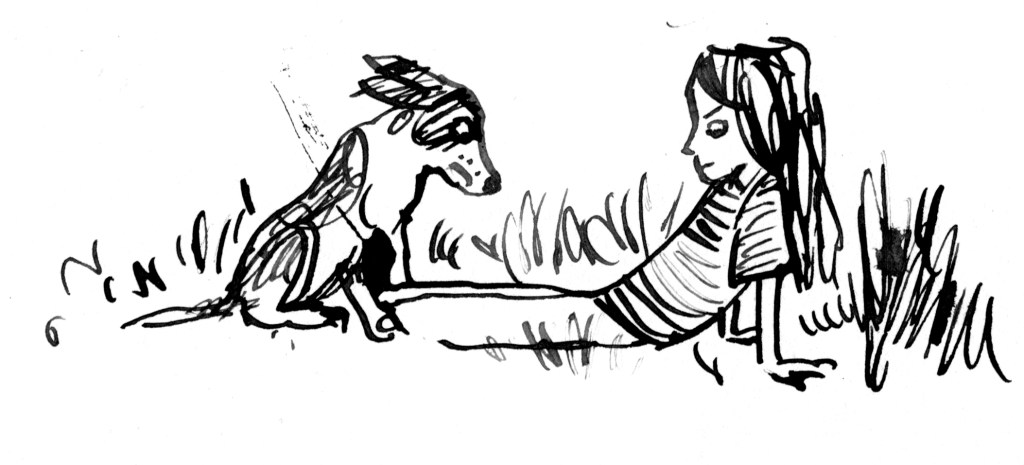
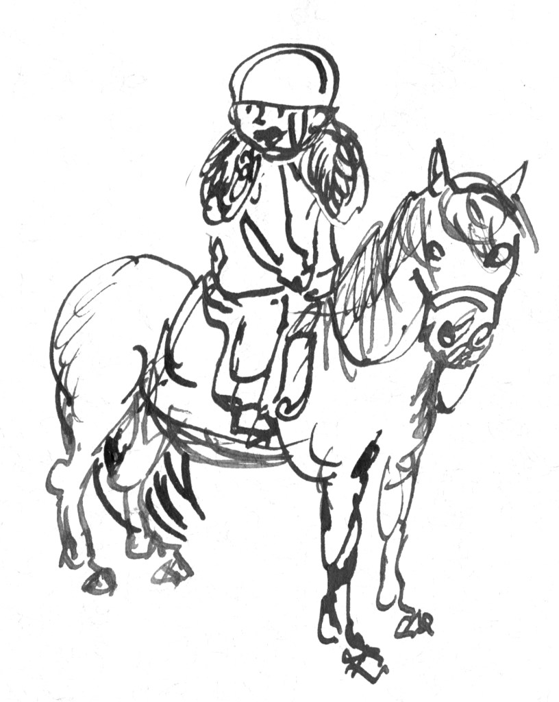
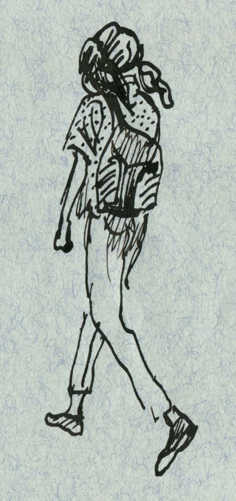
Pen and ink. Obviously this is all about the line. But it’s also about embracing a medium that can’t or won’t be fully controlled. I worked pretty small with these and just enjoyed making lots of small doodles. Perhaps some more finished work will come later.

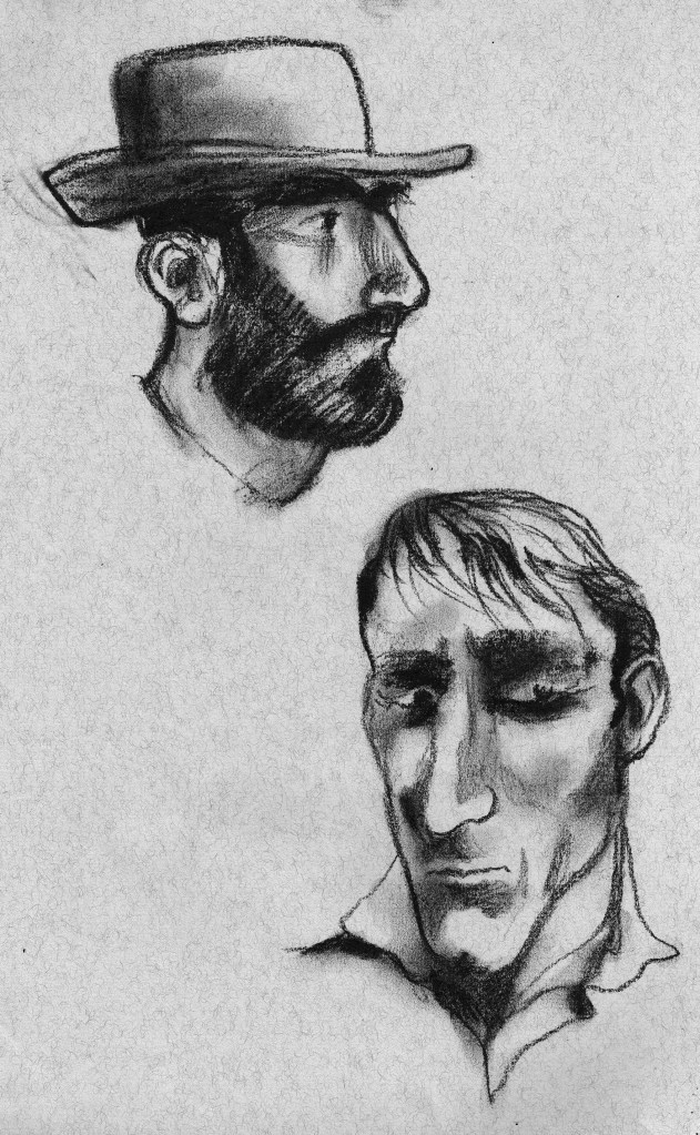
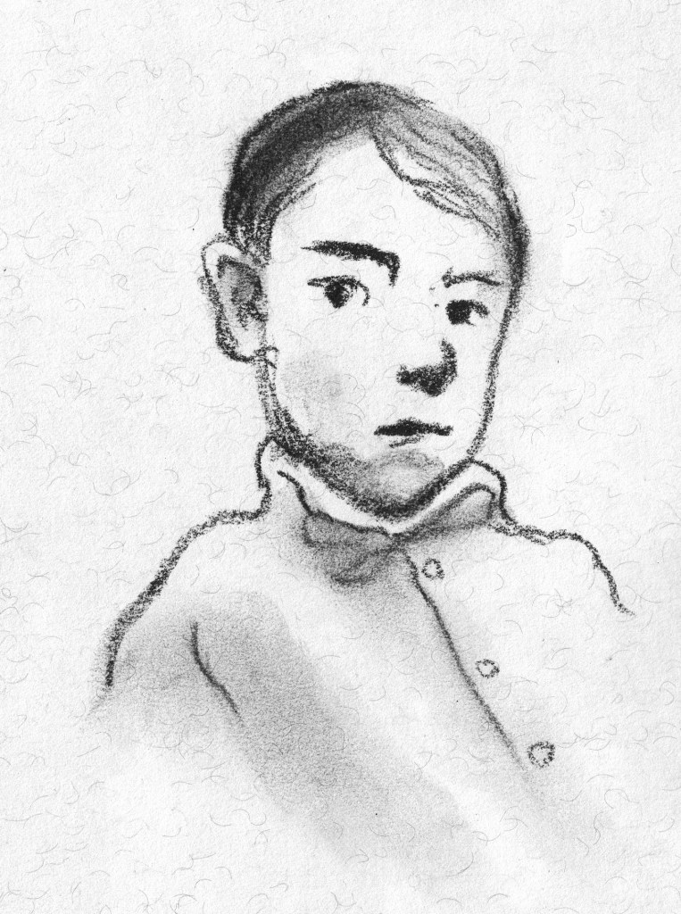
And charcoal or soft pastel. This is less about the line and more about the tone, but really it’s a delicate balance of both. And there’s an element of mystery that comes from the smudgy indistinctness. It feeds the imagination. I haven’t found my mojo again with this quite yet, but I have been enjoying the start of the journey.

These two are a bit obvious.
I like this little guy.

Lastly, I did a couple of tiny wash drawings with a touch of pencil detail.

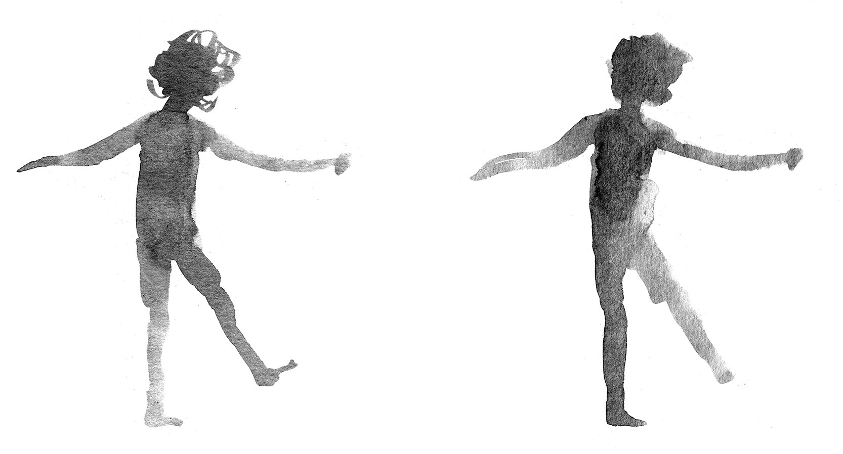
My daughter Remi at a fancy dress party a few years back.
My son Hugo listening to music in my studio the other day.
Another of Hugo.

Thanks again, Phil. It has been fun to provide the prompt this time around! x

Searching for Cicadas

A book about summer and family… and cicadas of course

Two books in one year is outrageous for me. I’m a slow cooker of books. Especially picture books. Each one is for me such a journey of discovery and striving and learning and change. So they emerge slowly.

Portrait of the artist as a very young person, before I illustrated this book.

But speaking of emergence, this is a book about cicadas… cicadas emerge slowly too! Some of them spend several years underground in their nymph form. One species spends seventeen years underground, which is longer than I have ever taken to illustrate a book… thankfully. Then they dig their way up into the light, shed their outer casing, dry their wings and sing a song to the summer. The boys do, anyway. And I’ll bet not many people know that they cover their ears when they are singing so that they don’t deafen themselves. Lesley taught me that.

The skeletal pencil and ink background of a spread from Searching for Cicadas
Ghostly shadows of the child figure for the same spread
The spread with colour and characters added

There are so many bits of fascinating information in Lesley Gibbes‘s text. And there are more than insects here too. There’s a narrative featuring a grandfather and child who go looking for cicadas on an overnight camping trip. And that is what I call fun.

Dirt and pine needles between the toes. Nothing beats bare feet.

Cicadas, summer and grandparents go together like cheese and biscuits. There’s something about these wonderfully noisy creatures (the cicadas, not the grandparents) that fascinates adults and children alike, and while we are sharing our fascination, we share a time, that later becomes a treasured memory. It did for me. I remember holding cicadas on my hand and collecting the empty shells (exoskeletons) and attaching them to the front of my clothes by their hooky little feet. They looked very decorative, along with the ripe cherry earrings hanging from my ears.

summer days in the country with my brother and Mum. I have no cherry earrings on in this photo.
Soundtrack: cicadas, magpies

I consider myself lucky to have been offered the opportunity to illustrate a Nature Storybook for Walker Books. It’s a series that I’ve admired for a long time. It features a double layer of text; story and scientific fact alongside one another in a child-friendly format. There are quite a few in the series, all beautiful. (I’d love to own an original painting from Dingo by Claire Saxby and Tannya Harricks. And check out Tannya’s dog paintings!)

Camping with Pa: bliss!
Soundtrack: cicadas, magpies

A few years ago I did quite a bit of illustration work for Museum Victoria where I got a taste for illustrating New Things That I Knew Nothing About. You research, scribble, take notes, panic, draw, draw again until you get it right… or right enough. (It’s never perfect.) This was a bit like that. It was really satisfying to learn to draw a cicada. I’m not confident I’d be able to draw a convincing one now, but for a few moments in time, I could do it.

This was my favourite cicada. He didn’t make the cut. I think it was because he had just a bit too much personality for a non-fiction title. He is my little friend.

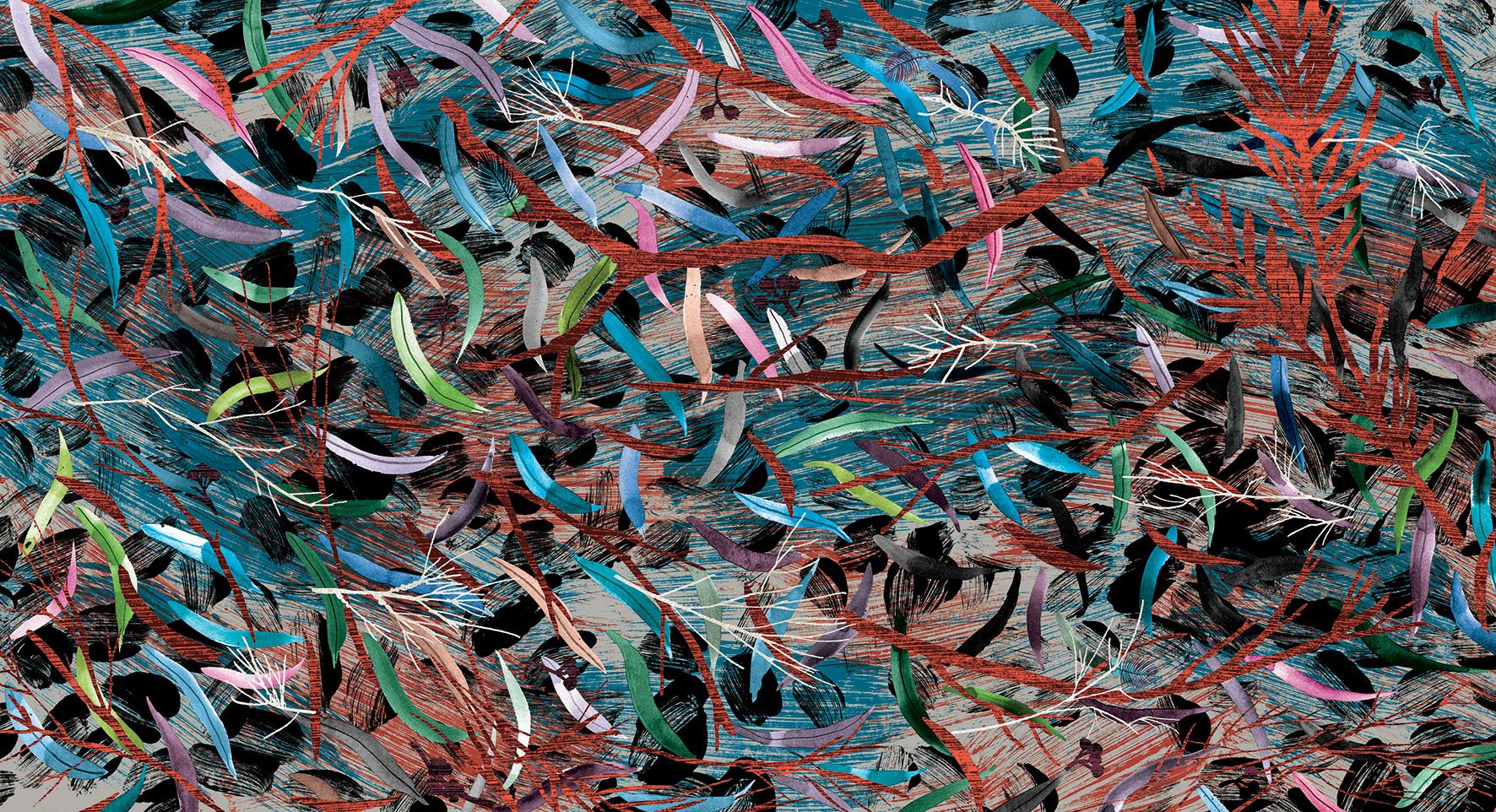
And best of all was illustrating the Australian bush and the leaf litter. It made me want to make great big paintings of leaf litter.

Me with my grandfather, the irrepressible Pop Worrall who wasn’t with us for long enough. We never went camping but we did lots of swimming together.

Studies in blue

Today I have been working on the mid section of roughs for Leonard Doesn’t Dance. It’s a difficult time for poor Leonard.

As I was drawing, in search of the right feeling in his posture and expression, I thought it might be interesting to picture book enthusiasts to see some of the thought that go into each illustration. So here we go.

Leonard RHS studies lores

An A2 sized page of studies for a vignette on page 15. (8 scans later, boy do I wish I had an A2 sized scanner!) I have numbered my drawings in order in case you are interested to see the progression of ideas.

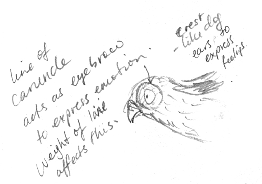
I’m not sure if you’ll be able to read my notes on the page. Leonard is feeling sorrow, resignation, defeat, regret, longing. Expressions I want to avoid include alarm, fear, guilt, anxiety or furtiveness.

Those who draw will know how a tiny variation in the curve of an eye or eyebrow, or the tilt of a head may change an intended sorrow into an accidental horror.

L sad 3

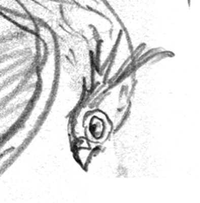
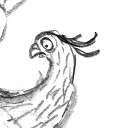
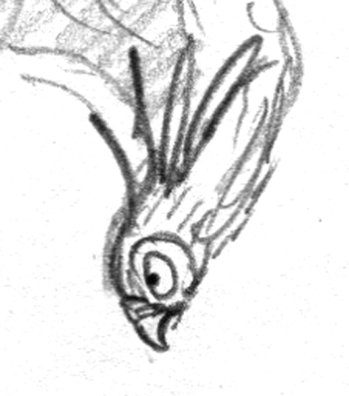
No.3. The heavy line at 10 o’clock on the eye gives the expression wretchedness. Otherwise the large, round eye looking backwards might have indicated a fear of pursuit.


L sad 4

No.4. This is my preferred facial expression. It says best what I think Leonard is feeling.

L sad 1.jpg

No. 1. The expression seems a mix between extreme mortification and horror, with a bit of disgust thrown in. The up-curving neck shows too much energy. I want Leonard to look a little defeated. 

L sad 6.jpg

No. 6 Although I like the body posture with raised wings, the face here is not quite as good as  that of No.4. The head tilt is less submissive, more head-butt. The crest is more raised, the eye less miserable.

L sad 2

No.2. Utter dejection with 1920s silent movie era eye makeup! Leonard is not even looking back, just downwards. I think I’d rather he looks wistfully backwards as it indicates a suppressed longing to join in. I don’t want our boy to be completely bereft of spirit. Poor lad.

Sometimes a thing like this can be positively excruciating if you can’t get it right. But today I enjoyed it. Leonard is  very accommodating.

In Leonard’s case, I have the eye to work with and also the caruncle (a patch of coloured skin) around his eye, which acts as an eyebrow or an underscore for the expression in his eye. And living with a flock of chickens has taught me what a sick or miserable chicken looks like; the hunch, the fluffed up feathers, and sometimes the dropped wings.

L dejected.jpg

But with Leonard’s crest I depart from the nature of birds. A fluffed up crest in the real world might indicate bird misery, but I’m using Leonard’s crest more in the way of ears like a dog, that drop when miserable, raise when interest is sparked. That is probably a language more readily identifiable to children, since more have dogs than chickens… in Australia at least.

So that covers the face. What about the body?

dejected posture.jpg

He’s retreating, so he’s best drawn partly from behind. The fluffed up hunched shoulders, I mentioned earlier. He should look clumsy, so I experimented with leg postures. He has just alighted so I need to suggest the flight just finished. And he’s walking away and downwards, so I have to suggest the forward downwards movement as well.

One challenge is the wings. Raised wings (6) could suggest a certain lifting of spirits. Spread wings look nicely clumsy (5) but tend to get in the way of the main subject (his lowered face). Lowered wings (2, 4) may be best for misery but are not so good for movement and flight. (In 2 he looks positively beaten. It’s a bit much.)

wings raised.jpg

Today as I was working on this, I once again remembered my fabulous school art teacher Cecily Osborn. I remember her explaining how artists can seek to depict movement in a motionless work of art. She used the ancient Greek sculpture of a discus thrower Discobolus by Myron as an example. The sculpture doesn’t depict any real life movement employed by an athlete whilst throwing a discus, but instead attempts to creatively suggest the movement that came before as well as hinting at the movement to follow the instant in time depicted by the sculpture. The sculptor borrows our imagination to evoke a movement that he can’t create in reality.

roman bronze reduction discus_thrower_Myron

A Roman bronze reduction of Myron’s discus thrower. The original artwork was made around 450BC.

“The potential energy expressed in this sculpture’s tightly wound pose, expressing the moment of stasis just before the release, is an example of the advancement of Classical sculpture from Archaic.” (says Wikipedia)

I’m very serious today, aren’t I? Do you think I am overthinking this?

I don’t think so. These thoughts take longer to describe than they do to think. All this and more goes through an illustrator’s head as he or she is drawing. And a lot of it is subconscious too. But it’s part of what makes the pictures work, it’s part of observing our world, and how the experiences of life feed into an artist’s work. I love that about my job.

But here are a couple of over-excited woodpeckers, because I wasn’t just drawing misery today.

Cheerio!

woodpecker black and white judywatsonartwoodpecker judywatsonart

Bird Immersion

Sorry I haven’t been around in Blog Land.

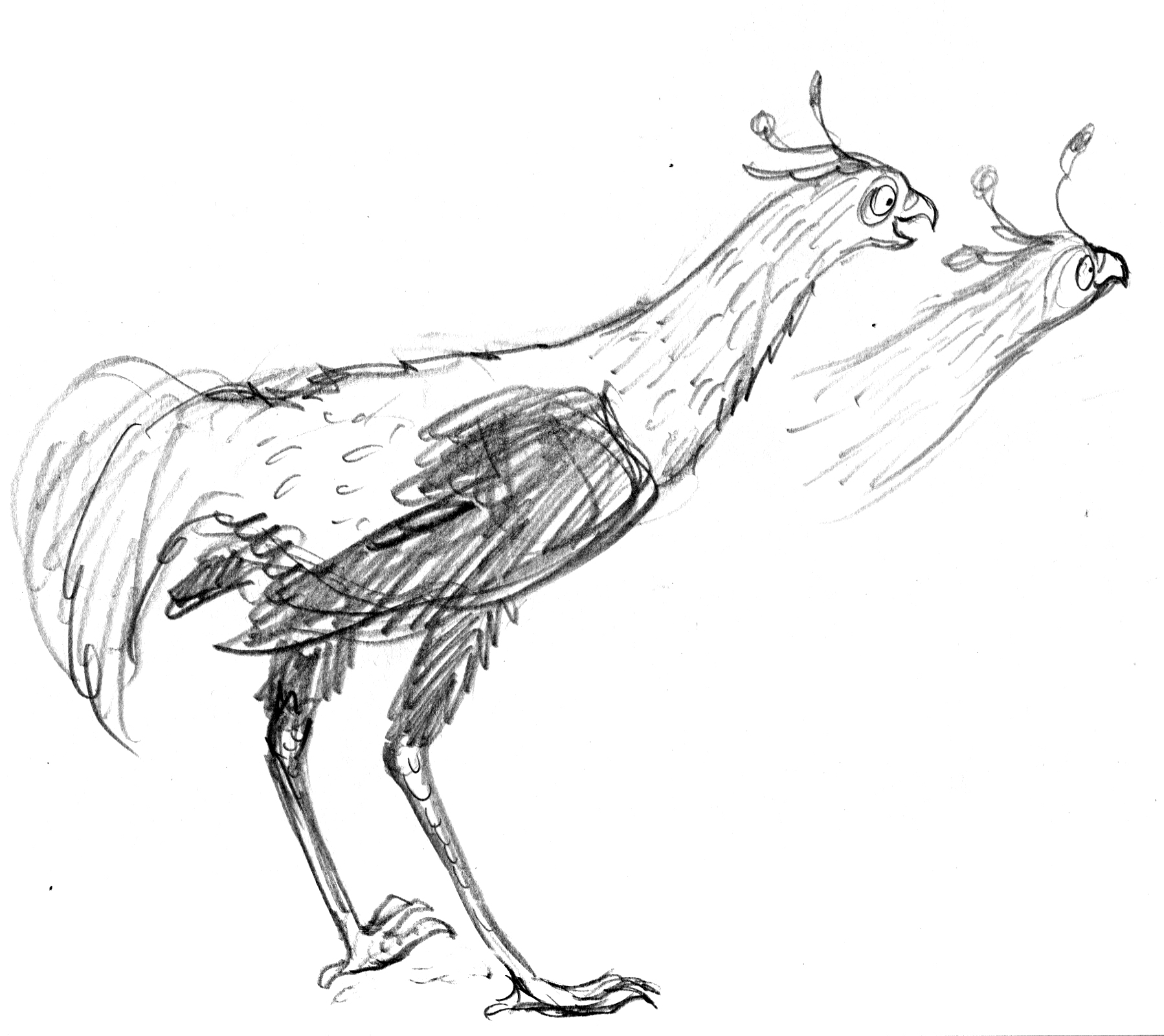
20-21 Leonard with 2 heads


Happily, this is mainly because I’ve been so busy drawing my roughs for Leonard, (and turning 50, and looking after an extra child because we have an overseas student staying with us at the moment).

I have to say, despite the fact that I’m multi-tasking like crazy (bad) Leonard is really fun (good!).

I can’t show you very much (bad). Many of the roughs describe the finished image. And this book, true to Frances Watts’ Style, will be brimming with humour (good!). So by showing you the full page roughs, I would be giving away all the gags (terribly, terribly bad).

But I can share with you bits and snippets and here-and-there touches.

chickens lightened.jpg

It’s interesting that the roughs have reverted to pencil, maybe my most natural medium. And this will pose its own challenges when it comes time to make the final art with broad paint strokes. The roughs began as large paintings, then switched to charcoal, and finally, to pencil.

singing

swingin Leonard

And something I’m excited about is my new light box! Wowsers! It’s so cool.
But I’m going to leave this and write more later.

I’m multi-tasking, remember?


Bookplates – just for fun (part 2)

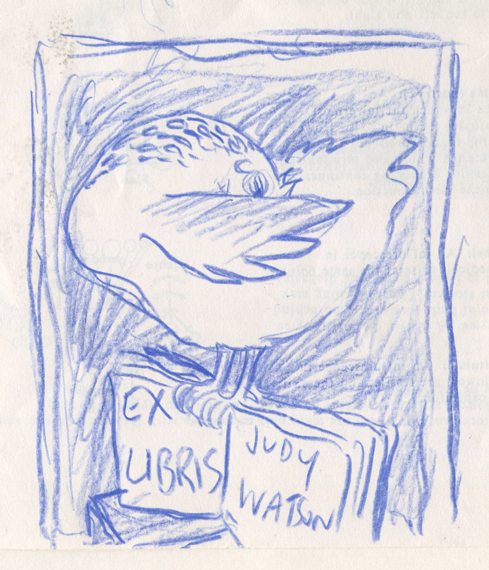
So here are my two quick bookplate designs. Unlike Hugo, my preliminary work was limited to one doodle in blue pencil. I then progressed straight into ‘make it up as you go along’, my strongest medium.

bookplate prelimiinary doodle judywatsonart

Wanting to play quite loosely with patches of colour, I used watercolour without any particular structure or organisation. Then I added ink with brush and dip pen, acrylic (to cover up the bits I didn’t like on the wing) and went for it with some lettering. I left it scanning while I started on a second one.

Bookplate2 judywatsonart stage 1

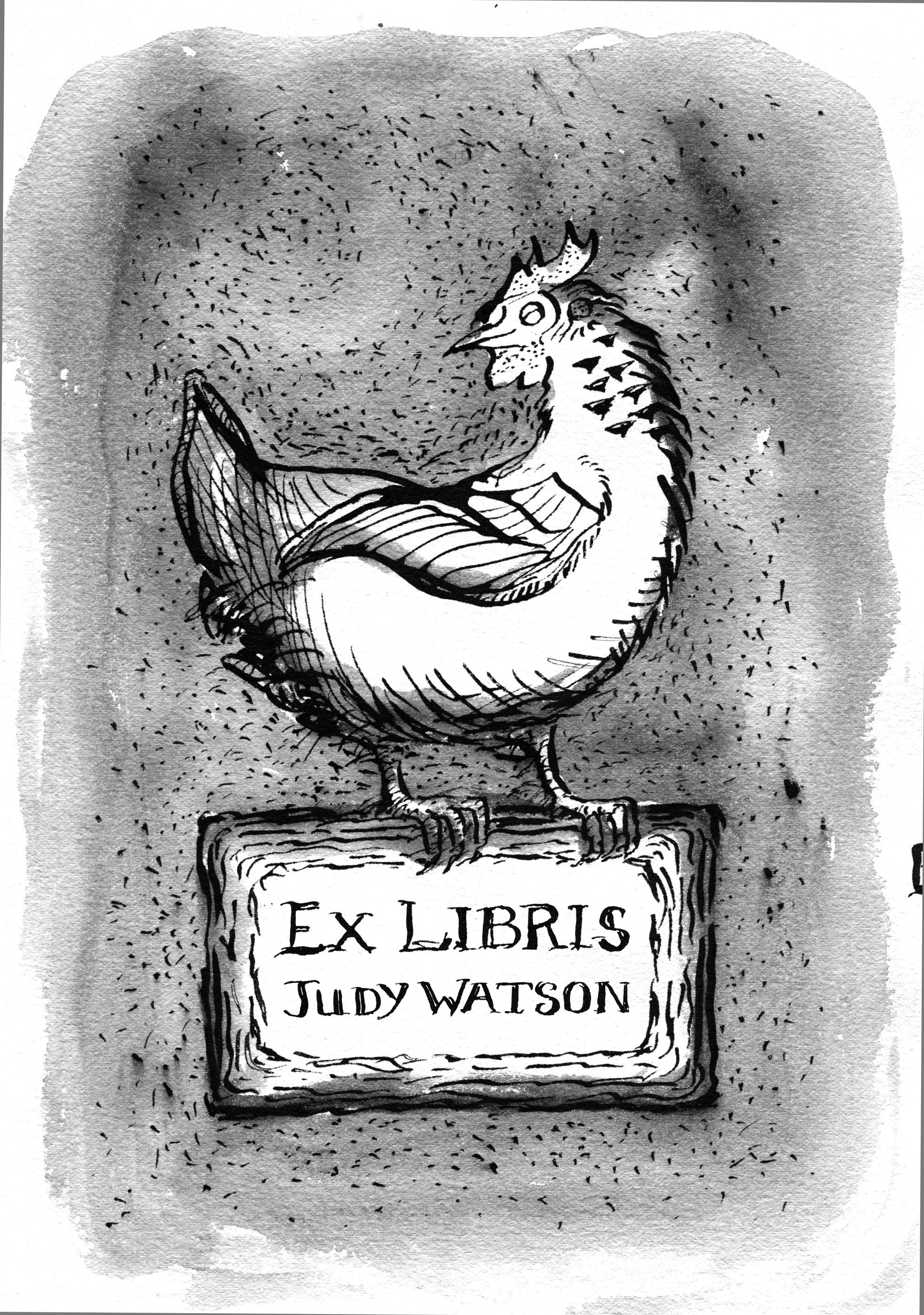
The second one was only black ink and dip pen with lots of splodgy bits. I scanned it before adding more texture, to give myself a way of going back. undo. (Am I the only one who mentally presses Command Z when I miss a turn off in the car? It doesn’t work.)

Bookplate judywatsonart stage 1

Then I took it back to the drawing board and added some very important dots and scratchy bits. (Chickens scratch. It’s symbolic, right?) Then I scanned it again. (undo)

Bookplate judywatsonart stage 2

Then I took it back to the drawing board for some wash, and scanned it a third time. (Actually, I blow-dried it first, and then scanned it and found it was wobbly, and then put it in the book press for 2 hours while I drove to school and back and then scanned it again, but that’s probably too much detail.)

Bookplate judywatsonart stage 3

Then I took it into PhotoShop and added some colour. Although it may have been better in black and white, it was too much fun not to add colour. (This process involved lots of undos.)

Bookplate judywatsonart tonal chookie

Then I went back to my first chicken; all loose and free and doing her own arty-farty, happy thing. And I had to mess with her. Cramp her style.

I desaturated her, taking her back to a sepia tone, then added very limited digital colour. She squawked in protest, but I took no notice. I told her firmly, ‘less is more… sometimes… Not when it comes to eggs, you understand.’ She gave me that bright beady-eyed look and then we sent the bookplates off to print.

The other chicken had been asleep through the whole process.

sepia chicken judywatsonart lores

Bear’s campfire story

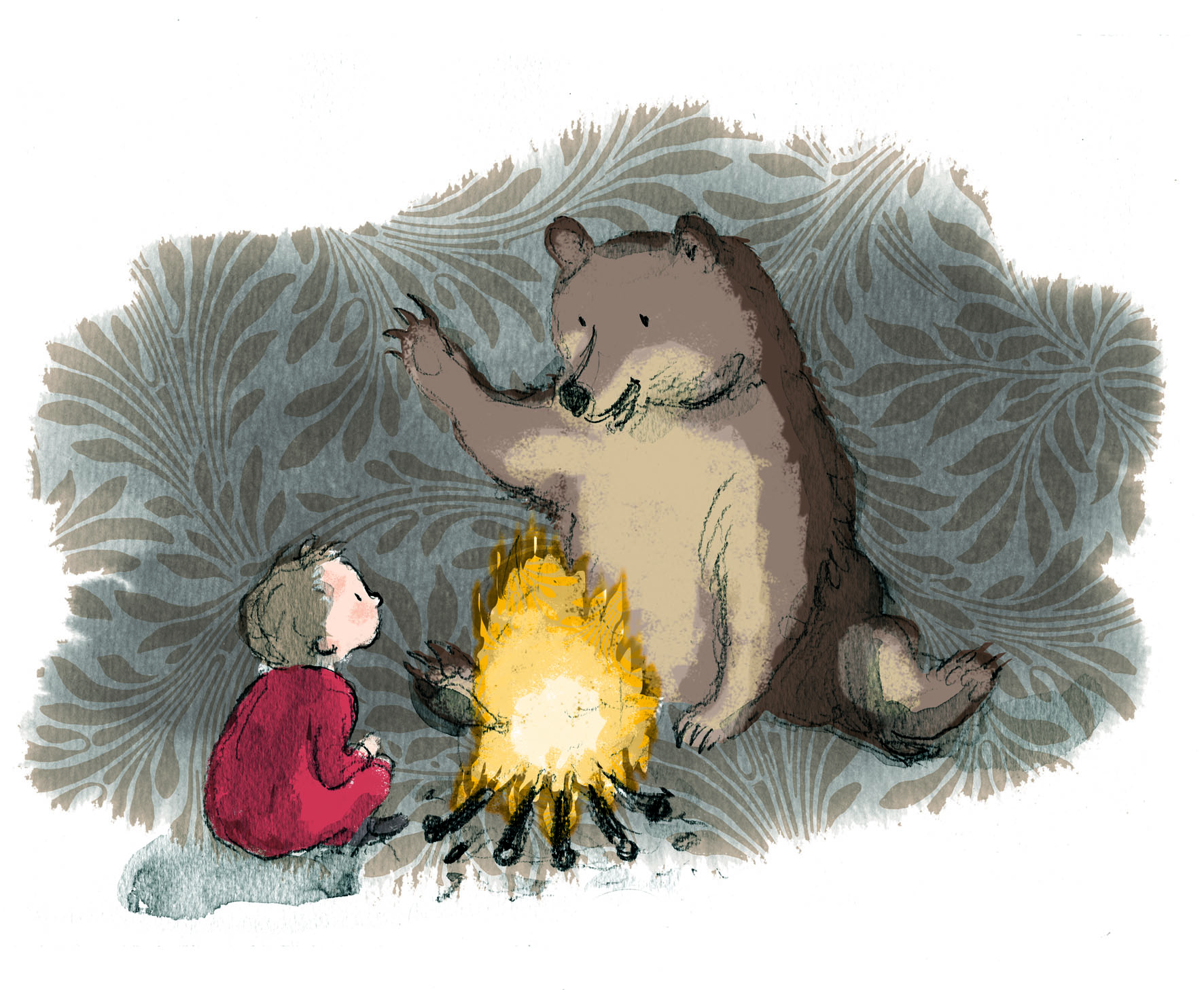
Here’s Bear with Boy.

Bear and Boy came about when I was working on the Share A Story poster with the team from the Australian Children’s Laureate.

bear campfire temp

Ann James and I were initially scribbling away at the same time, tossing ideas around for ways to illustrate themes like ‘grow a story’, ‘hunt a story’, ‘hear a story’. We had few preconceived ideas about how we were going to make the poster concept work and we were playing for all we were worth. During this process I drew Bear and Boy, which I later coloured, because I liked the sketch, but I didn’t bother finishing it off perfectly.

But I was primarily the designer for this job, and it quickly became obvious that for the sake of visual cohesion, Ann’s illustrations would look better throughout; not mixed with some of mine. I moved to the computer and started colouring and experimenting with pattern, until we found something that was starting to work. Justine Alltimes and Ann Haddon provided invaluable insight and art direction.

Asking Ann to produce all sorts of obscure drawings on demand was like popping coins into the Best-Ever-Slot-Machine, and watching exciting and unexpected treats pop out. At speed. So much fun!

While from Ann’s point of view, it was fun to watch her drawings merge with colour and pattern and start to form a composition on the poster.

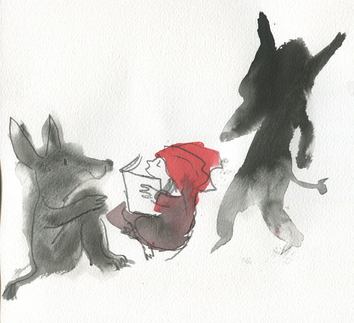
Ann James' Red Riding Hood and friend wolf (with mysterious dark figure looming behind!)

Ann James’ Red Riding Hood and Friend Wolf (with mysterious dark figure looming behind!) © Ann James 2015

Add classic vintage Australian Stamps

Add classic vintage Australian Stamps

Merge using a bit of digital magic along with some V&A pattern.

Merge using a bit of digital magic along with a V&A pattern in the background. Voila!

Being a fan of blobs, I liked the original inky halo around Mr Wolf. But the consensus was that there was not enough contrast to identify his shape against the background patterning, so he had to have a digital bath… or perhaps shave.

If you’d like to download the Share A Story free poster-calendar, conceived by Laureate Jackie French and illustrated by Ann James, go here. It is a great, open-ended way to engage your children with stories.

Share a Story poster final art web

Department of Education and Training early learning wall friezes

To prove I’m still here, I’m popping up some single illustrations done for the Department of Education and Training this year. The brief read thus:

The purpose of the four wall friezes is to encourage families to engage in learning activities with their child everyday. On each frieze there will be eight panels – a cover and a panel for each day of the week, with a different illustration of a family member(s) and a child/children engaged in a learning activity related to the theme. For example:

    • Music: dancing/singing, etc.
    • Science: cooking/exploring nature, etc.
    • Maths/numeracy: counting/measuring/block building/puzzles, etc.
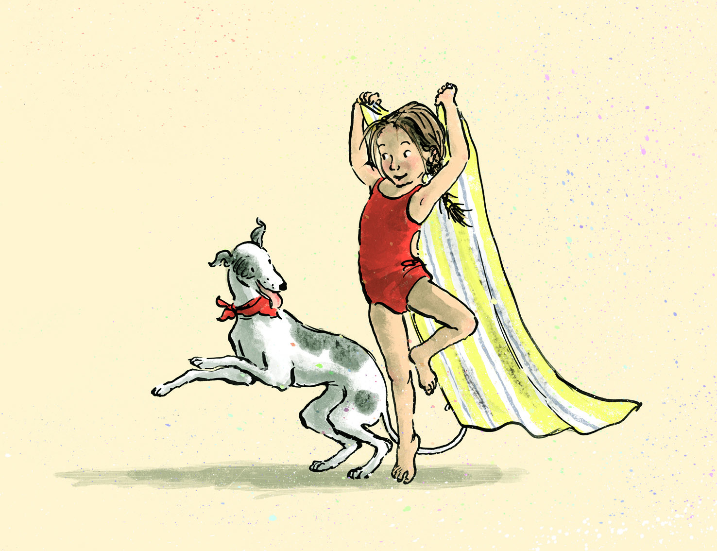
    • Imaginative play: dress ups/cubby houses/pretend play/creative play spaces, etc.

The DET are happy for me to post fragments of the artwork I did for them, and you will hopefully come across the full design somewhere; perhaps in your local library.

Not surprisingly there was a dog or a chicken in each illustration… Oh actually, I couldn’t find a hygienic way to get a dog or a chicken onto the kitchen bench for the Maths illustration. Rats.

(…There were no rats in the kitchen either.)

kids play music JudyWatsonArt

A fragment: Music

Tommy from Thunderstorm Dancing enjoyed a new incarnation here. So did some of the other characters.

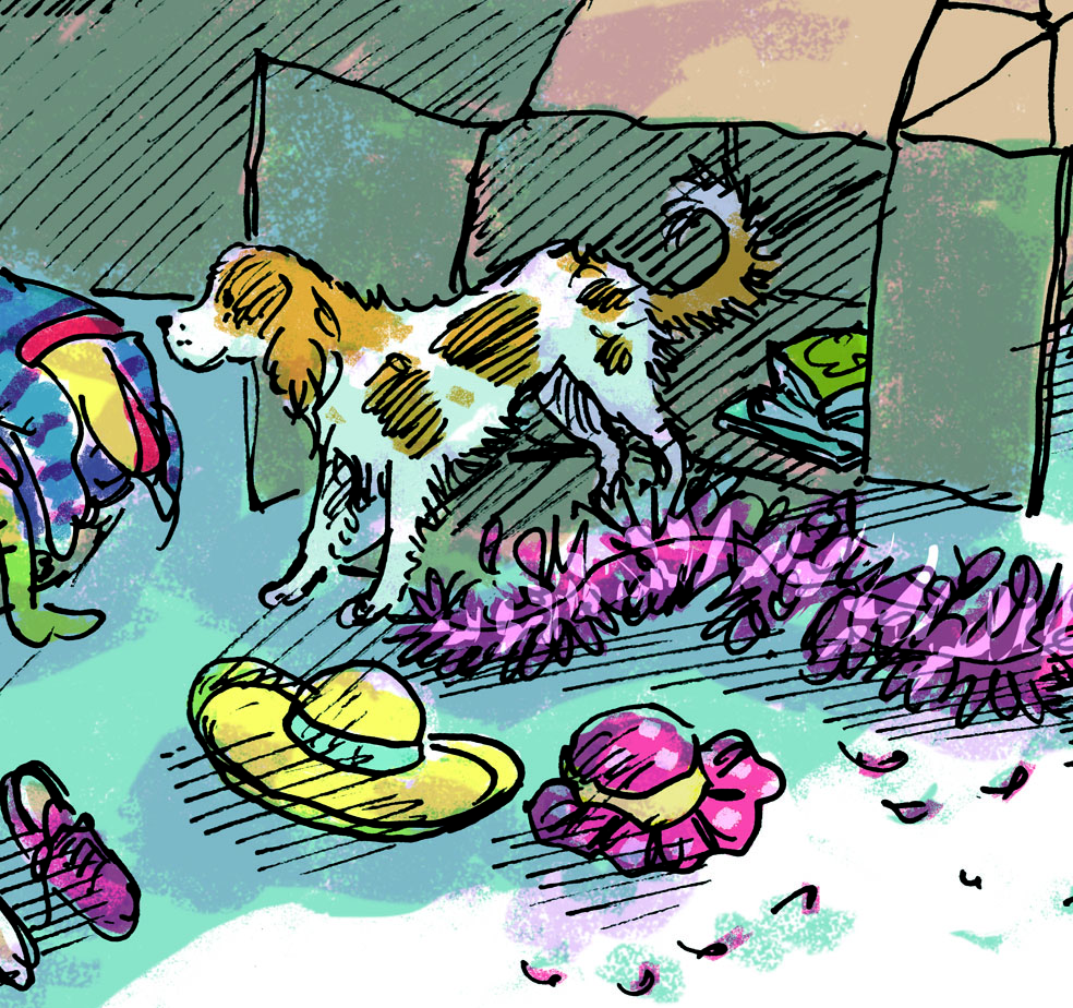
little spaniel from Imaginative play JudyWatsonArt

A (small) fragment: Imaginative play.

There’s that spaniel again. She keeps popping up.

my boys do cooking Maths JudyWatsonArt

A fragment: maths

My 12 year old got morphed into a 15 year old for this illustration. That was fun. I morphed him back again later. I’m not ready for a 15 year old.

Geeky little girl enjoys science with chicken friend

A fragment: science

Geeky girl gardener enjoys some science play. I like a geeky girl and I like her taste in chickens.

ATTEN….SHUN!!

ATTEN--SHUN

ATTEN–SHUN! (Even Lassie came to see me. It must be an emergency.)

I have received a few nudges lately.

Yep. I’ve been lost in a world of moving house; a barrage of bills and boxes; a wilderness of wrapping. I’ve been so pooped, I can’t even alliterate for more than one sentence and ‘moving house’ doesn’t count.

squirrel dog

Inane Squirrel Dog running hither and thither. This is not me, you understand. NOT me.

But I’m paying attention now. I’m here. Thank you to the nudgers one and all, for hauling me out of my box… or boxes.

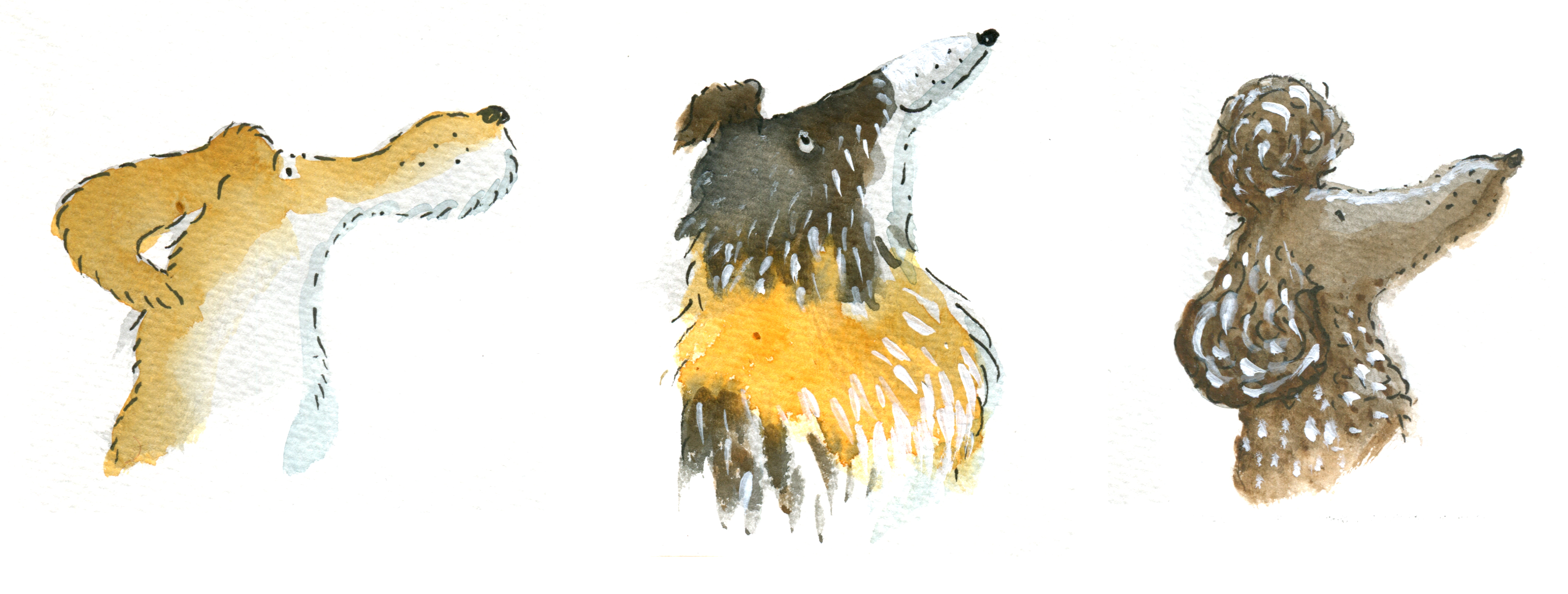
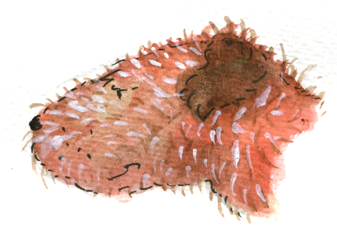
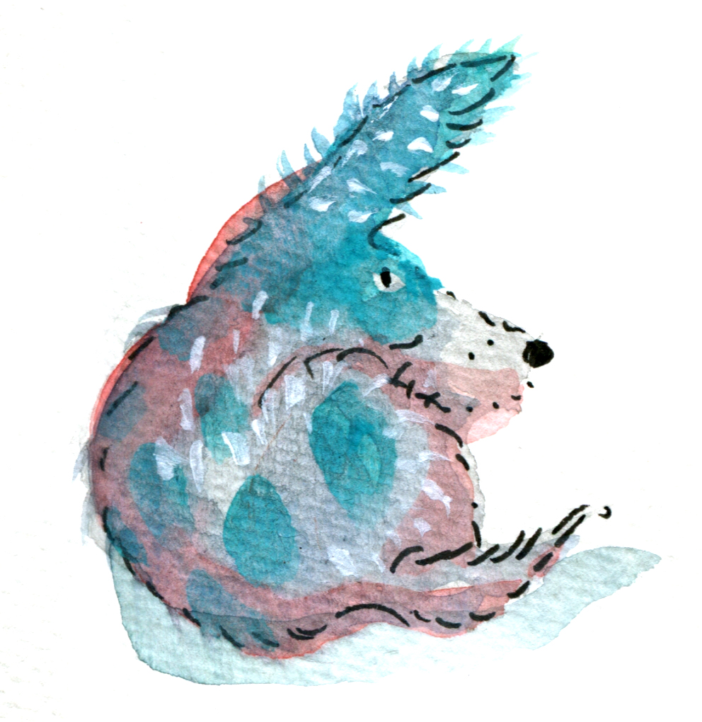
I visited a friend the other day and sat down to do a few harmless blobs over a very nice G&T. To make it even easier, I made them dog blobs. Dog blobs are the easiest blobs, unless you count stay-as-they-are blobs. (Chickens can do those without even trying, so with all due respect to chickens I don’t count them as proper blobs.)

In the spirit of the whole blob thing, where the blob leads the whole story every inch of the way, I promise to include each and every blob in this post, even the ones that are SO WRONG!! All blobs measure around 2-3cm across so it’s really quite impolite to be enlarging them this much. A bit like looking up somebody’s nose.

Okay, I need to get this one out there. It’s hanging over my head and it is SO WRONG!

so so so so wrong!

So so so so wrong!

Phew! All I can say is

THE BLOB MADE ME DO IT!

irish terrier x bull terrier

Irish Terrier x Bull Terrier in a bad mood (from a very nondescript blob.)

Dog breeders would say that this blob is all wrong as well. But I don’t mind him. He has a muscular, hardy look and may be useful carting boxes.

blue dog

Perplexed Irish Soft-coated Wheaten Terrier born on the wrong side of the breeding box.

Being Blue-with-Brown-Spots has proven challenging for this Wheaten Terrier. It reminds me of studying the theme of ‘between cultures’ when I was at school…

hip dysplasia dog

A victim of perspective

Reminding us all that one’s situation in life is all a matter of perspective is this young Springer Spaniel x Staffordshire Bull Terrier. With his back half shown from above in the Stafford position of repose and his front half shown from the side in full Springer Spaniel spring, he could see himself as either getting somewhere or going nowhere.

what the

Reg, the Space Dog

I have never seen a flop-eared dog do this before. His ear defies gravity. But perhaps Reg is in an anti-gravitational chamber and is practising to become a space dog. Luckily these days space dogs get to come down to earth again… I think.

Quite wrong. Pretty wrong. Almost certainly wrong.

Quite wrong. Pretty wrong. Almost certainly wrong.

This is Graham. Graham is undergoing hypnosis treatment, but not the kind you pay for. The hypnotist is an alien who has landed in the back garden and Graham was in the process of confronting him when an eerie light was switched on and began to swing slowly backwards and forwards… After that it was all up for Graham. I hope the alien is just going to take botanical samples from the garden, and not canine samples.

lick lick lick

lickety-split

Lickety-split means fast, pell-mell, gangbusters, like a bat-outa-hell… well maybe not quite as fast as a bat-outa-hell. So I think these two dogs are engaged in a contest to see who can clean themselves more quickly. They are fairly evenly matched for size and white areas, but my money is on the brown and white dog because his tongue is larger. Stands to reason. Also the black and white dog looks like he is losing his cool a bit. He may be trying to wash his tail. If I were he, I’d leave it until last and trust to it’s being black. Nobody’s going to notice.


The Blob Dog of Discontent

Emerson, the Blob Dog of Discontent

This blob dog is the smallest of all the blobs. Emerson was squished into the top left corner of the page. Perhaps that accounts partly for his disposition. Or, indeed he may be suffering from worms. (His posture is suggestive). But in fact, I suspect he was born this way and has been inflicting his testiness on everyone around him since puppyhood.

Even a dog biscuit would not help here.

Federation Square drawing and chatting tomorrow (13th June)

I might see you at Federation Square, if you are Melbourne based. Please say hi, if you are in the area. I’d love to see you.

I’m bringing a small number of limited edition prints to sell at the book stall along with signed books.

Below are some prints from the actual book, that will be for sale. And following them you’ll see some altered book prints which show the inspiration for the medium that was used in the book. But they also show the difference between the artificially created cream and the natural vintage book parchment.

My chance to sing lores JudyWatsonArt Ready Set Go lores JudyWatsonArt Thunder imprint page boat lores JudyWatsonArt Thunder opening spread seascape lores JudyWatsonArt

The parchment is naturally a much dirtier colour… which appeals to my inky nature, but the Allen & Unwin book designer Sandra Nobes very rightly recommended a clean cream for the book itself, and this is where PhotoShop was my ally. Thanks Sandra and PhotoShop.

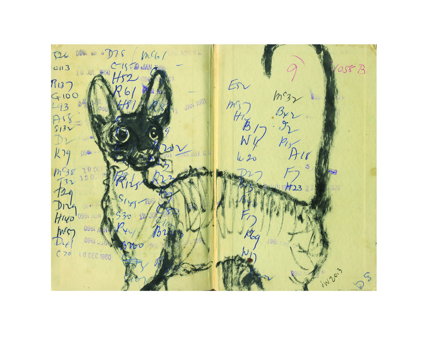
tabby kitten lores JudyWatsonArt Cornish library tick cat lores JudyWatsonArt

Book Signing Phobia

Here’s a lesser known part of the job of being a drawing machine. When we sign books for people, it  is a nice thing for them if the signature comes with a little doodle, drawn for them, right before their very own eyes. And it’s nice to be able to do that for them. It makes us happy too. If it works.

But the inscription is done in pen and can’t be rubbed out or corrected.

And when we draw during the usual course of our day, we usually do many drafts of any illustration before we get it right.

And if we mess up our inscription doodle we have the problem of either sending a deplorable doodle out into the world defacing the otherwise pristine title page of a newly purchased book, or replacing the book with a new one… which we might also mess up.

Now remember that some of us are very temperamental drawing machines, the kind whose engines won’t start unless the key is turned in just the right particular way, may never run very well on a Tuesday, and if the oil runs low we are likely to smoke. You will now realise that the aforementioned anxieties at the back of our minds can cause a little fumble in the fingers; a wobble in the wrist; a twitch in the felt-tip… and then…

Doom!

That is why I am practising my book signatures today.

With Best Fishes

With Best Fishes – practising my book signing today and this is page four. Ahem. 

I have spoken to illustrators who say they won’t do it any more. They will write anything but won’t draw. (And I’m not even going to discuss the issue of spelling difficult names correctly… or easy names for that matter.)

I have spoken to illustrators who say ‘it’s important to make the mark.’

I have watched with awe, some illustrators who sign and doodle with ease.

I have watched with awe, one illustrator who was CLEVER enough to get a rubber stamp made up in advance! (Yes, OtherJude, that was very clever!)

And I have used my bookmark giveaways to circumvent this problem with some success. (It’s much less stressful to draw on a bookmark, than a $25 book.)

photo 1

Anyway, see you at the next book signing!

I’m ready.

I think.

Enjoy your bookmark!

Enjoy your bookmark!