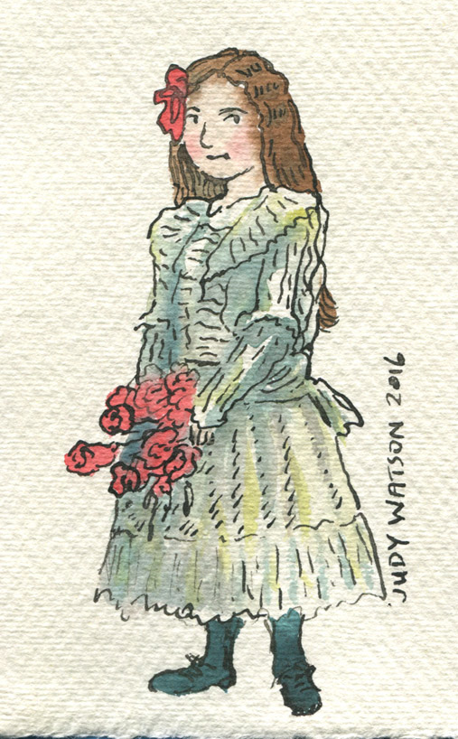
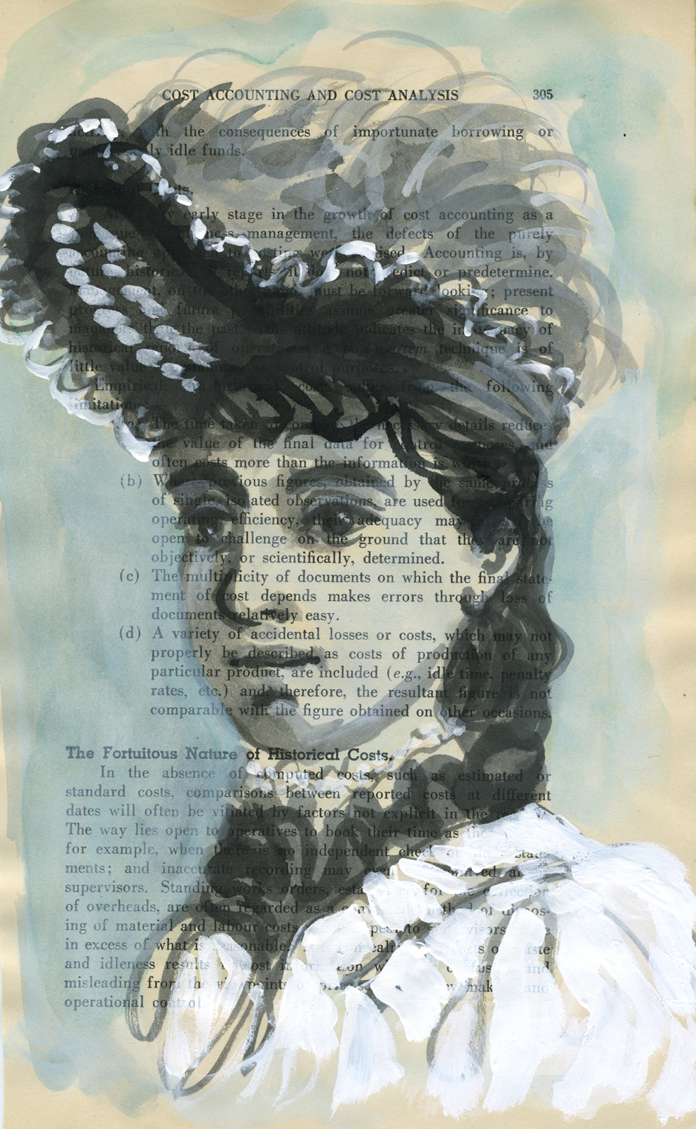
Bonneted girl in too many frills. (From a vintage cabinet card portrait photo)
Over the summer school holidays, I had the pleasure of pulling out all the monotype equipment, unused for many months, and taking it for an outing to the back garden of the new house. There is a space under the decking that’s perfect for fine weather art activities. The boys and I set up two trestle tables there and had a lovely afternoon of printing in the warm air.
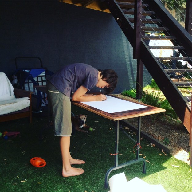
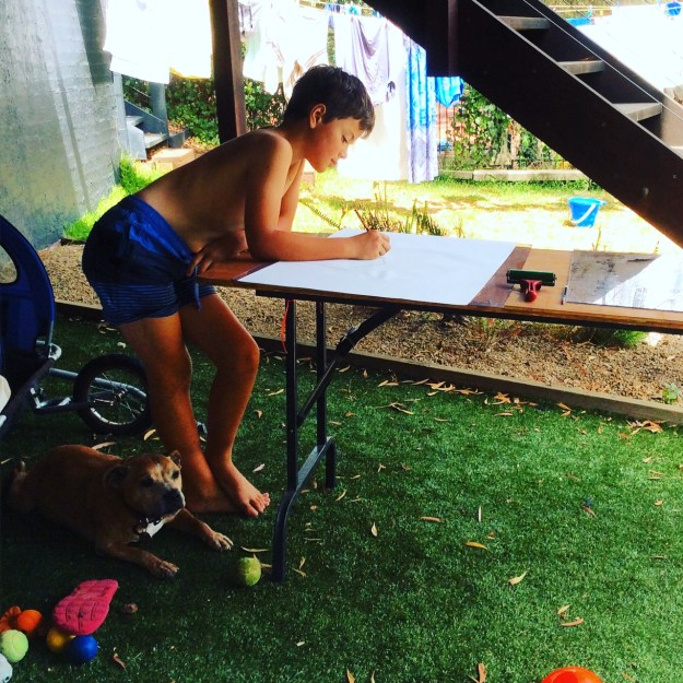
While the boys printed an assortment of monsters, animals and fancy lettering (most of which they remembered to reverse as they drew), I printed chickens, dogs and portraits of them drawing. They were mostly autonomous because they had printed before and are old enough to manage on their own, but my focus was divided between my own drawings and theirs, so I came back a few days later and had another go on my own.
Author Ann Martin had kindly posted me her collection of cabinet card photos after my last post on vintage clothing (here) and I decided to use these as the basis for my monotypes. I had also been admiring one of my favourite books Detour Art.
I LOVE that book, (one of my favourite Christmas presents ever!) and browsing through it again led me to look up and explore further the work of Thornton Dial Sr. who died only last month. You can see the video A Day With Thornton Dial Sr. here.

Thornton Dial’s work ranges between sculpture using found objects through to several dynamic painting styles. One of his loose drawing styles made me itch to print some monotypes and add either dry pastel or watercolour to them. I love the way his rapid line work dances with the limited colours he adds.
Below are some of Thornton Dial’s works that make my heart race!


As you will see, my own work is nothing like his whatsoever. As with most artistic adventures, the artwork takes on a life of its own, and mine were no exception. They were mostly drawn using a continuous single line, using a heavy crayon pressed firmly on the back of the paper. I was seeking a heavy line with bleed but also a loose line, and was mostly successful in this.

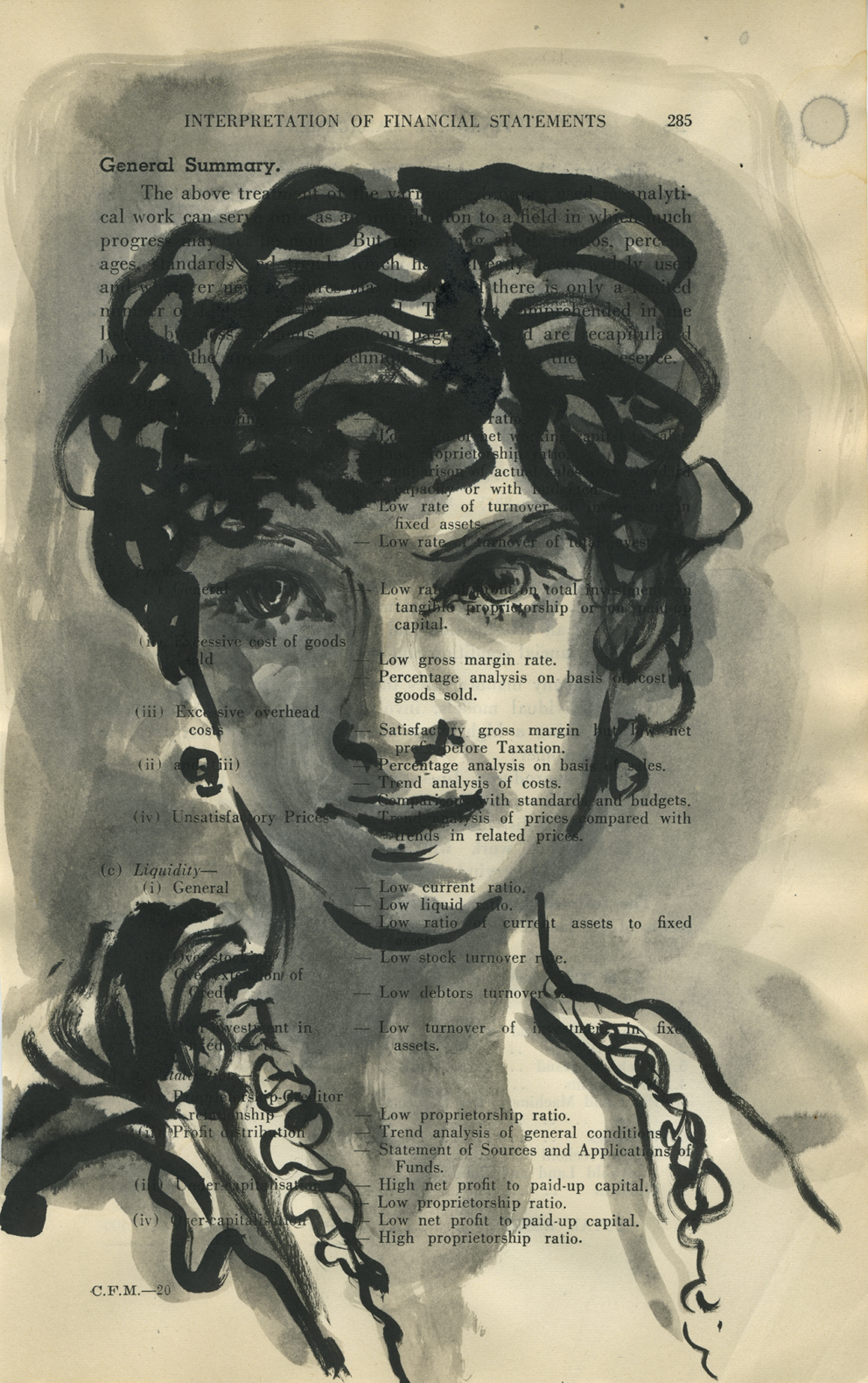
Bearded man – first take. The original did not look as heavy as this darkened photo and I increased the pressure when drawing the subsequent images.
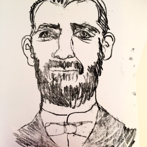
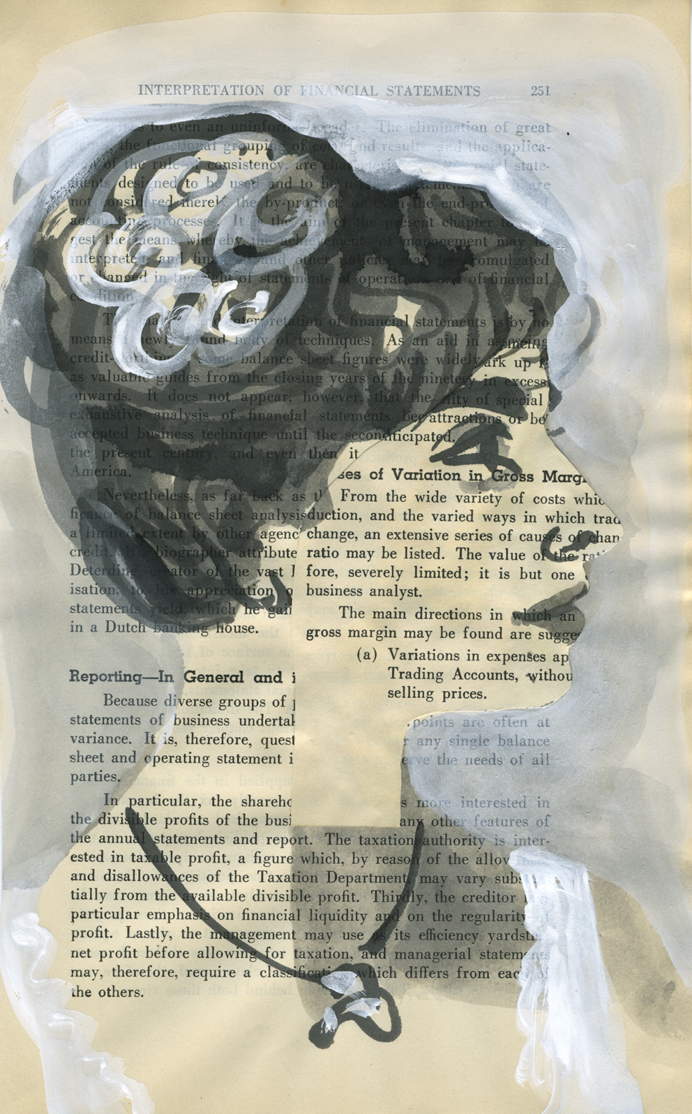
Bearded man – second take. (These were drawn from the same photo, so you can see that I was not attempting to achieve a likeness.) This is the image that I was most pleased with. I have an irresistible urge to add an off yellow background and pink to his tie, so he may yet be ruined, but I have taken the precaution this morning of gluing him to a cardboard backing in order to prevent buckling when I take paint to him.

This chap had a rather ridiculous face in the original photo. And my rendition made him possibly more ridiculous. But he does rather remind me of an idiotic version of Jude Law. (sorry Jude Law.)
After completing a few other prints, including the frilly little lass at the top of the post, I brought the prints indoors to dry so that I could add colour. I started with the first bearded man, because the outline was too weak to stand alone and I thought that by adding colour I’d either ruin it (and not mind) or redeem it.


Actually, I did neither.
The paper buckled a little but not too much as it is a heavy weight paper. I solidified some of the outlines and I had an absolute ball throwing the colour on. But I’m not overly excited about him. And I didn’t leave enough white space for him to breathe. He may have been better on a white background.

I then added colour to clown-like ‘Jude Law’. By golly it was fun to slosh the paint on a large piece of paper! I stopped after that. The girl would not benefit from colour and the other bearded man, being my favourite, deserved some thought and a backing board before proceeding, if at all.
I’ve now done the backing board, and I must decide his fate!