I will get back to posting soon. Just very busy with Thunderstorm Dancing for the moment and time is short:-)

I will get back to posting soon. Just very busy with Thunderstorm Dancing for the moment and time is short:-)

It is hard to write with conté.

I must keep going with the indian ink and not look down… or sideways, or upwards. Especially upwards.
I have been struggling with my roughs for Thunderstorm Dancing. The text is wonderful. The possibilities are endless. This is part of the problem. Endless possibilities are hard to deal with.
I’ve been working with pencils. Love those pencils, but when I have to draw eight characters (including Lucy the dog) interacting on the one spread, the pencil is not my friend. It is not broad enough. I tend to get all fiddly and fussy. I need to use loose lines to get those bodies expressing dance and play.

Lucy and Alice climbing on to the porch. Pencil looking great here. Only two characters and simple composition.
Then, today, when I was feeling a little lost and in need of help, I also made the mistake of looking at Alexis Deacon‘s blog. Aaaargh!! Begone Alexis, Thou Obscenely Talented Man!
Alexis is herewith banned from my studio until I am happy with my roughs. Then I’ll feast my eyes again on his fabulousness.
So what to do? I needed to strike out in a different direction; re-boot the old drawing engine.
I selected a large piece of my most rubbishy paper (ignoring the sticky note at the top of my drawing board), picked up a brush and dipped it into the Noodler’s Ink.

One of the notes at the top of my drawing board. Cecily Osborn was my lovely school art teacher.
Big sigh! I could see some life returning to my drawings. Maybe Noodling is the way forward. Maybe it’s the medium to use. Maybe I need to Noodle my way into some happy compositions and then revert back to pencil when the shapes are right. At any rate it’s a lifeline for now (perhaps like one of those pool noodles you can use for flotation).

DESPERATE DRAWERS – DO NOT DIVE
Here are some of the quick, inky sketches. They’re only rough, but they have a bit of life. So…
A way forward for tomorrow.


I’d better tell you right now that I don’t have all the answers to this. But I have some ideas that grow (and will no doubt change) as I go along.
This cover is from the wonderful Will Schofield’s blog 50 Watts.
Two days ago I was working on Thunderstorm Dancing at the library. I decided to concentrate on the cover. The recurring challenge for the day was to find a clean simple arrangement of four main elements: title (longish), two creator names, two leading characters in upbeat active pose (is that really two elements?), suggestion of approaching storm preferably including a big, dark cloudy area.
Thoughts on book covers


Great contrast and clarity but still has texture and painterliness.
A complicated image, but still clear to take in. Possibly helps that the book is HUGE.

A contemporary style. I might have skipped the white drop shadow on the title text. I love the texture on the bird and the string and how the string leads us to the title.
This is a copy of the original, and the hand lettering has been replaced by fake hand lettering. A pity, but it still works!

Also a copy, but so completely delicious! look at that colour contrast and all that ‘white’ space!
This might have been helped by a bit of extra contrast somewhere, but they’re going for soft and that’s okay. It’s not ground-breaking, but one of those tried and true working formulae.

Perfection. Again, a re-hashed concept. See the latest reprints of Goscinny & Sempé’s Nicholas books (Phaidon) for something very similar. But it’s so good, why not? This book, by the way, is a divine thing. It is like a meshing of Sempé and William Steig (Pete’s a Pizza). I’m buying a copy.
So that was my work day at the library. Yesterday I got home from an appointment to find a parcel on my doorstep with a book by Kang Woo Hyon called ‘Point Story’. Reading that clarified my book cover thoughts even further, with regards to simplicity, contrast and the beauty of the painter’s mark. So I am filled with ideas to move forward now!

From ‘Point Story’ by Kang Woo Hyon from NAMIbooks.
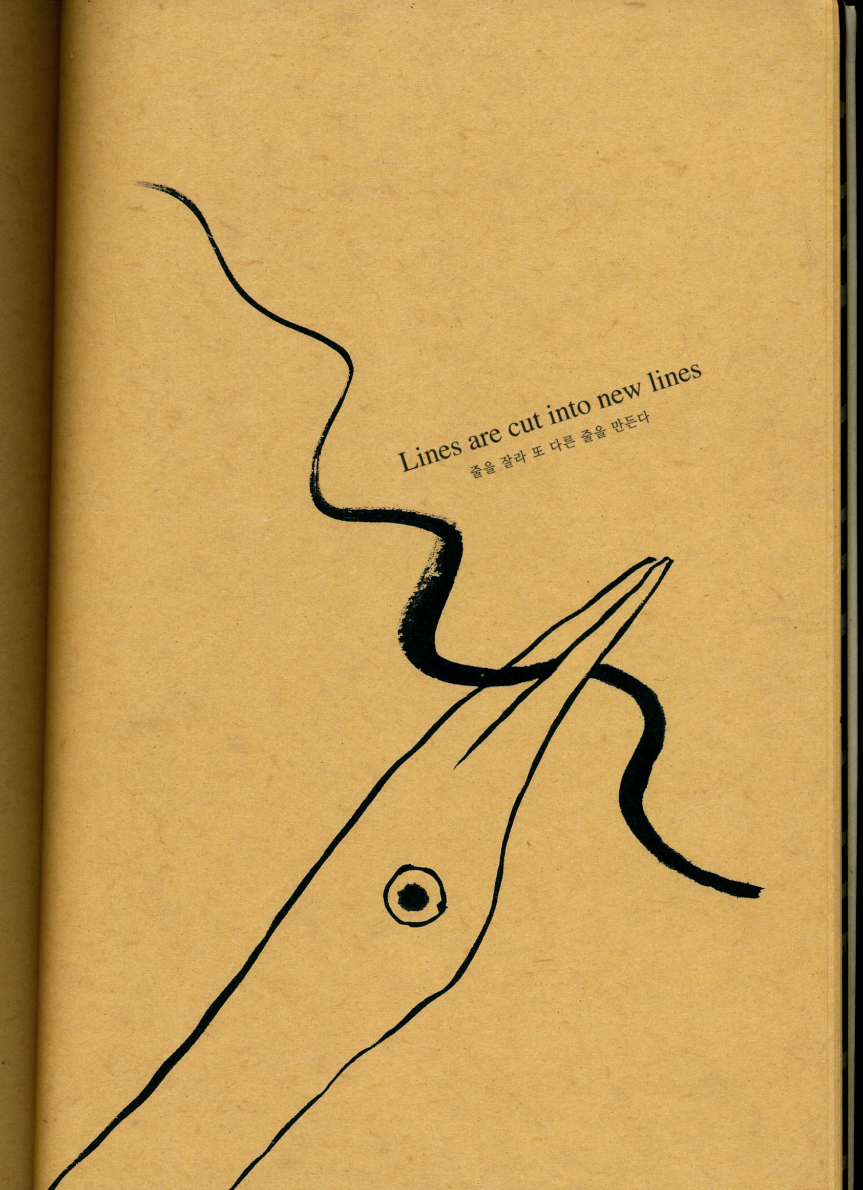
Also from Point Story. Go here to see more about NAMI books and Nami Island.
Sorry this was so long (and WordPress seems to be cramping all my paragraphs together. That’s not a good look).
Cheers!
I am currently illustrating a picture book by Katrina Germein called Thunderstorm Dancing, about a family celebrating a thunderstorm. Guess what I’m using? Yep, pencils! (and ink, and watercolour, and… I’ll probably see how I go with that lot and then improvise.)
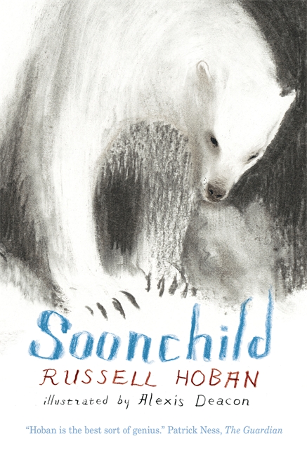
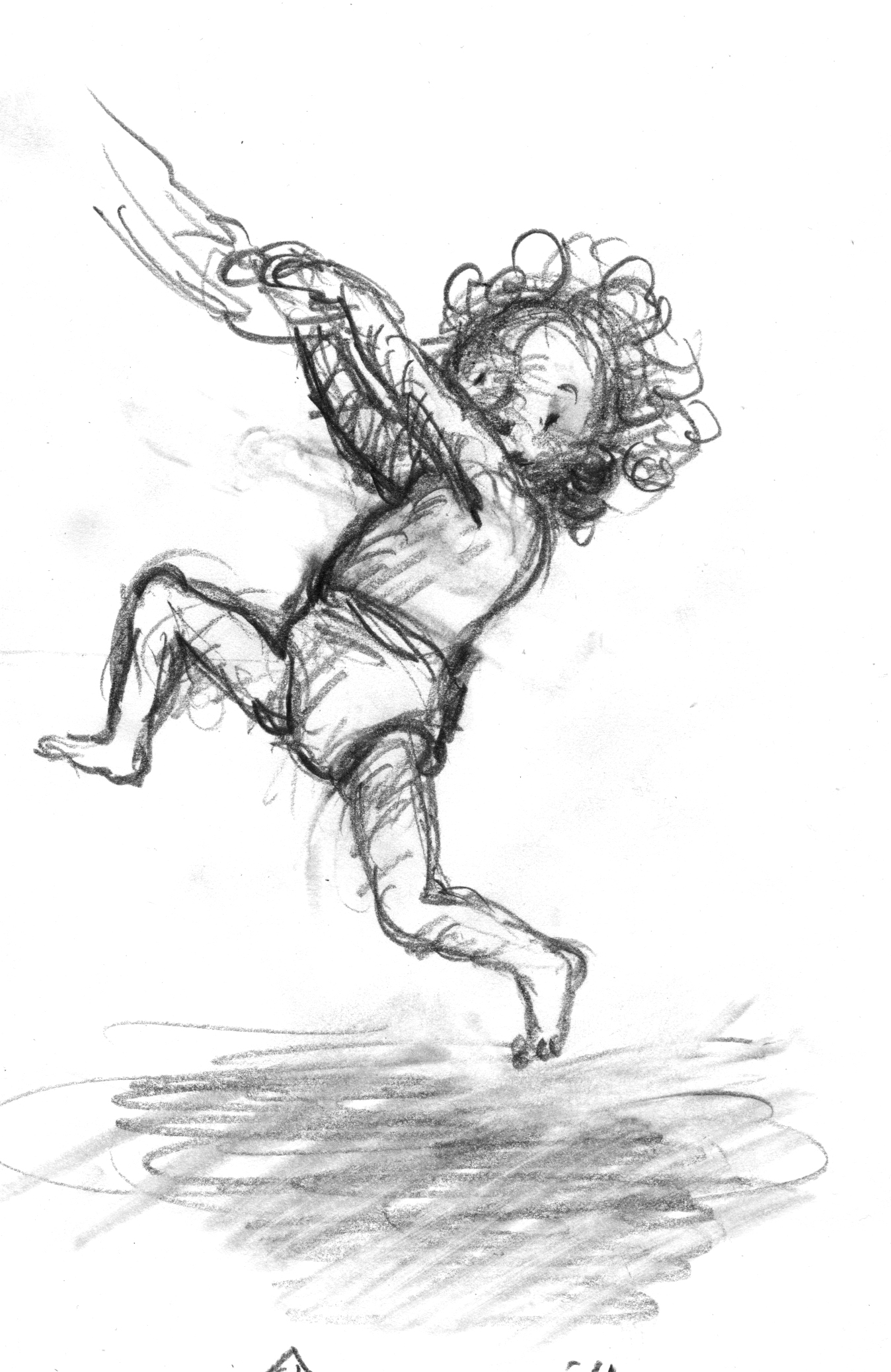
Along with texture and line, I am interested in the pattern of light and dark on the page, and I’m making thundery, stormy, windy shapes on my spreads. I love a nice bit of hatching, smudging, scribbling, and a bit of broken line – the indistinct glory of the printmaker’s mark; or the partly erased first, second or third attempt to render a leg in charcoal or pencil. So working in the library the other day, I blissfully looked up some of my favourite illustrators to soak up their inky, graphitey, smudgy vibes. One of them was Alexis Deacon. The books I was expecting to find on the shelves weren’t there (Beegu, Jitterbug Jam) But there was one. Soonchild! In the young adult section. Mmmm… I borrowed it.
I haven’t started reading it yet, but already I know I need to buy a copy to keep. Just because of Alexis Deacon’s comments in the back of the book, I would buy a copy. About working on this book, he says, ‘Snowy Owl Spirit children, past-wrong ghost wolves, evil mini whalebone demons… I lived with these characters for over a year. I wish it could have been ten.’ (Anyone who feels that way about the story they have spent months illustrating is giving an endorsement I can’t ignore.)
But then there are the illustrations. Oooh, yess. On one spread there is a swirl of (I assume) the aforementioned past-wrong ghost wolves encircling the double page spread like a cyclone – similar to the cyclone form I am using for a spread in Thunderstorm Dancing – but spookier! It reminded me instantly of Pat Marriott’s drawings for Joan Aiken‘s classic book The Wolves of Willoughby Chase. Nothing alike really… but just as scrumptious. (By the way, a quick search for Pat on the internet has brought to light the exciting rumour that Pat Marriott was actually Edward Gorey in disguise! Well, one of his assumed names for early illustrations of Aiken’s books. Is this true? If so I will have to evict the mental image I have of Pat Marriott as a mysterious female.) The rumour link is here. But I don’t know if it will stay.
Anyway, bravo Russell Hoban and Alexis Deacon!
The wonderful Russell Hoban died in December last year, but happily got to hold this beautiful book in his hands before he left. And I’m sure the writing will be just as glorious as the book itself. At the moment I can’t comment on the story. I haven’t read the book yet, only drooled over it.