Tag Archives: Thunderstorm Dancing

Musings on drawing and architecture from a non-straight-liner

From Tansy Magill by Carol Ann Martin

Some people can draw any building or interior with a sensitivity that invests it with warmth and personality. I truly admire them. For me, all those straight lines are problematic. I don’t feel any love for drawing architectural shapes, even though I love architecture itself. I prefer the outdoors and organic forms, including people and animals. The surface textures, the curved lines and the movement of figures or landscape are much easier for me to successfully express.

Most illustrated books require at least some built spaces to be drawn, and I’ve dealt with this in different ways for different book projects. Here are a few of them.

Cover design by Sandra Nobes for ABC Kids (HarperCollins). I remember getting emotional when the publisher suggested the mice could be printed with a spot varnish. I felt that being soft and velvety creatures, they shouldn’t be made hard and shiny! I get quite attached to all the characters in my books and become a bit protective. Embarrassing, but true.

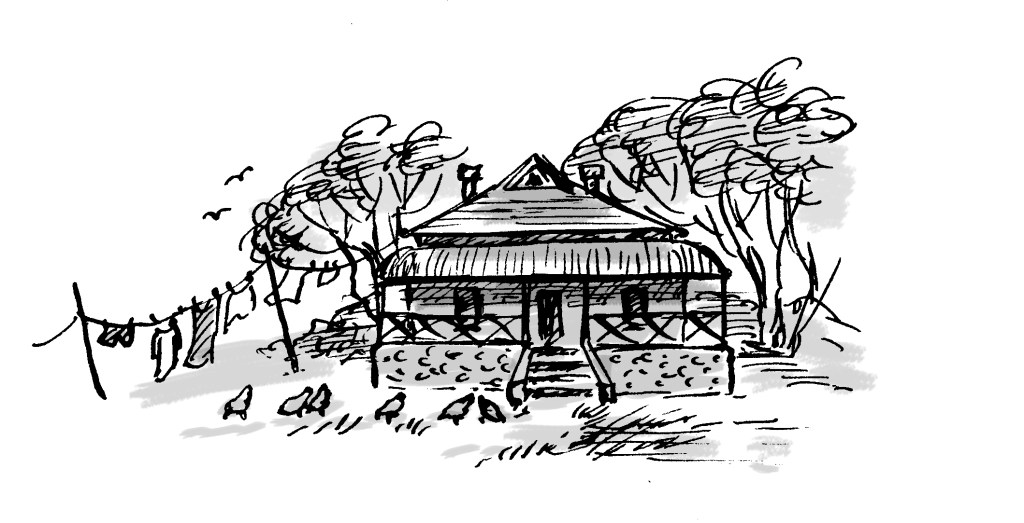
In Goodnight, Mice! By Frances Watts, I made the house organic, the walls, doorways and furniture curved. I took my inspiration from straw bale homes, wattle and daub homes, and hand-crafted furniture. Using a dip pen and ink, there was little opportunity to be overly fussy. Drawing with a dip pen sometimes feels like trying to control a half wild pony that’s running away with me.

The opening scene from Goodnight, Mice! showing a very small house with an enviable chimney.
Getting ready for bed, and selecting a book from a rather quirky bookcase.
The kind of bed that inspired the mousy furniture. (The mice must have used much smaller sticks!)
Sandra Nobes also designed this cover, for Allen and Unwin.
The book has just been re-released in paperback. Hooray!

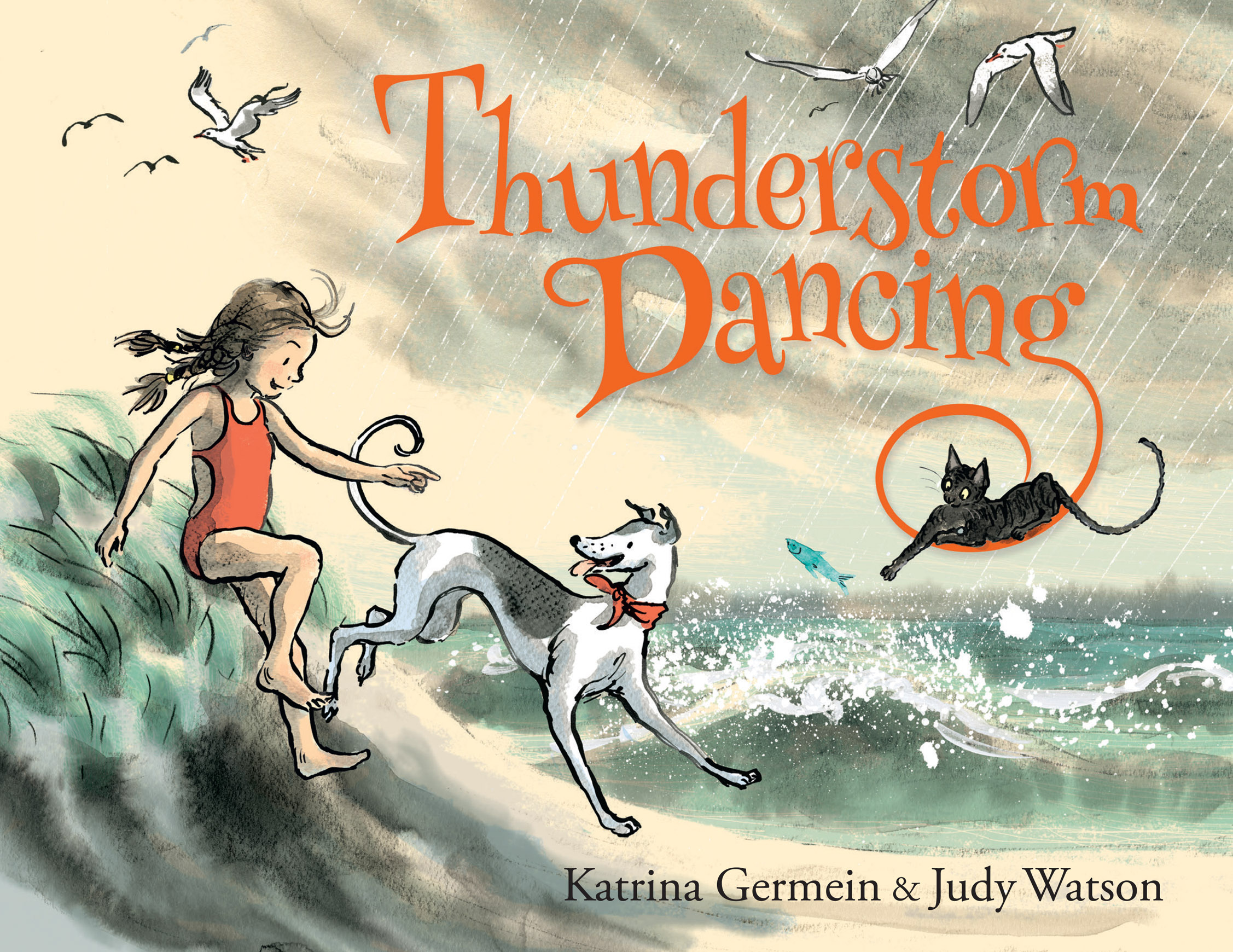
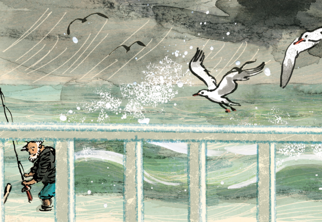
With Thunderstorm Dancing by Katrina Germein, I was happy with the small drawing I did for the back cover (below). Perhaps it worked for me because of the loose lines of the dip pen but especially because of the small size. There’s no room to fuss with a 30mm wide building. Snuggling the building into the hill and embedding it in a stormy sky helps to give it a certain ‘rightness’. It takes on the personality of its surroundings.

A small windswept beach house and matching chook shed for the back cover of Thunderstorm Dancing.

The veranda was perhaps not as successful as I would have liked, being rather stiff, but I made the focus the stormy lighting; the contrast between dark clouds and the golden late afternoon glow of the beach and figures. I added texture to soften it a little. Eep!

A lot of straight lines for a non-straight-liner! Hopefully the focus remains firmly on the atmosphere.
An interior that had to look warm and cosy, yet storm-lit. My selection
of furniture reflects again my need to put curves in wherever possible! And it is funny to me
to see how often my colour scheme is a soft, bright red and a greenish teal.
This lovely cover design is by Amanda Tarlau, for Walker Books.

My garden shed from Searching for Cicadas by Lesley Gibbes, was created in a similar way. Mostly pencil and wash, but with added texture and digital colour. (Note the soft red and greenish teal colour scheme!) My architecture leaves room for improvement, but hopefully the warmth of the characters on the page, the light, foliage and pets set the right tone. And on the next page, we happily marched off into the bushland away from human structures! Phew!

Another black cat. I have a one-eyed black foster cat climbing over my drawing board as I’m typing this
and my three-legged dog Noodle appears in the illustration, proudly flourishing four entire legs.
Off into the natural world.

I also have an unpublished project, where the my buildings again reject straight lines. Based on the trulli of the Puglia region in Italy, they have lovely domed roofs and soft curving interiors. I even stayed in a glorious trullo here, and did some research for my illustrations.

Trulli from a dummy book
Trulli homes in Ostuni, Italy.

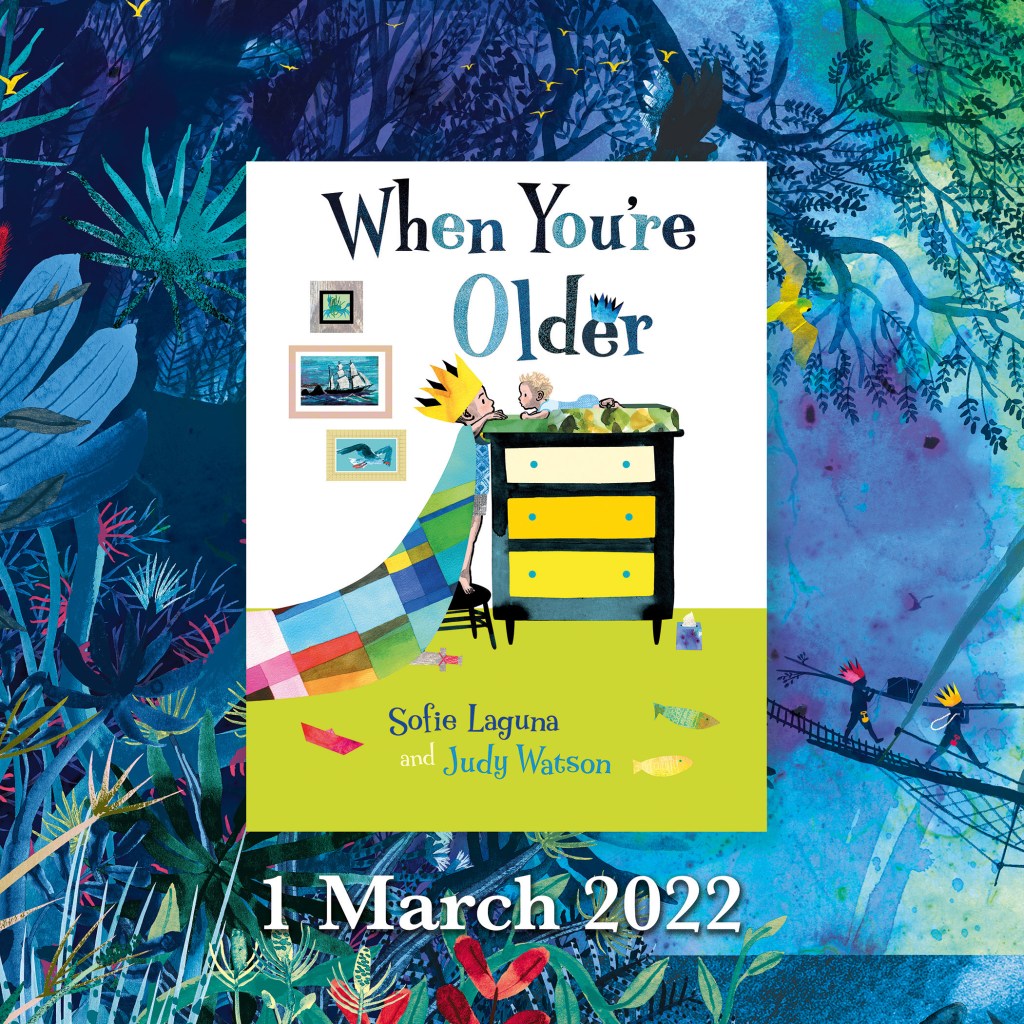
But it was exciting to take a different approach to the house in When You’re Older by Sofie Laguna. Here I used the straight lines of the room and other man-made objects to my advantage. I accentuated them, taking inspiration from the marvellous Ezra Jack Keats and pared them back to simple blocks of colour that mimic paper collage. Now they acted as a foil to the scenes beginning on the next page, where the story moves into the imagination and benefits from a strong contrast in style.

I know you’ve seen it already, but here is the cover of When You’re Older,
designed by Sandra Nobes for Allen and Unwin. Out 1 March 2022.
Straight lines, no regrets. The opening bedroom illustration in When You’re Older.

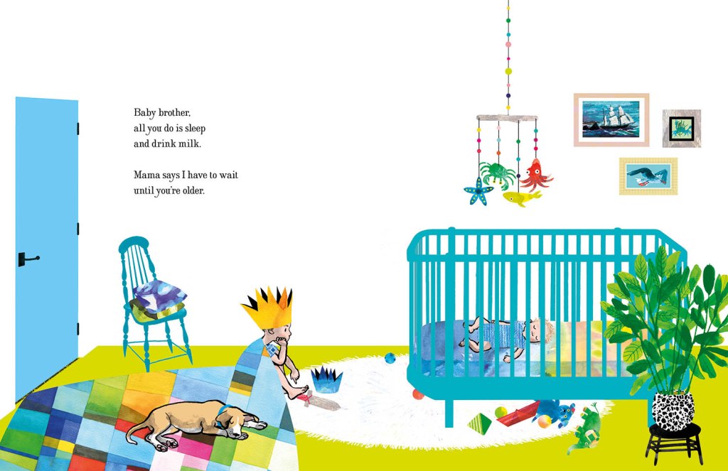
In the bedroom at the start of the narrative, we have animals and ships on wild seas contained in frames that have been reduced to a series of rectangles with no attempt to suggest a hook or a natural hanging angle. The boy too is sitting, waiting in a rectangular room like the paintings in their frames. But the small animals dotted around the room, the houseplant and the two kinds of boat (origami and painted) have fed his prodigious imagination which breaks loose as we turn the page.

Rampant curves and movement take over the book from here. (Do I spy soft red and greenish teal?)

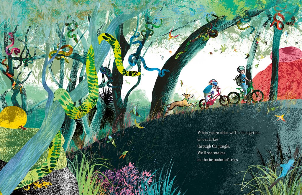
Here everything has broken out of its containment and we see the beginning of an undulating landscape, teeming with life and with an exaggerated forward slant like a slingshot that has just been released to propel our characters forward into the world.

I’ve used the solid graphic shapes here and there through the book, most often for man-made things like bikes, ladders, tents, and the fanciful double-ringed shape that suggests a view  through binoculars. So the contrast between rampant texture and solid graphic shapes continues. But on the pages dedicated to the immense power of nature, it is not really in evidence at all, and expressive brushstrokes set the entire scene until we return at last to our original bedroom.

Upcoming events to celebrate When You’re Older

Wednesday 23 March to Tuesday 19 April
Colour, Line and Collage: Mixed media works in and around books.
Exhibition of original works including the patchwork paintings featured in When You’re Older. Some prints of the illustrations will also be available to order.
At Streamline Publishing and Gallery
22 Commercial Place, Eltham 3095
Open Wednesday to Saturday 11am – 4pm, Every second Sunday 1pm – 4pm.
Enter from the Town Square.
Above Eltham Bookshop

Saturday 26 March – kids’ drawing / collage workshops and signed book sales.
Frankston Library
60 Playne Street, Frankston
Phone 03 9784 1020

Sunday 3 April WORKSHOP 2.30pm – 5.30pm
STORYBOARDING – taking a text and moulding its shape on the page.
A book illustration workshop for adults and young adults.
This three hour workshop will be hosted by
Eltham Bookshop and held at Streamline Publishing and Gallery
22 Commercial Place, Eltham 3095 (Above the bookshop)
To coincide with the launch of When You’re Older and the exhibition
Colour, Line and Collage: Mixed media works in and around books.
I will take participants through my process: How I responded to Sofie Laguna’s text and, together with the publishing team, brought her words together with my ideas to create finished art for the book. After a short break, participants will use a sample text to create a storyboard of their own.
Entry $80 includes a signed copy of the book, light refreshments and all materials.
Bookings can be made through Eltham Bookshop
Tel: (03) 9439 8700
Email: books@elthambookshop.com.au

Thunderstorm Dancing – nearly a book

Thunderstorm Dancing cover lores


Here it is! the finished cover and what you will see in the shops from next April. Currently it is away being made into a book, with paper and ink and all that stuff we like.

As with childbirth… all the grunting and groaning is fading away, and soon I won’t remember that it was difficult at all :-)


Catching up

Hello! I’ve been a bit absent! Thunder is finished and off to the printers! I’m looking forward to seeing an advance copy in early January. It’s taken a few weeks to just get myself into drawing again. That’s not something I anticipated. And there are a lot of other things that I need to catch up with now that I’ve finished that mammoth project… including Christmas!

I had a great day with Ann James and Justine Alltimes last Monday, designing a poster for Jackie French, our Australian Children’s Laureate. Her project Share a Story will revolve around the ideas on the poster/calendar which will be available for free download by Christmas.

Ann James is a well known and skilled Australian children’s illustrator. Justine Alltimes is one of the hardworking and capable Laureate Project Managers. When the three of us get together, the ideas ping about like pinballs. After Ann had drawn and painted some images, I was able to alter them digitally to make new, and hopefully intriguing combinations, that will work well together on the poster and spark the storytelling imaginations of children, teachers and parents. The challenge was to avoid the literal interpretations of words like Slurp a Story and instead to come up with images that were open-ended or suggestive. We want starting points for stories, not stories in themselves.

More on Share a Story when the poster is released.

Other work in progress includes an illustration of Phar Lap for the front cover of a colouring book for the Melbourne Museum to match the dinosaur one I did a couple of years ago. As always with work done for Museum Victoria, I learn heaps along the way as I research the topic! Glad to find out that Phar Lap was probably not deliberately or even accidentally poisoned. Not that it made much difference to the poor horse, but he most likely died of colic related to a rare disease of the intestinal tract.

MMDinoColBk_FRONT.jpg

The 52 Week Illustration Challenge forges on towards the finish, but will return next year. I wasn’t feeling like drawing for this either, for a couple of weeks. So I’ve missed Week 47 New York, but I may go back to that. Although drawing New York itself holds little attraction for me, the New Yorker and its famous cartoons hold enormous appeal for me. So I think I need to do a New Yorker style cartoon. But of what?…

Tim and Tig New Yorker

A page from ‘Tim and Tig’

Above is an illustration I did for Aussie Nibble – Tim & Tig many years ago. I illustrated Tim and Tig just after receiving a copy of the Complete Cartoons of the New Yorker; a fantastic book that had a powerful influence on my drawing! Many of the illos in Tim and Tig, I’d wish to do again and much better, but this one I still like.

Now that I think of it, I did do some quick doodles for Week 46 Circus. (Oh dear. What a rambling post.)

The Twisted Princess tidies her tresses

The Twisted Princess tidies her tresses

This doodle was on the bottom of a Thunder illustration. You may see a wee peek of the washy water top right, and it ran completely off the page. It started as a doodle and then I got mesmerised by the leotard pattern. Actually, this led my mind off in the direction of a series of paintings I’d like to do…

This brings me to last week’s theme. Week 48 Fox. In a shocking twist of fate, I found that the topic had long ago been changed from Chicken to Fox! Horrors!

I did some fox doodles while I was waiting for the kids to get out of drama class and below you can see them.

Deadly Maggie

Deadly Maggie

This was a fennec sketch in an old book. I added some digital colour experimentally (even though fennecs are creamy in colour). It’s not entirely successful but there are elements of it that I like, including the scratching into top layers of colour; a Thunder habit that may continue for some time. Perhaps lead into interesting new areas.

fox cub judywatsonart lores

A very innocent young blob fox.

By contrast, this little blob fox is not deadly. This was my protest on behalf of my chickens.

Contortionist fox

Contortionist fox

I liked the tail hatching on this one, and also the two tone retro feel, but it was certainly rushed. Not what you’d call finished work.

The Fox with the No.6 Tattoo

The Fox with the No.6 Tattoo

Lastly, this fellow. The fox with the No. 6 Tattoo. I liked his eyes and expression. He seems to have a canny and sophisticated air about him. I added some very flat colour panels in Photoshop trying to keep it sympathetic to his stylised and simple form and I like the result.


Swirling and Swinging

P24 Lachie judywatsonart lores

This afternoon I finished the second last illustration for Thunderstorm Dancing, which I should add is yet to be approved as the editor is not in the office today.

All being well, I’m now working on the last illustration for the book. I can hardly believe it. Wish me luck!

scribble cornish judywatsonart lores

This is not from Thunderstorm Dancing. This is a scribble-of-joy.

Okay… so this Scribble Cornish may exhibit some slight exaggerations of conformation… but the rest is true :-)


Cornish Cat working on the weekend :)

profile alice cat judywatsonart loresPhew! That’s half the spread fixed.

I spent a day on Thursday working on this page, and was really unhappy with the results at the end of the day, so it was back to the drawing board and a re-work of this character group. It might not have mattered so much if it were a busy page. But this is a section of the still page. It has to be right…

err… now I’m looking and finding a few things I might tweak… But not today. Time to spend time with my boys.

So the page 25 Cat-Called-Thunder and Alice are working to my satisfaction. I’ve just got to finish off the seven other members of the family! (laughs hysterically)


The writing/drawing process July 2014

At the start of the school holidays, I was invited by artist Rosalie Street to participate in a blog tour… which means answering some questions (below) and getting some other people to do the same next.

Here is Rosalie’s interview response. A visit to her blog to enjoy her lush canvases and delightful merchandise is well worth your while.

gold leaf by Rosalie Street

Gold Leaf – by Rosalie Street

The blog tour topic is The Writing/ Drawing Process. Since as yet, I have found little time to work on my writing projects and instead have been madly drawing, I’ll answer the questions in the context of my artwork.

The first bit (the questions)

1. What am I working on ?

Thunderstorm Dancing, a picture book by Katrina Germein

At the moment I am in the late stages of final art for a picture book by Katrina Germein to be published by Allen & Unwin. The book is called Thunderstorm Dancing and it has been over two years since I first starting mulling over the project.

As soon as I read the manuscript, I thought it would be both a great text and a very difficult text to illustrate. It has indeed proven difficult for me, but I also realise that I suffered from the internal pressure that comes from winning an award; this will be the first of my work to be published since that award and my inner self told me very sternly that it will have to be good. But I now move towards the completion of the book and I’m looking forward to seeing it in print.

An unused sketch for 'Thunderstorm Dancing'

An unused sketch for ‘Thunderstorm Dancing’

There have been many sketches made for this book. A decision on medium was elusive for a while. But it came along in the end, and I’ve really enjoyed the layering and scratching in PhotoShop combined with the earthy texture of the real paint and pencil on Litho paper.

A small fragment of one final illustration from Thunderstorm Dancing

A small fragment of one final illustration from Thunderstorm Dancing

Altered book art

Last year, while struggling to progress with the picture book, I almost accidentally began sketching in old books as a form of relaxation. I say almost accidentally, because I have admired altered book art and found poetry for quite some time, and had always intended to try it. But starting was not a deliberate step into something new. It was a gentle bit of play, while watching my children in their swimming lessons.

drybrush sketches in the bombing zone of the local swimming pool. Ink on vintage book page.

drybrush sketches in the bombing zone of the local swimming pool. Ink on vintage book page.

I began sketching them and other children. And I really loved the effect of the drawn image on the printed page. It also helped me with Thunderstorm Dancing, because I had decided early on that the family in the story would be at a beach house, and the main characters all in swimming cosies.

Altered book art continues to be one of my favourite activities, and I intend to do much more of it, and to explore new ways of using it in art projects.

52 Week Illustration Challenge

The 52 Week Illustration Challenge, dreamed up by Tania McCartney, was something I joined early this year. It requires participants to produce artwork to a given theme that changes each Wednesday, and then post them on the 52 Week Illustration Challenge FaceBook page.

Week 14: simplicity. This was a really enjoyable experiment with ink and watercolour

52 Week Illustration Challenge: Week 14: simplicity.
This was a really enjoyable experiment with ink and watercolour

One of the things I loved about it was that the community of people involved were from varied backgrounds and were supportive and kind to one another. Since early this year the group has grown to over 2000 members, many being expert practising artists and the standard of work has I think, sadly frightened many of the less skilled artists away, but the mood of generosity remains. And it is surprisingly good to have a theme to work to each week… often themes that I find very unappealing until they lead me off into some fun experimentation.

I have deliberately kept this challenge as a low-profile task for myself. I never spend long on anything I do for The Challenge and never worry too much if the work is imperfect or not my best. This, along with blogging imperfect work, has been a really healthy learning experience, and a great way to keep producing lots of other work and exploring as an artist, as well as doing my book project.

Clive Hicks-Jenkins’ Puppet Challenge

This is an on-line exhibition organised and curated by Clive Hick-Jenkins along with Peter Slight. I’ve not done so well with this one. In contrast to the other challenge, I have allowed this to become larger than life and daunting. I also failed to come to a decision over subject and medium, although my lightbulb moment came today in the shower (they often do happen there) when I may be too late to make it. So I’m not sure if that counts as something I’m working on or not…

Appropriately perplexed looking sketch of Greyfur the kangaroo who was my original subject matter for the puppet challenge

Appropriately perplexed looking sketch of Greyfur the kangaroo who was my original subject matter for the puppet challenge

Graphic design work

Periodically I take up graphic design work if it is not too time consuming. I enjoy this work very much, but too often lately I have had to decline offers of work due to the unfinished book and lack of time. Some of my favourite work is with the Australian Children’s Laureate support team who produce various publications and branding items every now and then. In this context I enjoy using other artists’ work and modifying it to use as part of a design. Ann James drew the magpie who became the Australian Children’s Laureate logo and I have used him in lots of ways.

The Australian Children's Laureate logo in one of its formats

The Australian Children’s Laureate logo in one of its formats

School children from around Australia made artwork that I used in silhouette for the pitch for Boori Monty Pryor’s Storykeepers documentary.

storykeeprs sample page storykeeprs sample page2 storykeeprs sample page3

Family life

This project of course doesn’t belong down the bottom here. It’s a very big part of my life – too big to summarise here. So I’ll simply say that I keep myself busy with two much loved youngsters Arthur and Hugo, husband Scott, the dog Dexter and chickens Hilda, Emily, Poppy, Storm, Stella and Vita.

Vita - Queen of the Backyard

Vita – Queen of the Backyard

My own writing projects

This gets a wee mention at the bottom. In fact there are several projects I’m very keen to get on to, that are waiting in line for me to find a bit of space and time. I look forward to launching into them.

2. How does my work differ from others of this genre/ style?

Watch this space

3. Why do I draw/ paint what I do ?

Watch this space too

4. How does my drawing process work ?

Hmmmm…

I have taken waaaay too long answering the first question, so I’m going to split this up and post my answer to the other questions later. Cheerio for now!

Pinterest

A few days ago I got around to joining Pinterest and have started to organise some of my work into boards. It is really quite a useful thing to be able to view a set of work at a glance. I’ve put some Thunderstorm Dancing fragments and working sketches on there too. Nice to bring it together and see what changes have occurred over 2 years!

Here I am if you want to visit me.

pinterest Thunder sample

My altered Book art is there too. But there’s a lot in my cupboard! Only some of it is on Pinterest. I’ll update it over time.

Judywatson Altered Book Art Pinterest sample