Tag Archives: ink

Kick-About #57 Mervyn Peake

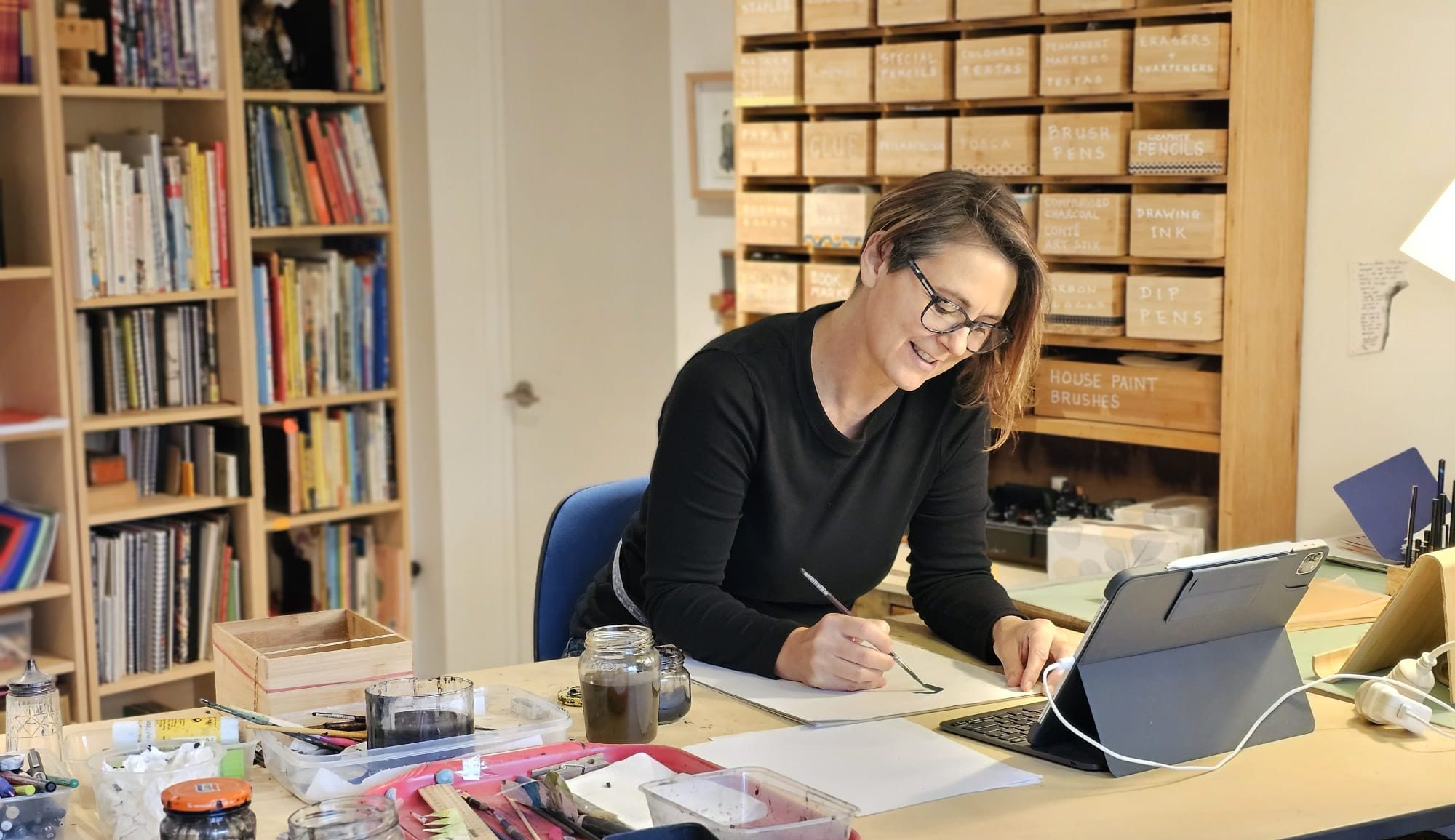
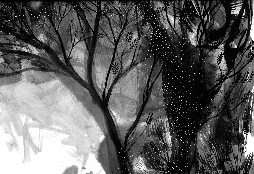
The prompt for the 57th Kick-About is the drawings of painter, illustrator, author, poet and war artist, Mervyn Peake.

Peake was the author and illustrator of the Gormenghast series which has taken on cult status since the publication of the first book Titus Groan in 1946. But for some it’s too dark, daunting. It’s usually classified as a fantasy, but it contains no magic other than the magic of Peake’s imagination.

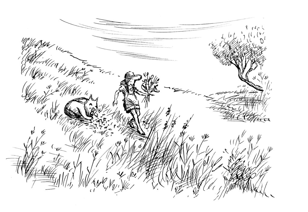
Peake was also a war artist. He was one of the first civilians to enter the German concentration camp at Belsen in 1945, an experience that had a profound effect upon him. His work was sometimes dark and grotesque. Other times his drawings expressed delicacy and softness, but they always emitted an intensity of personality and his use of light and shadow lifted even the prettiest of subjects far above anything that might be labeled saccharine. And then there are his drawings for his children. I have a copy of The Sunday Books, a collection of spontaneous creations he made on demand for his two small sons. In these, the images are flawed in the most lovely way. They are simply what flowed from his pen in the moment, with no polish, no corrections.

While thinking about Peake, I’ve been thinking about ’caricatures’. I’m not a fan of caricatures. Years ago, when a friend introduced me to someone who had no understanding of book illustration, the person said something along the lines of ’Oh you do caricatures! They are so clever!’ I confess I was horrified to be thought of as a caricaturist. (There’s something weird and fragile going on there, but we’ll leave that for now.) Some of Peake’s book illustrations are precariously close to caricatures if a caricature is something that depicts a person in a grotesque way by exaggerating their features. And yet the sophistication and delicacy of the rendering is undeniable.

illustration by Mervyn Peake

And what is the purpose of illustration? It’s not to depict the banal reality of what we can see every day with our own eyes. It’s about expressing a feeling, a mood, an atmosphere. Or sparking a feeling or mood in the reader. And so it follows that a certain amount of well considered exaggeration goes with the territory.

There’s much to explore in response to Peake’s work, and I don’t think I can do it on one hit, so let us see where it takes me. But to begin with, it has taken me back to two mediums I loved in earlier years but have neglected more recently.

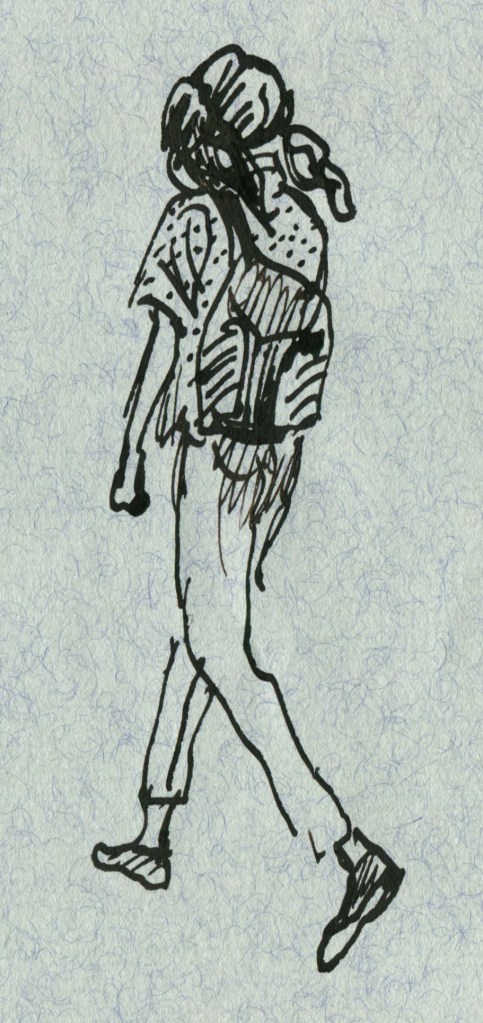
Pen and ink. Obviously this is all about the line. But it’s also about embracing a medium that can’t or won’t be fully controlled. I worked pretty small with these and just enjoyed making lots of small doodles. Perhaps some more finished work will come later.

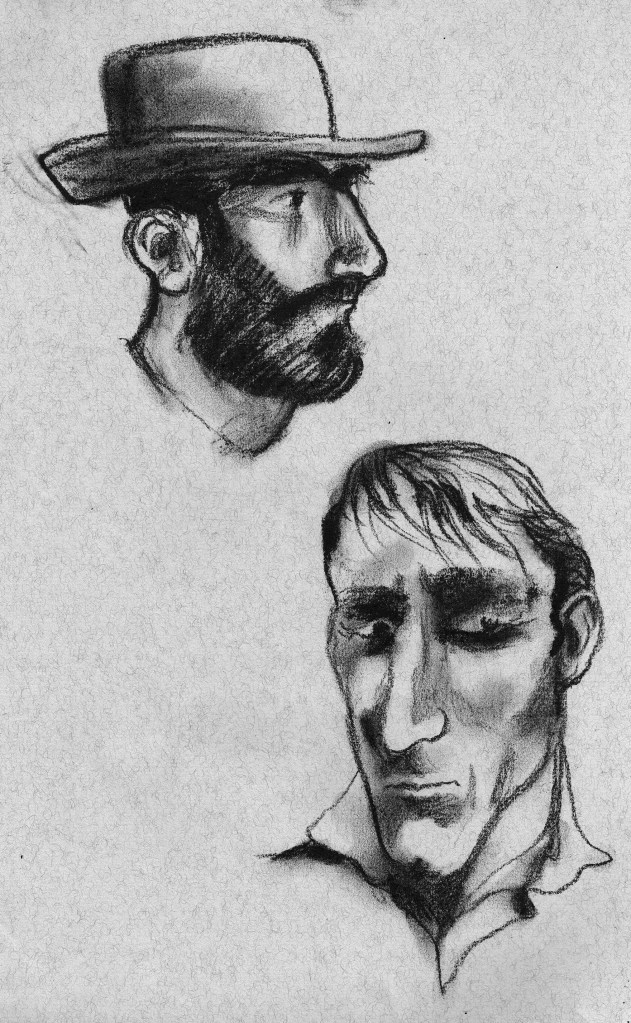
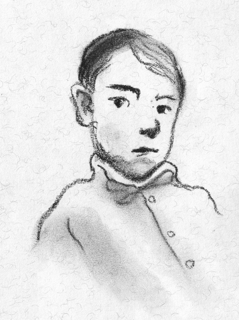
And charcoal or soft pastel. This is less about the line and more about the tone, but really it’s a delicate balance of both. And there’s an element of mystery that comes from the smudgy indistinctness. It feeds the imagination. I haven’t found my mojo again with this quite yet, but I have been enjoying the start of the journey.

These two are a bit obvious.
I like this little guy.

Lastly, I did a couple of tiny wash drawings with a touch of pencil detail.

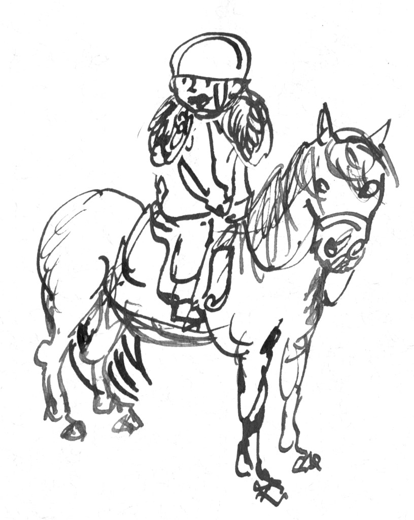
My daughter Remi at a fancy dress party a few years back.
My son Hugo listening to music in my studio the other day.
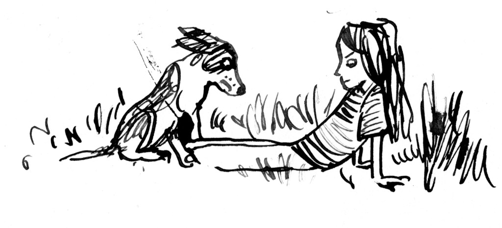
Another of Hugo.

Thanks again, Phil. It has been fun to provide the prompt this time around! x

Kick-About #38 Algae

I don’t know why I love this crab so much.

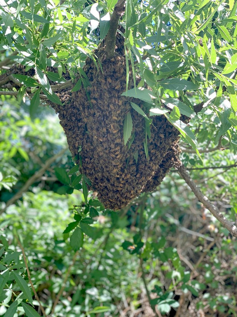
The prompt for the 38th Kick-About is one of Matisse’s lovely cut-outs, titled White Alga on Orange and Red Background. I’m a big fan of drawing with scissors as Matisse described it. But I didn’t pick up the scissors. For one thing, the bees kept swarming! Three more times. I mean, crikey! We have managed to capture each of the swarms. (Today I noticed that the neighbour‘s bees are swarming. I‘m letting that lot go.)

We now have not one hive, but four. The smallest swarm was successfully reunited with the original hive. I have learned so much in a fortnight! Because I absolutely can’t help myself, I have begun the process of naming the four hives after fictional places. (Scott argues in favour of One, Two, Three and Four. *sigh*)

The original hive is three boxes high, was neglected for the last few years, and became overpopulated. It’s no longer neglected or overpopulated, but it’s still tall. It is going to be either Gormenghast, or AnkhMorpork. Both are very appealing, so we will continue thinking about that.

The smallest new hive is called Dagobah. It’s getting supplementary feeding with sugar syrup. Some of those bees fell in the stormwater drain while we were bringing them down from an overhanging branch. I fished them out of the water with a net but things didn’t look good for the piles of cold, soggy bees on the ground and dark was falling, with rain forecast. (Told you we have been learning…) However, the next day when the sun reached them, they began to recover and almost all of them rose up in reincarnated glory and returned to the colony. After this swampy experience, the name seemed obvious. (There are several Star Wars fanatics in this household.)

The original swarm from my previous post is a Thing of Glory! It is buzzing and growing and brimming with pollen and nectar. Cells are filling with larvae as new bees are created. Hugo has named this hive Sanctaphrax. Perhaps he feels this new hive will be a home of intellectual pursuit and heroic deeds. At any rate, it’s a great opportunity to honour his favourite book series.

This only leaves one hive unnamed. It is middle sized and thriving. It has had a lucky beginning, in that we donated brood from the old city to help them build their new colony. I could name it Serendipity, but it has to be a fictional place. So we will think some more on that one.

Once again, I am talking more about bees than art! What is going on?

This is an accurate reflection of my world just at present, but it’s probably time to mention that as soon I saw the prompt for the Kick-About I thought of seaweed, (not bees) and in particular I thought of the seaweed I painted for When You’re Older by Sofie Laguna; the book I have just finished illustrating.

There are several pages featuring the sea in this book, and in three of them I took the opportunity to create underwater scenes full of colourful seaweed. So when I was working on ideas for the endpapers, one of them featured crabs and seaweed. I never finished this concept, because it didn’t seem as apt as some of the other ideas, but after spending a whole day painting tiny crabs, and working them into patterns, I did fall in love with the little guy at the top of this post, hiding behind his seaweed. He totally captured my heart. I made a few more little arrangements of crabs, but I wasn’t sure they worked as well when reduced in size.

Crabs. Are you confused? We’re on crabs now. Keep up!

Today I revisited the unfinished endpapers and played around a little bit more. They’re probably nicer on white, but hey.

And here are some small sections of this non-endpaper creation.

Thanks, Phil Gomm, for hosting the Kick-About. (I’m late again!)

Kick-About #37 plus Bees!

The prompt for the 37th Kick-About could hardly have been more suited to me and my natural inclinations. It’s inky and leafy and Australian. It’s Peter Mungkuri’s Punu Ngura (2019)

Punu Nura (Country with trees) © Peter Mungkuri, Iwantja Arts. 2019.

From the Yankunytjatjara, Southern Desert region comes this beautiful black and white ink drawing on paper by Peter Mungkuri. I’m glad this prompt was chosen because it has introduced me to Mungkuri’s work, which is perfectly balanced, sumptuously decorative and calmly natural all at the same time. It is well worth a visit to the Art Gallery of NSW website to see a collection of his work. Swoon!

What strikes me most is the combination of the loosest of ink splatters with far more careful and detailed patterning. I was going to explore some inkiness yesterday (Yep! Last minute again!) to see where an observation of Mungkuri’s work might take me, especially with regard to the use of white ink patterning over the top of the looser ink layers. But before I could begin something happened.

Our bees swarmed.

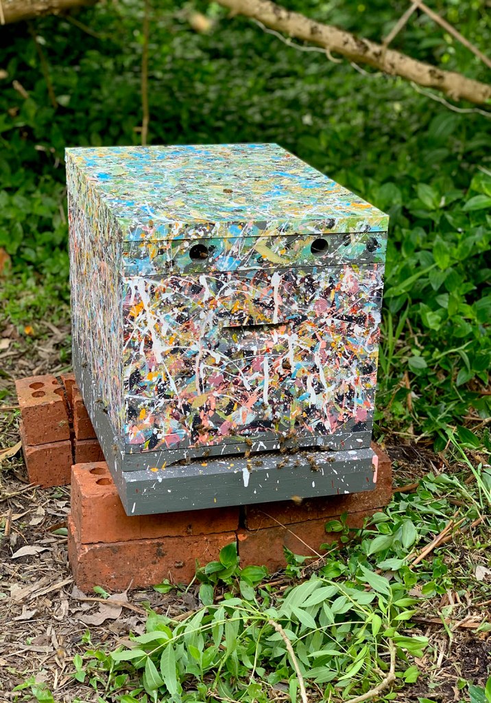
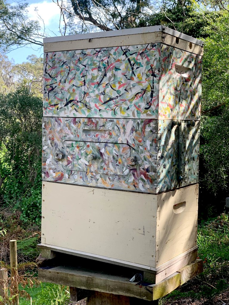
This happened last year and we weren’t prepared. The hive became overcrowded, and half the bees took off to find roomier accommodation. This time, we had not only added an extra box to our existing hive to give them extra space, but we had prepared a separate hive in case they swarmed, and had it ready for the new colony to use. Well, not perfectly ready. The frames were in, with wax and wire for the bees to build on. But I wasn’t completely finished with my exterior paint job.

This is the old hive with a new box added on top. But this colony is thriving and they needed more space than this.
New hive, unfinished. Artist dissatisfied.

This is our new hive in the middle of my paint assault a couple of weeks ago. I had to stop when the paint was so thickly applied that it needed a few hours to dry before I could apply anything more with a brush. Alas, other tasks have called me since then. I hadn’t yet reached a satisfactory conclusion when the bees swarmed.

I should be annoyed. Pesky bees. They sent me no email, no letter and didn’t phone to say they were leaving that day. Just… buzzed off.

But I’m not annoyed. Far from it. My spring day with the bees was uplifting, empowering, mindful and full of joy. So I’m ok with the paint job. In fact, we have installed the bees in the brood box only, so I can tweak the top box before we put it in position. The roof and base are harder to alter… but who knows what might be stealthily achieved at night with a daylight bulb…

So here is what happened in pictures (and just a few words).

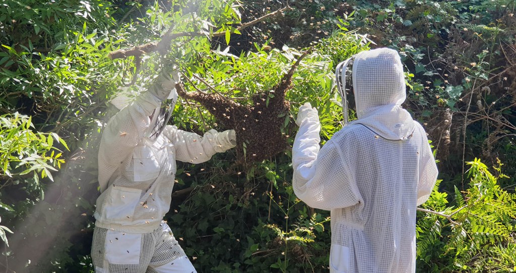
We were lucky with the location the bees chose to hang out. They congregated in the empty block next door, just by a storm water outlet, hanging from a conjunction of branches in a Desert Ash. It might have been over the storm water drain. It might have been up too high to reach without a ladder. But they chose a spot just reachable from the ground and just far enough away from the concrete drain that we didn’t risk falling into it. Phew! (I could have done without the blackberry canes though.)

First we suited up. Hugo, sorry about the shut-eye photo. It was you or me. (Blogger’s prerogative.)
Then I sawed through the main branch in order to lift the swarm down to the box. It was a bit tricky because there were several branches tangled together and the bees were dangling lower with every jiggle. The blackberries bit me. They have no respect for bee suits.
We gave the branch a firm shake and most of the bees dropped into the box.
Hugo and I then gently scooped as many bees as we could up and dropped them into the box. Hugo worked out where the queen bees was (inside) and we gently placed the lid on the box, whilst blowing bees out of harm’s way in an undignified manner.
With the tricky part over, we decided to sit in the sunshine (on the handy concrete drain) to watch the bees for a while. Some of the bees were fanning their wings near the entrance on the right. We guessed the queen was on the inside near that point and we were hopeful that all was well.

After this we stepped away and shook the bees off our suits. But then I had to go back to have another look. Just because.

This is what it looked like straight afterwards. The bees were slowly moving towards the entrance and going into the box.
A couple of hours later, almost all were inside the box. We moved them into their proper location beside the other hive after dark and all seems well today.

That evening, I had a bit of a go at my inky exploration of Peter Mungkuri’s plant drawings, but my mind was full of bees. And joy. So it became an illustration of Hugo and me, arms uplifted to the swarming bees.

In painting it, I was tumbling three things together: what happened last year (they swarmed and disappeared) what happened this year (they swarmed and we were in the middle of it) and what happens every year (we have a dead tree stump that disgorges thousands of tiny moths once a year and they spiral upwards into the sky in the early evening attracting a feeding frenzy of bird life. It is quite the annual spectacle.)

Finished painting. Scanned in 6 parts and assembled.

Thanks again, Phil Gomm, for hosting the Kick-About. Sorry I’m late!

The Kick-About #9 ‘Short Ride in a Fast Machine’

Hello from Locked Down Melbourne. We are a little way off the easing of restrictions, but they are on the horizon. I cleared out and organised my linen cupboard on the weekend. It brought me great comfort. I now realise that we have about 80 pillowcases. Hmmm.

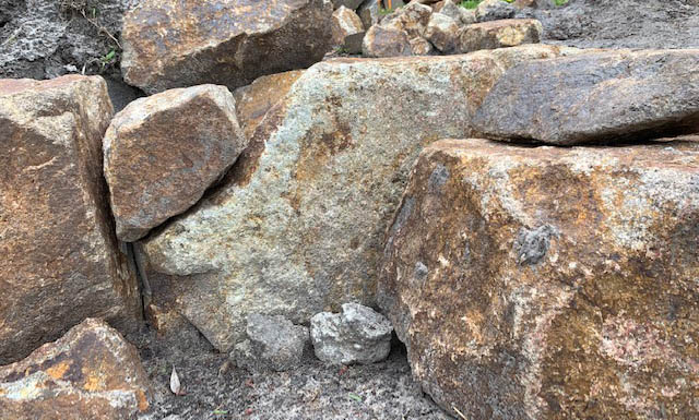
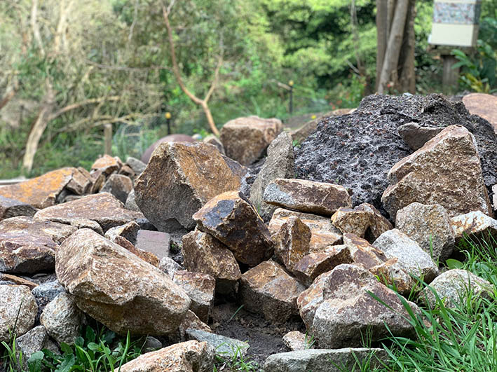
But today was the first day of spring. The hens are laying, the wild birds are fiercely courting, nesting, and engaging in aerial warfare. The garden is in uproar where Scott has been landscaping with giant rocks. The garden is his sandpit. And also his linen cupboard.

Oh yes! The kick-about. This was an inspired choice of prompt. We were to respond to a very lively piece of music, to blow away the cobwebs. In truth, I think I am still stuck in the Kick-About #7 Ennui, but the idea of having energy and the space and freedom to expend it is appealing. I listened to the music while walking around the local nature reserve on a windy, sunny day. It was glorious.

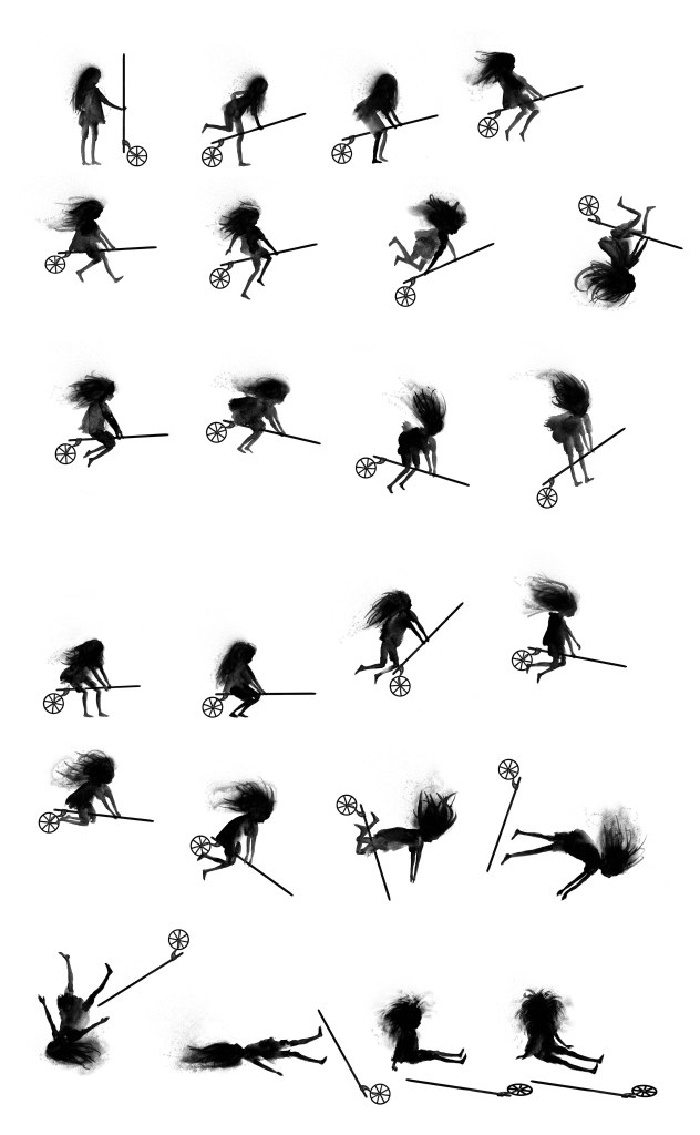
The fast machine was a billy cart in my mind. But that seemed too earthbound. And perhaps due to my caged bird mentality at the moment, my thoughts turned towards flight. Some little ink sketches resulted.

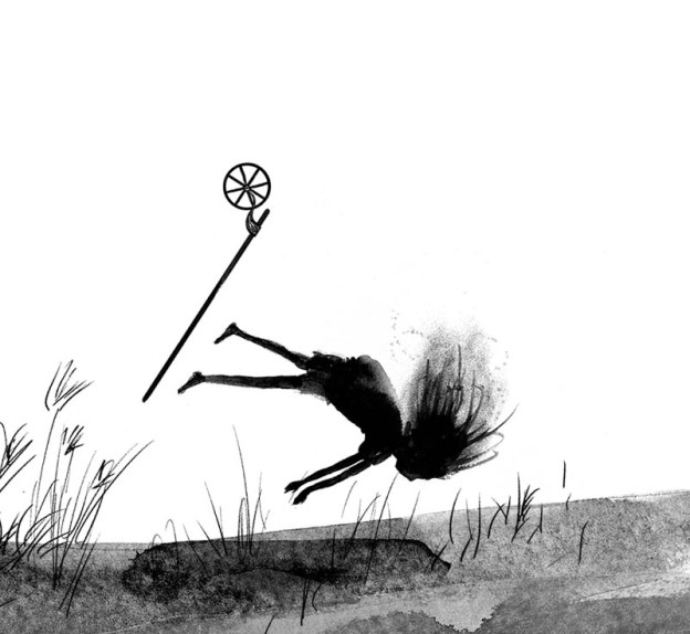
This slightly steampunk, ragged little witch has a broomstick that is a first cousin to a billy cart.

Once again I was planning an animation. But my computer obstinately refuses to export a video file. Phooey!

But I had revisited the work of Eadweard Muybridge earlier in the week when I was drawing running dogs for When You‘re Older.

V0048768 A dog running. Photogravure after Eadweard Muybridge, 1887. Credit: Wellcome Library, London. Wellcome Images images@wellcome.ac.uk http://wellcomeimages.org A dog running. Photogravure after Eadweard Muybridge, 1887. 1887 By: Eadweard Muybridge and University of Pennsylvania.Published: 1887 Copyrighted work available under Creative Commons Attribution only licence CC BY 4.0 http://creativecommons.org/licenses/by/4.0/

This gave me the idea to arrange my little steampunk witch drawings into a tribute to Muybridge‘s sequence photographs. It was fun. But in the end, I felt they looked better on a plain white background.

Here are a couple of frames from the obdurate animation file.

This last image does not bode ill for my little witch. In the final frame she sits up. I wanted a cheeky smile to emerge. However, when I drew it in, she looked demonic. So I removed. it. Ha ha!

The Kick-About #8 ‘Cicada’ (part one)

Here we go with another Kick-About prompt from Red’s Kingdom. It comes at a good time. I‘ve been working productively during Melbourne’s two lockdowns on my picture book project When You’re Older*. The project has leapt forward dramatically, which is satisfying, but I needed a little break and a breath of creative fresh air. The disconnectedness and anxiety that many of us are feeling as a result of the pandemic and the world news are pretty wearing, even to an introvert like me.

The prompt is Cicada, and those little creatures are old friends at this stage. I spent two weekends working on this prompt. The first one I spent learning some animation techniques, and my original intention was to make an animation by selecting material from Searching for Cicadas**, either working with some of the unused artwork, or developing a page from the book.

This is the page I’d like to animate. I’ll return to this idea at a later point. He’s such a cute little fellow, I’d like to see him walk across his landscape.

But on the second weekend I wandered in a different direction. It began with thinking about cicadas in a less realistic way and thinking about drawing some She Cicadas in the style of my Metropolis Bird Women. Then I thought about the unique, and seemingly magical qualities of a cicada (in particular, its life cycle and metamorphosis) and how easily cicadas might fit into a fairy or folk tale. I haven‘t written anything like that since The Woman, the Chicken and the Grapes. And it seemed the perfect break from intense illustration work.

A frontispiece for a fairytale that isn’t finished yet.

However, I was forgetting my tendency towards perfectionism (strangely combined with a loathing for neatness, exactness or fussiness), and so, Kick-About time is up and the fairy tale is not complete. But never mind! Here are some images I began for it and I’ll work up the text a little more before posting it.

I love these little cicada nymphs. They are so innocent and purposeful. They provide the perfect foil to an arrogant giant python.
I was aware how much my fairy tale was resembling a Red Riding Hood tale. The significance of the snake (instead of a wolf) was pretty obvious, so I popped my little girl into a reddish tint to refer to the original story. And a hood, of course. But I liked her to be visually quite subtle and hard to make out.
The python drawing, became a bit worrisome actually. Although he was just a 5 minute ink drawing, incised with a wooden skewer, he scanned and turned out a bit too ‘realistic’ for my taste, even after I popped some tattoos on him. I prefer the more stylised fellow on the frontispiece. This is a balancing act I regularly struggle with.
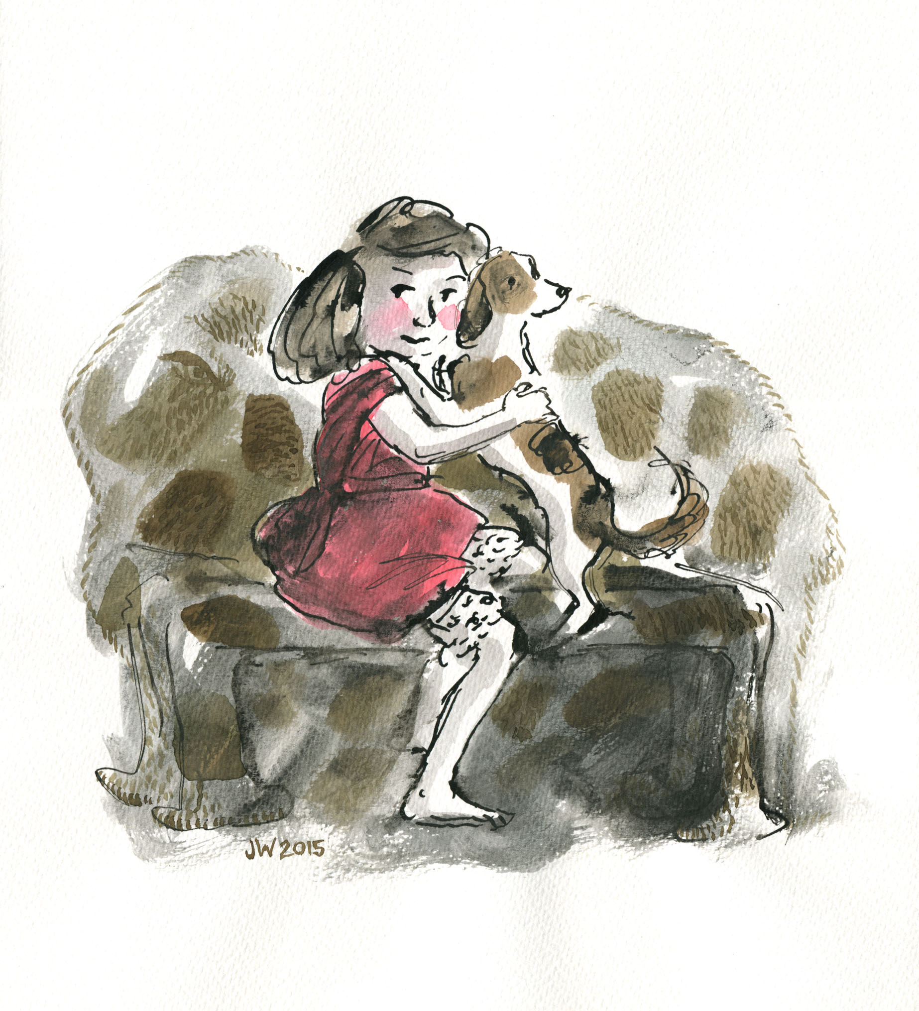
Some wash drawings of my little girl. These are each about 12cm high and some have been tidied up a bit; some haven‘t. The little girl at bottom right was not right for this story as she has a vulnerability in her body language and droopy plaits that is not leading lady material. I liked her little legs though. The girl top left, though leaning backwards in a seemingly defensive posture, is nevertheless communicating a wily strength of character. Is she retreating, or is she subtly reaching behind herself for a possible weapon? So she was worked up very lightly for the scene at the top of this post. The girl with the high hood makes me laugh. She is so contemporary looking with her confident, slouching gait. She’s probably wearing headphones and a ponytail.
Two of the sketches for the frontispiece, before I tidied up the one on the right, just a little.

Cheerio for now. Time to get back to the snowy scenes for When You‘re Older.

*When You‘re Older, written by Sofie Laguna, to be published by Allen and Unwin.
** Searching for Cicadas teaching notes here and you can purchase at your local bookshop. If you are in lockdown and need to buy online, in Australia you can find a local bookshop here or check out this page. If you‘re in the USA there‘s this page and it may include other countries too. Let me know.

Leonard dances on (part 2)

Having had a lot of fun with my digital collage and brushwork, I picked up the dip pen and filled my inkwell once more to explore Option One.

pen and ink crooner judywatsonart

Dip pen and ink with real wash. 

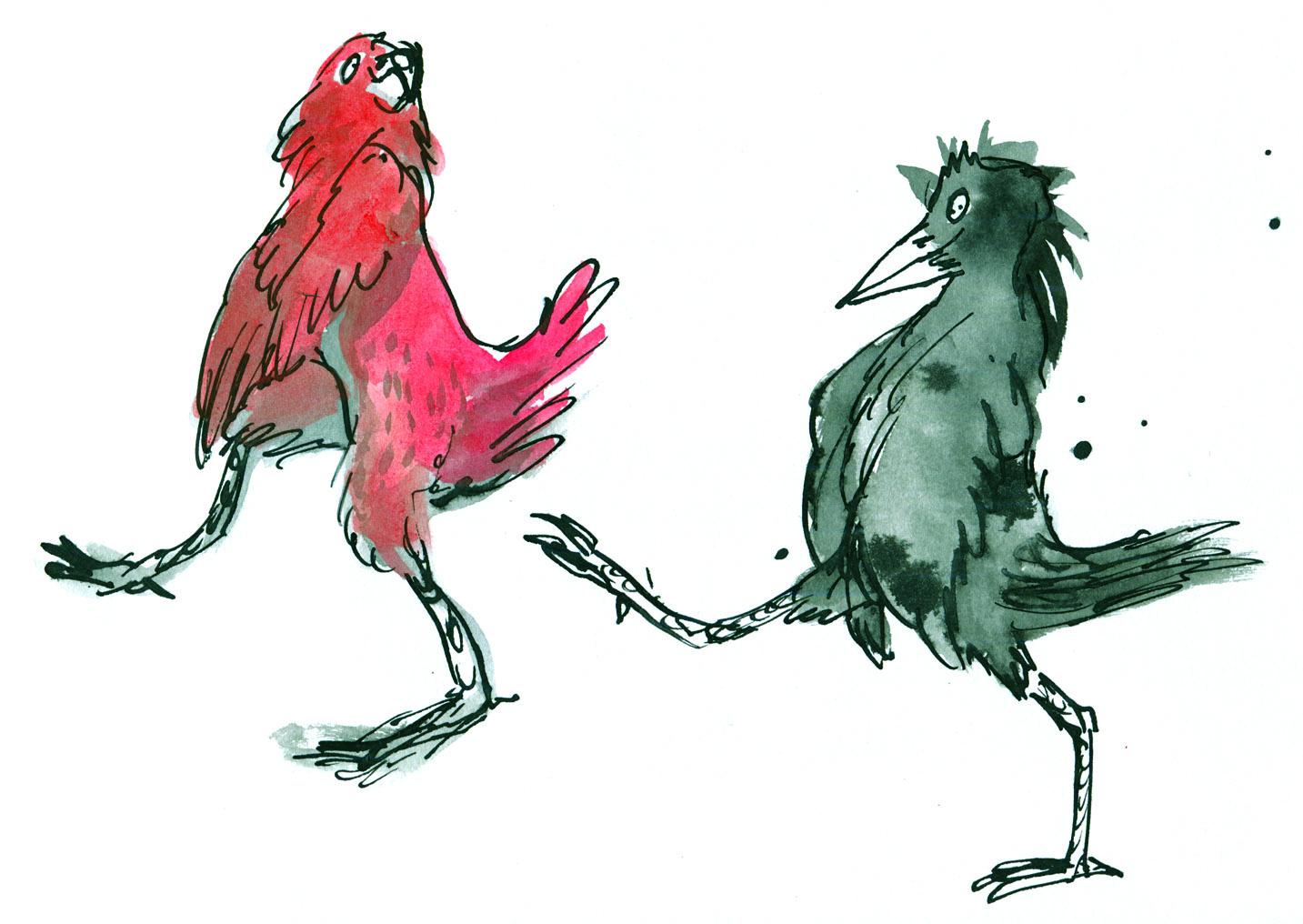
Having fuddled around with birds for some weeks, I felt warmed up. My drawing hand was in action again. I was feeling a bit racy. The big brushy birds were fairly cumbersome in terms of getting the dance action going, and I wanted to see how these birds might actually look dancing; particularly in pairs or groups.

So here’s where my trusty dip pen came in. I used the same one for the whole of Thunderstorm Dancing and I’m not sure what I’ll do when this particular ratty nib gives up the ghost. It’s pointy and twitchy and zippy and once the pen hand is warmed up, the quicker the drawing, the better.

In my first sketches, I referred to pictures of people dancing. The birds looked rather hilariously like people in bird costumes.

pen and ink crazy peoplebirds lores

pen and ink ridiculous birds

Seriously, what???!! Must be stuffy in those bird costumes…

pen and ink person to bird lores

Here you see me trying to figure out how to turn a human dance pose into the equivalent bird pose. Doesn’t work. The bird’s leg joints are so different that when forced into a corresponding pose, they become stiff and awkward. 

pen and ink john travolta lores

John Travolta? 

They were terrible. After that I put Fred and Ginger aside. Phooey! Better to just look at birds and make their gestures approximately dancelike. Despite my lack of dance expertise, I could put more of an expressive spin on a bird drawing without scrutinising a real dance move.

Then it became more fun. These birds were attending an imaginary ball. I gave them names. Just because.

pen and ink tiara

Spotted at the ball this evening – Miss Ophelia Oriole in yellow cape and tiara.

pen and ink orange pair

Melva and Gene Shufflebottom set the dance floor on fire this evening. Luckily, no one was hurt. (That’s from Thomas the Tank Engine. Some of you will recognise it.)

pen and ink blue green pair judywatsonart

Sparking rumours this evening at the ball, Adele Coiffe and Thomas Furle were inseparable on the dance floor. 

pen and ink cindermallard

A Mysterious Mallard wowed the guests at this evening’s festivities, but departed hurriedly at midnight, leaving behind a puddle of water. 

pen and ink crooner judywatsonart

A starling vocal performance was given this evening by Steve Brash, with backing vocals by the Fluffies. (not shown.)

Lastly, I spend about 40 minutes whipping up a page spread in this style to see how I’d go with drawing a crowd. It wasn’t so great, but it was good enough to act as a sample for discussions with the editorial team at Harper Collins.

pen and ink rough spread judywatsonart lores.jpg

This sketch is coloured digitally, so that I could get a quick idea of how it might look. It’s very rough, and fairly energetic. I like the energy. It reminded me of a picture I’d done for the Ernie and Maud series years ago. Particularly the duck in the middle, waving to a friend. (There was an excellent hot air ballooning duck in that story.)

Greatest Sheep in History judywatsonart lores


I’ll be interested to hear what treatment you would have chosen. But I have to say voting has closed and the team at Harper Collins voted unanimously for….

drum roll…

BRUSHY!

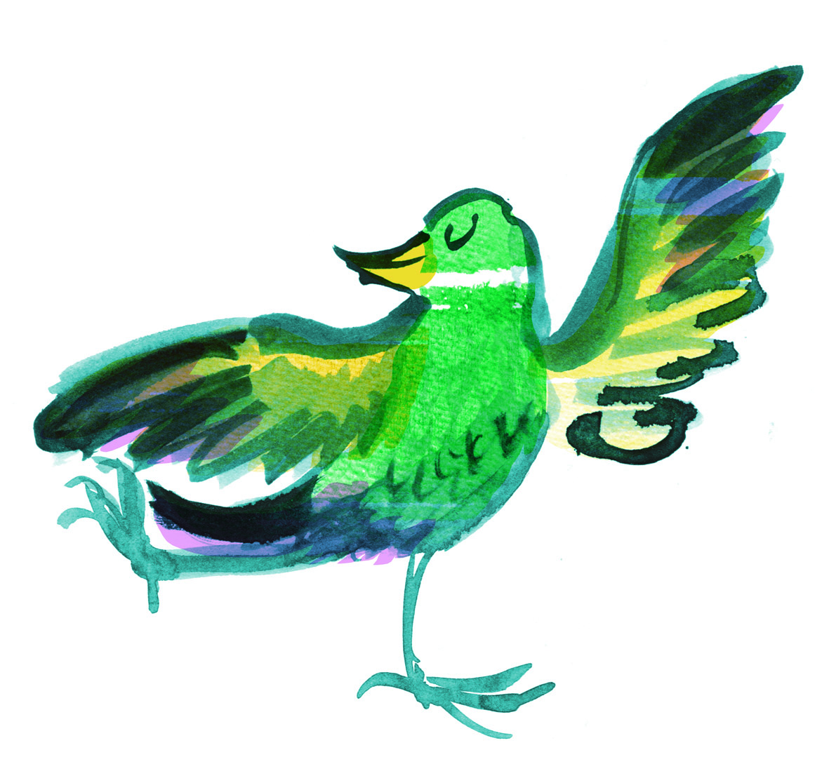
brushy green bird

Let the games begin!

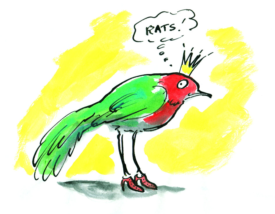
pen and ink rats lores

Was it the shoes? Too much?

Leonard dances on

Well, enough of that frivolous sewerage stuff for now. Time to get back to Leonard because I’ve got some roughs to complete! (Sorry to those who were enjoying  my inexpert comics doodles. I’ll try to fill you in on the end of the story at some stage. Evil snigger.)

woodpecker colour flat

Option B. Read on…

Now where did we leave off? I think I was drawing finches in all sorts of styles.

After that, I drew a few more birds of other kinds… That’s rather offhand, isn’t it? I’m skipping over about 16 species without even excusing myself…

And then I spent a day or so researching and downloading images of various dances. I am much more familiar with birds than I am with dances. Seriously, you should see me try to dance. But what a great excuse to get a book about Fred Astaire and Ginger Rogers out of the library.

Then I spent a day drawing birds dancing, putting it together. And all the while my days and nights were filled with mullings and musings about medium. That’s just too much, right?

I am a person who could spend a long time making up my mind. So I wrote this shortlist.

shortlist worksheet

There was a third option but since it had a difficulty rating of 5/5 it soon dropped off. 

The fabulousness ratings are important for me because I don’t feel there’s any point in making a picture book if I don’t at least attempt to make it fabulous. But they’re hypothetical, and of course totally subjective.

So. Being me, I started with Option Two. 

Brush and wash with digital blocks of colour. 

I have to thank Clive Hicks-Jenkins for accidentally reminding me of the brush and wash option. He posted my bookplate blog post on his FaceBook page. And when I looked at the bookplate again, I remembered how much I had enjoyed painting that chicken with brush and ink and how the digital editing changed it into something I rather liked, with very simple blocks of flat colour over the painted image. It was easy to do and retained the painterly look, which many digital treatments do not. But it wasn’t something I had considered as a treatment for Leonard.

sepia chicken judywatsonart lores

This particular image would be rather dark and heavy in a picture book. But it’s really just the background that makes it heavy. With a different background treatment and a lot of white space, it could work. I had a vision with lots of white space but with some painted plants strategically placed, in paler tones than those of the birds.

With the chicken bookplate, I converted the original art to a sepia colour; still very inky looking. But I could make the brushwork any colour that harmonises with the overlaid colour blocks. Indeed each bird need not be treated the same way.

I made some quick mock-ups.

finch flap lores

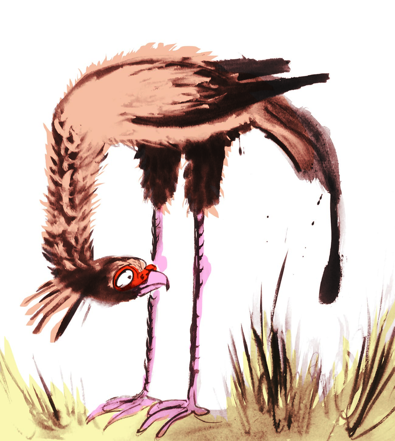
unhappy secretary bird photo

brushy sketch

unhappy secretary bird test

brushy sketch with flat colour


several finches with flattened background 2 col copy

a digital collage with brushy finches, a woodpecker and digitally applied colour wash

These brushy bird paintings were large. Nearly A4 size for each individual bird, so I wondered if I might be able to work at a smaller scale using a pencil for details like eyes. And made this quick  sample. I think I prefer the brush alone, but it will depend how practical this giant size proves, when working on entire page compositions.

bluebird test judywatsonart

brush and pencil bluebird with digitally applied colour wash

And I made a few brushy background vegetation sketches. I could have a lot of fun with these, adding some colour and layering. We could go a little 1970s…

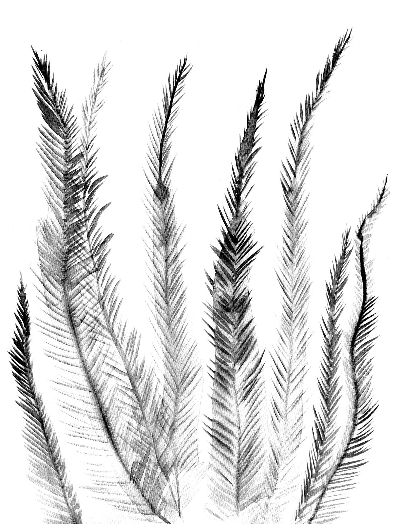
feathery tester loresfruity tester loresginkoish tester loresgrassy tester lores

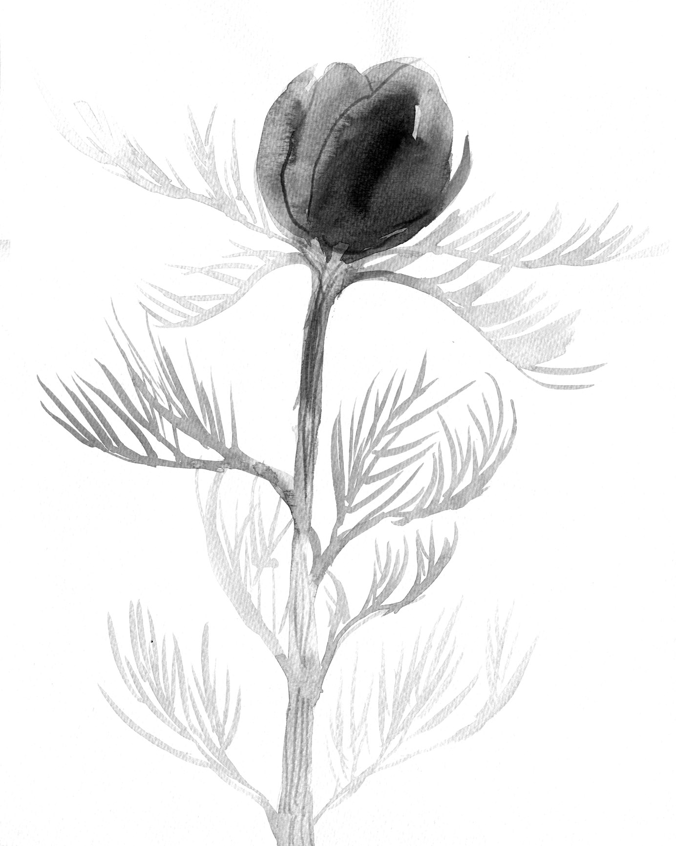
flower tester levels loresjointed flower tester levels

I think that will have to do for tonight. Option One tomorrow!


Midsummer Monotypes

IMG_7310

Bonneted girl in too many frills. (From a vintage cabinet card portrait photo)

Over the summer school holidays, I had the pleasure of pulling out all the monotype equipment, unused for many months, and taking it for an outing to the back garden of the new house. There is a space under the decking that’s perfect for fine weather art activities. The boys and I set up two trestle tables there and had a lovely afternoon of printing in the warm air.

IMG_7179IMG_7180

While the boys printed an assortment of monsters, animals and fancy lettering (most of which they remembered to reverse as they drew), I printed chickens, dogs and portraits of them drawing. They were mostly autonomous because they had printed before and are old enough to manage on their own, but my focus was divided between my own drawings and theirs, so I came back a few days later and had another go on my own.

Author Ann Martin had kindly posted me her collection of cabinet card photos after my last post on vintage clothing (here) and I decided to use these as the basis for my monotypes. I had also been admiring one of my favourite books Detour Art.

I LOVE that book, (one of my favourite Christmas presents ever!) and browsing through it again led me to look up and explore further the work of Thornton Dial Sr. who died only last month. You can see the video A Day With Thornton Dial Sr. here. 
Thornton Dial Senior

Thornton Dial’s work ranges between sculpture using found objects through to several dynamic painting styles. One of his loose drawing styles made me itch to print some monotypes and add either dry pastel or watercolour to them. I love the way his rapid line work dances with the limited colours he adds.

Below are some of Thornton Dial’s works that make my heart race!

As you will see, my own work is nothing like his whatsoever. As with most artistic adventures, the artwork takes on a life of its own, and mine were no exception. They were mostly drawn using a continuous single line, using a heavy crayon pressed firmly on the back of the paper. I was seeking a heavy line with bleed but also a loose line, and was mostly successful in this.

IMG_7316

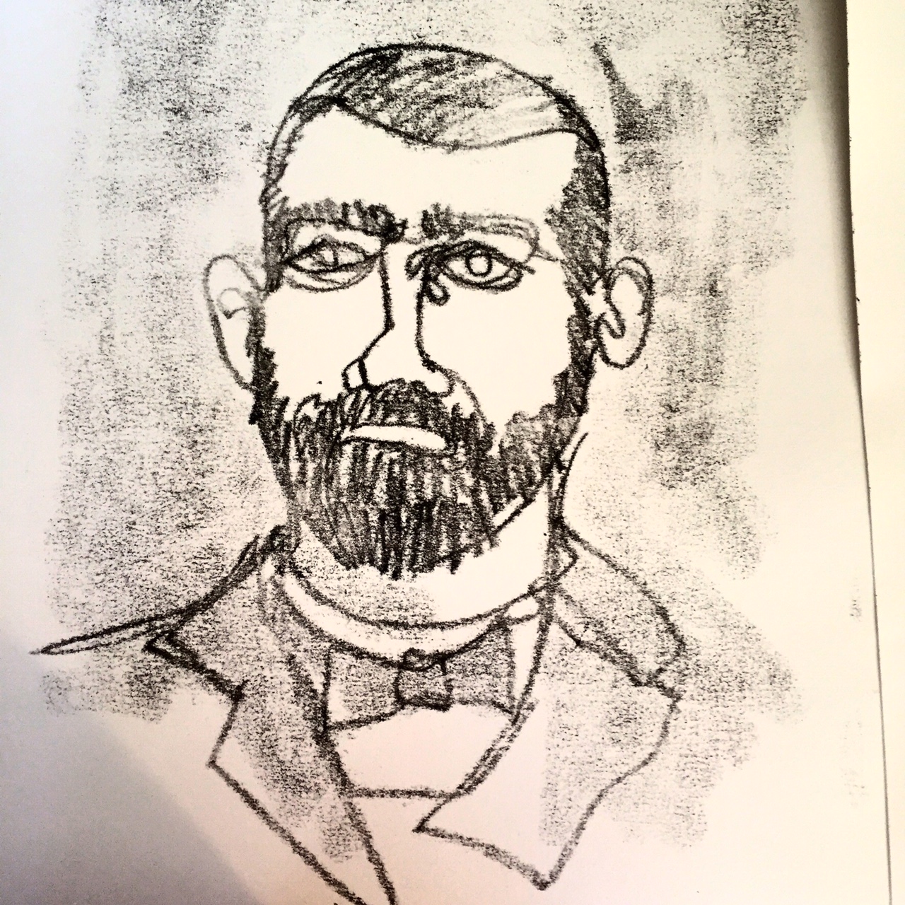
Bearded man – first take. The original did not look as heavy as this darkened photo and I increased the pressure when drawing the subsequent images.

IMG_7318

Bearded man – second take. (These were drawn from the same photo, so you can see that I was not attempting to achieve a likeness.) This is the image that I was most pleased with. I have an irresistible urge to add an off yellow background and pink to his tie, so he may yet be ruined, but I have taken the precaution this morning of gluing him to a cardboard backing in order to prevent buckling when I take paint to him.

IMG_7315

This chap had a rather ridiculous face in the original photo. And my rendition made him possibly more ridiculous. But he does rather remind me of an idiotic version of Jude Law. (sorry Jude Law.)

After completing a few other prints, including the frilly little lass at the top of the post, I brought the prints indoors to dry so that I could add colour. I started with the first bearded man, because the outline was too weak to stand alone and I thought that by adding colour I’d either ruin it (and not mind) or redeem it.

IMG_7325IMG_7320

Actually, I did neither.

The paper buckled a little but not too much as it is a heavy weight paper. I solidified some of the outlines and I had an absolute ball throwing the colour on. But I’m not overly excited about him. And I didn’t leave enough white space for him to breathe. He may have been better on a white background.

IMG_7326

I then added colour to clown-like ‘Jude Law’. By golly it was fun to slosh the paint on a large piece of paper! I stopped after that. The girl would not benefit from colour and the other bearded man, being my favourite, deserved some thought and a backing board before proceeding, if at all.

I’ve now done the backing board, and I must decide his fate!


Old World Monsters

I went away with some good friends in the September holidays for a long weekend, and began a range of art and craft projects which I promised to post here. I’ve been too busy until now to look at them further but now it’s Christmas holiday time, and I had a great time the other day, getting things out to play with in the studio! Hooray!

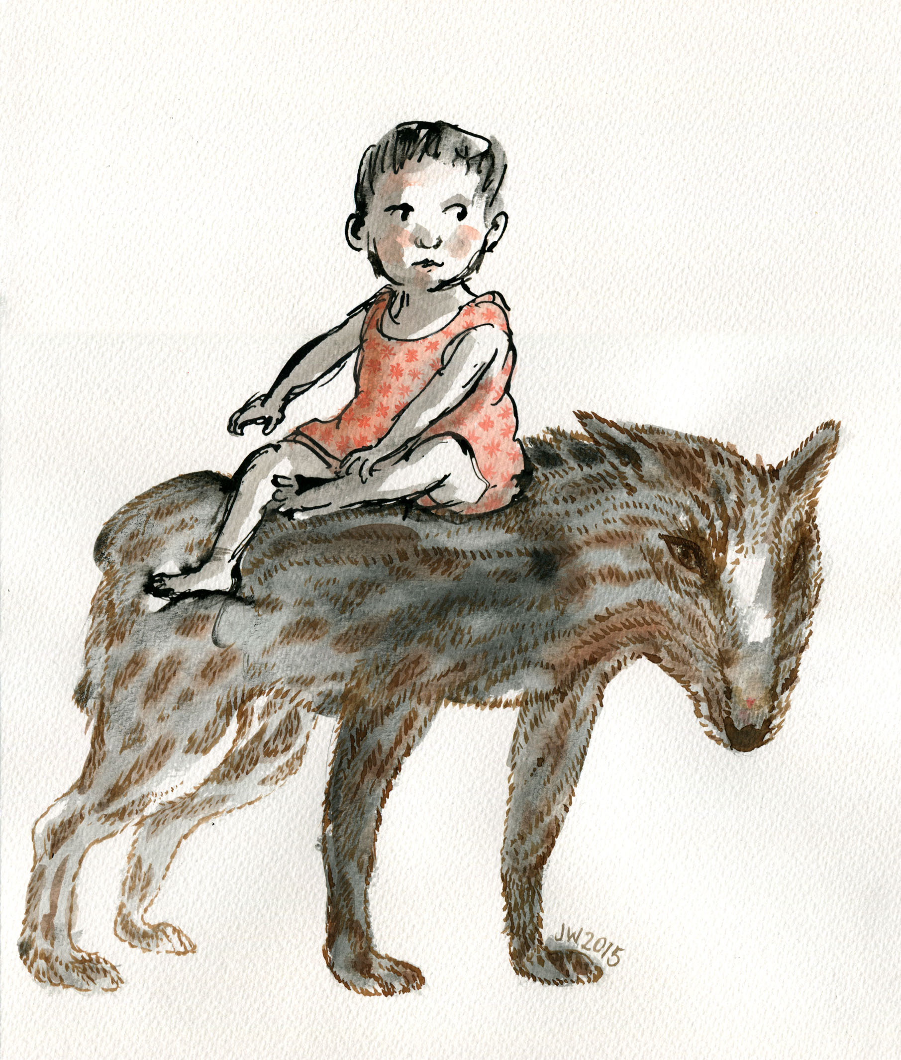
As part of my continuing fascination with vintage cabinet card portraits, I had drawn at  some children from old photos and added shadowy blob shapes of old world beasts and imaginary creatures into their formal poses. I hadn’t by any means fully thought out the ideas I was exploring, and I still haven’t. But I added some watercolour detail with a fine brush the other day and scanned them. So here they are.

I will probably do some more with this, and see where it goes. I think monsters take time to form properly. These are only partly menacing, and it’s unclear whether the children are aware of them or not. They may be allies, or the monsters may even be generated by the children themselves.

old world new world wolf boy JudyWatsonArt

old world new world hat JudyWatsonArtold world new world bench beast JudyWatsonArtold world new world chair and hat JudyWatsonArt

Leonard’s Friends

Leonard 6

As some will know, my current book project is a picture book by Frances Watts to be published next year by HarperCollins. Leonard Doesn’t Dance is the title, and it will feature a cast of feathered friends of many species.

Leonard and his friends have been forming on the page but I’ve yet to definitely decide on the medium that will best suit the book. As a way of exploring options, I’ve begun getting to know this list of species.

Magpies
Ducks
Pigeons / Doves
Rosellas
Galahs
Woodpeckers
Flamingos
Swans
Chickens
Turkeys
Quails
Bluebirds
Finches
Penguins
Puffins

First on the list, penguins. (Yes, I’m not even reliably back-to-front.)

Penguins come in several shapes and sizes and are attired in formal to smart casual. Their posture is generally upright, and they are fond of water sports. Some are tall and imposing. Some are small and wiry. Some are round, cuddly and ridiculously cute. Possibly too cute. (What kind of a kill-joy book illustrator am I? Too cute?)
penguin very first pencil sketch

A warm-up penguin. I liked to think I was channelling William Kentridge with my deft use of the eraser… but really, this is just a warm-up penguin. My eraser was employed in deftless ways.

penguin pencil and wash early 1

A second warm-up penguin. Sometimes the warm-up process temporarily takes one backwards.  (Watercolour and brush on smooth watercolour paper.)

the rather dull small fluffy penguin

See what I mean? (Noodler’s ink, watercolour and gouache on watercolour paper.)

the rather dull penguin

A half-warmed up penguin, using a soft pencil and watercolour. I need to bond with penguin feet. They are thick and sturdy and look like lumps of pink putty. These are not right. But I like the head.

penguin pencil and wash later

A tighter line. Testing the look of a more stylised shape. This penguin is quite athletic. I didn’t  realise that some penguins have rather long legs. Even if much of the leg appears to be inside their body. Rather like walking around inside a large pillowcase with your toes in the corners… Or not. I do like the watercolour over the textured pencil.

tighter penguin

A tighter outline again with an exaggerated shape. But still with a loose hatching technique. I don’t do tidy hatching. I associate it with things like ironing shirts. A useful skill that I don’t have the patience for.

penguin pencil sketch

Looser? Almost the same head. But loose and with added dance steps.

twin penguins

Looser with ink. I think this is a combination of the last two. Or three.

A question arising is the ink. This ink is water soluble. I often enjoy this, because it’s rather scrumptious to see the line dissolve under the watercolour brush to do unexpected things. I mostly like unexpected things. But would I like unexpected things to happen on my final artwork? Maybe not.

Also, it’s hard to lay clean colour over dissolving black ink. I will want some of my colours to be clean. I will have a try with water-fast ink later. But there are other ways around this. I could do the black part with water soluble ink and print out the illustrations onto fresh watercolour paper before adding colour. But all this can get rather complicated and size can become a limitation. There is much to ponder over the next few weeks.

I will share some finches with you soon.