Tag Archives: cover design

Leonard galumphs into bookshops

I nearly wrote ‘Leonard dances into bookshops’. But then I remembered that Leonard Doesn’t Dance… or does he?

Leonard doesnt dance detail.jpg

I’m very fond of that great galumphing bird. I relate to him very much. The initial enthusiasm, the self doubt, the impulse to hide away in a thorny tree, the desire to be with my friends that usually draws me out of the tree. And like Leonard, I have some fabulous friends.

My thanks to the team at Harper Collins and to Frances Watts, for patiently waiting for Leonard as he put one lanky leg in front of another (tripping over several times) and eventually became finished art; now a book.

This lovely cover was designed by Hannah Janzen.

I had been initially drawn to a white cover, because black ink on white paper was a signature part of making the artwork. There was a lot of ink involved. Brushed on, drawn on, printed, wiped and smudged onto white paper. Big broad strokes, and fine textured marks. So my original idea was to have an inky black and white cover, with a pop of red on Leonard’s face, and a scattering of brilliantly coloured birds flung around it like a double handful of lollies, and wrapping around both covers.

The team at Harper Collins didn’t think the white design was indicative of what was inside: a rampant world of jungly colour. This was perfectly true, and is why editors are so great! and Hannah did a fabulous job of designing something rich and celebratory.

Here are some of the lolly birds from the white cover design. Some of them found their way onto the new cover anyway. Perhaps you can spot them.

I visited the Grade Sixes at Derinya Primary School a few weeks back and we had a great time talking about Leonard Doesn’t Dance, story arcs, tension and making storyboards for picture books. There is just so much to talk about! A two hour session went by in a flash. I will be signing up with Creativenet Speakers’ Agency very shortly, so if any schools or groups of lovely librarians within Cooee of Melbourne would like to book a workshop and talk with me, that will be the place to go.

I have another book released this month as well! A very leafy book about cicadas. More on that soon. Enjoy your week!

Temptation at the Parkdale Primary School Fair

Parkdale PS fete book stall

Ahhhh me! How did I cope with temptation like this at Parkdale PS fair’s book stall?

Not too badly I think… I bought a pile of books merely 31cm high; a little over twelve inches for those of you not in the metric way. (Oh and two cakes. An obscene chocolate one with smarties on the top – described as ‘hefty’ by the stall-holder as she lifted it, and chosen by Hugo who is eight years old and loves chocolate. And a very sensible and delicious lemon one, dripping with lemon syrup… also slightly hefty for its size it must be admitted and chosen by lemon-loving me. Cake stalls can be tempting too.)

But back to the books! If you consider the quantity of books on offer, it must be seen that I gallantly resisted many of them! Here is one I resisted only because I already have a copy (recommended) but I photographed it for the great vintage cover. The Giant Under the Snow by John Gordon. This story lingers in my head for its magical scenes including a wonderful episode of magical flying. What greater temptation for the child’s imagination?

The Giant under the Snow

Here’s one I couldn’t resist (because of the great vintage cover) Normally I don’t collect 1970s books, as it’s a little later than my area of interest, but this one was so different from the style I usually associate with Gerald Durrell, that I made an exception for its fantastical, jewel-like cover design. (Also, 9 year old Arthur is animal mad and will probably get into Durrell at some stage.)

Gerald Durrell the Talking Parcel

Actually, from a quick search of the internet it would appear that Durrell’s books have taken on many differing styles over the years. His image is anything but branded. See the below thumbnails for examples.

catch me durrell selection fillets of place my family mid 20th century my family overloaded ark

Here was a mis-matched pared-back pair of Chatterleys that I resisted. Lady Chatterley herself didn’t resist temptation, but I don’t blame her for that. The Phoenix was an interesting choice of motif for this book. The ‘unexpurgated’ edition, probably from the 70s, is a little more obvious.

Lady Chatterley unmatching pair

But I couldn’t resist this luridly tempting classic, which I haven’t yet read.

Blue Vile Bodies

What next? I found a bit of fodder for my current fairy tale binge. A copy of New Tales from Grimm. I’ll admit I’m not even trying to resist fairy tales at the moment. I’m a glutton for the temptation of poisoned apples and gingerbread roof tiles. (Although I’d pass on the little boy stew from ‘The Juniper Tree’ in Philip Pullman’s Grimm Tales for Young and Old, my current bedtime reading.)

The endpapers on this copy were more exciting than the cover which was lacking its dust jacket. But the internal illustrations were elegant. ‘Hurleburlebutz’ What a great name for a tale! (or a chicken?)

Grimm endpapers Hurleburlebutz

Nor could I resist this paperback copy of The Sword in the Stone by T H White. Scott and I were reading this series aloud to each other during my pregnancy with Arthur (hence his name) but our copy is a weighty tome. This one is quite appealing, and the cover illustration of Arthur (‘The Wart’) looks rather like our long-haired lad at the moment… If you’re wondering how I can tie in temptation for this one, I’ve got one word for you. Guinevere :-)

Sword in the Stone

As I was heading for the door with my armful of books, ready to make my escape, I spotted one more and went back to pay for it. The Book of Cats, (View Productions 1985). The books suffers from a clumsy cover design. But the few internal illustrations are great and made it worthwhile to purchase, especially as there is now a disgruntled black cat in Thunderstorm Dancing. 

I can’t tie in my cat book with temptation, so I’m going into the kitchen to eat some blue cheese. Catch you later!

book of cats cover

book of cats internal book of cats internal 1 book of cats internal 2

Temptation at Vinnies Rosebud

sailing endpapers

Some real endpapers that I resisted at Rosebud Vinnies on Saturday. (How did I do that? The cover wasn’t great.)

Dr Doolittles Circus endpapers

And some endpapers that I just couldn’t resist. From Doctor Dolittle’s Circus. A copy without its dust jacket but rather delightful, and paired with a copy of Dr Dolittle and the Secret Lake. I bought both, along with a 1956 copy of Latta and Macbeath’s ‘The Elements of Logic‘ for Scotty to satisfy both his love of logic and his illogical weakness for a nice old book with a special feature. In this case, a custom ‘postage stamp’ on the inside of the front cover advertising the bookstore where it came from. Grahame Book Company.

book shop stamp

Going back to Dr Dolittle for a moment, is it just me, or does this internal illustration from the book depict The Mymble’s long lost sister? (feistiness of this kind runs in the Mymble family, remember.)

Dr Doolittle meets Mymble

Here’s the mysterious Dolittle lady apparently bumping people from a high place ‘by accident’…

Mymble and daughters

And here is the Mymble with sundry feisty daughters. She is introduced to moomin fans in The Exploits of Moominpappa by Tove Jansson (one of my all time fave books).

Keys to successful picture book covers?

I’d better tell you right now that I don’t have all the answers to this. But I have some ideas that grow (and will no doubt change) as I go along.

01_heinrich_strub_sumse

This cover is from the wonderful Will Schofield’s blog 50 Watts.

Two days ago I was working on Thunderstorm Dancing at the library. I decided to concentrate on the cover. The recurring challenge for the day was to find a clean simple arrangement of four main elements: title (longish), two creator names, two leading characters in upbeat active pose (is that really two elements?), suggestion of approaching storm preferably including a big, dark cloudy area.

Thoughts on book covers

thinking in the library

1. Book covers are a lot like posters. The main thing is simplicity. The brain can’t take in (or rather can’t organise and process into the short term memory) more than a certain number of ‘chunks’ of information at one time. So you have to organise and limit your chunks and try to get your tonal contrast to help you with this.
2. You need a clear hierarchy of information. Don’t let your illustration and your lettering get into a battle over the top billing. This is a common problem, I find, and was my biggest challenge the other day.
3. Title Lettering is important. Hand lettering is nice if you can do it well. Sometimes skilful typography is as good or better.
4. Striking that fine balance of using a formula that works but also avoiding cliché! Tricky
The perfect number of ‘Chunks of information’
George A. Miller has provided two theoretical ideas that are fundamental to the information processing framework and cognitive psychology more generally. The first concept is `chunking’ and the capacity of short term (working) memory. Miller (1956) presented the idea that short-term memory could only hold 5-9 chunks of information (seven plus or minus two) where a chunk is any meaningful unit. A chunk could refer to digits, words, chess positions, or people’s faces. The concept of chunking and the limited capacity of short term memory became a basic element of all subsequent theories of memory.
Hierarchy and clarity of text with illustration.
The Middle Sheep
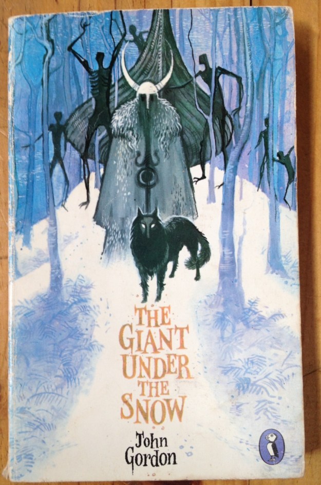
A good arrangement. I was happy with this. No fighting. (Although inside the book plenty of fighting between characters)
Greatest Sheep in History
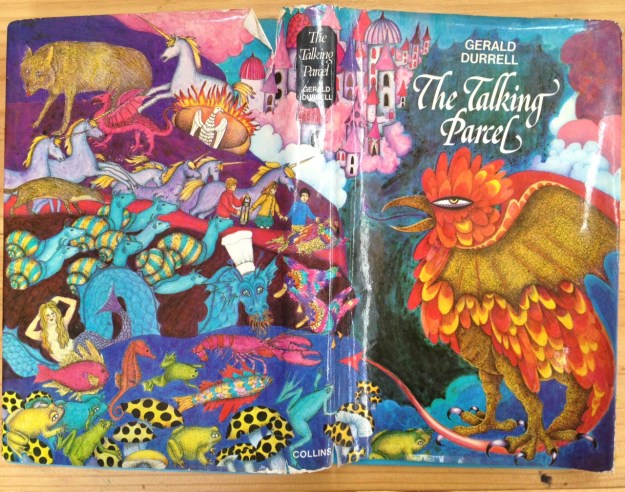
This is a favourite book of mine but not my greatest cover design. The lettering is fighting with the balloon and it could end in tears.
Title Lettering
There are some hand lettering examples here and some are pictured further down.
Cliché
Sometimes making certain that something will work well, means taking the safe route. And that’s not really what art is about, and it doesn’t help us to grow in our abilities, nor our courage. So if there’s a new, exciting idea that works, and doesn’t look like something we have all have seen 300 times before, that is probably better. If your deadline is tomorrow and you have a headache, that might be another matter. Go for the cliché but do it well.
Well, how did I go with my work? Most of the chunks on my cover designs were getting in each other’s way. I needed them to work as a team. I needed a coach, with a whip and a carrot and another carrot or maybe some chocolate. I didn’t have a coach, so I did the next best thing. I went and sat in the children’s picture book section (not to suck my thumb) and went through two shelves pulling out any covers that I thought worked.
These are not necessarily the pinnacle of book covers. They just happened to be the ones on the B and D shelves that seemed to work. At a guesstimate, they amounted to about 2% of the books. A lot of the books fell into the trap of the 
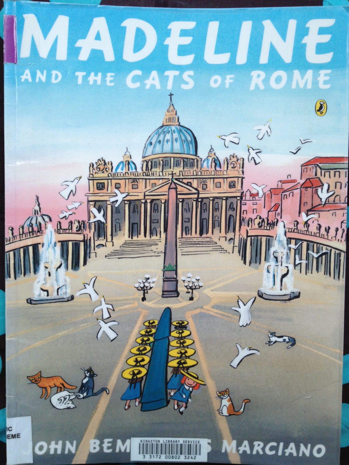
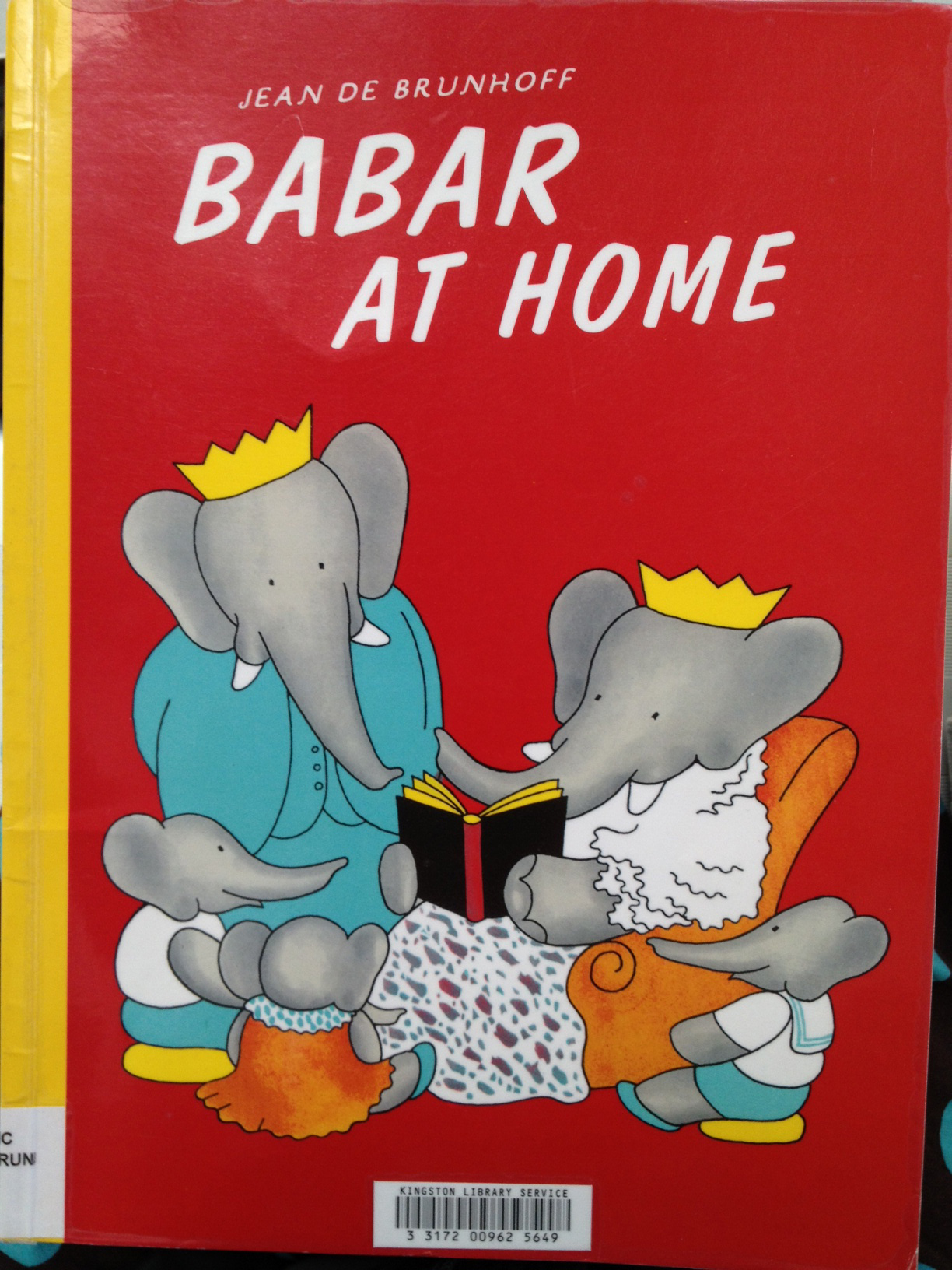
Greatest Sheep in History with text and illustration fighting to the death. Some were just outdated looking but not in a good way. A lot of the successful ones were older classics like Babar and Madeline, and they also provide great examples of the use of hand lettering. I’m not posting any of the not-working ones, because I’m not here to knock anybody else’s stuff, only my own :-) So here are the books from the B and D shelf that worked for me (some better than others).
Madeline and the gypsies

Great contrast and clarity but still has texture and painterliness.

Madeline and the cats of rome

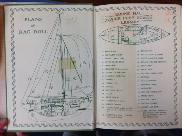
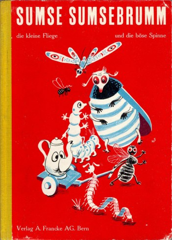
A complicated image, but still clear to take in. Possibly helps that the book is HUGE.

just how long

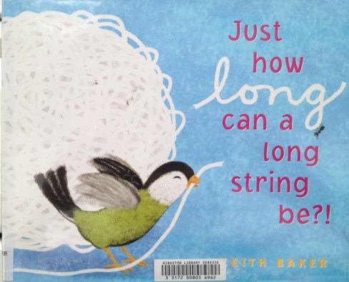
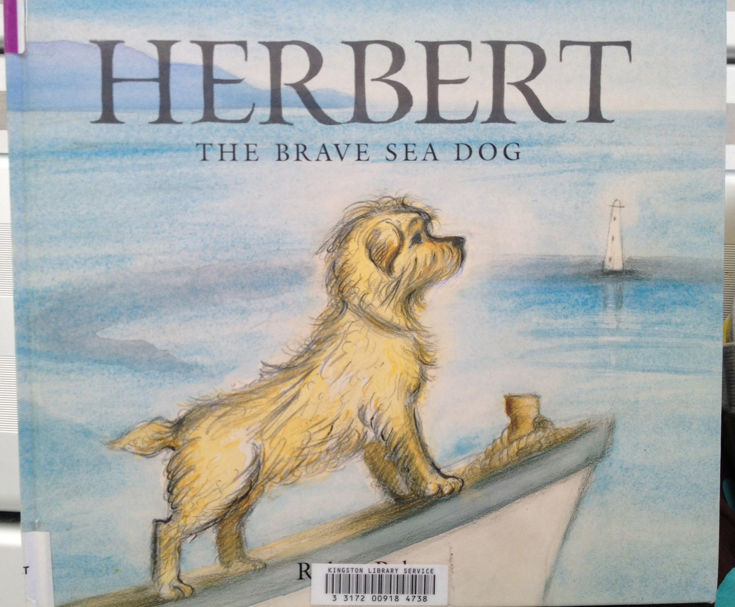
A contemporary style. I might have skipped the white drop shadow on the title text. I love the texture on the bird and the string and how the string leads us to the title.

Babar at Home

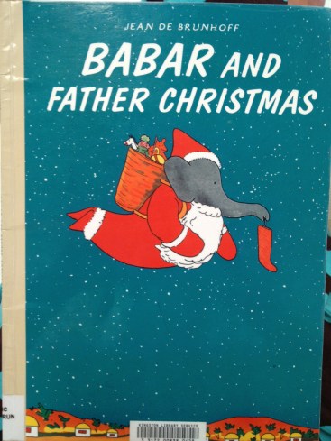
This is a copy of the original, and the hand lettering has been replaced by fake hand lettering. A pity, but it still works!

Babar and Father Christmas

Also a copy, but so completely delicious! look at that colour contrast and all that ‘white’ space!

Herbert the brave sea dog

This might have been helped by a bit of extra contrast somewhere, but they’re going for soft and that’s okay. It’s not ground-breaking, but one of those tried and true working formulae.

20130305-180114.jpg

Perfection. Again, a re-hashed concept. See the latest reprints of Goscinny & Sempé’s Nicholas books (Phaidon) for something very similar. But it’s so good, why not? This book, by the way, is a divine thing. It is like a meshing of Sempé and William Steig (Pete’s a Pizza). I’m buying a copy.

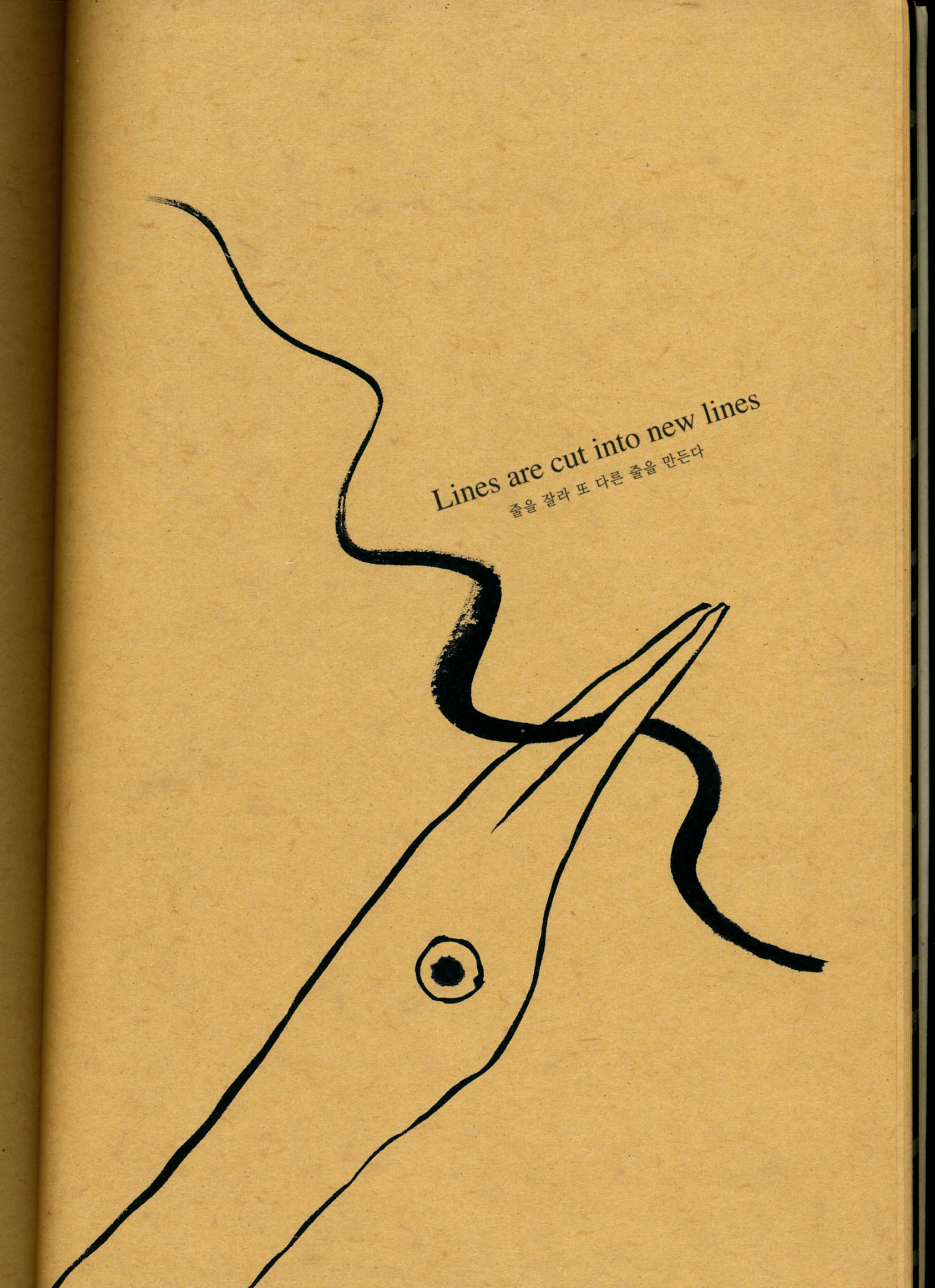
So that was my work day at the library. Yesterday I got home from an appointment to find a parcel on my doorstep with a book by Kang Woo Hyon called ‘Point Story’. Reading that clarified my book cover thoughts even further, with regards to simplicity, contrast and the beauty of the painter’s mark. So I am filled with ideas to move forward now!

point story 1

From ‘Point Story’ by Kang Woo Hyon from NAMIbooks.

point story 2

Also from Point Story. Go here to see more about NAMI books and Nami Island.

Sorry this was so long (and WordPress seems to be cramping all my paragraphs together. That’s not a good look).

Cheers!