Category Archives: Uncategorized

Keys to successful picture book covers?

I’d better tell you right now that I don’t have all the answers to this. But I have some ideas that grow (and will no doubt change) as I go along.

01_heinrich_strub_sumse

This cover is from the wonderful Will Schofield’s blog 50 Watts.

Two days ago I was working on Thunderstorm Dancing at the library. I decided to concentrate on the cover. The recurring challenge for the day was to find a clean simple arrangement of four main elements: title (longish), two creator names, two leading characters in upbeat active pose (is that really two elements?), suggestion of approaching storm preferably including a big, dark cloudy area.

Thoughts on book covers

thinking in the library

1. Book covers are a lot like posters. The main thing is simplicity. The brain can’t take in (or rather can’t organise and process into the short term memory) more than a certain number of ‘chunks’ of information at one time. So you have to organise and limit your chunks and try to get your tonal contrast to help you with this.
2. You need a clear hierarchy of information. Don’t let your illustration and your lettering get into a battle over the top billing. This is a common problem, I find, and was my biggest challenge the other day.
3. Title Lettering is important. Hand lettering is nice if you can do it well. Sometimes skilful typography is as good or better.
4. Striking that fine balance of using a formula that works but also avoiding cliché! Tricky
The perfect number of ‘Chunks of information’
George A. Miller has provided two theoretical ideas that are fundamental to the information processing framework and cognitive psychology more generally. The first concept is `chunking’ and the capacity of short term (working) memory. Miller (1956) presented the idea that short-term memory could only hold 5-9 chunks of information (seven plus or minus two) where a chunk is any meaningful unit. A chunk could refer to digits, words, chess positions, or people’s faces. The concept of chunking and the limited capacity of short term memory became a basic element of all subsequent theories of memory.
Hierarchy and clarity of text with illustration.
The Middle Sheep
A good arrangement. I was happy with this. No fighting. (Although inside the book plenty of fighting between characters)
Greatest Sheep in History
This is a favourite book of mine but not my greatest cover design. The lettering is fighting with the balloon and it could end in tears.
Title Lettering
There are some hand lettering examples here and some are pictured further down.
Cliché
Sometimes making certain that something will work well, means taking the safe route. And that’s not really what art is about, and it doesn’t help us to grow in our abilities, nor our courage. So if there’s a new, exciting idea that works, and doesn’t look like something we have all have seen 300 times before, that is probably better. If your deadline is tomorrow and you have a headache, that might be another matter. Go for the cliché but do it well.
Well, how did I go with my work? Most of the chunks on my cover designs were getting in each other’s way. I needed them to work as a team. I needed a coach, with a whip and a carrot and another carrot or maybe some chocolate. I didn’t have a coach, so I did the next best thing. I went and sat in the children’s picture book section (not to suck my thumb) and went through two shelves pulling out any covers that I thought worked.
These are not necessarily the pinnacle of book covers. They just happened to be the ones on the B and D shelves that seemed to work. At a guesstimate, they amounted to about 2% of the books. A lot of the books fell into the trap of the Greatest Sheep in History with text and illustration fighting to the death. Some were just outdated looking but not in a good way. A lot of the successful ones were older classics like Babar and Madeline, and they also provide great examples of the use of hand lettering. I’m not posting any of the not-working ones, because I’m not here to knock anybody else’s stuff, only my own :-) So here are the books from the B and D shelf that worked for me (some better than others).
Madeline and the gypsies

Great contrast and clarity but still has texture and painterliness.

Madeline and the cats of rome

A complicated image, but still clear to take in. Possibly helps that the book is HUGE.

just how long

A contemporary style. I might have skipped the white drop shadow on the title text. I love the texture on the bird and the string and how the string leads us to the title.

Babar at Home

This is a copy of the original, and the hand lettering has been replaced by fake hand lettering. A pity, but it still works!

Babar and Father Christmas

Also a copy, but so completely delicious! look at that colour contrast and all that ‘white’ space!

Herbert the brave sea dog

This might have been helped by a bit of extra contrast somewhere, but they’re going for soft and that’s okay. It’s not ground-breaking, but one of those tried and true working formulae.

20130305-180114.jpg

Perfection. Again, a re-hashed concept. See the latest reprints of Goscinny & Sempé’s Nicholas books (Phaidon) for something very similar. But it’s so good, why not? This book, by the way, is a divine thing. It is like a meshing of Sempé and William Steig (Pete’s a Pizza). I’m buying a copy.

So that was my work day at the library. Yesterday I got home from an appointment to find a parcel on my doorstep with a book by Kang Woo Hyon called ‘Point Story’. Reading that clarified my book cover thoughts even further, with regards to simplicity, contrast and the beauty of the painter’s mark. So I am filled with ideas to move forward now!

point story 1

From ‘Point Story’ by Kang Woo Hyon from NAMIbooks.

point story 2

Also from Point Story. Go here to see more about NAMI books and Nami Island.

Sorry this was so long (and WordPress seems to be cramping all my paragraphs together. That’s not a good look).

Cheers!

Art(z) Blitz 2013

Why don’t they call it Art Blitz?

‘Artz Blitz’ when spoken aloud sounds like ‘Art Splits’.

When I mention this excellent annual Kingston City Council event in conversation I find myself pronouncing it with a kind of glottal stop to prevent people thinking I am talking about an Art Sundae served with a lot of cream.

Or some kind of gymnastic sequence involving a hand-painted leotard. (Cute… if only I could do the splits.)

But never mind. The theme was announced at 5pm Friday afternoon and it was ‘Connect’. I wasn’t keen at first. It evoked only mechanical thoughts for me. But a little warm-up-phone-text-brainstorming session with Juliet (thanks Juliet) soon got the connection juices flowing.

After a long day of drawing other stuff I felt like mulling over ideas for a while and going to bed rather than burning the midnight oil, so I didn’t do any blitzing yet. When I went to bed, my brainstorm page looked like this.

brainstorm lo res

I was leaning towards the bottom right corner. (obscure pedantic note: ‘toward’ means something quite different from ‘towards’)

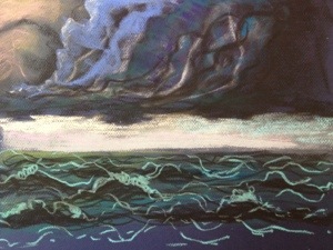
I was pretty certain I was going to do a skeleton of some kind, probably a collage or a twisted wire arrangement or an assemblage of found bones (yeah, right! but I did set the alarm for 6am to go trawling the local wetlands where we often do find animal bones…). The medium may have been undecided, but bones was the go.

6 am: the alarm went off.

I turned it off.

7.30 am: I woke and realised the boys were supposed to be leaving for sailing school in half an hour. Woke up Scott and turned over to doze through the chaos. (evil snicker)

8.10 am: phone rang and it was fellow Art(z) Blitzer Kerrie (hereafter referred to as Kezza or Kezzita) I heard Scott telling her I was sound asleep and probably not doing Art(z) Blitz this year… At this point I had to make my awakeness known, and also debunk Scotty’s theory. Perhaps awakitude is better? You might well ask how I can be so pedantic and then make up words…

Okay, so I could go on, but this is getting boring, right? So eventually after a nice chat with Kezza I got up and after the boys vacated, I re-distributed the dogs and chickens in a complicated way. My mum’s visiting dog, Mannie, the Fox Terrier (alias The Anteater) would kill our chickens if not well separated from them –  by mind power alone if his teeth couldn’t get near them. Thereafter I could walk in and out of our house, studio and shed with my tape measure to collect appropriately sized (hoarded) frames, canvases and lumps of wood, without causing a feathery carnage. (horrors! I love my chickens.)

Hilda and Emily

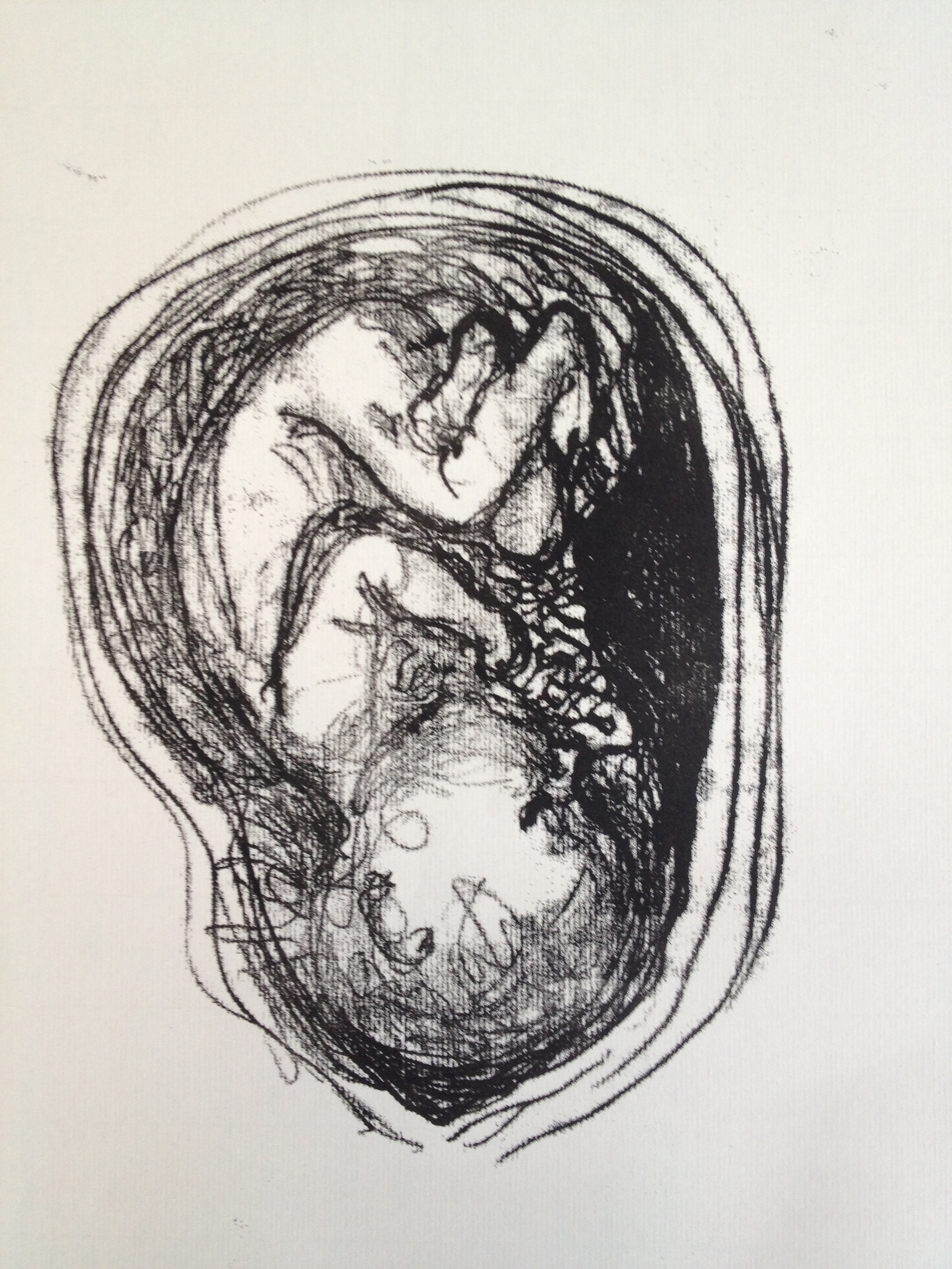
Right! That done, I spent the morning painting over failed artwork with white paint or gesso (which didn’t work – good learning experience), getting first, second and third choice media ready for action, and sourcing reference material. I had at this stage decided on umbilical cords instead of skeletons.

I imagined I’d be doing an oil stick sketch on a white canvas background. I was keen as mustard to get my hands on that black oil stick and draw (not paint) a baby in a womb with an umbilical cord in oil paint. What fun! Yeah! But I needed my gesso (remember it failed) and my white acrylic paint white-out to dry first, so I thought, ‘Skip to Medium 2 and do a few monotypes while I’m waiting for my canvases to dry’.

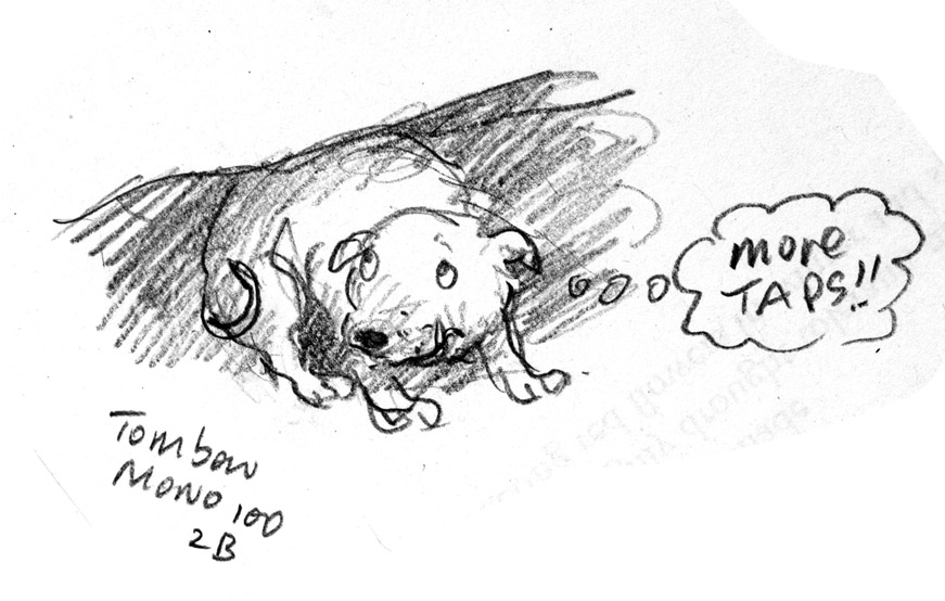
The first attempt looked like this. And after a long afternoon of drawing, I still think it might have been the best of them. You can tell me if you think so. But I liked it, so I kept on doing monotypes all afternoon.

photo 1-2

Juliet helped me choose which one to enter in Art(z) Blitz and it was this one. (The very last one of the day)

photo 2-3

But there were quite a few others. As I got used to drawing babies in the womb, they got too realistic, and then they got too cute, and always with this kind of monotype it is a very tricky thing to manage the amount of ink and how light or dark they come out so many were either too light or too dark and blotchy. And sometimes, the pencil drawing on the back of the page was better than the monotype on the front of the page, until I had to do the smudging to add tone, and then the pencil drawing got smudged.

Once, I accidentally used two pieces of paper at the same time and after I had separated them, there was no way of continuing my monotype or adding tone, because I would have been working blind. (For a tutorial on how to do this monotype technique, go here. It’s great to do with kids.)

At one point I thought of switching to the topic of breastfeeding. Also a good example of connecting. But I decided that even though Picasso got away with it, my own attempts might be at risk of looking sentimental. Can’t do sentimental. It worries me. I can be sentimental but don’t like to draw sentimentally. Sometimes I do it by accident.

Here are the monotypes from today in all their mixed-upness. Some could probably be improved with a bit of extra work, but I was working on Ingres paper and it’s pretty thin and won’t take much wetting. I liked the effect of the paper texture.

photo 2-2

photo 3-1photo 1-6photo 2-6photo 3-4 photo 2-5 photo 3-3

photo 1-4 photo 2-4

photo 1-3photo 3-2

So there we are. Several hours of printing and a lot of fun really. But I just kept going, thinking I’ll do just one more. This next one will nail it. Right contrast, tone, line… Just one more!

That must be how gamblers feel on the dreaded pokies. Thankfully Art(z) Blitz has a time limit or I might be a slavering mess by now.

Mentone Park Primary School fundraiser auction

Dogs, dogs and more dogs! Do you desire dalmatians? Do you prefer pugs? What dogs do you like? Maybe some honest mutts?

These original illustrations (and perhaps a couple more if time allows) will be auctioned to raise funds for my sons’ primary school in Mentone Australia. The final day for bidding will be Saturday 23 March (if you can make it over to Broome Ave Mentone in person to enjoy the fun of the school fete) or you can bid over the phone until Friday 22 March if you live too far away or you’re too busy sipping champagne by the pool.

If you would like to phone through a bid with your credit card details, call the school office on +613 9583 4935 or you could email them on mentone.park.ps@edumail.vic.gov.au to make arrangements.

The Dalmatian and the Pug are monotypes (one-off prints) hand coloured with watercolour.

Arf!

pug web

dalmatian web

Hello From Australia - Australian illustrators exhibited in Korea

This is an article from the Korea JoongAng Daily, about a triple faceted exhibition ‘Faces of Australia’ at the Korea Foundation Cultural Centre Gallery until 7 March. It features the photographic works of Lee Kyung-wook; a range of books and prints by Australian illustrators, and showcases the work of Shaun Tan. Ann James, wearing a sling because she broke her wrist on the ice shortly after her arrival in Korea, talks about the exhibition. My mice from ‘Goodnight, Mice!’ are bedding down for the night at the top, just over Ann’s glorious ‘It’s a Miroocool’ dust cloud. I hope they don’t get dust in their whiskers.
Many thanks to Ann Haddon and Ann James for once again showcasing Australia’s illustrators overseas. You can see more photos from their trip and this exhibition at the Books Illustrated blog, listed on this page.

Polar bear versus seal, adult versus child artist

It happens again! I draw a picture – in this instance on a paper napkin at the Fish Creek Pub; a child copies my picture and beats it hands down for line work and character.

*Sigh*

At least I can reach the biscuits on the top shelf and she can’t. That is some consolation.

Who am I kidding? She’s smart enough to get a chair.

Below: polar bears and seals by Judy and Devon.

20130222-220218.jpg

20130222-220259.jpg

Thunderstorm

Wonder if this will work… Here’s a pastel storm approaching, posted from my phone.

20130222-214954.jpg

Soon to read: Soonchild (a review that is not a review)

I am currently illustrating a picture book by Katrina Germein called Thunderstorm Dancing, about a family celebrating a thunderstorm. Guess what I’m using? Yep, pencils! (and ink, and watercolour, and… I’ll probably see how I go with that lot and then improvise.)

Along with texture and line, I am interested in the pattern of light and dark on the page, and I’m making thundery, stormy, windy shapes on my spreads. I love a nice bit of hatching, smudging, scribbling, and a bit of broken line – the indistinct glory of the printmaker’s mark; or the partly erased first, second or third attempt to render a leg in charcoal or pencil. So working in the library the other day, I blissfully looked up some of my favourite illustrators to soak up their inky, graphitey, smudgy vibes. One of them was Alexis Deacon. The books I was expecting to find on the shelves weren’t there (Beegu, Jitterbug Jam) But there was one. Soonchild! In the young adult section. Mmmm… I borrowed it. 

I haven’t started reading it yet, but already I know I need to buy a copy to keep. Just because of Alexis Deacon’s comments in the back of the book, I would buy a copy. About working on this book, he says, ‘Snowy Owl Spirit children, past-wrong ghost wolves, evil mini whalebone demons… I lived with these characters for over a year. I wish it could have been ten.’ (Anyone who feels that way about the story they have spent months illustrating is giving an endorsement I can’t ignore.)

But then there are the illustrations. Oooh, yess. On one spread there is a swirl of (I assume) the aforementioned past-wrong ghost wolves encircling the double page spread like a cyclone – similar to the cyclone form I am using for a spread in Thunderstorm Dancing – but spookier! It reminded me instantly of Pat Marriott’s drawings for Joan Aiken‘s classic book The Wolves of Willoughby Chase. Nothing alike really… but just as scrumptious. (By the way, a quick search for Pat on the internet has brought to light the exciting rumour that Pat Marriott was actually Edward Gorey in disguise! Well, one of his assumed names for early illustrations of Aiken’s books. Is this true? If so I will have to evict the mental image I have of Pat Marriott as a mysterious female.) The rumour link is here. But I don’t know if it will stay.

Anyway, bravo Russell Hoban and Alexis Deacon!

The wonderful Russell Hoban died in December last year, but happily got to hold this beautiful book in his hands before he left. And I’m sure the writing will be just as glorious as the book itself. At the moment I can’t comment on the story. I haven’t read the book yet, only drooled over it. 

Image

Purple Pencil Period

My husband Scott is going through his Pencil Period. For the last several months he has been researching famous and infamous pencils on the web and buying samples. This is good because I get through a lot of pencils, and it’s nice to have good ones to use.

So far, my favourite has been the Palomino Blackwing although he assures me this particular pencil is not lauded as the greatest of pencils; it’s only a celebrity pencil… courtesy of indirect (and disputed) links with Frank Lloyd Wright, Bob Dylan, John Steinbeck, Steven Sondheim, Chuck Jones (illustrator of Bugs Bunny) and Igor Stravinsky.

The pencils I am supposed to be wowed by are the Mitsubishi Hi-Uni and the Tombow Mono 100. There are several others too that just look pretty darned gorgeous, like the Mitsubishi Hi-uni HB lacquer pencil. If you’re into pencils you might like to go here for a list of those at the ‘pinnacle of pencil making’. (Alliteration in the service of pencils)

Actually, they all just seem good to me. But I try to helpfully doodle with whichever one he puts in my hand. And the thing most commonly to hand for doodling is Dexter, my ageing Staffordshire Bull Terrier. Last night, when I was required to test 4 pencils, Dexter was in the middle of his nightly anxiety attack brought on without fail by the sound of the bathroom tap being turned on and off as the kids brush their teeth… It squeaks. So naturally Dexter the Lion-hearted turns on his instant-whole-body-shiver and lurks near my legs looking very soppy.

His instant-whole-body-shiver can be turned off as rapidly as the devilish tap in question at the emergence of a tennis ball. Amazing stuff.

Hence, my somewhat facetious images of Dexter, each with the name of the appropriate pencil used to render it.

Image

Stage 1: Tombow 8900 2B – a cheap everyday pencil. This comes in a lovely box.

Image

Stage 2: the illustrious Tombow mono 100 2B (introduced in 1967, reportedly favoured by animators)

Image

Stage 3: the illustrious mitsubishi hi-uni

Image

Stage 4: my favourite – the Palomino Blackwing with a handy eraser on the end. Yaay!

If you want to buy any of these pencils you could go here or here or here. There are other retailers in Australia as well.

If you want to buy a Staffordshire Bull Terrier, check first if its sire or dam are afraid of squeaking taps.