Category Archives: Uncategorized

Strange chickens and illustrated packages

3G parcel Last night I had the pleasure of painting a thank you card for a thank you card… The sort of thing you only do for fun, or for children. (In this case both. A grade 3 class at my children’s school sent me a handmade card thanking me for some books I had sent their way instead of to the op shop.)

I’ve been lucky enough to receive a fair few hand-made cards, (my family often hand-make their birthday cards) and illustrated parcels too (thanks Ann). Even sometimes hand-decorated wrapping paper. (lucky me!)

They give so much pleasure – sometimes even more than what is inside the parcel. The first sight of an illustrated parcel on the doorstep or in your lap, with the handwriting of someone you love, just makes your day.

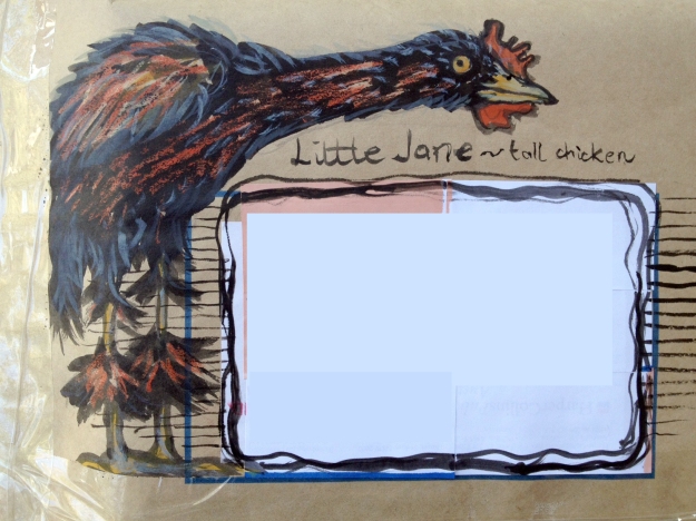
large chicken parcel - no address

Having five funny chickens in my life (with legs much shorter than those illustrated!), and a few bottles of Noodlers ink on the drawing board has prompted two strange chicken decorations in the last week. What will be next?

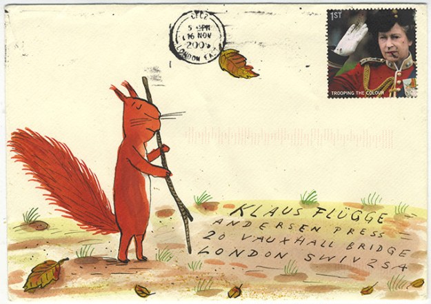
Here are some decorated envelopes sent from celebrated illustrators to publisher Klaus Flügge. How nice it would be to receive something as wonderful as this! But all of us can illustrate packages in our own way. Hooray!

Exel Sheffler envelope

Thunderstorm Dancing

DON’T LOOK DOWN!

I am balancing on the thinnest of ropes over an abyss of awful drawings.

I must keep going with the indian ink and not look down… or sideways, or upwards. Especially upwards.

I have been struggling with my roughs for Thunderstorm Dancing. The text is wonderful. The possibilities are endless. This is part of the problem. Endless possibilities are hard to deal with.

I’ve been working with pencils. Love those pencils, but when I have to draw eight characters (including Lucy the dog) interacting on the one spread, the pencil is not my friend. It is not broad enough. I tend to get all fiddly and fussy. I need to use loose lines to get those bodies expressing dance and play.

Lucy and Alice climbing on to the porch. Pencil looking great here. Only two characters and simple composition.

Then, today, when I was feeling a little lost and in need of help, I also made the mistake of looking at Alexis Deacon‘s blog. Aaaargh!! Begone Alexis, Thou Obscenely Talented Man! 

Alexis is herewith banned from my studio until I am happy with my roughs. Then I’ll feast my eyes again on his fabulousness.

So what to do? I needed to strike out in a different direction; re-boot the old drawing engine.

I selected a large piece of my most rubbishy paper (ignoring the sticky note at the top of my drawing board), picked up a brush and dipped it into the Noodler’s Ink.

small use the good paper!

One of the notes at the top of my drawing board. Cecily Osborn was my lovely school art teacher.

Big sigh! I could see some life returning to my drawings. Maybe Noodling is the way forward. Maybe it’s the medium to use. Maybe I need to Noodle my way into some happy compositions and then revert back to pencil when the shapes are right. At any rate it’s a lifeline for now (perhaps like one of those pool noodles you can use for flotation).

DO NOT DIVE

DESPERATE DRAWERS – DO NOT DIVE

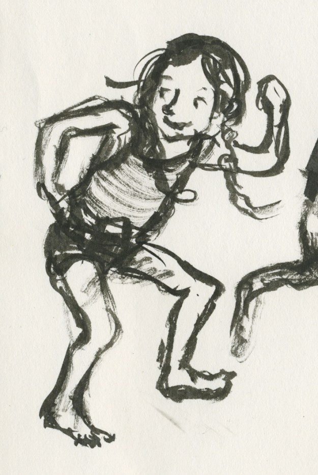
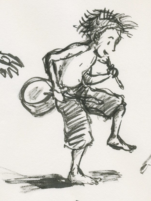
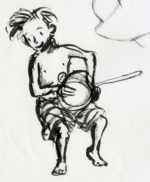
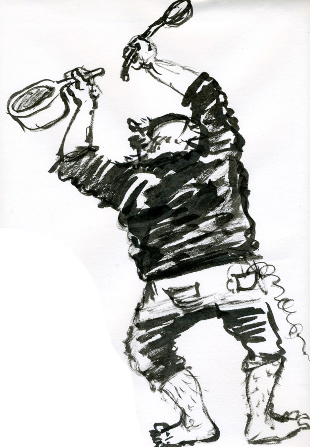
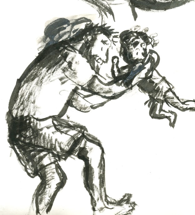
Here are some of the quick, inky sketches. They’re only rough, but they have a bit of life. So…

A way forward for tomorrow.

alice dancing sml ink mitchell dancing sml ink mitchell dancing2 sml ink poppy dancing sml ink tommy and dad dancing sml ink tommy dancing sml ink

Link

CBCA Book of the Year shortlist announced

Congratulations to the Shortlisted book creators and the Notable creators! Some great reading in these lists. When I’m not so flat out busy, I intend to read my way through quite a few of them.

Here are two beauties that I know well already.

The Coat, by Julie Hunt and Ron Brooks

The Coat

And It’s a Miroocool by Christine Harris and Ann James

It's a Miroocool

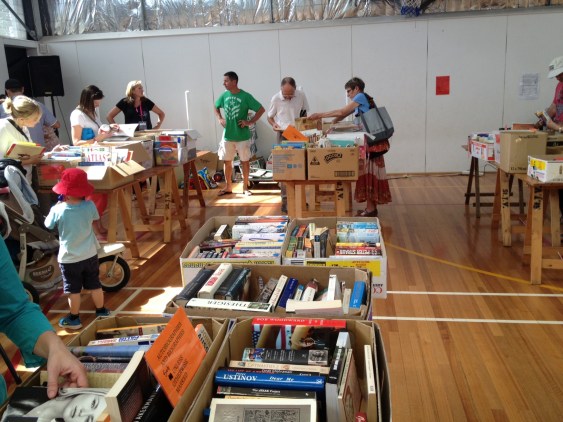
Temptation at the Parkdale Primary School Fair

Parkdale PS fete book stall

Ahhhh me! How did I cope with temptation like this at Parkdale PS fair’s book stall?

Not too badly I think… I bought a pile of books merely 31cm high; a little over twelve inches for those of you not in the metric way. (Oh and two cakes. An obscene chocolate one with smarties on the top – described as ‘hefty’ by the stall-holder as she lifted it, and chosen by Hugo who is eight years old and loves chocolate. And a very sensible and delicious lemon one, dripping with lemon syrup… also slightly hefty for its size it must be admitted and chosen by lemon-loving me. Cake stalls can be tempting too.)

But back to the books! If you consider the quantity of books on offer, it must be seen that I gallantly resisted many of them! Here is one I resisted only because I already have a copy (recommended) but I photographed it for the great vintage cover. The Giant Under the Snow by John Gordon. This story lingers in my head for its magical scenes including a wonderful episode of magical flying. What greater temptation for the child’s imagination?

The Giant under the Snow

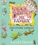
Here’s one I couldn’t resist (because of the great vintage cover) Normally I don’t collect 1970s books, as it’s a little later than my area of interest, but this one was so different from the style I usually associate with Gerald Durrell, that I made an exception for its fantastical, jewel-like cover design. (Also, 9 year old Arthur is animal mad and will probably get into Durrell at some stage.)

Gerald Durrell the Talking Parcel

Actually, from a quick search of the internet it would appear that Durrell’s books have taken on many differing styles over the years. His image is anything but branded. See the below thumbnails for examples.

catch me durrell selection fillets of place my family mid 20th century my family overloaded ark

Here was a mis-matched pared-back pair of Chatterleys that I resisted. Lady Chatterley herself didn’t resist temptation, but I don’t blame her for that. The Phoenix was an interesting choice of motif for this book. The ‘unexpurgated’ edition, probably from the 70s, is a little more obvious.

Lady Chatterley unmatching pair

But I couldn’t resist this luridly tempting classic, which I haven’t yet read.

Blue Vile Bodies

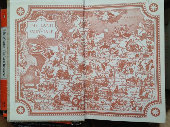
What next? I found a bit of fodder for my current fairy tale binge. A copy of New Tales from Grimm. I’ll admit I’m not even trying to resist fairy tales at the moment. I’m a glutton for the temptation of poisoned apples and gingerbread roof tiles. (Although I’d pass on the little boy stew from ‘The Juniper Tree’ in Philip Pullman’s Grimm Tales for Young and Old, my current bedtime reading.)

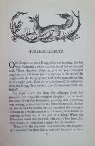
The endpapers on this copy were more exciting than the cover which was lacking its dust jacket. But the internal illustrations were elegant. ‘Hurleburlebutz’ What a great name for a tale! (or a chicken?)

Grimm endpapers Hurleburlebutz

Nor could I resist this paperback copy of The Sword in the Stone by T H White. Scott and I were reading this series aloud to each other during my pregnancy with Arthur (hence his name) but our copy is a weighty tome. This one is quite appealing, and the cover illustration of Arthur (‘The Wart’) looks rather like our long-haired lad at the moment… If you’re wondering how I can tie in temptation for this one, I’ve got one word for you. Guinevere :-)

Sword in the Stone

As I was heading for the door with my armful of books, ready to make my escape, I spotted one more and went back to pay for it. The Book of Cats, (View Productions 1985). The books suffers from a clumsy cover design. But the few internal illustrations are great and made it worthwhile to purchase, especially as there is now a disgruntled black cat in Thunderstorm Dancing. 

I can’t tie in my cat book with temptation, so I’m going into the kitchen to eat some blue cheese. Catch you later!

book of cats cover

book of cats internal book of cats internal 1 book of cats internal 2

20130404-170709.jpg

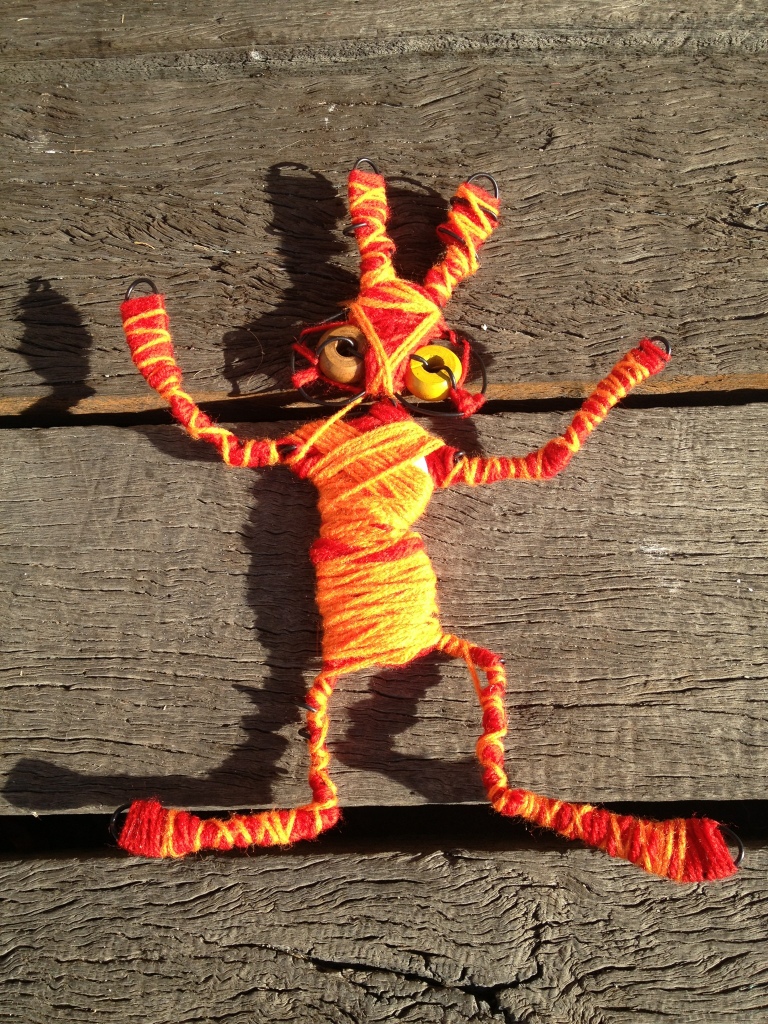
This should scare away the bogeymen when we hang it in the tree in the front yard.
I hope everyone is able to find an hour here and there to do craft with their kids during the holidays. It is fun. Better get back to some real work now though:-)

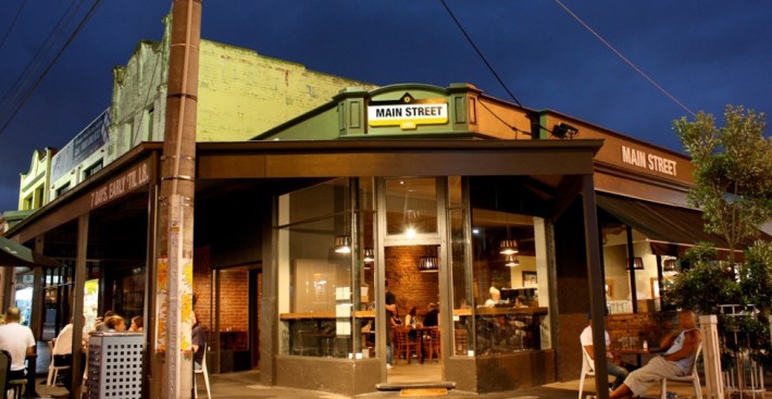
Main Street Café, Mordialloc

Image

What are the essential skills of a good waiter? Friendly helpfulness and not spilling your dinner down your neck? Well, yes. But they are bonuses. What you really want is children’s book recommendations and a chat about literature. 

ImageSo here are Gabe’s two most influential reads from the age of around 11. 

1. Ender’s Game by Orson Scott Card – a cult classic soon to be a film. Gabe says ignore the blurb that emphasises a sci-fi theme. It’s really about people.

Image

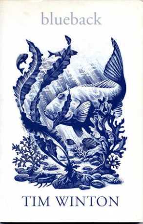
2. Blueback by Tim Winton – a great book. I’ve read this one. 

Image

By the way, Gabe was our bonus waiter. Our real waiter was fantastic and friendly too, but we didn’t get his name. (Only the names of his kids – Arte and Will.) So thanks to the staff at Main Street for my fabulous birthday dinner out. Whenever we have been to this café we have been blown away by the loveliness of the staff. 


The Book of Dragons - current copy

Curses!!

This is the copy of E Nesbit’s The Book of Dragons that I have just bought.

NOW I find, (from my latest ABE books newsletter) that for a mere A$ 813.48 I could have bought this!

567298990567298990_4 567298990_3 567298990_2

World Book Day Showcase – promote children’s reading

This is a great thing. All you crazy book nuts, get on here and write down your thoughts on kids and reading. You already have the book bug. How do you infect the kids as well? My two are already down with a raging book bug infection likely to last them for life. But some kids have an inborn immunity. How can we help them to find the joy and infinite advantages of a reading habit?

Share your ideas on the World Book Day Showcase!

Showcase | World Book Day.


Where have my links gone? Woe…

I am so new to this. I had to change my blog ‘theme’ to something plainer and whiter without little black borders around all the images. Now all my links to favourite blogs have disappeared from the side. Sigh. I guess I’ll work it out, or perhaps someone can help me…

Have a great weekend!

Image

Keys to successful picture book covers?

I’d better tell you right now that I don’t have all the answers to this. But I have some ideas that grow (and will no doubt change) as I go along.

01_heinrich_strub_sumse

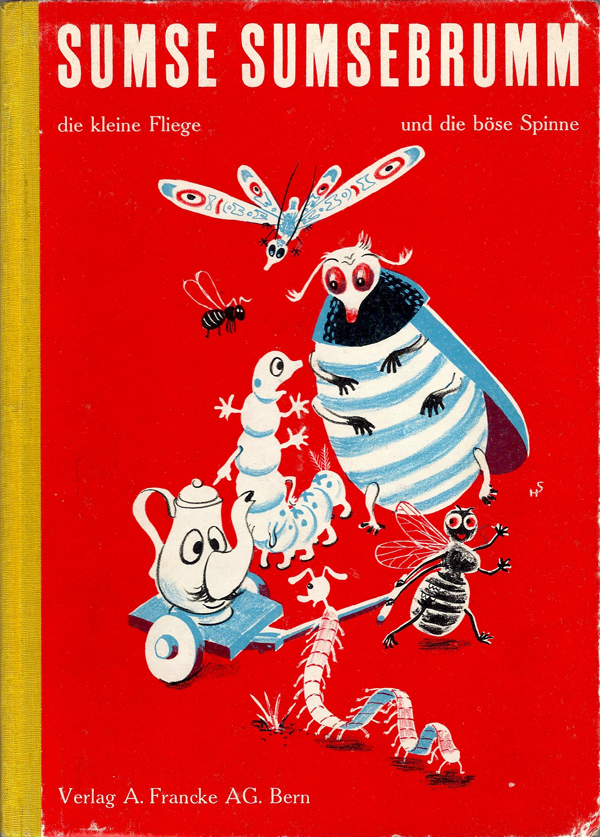
This cover is from the wonderful Will Schofield’s blog 50 Watts.

Two days ago I was working on Thunderstorm Dancing at the library. I decided to concentrate on the cover. The recurring challenge for the day was to find a clean simple arrangement of four main elements: title (longish), two creator names, two leading characters in upbeat active pose (is that really two elements?), suggestion of approaching storm preferably including a big, dark cloudy area.

Thoughts on book covers

thinking in the library

1. Book covers are a lot like posters. The main thing is simplicity. The brain can’t take in (or rather can’t organise and process into the short term memory) more than a certain number of ‘chunks’ of information at one time. So you have to organise and limit your chunks and try to get your tonal contrast to help you with this.
2. You need a clear hierarchy of information. Don’t let your illustration and your lettering get into a battle over the top billing. This is a common problem, I find, and was my biggest challenge the other day.
3. Title Lettering is important. Hand lettering is nice if you can do it well. Sometimes skilful typography is as good or better.
4. Striking that fine balance of using a formula that works but also avoiding cliché! Tricky
The perfect number of ‘Chunks of information’
George A. Miller has provided two theoretical ideas that are fundamental to the information processing framework and cognitive psychology more generally. The first concept is `chunking’ and the capacity of short term (working) memory. Miller (1956) presented the idea that short-term memory could only hold 5-9 chunks of information (seven plus or minus two) where a chunk is any meaningful unit. A chunk could refer to digits, words, chess positions, or people’s faces. The concept of chunking and the limited capacity of short term memory became a basic element of all subsequent theories of memory.
Hierarchy and clarity of text with illustration.
The Middle Sheep
A good arrangement. I was happy with this. No fighting. (Although inside the book plenty of fighting between characters)
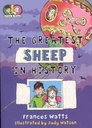
Greatest Sheep in History
This is a favourite book of mine but not my greatest cover design. The lettering is fighting with the balloon and it could end in tears.
Title Lettering
There are some hand lettering examples here and some are pictured further down.
Cliché
Sometimes making certain that something will work well, means taking the safe route. And that’s not really what art is about, and it doesn’t help us to grow in our abilities, nor our courage. So if there’s a new, exciting idea that works, and doesn’t look like something we have all have seen 300 times before, that is probably better. If your deadline is tomorrow and you have a headache, that might be another matter. Go for the cliché but do it well.
Well, how did I go with my work? Most of the chunks on my cover designs were getting in each other’s way. I needed them to work as a team. I needed a coach, with a whip and a carrot and another carrot or maybe some chocolate. I didn’t have a coach, so I did the next best thing. I went and sat in the children’s picture book section (not to suck my thumb) and went through two shelves pulling out any covers that I thought worked.
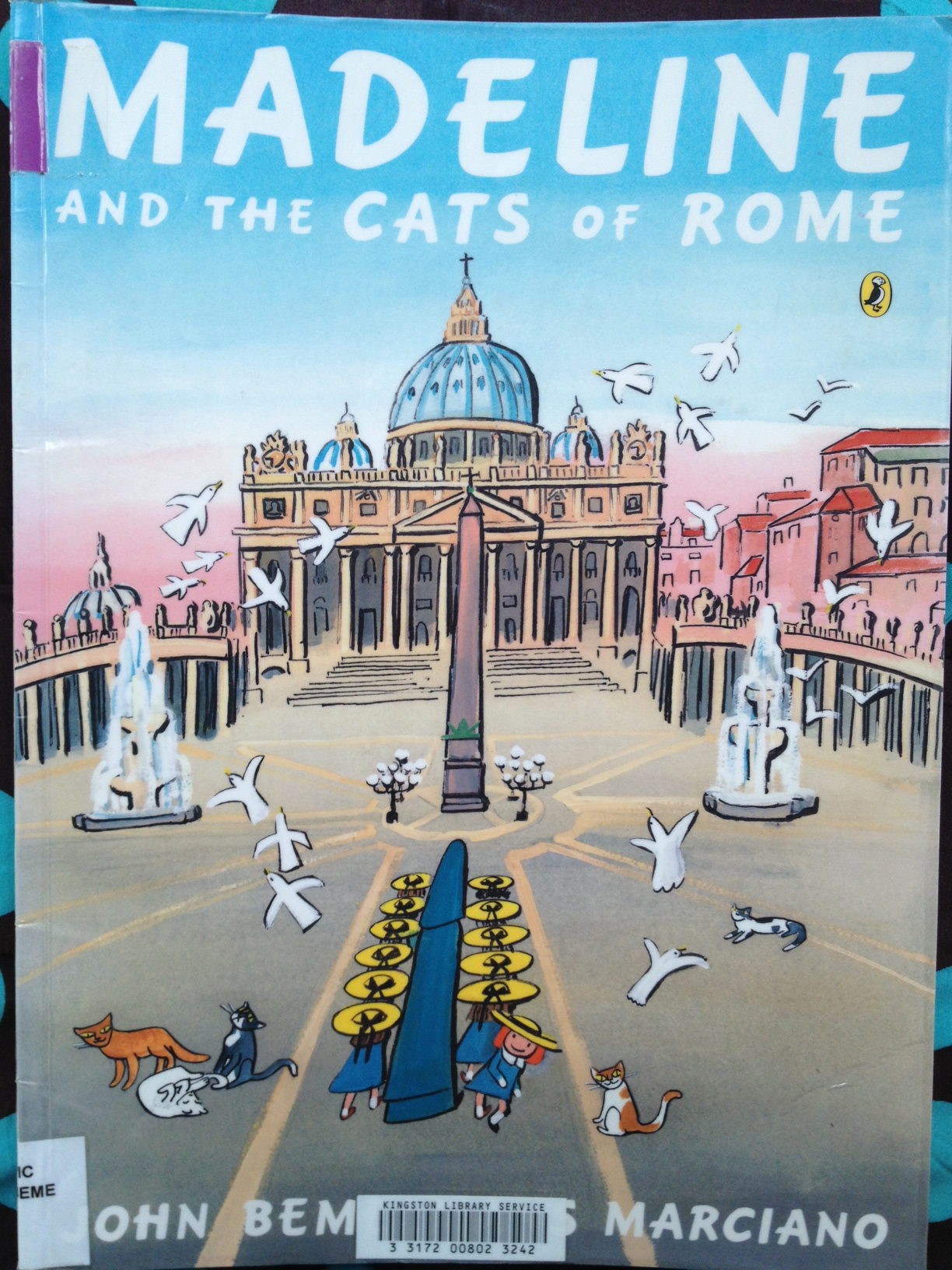
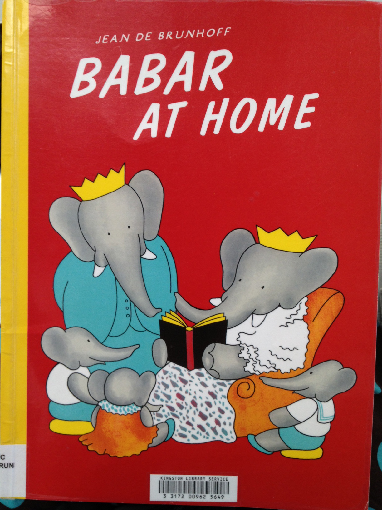
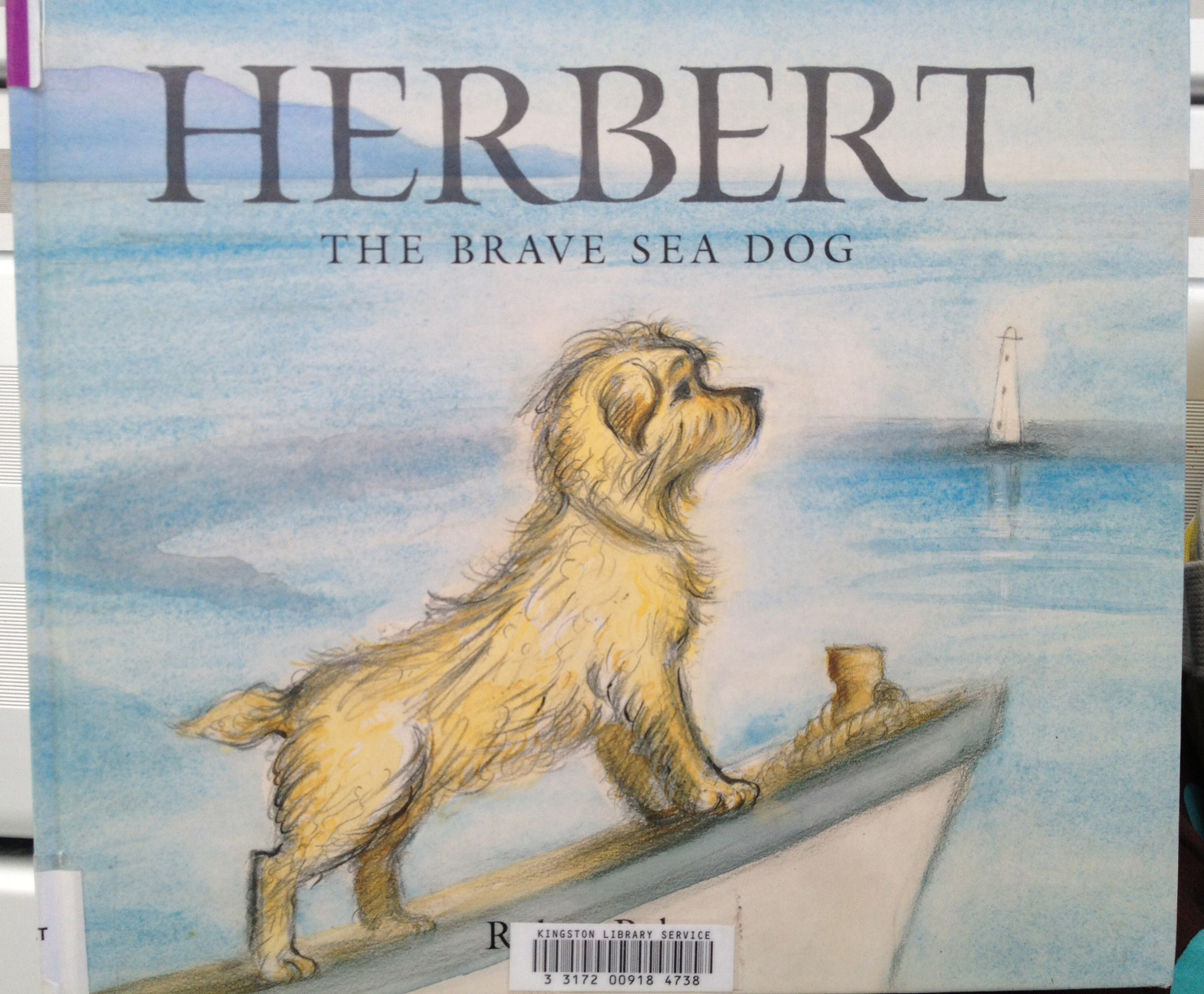
These are not necessarily the pinnacle of book covers. They just happened to be the ones on the B and D shelves that seemed to work. At a guesstimate, they amounted to about 2% of the books. A lot of the books fell into the trap of the Greatest Sheep in History with text and illustration fighting to the death. Some were just outdated looking but not in a good way. A lot of the successful ones were older classics like Babar and Madeline, and they also provide great examples of the use of hand lettering. I’m not posting any of the not-working ones, because I’m not here to knock anybody else’s stuff, only my own :-) So here are the books from the B and D shelf that worked for me (some better than others).
Madeline and the gypsies

Great contrast and clarity but still has texture and painterliness.
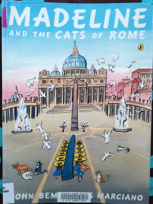
Madeline and the cats of rome

A complicated image, but still clear to take in. Possibly helps that the book is HUGE.

just how long

A contemporary style. I might have skipped the white drop shadow on the title text. I love the texture on the bird and the string and how the string leads us to the title.
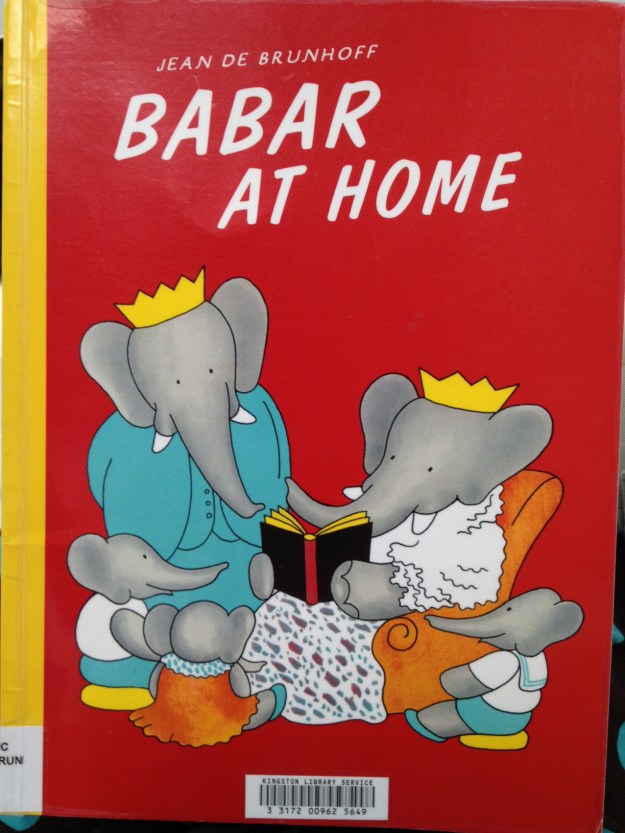
Babar at Home

This is a copy of the original, and the hand lettering has been replaced by fake hand lettering. A pity, but it still works!

Babar and Father Christmas

Also a copy, but so completely delicious! look at that colour contrast and all that ‘white’ space!
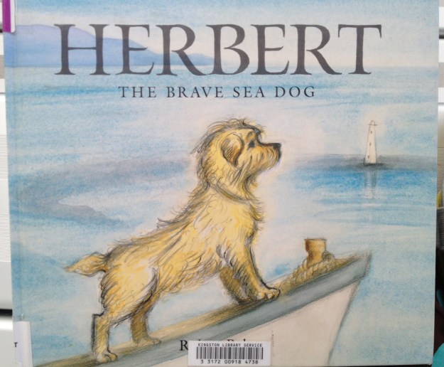
Herbert the brave sea dog

This might have been helped by a bit of extra contrast somewhere, but they’re going for soft and that’s okay. It’s not ground-breaking, but one of those tried and true working formulae.

20130305-180114.jpg

Perfection. Again, a re-hashed concept. See the latest reprints of Goscinny & Sempé’s Nicholas books (Phaidon) for something very similar. But it’s so good, why not? This book, by the way, is a divine thing. It is like a meshing of Sempé and William Steig (Pete’s a Pizza). I’m buying a copy.

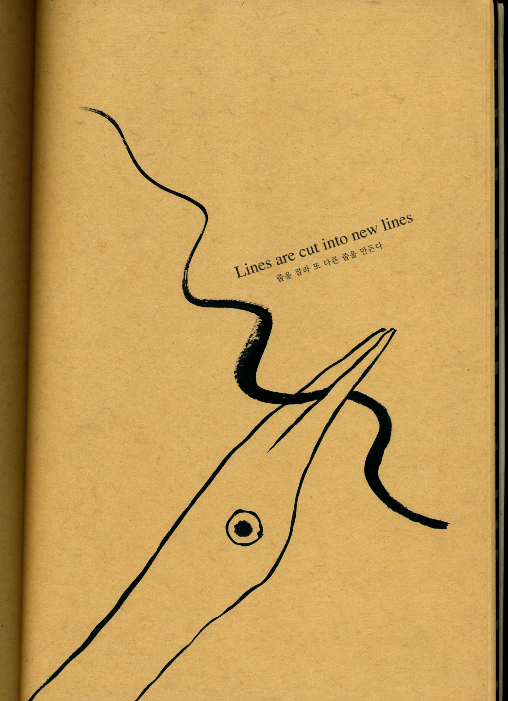
So that was my work day at the library. Yesterday I got home from an appointment to find a parcel on my doorstep with a book by Kang Woo Hyon called ‘Point Story’. Reading that clarified my book cover thoughts even further, with regards to simplicity, contrast and the beauty of the painter’s mark. So I am filled with ideas to move forward now!
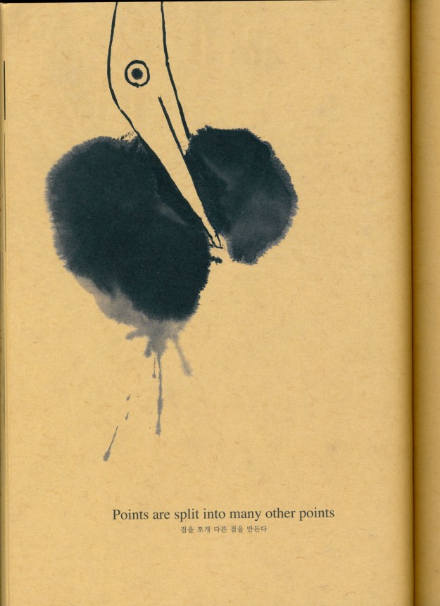
point story 1

From ‘Point Story’ by Kang Woo Hyon from NAMIbooks.

point story 2

Also from Point Story. Go here to see more about NAMI books and Nami Island.

Sorry this was so long (and WordPress seems to be cramping all my paragraphs together. That’s not a good look).

Cheers!