Tag Archives: 52 week illustration challenge

Tentacles

Wednesday night. My night of indulgence. Kids in drama lesson. Me drawing for an hour. I remembered to take some water containers this week.

No I didn’t. I got them out. Then left them behind. But I did get a plastic cup from the cafeteria which I could have done last week if I hadn’t had a secret desire to eat ink.

The 52 Week Illustration Challenge theme… OCTOPUS. I was feeling reasonably comfortable with this, since I’d done an octopus/ squid that I liked back in SIMPLICITY week. (below)

inky octo

Nice and simple. Oh well. I couldn’t put him in because he wasn’t done freshly for the Challenge theme. So I drew a few more.

First this.

red octopus lores

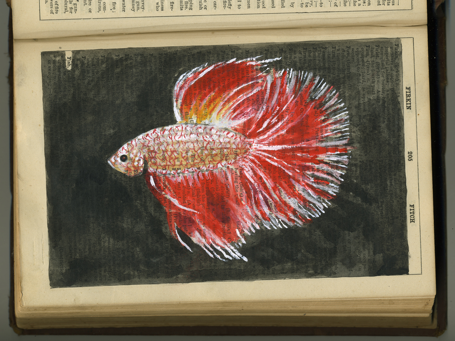
I liked working with all the reds and wishy washing them over each other. That was nice. But I shouldn’t have tried to do the eye ‘realistically’. It’s most unattractive. (Unless you’re an octopus. Then, I’m sure it’s wildly sexy.) I bumped up the colour on this one before posting on Facebook. So he looks like this now.

red octopus levels lores


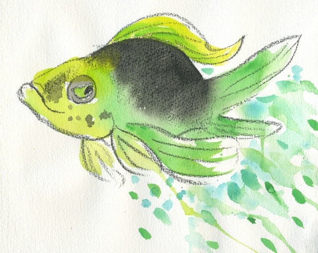
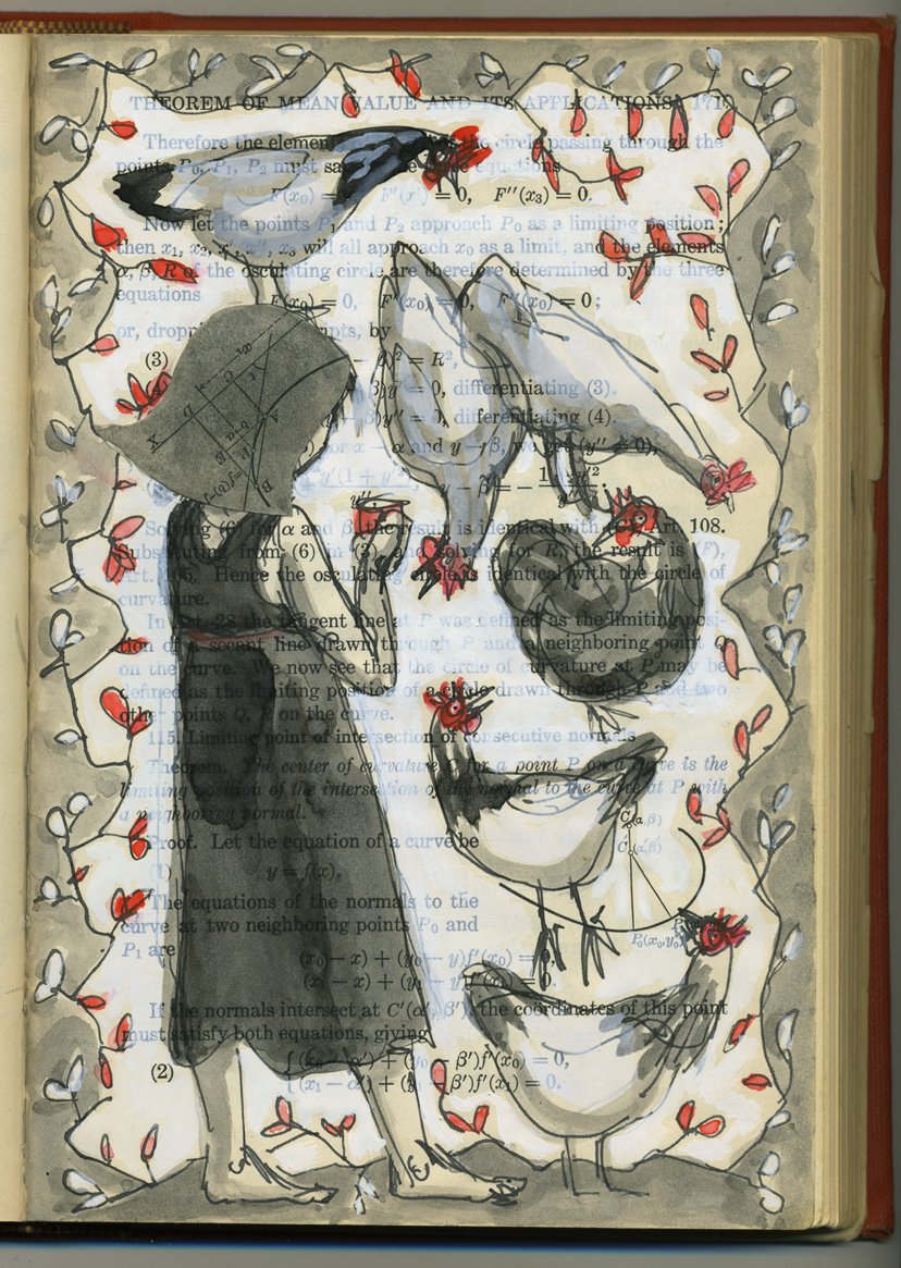
I preferred my second go. It was very quickly drawn in the old Calculus book, with a bit of wash added after the Prismacolour artstick.

altered book octopus loresHe’s got a little more life to him. And I like his eye which looks quite focused and intelligent.

The next one (groan) was painted after I got home and I thought I’d do a semi-blob treatment starting with grey ink. But he was awfully drab and then I added soft pastels to liven him up. It partly worked. But I was too lazy to hunt out the full collection of pastels and the colour around the eye is yucky! (Very typical of me to stay put on the high chair and use only the colours that are within reach at the drawing table. A shocking vice which may have had something to do with my ink eating last week…) Also the eye is awful again.

octo cleaned up lores

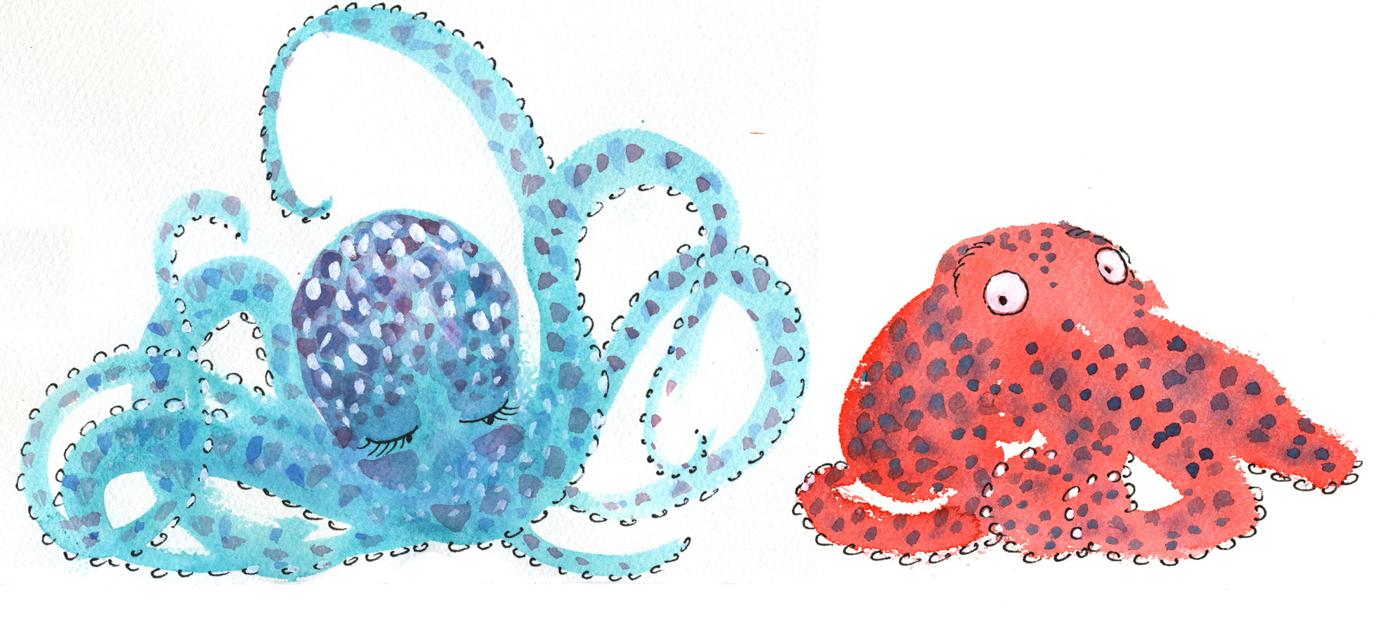
Finally I did another using the semi-blob treatment using coloured instead of grey ink. And I changed the eye treatment. I came up with a cute little red octopus on his first date. He is sitting on all his tentacles so as not to accidentally embarrass himself. I like him, but I really don’t like the girlfriend I whizzed up for him. Maybe it was a kind of jealousy. I wanted him for myself…

But I should be kind. Good luck little red octopus. I hope she’s the one for you.

octopus first date lores


The Feast

or

The Fast

or

The Curse of the Black Tongue

This evening was the Drama Class night, when I take my two plus one more to a drama lesson at a big leisure centre. We always enjoy the evening despite the slightly rushy nature of eating early straight after school and then getting to the class on time, when nobody can find their shoes, or their book for the car or remember to go to the toilet until we are about to drive away… the usual stuff. They are a happy bunch of three and I enjoy their nutty company. I also enjoy the slightly-less-than-one-hour of free time at the centre when I can draw just for fun.

This week’s 52 Week Illustration Challenge theme is ‘feast’. It’s not a theme that lends itself to time poor folk because it conjures up mental images of banqueting tables, rife with imaginative and mouth watering detail. Forget that.

Having grabbed the nearest half-stocked ‘art backpack’ as I went out the door with the mad ones, I found that I had limited supplies with me. (You were wondering what that subtitle The Fast was all about, weren’t you?) I had a vintage book to draw in and a box with pencils, fine point felt tips losing their inkiness, a brush tip black pen (also fading), one deep terracotta red crayon and a small paintbrush but no water receptacle.

Thinking I’d hopefully find a pithy quote to illustrate in the vintage book – something that brimmed with feastiness, or failing that, feistiness –  I found it was all about a family during the Gold Rush and that Hugo had used the first half to practice scribbling with thick black texta.

Image

Not to be deterred, I found a page with a description of an extravagant breakfast. I set to work illustrating it using a pencil and the first subject that came to mind: a chicken serving breakfast. Unfortunately the chicken was so long and elegant of neck that she obscured the text she was illustrating, so I swiftly moved on.

I found the page above and quickly drew Mrs Pym in her kitchen with the fading brush tip. She’s okay. But remembering that the brush tip is water soluble I found I hankered to deepen the tone with a bit of water. No water. Aha! Yes! You guessed it. The Curse of the Black Tongue!

I confess I glanced around me to see that nobody was deeply offended, as I proceeded to use the nearest clear liquid to hand… or mouth.

I had half a drama class still to use… what could I find? After a few minutes of fruitless searching, I gave up on wasting time looking for food references in the vintage book. I thought I’d draw a pelican with a border of fish leaping around him on the page. And so I did. But the fine point markers kept running out on me as I drew, so I kept changing, keeping to a .5 or below.

FEAST pelican lores


Although a real pelican  would be more likely to feature blue legs I think, the red crayon came in handy here. And once complete, I was just left thinking how much I’d like one more colour to highlight the fish with. If only!

Oh happy pelican! As I resorted to the Black Tongue again in a not-very-hopeful kind of way, thinking that this time, the ink was waterproof, I found to my delight that all but the bird’s body and one wing were drawn in fine point markers that were water soluble and which when wet became green!

I am quite pleased with my pelican page. But I can still taste that ink on my tongue.


Some Fishes

I recently looked up the correct usage of fish vs. fishes. I was pleased to see that fishes is the correct term when referring to different varieties. There’s something nice about the word fishes and it goes nicely with swishes and wishes.

If you happened to be a fisherman and you caught 25 fish they would all have to be  of the same species.

These fishes are not of the same species. Some might say they were not drawn by the same artist.

Sometimes I worry that I should have a single, recognisable style; that all my work should be instantly recognisable, like a trademark. You can always recognise a Quentin Blake, a Mondrian, a Mitch Vane, (to take a more local example).

Other times, I say to myself… whatever comes out, comes out. Art is a lot about the process of discovery, the process of play, imagination, exploration, invention. And when I wander into new territory, with an insatiable curiosity for (and delight in) new artistic approaches, I am glad to be a wandering artist… I learn new things all the time and that is a great thing to find in life.

Image

Detailed, or static styles are not, and never will be my strong point. I’m too impatient (and ambivalent) to invest much time in details, so my ‘detailed’ work never stands up by comparison with the work of those who specialise in that area. But every now and then I come back to it, and play around and there’s something satisfying in the process, even if the result lacks both the liveliness of my quicker work and the detail that would seem to be required. Often the honesty of the piece redeems it.

In this case, the vintage Collins Dictionary (with pages disintegrating and falling out) seemed to ask for a static approach. I think the single artwork above is unremarkable. But if I were to fill the book in a similar manner with various artworks, the book itself may become a thing to treasure one day. The fish will be swallowed by the larger beast.

Image

Here is a return to my much quicker approach. The prismacolour artstick strikes again. It may be partly inspired by political weariness… the idea of the dangling lure… leading to what?…

But mainly it was a very rapid experiment in the power of transforming a sketch with PhotoShop colour. I’ll be using this technique in my next book, so why not?

Image

Finally, a very quick sketch with watercolour. The first watercolour experiment I did (not shown here) was deader than a doorknob. This was a 10 minute exercise in proving to myself that I could do the same fish with a bit of life. Not sure what he is up to. I think he may have the same kind of determined expression I adopted when drawing him…

Equine Soliloquy (continued)

I haven’t touched this project for a while. But the 52 Week Illustration Challenge theme for this week is ‘horse’ so it seemed a good reason to do some more doodles in the horse book. Most of these were done in brush pen during the hour of the kids drama class, but I’ve worked them up a little more at home today.

Horse alive, horse dead

Horse alive, horse dead

snowy squiggle horses

snowy squiggle horses

The front horse was drawn with photographic reference in front of me. The rear two emerged on their own. I like the freer, more pattern-like quality of the rear two horses, but quite like the very typical attitude of the foreground horse’s head. The two types don’t really go together but it’s a point of interest for me.

I enjoy this squiggle style of drawing. I find I do it more and more. It’s fun to let my hand (seemingly) control itself and wander very rapidly all over the page.

equine soliloquy hunched horse

Little scraggy wild horse

This is the brush pen I used quite a bit for the Cornish Soliloquy. I must buy a couple more. They are very interesting to work with. The ink doesn’t flow very quickly so they tend to get a bit affronted by my drawing style. I draw pretty quickly and the ink flow goes on strike and demands a breather every minute or so.

wild horse, captured horse

wild horse, captured horse

I was really pleased with the way this little sketch worked out. I strangely like the way the gutter interferes with the horse’s hind quarters, and I  liked the cream, blue, burnt umber colour palette.

Anzac Day war horse

Anzac Day war horse

This was an accident really. I was dissatisfied with the original sketch on the left hand side of the skeleton horse spread, and cut this black horse silhouette out very quickly to place over it. In the meantime, I painted out some protruding bits on the other page to give myself a fairly blank canvas. But this led to a new sketch on that page, and hence no need for the cutout horse.

So he went onto a new page, and I started randomly embellishing him. I started with the halter, but war horses and Anzac Day were at the back of my mind and I started putting tassels and other structures into the picture (from an outdated botanical diary). Before I knew it the background had gone smokey, fiery and the final touches were some poppies and botanical bombs in the air. The bombs also remind me of a holy trinity of sorts, but since I am not religious, they are primarily bombs… or just fruit.

I seem to have returned to muted tones for the time being.


52 Week Illustration Challenge – Week 7 Watercolour

Aaah, the perils and pleasures of spontaneity and ignoring the rules!

Woman mourning the loss of a Giant Pomeranian

Woman mourning the loss of a Giant Pomeranian

Having decided to do an illustration onto plain paper (gasp!) instead of a printed book page, I grabbed a fine liner (the nearest one to hand) and proceeded to do a slow and deliberate (double gasp!) outline.

It was when I was about to apply the first watercolour that I thought to look at the pen to see if it was waterproof. The pen shaft was mute on the subject. Oh well… My first dab of watercolour revealed the truth and the ink began to run enthusiastically. However, I have long been a fan of Sally Rippin’s beautiful ‘Fang Fang’s Chinese New Year’ that features profusely bleeding ink outlines so I continued on and  really enjoyed it. (I must ask Sally how she did this.)

I also liked the fact that the ink bled a deep purple colour, which has infused the whole picture with blackcurrant tones.

When I tried to invent a new breed of dog (a kind of Giant Pomeranian) to accompany my character, it didn’t work. But that’s another story. So my costumed lady was cut out from her page and collaged onto a new background. And I enjoyed that too, including the bright, undisguised cut edges remaining around her.

And lastly, Brain Pickings had a great post today on creativity and taking risks and it’s worth a read for any artist. Yaaay!

selfie lores

Another for the 52-week Illustration Challenge.

Theme for this week, ‘selfie’. I am looking a bit Holly Hobbyish here with a large, collage head of differential calculus hair. It would have looked better with darker hair, but I didn’t want to lose the lovely calculus curves under a heavy load of ink. So I’ve left it lightly tinted.

I liked the way the little numbers and mathematical figures here and there remind me of insects or seeds that the chickens are constantly seeking.

The smooth paper of a vintage book reacts completely differently from the way proper watercolour paper should react to paint. But there’s something rather nice about it. It  sucks up the ink in a thirsty way, remaining very smooth and composed all the while.

Scott discovered the word ‘groke’ the other day. We all like it in this house and think it deserves constant and affectionate use. It reminds us of Tove Jansson‘s Groke and it means this: to ‘stare at someone in the hope that they’ll give you some food’. (The Groke in Jansson’s  Moominpappa at Sea visits Moomintroll every night to beg him to show her his lantern flame, because she is a lonely creature craving warmth and light but unable to get either. So it’s a poignant form of groking after all.)

With six pampered chickens and a dog, we get plenty of groking around here. Speaking of which, better go and lock the girls up.


Caravan

Caravan

A little pick-me-up / warm-up session this morning for Tania McCartney’s 52 Week Illustration Challenge.

(funny how sometimes my post headings don’t show up… It could be just at my end. Who knows? Now that I have typed the heading into the body of the post, no doubt it will come up as a double heading. Oh well :-)