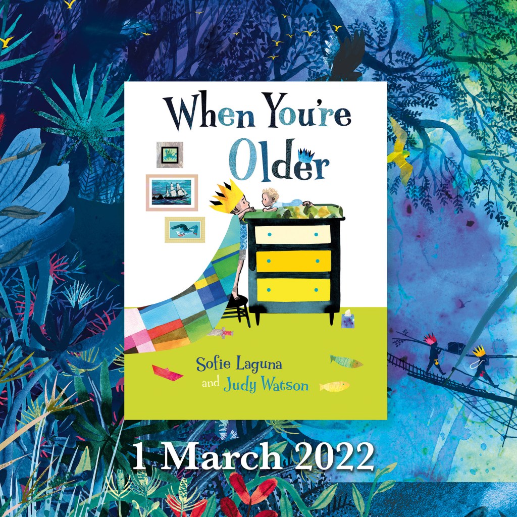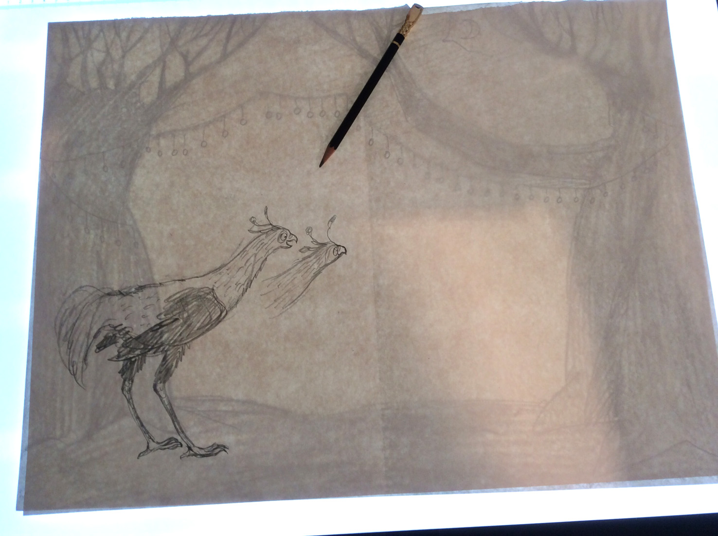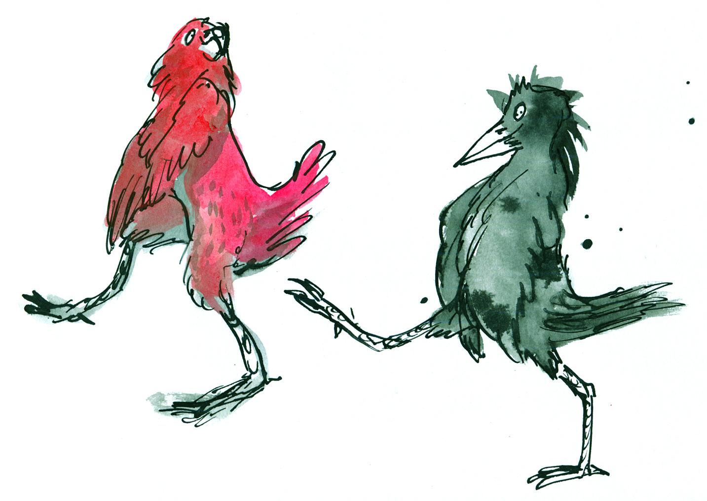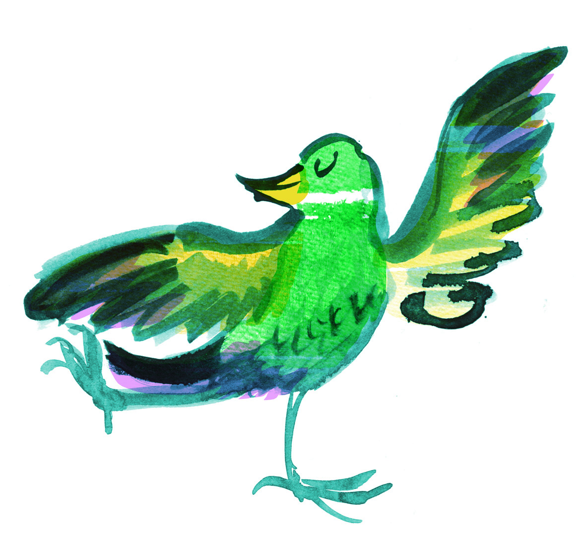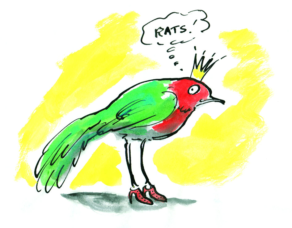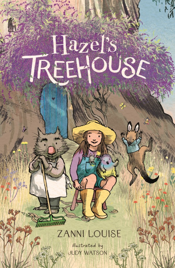
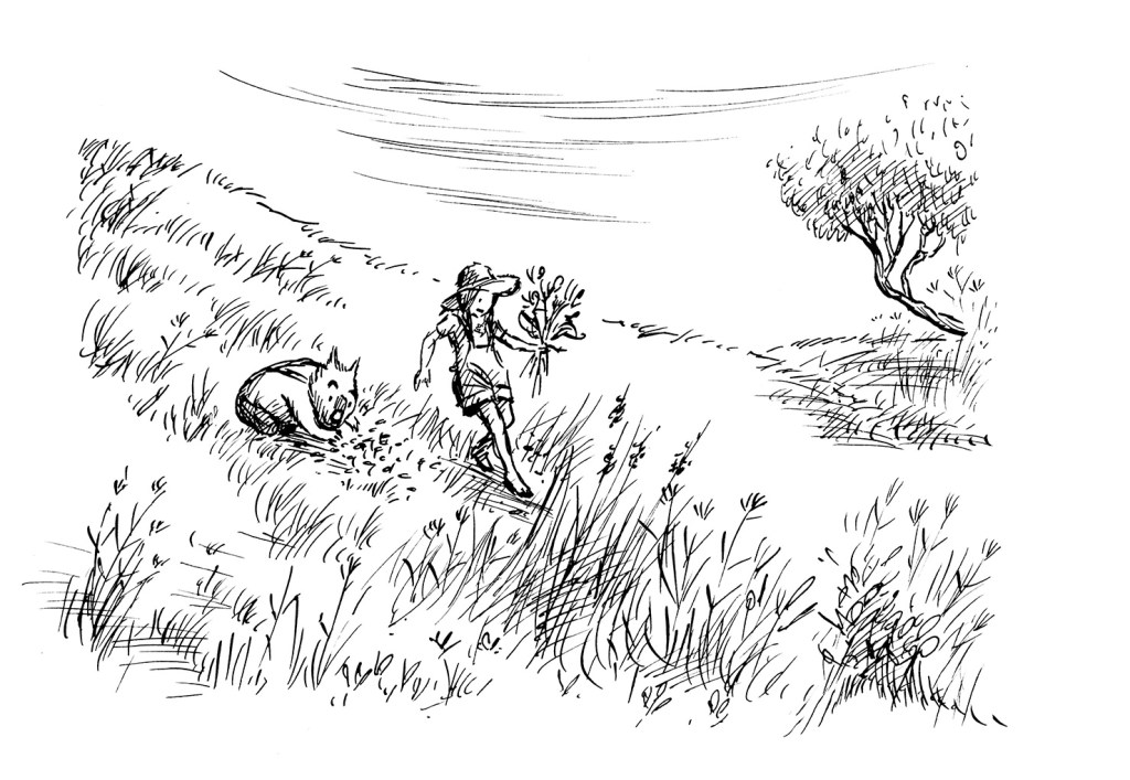
Hazel’s Treehouse is a new collection of gentle junior fiction stories from Walker Books Australia. It’s written by Zanni Louise, illustrated by me in dip pen and ink and it’s wrapped in flowers from its embossed hard cover and purple endpapers, through each of the ten stories to the creator biographies at the end.

Zanni’s a talented and prolific author across all age groups from the very young to YA, and she’s also an adept teacher. So I was delighted to be offered her stories to illustrate. You can check out her other books here if you haven’t already come across them.

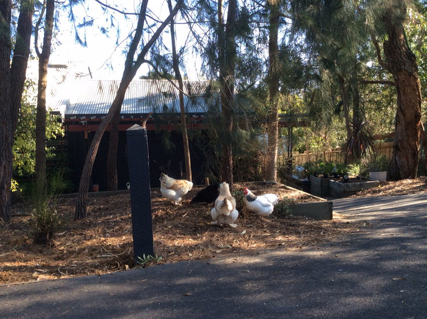
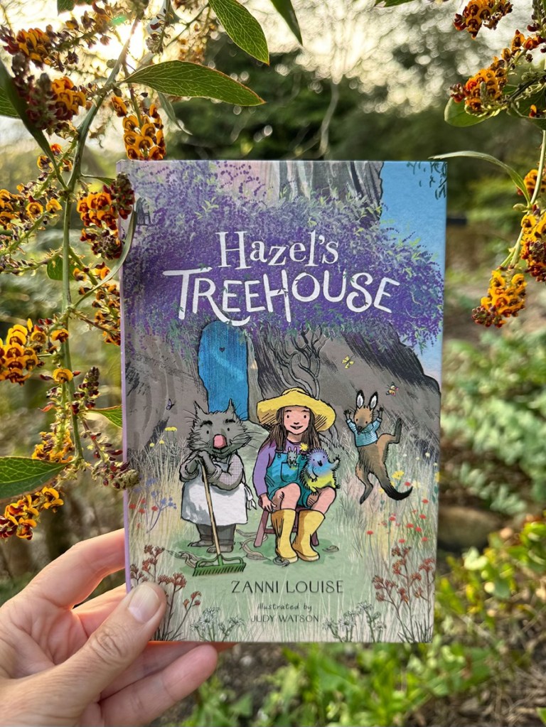
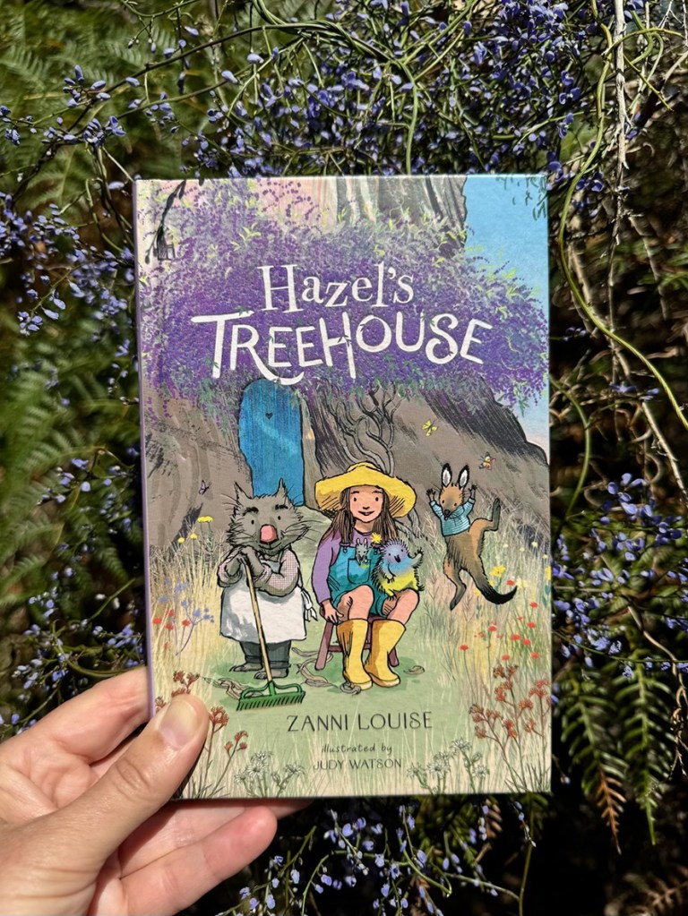
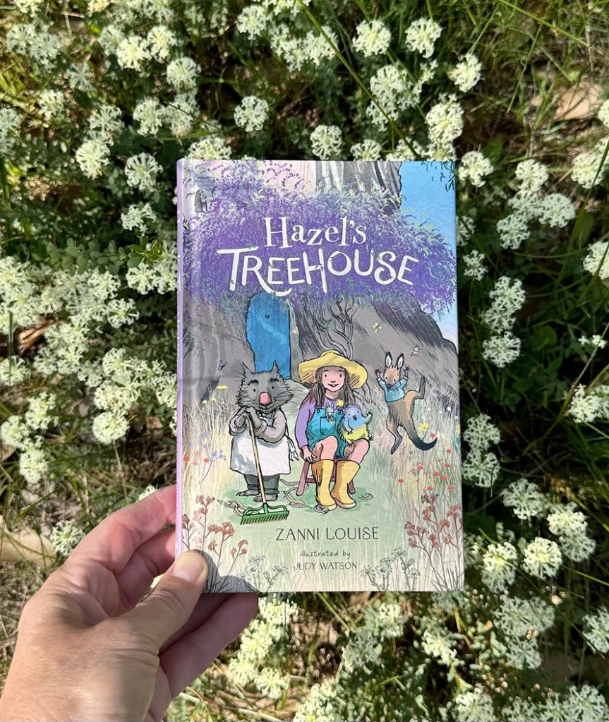
The book came out at the start of November amid an exuberance of spring flowers in our garden and local surrounds, because we’re lucky enough to live opposite a creek reserve and just down the road from a retired reservoir set in native bushland. I loved taking my advance copies of the book out for walks in the bush and photographing it against whatever was in bloom. There’s a floral sampling below, including some of the show-offs and some of the delicate species that people may overlook. In much of Australia, harsh weather, shallow topsoil and unreliable rainfall have combined to evolve plants that conserve energy with small blooms and avoid dehydration with sparse leaves. These plants are quietly beautiful and tough.


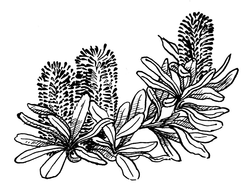
Zanni referred to several Australian flower species in her text, and because I had worked in nature conservation and had a horticultural husband brimming with indigenous plant nerdiness, it was an easy thing to embrace those references and run with them. I chose a plant to begin each story – whichever seemed the best fit (and that I felt capable of drawing!) Some of them were mentioned in the text and some were appropriate for other reasons. Christmas Orchids (Calanthe triplicata) adorned the Christmas story ‘A Very Tiny Day’. Coast Banksia (Banksia integrifolia) was used for ‘A Beach Day’ – even though the gang never made it to the beach. (You’ll have to read it to find out what they did instead, but they still managed to use their goggles and flippers.) Sometimes, if there was no obvious link, it was an opportunity for me to feature some of my personal favourites, like Hibbertia or Pimelea.


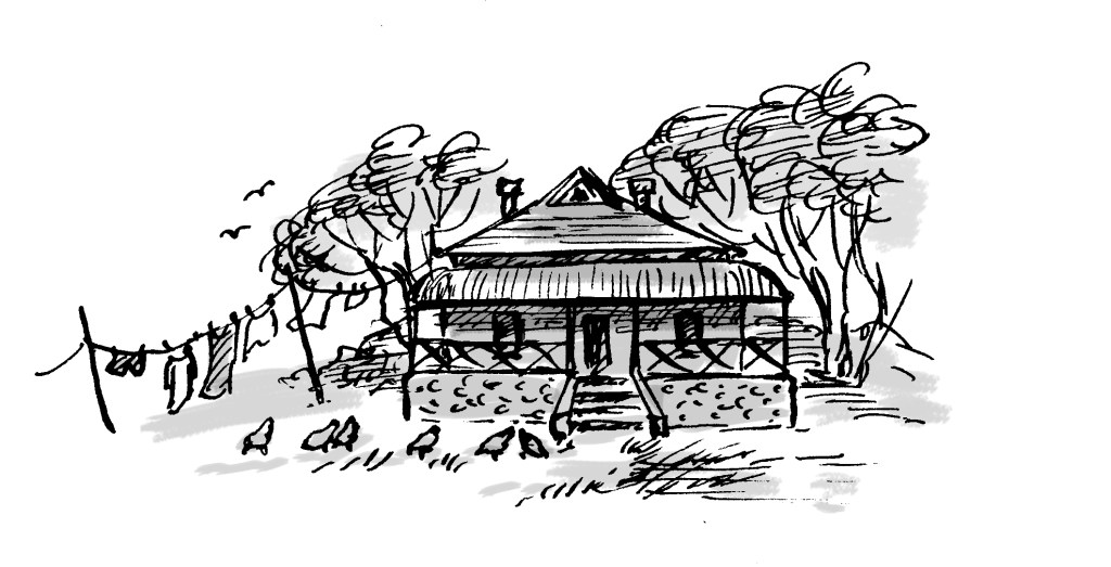
When I first noticed the plant references in the text, I was looking for clues to the location. The setting for any story is also a major ‘character’ in the story, creating an atmosphere, a flavour, and the physical framework into which our reader can immerse themself. So it’s one of the first things that I’m feeling for when I’m reading a manuscript for the first time. I thought that Zanni might have chosen plants local to a particular area where she’d prefer to see her stories illustrated. But the plants she mentioned are found all over Australia, and in some cases nowhere near each other. This told me that my setting was an imaginary location in a magical Australia, so… no rules! But for the most part, I’ve illustrated this imaginary place as a Grassy Woodland.
The NSW Office of Environment and Heritage describes Hazel’s surroundings to a tee: The Grassy Woodlands are a widespread and quintessential feature of rural Australia. Dominated by eucalypts, typically boxes and red gums, grassy woodlands have a relatively open canopy with sparsely distributed shrubs and a conspicuous and diverse ground cover of tussock grasses and herbs. Ephemeral grasses and herbs appear from seed banks following rain, while ground orchids and lilies emerge after fires to produce a spectacular floral display.
Hazel’s Treehouse has already been met with a flowering of warmth and enthusiasm from readers and reviewers. There’s much more to share about the process of illustrating it, but it seemed right to mention the flowers before the close of the last day of spring!
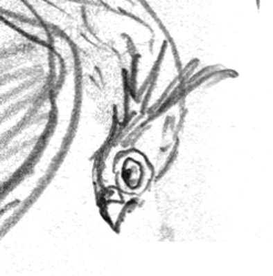
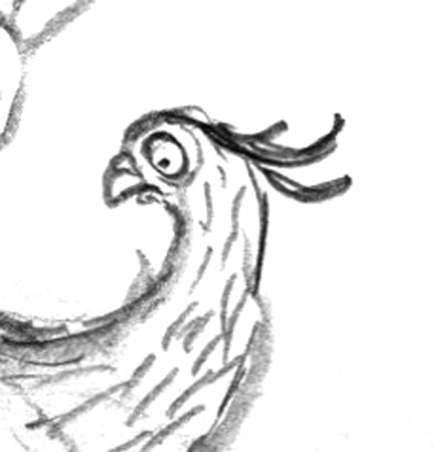
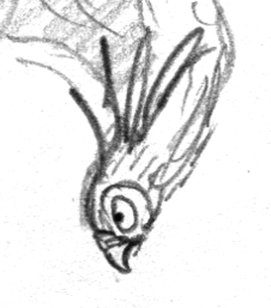
Oh, and here’s 54 seconds of baby Eastern Rosellas in the nest box in our garden, looking exactly like muppets.
For more details about Hazel’s Treehouse, and to read some extracts of reviews, click here.