Tag Archives: watercolour

Endpapers (part one)

Endpapers are a particular favourite of mine, both old and new. I love to create the ends for the books that I illustrate. They’re wonderfully freeing, because they’re not required to go alongside an author’s text, nor do they need to follow along in the exact same style or medium as the other illustrations. They need to feel as though they belong in the same family as the rest of the book, but they can fly off in all sorts of playful directions, and frequently do.

Sometimes it’s lovely to take a purely decorative approach, using whatever medium seems complementary to the book, without direct reference to the story at all. Decorative endpapers may just be stripes, spots or splashes and can look beautiful, as though the reader is opening a brightly wrapped present – which in a way they are!

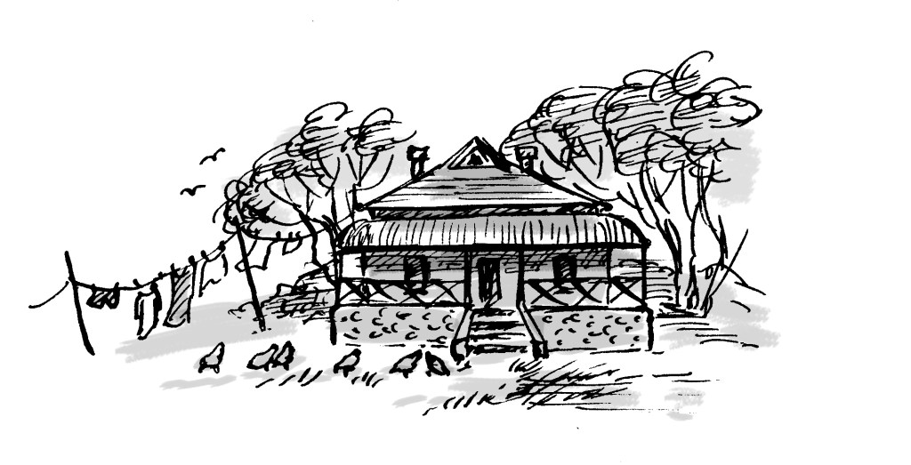
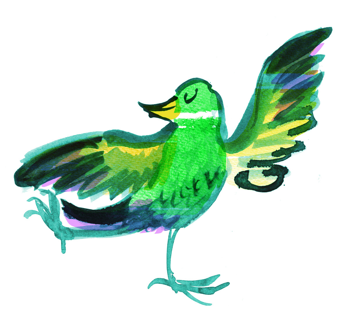
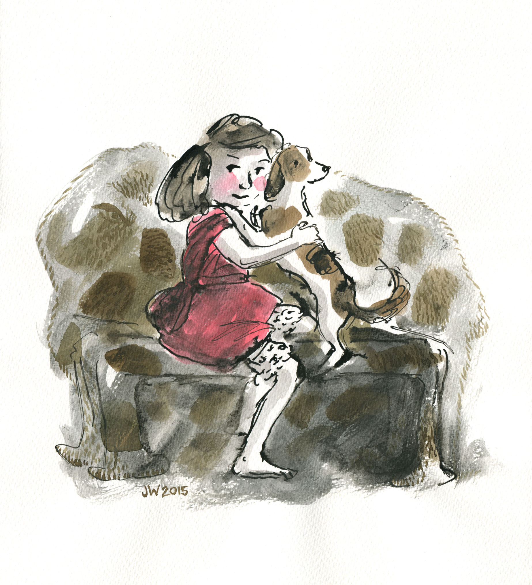
Mostly, I am so involved with the text that I can’t resist linking the ends to what’s inside. Sometimes I like to refer to a repeating motif in the book such as seagulls, and a little black cat as we see in Thunderstorm Dancing. Or I refer to the setting of the story, such as the forest in Leonard Doesn’t Dance. Sometimes I like to tell a bonus story without words, so that when the book has been read and the story is over, there is somewhere to linger and to imagine our characters in their next adventure or in their everyday lives.

Endpapers for Goodnight, Mice! by Frances Watts and Judy Watson.

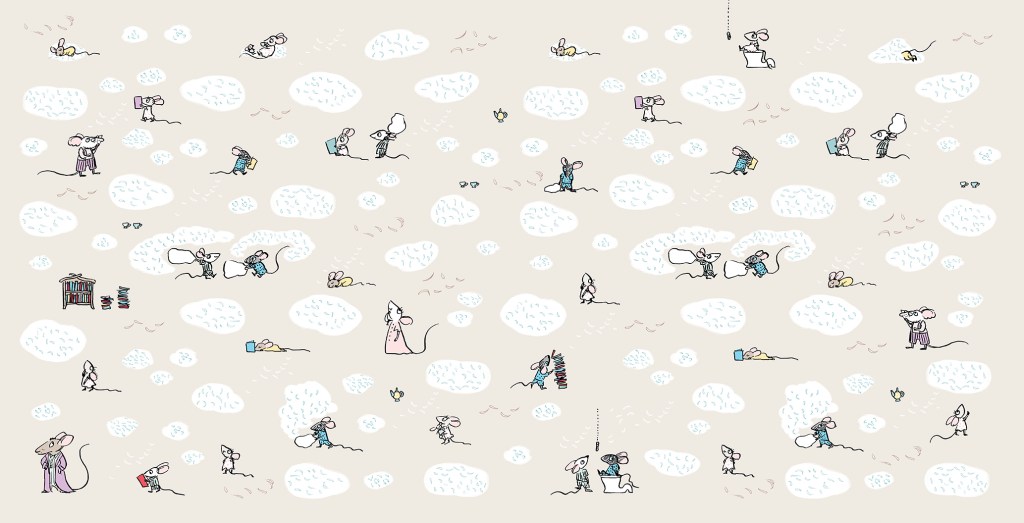
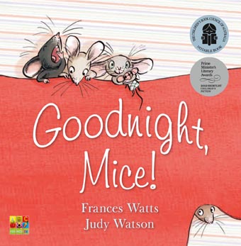
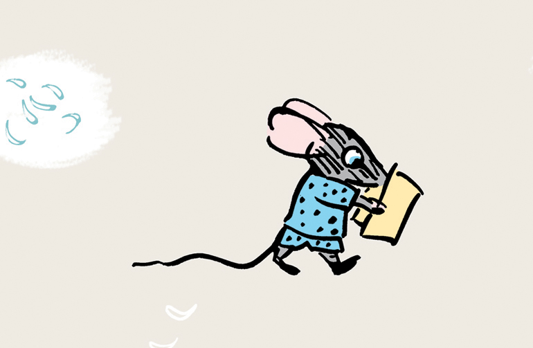
Goodnight, Mice! is a bedtime book, so the ends are muted in colour and evocative of a pyjama pattern. But I really wanted to play around a little further with these sweet mice, so I made tiny, simplified sketches of all of the family members. It was fun creating shorthand versions of each of the characters. The twins of course, are causing mayhem with a pillow fight, and there are stylised feathers floating everywhere (made by pressing down hard with my poor, mistreated dip-pen nib).

Mitzi and Billy – up to mischief as usual.
I feel that Clementine will not be happy about this.
Books and bedtime go together like cheese and… mice. So I put lots of books on the ends as well.
I really hope Billy is not going to flush before Mitzi gets off the loo…
This is the original family from the internal illustrations. Still loose, but more fully formed. (That was not a toilet joke.)

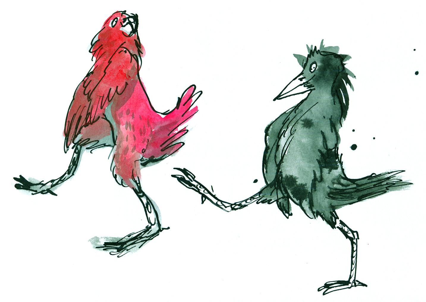
The endpapers for Thunderstorm Dancing were originally to have been printed in two colours, which is why I set them up in black and blue, (black and red for the rear ends) but Allen and Unwin decided to print in four colour process instead. In the internal illustrations, I had sneaked in a playful visual gag where the cat is greedily eyeing off all the fish. I thought it only fair that he got to eat his fish in the end. So below you see him washing up after his meal. (The seagulls are not amused.) In this case, I decided to do the reverse of what I had done for Goodnight, Mice! Instead of shrinking and simplifying the characters from the book, I enlarged them and made them more naturalistic in style.

Front endpapers for Thunderstorm Dancing by Katrina Germein and Judy Watson.
Rear endpapers for Thunderstorm Dancing.
This is a detail of the cat as it appears, quite small, in one of the internal illustrations.
Front endpapers for Leonard Doesn’t Dance by Frances Watts and Judy Watson
Rear endpapers for Leonard Doesn’t Dance.

The ends for Leonard Doesn’t Dance are mostly decorative, but they also set the scene for the story. I wanted them to be sumptuous, because I enjoyed making Leonard’s forest world so much. The front and back ends are continuations of the same setting, except that the moon is lower in the sky after the birds have been partying all night. The party lights can be seen in the distance.

Endpapers from Searching for Cicadas by Lesley Gibbes and Judy Watson

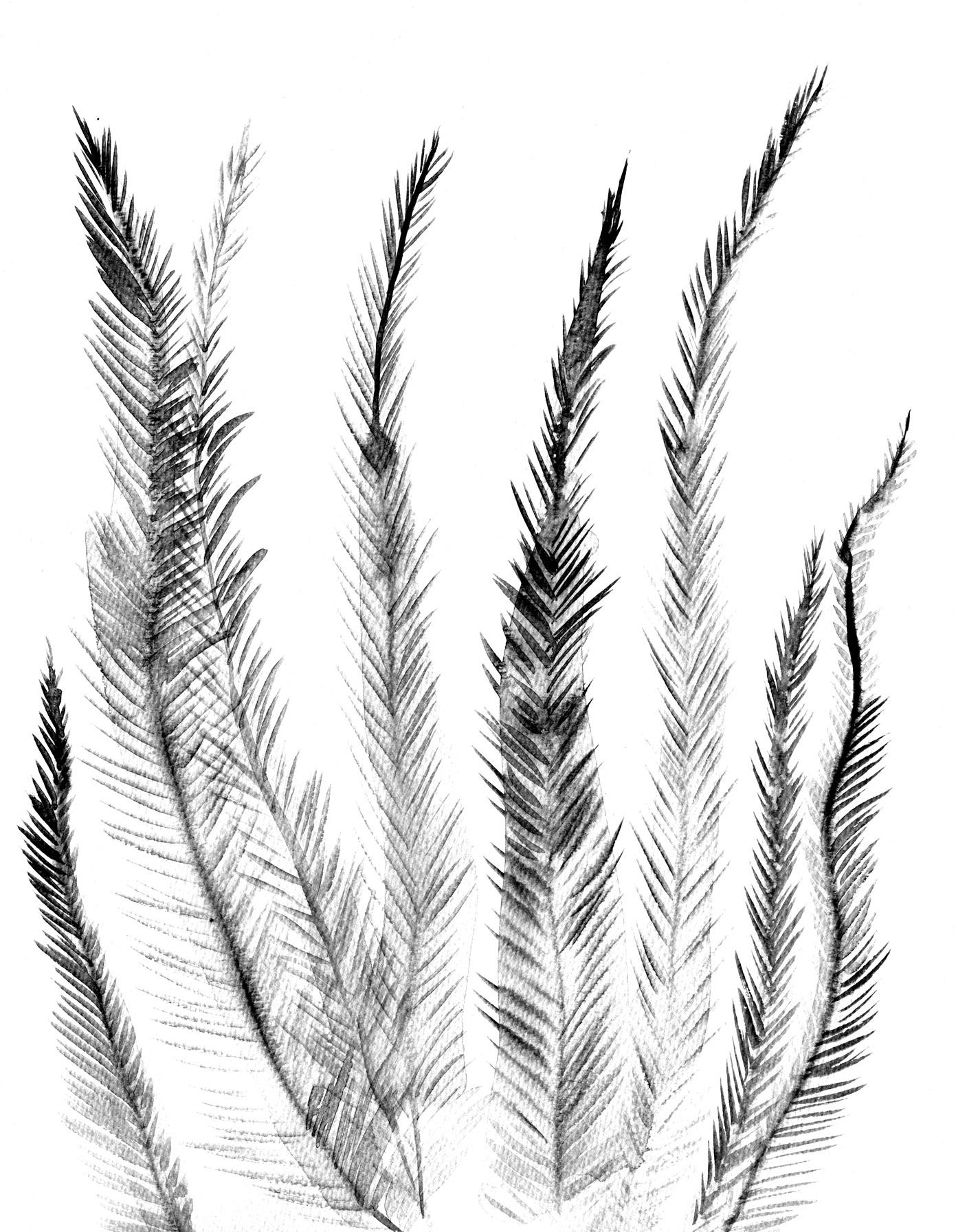
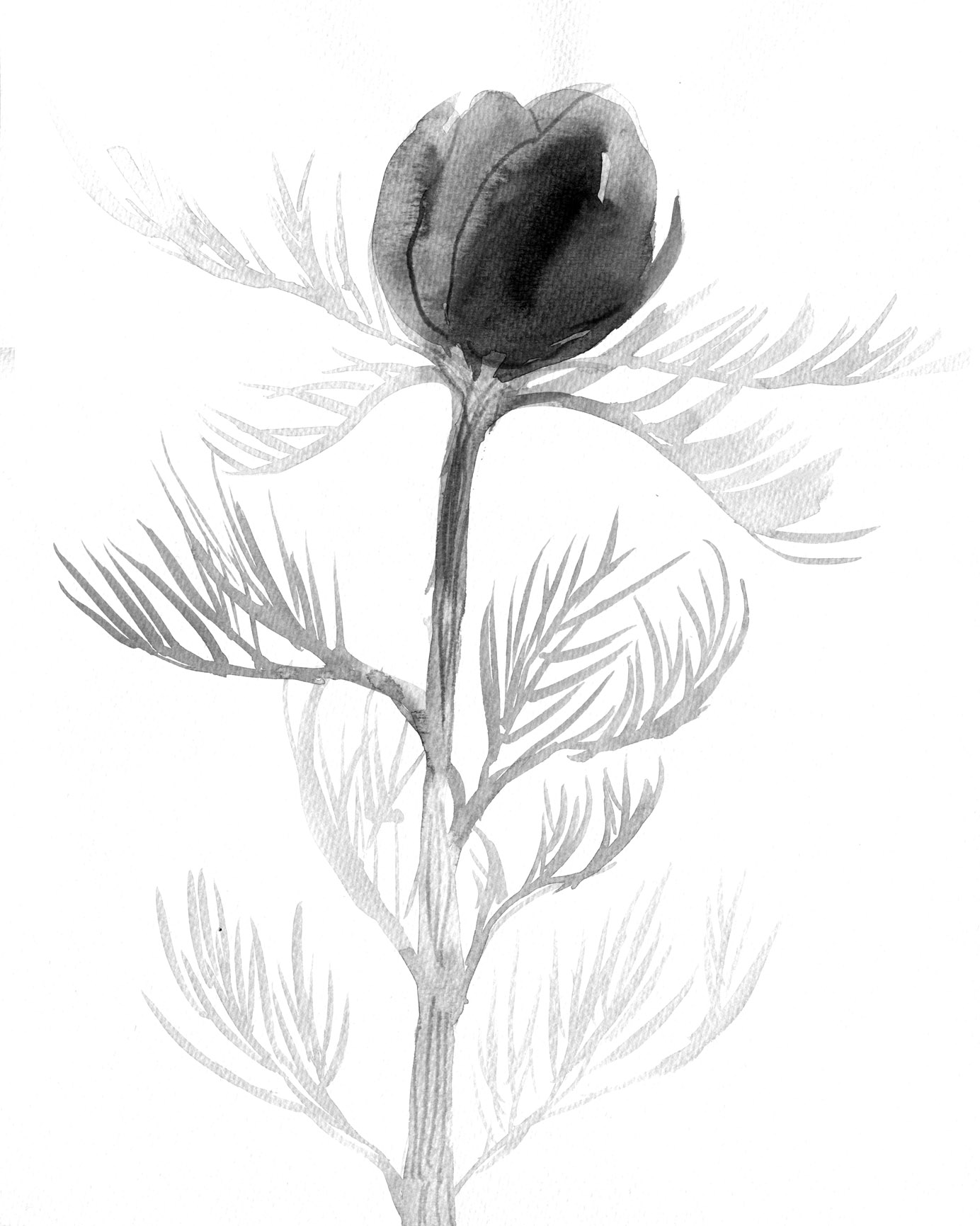
These ends are mostly decorative too, but they hint that in this story we will be looking closely at the forest floor. They were a delight to make, involved a lot of glorious inky mess, and they have their very own classroom activity. You can find it here.

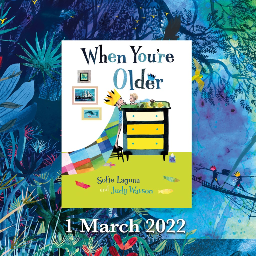
Now we get to my latest endpapers – the ends for When You’re Older.

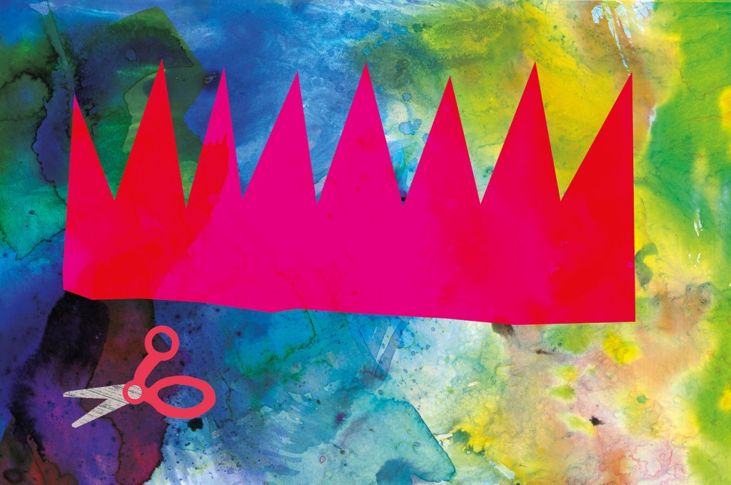
When I was thinking about what kind of endpapers would be best for When You’re Older, one of my ideas included origami sea creatures, and one of them included a paper crown. They looked like this.

There were a few reasons why these ideas might have been fun and effective:

• Firstly, they are bright and cheerful and the scale of the images is large, which made a nice contrast with the fine detail of much of the book.

• Secondly, they are an easy way to communicate to someone choosing a book, that the story is suitable for a young child.

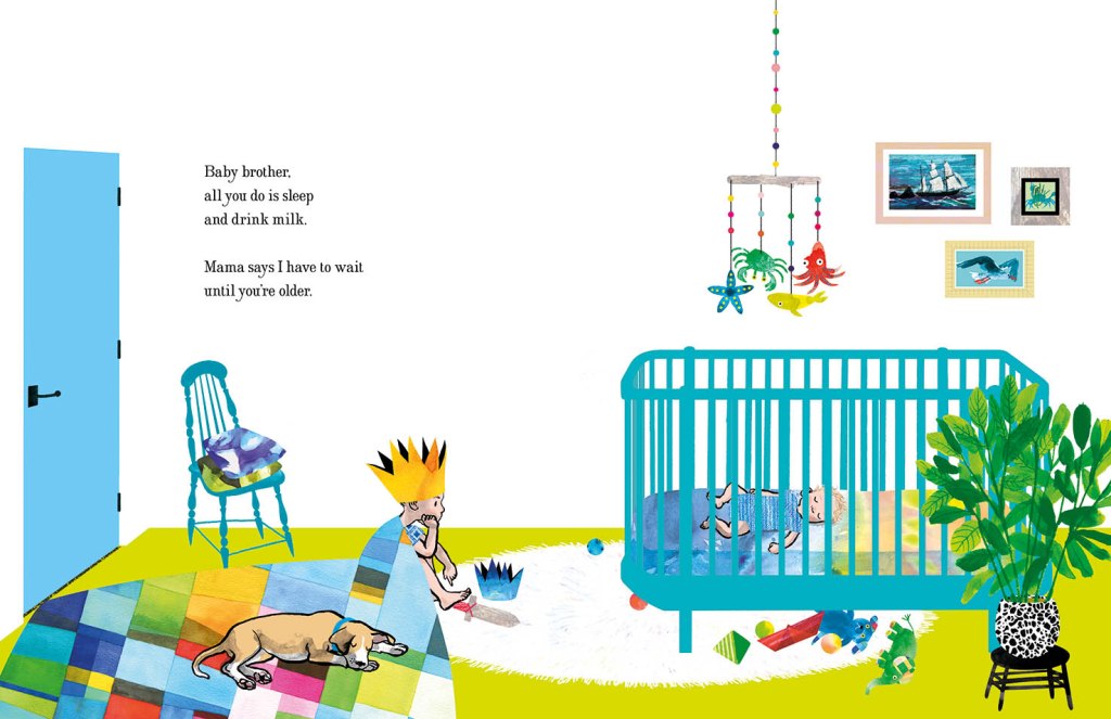
• Thirdly, they help set the opening scene in the homely world of the brother who is enjoying some paper craft. The crown concept shows us a close-up of what he is doing on the title and half title pages. The origami concept gives us an example of something he might do on a different day. And it leads the reader into the theme of sea creatures that repeats throughout the story.

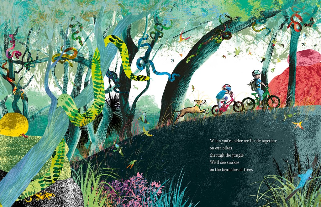
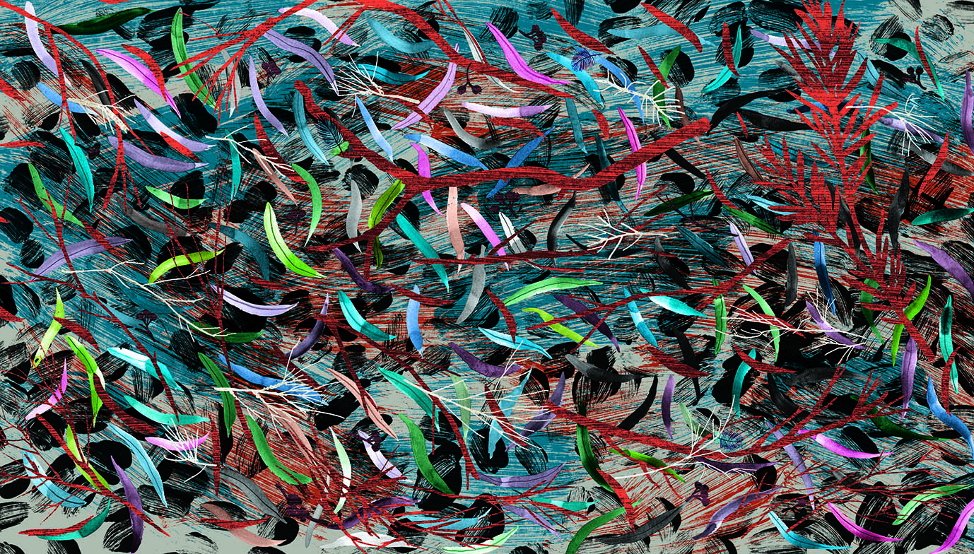
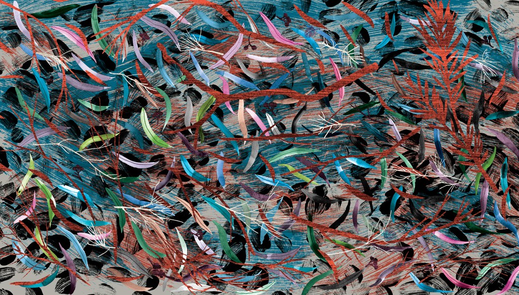
In the end we decided that the treasure hunting scene (below) would be best, because it is truly dreamlike, and hints that we will be entering a world of the imagination. It reflects the illustration style of the adventure part of the book; full of detailed vegetation, creatures real and imagined and with our boys painted in silhouette. But it is subtly different, in that it is rainbow hued and uses blue instead of black for the details of the ship and characters. The blue has a hazy feel and helps to suggest the dream state. The feel of the endpapers is decorative, but it is really a ‘bonus story’.

Endpapers for When You’re Older by Sofie Laguna and Judy Watson

I had a second idea for a bonus story and I hoped to have different ends front and back, telling two dream adventure tales. But it would have taken too long to complete. I hope to make the second illustration as a standalone, and if I do it will be available as a print. (It involves a giant squid, deep sea diving and more treasure!)


Musings on drawing and architecture from a non-straight-liner

From Tansy Magill by Carol Ann Martin

Some people can draw any building or interior with a sensitivity that invests it with warmth and personality. I truly admire them. For me, all those straight lines are problematic. I don’t feel any love for drawing architectural shapes, even though I love architecture itself. I prefer the outdoors and organic forms, including people and animals. The surface textures, the curved lines and the movement of figures or landscape are much easier for me to successfully express.

Most illustrated books require at least some built spaces to be drawn, and I’ve dealt with this in different ways for different book projects. Here are a few of them.

Cover design by Sandra Nobes for ABC Kids (HarperCollins). I remember getting emotional when the publisher suggested the mice could be printed with a spot varnish. I felt that being soft and velvety creatures, they shouldn’t be made hard and shiny! I get quite attached to all the characters in my books and become a bit protective. Embarrassing, but true.

In Goodnight, Mice! By Frances Watts, I made the house organic, the walls, doorways and furniture curved. I took my inspiration from straw bale homes, wattle and daub homes, and hand-crafted furniture. Using a dip pen and ink, there was little opportunity to be overly fussy. Drawing with a dip pen sometimes feels like trying to control a half wild pony that’s running away with me.

The opening scene from Goodnight, Mice! showing a very small house with an enviable chimney.
Getting ready for bed, and selecting a book from a rather quirky bookcase.
The kind of bed that inspired the mousy furniture. (The mice must have used much smaller sticks!)
Sandra Nobes also designed this cover, for Allen and Unwin.
The book has just been re-released in paperback. Hooray!

With Thunderstorm Dancing by Katrina Germein, I was happy with the small drawing I did for the back cover (below). Perhaps it worked for me because of the loose lines of the dip pen but especially because of the small size. There’s no room to fuss with a 30mm wide building. Snuggling the building into the hill and embedding it in a stormy sky helps to give it a certain ‘rightness’. It takes on the personality of its surroundings.

A small windswept beach house and matching chook shed for the back cover of Thunderstorm Dancing.

The veranda was perhaps not as successful as I would have liked, being rather stiff, but I made the focus the stormy lighting; the contrast between dark clouds and the golden late afternoon glow of the beach and figures. I added texture to soften it a little. Eep!

A lot of straight lines for a non-straight-liner! Hopefully the focus remains firmly on the atmosphere.
An interior that had to look warm and cosy, yet storm-lit. My selection
of furniture reflects again my need to put curves in wherever possible! And it is funny to me
to see how often my colour scheme is a soft, bright red and a greenish teal.
This lovely cover design is by Amanda Tarlau, for Walker Books.

My garden shed from Searching for Cicadas by Lesley Gibbes, was created in a similar way. Mostly pencil and wash, but with added texture and digital colour. (Note the soft red and greenish teal colour scheme!) My architecture leaves room for improvement, but hopefully the warmth of the characters on the page, the light, foliage and pets set the right tone. And on the next page, we happily marched off into the bushland away from human structures! Phew!

Another black cat. I have a one-eyed black foster cat climbing over my drawing board as I’m typing this
and my three-legged dog Noodle appears in the illustration, proudly flourishing four entire legs.
Off into the natural world.

I also have an unpublished project, where the my buildings again reject straight lines. Based on the trulli of the Puglia region in Italy, they have lovely domed roofs and soft curving interiors. I even stayed in a glorious trullo here, and did some research for my illustrations.

Trulli from a dummy book
Trulli homes in Ostuni, Italy.

But it was exciting to take a different approach to the house in When You’re Older by Sofie Laguna. Here I used the straight lines of the room and other man-made objects to my advantage. I accentuated them, taking inspiration from the marvellous Ezra Jack Keats and pared them back to simple blocks of colour that mimic paper collage. Now they acted as a foil to the scenes beginning on the next page, where the story moves into the imagination and benefits from a strong contrast in style.

I know you’ve seen it already, but here is the cover of When You’re Older,
designed by Sandra Nobes for Allen and Unwin. Out 1 March 2022.
Straight lines, no regrets. The opening bedroom illustration in When You’re Older.

In the bedroom at the start of the narrative, we have animals and ships on wild seas contained in frames that have been reduced to a series of rectangles with no attempt to suggest a hook or a natural hanging angle. The boy too is sitting, waiting in a rectangular room like the paintings in their frames. But the small animals dotted around the room, the houseplant and the two kinds of boat (origami and painted) have fed his prodigious imagination which breaks loose as we turn the page.

Rampant curves and movement take over the book from here. (Do I spy soft red and greenish teal?)

Here everything has broken out of its containment and we see the beginning of an undulating landscape, teeming with life and with an exaggerated forward slant like a slingshot that has just been released to propel our characters forward into the world.

I’ve used the solid graphic shapes here and there through the book, most often for man-made things like bikes, ladders, tents, and the fanciful double-ringed shape that suggests a view  through binoculars. So the contrast between rampant texture and solid graphic shapes continues. But on the pages dedicated to the immense power of nature, it is not really in evidence at all, and expressive brushstrokes set the entire scene until we return at last to our original bedroom.

Upcoming events to celebrate When You’re Older

Wednesday 23 March to Tuesday 19 April
Colour, Line and Collage: Mixed media works in and around books.
Exhibition of original works including the patchwork paintings featured in When You’re Older. Some prints of the illustrations will also be available to order.
At Streamline Publishing and Gallery
22 Commercial Place, Eltham 3095
Open Wednesday to Saturday 11am – 4pm, Every second Sunday 1pm – 4pm.
Enter from the Town Square.
Above Eltham Bookshop

Saturday 26 March – kids’ drawing / collage workshops and signed book sales.
Frankston Library
60 Playne Street, Frankston
Phone 03 9784 1020

Sunday 3 April WORKSHOP 2.30pm – 5.30pm
STORYBOARDING – taking a text and moulding its shape on the page.
A book illustration workshop for adults and young adults.
This three hour workshop will be hosted by
Eltham Bookshop and held at Streamline Publishing and Gallery
22 Commercial Place, Eltham 3095 (Above the bookshop)
To coincide with the launch of When You’re Older and the exhibition
Colour, Line and Collage: Mixed media works in and around books.
I will take participants through my process: How I responded to Sofie Laguna’s text and, together with the publishing team, brought her words together with my ideas to create finished art for the book. After a short break, participants will use a sample text to create a storyboard of their own.
Entry $80 includes a signed copy of the book, light refreshments and all materials.
Bookings can be made through Eltham Bookshop
Tel: (03) 9439 8700
Email: books@elthambookshop.com.au

The Kick-About #10 ‘Romantic Museum’

The prompt for Kick-About #10 is one of Joseph Cornell’s boxes from 1946 titled ‘Romantic Museum’. I have a book of Cornell‘s bird boxes, and I love it, but I hadn’t seen this box.

Every person‘s experience of a work of art is different. Nevertheless I can’t help wondering how many people may see ‘mass isolation’ as I do in this piece – viewing it now, during a pandemic. I see a hand stitching quietly, small, intimate objects, windows and walls and another window over the entire thing. And finally a cloud of black sand infiltrating everything. This prompt was chosen by artist, Vanessa Clegg. I will be interested to read what she has come up with.

My response to this piece led me to paint a series of hearts partly hidden behind or framed by window shapes. I was thinking of them as hearts as I was painting, though they didn‘t look like hearts in the anatomical sense, nor as pictograms. They represented all those people; their feelings, quietly beating away, hidden behind windows and walls. A lot of them were in shades of red, but they changed to blue and other colours.

heart beating

I started thinking of all the ways hearts are described. All those corny yet evocative terms…

smouldering • aflame • stony • black • blue • hidden • heavy • bursting • in flight • weeping • broken • united • wounded • beating • battered • lifted • stolen • promised • given • taken • tender • gentle • faint • brave • open • loving • pure • of glass (thanks Blondie) • rotten • twin • frozen • bleeding

Blue tending to Black (A rubbish scan. It doesn’t capture the colours at all well.)

Then I thought of all the combinations I could have, starting with Blue Tending to Black. How about Pure – Frozen, or Stolen – Smouldering, Stony and Promised… but I realised That what was really giving me pleasure was the layering and texture. No surprises there. Layering and texture have been a focus for me for quite a while and are very evident in my most recent book illustration.

fan brush layering gouache, watercolour and black ink. (This fragment was painted as collage material for my current book project.)

In particular, I was using a fan brush to very lightly drag layers of watercolour and gouache across the painting. The delicacy of the fragmented lines entranced me. Also the way the colour changed as the paint dried, as gouache will do. It made the painting feel so alive. Each pass with the brush partly obscured the previous layer, but did not completely cover it. It felt like a metaphor for life. Which is really what artists are grappling with every day. And probably partly explains their angst! Every decision is a little goodbye to the past that cannot ever again be recovered exactly as it was. And a hello to a new possibility, that just may be more beautiful yet.

The passes with the brush became slower, more deliberate; crossing over left to right, top to bottom. Always with the heart in the window in mind. Then I found myself weaving.

Woven

And this was the result.

Leonard dances on (part 2)

Having had a lot of fun with my digital collage and brushwork, I picked up the dip pen and filled my inkwell once more to explore Option One.

pen and ink crooner judywatsonart

Dip pen and ink with real wash. 

Having fuddled around with birds for some weeks, I felt warmed up. My drawing hand was in action again. I was feeling a bit racy. The big brushy birds were fairly cumbersome in terms of getting the dance action going, and I wanted to see how these birds might actually look dancing; particularly in pairs or groups.

So here’s where my trusty dip pen came in. I used the same one for the whole of Thunderstorm Dancing and I’m not sure what I’ll do when this particular ratty nib gives up the ghost. It’s pointy and twitchy and zippy and once the pen hand is warmed up, the quicker the drawing, the better.

In my first sketches, I referred to pictures of people dancing. The birds looked rather hilariously like people in bird costumes.

pen and ink crazy peoplebirds lores

pen and ink ridiculous birds

Seriously, what???!! Must be stuffy in those bird costumes…

pen and ink person to bird lores

Here you see me trying to figure out how to turn a human dance pose into the equivalent bird pose. Doesn’t work. The bird’s leg joints are so different that when forced into a corresponding pose, they become stiff and awkward. 

pen and ink john travolta lores

John Travolta? 

They were terrible. After that I put Fred and Ginger aside. Phooey! Better to just look at birds and make their gestures approximately dancelike. Despite my lack of dance expertise, I could put more of an expressive spin on a bird drawing without scrutinising a real dance move.

Then it became more fun. These birds were attending an imaginary ball. I gave them names. Just because.

pen and ink tiara

Spotted at the ball this evening – Miss Ophelia Oriole in yellow cape and tiara.

pen and ink orange pair

Melva and Gene Shufflebottom set the dance floor on fire this evening. Luckily, no one was hurt. (That’s from Thomas the Tank Engine. Some of you will recognise it.)

pen and ink blue green pair judywatsonart

Sparking rumours this evening at the ball, Adele Coiffe and Thomas Furle were inseparable on the dance floor. 

pen and ink cindermallard

A Mysterious Mallard wowed the guests at this evening’s festivities, but departed hurriedly at midnight, leaving behind a puddle of water. 

pen and ink crooner judywatsonart

A starling vocal performance was given this evening by Steve Brash, with backing vocals by the Fluffies. (not shown.)

Lastly, I spend about 40 minutes whipping up a page spread in this style to see how I’d go with drawing a crowd. It wasn’t so great, but it was good enough to act as a sample for discussions with the editorial team at Harper Collins.

pen and ink rough spread judywatsonart lores.jpg

This sketch is coloured digitally, so that I could get a quick idea of how it might look. It’s very rough, and fairly energetic. I like the energy. It reminded me of a picture I’d done for the Ernie and Maud series years ago. Particularly the duck in the middle, waving to a friend. (There was an excellent hot air ballooning duck in that story.)

Greatest Sheep in History judywatsonart lores


I’ll be interested to hear what treatment you would have chosen. But I have to say voting has closed and the team at Harper Collins voted unanimously for….

drum roll…

BRUSHY!

brushy green bird

Let the games begin!

pen and ink rats lores

Was it the shoes? Too much?

Leonard dances on

Well, enough of that frivolous sewerage stuff for now. Time to get back to Leonard because I’ve got some roughs to complete! (Sorry to those who were enjoying  my inexpert comics doodles. I’ll try to fill you in on the end of the story at some stage. Evil snigger.)

woodpecker colour flat

Option B. Read on…

Now where did we leave off? I think I was drawing finches in all sorts of styles.

After that, I drew a few more birds of other kinds… That’s rather offhand, isn’t it? I’m skipping over about 16 species without even excusing myself…

And then I spent a day or so researching and downloading images of various dances. I am much more familiar with birds than I am with dances. Seriously, you should see me try to dance. But what a great excuse to get a book about Fred Astaire and Ginger Rogers out of the library.

Then I spent a day drawing birds dancing, putting it together. And all the while my days and nights were filled with mullings and musings about medium. That’s just too much, right?

I am a person who could spend a long time making up my mind. So I wrote this shortlist.

shortlist worksheet

There was a third option but since it had a difficulty rating of 5/5 it soon dropped off. 

The fabulousness ratings are important for me because I don’t feel there’s any point in making a picture book if I don’t at least attempt to make it fabulous. But they’re hypothetical, and of course totally subjective.

So. Being me, I started with Option Two. 

Brush and wash with digital blocks of colour. 

I have to thank Clive Hicks-Jenkins for accidentally reminding me of the brush and wash option. He posted my bookplate blog post on his FaceBook page. And when I looked at the bookplate again, I remembered how much I had enjoyed painting that chicken with brush and ink and how the digital editing changed it into something I rather liked, with very simple blocks of flat colour over the painted image. It was easy to do and retained the painterly look, which many digital treatments do not. But it wasn’t something I had considered as a treatment for Leonard.

sepia chicken judywatsonart lores

This particular image would be rather dark and heavy in a picture book. But it’s really just the background that makes it heavy. With a different background treatment and a lot of white space, it could work. I had a vision with lots of white space but with some painted plants strategically placed, in paler tones than those of the birds.

With the chicken bookplate, I converted the original art to a sepia colour; still very inky looking. But I could make the brushwork any colour that harmonises with the overlaid colour blocks. Indeed each bird need not be treated the same way.

I made some quick mock-ups.

finch flap lores

unhappy secretary bird photo

brushy sketch

unhappy secretary bird test

brushy sketch with flat colour


several finches with flattened background 2 col copy

a digital collage with brushy finches, a woodpecker and digitally applied colour wash

These brushy bird paintings were large. Nearly A4 size for each individual bird, so I wondered if I might be able to work at a smaller scale using a pencil for details like eyes. And made this quick  sample. I think I prefer the brush alone, but it will depend how practical this giant size proves, when working on entire page compositions.

bluebird test judywatsonart

brush and pencil bluebird with digitally applied colour wash

And I made a few brushy background vegetation sketches. I could have a lot of fun with these, adding some colour and layering. We could go a little 1970s…

feathery tester loresfruity tester loresginkoish tester loresgrassy tester lores

flower tester levels loresjointed flower tester levels

I think that will have to do for tonight. Option One tomorrow!


Midsummer Monotypes

IMG_7310

Bonneted girl in too many frills. (From a vintage cabinet card portrait photo)

Over the summer school holidays, I had the pleasure of pulling out all the monotype equipment, unused for many months, and taking it for an outing to the back garden of the new house. There is a space under the decking that’s perfect for fine weather art activities. The boys and I set up two trestle tables there and had a lovely afternoon of printing in the warm air.

IMG_7179IMG_7180

While the boys printed an assortment of monsters, animals and fancy lettering (most of which they remembered to reverse as they drew), I printed chickens, dogs and portraits of them drawing. They were mostly autonomous because they had printed before and are old enough to manage on their own, but my focus was divided between my own drawings and theirs, so I came back a few days later and had another go on my own.

Author Ann Martin had kindly posted me her collection of cabinet card photos after my last post on vintage clothing (here) and I decided to use these as the basis for my monotypes. I had also been admiring one of my favourite books Detour Art.

I LOVE that book, (one of my favourite Christmas presents ever!) and browsing through it again led me to look up and explore further the work of Thornton Dial Sr. who died only last month. You can see the video A Day With Thornton Dial Sr. here. 

Thornton Dial Senior

Thornton Dial’s work ranges between sculpture using found objects through to several dynamic painting styles. One of his loose drawing styles made me itch to print some monotypes and add either dry pastel or watercolour to them. I love the way his rapid line work dances with the limited colours he adds.

Below are some of Thornton Dial’s works that make my heart race!

As you will see, my own work is nothing like his whatsoever. As with most artistic adventures, the artwork takes on a life of its own, and mine were no exception. They were mostly drawn using a continuous single line, using a heavy crayon pressed firmly on the back of the paper. I was seeking a heavy line with bleed but also a loose line, and was mostly successful in this.

IMG_7316

Bearded man – first take. The original did not look as heavy as this darkened photo and I increased the pressure when drawing the subsequent images.

IMG_7318

Bearded man – second take. (These were drawn from the same photo, so you can see that I was not attempting to achieve a likeness.) This is the image that I was most pleased with. I have an irresistible urge to add an off yellow background and pink to his tie, so he may yet be ruined, but I have taken the precaution this morning of gluing him to a cardboard backing in order to prevent buckling when I take paint to him.

IMG_7315

This chap had a rather ridiculous face in the original photo. And my rendition made him possibly more ridiculous. But he does rather remind me of an idiotic version of Jude Law. (sorry Jude Law.)

After completing a few other prints, including the frilly little lass at the top of the post, I brought the prints indoors to dry so that I could add colour. I started with the first bearded man, because the outline was too weak to stand alone and I thought that by adding colour I’d either ruin it (and not mind) or redeem it.

IMG_7325IMG_7320

Actually, I did neither.

The paper buckled a little but not too much as it is a heavy weight paper. I solidified some of the outlines and I had an absolute ball throwing the colour on. But I’m not overly excited about him. And I didn’t leave enough white space for him to breathe. He may have been better on a white background.

IMG_7326

I then added colour to clown-like ‘Jude Law’. By golly it was fun to slosh the paint on a large piece of paper! I stopped after that. The girl would not benefit from colour and the other bearded man, being my favourite, deserved some thought and a backing board before proceeding, if at all.

I’ve now done the backing board, and I must decide his fate!


Some victims of ‘fancy dress’

As I’m on holidays for another couple of weeks, and I was doing some art in the garden with the kids this afternoon, I kept going and made a few tiny images for the start of this year’s 52 Week Illustration Challenge on Facebook.

Week 1 is Fancy Dress.

I went naturally to my cabinet card portrait collection where there are plenty of people in both fancy dresses and in ‘fancy dress’ in the sense of costume.  There I saw lots of kids who had been hauled, strapped, tied or stuffed into their best clothes for portraits; many of them looking dubious about the whole experience. So I thought I’d borrow their misery for a few little ink and wash drawings.

W1 fancy dress unwilling suit boy judywatsonart lores

A little boy in fancy dress, from a cabinet card portrait. It was hard to say if he was in his best clothes or in costume. The clothes are somewhat smart but also very oversized, especially the hat!

W1 fancy dress unwilling girl judywatsonart lores

A little girl who would rather be playing with her dog in the garden

W1 fancy dress - scottish judywatsonart lores

A little Scottish lad in fancy dress looking very miserable

Old World Monsters

I went away with some good friends in the September holidays for a long weekend, and began a range of art and craft projects which I promised to post here. I’ve been too busy until now to look at them further but now it’s Christmas holiday time, and I had a great time the other day, getting things out to play with in the studio! Hooray!

As part of my continuing fascination with vintage cabinet card portraits, I had drawn at  some children from old photos and added shadowy blob shapes of old world beasts and imaginary creatures into their formal poses. I hadn’t by any means fully thought out the ideas I was exploring, and I still haven’t. But I added some watercolour detail with a fine brush the other day and scanned them. So here they are.

I will probably do some more with this, and see where it goes. I think monsters take time to form properly. These are only partly menacing, and it’s unclear whether the children are aware of them or not. They may be allies, or the monsters may even be generated by the children themselves.

old world new world wolf boy JudyWatsonArt

old world new world hat JudyWatsonArtold world new world bench beast JudyWatsonArtold world new world chair and hat JudyWatsonArt

Leonard’s Friends

Leonard 6

As some will know, my current book project is a picture book by Frances Watts to be published next year by HarperCollins. Leonard Doesn’t Dance is the title, and it will feature a cast of feathered friends of many species.

Leonard and his friends have been forming on the page but I’ve yet to definitely decide on the medium that will best suit the book. As a way of exploring options, I’ve begun getting to know this list of species.

Magpies
Ducks
Pigeons / Doves
Rosellas
Galahs
Woodpeckers
Flamingos
Swans
Chickens
Turkeys
Quails
Bluebirds
Finches
Penguins
Puffins

First on the list, penguins. (Yes, I’m not even reliably back-to-front.)

Penguins come in several shapes and sizes and are attired in formal to smart casual. Their posture is generally upright, and they are fond of water sports. Some are tall and imposing. Some are small and wiry. Some are round, cuddly and ridiculously cute. Possibly too cute. (What kind of a kill-joy book illustrator am I? Too cute?)

penguin very first pencil sketch

A warm-up penguin. I liked to think I was channelling William Kentridge with my deft use of the eraser… but really, this is just a warm-up penguin. My eraser was employed in deftless ways.

penguin pencil and wash early 1

A second warm-up penguin. Sometimes the warm-up process temporarily takes one backwards.  (Watercolour and brush on smooth watercolour paper.)

the rather dull small fluffy penguin

See what I mean? (Noodler’s ink, watercolour and gouache on watercolour paper.)

the rather dull penguin

A half-warmed up penguin, using a soft pencil and watercolour. I need to bond with penguin feet. They are thick and sturdy and look like lumps of pink putty. These are not right. But I like the head.

penguin pencil and wash later

A tighter line. Testing the look of a more stylised shape. This penguin is quite athletic. I didn’t  realise that some penguins have rather long legs. Even if much of the leg appears to be inside their body. Rather like walking around inside a large pillowcase with your toes in the corners… Or not. I do like the watercolour over the textured pencil.

tighter penguin

A tighter outline again with an exaggerated shape. But still with a loose hatching technique. I don’t do tidy hatching. I associate it with things like ironing shirts. A useful skill that I don’t have the patience for.

penguin pencil sketch

Looser? Almost the same head. But loose and with added dance steps.

twin penguins

Looser with ink. I think this is a combination of the last two. Or three.

A question arising is the ink. This ink is water soluble. I often enjoy this, because it’s rather scrumptious to see the line dissolve under the watercolour brush to do unexpected things. I mostly like unexpected things. But would I like unexpected things to happen on my final artwork? Maybe not.

Also, it’s hard to lay clean colour over dissolving black ink. I will want some of my colours to be clean. I will have a try with water-fast ink later. But there are other ways around this. I could do the black part with water soluble ink and print out the illustrations onto fresh watercolour paper before adding colour. But all this can get rather complicated and size can become a limitation. There is much to ponder over the next few weeks.

I will share some finches with you soon.


Bookplates – just for fun (part 2)

So here are my two quick bookplate designs. Unlike Hugo, my preliminary work was limited to one doodle in blue pencil. I then progressed straight into ‘make it up as you go along’, my strongest medium.

bookplate prelimiinary doodle judywatsonart

Wanting to play quite loosely with patches of colour, I used watercolour without any particular structure or organisation. Then I added ink with brush and dip pen, acrylic (to cover up the bits I didn’t like on the wing) and went for it with some lettering. I left it scanning while I started on a second one.

Bookplate2 judywatsonart stage 1

The second one was only black ink and dip pen with lots of splodgy bits. I scanned it before adding more texture, to give myself a way of going back. undo. (Am I the only one who mentally presses Command Z when I miss a turn off in the car? It doesn’t work.)

Bookplate judywatsonart stage 1

Then I took it back to the drawing board and added some very important dots and scratchy bits. (Chickens scratch. It’s symbolic, right?) Then I scanned it again. (undo)

Bookplate judywatsonart stage 2

Then I took it back to the drawing board for some wash, and scanned it a third time. (Actually, I blow-dried it first, and then scanned it and found it was wobbly, and then put it in the book press for 2 hours while I drove to school and back and then scanned it again, but that’s probably too much detail.)

Bookplate judywatsonart stage 3

Then I took it into PhotoShop and added some colour. Although it may have been better in black and white, it was too much fun not to add colour. (This process involved lots of undos.)

Bookplate judywatsonart tonal chookie

Then I went back to my first chicken; all loose and free and doing her own arty-farty, happy thing. And I had to mess with her. Cramp her style.

I desaturated her, taking her back to a sepia tone, then added very limited digital colour. She squawked in protest, but I took no notice. I told her firmly, ‘less is more… sometimes… Not when it comes to eggs, you understand.’ She gave me that bright beady-eyed look and then we sent the bookplates off to print.

The other chicken had been asleep through the whole process.

sepia chicken judywatsonart lores