Tag Archives: printmaking

Metropolis

I have joined in a Kick About! It’s a bit of creative play organised by Phil Gomm over at Red’s Kingdom. Phil provides a prompt and we have a couple of weeks or so to make something. It’s casual. Lovely!

I have been wanting to do something calm and creative to harvest all this turbulent Isolation Energy. (The dreams! Is anyone else having crazy dreams?) There seem to be a lot of Creative Challenges that have popped up to keep people busy during isolation. But with already more than enough actual work to complete, they weren’t calling to me.

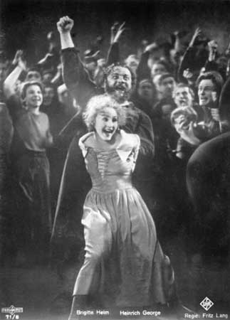
Then I saw Phil Cooper’s glorious artwork for the previous Kick About topic, and I jumped on the band wagon. The current theme is Metropolis, which could mean any metropolis, but I have taken it to be the 1927 German expressionist Sci-fi film by Fritz Lang, because it’s one of my favourite films. I have fond memories of being taken along to it as a teenager by my big brother. My eyes were nearly popping out of my head.
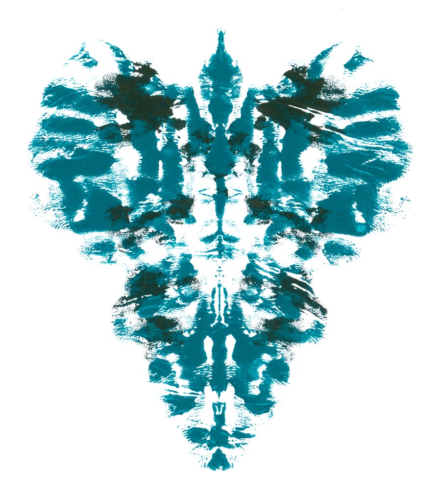
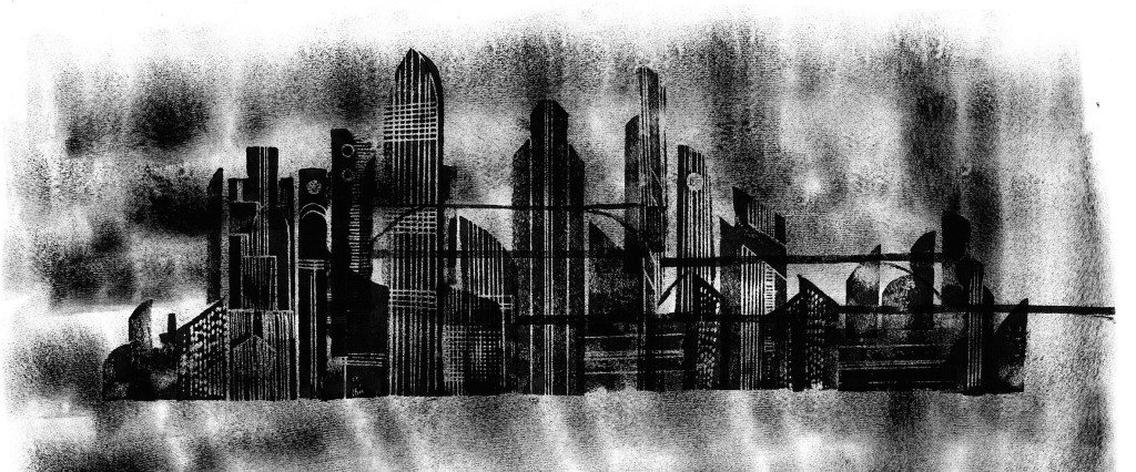
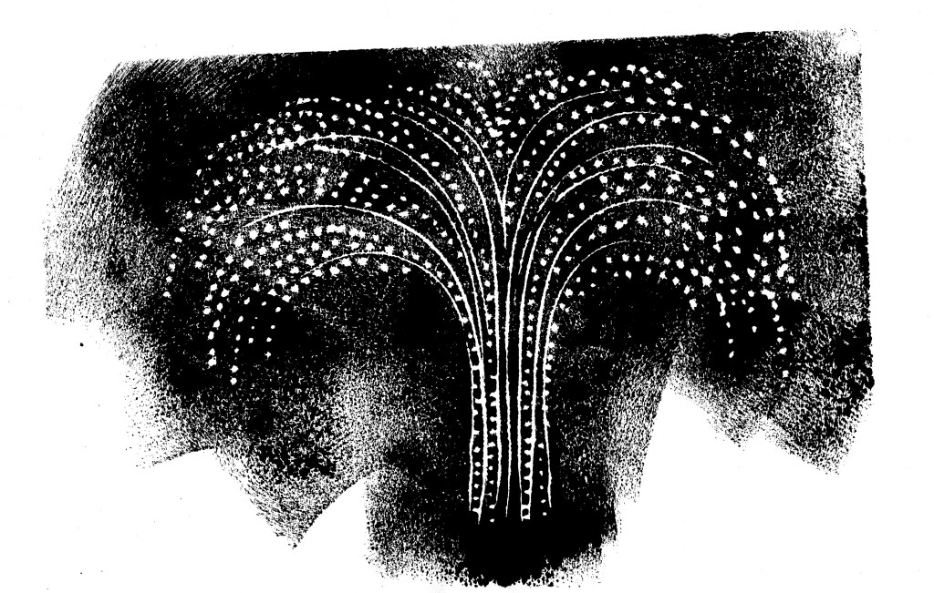
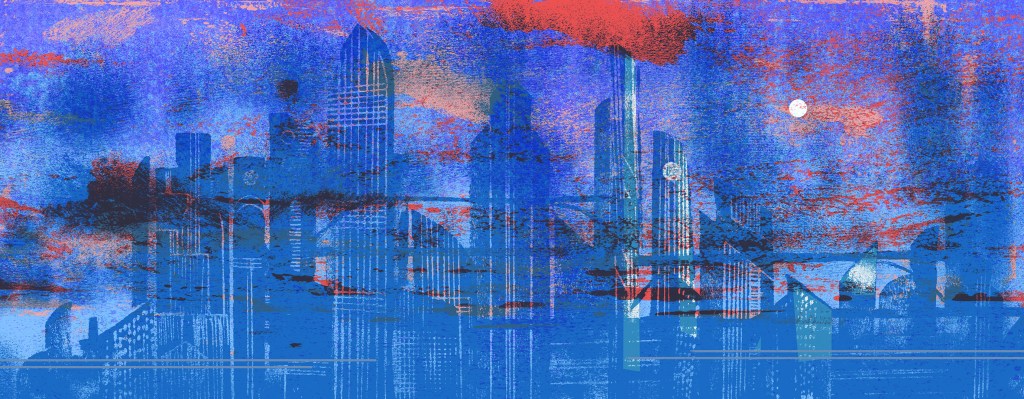
I started with my usual black ink. I chopped up and printed from a few bits of foam to create an impression of the Metropolis City. And a fountain of water.

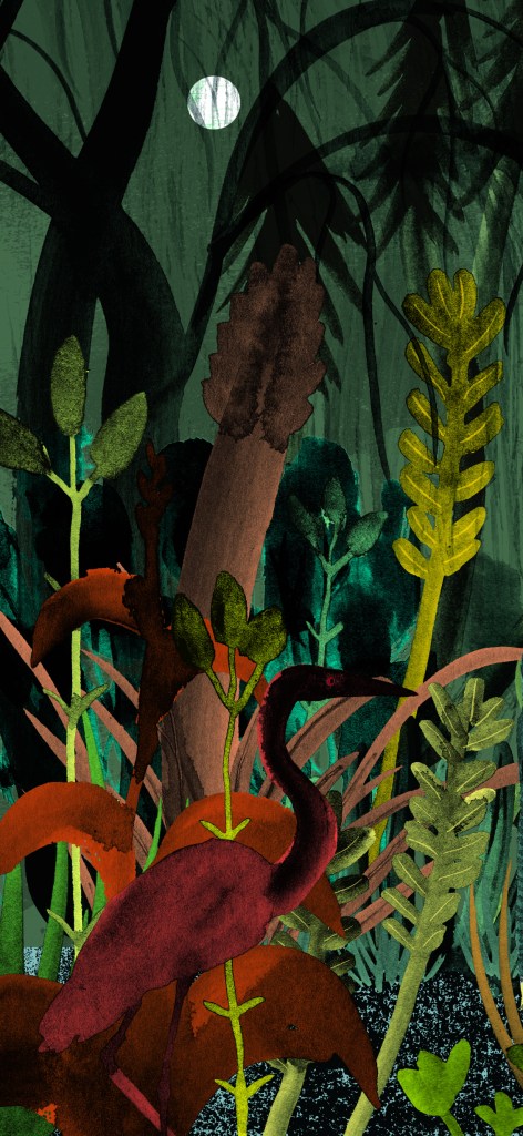
But some of the most compelling memories of the movie for me were the scenes in the Rich Men’s pleasure gardens. I was thinking of using the city scene as a backdrop behind the gardens. I coloured it and knocked back the contrast, but ultimately it was too distracting to use behind my main subject, which had more than enough going on with the plants.

The Pleasure Gardens are extraordinary. They are stupendously opulent, and are filled with tumescent plants and feature a scalloped grotto and various fountains. In them two very striking scenes take place. In one, an unprepossessing petty official pompously selects a concubine, as though choosing a piece of fruit from a fruit bowl. She is to entertain Freder, later that day.

In the other scene, Freder frolics with the girl in the garden, playing a game of chasey around a fountain, when suddenly from a doorway, the angelic Maria appears surrounded by children. ‘Look, these are our brothers,’ she says.

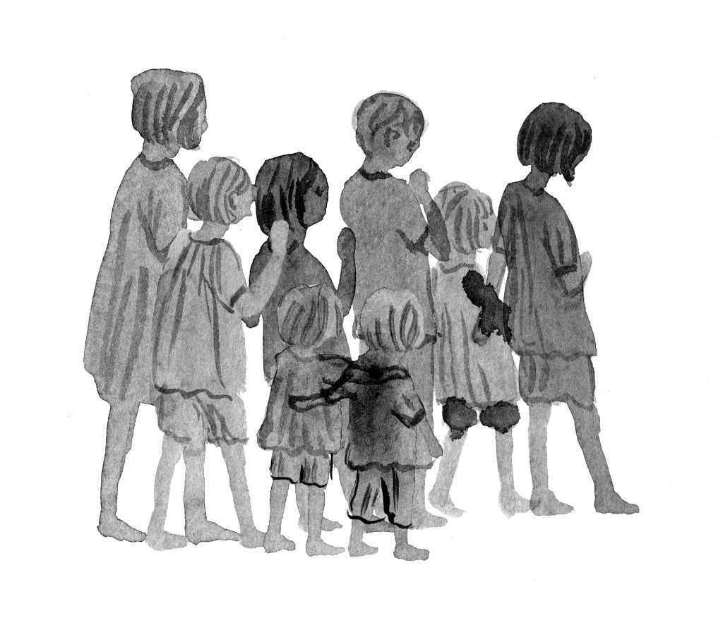
Some of my doodles of small 1920s children.

Need I say it? Freder is dumbstruck. Smitten. The poor concubine becomes insignificant, and her distress is evident in her face and posture, as she fails to retain Freder’s attention. She’ll be demoted, no doubt. Or something…

I wasn’t really sure which of these scenes I was going to play about with. It turned out to be sort of both. But really, the gardens themselves became the main subject.

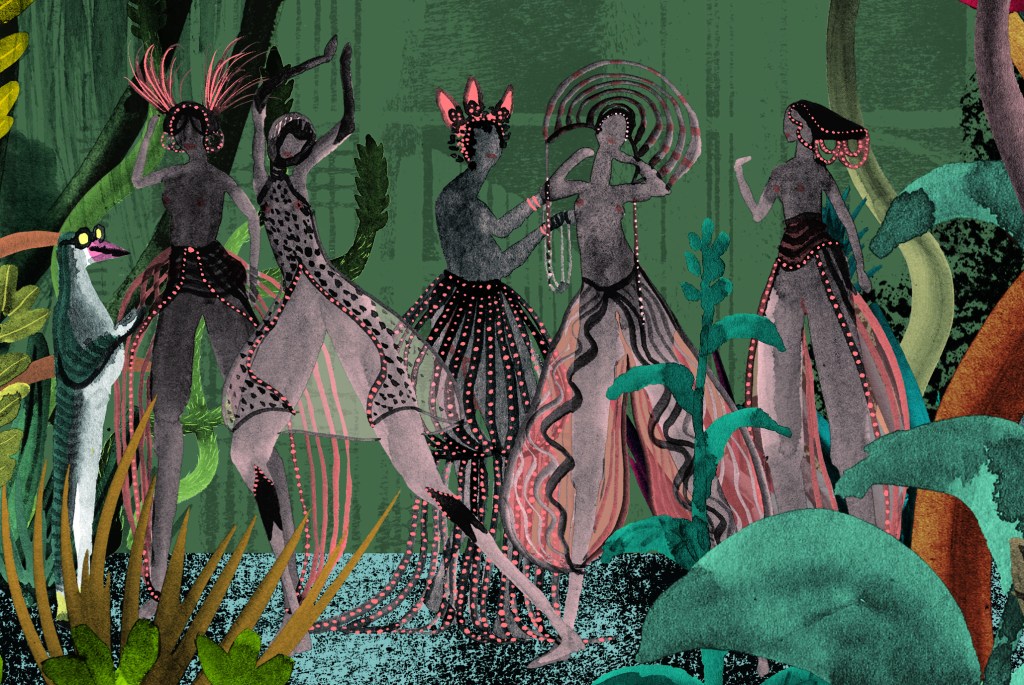
I placed the children and Maria in the garden, and some concubines. But they seemed somehow too literal, and it was too busy. Surprisingly, it was Freder’s moment of suspense and call to action that won me over. And only he remained in this scene.

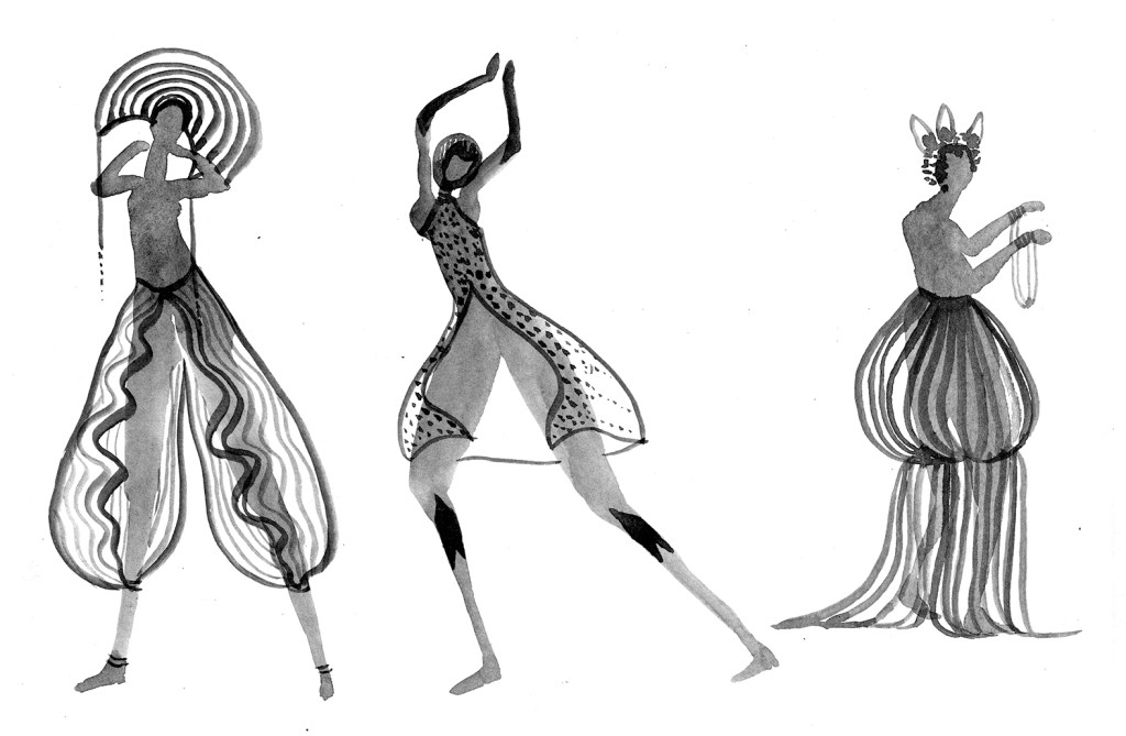
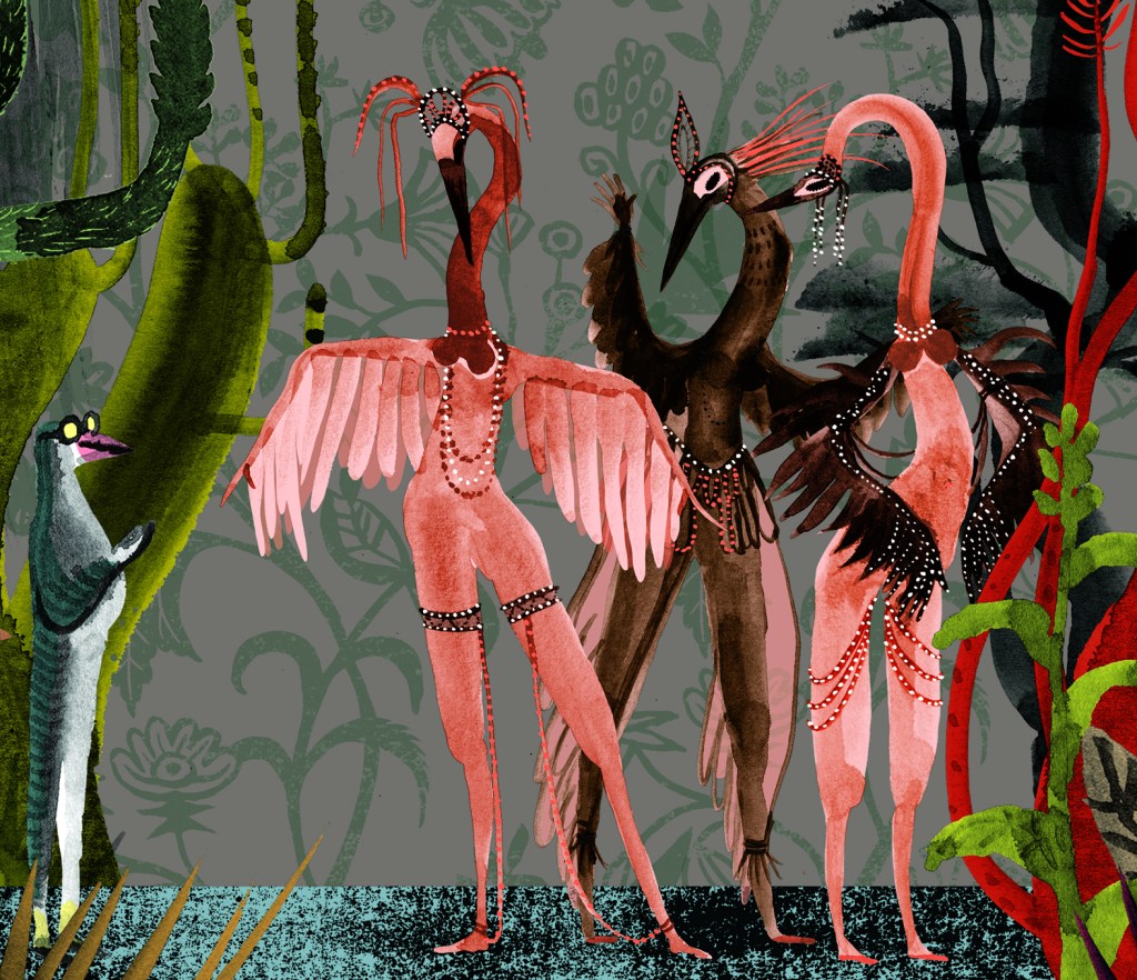
I decided to make a second scene featuring the bureaucrat selecting the concubine and had several goes at different forms for the women, some exaggerating their body parts and others not.

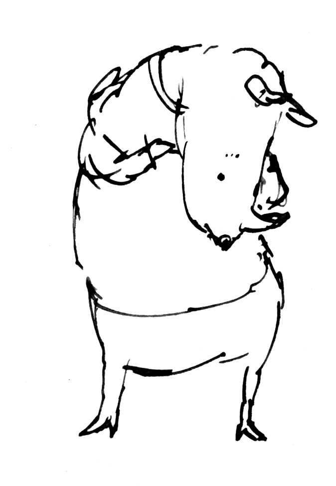
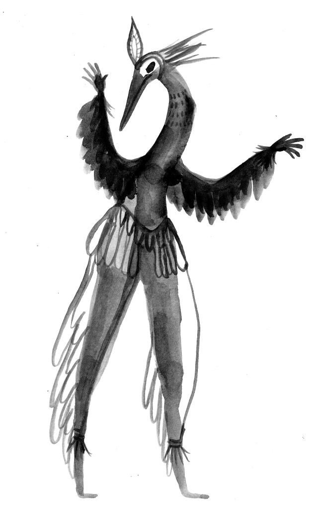
I was pleased with my version of the bureaucrat as a stiff little penguin creature with big eyes and yellow socks. So after a few different versions, battling to find a balance between background and foreground, whilst still using my favourite black ink for the figures, I made the girls into bird people as well.

It’s still not entirely resolved. Especially with regards to the background colour. But I really enjoyed using a muted art deco palette, heavily infused with black, because it suggested the darkness of the film without actually being black and white.

It’s just a Kick About. So that’s it for now. It did give me lots of ideas, and took me into some wacky places that were very refreshing. Thanks so much Phil Gomm and also Phil Cooper!

Here I am

After the longest time!

Hi there. I’ve missed you. Work on Leonard Doesn’t Dance is going well. And I’m also working on another exciting project. A picture book by Sofie Laguna called When You’re Older. It’s a bit tricky working on two; just when I’m submerged deeply in one, I have to haul myself out by the scruff of the neck and focus on the other. But it’s fine, because both are lovely books.

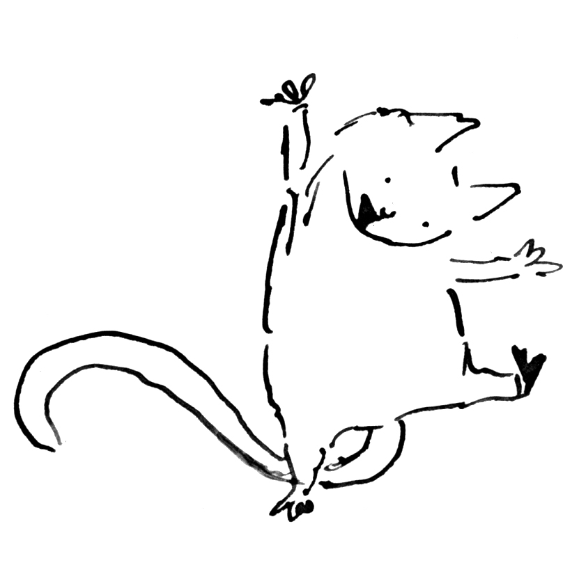
Leonard and his pigeon friends are learning the can-can. I can’t do the can-can. (I might yet learn… A fake leg might be helpful.) But pigeons can can-can.

Here’s a small section of what I’m working on today. The background is in progress so the yellow area is sketched in. And all around what you see here are plants and other birds and a couple of beasts. But this is one of the white pages. The full colour pages look different.

Leonard and the Can-can pigeons

Detail of the can-can page from Leonard Doesn’t Dance by Frances Watts

They look like this.

Leonard colour page sample

Detail from a full colour page as the sun sets in Leonard’s world.

I’m using a big mix of media in this book. I’m printmaking, painting, drawing, collaging and digitising. (I’m doing the same for When You’re Older, but with a different colour palette.)

The printmaking is the most fun part. There’s something so intoxicating about printmaking. When the outcome is uncertain, due to the variability of the process, you are always on the brink of something… and it could be wonderful. It could be a treasure. Those op-shoppers among you will understand the feeling as it’s rather similar.

The print below is saved to my computer with the ignominious title ‘Disappointing Flowers’. But once colour and collage treatment are added, it actually works very well.

‘Disappointing Flowers’

This is a quick mock-up showing how the application of colour and a trim here and there, bring a disappointing print into a context that works. At least, for me. It’s not from the book.

A quick digital collage of my disappointing flowers to see if they rise to the challenge.

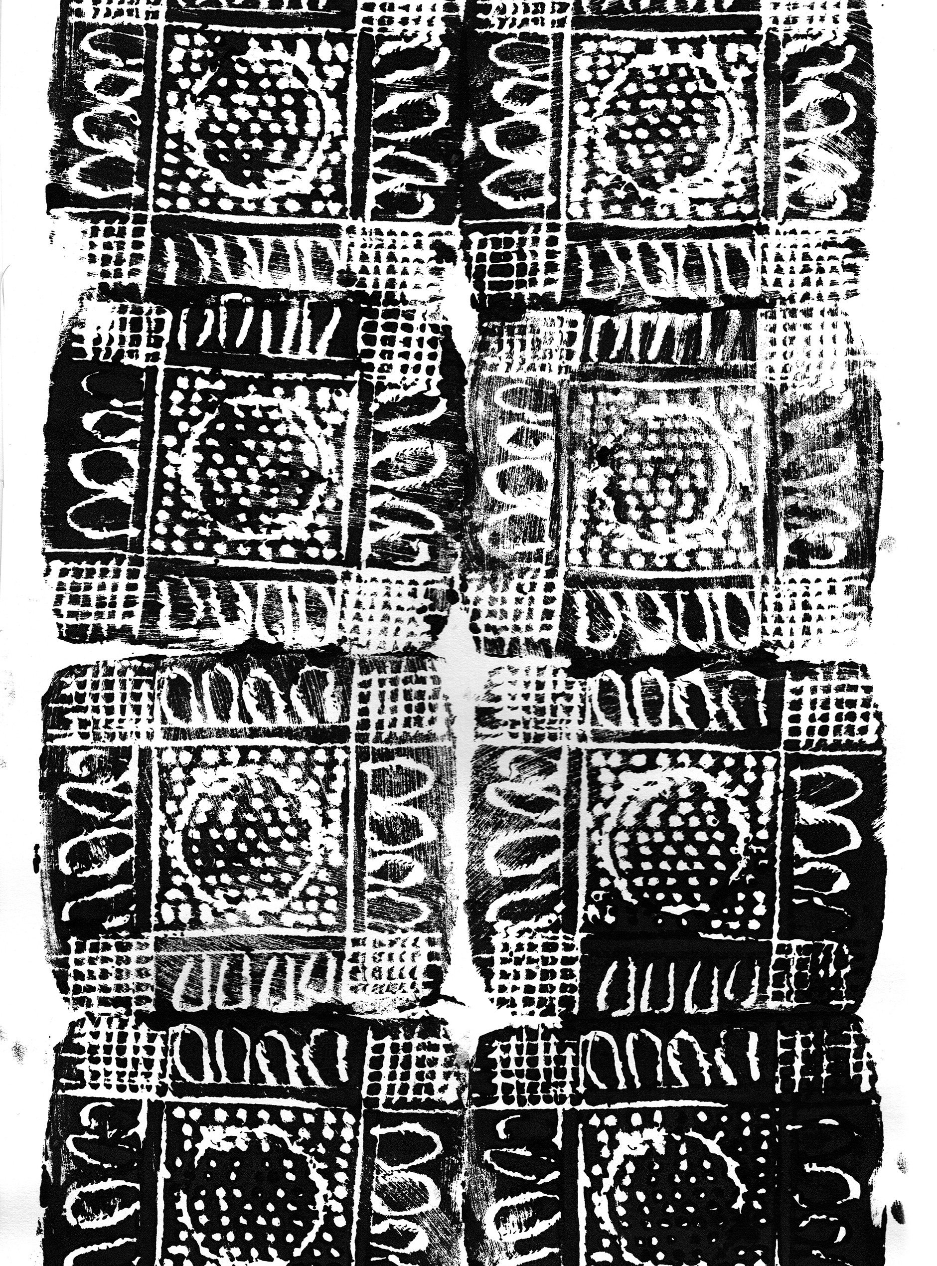
This one I was truly delighted with. It’s such a simple pattern, printed with a single block and roughly aligned. The roughness appeals to my deepest instincts in a way that nothing tidy or perfect can do. And the print has become a raw material like a delicious cheese that I might put into some cooking.

repeat pattern lores

Rough, ready and rambunctious, this print appeals to me like a Staffordshire Bull Terrier.

And here are some of the inky painted areas I’m using. These too, will be barely recognisable when I’ve finished colouring and ornamenting them on the computer, but for me, the shapes produced with a brush have more animation than anything I can draw directly on the screen.

8-9 tree shapes lores

Inky tree shapes for Leonard Doesn’t Dance… Or maybe for When You’re Older.

Now it’s back to the page. Some ducks are calling for my attention.

Yes. I think some of them are Call Ducks.


Midsummer Monotypes

IMG_7310

Bonneted girl in too many frills. (From a vintage cabinet card portrait photo)

Over the summer school holidays, I had the pleasure of pulling out all the monotype equipment, unused for many months, and taking it for an outing to the back garden of the new house. There is a space under the decking that’s perfect for fine weather art activities. The boys and I set up two trestle tables there and had a lovely afternoon of printing in the warm air.

IMG_7179IMG_7180

While the boys printed an assortment of monsters, animals and fancy lettering (most of which they remembered to reverse as they drew), I printed chickens, dogs and portraits of them drawing. They were mostly autonomous because they had printed before and are old enough to manage on their own, but my focus was divided between my own drawings and theirs, so I came back a few days later and had another go on my own.

Author Ann Martin had kindly posted me her collection of cabinet card photos after my last post on vintage clothing (here) and I decided to use these as the basis for my monotypes. I had also been admiring one of my favourite books Detour Art.

I LOVE that book, (one of my favourite Christmas presents ever!) and browsing through it again led me to look up and explore further the work of Thornton Dial Sr. who died only last month. You can see the video A Day With Thornton Dial Sr. here. 

Thornton Dial Senior

Thornton Dial’s work ranges between sculpture using found objects through to several dynamic painting styles. One of his loose drawing styles made me itch to print some monotypes and add either dry pastel or watercolour to them. I love the way his rapid line work dances with the limited colours he adds.

Below are some of Thornton Dial’s works that make my heart race!

As you will see, my own work is nothing like his whatsoever. As with most artistic adventures, the artwork takes on a life of its own, and mine were no exception. They were mostly drawn using a continuous single line, using a heavy crayon pressed firmly on the back of the paper. I was seeking a heavy line with bleed but also a loose line, and was mostly successful in this.

IMG_7316

Bearded man – first take. The original did not look as heavy as this darkened photo and I increased the pressure when drawing the subsequent images.

IMG_7318

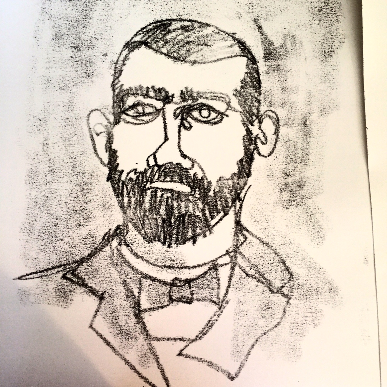
Bearded man – second take. (These were drawn from the same photo, so you can see that I was not attempting to achieve a likeness.) This is the image that I was most pleased with. I have an irresistible urge to add an off yellow background and pink to his tie, so he may yet be ruined, but I have taken the precaution this morning of gluing him to a cardboard backing in order to prevent buckling when I take paint to him.

IMG_7315

This chap had a rather ridiculous face in the original photo. And my rendition made him possibly more ridiculous. But he does rather remind me of an idiotic version of Jude Law. (sorry Jude Law.)

After completing a few other prints, including the frilly little lass at the top of the post, I brought the prints indoors to dry so that I could add colour. I started with the first bearded man, because the outline was too weak to stand alone and I thought that by adding colour I’d either ruin it (and not mind) or redeem it.

IMG_7325IMG_7320

Actually, I did neither.

The paper buckled a little but not too much as it is a heavy weight paper. I solidified some of the outlines and I had an absolute ball throwing the colour on. But I’m not overly excited about him. And I didn’t leave enough white space for him to breathe. He may have been better on a white background.

IMG_7326

I then added colour to clown-like ‘Jude Law’. By golly it was fun to slosh the paint on a large piece of paper! I stopped after that. The girl would not benefit from colour and the other bearded man, being my favourite, deserved some thought and a backing board before proceeding, if at all.

I’ve now done the backing board, and I must decide his fate!