

As some will know, my current book project is a picture book by Frances Watts to be published next year by HarperCollins. Leonard Doesn’t Dance is the title, and it will feature a cast of feathered friends of many species.
Leonard and his friends have been forming on the page but I’ve yet to definitely decide on the medium that will best suit the book. As a way of exploring options, I’ve begun getting to know this list of species.
Magpies
Ducks
Pigeons / Doves
Rosellas
Galahs
Woodpeckers
Flamingos
Swans
Chickens
Turkeys
Quails
Bluebirds
Finches
Penguins
Puffins
First on the list, penguins. (Yes, I’m not even reliably back-to-front.)
Penguins come in several shapes and sizes and are attired in formal to smart casual. Their posture is generally upright, and they are fond of water sports. Some are tall and imposing. Some are small and wiry. Some are round, cuddly and ridiculously cute. Possibly too cute. (What kind of a kill-joy book illustrator am I? Too cute?)

A warm-up penguin. I liked to think I was channelling William Kentridge with my deft use of the eraser… but really, this is just a warm-up penguin. My eraser was employed in deftless ways.

A second warm-up penguin. Sometimes the warm-up process temporarily takes one backwards. (Watercolour and brush on smooth watercolour paper.)

See what I mean? (Noodler’s ink, watercolour and gouache on watercolour paper.)

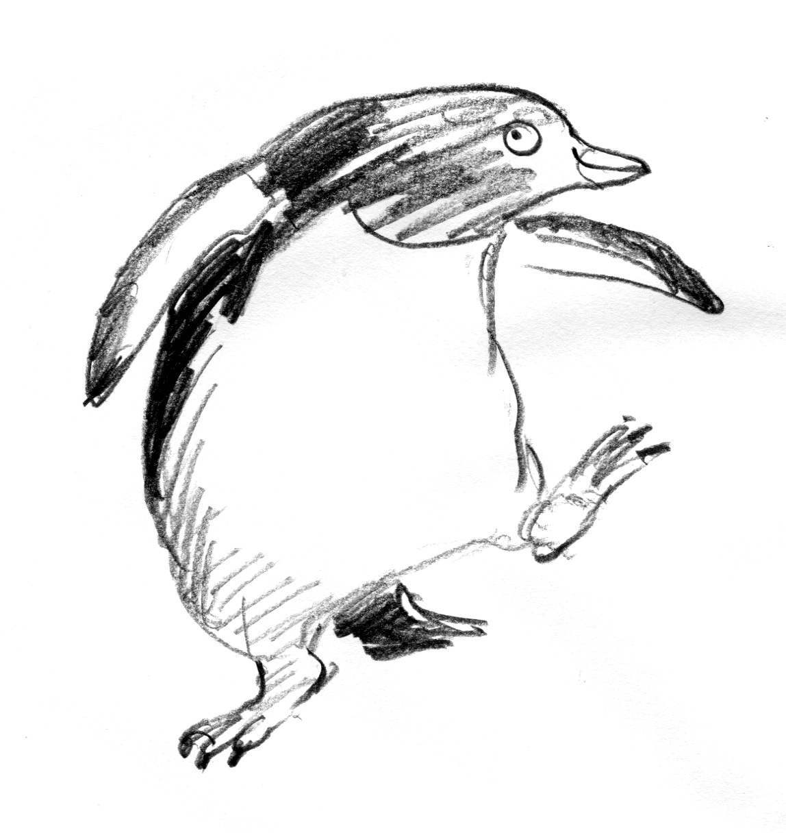
A half-warmed up penguin, using a soft pencil and watercolour. I need to bond with penguin feet. They are thick and sturdy and look like lumps of pink putty. These are not right. But I like the head.

A tighter line. Testing the look of a more stylised shape. This penguin is quite athletic. I didn’t realise that some penguins have rather long legs. Even if much of the leg appears to be inside their body. Rather like walking around inside a large pillowcase with your toes in the corners… Or not. I do like the watercolour over the textured pencil.

A tighter outline again with an exaggerated shape. But still with a loose hatching technique. I don’t do tidy hatching. I associate it with things like ironing shirts. A useful skill that I don’t have the patience for.
Looser? Almost the same head. But loose and with added dance steps.

Looser with ink. I think this is a combination of the last two. Or three.
A question arising is the ink. This ink is water soluble. I often enjoy this, because it’s rather scrumptious to see the line dissolve under the watercolour brush to do unexpected things. I mostly like unexpected things. But would I like unexpected things to happen on my final artwork? Maybe not.
Also, it’s hard to lay clean colour over dissolving black ink. I will want some of my colours to be clean. I will have a try with water-fast ink later. But there are other ways around this. I could do the black part with water soluble ink and print out the illustrations onto fresh watercolour paper before adding colour. But all this can get rather complicated and size can become a limitation. There is much to ponder over the next few weeks.
I will share some finches with you soon.

Entertaining and gorgeous.
LikeLike
Thanks Kezzita! x
LikeLike
Watercolour over textured pencil really did it for me – but the loose pencil penguin has the engaged the most, with his slightly cheeky expression and tapping feet. I love the consideration your’e putting into each friend – it makes for such lively, authentic final work. Have you done the storyboard already? (Just wondering what your process is. I need to put more into character design – I always rush into rough layouts WAY too early…)
LikeLike
Hi Lucinda, I must say my process has always been a bit haphazard, but this year it’s been disastrously haphazard due to a very disrupted year. The Watson process is a lot of messing about until something finally looks right. It has to have a certain sparkle or something that just feels like a rhythm. (And with me, the rhythm does have a lot to do with character design.) Then either straight to roughs, or storyboard / dummy book and then roughs. I have half the storyboard for Leonard done, but it will need updating this week.
I know what you mean about leaping into layouts early. I think it’s pretty natural if you’re a book fanatic. You read the manuscript and in your head, it’s a book in nanoseconds. I have a habit of rushing off and drawing cover designs before I’ve even spoken to the publisher to accept the offer. A new manuscript, (the right one) can be quite intoxicating to an illustrator.
I have particular trouble with storyboards because I keep putting in detail, which is not the point and only hampers corrections. I think I need an egg timer…
Anyway, I’m not the one with a finely honed and excellent process. If you want to see that, you could head over to Alexis Deacon’s blog or to Clive Hicks Jenkins. https://clivehicksjenkins.wordpress.com/2014/11/09/making-a-dummy-book-of-hansel-gretel/
LikeLike
This looks like a great project Judy. I enjoyed your discernment penguin art. I liked the dancing penguins style the most, not to mention the joy in the characters.
LikeLike
Thanks Tim. Do you mean the sketchy little penguin? He is probably the most ‘effortless’ of them all. But as you will probably know, the act of drawing effortlessly doesn’t come without effort… How confusing art is. Like you, I love birds. I would feel I had failed badly if I created a book about birds and didn’t capture their cheeky joyfulness.
LikeLike
Pingback: Leonard’s Friends (part 2) | endpapers