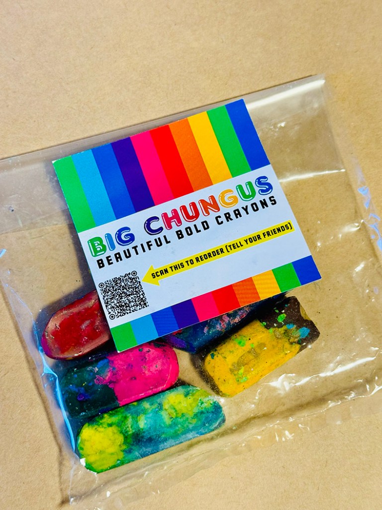
I was just clearing up my art equipment for the day’s activities, and I couldn’t resist one last little go with the Big Chungus, so here are some baby birds of paradise.
By the way, writing the plural for Bird-of-paradise reminded me of seeing the stage play Shadowlands about C. S. Lewis and Joy Gresham. I remember laughing at the bit where Lewis debates whether he should be ordering gin and tonics or gins and tonic. This is just the sort of thing that delights my brain. But alas, I’m not sure these work so well as Bird-of-Paradises.
I forgot to give the Spotty-Pyjama-B-O-P a tail. By rights, there should be a stumpy one at least.
Hello Kick-About! I haven’t participated in the longest time. I’ve watched the posts flash by every two weeks. Some of them would have been a challenge indeed, but some of them were right up my alley. I nearly cried to miss ‘Kenojuak Ashevak’. But I haven’t been able to squeeze the Kick-About in.
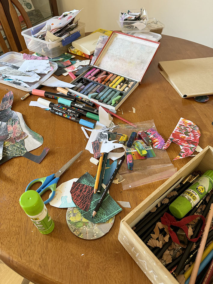
I’m the Burrow in Adelaide on a writing fellowship during July so the demands on my time are fewer. Saturday seemed like a good day to take a break from the keyboard and play with mixed media. I’ve brought a limited selection of art equipment with me, focusing on dry media and collage to keep it cleaner. But I’ve still managed to make the kitchen table look a lot like my drawing board at home.
A shout out to Zoë Collins who sent me a packet of her gorgeous up-cycled crayons to use several months ago. This is the first chance I’ve had to play with them. They are really an upscaled version of what Ann James calls magic pencils, the multicoloured pencils she used to illustrate the Dirty Dinosaur series of books by Janeen Brian. (When she wasn’t using mud. See this video to watch that!)
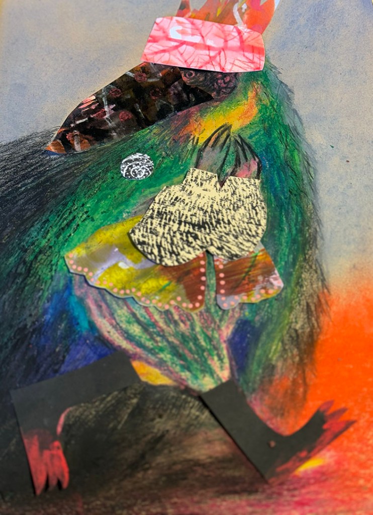
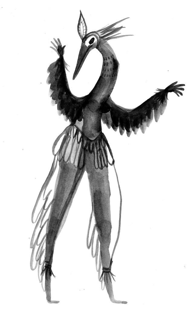
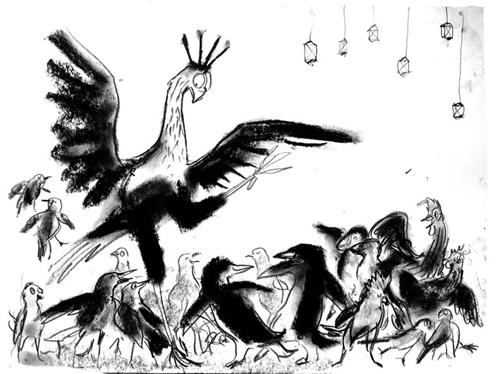
On to the paradisaeidae! This is just the family name for the Bird-of-Paradise. And since I seem to have been drawing bird people for the longest time, it couldn’t be a more perfect prompt for a one day session using crayons, pencils and collage. It does occur to me that these pictures are equally suited to the previous Kick-About prompt ‘Chinelos’ and I seem to have blended the two in a sneaky way.
I started with the chungus crayons because I was very curious to use them. I had a ball with them. Part of their appeal is the letting go of control that goes with them. As you apply them, the colour changes, so it takes you to unexpected places. And letting go of control is about the best thing you can do if you are taking just one morning out to play with art materials. I started randomly colouring a bird shape and let it form itself as I went along. I soon felt the need of black, which wasn’t in my crayons, so I introduced soft pastels.
To give the bird a bit of dynamism I made it hurry forwards looking furtively over its shoulder. Apparently my subconscious was dwelling in the venal world of politics, elections, the patriarchy, and the progress of the Far Right, because my bird was evolving into a pompous creature, over-dressed, clutching at his medal of office whilst walking though a field of smoke and with blood on his feet! My subconscious has opinions, apparently. At least the Tories are out. Below is the unfinished collage, with pieces not yet glued down.
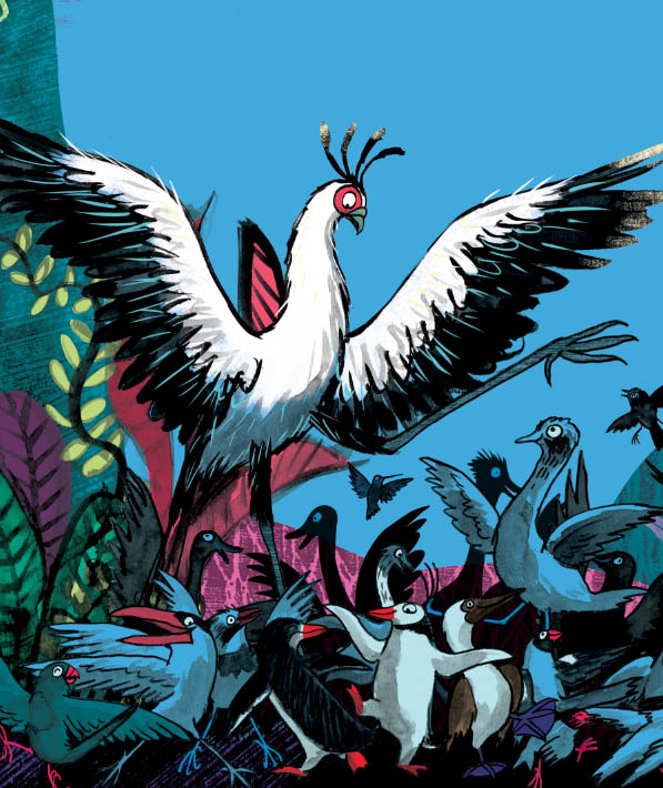
However, in terms of colour there was no focal point, so although I was enjoying the texture interactions, I started to overlay further collage pieces over sections of the bird, and ended up by cutting him away from his background. This is what he ended up looking like.
I think my subconscious was happy to have got him out of its system by this time, so I moved on to these little sketches that I had dashed off as soon as I read the Kick-About prompt earlier. My plan was to overlay digital collage on to them and to make them look like quirky dancers or mummers of some sort. They’re generally much more cheerful.
I made a bit of versatile colour and texture to clad them, using soft pastels and Posca pens. I made sure I had both light and dark areas. And then I simply dressed them up in PhotoShop without fussing too much. Mission completed!
Firstly, an update. I’m fortunate enough to be in Adelaide for the month of July courtesy of the May Gibbs Children’s Literature Trust to undertake a Creative Time Residential Fellowship. I was awarded a Mary Wilson Fellowship, and was supposed to undertake it last year, but we had a few serious health and wellbeing issues in our family at that time and the Trust was kind enough to squeeze me in for this year instead. The Fellowship is named after Mary Wilson, a patron of the trust who has been involved since its inception in 1989 and is passionate about our natural environment, so projects undertaken should have a significant environmental theme. My original intention was to write a non-fiction picture book about an Australian animal, but things have shifted slightly since my application back in May 2022, and instead I find myself writing a verse novel about tadpoles.
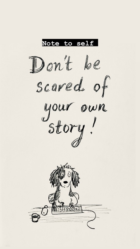
One of my other projects is a picture book with a climate theme, but I’m a bit scared of that one. Last time I worked on it the most devastating ear worm attacked me with a doggerel rhythm, and I couldn’t shake it off. I’m scared the worm will attack again, so I’m postponing that project until I’ve gained some writing muscle over the next week or so. I’ve been doing all sorts of keyboard push-ups in preparation. If that worm attacks I will be prepared.
I also made this note for myself and stuck it on the wall. It hasn’t completely worked yet.
The colour photo is by Melisa Savickas
I’ll be doing a bit of teaching while I’m in Adelaide. This workshop is at the State Library. If you’re local to Adelaide, you can click the image to read more about it or make a booking. Below is the delightful Norwood Library. I scooted out to join it the day after I arrived. I can’t survive without a library membership.
So that’s the first thing. The second is that my son Hugo is creating a website for me – a task I have been meaning to get to for years. So this blog will jump across to the website when it’s ready.
I suspect that readers who have subscribed with their email address will be transported across the techno-wilderness and stay on the mailing list. Those WordPress users who follow using the WordPress follow function will probably drop off. So if you still want to hear from me and you haven’t subscribed with an email address, you can do that now, or do it later on at my new website.
I’m planning on having two options. My blog will be about things I have been working on. My newsletter will be occasional notifications of upcoming book releases or exhibitions, for those who are interested in purchasing or attending.
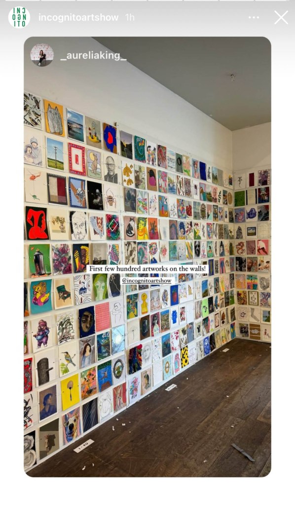
Which brings me to the third thing. For those of you who are in the vicinity of Sydney, the Incognito Art Show is coming up very soon! I am quite envious of those who can visit this show in person. It looks like quite an occasion, judging from photos of previous years. And having gone through the artwork on-line (which takes a while!) I can attest that there are STACKS of fantastic postcard sized artworks up for grabs. They are all at the one price of $100. The screenshots below from the Incognito Instagram account give you an idea of what the walls will look like.
ScreenshotScreenshot
The fun part is that all works are incognito until after purchase. You can read all about it here. And you can register your name on the website to create a wishlist of your favourites here. The best thing of all is that all proceeds go to supporting artists living with a disability.
I’ve currently got over 150 saved in my wishlist, so that says a lot about my inability to make decisions, but also a lot about the gloriousness of the artwork. And I’m not telling ANYONE what my favourites are, because the people who attend in person get first dibs, and I’ll only be in with a chance when the online sale goes live after the in person sale days.
I have three artworks in the show. I can’t show you what they look like of course. But for those who like puzzles, I am including a greyed out version of my artworks with little windows cut into the grey. If you can work out which art is mine from this, you are nothing short of a genius. I’ve only been able to find one of mine on the website so far, and I know what they look like.
Mystery artwork 1 Mystery artwork 2
13/7/24 I’ve updated to add the actual artwork for this one which has just sold. Titled Family Group. Mixed media A5 size. So many bird people. Where do they all come from?
Mystery artwork 3
Believe it or not, I will post again tomorrow, because today I took a day off writing and made some art with limited materials, for the Kickabout! But also because I miss my blog, and I’m a bit disheartened by social media. Cheerio until tomorrow!
Here’s a bonus dog-bird doodle. My dog people and bird people finally met in the middle.
Look at that! I’ve jumped seamlessly from Kick-About #28 to Kick-About #36 without a single kick!
I was busy there for a while. By putting just about every other thing to one side, I have finished my picture book project for Allen and Unwin, and I’m very excited that I will have an advance copy of When You’re Older in my hands in late November this year. So Hip hip hoorah! But more on that another day. This rather hasty post will be about surrealism and the language of dreams.
The theme is Sheila Legge, seen above in costume in 1936 as a ‘Surrealist Phantom’ in Trafalgar Square to promote the opening of the 1936 International Surrealist Exhibition … Should I call it a costume? Because she is a living work of art, the living embodiment of a Salvador Dali painting Printemps nécrophilique.
I’m sure I’m not the only one to be having vivid dreams and nightmares at the moment. Melbourne is currently still in lock-down while we wait for enough people to be vaccinated against Covid-19 to allow us to step out without swamping hospitals and losing many more lives. Unlike so many others around the world who are facing real danger and hardship, I am here, at home, living in a kind of paradise with a partner in full time work, a roof over my head, a vista of green outside my windows and the company of my family. For all this I am truly grateful. Nevertheless the night time world of my dreams is a wild one – a Rousseau Paradise, rather than a Fragonard. This was even before I started re-reading short stories by Angela Carter and Leonora Carrington… Ahem.
So there’s a coincidence! Just when I was reading the short stories of Leonora Carrington, who met Max Ernst and became involved with the surrealists in 1937 at the age of 20, the Kick-About veered into the very same territory with Sheila Legge.
This book beside my bed… Could it be influencing my dreams?
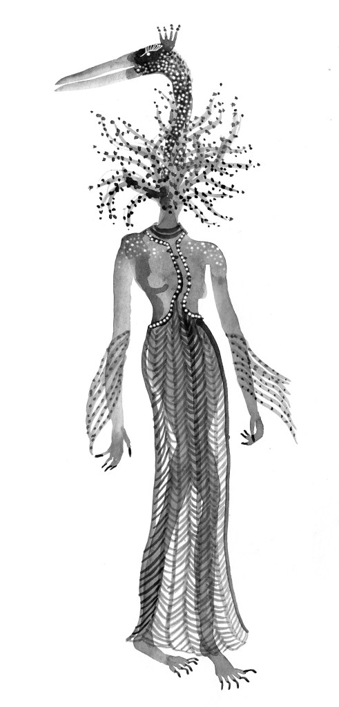
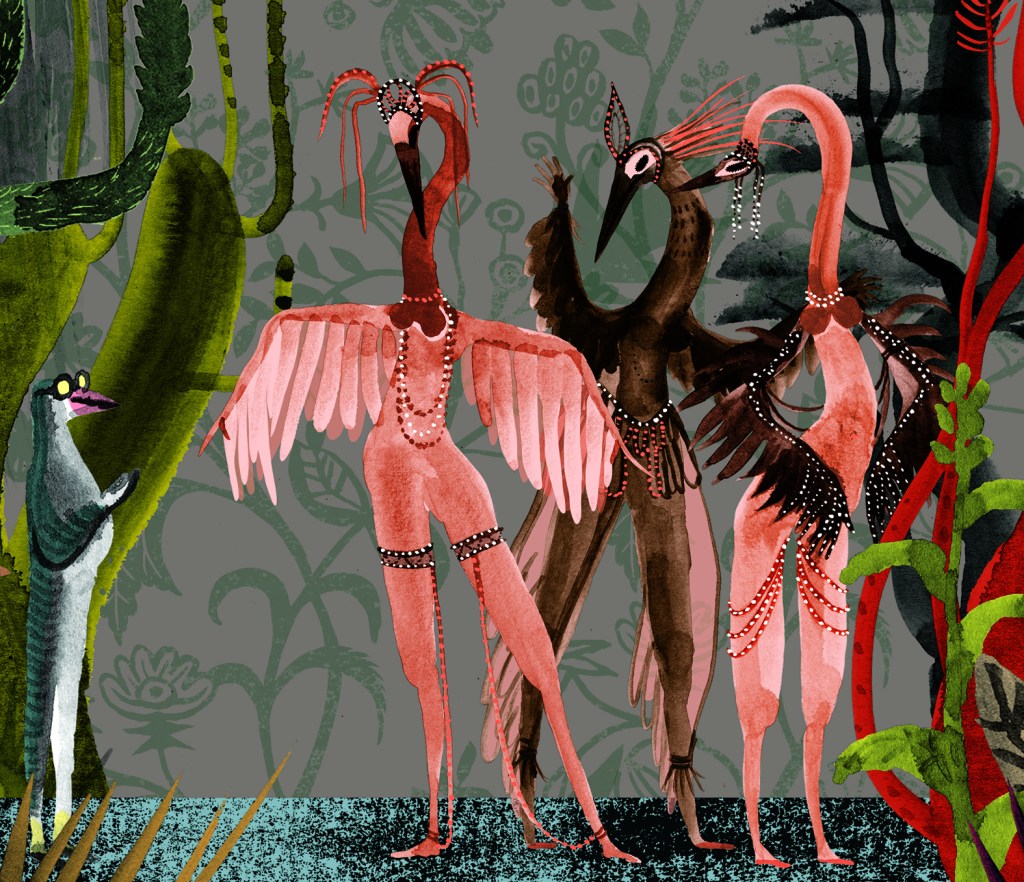
All I have to offer the Kick-About today is the beginnings of a… something… featuring some bird-headed, flower-headed women. They will possibly eat one another. I may add colour if there’s anything left of them by tomorrow. (growls softly)
I have joined in a Kick About! It’s a bit of creative play organised by Phil Gomm over at Red’s Kingdom. Phil provides a prompt and we have a couple of weeks or so to make something. It’s casual. Lovely!
I have been wanting to do something calm and creative to harvest all this turbulent Isolation Energy. (The dreams! Is anyone else having crazy dreams?) There seem to be a lot of Creative Challenges that have popped up to keep people busy during isolation. But with already more than enough actual work to complete, they weren’t calling to me.
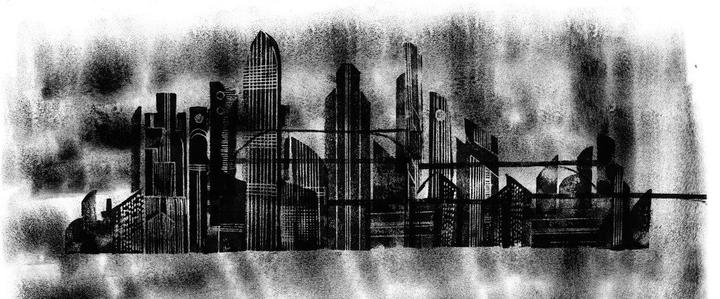
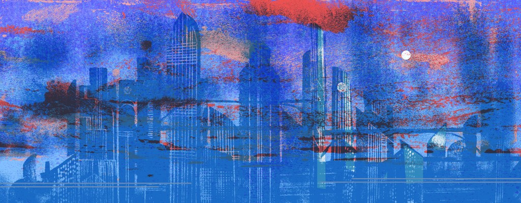
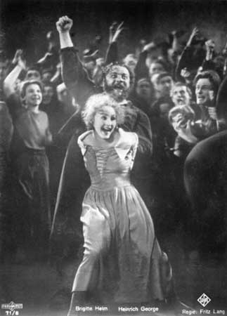
Then I saw Phil Cooper’s glorious artwork for the previous Kick About topic, and I jumped on the band wagon. The current theme is Metropolis, which could mean any metropolis, but I have taken it to be the 1927 German expressionist Sci-fi film by Fritz Lang, because it’s one of my favourite films. I have fond memories of being taken along to it as a teenager by my big brother. My eyes were nearly popping out of my head.
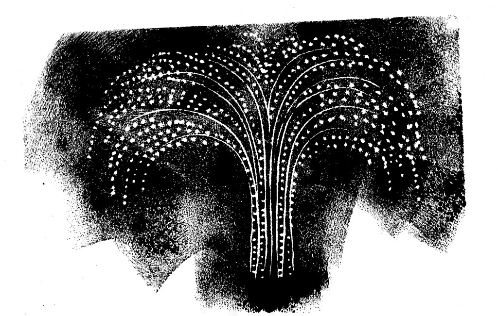
I started with my usual black ink. I chopped up and printed from a few bits of foam to create an impression of the Metropolis City. And a fountain of water.
But some of the most compelling memories of the movie for me were the scenes in the Rich Men’s pleasure gardens. I was thinking of using the city scene as a backdrop behind the gardens. I coloured it and knocked back the contrast, but ultimately it was too distracting to use behind my main subject, which had more than enough going on with the plants.
The Pleasure Gardens are extraordinary. They are stupendously opulent, and are filled with tumescent plants and feature a scalloped grotto and various fountains. In them two very striking scenes take place. In one, an unprepossessing petty official pompously selects a concubine, as though choosing a piece of fruit from a fruit bowl. She is to entertain Freder, later that day.
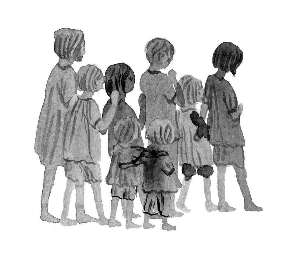
In the other scene, Freder frolics with the girl in the garden, playing a game of chasey around a fountain, when suddenly from a doorway, the angelic Maria appears surrounded by children. ‘Look, these are our brothers,’ she says.
Some of my doodles of small 1920s children.
Need I say it? Freder is dumbstruck. Smitten. The poor concubine becomes insignificant, and her distress is evident in her face and posture, as she fails to retain Freder’s attention. She’ll be demoted, no doubt. Or something…
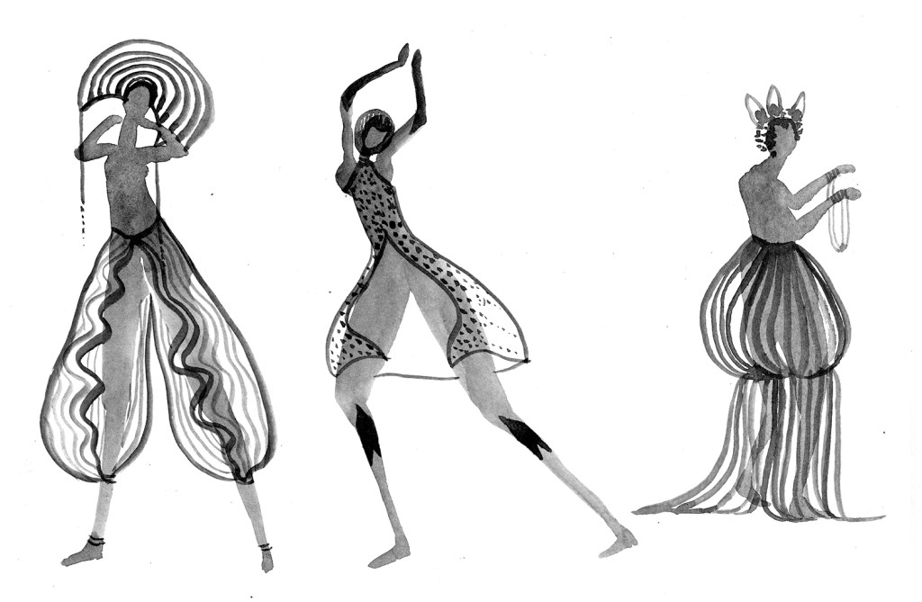
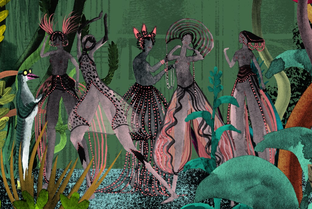
I wasn’t really sure which of these scenes I was going to play about with. It turned out to be sort of both. But really, the gardens themselves became the main subject.
I placed the children and Maria in the garden, and some concubines. But they seemed somehow too literal, and it was too busy. Surprisingly, it was Freder’s moment of suspense and call to action that won me over. And only he remained in this scene.
I decided to make a second scene featuring the bureaucrat selecting the concubine and had several goes at different forms for the women, some exaggerating their body parts and others not.
I was pleased with my version of the bureaucrat as a stiff little penguin creature with big eyes and yellow socks. So after a few different versions, battling to find a balance between background and foreground, whilst still using my favourite black ink for the figures, I made the girls into bird people as well.
It’s still not entirely resolved. Especially with regards to the background colour. But I really enjoyed using a muted art deco palette, heavily infused with black, because it suggested the darkness of the film without actually being black and white.
It’s just a Kick About. So that’s it for now. It did give me lots of ideas, and took me into some wacky places that were very refreshing. Thanks so much Phil Gomm and also Phil Cooper!
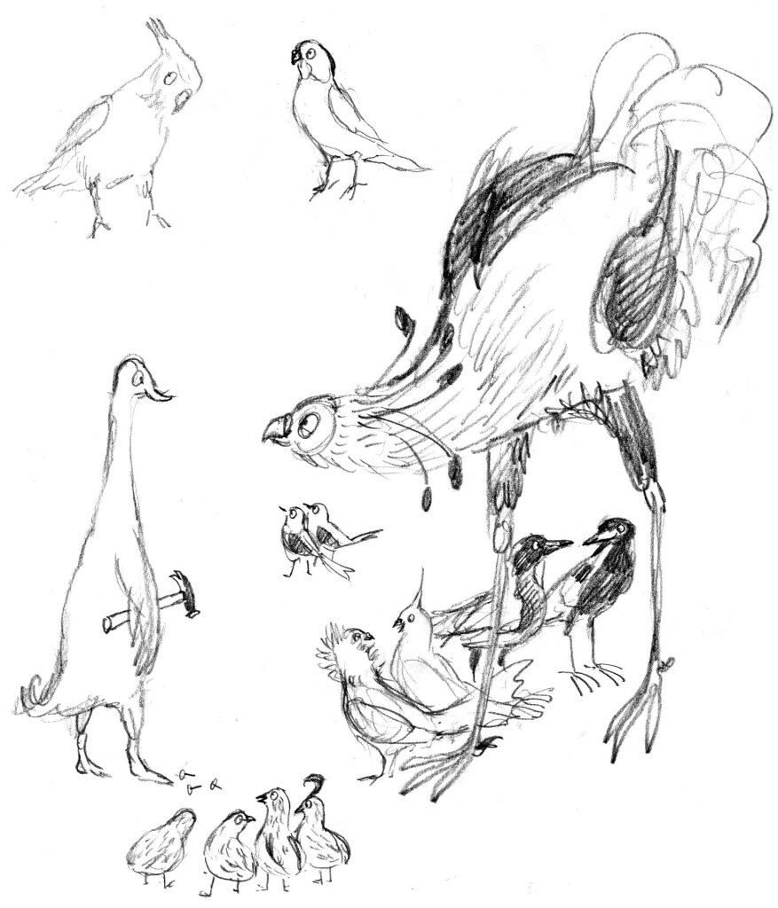
One of the early sketches for page 4 of Leonard Doesn’t Dance. It features some darlings who survived and some darlings who were killed off. (The duck was replaced with a penguin, poor darling, and didn’t even get featured on this page.)
When illustrating for children’s books, we are helping to teach children empathy, which is enormously important for their future wellbeing, and for the wellbeing of our world. So drawing a character’s feelings in a way that children can relate to, or ponder and begin to understand, is Number One for me. It takes precedence over aesthetics and character continuity.
Big-beaked Leonard. His rapture was important and his beak said this best. Hence, a big beak! The crest was a great bonus for expressing mood on every page. Here, it’s excited, but hesitant…
This means that I often approach the end of an illustration project and look through it to find that I have not one leading character, but several variations on that character. Sometimes it bothers me and I change the artwork if time allows. Leonard is pretty variable throughout Leonard Doesn’t Dance, sometimes thicker or thinner and his beak varies from one page to the next. Sometimes he has enormous wings, and other times, they’re stubby. Does it bother me? Nope. He’s still the same gawky, tender-hearted, enthusiastic and loyal fellow throughout. And his feelings are written large on his face and in his body language. I’m happy with that.
Sad, sad Leonard. Here, the beak says less. Although it does have a downward turn. The wings, crest, eye, tail and body posture all say ‘MISERABLE’. An early sketch for page 25. The wings and foot outstretched, express Leonard’s discomfort. He needs to look out of place in both in scale and mood. Detail of final art for page 25. Leonard’s wings and raised leg have been even further exaggerated, although his face and head size has been brought further into line with other illustrations.
Late in the process of illustrating Leonard, I noted a few pictures that could do with tweaking, to make Leonard more consistent. One of them was this image of Leonard just out of bed, reading a notice about the Big Beaky Bird Ball.
The drawing for this one had been done early on, (see the sketch at the top) and my ‘Leonard shorthand’ had developed since then. Later on, he had a longer, narrower neck, looser curves on his toes (yes, I actually think about those things) a smaller body and bolder black and white contrast – he looks less fuzzy and soft in later illustrations.
The later Leonard, less fuzzy, less smudgy. A smaller head and a slinky neck.
I really loved my page four Fuzzy Leonard, but I redrew him. I killed my darling. I lengthened his neck and made other tweaks. I finished the illustration and went back to other edits for other pages.
Finally, I came back to page 4 and looked at it. I had loved this scene. It had made me feel so warm and fond of Leonard. He reminded me of a 3 year old in pyjamas, just out of bed with his hair all fluffy and squashed and his face all soft and sleepy.
Somehow, though the character was now more consistent with other pages, the joy was gone. Somehow, the Leonard I loved was no longer there. At the eleventh hour I raised Fuzzy Leonard from the dead. I must have very fine necromancy skills because he was just as loveable as I remembered him to be, and he didn’t show any zombie tendencies at all.
Character continuity… I’m conflicted about it. I dorealise that if I found it easy I wouldn’t be conflicted about it… Did Charles Schultz ever have these problems?
A book about summer and family… and cicadas of course
Two books in one year is outrageous for me. I’m a slow cooker of books. Especially picture books. Each one is for me such a journey of discovery and striving and learning and change. So they emerge slowly.
Portrait of the artist as a very young person, before I illustrated this book.
But speaking of emergence, this is a book about cicadas… cicadas emerge slowly too! Some of them spend several years underground in their nymph form. One species spends seventeen years underground, which is longer than I have ever taken to illustrate a book… thankfully. Then they dig their way up into the light, shed their outer casing, dry their wings and sing a song to the summer. The boys do, anyway. And I’ll bet not many people know that they cover their ears when they are singing so that they don’t deafen themselves. Lesley taught me that.
The skeletal pencil and ink background of a spread from Searching for CicadasGhostly shadows of the child figure for the same spreadThe spread with colour and characters added
There are so many bits of fascinating information in Lesley Gibbes‘s text. And there are more than insects here too. There’s a narrative featuring a grandfather and child who go looking for cicadas on an overnight camping trip. And that is what I call fun.
Dirt and pine needles between the toes. Nothing beats bare feet.
Cicadas, summer and grandparents go together like cheese and biscuits. There’s something about these wonderfully noisy creatures (the cicadas, not the grandparents) that fascinates adults and children alike, and while we are sharing our fascination, we share a time, that later becomes a treasured memory. It did for me. I remember holding cicadas on my hand and collecting the empty shells (exoskeletons) and attaching them to the front of my clothes by their hooky little feet. They looked very decorative, along with the ripe cherry earrings hanging from my ears.
summer days in the country with my brother and Mum. I have no cherry earrings on in this photo. Soundtrack: cicadas, magpies
I consider myself lucky to have been offered the opportunity to illustrate a Nature Storybook for Walker Books. It’s a series that I’ve admired for a long time. It features a double layer of text; story and scientific fact alongside one another in a child-friendly format. There are quite a few in the series, all beautiful. (I’d love to own an original painting from Dingo by Claire Saxby and Tannya Harricks. And check out Tannya’s dog paintings!)
Camping with Pa: bliss! Soundtrack: cicadas, magpies
A few years ago I did quite a bit of illustration work for Museum Victoria where I got a taste for illustrating New Things That I Knew Nothing About. You research, scribble, take notes, panic, draw, draw again until you get it right… or right enough. (It’s never perfect.) This was a bit like that. It was really satisfying to learn to draw a cicada. I’m not confident I’d be able to draw a convincing one now, but for a few moments in time, I could do it.
This was my favourite cicada. He didn’t make the cut. I think it was because he had just a bit too much personality for a non-fiction title. He is my little friend.
And best of all was illustrating the Australian bush and the leaf litter. It made me want to make great big paintings of leaf litter.
Me with my grandfather, the irrepressible Pop Worrall who wasn’t with us for long enough. We never went camping but we did lots of swimming together.
I nearly wrote ‘Leonard dances into bookshops’. But then I remembered that Leonard Doesn’t Dance… or does he?
I’m very fond of that great galumphing bird. I relate to him very much. The initial enthusiasm, the self doubt, the impulse to hide away in a thorny tree, the desire to be with my friends that usually draws me out of the tree. And like Leonard, I have some fabulous friends.
My thanks to the team at Harper Collins and to Frances Watts, for patiently waiting for Leonard as he put one lanky leg in front of another (tripping over several times) and eventually became finished art; now a book.
This lovely cover was designed by Hannah Janzen.
I had been initially drawn to a white cover, because black ink on white paper was a signature part of making the artwork. There was a lot of ink involved. Brushed on, drawn on, printed, wiped and smudged onto white paper. Big broad strokes, and fine textured marks. So my original idea was to have an inky black and white cover, with a pop of red on Leonard’s face, and a scattering of brilliantly coloured birds flung around it like a double handful of lollies, and wrapping around both covers.
The team at Harper Collins didn’t think the white design was indicative of what was inside: a rampant world of jungly colour. This was perfectly true, and is why editors are so great! and Hannah did a fabulous job of designing something rich and celebratory.
Here are some of the lolly birds from the white cover design. Some of them found their way onto the new cover anyway. Perhaps you can spot them.
I visited the Grade Sixes at Derinya Primary School a few weeks back and we had a great time talking about Leonard Doesn’t Dance, story arcs, tension and making storyboards for picture books. There is just so much to talk about! A two hour session went by in a flash. I will be signing up with Creativenet Speakers’ Agency very shortly, so if any schools or groups of lovely librarians within Cooee of Melbourne would like to book a workshop and talk with me, that will be the place to go.
I have another book released this month as well! A very leafy book about cicadas. More on that soon. Enjoy your week!
Hi there. I’ve missed you. Work on Leonard Doesn’t Dance is going well. And I’m also working on another exciting project. A picture book by Sofie Laguna called When You’re Older. It’s a bit tricky working on two; just when I’m submerged deeply in one, I have to haul myself out by the scruff of the neck and focus on the other. But it’s fine, because both are lovely books.
Leonard and his pigeon friends are learning the can-can. I can’t do the can-can. (I might yet learn… A fake leg might be helpful.) But pigeons can can-can.
Here’s a small section of what I’m working on today. The background is in progress so the yellow area is sketched in. And all around what you see here are plants and other birds and a couple of beasts. But this is one of the white pages. The full colour pages look different.
Detail of the can-can page from Leonard Doesn’t Dance by Frances Watts
They look like this.
Detail from a full colour page as the sun sets in Leonard’s world.
I’m using a big mix of media in this book. I’m printmaking, painting, drawing, collaging and digitising. (I’m doing the same for When You’re Older, but with a different colour palette.)
The printmaking is the most fun part. There’s something so intoxicating about printmaking. When the outcome is uncertain, due to the variability of the process, you are always on the brink of something… and it could be wonderful. It could be a treasure. Those op-shoppers among you will understand the feeling as it’s rather similar.
The print below is saved to my computer with the ignominious title ‘Disappointing Flowers’. But once colour and collage treatment are added, it actually works very well.
‘Disappointing Flowers’
This is a quick mock-up showing how the application of colour and a trim here and there, bring a disappointing print into a context that works. At least, for me. It’s not from the book.
A quick digital collage of my disappointing flowers to see if they rise to the challenge.
This one I was truly delighted with. It’s such a simple pattern, printed with a single block and roughly aligned. The roughness appeals to my deepest instincts in a way that nothing tidy or perfect can do. And the print has become a raw material like a delicious cheese that I might put into some cooking.
Rough, ready and rambunctious, this print appeals to me like a Staffordshire Bull Terrier.
And here are some of the inky painted areas I’m using. These too, will be barely recognisable when I’ve finished colouring and ornamenting them on the computer, but for me, the shapes produced with a brush have more animation than anything I can draw directly on the screen.
Inky tree shapes for Leonard Doesn’t Dance… Or maybe for When You’re Older.
Now it’s back to the page. Some ducks are calling for my attention.
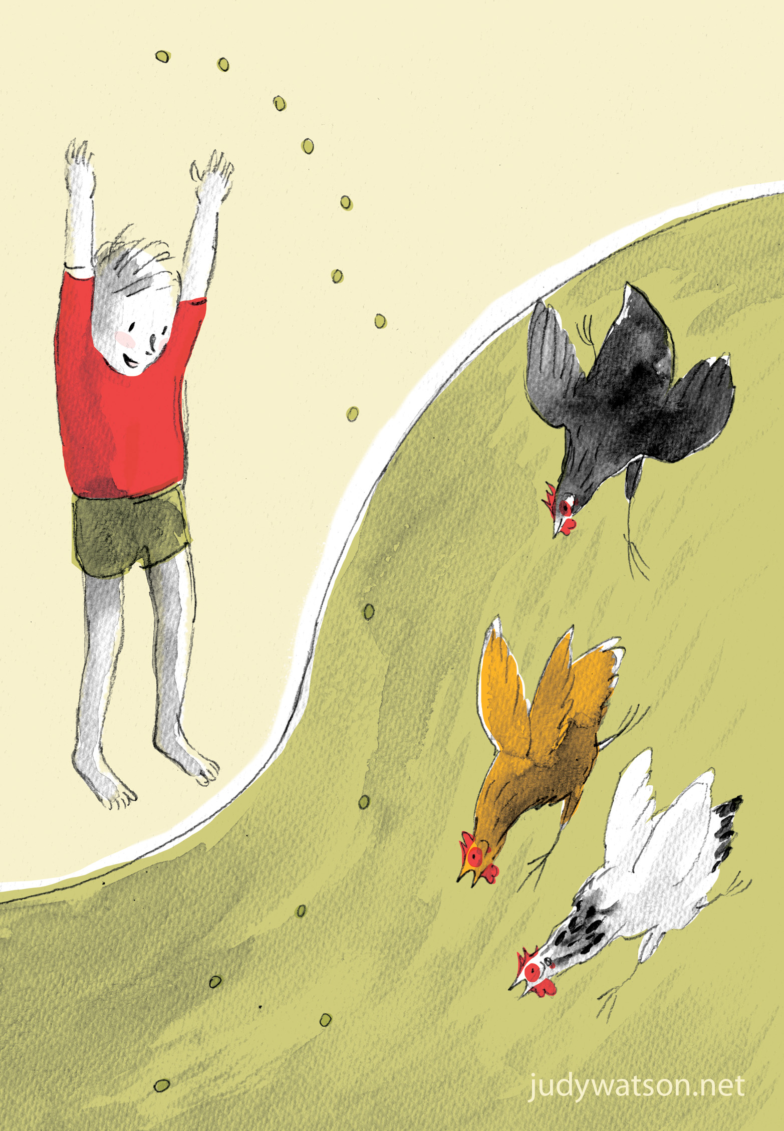
There were once a woman and her son who loved chickens.
One day the woman looked at the grapes in her fridge and decided that they were no longer appetising enough for her family to eat. So she and her son took some of the grapes out to feed to the chickens in the garden.
Because the garden was on a steep slope with a hard driveway running through it, the grapes were inclined to roll and the woman and her son laughed in delight to see the chickens run up and down the hill chasing the grapes and one another.
But after a short while, the woman noticed that one of the chickens was standing still and jerking its head in an uncomfortable manner. And although her son laughed to see the chicken dancing, the woman saw that this was because the chicken was trying to dislodge a grape that was stuck in its throat.
The boy picked up the chicken and saw that foam was accumulating in its throat as it struggled to breathe. The woman took the chicken and tried to reach a finger down its throat to retrieve the grape. But the throat was too long and too narrow. Then she saw that the bird’s comb was turning blue and that it would soon die if she could not clear its airway. So she gently but firmly blew once down the bird’s throat.
Although this inflated the chicken momentarily in quite a surprising way, it did not dislodge the grape and the boy began to cry. Then the woman in desperation, felt amongst the feathers on the front of the chicken’s neck. She found to her surprise that the grape was very easily detected and she quickly pushed the round lump upwards into the bird’s mouth and out onto the ground where she stamped it flat before another chicken could take it.
The bird began to breathe again and sat contentedly in the woman’s arms as she comforted the boy. Soon the boy stopped crying, and the chicken began scratching around the garden with the others as before.
The next day, the woman saw the remaining grapes in her fridge, which were not good enough for the family to eat, but yet not poor enough to throw onto the compost heap and she said to herself. ‘I will not make the same mistake again. This time I will cut up the grapes so that they do not stick in the chicken’s throat.’ And she pulled out a large chopping board and a very sharp knife and began to slice the grapes.
But the grapes began to roll about the board, and the woman was hard put to cut them without losing them onto the floor. So she held each grape closely and cut them individually saying to herself, ‘a job worth doing is worth doing well’. But holding one grape a little too closely, she accidentally cut off the very tip of her finger and she bled and bled.
The chickens did not mind the blood, nor the tip of the finger. Not a single chicken choked on a grape and there were three eggs in the nesting box that day, each with a yolk as round and yellow as the sun.