Tag Archives: birds

Here I am

After the longest time!

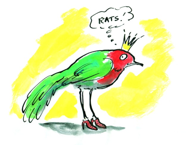
Hi there. I’ve missed you. Work on Leonard Doesn’t Dance is going well. And I’m also working on another exciting project. A picture book by Sofie Laguna called When You’re Older. It’s a bit tricky working on two; just when I’m submerged deeply in one, I have to haul myself out by the scruff of the neck and focus on the other. But it’s fine, because both are lovely books.

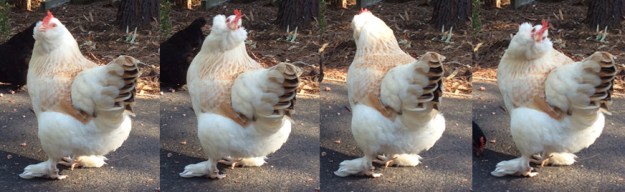
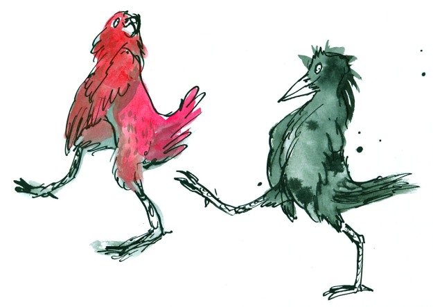
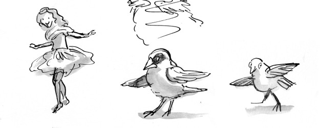
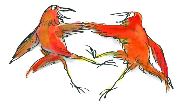
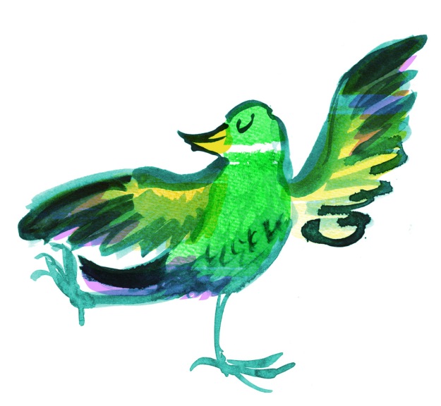
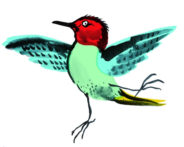
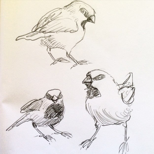
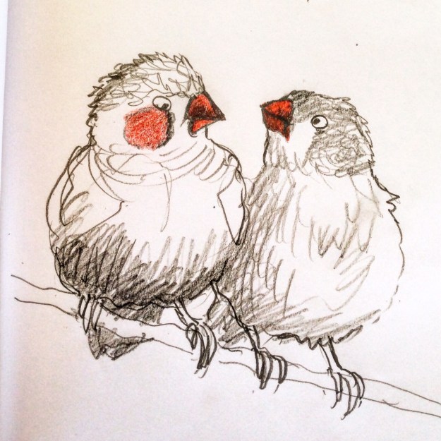
Leonard and his pigeon friends are learning the can-can. I can’t do the can-can. (I might yet learn… A fake leg might be helpful.) But pigeons can can-can.

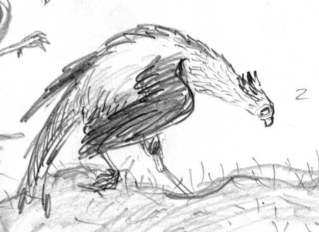
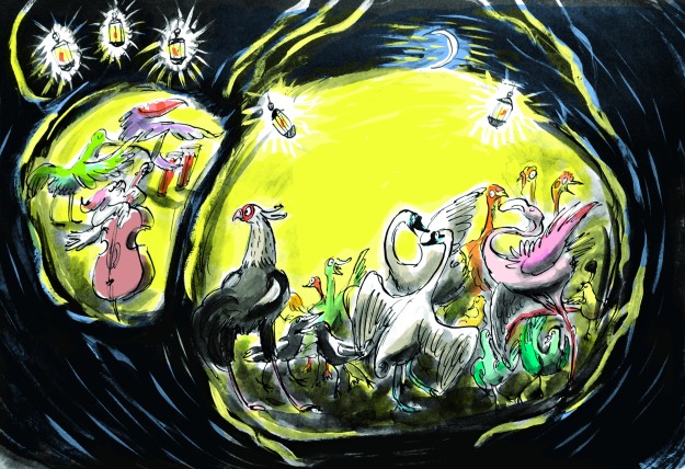
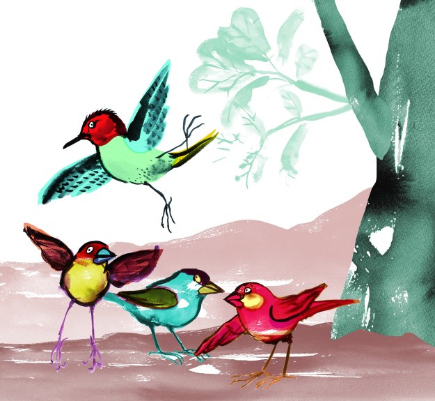
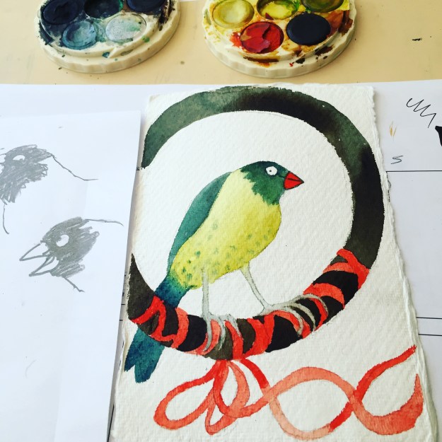
Here’s a small section of what I’m working on today. The background is in progress so the yellow area is sketched in. And all around what you see here are plants and other birds and a couple of beasts. But this is one of the white pages. The full colour pages look different.

Leonard and the Can-can pigeons

Detail of the can-can page from Leonard Doesn’t Dance by Frances Watts

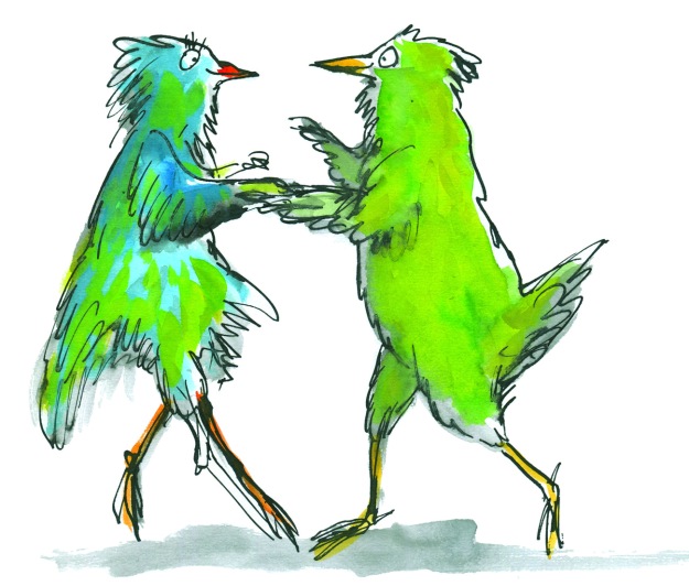
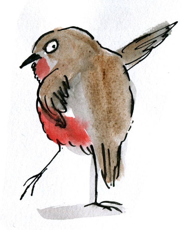
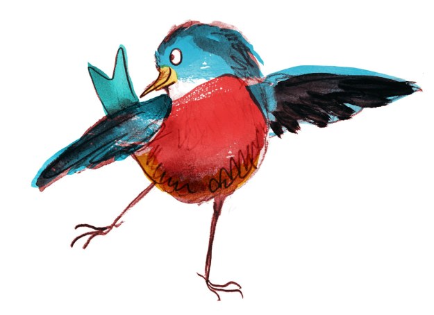
They look like this.

Leonard colour page sample

Detail from a full colour page as the sun sets in Leonard’s world.

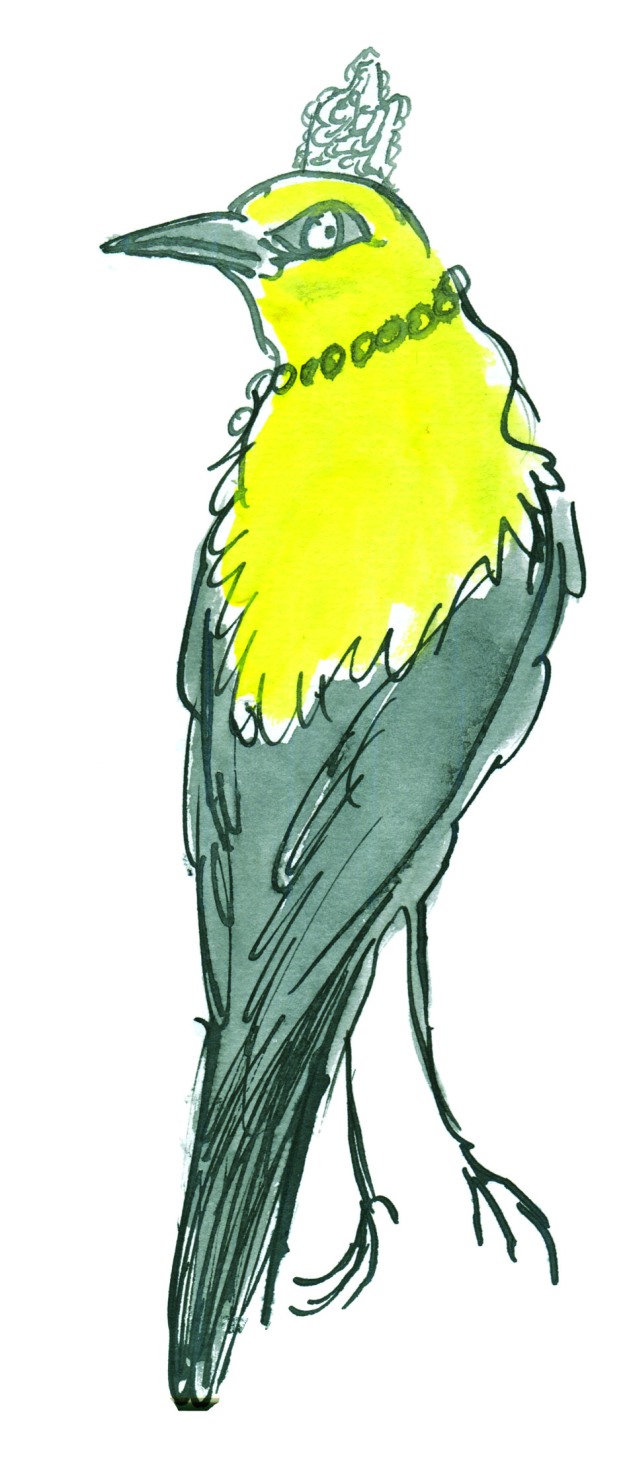
I’m using a big mix of media in this book. I’m printmaking, painting, drawing, collaging and digitising. (I’m doing the same for When You’re Older, but with a different colour palette.)

The printmaking is the most fun part. There’s something so intoxicating about printmaking. When the outcome is uncertain, due to the variability of the process, you are always on the brink of something… and it could be wonderful. It could be a treasure. Those op-shoppers among you will understand the feeling as it’s rather similar.

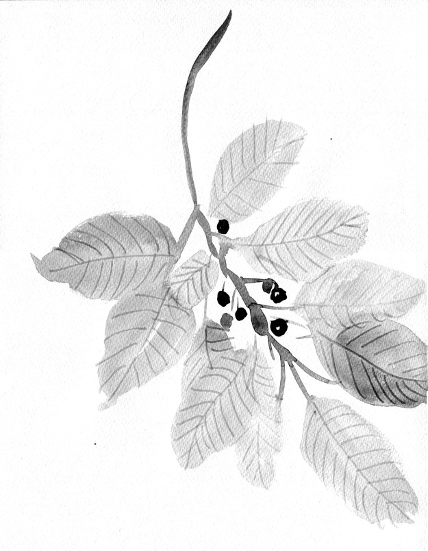
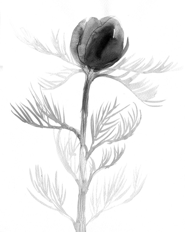
The print below is saved to my computer with the ignominious title ‘Disappointing Flowers’. But once colour and collage treatment are added, it actually works very well.

‘Disappointing Flowers’

This is a quick mock-up showing how the application of colour and a trim here and there, bring a disappointing print into a context that works. At least, for me. It’s not from the book.

A quick digital collage of my disappointing flowers to see if they rise to the challenge.

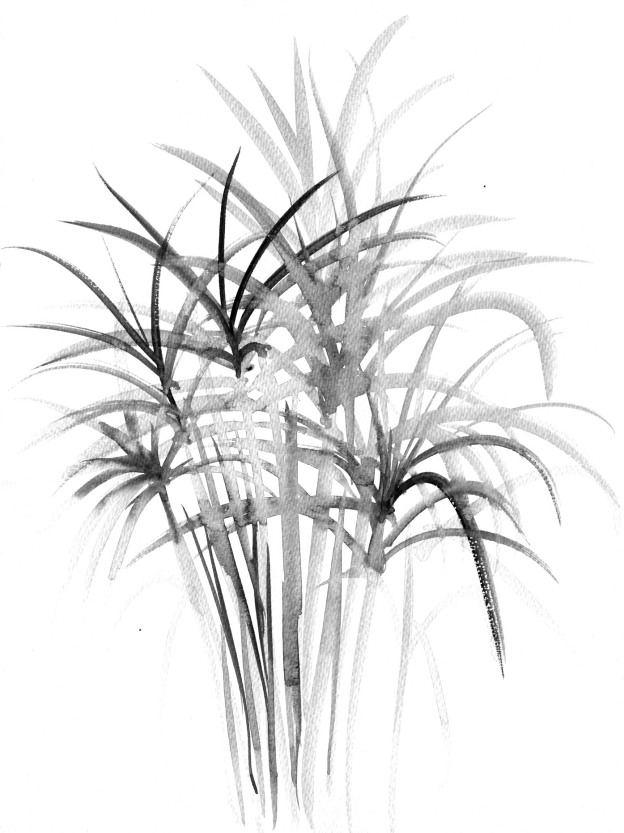
This one I was truly delighted with. It’s such a simple pattern, printed with a single block and roughly aligned. The roughness appeals to my deepest instincts in a way that nothing tidy or perfect can do. And the print has become a raw material like a delicious cheese that I might put into some cooking.

repeat pattern lores

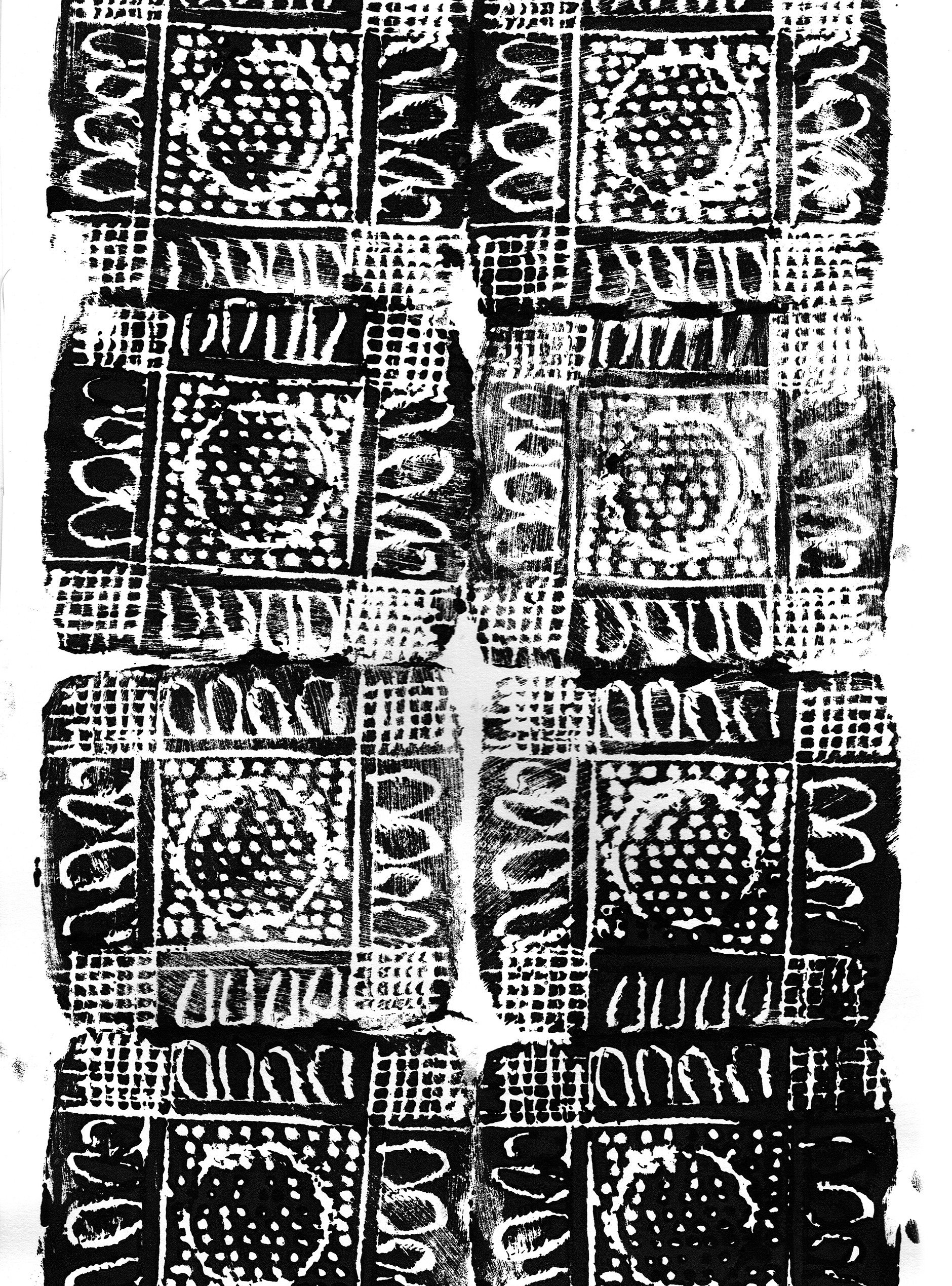
Rough, ready and rambunctious, this print appeals to me like a Staffordshire Bull Terrier.

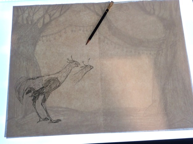
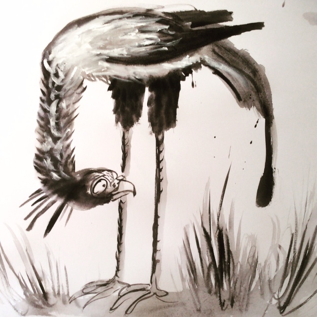
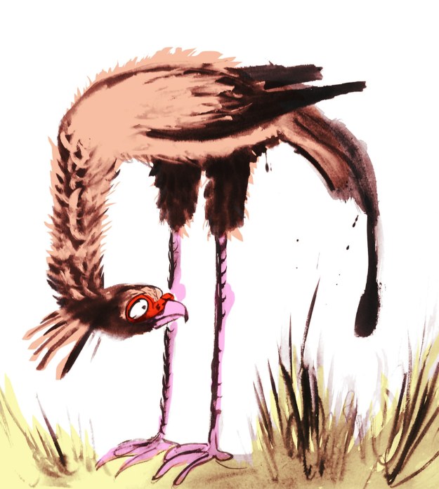
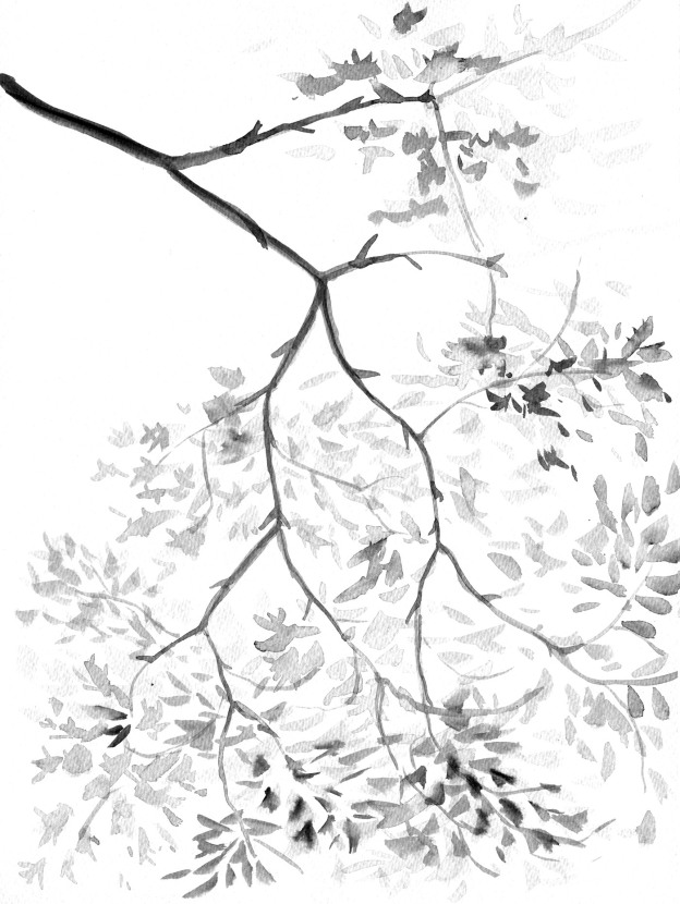
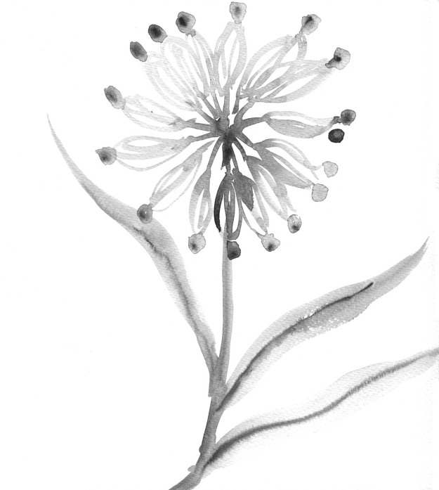
And here are some of the inky painted areas I’m using. These too, will be barely recognisable when I’ve finished colouring and ornamenting them on the computer, but for me, the shapes produced with a brush have more animation than anything I can draw directly on the screen.

8-9 tree shapes lores

Inky tree shapes for Leonard Doesn’t Dance… Or maybe for When You’re Older.

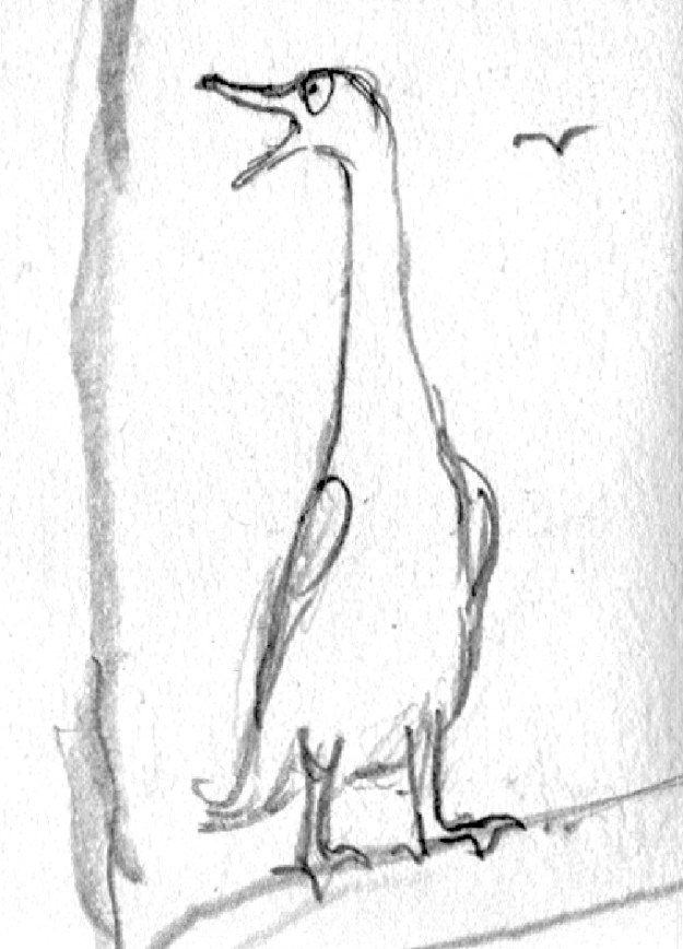
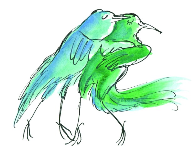
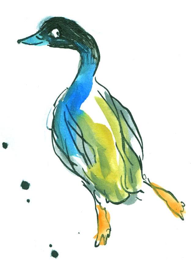
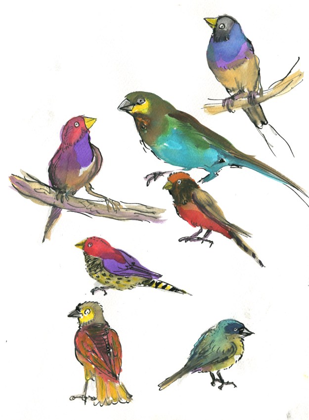
Now it’s back to the page. Some ducks are calling for my attention.

Yes. I think some of them are Call Ducks.


Studies in blue

Today I have been working on the mid section of roughs for Leonard Doesn’t Dance. It’s a difficult time for poor Leonard.

As I was drawing, in search of the right feeling in his posture and expression, I thought it might be interesting to picture book enthusiasts to see some of the thought that go into each illustration. So here we go.

Leonard RHS studies lores

An A2 sized page of studies for a vignette on page 15. (8 scans later, boy do I wish I had an A2 sized scanner!) I have numbered my drawings in order in case you are interested to see the progression of ideas.

I’m not sure if you’ll be able to read my notes on the page. Leonard is feeling sorrow, resignation, defeat, regret, longing. Expressions I want to avoid include alarm, fear, guilt, anxiety or furtiveness.

Those who draw will know how a tiny variation in the curve of an eye or eyebrow, or the tilt of a head may change an intended sorrow into an accidental horror.

L sad 3

No.3. The heavy line at 10 o’clock on the eye gives the expression wretchedness. Otherwise the large, round eye looking backwards might have indicated a fear of pursuit.


L sad 4

No.4. This is my preferred facial expression. It says best what I think Leonard is feeling.

L sad 1.jpg

No. 1. The expression seems a mix between extreme mortification and horror, with a bit of disgust thrown in. The up-curving neck shows too much energy. I want Leonard to look a little defeated. 

L sad 6.jpg

No. 6 Although I like the body posture with raised wings, the face here is not quite as good as  that of No.4. The head tilt is less submissive, more head-butt. The crest is more raised, the eye less miserable.

L sad 2

No.2. Utter dejection with 1920s silent movie era eye makeup! Leonard is not even looking back, just downwards. I think I’d rather he looks wistfully backwards as it indicates a suppressed longing to join in. I don’t want our boy to be completely bereft of spirit. Poor lad.

Sometimes a thing like this can be positively excruciating if you can’t get it right. But today I enjoyed it. Leonard is  very accommodating.

In Leonard’s case, I have the eye to work with and also the caruncle (a patch of coloured skin) around his eye, which acts as an eyebrow or an underscore for the expression in his eye. And living with a flock of chickens has taught me what a sick or miserable chicken looks like; the hunch, the fluffed up feathers, and sometimes the dropped wings.

L dejected.jpg

But with Leonard’s crest I depart from the nature of birds. A fluffed up crest in the real world might indicate bird misery, but I’m using Leonard’s crest more in the way of ears like a dog, that drop when miserable, raise when interest is sparked. That is probably a language more readily identifiable to children, since more have dogs than chickens… in Australia at least.

So that covers the face. What about the body?

dejected posture.jpg

He’s retreating, so he’s best drawn partly from behind. The fluffed up hunched shoulders, I mentioned earlier. He should look clumsy, so I experimented with leg postures. He has just alighted so I need to suggest the flight just finished. And he’s walking away and downwards, so I have to suggest the forward downwards movement as well.

One challenge is the wings. Raised wings (6) could suggest a certain lifting of spirits. Spread wings look nicely clumsy (5) but tend to get in the way of the main subject (his lowered face). Lowered wings (2, 4) may be best for misery but are not so good for movement and flight. (In 2 he looks positively beaten. It’s a bit much.)

wings raised.jpg

Today as I was working on this, I once again remembered my fabulous school art teacher Cecily Osborn. I remember her explaining how artists can seek to depict movement in a motionless work of art. She used the ancient Greek sculpture of a discus thrower Discobolus by Myron as an example. The sculpture doesn’t depict any real life movement employed by an athlete whilst throwing a discus, but instead attempts to creatively suggest the movement that came before as well as hinting at the movement to follow the instant in time depicted by the sculpture. The sculptor borrows our imagination to evoke a movement that he can’t create in reality.

roman bronze reduction discus_thrower_Myron

A Roman bronze reduction of Myron’s discus thrower. The original artwork was made around 450BC.

“The potential energy expressed in this sculpture’s tightly wound pose, expressing the moment of stasis just before the release, is an example of the advancement of Classical sculpture from Archaic.” (says Wikipedia)

I’m very serious today, aren’t I? Do you think I am overthinking this?

I don’t think so. These thoughts take longer to describe than they do to think. All this and more goes through an illustrator’s head as he or she is drawing. And a lot of it is subconscious too. But it’s part of what makes the pictures work, it’s part of observing our world, and how the experiences of life feed into an artist’s work. I love that about my job.

But here are a couple of over-excited woodpeckers, because I wasn’t just drawing misery today.

Cheerio!

woodpecker black and white judywatsonartwoodpecker judywatsonart

Hello studio, hello birds, hello autumn.

It’s the second week of the school holidays and I’m back in the studio today after a busy week with the family. The boys are visiting with their grandparents in the country all this week. And I have no work to show you yet, so I thought I’d just say hi.

I really love the autumn in Victoria. The light is soft and warm with honey tones like a dessert wine. (yum.) It’s the best time of year for closing your eyes and lying in the sun,

Hugo shaking apples down.JPG

for shaking apples from the apple tree,

last water fight of the season.JPG

or for having the Last Great Water Fight of the season.


But in the midst of this mellow finale, the wild birds have been rowdy today for some reason, as they were back in the spring when they were fighting for nesting sites and mates and eating each other’s babies!

This afternoon I saw a kookaburra nearly stun itself by attacking its reflection in our lounge room window, as a grey butcherbird watched closely, waiting for an opportunity. While the kookaburra sat on a branch recovering its composure, the butcherbird (3 flights up) dived down and audibly clouted it on the top of the head. Is that adding insult to injury, or injury to injury? The kookaburra raised its head feathers in lieu of a comb or a finger and looked outraged and rumpled but didn’t pursue.

Our chicken girls weren’t rowdy though. In fact, they were a little alarmed by the swooping and noises in the trees around them when I let them out this afternoon.

chicken conference in driveway.jpg

A chicken conference under the sheokes.

Takara spots a kookaburra.jpg

Takara demonstrates her funky chicken dance as three kookaburras overhead cause some concern with their noisy display. 

fluff balls eating south african food.jpg

Our two Salmon Faverolles, Takara and Cressida Cowell eating peanuts in the driveway. Takara (on the left) has started laying and hence the big, red comb. Cressida is a late bloomer and a big, fat baby who galumphs about tripping over her ugg boots. She is by far our largest and heaviest chicken and at the bottom of the pecking order. It’s amusing to watch tiny Storm scold her whilst barely reaching up to Cressida’s fluffy chin at full stretch. 


Meanwhile, back in the studio, for want of new artwork to show you today, here are some of the musicians that didn’t make it through the auditions recently.

They don’t mind. They have a regular gig down at The Swamp on Thursday nights.

swing band.jpg

Here are a pair of cockatoos do-si-doing. They are going to try to squeeze into a spread for Leonard Doesn’t Dance tomorrow.

20-21 dancers 3.jpeg

My drawing board now that the sun has gone down,

drawing board.jpg

My black Cornish Rex inkwell,

Cornish Rex ink well.jpg

and last of all, something that isn’t here yet. The Squirrel. A wood fired stove that will soon be warming my studio. Woohoo! 

morso-1430.jpg


Bird Immersion (2)

This is another quickie post. It’s all terribly busy around here.

Even the birds are looking a bit concerned.

call duck

I’ve often seen ‘Call Ducks’ advertised when I have been browsing the chickens-for-sale ads (as some of us do). I feel this may be what they look like.


worried galah

And this galah barely knows which way to turn.

light box in action

I’m still excited about my new light box. It’s much bigger than the trusty old one. It gets brighter or dimmer if you hold your finger on the power button! Sometimes I do that just for fun.

You may be able to see that one spread looks rather a lot like the (empty) stage of a theatre. It’s not a stage, but I quite like that it looks like one. And I like that I can sketch the characters freely on a separate sheet of paper over the top of the scene. I suppose this is what animators used to do all the time.

20-21 muso initial sketches

These are my first drumming bird sketches. It’s been interesting to work out how the bird might play the instrument and how much to simplify or modify the instruments from those in the real world. I liked the bounce in the woodpecker trio at top left but I came up with a much better drawing later. The first one I drew here was the duck and that drum looks most unstable. I’m not sure it’s even three dimensional!

I worked out a great plan (my 25th) for the cover of Leonard Doesn’t Dance in the shower the other day. I often draw Leonard covers on the shower screen. It is an important part of my process and one of the more literal interpretations of bird immersion. Luckily I have imprinted the idea almost perfectly on my brain, because when I went back to the bathroom to photograph the cover design, it had melted away….

That reminds me, I need to buy another back-up hard drive for my computer.

And lastly, for those of you who are interested in bird immersion in general, (you may be the kind who browse the chickens-for-sale ads) did you know that some chickens can swim? Go here to see the most gorgeous Buff Orpingtons in a swimming pool.

It should be added at this point, that we had to rescue Stella from the fish pond a few weeks ago as she fell in and did not seem to have the required flotation skills.

(Why does ‘floatation’ look wrong?)


Bird Immersion

Sorry I haven’t been around in Blog Land.

20-21 Leonard with 2 heads


Happily, this is mainly because I’ve been so busy drawing my roughs for Leonard, (and turning 50, and looking after an extra child because we have an overseas student staying with us at the moment).

I have to say, despite the fact that I’m multi-tasking like crazy (bad) Leonard is really fun (good!).

I can’t show you very much (bad). Many of the roughs describe the finished image. And this book, true to Frances Watts’ Style, will be brimming with humour (good!). So by showing you the full page roughs, I would be giving away all the gags (terribly, terribly bad).

But I can share with you bits and snippets and here-and-there touches.

chickens lightened.jpg

It’s interesting that the roughs have reverted to pencil, maybe my most natural medium. And this will pose its own challenges when it comes time to make the final art with broad paint strokes. The roughs began as large paintings, then switched to charcoal, and finally, to pencil.

singing

swingin Leonard

And something I’m excited about is my new light box! Wowsers! It’s so cool.

But I’m going to leave this and write more later.

I’m multi-tasking, remember?


Leonard dances on (part 2)

Having had a lot of fun with my digital collage and brushwork, I picked up the dip pen and filled my inkwell once more to explore Option One.

pen and ink crooner judywatsonart

Dip pen and ink with real wash. 

Having fuddled around with birds for some weeks, I felt warmed up. My drawing hand was in action again. I was feeling a bit racy. The big brushy birds were fairly cumbersome in terms of getting the dance action going, and I wanted to see how these birds might actually look dancing; particularly in pairs or groups.

So here’s where my trusty dip pen came in. I used the same one for the whole of Thunderstorm Dancing and I’m not sure what I’ll do when this particular ratty nib gives up the ghost. It’s pointy and twitchy and zippy and once the pen hand is warmed up, the quicker the drawing, the better.

In my first sketches, I referred to pictures of people dancing. The birds looked rather hilariously like people in bird costumes.

pen and ink crazy peoplebirds lores

pen and ink ridiculous birds

Seriously, what???!! Must be stuffy in those bird costumes…

pen and ink person to bird lores

Here you see me trying to figure out how to turn a human dance pose into the equivalent bird pose. Doesn’t work. The bird’s leg joints are so different that when forced into a corresponding pose, they become stiff and awkward. 

pen and ink john travolta lores

John Travolta? 

They were terrible. After that I put Fred and Ginger aside. Phooey! Better to just look at birds and make their gestures approximately dancelike. Despite my lack of dance expertise, I could put more of an expressive spin on a bird drawing without scrutinising a real dance move.

Then it became more fun. These birds were attending an imaginary ball. I gave them names. Just because.

pen and ink tiara

Spotted at the ball this evening – Miss Ophelia Oriole in yellow cape and tiara.

pen and ink orange pair

Melva and Gene Shufflebottom set the dance floor on fire this evening. Luckily, no one was hurt. (That’s from Thomas the Tank Engine. Some of you will recognise it.)

pen and ink blue green pair judywatsonart

Sparking rumours this evening at the ball, Adele Coiffe and Thomas Furle were inseparable on the dance floor. 

pen and ink cindermallard

A Mysterious Mallard wowed the guests at this evening’s festivities, but departed hurriedly at midnight, leaving behind a puddle of water. 

pen and ink crooner judywatsonart

A starling vocal performance was given this evening by Steve Brash, with backing vocals by the Fluffies. (not shown.)

Lastly, I spend about 40 minutes whipping up a page spread in this style to see how I’d go with drawing a crowd. It wasn’t so great, but it was good enough to act as a sample for discussions with the editorial team at Harper Collins.

pen and ink rough spread judywatsonart lores.jpg

This sketch is coloured digitally, so that I could get a quick idea of how it might look. It’s very rough, and fairly energetic. I like the energy. It reminded me of a picture I’d done for the Ernie and Maud series years ago. Particularly the duck in the middle, waving to a friend. (There was an excellent hot air ballooning duck in that story.)

Greatest Sheep in History judywatsonart lores


I’ll be interested to hear what treatment you would have chosen. But I have to say voting has closed and the team at Harper Collins voted unanimously for….

drum roll…

BRUSHY!

brushy green bird

Let the games begin!

pen and ink rats lores

Was it the shoes? Too much?

Leonard dances on

Well, enough of that frivolous sewerage stuff for now. Time to get back to Leonard because I’ve got some roughs to complete! (Sorry to those who were enjoying  my inexpert comics doodles. I’ll try to fill you in on the end of the story at some stage. Evil snigger.)

woodpecker colour flat

Option B. Read on…

Now where did we leave off? I think I was drawing finches in all sorts of styles.

After that, I drew a few more birds of other kinds… That’s rather offhand, isn’t it? I’m skipping over about 16 species without even excusing myself…

And then I spent a day or so researching and downloading images of various dances. I am much more familiar with birds than I am with dances. Seriously, you should see me try to dance. But what a great excuse to get a book about Fred Astaire and Ginger Rogers out of the library.

Then I spent a day drawing birds dancing, putting it together. And all the while my days and nights were filled with mullings and musings about medium. That’s just too much, right?

I am a person who could spend a long time making up my mind. So I wrote this shortlist.

shortlist worksheet

There was a third option but since it had a difficulty rating of 5/5 it soon dropped off. 

The fabulousness ratings are important for me because I don’t feel there’s any point in making a picture book if I don’t at least attempt to make it fabulous. But they’re hypothetical, and of course totally subjective.

So. Being me, I started with Option Two. 

Brush and wash with digital blocks of colour. 

I have to thank Clive Hicks-Jenkins for accidentally reminding me of the brush and wash option. He posted my bookplate blog post on his FaceBook page. And when I looked at the bookplate again, I remembered how much I had enjoyed painting that chicken with brush and ink and how the digital editing changed it into something I rather liked, with very simple blocks of flat colour over the painted image. It was easy to do and retained the painterly look, which many digital treatments do not. But it wasn’t something I had considered as a treatment for Leonard.

sepia chicken judywatsonart lores

This particular image would be rather dark and heavy in a picture book. But it’s really just the background that makes it heavy. With a different background treatment and a lot of white space, it could work. I had a vision with lots of white space but with some painted plants strategically placed, in paler tones than those of the birds.

With the chicken bookplate, I converted the original art to a sepia colour; still very inky looking. But I could make the brushwork any colour that harmonises with the overlaid colour blocks. Indeed each bird need not be treated the same way.

I made some quick mock-ups.

finch flap lores

unhappy secretary bird photo

brushy sketch

unhappy secretary bird test

brushy sketch with flat colour


several finches with flattened background 2 col copy

a digital collage with brushy finches, a woodpecker and digitally applied colour wash

These brushy bird paintings were large. Nearly A4 size for each individual bird, so I wondered if I might be able to work at a smaller scale using a pencil for details like eyes. And made this quick  sample. I think I prefer the brush alone, but it will depend how practical this giant size proves, when working on entire page compositions.

bluebird test judywatsonart

brush and pencil bluebird with digitally applied colour wash

And I made a few brushy background vegetation sketches. I could have a lot of fun with these, adding some colour and layering. We could go a little 1970s…

feathery tester loresfruity tester loresginkoish tester loresgrassy tester lores

flower tester levels loresjointed flower tester levels

I think that will have to do for tonight. Option One tomorrow!


Leonard’s Friends (part 2)

the finch who has forgotten the next step

Yikes! It seems there is a lot going on quite quickly, and I haven’t been keeping up with my blog posts. By the time I find a few minutes to write, I have a backlog of several things to write about and most of them are out of date!

Ah well. One step at a time. Or perhaps one Two-Step at a time in the case of Leonard Doesn’t Dance.

I seem to remember promising to post more on my visual exploration of the bird species of Leonard Doesn’t Dance; the finch being next bird on the wire. So here they are first.

I think the page of coloured birds below was my very first page of finches. I was sketching quickly, trying to keep loose and have fun, while getting the general idea of their shape. The ink was water soluble, which bled into the very saturated colour I was using, and the effect is not so great, especially in a group. It’s a bit like an over-cooked rainbow stew. Or perhaps something that a child might create with a mud pie and food colouring…

saturated finches

Another notable point about learning to draw finches is their beaks. They have a particularly fierce strength about them. They remind me very much of a crescent wrench or adjustable wrench. In this first page of finches, I had not yet cottoned on to the beak thing.

adjustable wrenchcrescent wrench

Wrenches. Distinctly finch-like. Compare with the two top right-hand images below.

Here you see where I cottoned on to the beaks. I did a series of head sketches, playing with character, expression and finchy beaks. I was pleased with this page. I think at this point I was also pondering whether Leonard might have a little finch buddy who is a more confident dancer than he. A non-speaking role. A kind of Cyd Charisse.

finch faces

I then went on to exaggerate the beak further, and added some wash over the pencil sketches. I drew this stolid fellow below. (That amused me, drawing a stolid finch.) And then the finch at the top of this blog post, who is more lively, and still with that lethal looking tool on the front.

the stolid finch

Next up, Christmas happened! Determined to wrestle every possible bit of finch drawing out of daily life, I painted finch Christmas cards for family and friends. Using a faint pencil guideline, I avoided all conflict between watercolours and inks.

IMG_8415IMG_8425

I think I liked this smiling chap best (above). You can see he came directly out of the head sketches I drew earlier.

IMG_8423

Now we move on to another day in late January where I took my sketching materials to the yacht club to get some work done while keeping an eye on the boys in the water. I didn’t have any of my earlier sketches with me and Christmas and New Year had completely erased my memory.

(…) That’s what it looked like inside my brain.

I had only a very soft graphite pencil and a red pencil with me. I started by drawing this fellow, starting with the beak. He looks horribly fierce, mostly because of the dark shading above his rather narrow eye.

I had moved on from beaks and was experimenting with a simplified way of drawing the feet. I’m not really wanting to get too anatomical with my birds’ feet; I think that would become a distraction for me while drawing, and for the reader while reading. So I need to find a shorthand for them, that expresses the bird (and the dance) and doesn’t evoke a biology book.

IMG_7202

These chaps were next.

IMG_1574

I added red pencil over the beaks, on a whim. The red pencil did not like the soft pencil. More rainbow pie.

IMG_7204

Euwww! Is that egg on your chin?

By this time, I was noticing that many of the finches in the reference photos sported black eye-makeup and red cheek patches. What was I to think? They looked a little clownish.

pencil finch clowns

But wait! Maybe they are superheroes?

pencil finch superheroes

Posting these now, I notice that the clown finches have more weight on their cheeks and bodies with not much forehead; it’s a sagging, comical shape. The superhero finches have a more compact, athletic shape and more cranial space. They look speedier and sharper. I’m not sure how much of that was conscious, and how much unconscious. (…)

I was pretty comfy at the yacht club, and I continued on with some puffins (deplorable) and some woodpeckers (passable).

But enough for now!

pencil woodpeckers


Leonard’s Friends

Leonard 6

As some will know, my current book project is a picture book by Frances Watts to be published next year by HarperCollins. Leonard Doesn’t Dance is the title, and it will feature a cast of feathered friends of many species.

Leonard and his friends have been forming on the page but I’ve yet to definitely decide on the medium that will best suit the book. As a way of exploring options, I’ve begun getting to know this list of species.

Magpies
Ducks
Pigeons / Doves
Rosellas
Galahs
Woodpeckers
Flamingos
Swans
Chickens
Turkeys
Quails
Bluebirds
Finches
Penguins
Puffins

First on the list, penguins. (Yes, I’m not even reliably back-to-front.)

Penguins come in several shapes and sizes and are attired in formal to smart casual. Their posture is generally upright, and they are fond of water sports. Some are tall and imposing. Some are small and wiry. Some are round, cuddly and ridiculously cute. Possibly too cute. (What kind of a kill-joy book illustrator am I? Too cute?)

penguin very first pencil sketch

A warm-up penguin. I liked to think I was channelling William Kentridge with my deft use of the eraser… but really, this is just a warm-up penguin. My eraser was employed in deftless ways.

penguin pencil and wash early 1

A second warm-up penguin. Sometimes the warm-up process temporarily takes one backwards.  (Watercolour and brush on smooth watercolour paper.)

the rather dull small fluffy penguin

See what I mean? (Noodler’s ink, watercolour and gouache on watercolour paper.)

the rather dull penguin

A half-warmed up penguin, using a soft pencil and watercolour. I need to bond with penguin feet. They are thick and sturdy and look like lumps of pink putty. These are not right. But I like the head.

penguin pencil and wash later

A tighter line. Testing the look of a more stylised shape. This penguin is quite athletic. I didn’t  realise that some penguins have rather long legs. Even if much of the leg appears to be inside their body. Rather like walking around inside a large pillowcase with your toes in the corners… Or not. I do like the watercolour over the textured pencil.

tighter penguin

A tighter outline again with an exaggerated shape. But still with a loose hatching technique. I don’t do tidy hatching. I associate it with things like ironing shirts. A useful skill that I don’t have the patience for.

penguin pencil sketch

Looser? Almost the same head. But loose and with added dance steps.

twin penguins

Looser with ink. I think this is a combination of the last two. Or three.

A question arising is the ink. This ink is water soluble. I often enjoy this, because it’s rather scrumptious to see the line dissolve under the watercolour brush to do unexpected things. I mostly like unexpected things. But would I like unexpected things to happen on my final artwork? Maybe not.

Also, it’s hard to lay clean colour over dissolving black ink. I will want some of my colours to be clean. I will have a try with water-fast ink later. But there are other ways around this. I could do the black part with water soluble ink and print out the illustrations onto fresh watercolour paper before adding colour. But all this can get rather complicated and size can become a limitation. There is much to ponder over the next few weeks.

I will share some finches with you soon.


Bookplates – just for fun (part 2)

So here are my two quick bookplate designs. Unlike Hugo, my preliminary work was limited to one doodle in blue pencil. I then progressed straight into ‘make it up as you go along’, my strongest medium.

bookplate prelimiinary doodle judywatsonart

Wanting to play quite loosely with patches of colour, I used watercolour without any particular structure or organisation. Then I added ink with brush and dip pen, acrylic (to cover up the bits I didn’t like on the wing) and went for it with some lettering. I left it scanning while I started on a second one.

Bookplate2 judywatsonart stage 1

The second one was only black ink and dip pen with lots of splodgy bits. I scanned it before adding more texture, to give myself a way of going back. undo. (Am I the only one who mentally presses Command Z when I miss a turn off in the car? It doesn’t work.)

Bookplate judywatsonart stage 1

Then I took it back to the drawing board and added some very important dots and scratchy bits. (Chickens scratch. It’s symbolic, right?) Then I scanned it again. (undo)

Bookplate judywatsonart stage 2

Then I took it back to the drawing board for some wash, and scanned it a third time. (Actually, I blow-dried it first, and then scanned it and found it was wobbly, and then put it in the book press for 2 hours while I drove to school and back and then scanned it again, but that’s probably too much detail.)

Bookplate judywatsonart stage 3

Then I took it into PhotoShop and added some colour. Although it may have been better in black and white, it was too much fun not to add colour. (This process involved lots of undos.)

Bookplate judywatsonart tonal chookie

Then I went back to my first chicken; all loose and free and doing her own arty-farty, happy thing. And I had to mess with her. Cramp her style.

I desaturated her, taking her back to a sepia tone, then added very limited digital colour. She squawked in protest, but I took no notice. I told her firmly, ‘less is more… sometimes… Not when it comes to eggs, you understand.’ She gave me that bright beady-eyed look and then we sent the bookplates off to print.

The other chicken had been asleep through the whole process.

sepia chicken judywatsonart lores