Tag Archives: gouache

The Kick-About #11 ‘TRAPPIST -1e’

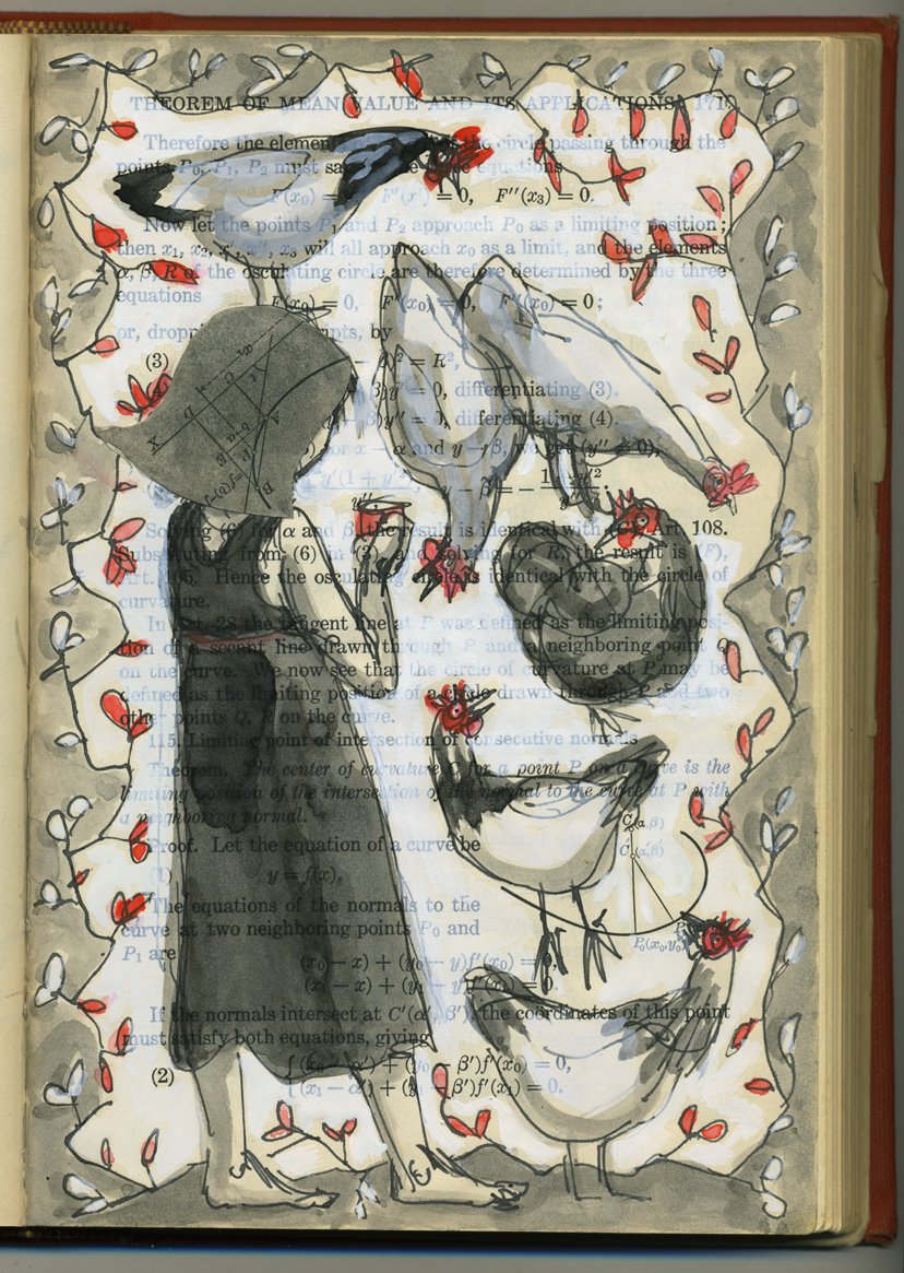
Apologies to my email subscribers if you receive this twice. Due to operator error, the post became a draft again. And now in order to make it visible, I have to republish it. Hopefully that doesn’t mean it comes into your inbox again.

The prompt for Kick-About #11 is TRAPPIST -1e.

By NASA/JPL-Caltech – Cropped from: PIA22093: TRAPPIST-1 Planet Lineup – Updated Feb. 2018, Public Domain, https://commons.wikimedia.org/w/index.php?curid=76364487

Does it look enticing to you? TRAPPIST-1e is one of the most potentially habitable exoplanets discovered so far. Your descendants may be living there one day. It is similar to the size of Earth and closely orbits a dwarf star named TRAPPIST-1 which is not as hot or bright as our sun. One side of TRAPPIST-1e faces permanently towards its host star, so the other side is in perpetual darkness. But apparently the best real estate would be the sliver of space between the eternally light and the eternally dark sides – the terminator line where temperatures may even be a cosy 0 °C (32 °F).

The artist’s impression above reminds me of a polished marble kitchen bench, albeit one from which all of your plates and utensils would slip off. It looks cold. It makes me want to crawl back into bed, snuggle up and feel grateful. However, it is beautiful.

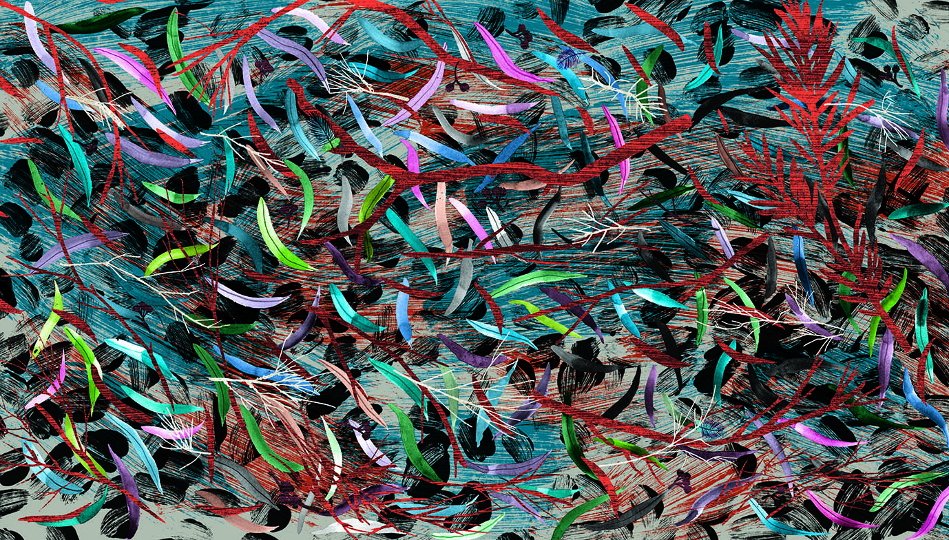
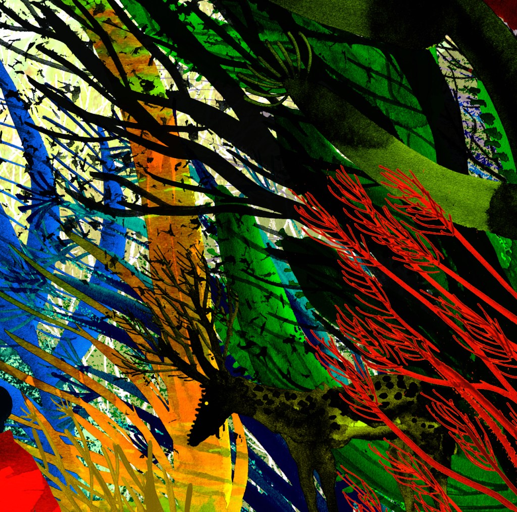
I started painting some plants for this new world, and I imagined that they would all be turning towards the dim light of their star. So I made a world where everything was evolved to point in one direction only, sucking up the warmth, the light, the energy; a single-minded yearning, shared by every living thing on the planet.

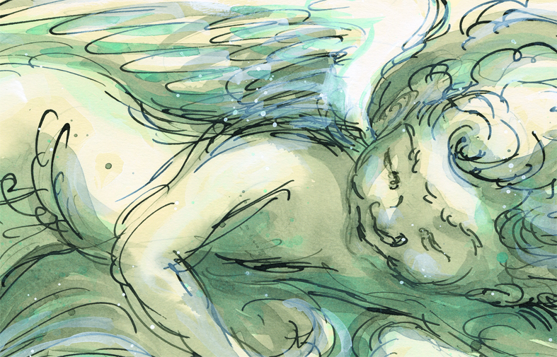
It made me ponder on humankind’s perpetual yearning, which leads us to disaster over long roads and short. If only we could all focus as readily on the majesty and wonder of the world that we already inhabit. There was nothing I could paint for this new world that could rival the natural wonders in the one we already have. I made the new inhabitants – refugees from Earth – look on in wonder. And then, because of their pose, looking upwards within the vivid setting, it put me in mind of a propaganda poster. which made me laugh.

A Nudibranch Stag
A Basking Wolf Man
Basking Plants

Thanks again, Phil Gomm! This took me on a pleasurable journey this afternoon. I‘m posting this a bit early because I won’t have any more time to spend on it later in the week.

The Kick-About #10 ‘Romantic Museum’

The prompt for Kick-About #10 is one of Joseph Cornell’s boxes from 1946 titled ‘Romantic Museum’. I have a book of Cornell‘s bird boxes, and I love it, but I hadn’t seen this box.

Every person‘s experience of a work of art is different. Nevertheless I can’t help wondering how many people may see ‘mass isolation’ as I do in this piece – viewing it now, during a pandemic. I see a hand stitching quietly, small, intimate objects, windows and walls and another window over the entire thing. And finally a cloud of black sand infiltrating everything. This prompt was chosen by artist, Vanessa Clegg. I will be interested to read what she has come up with.

My response to this piece led me to paint a series of hearts partly hidden behind or framed by window shapes. I was thinking of them as hearts as I was painting, though they didn‘t look like hearts in the anatomical sense, nor as pictograms. They represented all those people; their feelings, quietly beating away, hidden behind windows and walls. A lot of them were in shades of red, but they changed to blue and other colours.

heart beating

I started thinking of all the ways hearts are described. All those corny yet evocative terms…

smouldering • aflame • stony • black • blue • hidden • heavy • bursting • in flight • weeping • broken • united • wounded • beating • battered • lifted • stolen • promised • given • taken • tender • gentle • faint • brave • open • loving • pure • of glass (thanks Blondie) • rotten • twin • frozen • bleeding

Blue tending to Black (A rubbish scan. It doesn’t capture the colours at all well.)

Then I thought of all the combinations I could have, starting with Blue Tending to Black. How about Pure – Frozen, or Stolen – Smouldering, Stony and Promised… but I realised That what was really giving me pleasure was the layering and texture. No surprises there. Layering and texture have been a focus for me for quite a while and are very evident in my most recent book illustration.

fan brush layering gouache, watercolour and black ink. (This fragment was painted as collage material for my current book project.)

In particular, I was using a fan brush to very lightly drag layers of watercolour and gouache across the painting. The delicacy of the fragmented lines entranced me. Also the way the colour changed as the paint dried, as gouache will do. It made the painting feel so alive. Each pass with the brush partly obscured the previous layer, but did not completely cover it. It felt like a metaphor for life. Which is really what artists are grappling with every day. And probably partly explains their angst! Every decision is a little goodbye to the past that cannot ever again be recovered exactly as it was. And a hello to a new possibility, that just may be more beautiful yet.

The passes with the brush became slower, more deliberate; crossing over left to right, top to bottom. Always with the heart in the window in mind. Then I found myself weaving.

Woven

And this was the result.

Blue Cornish Shadow Dance – a work in progress

blue tabby Cornish shadow dance

Thunderstorm inking is in progress this afternoon. I stopped to paint a cat on a discarded piece of paper (a piece of paper with two eyes cut out of it for Greyfur the puppet and a great deal of splodgy ink). This is actually a glorified-blob drawing. The blob suggested the Cornish Rex, and then I finished it off and put some shadow play in the background, experimenting with tone and shape in the way that I want to much more in the future.  The Greyfur eye holes (bottom right) can be seen but have been filled in with a collaged piece of watercolour paper behind.

But here’s the thing. The original hard copy looks like this (below).

Cornish shadow dance original in progress Judywatsonart lores

I’m reasonably pleased with this picture as a start. But it needs more tonal contrast and more definition in some areas I think. I shaded those blue areas over the top of this image in PhotoShop, almost without thinking, because I’m using PhotoShop so much to edit and enhance illustration work at the moment. I wanted to see what would happen if I added a further layer of colour and shape.

Now I can go back and add this over the real image if I want to. Or in a different colour and pattern. It’s a handy experiment that I hadn’t thought of before that might be quite helpful with my painting practice sometimes.


selfie lores

Another for the 52-week Illustration Challenge.

Theme for this week, ‘selfie’. I am looking a bit Holly Hobbyish here with a large, collage head of differential calculus hair. It would have looked better with darker hair, but I didn’t want to lose the lovely calculus curves under a heavy load of ink. So I’ve left it lightly tinted.

I liked the way the little numbers and mathematical figures here and there remind me of insects or seeds that the chickens are constantly seeking.

The smooth paper of a vintage book reacts completely differently from the way proper watercolour paper should react to paint. But there’s something rather nice about it. It  sucks up the ink in a thirsty way, remaining very smooth and composed all the while.

Scott discovered the word ‘groke’ the other day. We all like it in this house and think it deserves constant and affectionate use. It reminds us of Tove Jansson‘s Groke and it means this: to ‘stare at someone in the hope that they’ll give you some food’. (The Groke in Jansson’s  Moominpappa at Sea visits Moomintroll every night to beg him to show her his lantern flame, because she is a lonely creature craving warmth and light but unable to get either. So it’s a poignant form of groking after all.)

With six pampered chickens and a dog, we get plenty of groking around here. Speaking of which, better go and lock the girls up.

Sea Lioness secures future plan

I’m sure they’re not called sea lionesses. But they should be. It’s nice.

Investing in her future

Investing in her future – felt tip, indian ink and gouache on book page

sold

This drawing (or is it a painting?) goes with the Bactrian Camel. Both are painted in the same book about financial management. This sea lioness with her pup appears on a page about investment. As with the Bactrian Camel, the photograph that formed the basis of the drawing  comes from The Wonder Book of Animals.

There is a second sea lioness on the drawing board. She’ll have to wait until I’ve finished ‘Poppy is the Thunder’, the current page in progress for Thunderstorm Dancing.

The Wonder Book of Animals: both drawn in and drawn from

The Wonder Book of Animals: drawn in and drawn from. My copy is much more dilapidated than this one taken from an ebay listing.

This painting sprang from two books and a sudden urge to paint something in a mid-century modern way. An urge indeed! It got me up out of bed and I had to clear the drawing board!

bactrian camel rescanned obsolescence lores

I wanted a larger book than a novel format, so I grabbed a delicious weighty tome from the shelf, Raymond Chambers’ book Financial Management. Weighty in two senses.

As the book fell open on a page about Obsolescence, I decided to flick through The Wonder Book of Animals to find a subject who would fit the bill. I was vaguely thinking Dodo until my brain kicked into gear and I realised that the poor Dodo did not in any way become obsolete. Its very desirability (and perhaps amiability) caused its downfall. At any rate these mournful observations ceased when I set eyes on a photo of a lovely, shaggy Bactrian Camel. Not entirely obsolete, I’m pleased to say, for those who do not own a motor vehicle. But his lovely curvy form said ‘draw me!’ So I did.

sold