Hello Kick-About! I haven’t participated in the longest time. I’ve watched the posts flash by every two weeks. Some of them would have been a challenge indeed, but some of them were right up my alley. I nearly cried to miss ‘Kenojuak Ashevak’. But I haven’t been able to squeeze the Kick-About in.
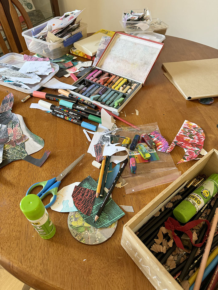
I’m the Burrow in Adelaide on a writing fellowship during July so the demands on my time are fewer. Saturday seemed like a good day to take a break from the keyboard and play with mixed media. I’ve brought a limited selection of art equipment with me, focusing on dry media and collage to keep it cleaner. But I’ve still managed to make the kitchen table look a lot like my drawing board at home.
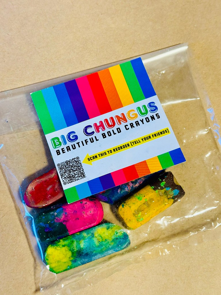
A shout out to Zoë Collins who sent me a packet of her gorgeous up-cycled crayons to use several months ago. This is the first chance I’ve had to play with them. They are really an upscaled version of what Ann James calls magic pencils, the multicoloured pencils she used to illustrate the Dirty Dinosaur series of books by Janeen Brian. (When she wasn’t using mud. See this video to watch that!)
On to the paradisaeidae! This is just the family name for the Bird-of-Paradise. And since I seem to have been drawing bird people for the longest time, it couldn’t be a more perfect prompt for a one day session using crayons, pencils and collage. It does occur to me that these pictures are equally suited to the previous Kick-About prompt ‘Chinelos’ and I seem to have blended the two in a sneaky way.
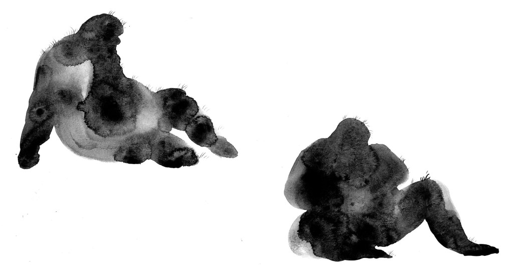
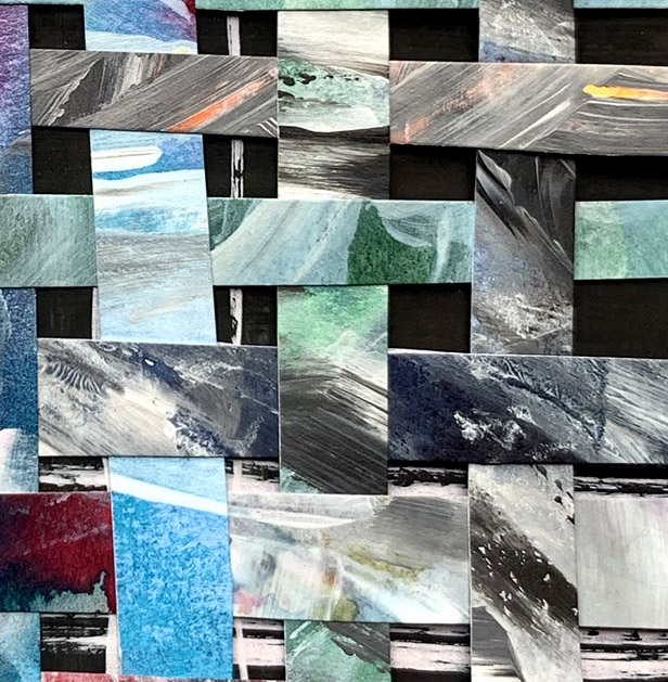
I started with the chungus crayons because I was very curious to use them. I had a ball with them. Part of their appeal is the letting go of control that goes with them. As you apply them, the colour changes, so it takes you to unexpected places. And letting go of control is about the best thing you can do if you are taking just one morning out to play with art materials. I started randomly colouring a bird shape and let it form itself as I went along. I soon felt the need of black, which wasn’t in my crayons, so I introduced soft pastels.
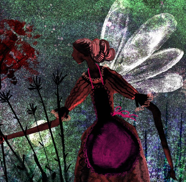
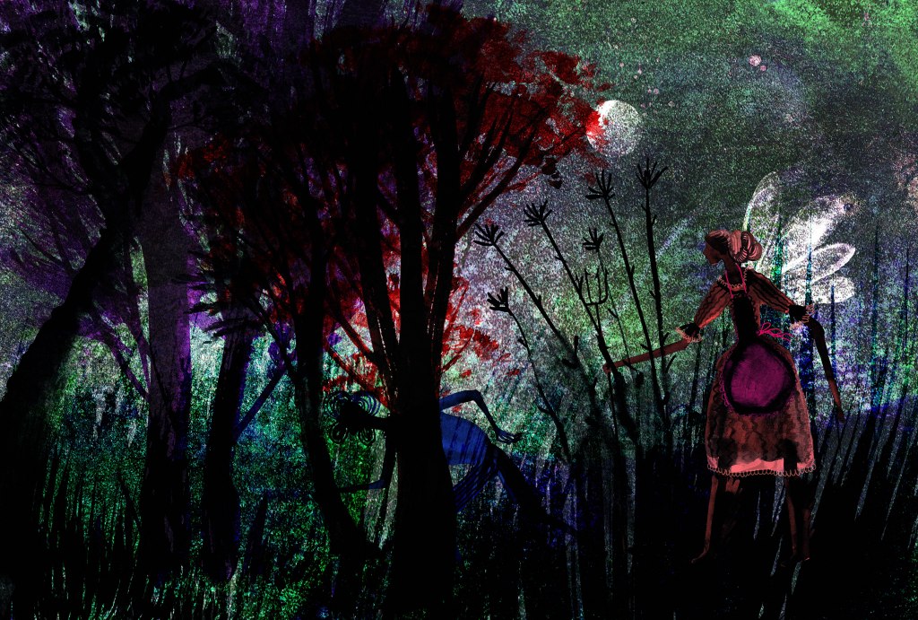
To give the bird a bit of dynamism I made it hurry forwards looking furtively over its shoulder. Apparently my subconscious was dwelling in the venal world of politics, elections, the patriarchy, and the progress of the Far Right, because my bird was evolving into a pompous creature, over-dressed, clutching at his medal of office whilst walking though a field of smoke and with blood on his feet! My subconscious has opinions, apparently. At least the Tories are out. Below is the unfinished collage, with pieces not yet glued down.
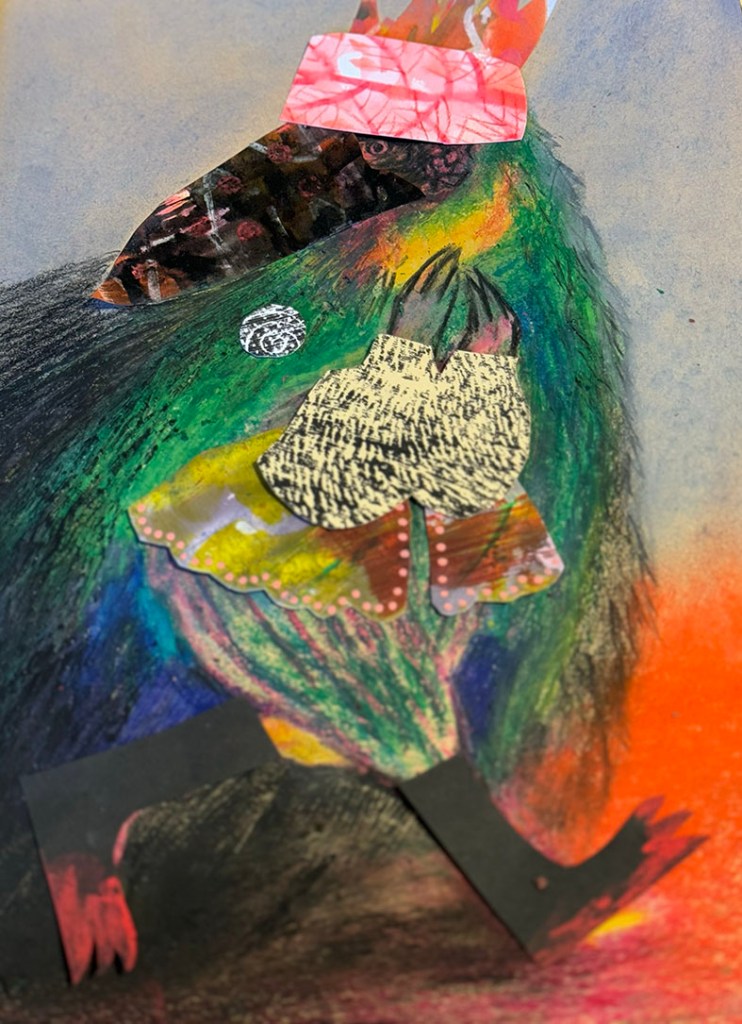
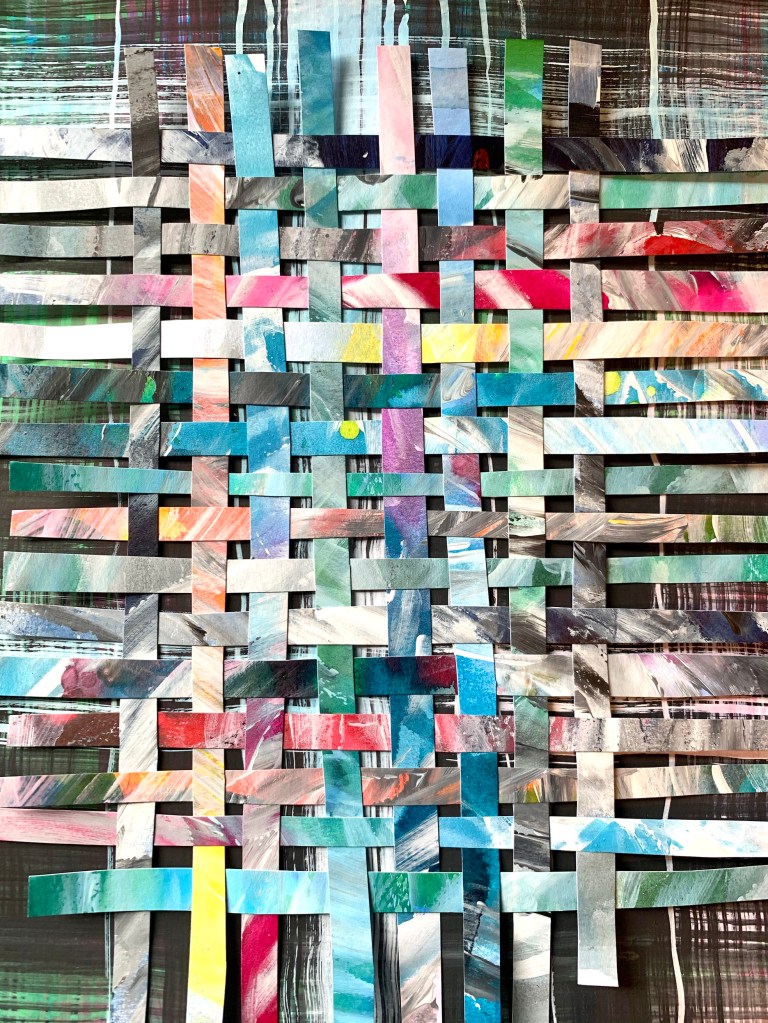
However, in terms of colour there was no focal point, so although I was enjoying the texture interactions, I started to overlay further collage pieces over sections of the bird, and ended up by cutting him away from his background. This is what he ended up looking like.

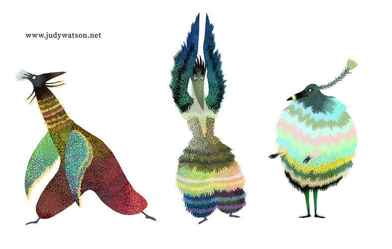
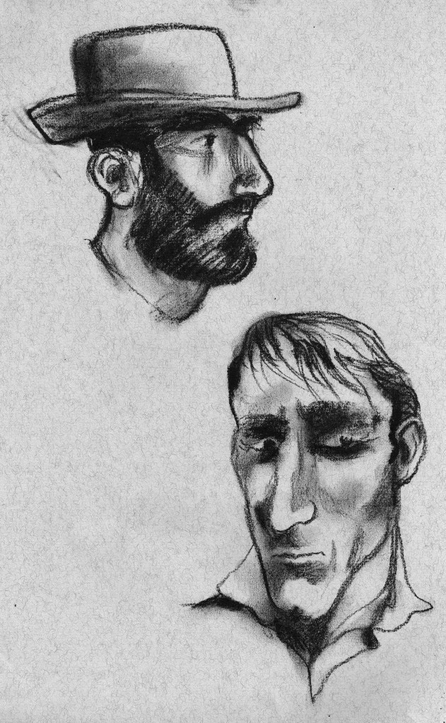
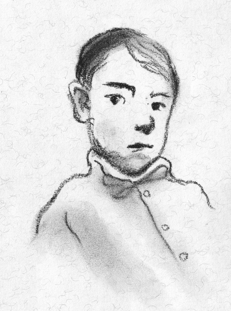
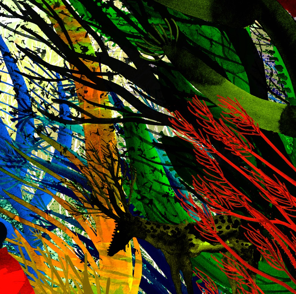
I think my subconscious was happy to have got him out of its system by this time, so I moved on to these little sketches that I had dashed off as soon as I read the Kick-About prompt earlier. My plan was to overlay digital collage on to them and to make them look like quirky dancers or mummers of some sort. They’re generally much more cheerful.

I made a bit of versatile colour and texture to clad them, using soft pastels and Posca pens. I made sure I had both light and dark areas. And then I simply dressed them up in PhotoShop without fussing too much. Mission completed!