Tag Archives: cats

Federation Square drawing and chatting tomorrow (13th June)

I might see you at Federation Square, if you are Melbourne based. Please say hi, if you are in the area. I’d love to see you.

I’m bringing a small number of limited edition prints to sell at the book stall along with signed books.

Below are some prints from the actual book, that will be for sale. And following them you’ll see some altered book prints which show the inspiration for the medium that was used in the book. But they also show the difference between the artificially created cream and the natural vintage book parchment.

My chance to sing lores JudyWatsonArt Ready Set Go lores JudyWatsonArt Thunder imprint page boat lores JudyWatsonArt Thunder opening spread seascape lores JudyWatsonArt

The parchment is naturally a much dirtier colour… which appeals to my inky nature, but the Allen & Unwin book designer Sandra Nobes very rightly recommended a clean cream for the book itself, and this is where PhotoShop was my ally. Thanks Sandra and PhotoShop.

tabby kitten lores JudyWatsonArt Cornish library tick cat lores JudyWatsonArt

Book Signing Phobia

Here’s a lesser known part of the job of being a drawing machine. When we sign books for people, it  is a nice thing for them if the signature comes with a little doodle, drawn for them, right before their very own eyes. And it’s nice to be able to do that for them. It makes us happy too. If it works.

But the inscription is done in pen and can’t be rubbed out or corrected.

And when we draw during the usual course of our day, we usually do many drafts of any illustration before we get it right.

And if we mess up our inscription doodle we have the problem of either sending a deplorable doodle out into the world defacing the otherwise pristine title page of a newly purchased book, or replacing the book with a new one… which we might also mess up.

Now remember that some of us are very temperamental drawing machines, the kind whose engines won’t start unless the key is turned in just the right particular way, may never run very well on a Tuesday, and if the oil runs low we are likely to smoke. You will now realise that the aforementioned anxieties at the back of our minds can cause a little fumble in the fingers; a wobble in the wrist; a twitch in the felt-tip… and then…

Doom!

That is why I am practising my book signatures today.

With Best Fishes

With Best Fishes – practising my book signing today and this is page four. Ahem. 

I have spoken to illustrators who say they won’t do it any more. They will write anything but won’t draw. (And I’m not even going to discuss the issue of spelling difficult names correctly… or easy names for that matter.)

I have spoken to illustrators who say ‘it’s important to make the mark.’

I have watched with awe, some illustrators who sign and doodle with ease.

I have watched with awe, one illustrator who was CLEVER enough to get a rubber stamp made up in advance! (Yes, OtherJude, that was very clever!)

And I have used my bookmark giveaways to circumvent this problem with some success. (It’s much less stressful to draw on a bookmark, than a $25 book.)

photo 1

Anyway, see you at the next book signing!

I’m ready.

I think.

Enjoy your bookmark!

Enjoy your bookmark!

Little Cats (or patience is a virtue)

I was led off the trail of birds this afternoon. I had an important task to complete that was overdue. Lisa S contacted me many months ago to ask about my Cornish Rex artwork and she has been waiting patiently in New York for a signed copy of Thunderstorm Dancing for a long time. Boy is she tired!

Because she has been waiting so long, she got some little bonuses in her bundle. Some Cornish doodles. Lisa has two Cornish Rex cats. One is black (Nigel). One is white (Finley).

Check out Finley with my Cornish Soliloquy drawing from last year.

Cornish Soliloquy cat

Here’s the title page from The Cornish Soliloquy

Finley

Here’s adorable Finley!

Today, I have finally wrapped up a signed copy of Thunderstorm Dancing for Lisa and it will go into the post tomorrow, bedecked with cats.

Tucked into the book:

White Cornish Rex on Endpapers JudyWatsonArt lores

A little white Cornish sketch painted on the endpapers of ‘The Book of British Villages’. I was going to paint him on a map of Cornwall, but I got engrossed in this one instead.

Black cat white cat

The little white cat with his friend the black cat, drawn on a (terrible) 1980s dress pattern

Thunderstorm Dancing all wrapped up:

wrapped copy of Thunderstorm Dancing

Ready for the post bag

And finally, a doodle on the envelope:

cat parcel awaiting stamps

parcel ready for stamps

When I was at the post office a few days ago, the only stamps they had were husky dogs… That’s not going to go down well! Fingers crossed there are some stamps there tomorrow that are more feline friendly.

The Three Demon Cats

If you mentally rotate this 90 degrees anticlockwise, and imagine the faint grey wash without the  black ink details, you will be seeing what I painted a few weeks ago for page 14 of Thunderstorm Dancing. They were shadows on the floor for the cat I’m calling Thunder.

I picked up the piece of paper with three grey blobs on it today and looked at it in bemusement. ‘What are those three weird, rounded-yet pointy-blobs? They kind of remind me of something, but I’m not sure what…’

After working out what they were for, and given they are no longer needed, it seemed a shame to waste a piece of perfectly good paper. So I turned them into demon cats.

I could have turned them into nice cats. But their shape was somehow not really wholesome… more gothic. But don’t be alarmed. I will keep them in an iron-bound book and they will be unable to escape. (A small nod there to The Hounds of the Morrigan by Pat O’Shea.)

Image

The Three Demon Cats

Cat called Thunder alarmed

The Cat Called Thunder having a bad day

Those demon cats may be related to the storm cat below. He kind of accidentally appeared when I was drawing storm tendrils… or whisps… or wisps.

storm cat

The Storm Cat – King of Tempests


Monotypes with Dad in the garden on a Sunday

Lovely to have a day off yesterday, and to spend it with Dad and the boys, (as well as Scott when he wasn’t on board his yacht admiring seals in the bay). Dad suggested we do some monotypes, and we finally got around to it in the late afternoon.  It was really pleasant in the garden, and we could use the hose to easily clean off our plates without messing up the bath as I usually do at home. Boy, you should see it after a printing session!

We didn’t get too fussed about what we drew, and we were mostly messing about trying to find a paper that would take the monotype process and a bit of ink added afterwards.

Unfortunately I didn’t get a photo of Dad’s pictures, but he probably wouldn’t have let me post them anyway!

little dark girl monotype lores

This little dark girl was taken from a photo and was an experiment in drawing with big, angular shapes and using high contrast. It’s so tricky to draw children without the results looking sentimental, because the subject of children is so heavily laden with very strong human emotion, and many pictures of children actively seek to communicate those emotions. This drawing probably looks sentimental too, just because the child is thoughtful or pensive. She certainly wasn’t meant to look like she’d left her favourite teddy in the park. I just loved her blocky haircut and the shapes her interlocking arms made. Oh, and the reason I was drawing a child (on my day off, ha ha!) was because I decided to join in a Facebook group with a weekly illustration topic, just for fun. This week’s topic was ‘children’.

The paper was medium weight, and was fine with the monotype process, but didn’t cope with the ink wash afterwards. Buckled all over the place. Earlier, we tried with 300 gsm watercolour paper and couldn’t get an ink impression because it was too stiff. Wetting the paper didn’t work too well either, because our block printing ink is water based. (I think the ink used in intaglio printing onto wet paper is oil based. Somebody tell me if I’m wrong.)

monotype altered book cat lores

The cat was a bit of fun for me as I suddenly had the happy thought that I could combine altered book art with monotype. Although the page was rudely removed from the book, as you can see, it did cope perfectly with the ink, and also coped rather well with the wash afterwards. Strangely, it has a fine, sparkly thing happening in the dark areas when I hold it to the light. It must be to do with the paper, as it isn’t the ink, I’m sure.

monotype blue boy lores

This little guy was done on very lightweight paper and the monotype line is rather delicate because there was not a heavy load of ink on the plate. I added chinese ink, Prismacolour artstick and soft pastel afterwards to give him a bit of contrast, and the original monotype line is barely there. The paper of course, buckled.

Thanks for an enjoyable afternoon, Dad!

Temptation at the Parkdale Primary School Fair

Parkdale PS fete book stall

Ahhhh me! How did I cope with temptation like this at Parkdale PS fair’s book stall?

Not too badly I think… I bought a pile of books merely 31cm high; a little over twelve inches for those of you not in the metric way. (Oh and two cakes. An obscene chocolate one with smarties on the top – described as ‘hefty’ by the stall-holder as she lifted it, and chosen by Hugo who is eight years old and loves chocolate. And a very sensible and delicious lemon one, dripping with lemon syrup… also slightly hefty for its size it must be admitted and chosen by lemon-loving me. Cake stalls can be tempting too.)

But back to the books! If you consider the quantity of books on offer, it must be seen that I gallantly resisted many of them! Here is one I resisted only because I already have a copy (recommended) but I photographed it for the great vintage cover. The Giant Under the Snow by John Gordon. This story lingers in my head for its magical scenes including a wonderful episode of magical flying. What greater temptation for the child’s imagination?

The Giant under the Snow

Here’s one I couldn’t resist (because of the great vintage cover) Normally I don’t collect 1970s books, as it’s a little later than my area of interest, but this one was so different from the style I usually associate with Gerald Durrell, that I made an exception for its fantastical, jewel-like cover design. (Also, 9 year old Arthur is animal mad and will probably get into Durrell at some stage.)

Gerald Durrell the Talking Parcel

Actually, from a quick search of the internet it would appear that Durrell’s books have taken on many differing styles over the years. His image is anything but branded. See the below thumbnails for examples.

catch me durrell selection fillets of place my family mid 20th century my family overloaded ark

Here was a mis-matched pared-back pair of Chatterleys that I resisted. Lady Chatterley herself didn’t resist temptation, but I don’t blame her for that. The Phoenix was an interesting choice of motif for this book. The ‘unexpurgated’ edition, probably from the 70s, is a little more obvious.

Lady Chatterley unmatching pair

But I couldn’t resist this luridly tempting classic, which I haven’t yet read.

Blue Vile Bodies

What next? I found a bit of fodder for my current fairy tale binge. A copy of New Tales from Grimm. I’ll admit I’m not even trying to resist fairy tales at the moment. I’m a glutton for the temptation of poisoned apples and gingerbread roof tiles. (Although I’d pass on the little boy stew from ‘The Juniper Tree’ in Philip Pullman’s Grimm Tales for Young and Old, my current bedtime reading.)

The endpapers on this copy were more exciting than the cover which was lacking its dust jacket. But the internal illustrations were elegant. ‘Hurleburlebutz’ What a great name for a tale! (or a chicken?)

Grimm endpapers Hurleburlebutz

Nor could I resist this paperback copy of The Sword in the Stone by T H White. Scott and I were reading this series aloud to each other during my pregnancy with Arthur (hence his name) but our copy is a weighty tome. This one is quite appealing, and the cover illustration of Arthur (‘The Wart’) looks rather like our long-haired lad at the moment… If you’re wondering how I can tie in temptation for this one, I’ve got one word for you. Guinevere :-)

Sword in the Stone

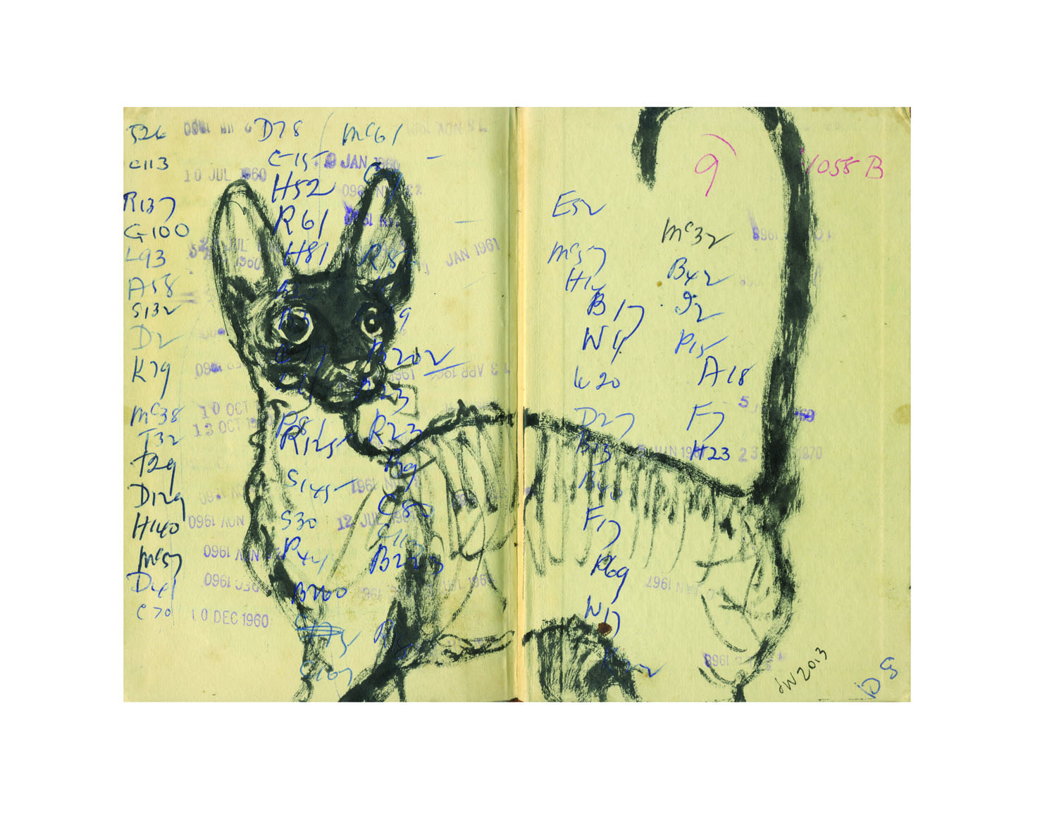
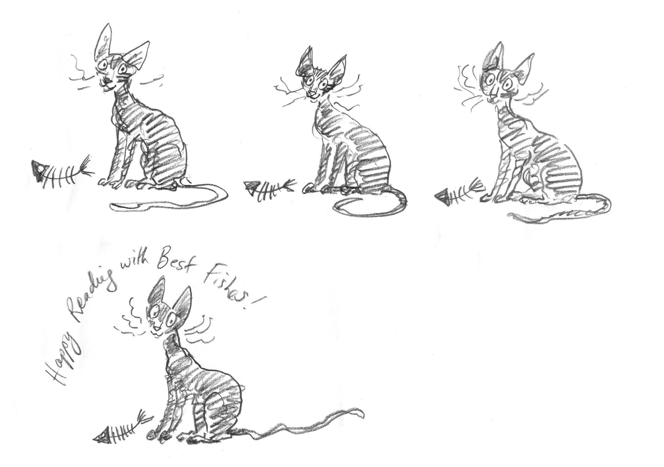
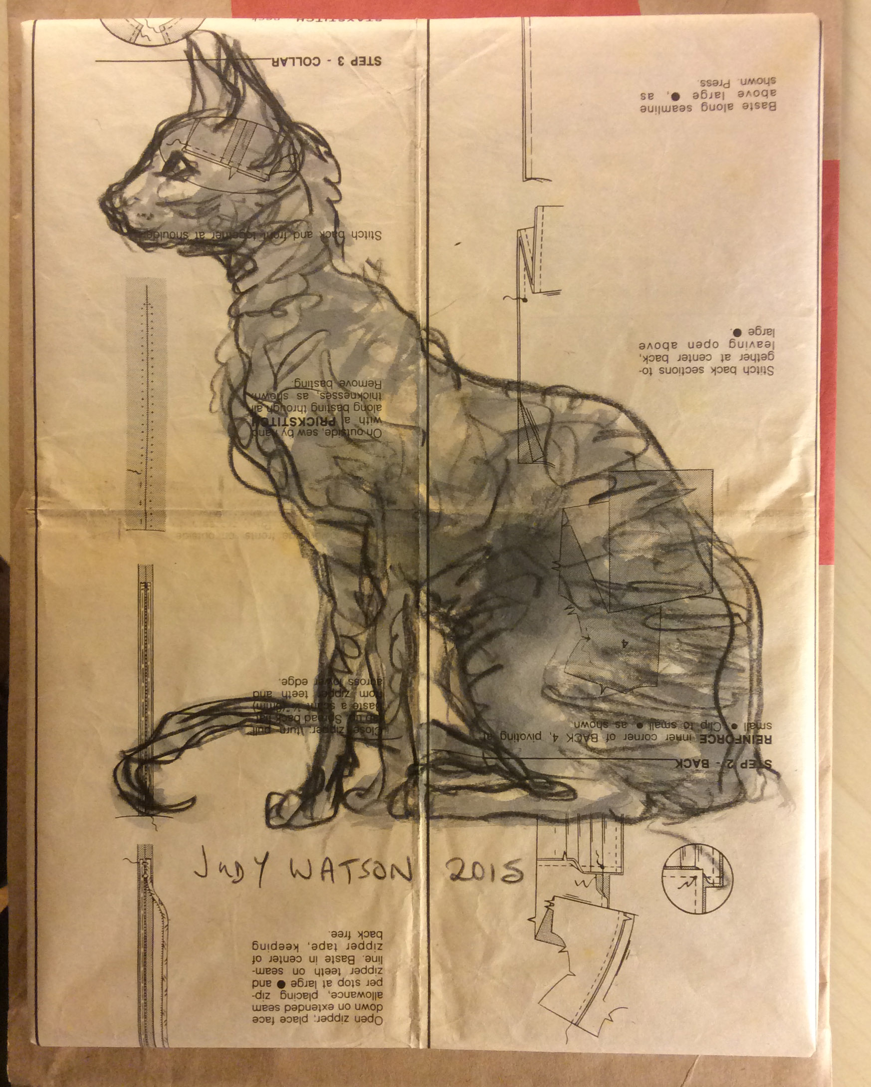
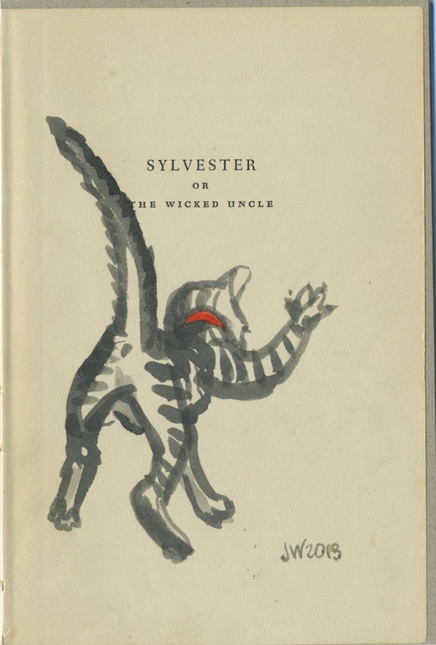
As I was heading for the door with my armful of books, ready to make my escape, I spotted one more and went back to pay for it. The Book of Cats, (View Productions 1985). The books suffers from a clumsy cover design. But the few internal illustrations are great and made it worthwhile to purchase, especially as there is now a disgruntled black cat in Thunderstorm Dancing. 

I can’t tie in my cat book with temptation, so I’m going into the kitchen to eat some blue cheese. Catch you later!

book of cats cover

book of cats internal book of cats internal 1 book of cats internal 2