Tag Archives: creative process

Here I am

After the longest time!

Hi there. I’ve missed you. Work on Leonard Doesn’t Dance is going well. And I’m also working on another exciting project. A picture book by Sofie Laguna called When You’re Older. It’s a bit tricky working on two; just when I’m submerged deeply in one, I have to haul myself out by the scruff of the neck and focus on the other. But it’s fine, because both are lovely books.

Leonard and his pigeon friends are learning the can-can. I can’t do the can-can. (I might yet learn… A fake leg might be helpful.) But pigeons can can-can.

Here’s a small section of what I’m working on today. The background is in progress so the yellow area is sketched in. And all around what you see here are plants and other birds and a couple of beasts. But this is one of the white pages. The full colour pages look different.

Leonard and the Can-can pigeons

Detail of the can-can page from Leonard Doesn’t Dance by Frances Watts

They look like this.

Leonard colour page sample

Detail from a full colour page as the sun sets in Leonard’s world.

I’m using a big mix of media in this book. I’m printmaking, painting, drawing, collaging and digitising. (I’m doing the same for When You’re Older, but with a different colour palette.)

The printmaking is the most fun part. There’s something so intoxicating about printmaking. When the outcome is uncertain, due to the variability of the process, you are always on the brink of something… and it could be wonderful. It could be a treasure. Those op-shoppers among you will understand the feeling as it’s rather similar.

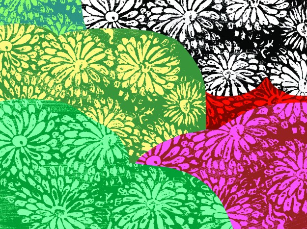
The print below is saved to my computer with the ignominious title ‘Disappointing Flowers’. But once colour and collage treatment are added, it actually works very well.

‘Disappointing Flowers’

This is a quick mock-up showing how the application of colour and a trim here and there, bring a disappointing print into a context that works. At least, for me. It’s not from the book.

A quick digital collage of my disappointing flowers to see if they rise to the challenge.

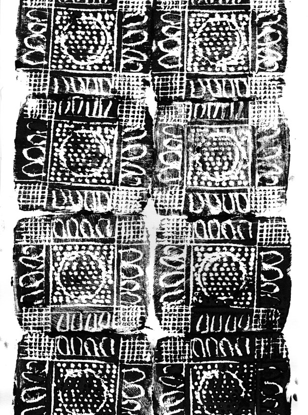
This one I was truly delighted with. It’s such a simple pattern, printed with a single block and roughly aligned. The roughness appeals to my deepest instincts in a way that nothing tidy or perfect can do. And the print has become a raw material like a delicious cheese that I might put into some cooking.

repeat pattern lores

Rough, ready and rambunctious, this print appeals to me like a Staffordshire Bull Terrier.

And here are some of the inky painted areas I’m using. These too, will be barely recognisable when I’ve finished colouring and ornamenting them on the computer, but for me, the shapes produced with a brush have more animation than anything I can draw directly on the screen.

8-9 tree shapes lores

Inky tree shapes for Leonard Doesn’t Dance… Or maybe for When You’re Older.

Now it’s back to the page. Some ducks are calling for my attention.

Yes. I think some of them are Call Ducks.
 

Leonard Chooses His Hues

I have given the medium for Leonard Doesn’t Dance a lot of thought over the last few months. I knew that I wanted the style to be very different from Thunderstorm Dancing, quicker, looser, lighter in touch and for some reason sherberty… Ahem. Don’t ask me why.

And during my time in Italy, I was immersed in so much illustration at the Bologna Children’s Book Fair that it was the perfect time to consider what I did and didn’t want to do, and what was already done too many times elsewhere.

Ann James and I talked about illustration styles, strengths and weaknesses too. She told me that the key to good illustration is authenticity. When she looks at a folio of work, if the expression of line or character feels genuine, as though it really comes from the illustrator’s inner self, then technical weaknesses don’t matter so much. You can see the kernel of the artist in the work and it’s good. I’m re-phrasing of course, because I can’t remember the exact words that either of us used. But this is the gist of it.

So where does that leave me as a wandering artist, prone to changes of style? What is my kernel?

I came to the conclusion that I am very comfortable with my pencil, and my line is probably most expressive of my style or styles. Most me. I had decided that I would use pencil or fine liner (for the lightness of touch), white backgrounds on most pages, and colour the drawings swiftly and joyously in bright, (sherberty) digital colour.

Here are some old artworks for the sake of discussion of medium. None of them were drawn for Leonard Doesn’t Dance

parrot purr judywatsonart lores

fine liner with quick sherberty digital colour. (originally drawn for 52 Week Illustration Challenge – theme WORDS)

Perhaps this parrot cartoon isn’t a perfect example of what I had in mind, but it’s me, and it has the fine line that I want, the simple, swift colour and the white background. And it’s playful. Playfulness is key to this book.

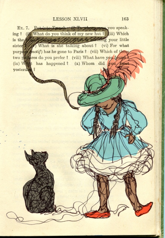
new hat judywatsonart colour lores

loose lines with digital colour (originally drawn for 52 Week Illustration Challenge theme – LINE)

This continuous line drawing is a little heavier in line (a thicker fine liner) and heavier in tone too, on the cream background of a vintage book which was the very thing that inspired the work for Thunderstorm Dancing. But even so, it is me at my most comfortable with a wandering line… making it up as I go along.

So there I was. All decided.

Then the discussion of clothes came up with the Frances Watts and the publishing team.

Do these birds wear any clothes? Should Leonard be wearing those breeches? Or should he not?

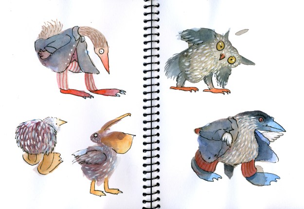
During the course of this (somewhat cheeky) discussion I whizzed through some ‘Trouserbirds’ as evidence of the way my bird drawings had been going in recent times. Most of them were wearing trousers. The examples I sent were from my series of blob birds; all painted by starting with a pale grey washy blob, and then transforming it into wacky creatures with watercolour.

stork seaside 2

Fine liner, white background, sherberty. Paint instead of digital colour… (a blob experiment from 2014)

blob birds lores

fine liner, watercolour, trousers… why not? (These blob experiments from last year are darker in tone, but that is mostly about the shade of grey used in the original blob. Partly too about their wintery clothes which seemed to ask for deeper, more tweedy tones.)

Frances Watts was taken with the watercolour. Which gave pause for thought. Because I really enjoyed making these blobs and was already planning a book for them of my own. But there’s no reason why they couldn’t launch with Leonard…

More soon.