Tag Archives: Leonard Doesn’t Dance

Leonard’s Fluffball Moment

(or… Raise your Darlings from the Dead)

One of the early sketches for page 4 of Leonard Doesn’t Dance. It features some darlings who survived and some darlings who were killed off. (The duck was replaced with a penguin, poor darling, and didn’t even get featured on this page.)

When illustrating for children’s books, we are helping to teach children empathy, which is enormously important for their future wellbeing, and for the wellbeing of our world. So drawing a character’s feelings in a way that children can relate to, or ponder and begin to understand, is Number One for me. It takes precedence over aesthetics and character continuity.

Big-beaked Leonard. His rapture was important and his beak said this best. Hence, a big beak! The crest was a great bonus for expressing mood on every page. Here, it’s excited, but hesitant…

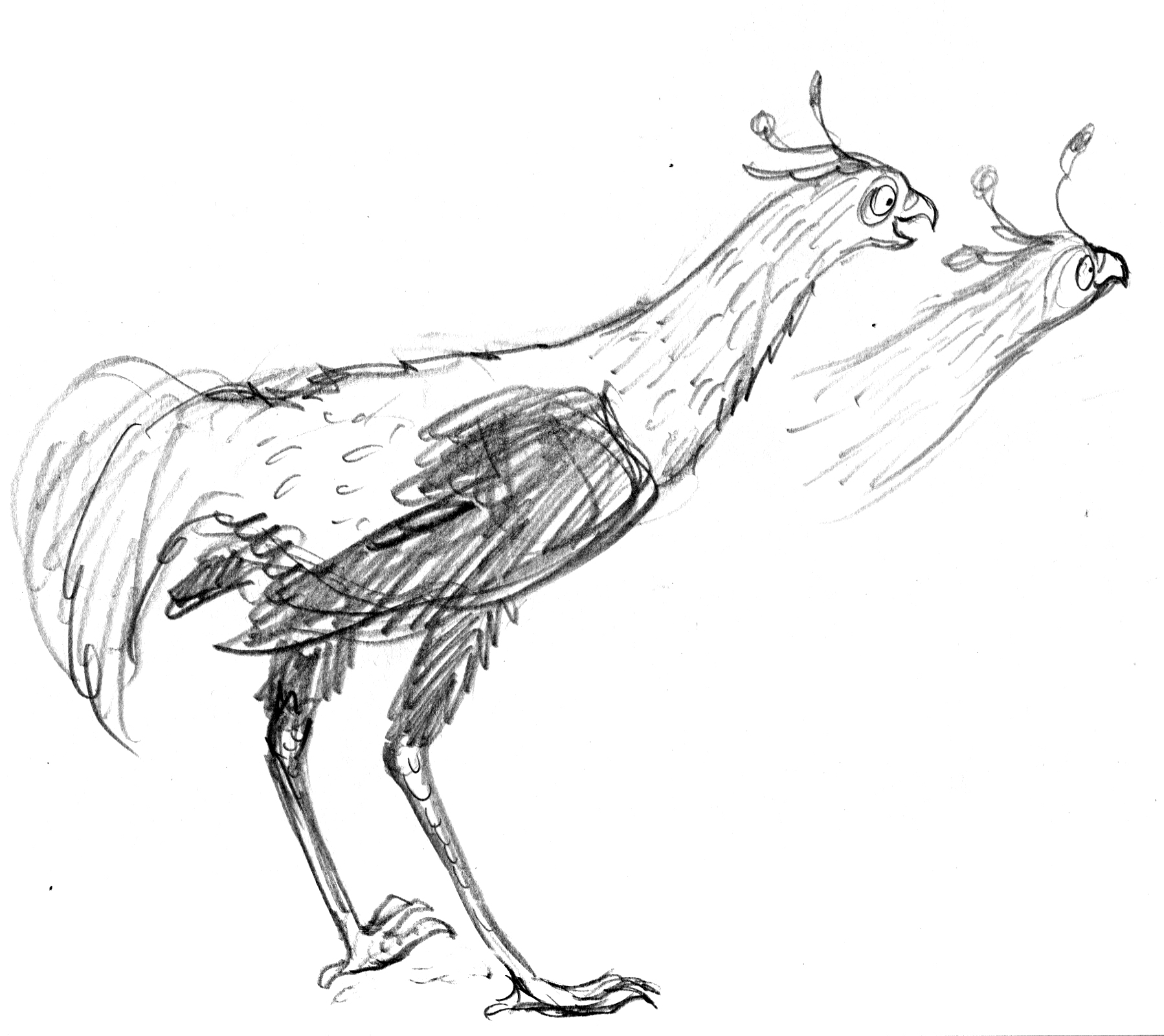
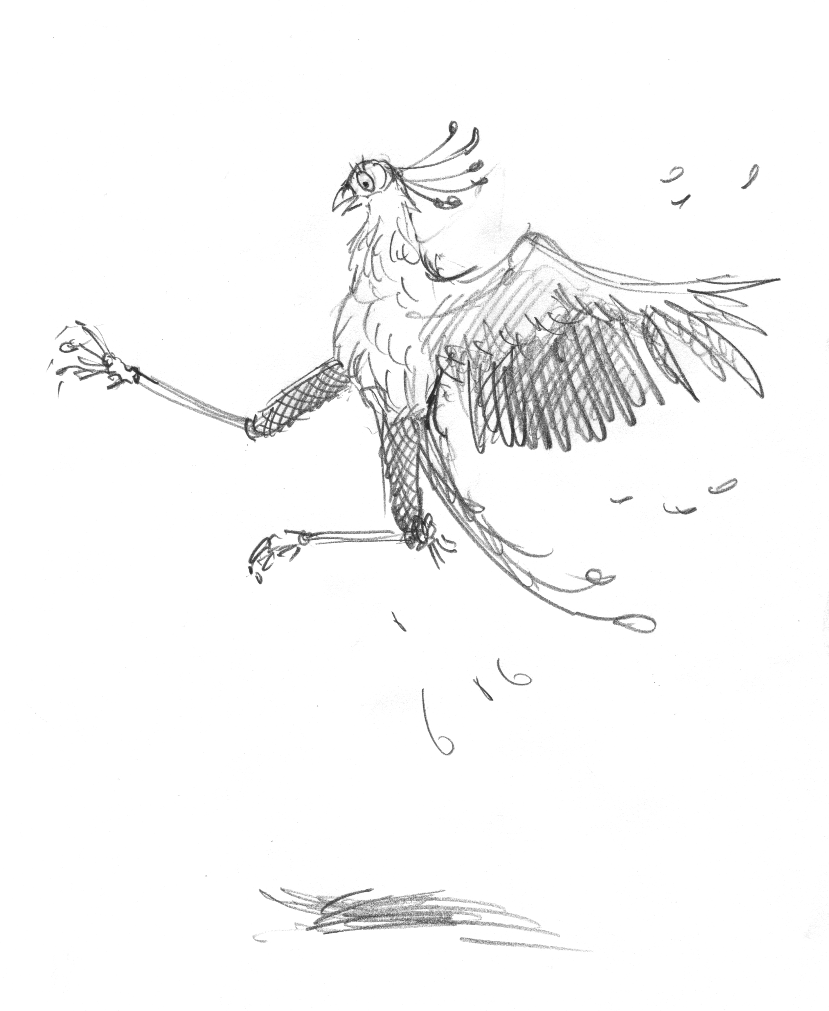
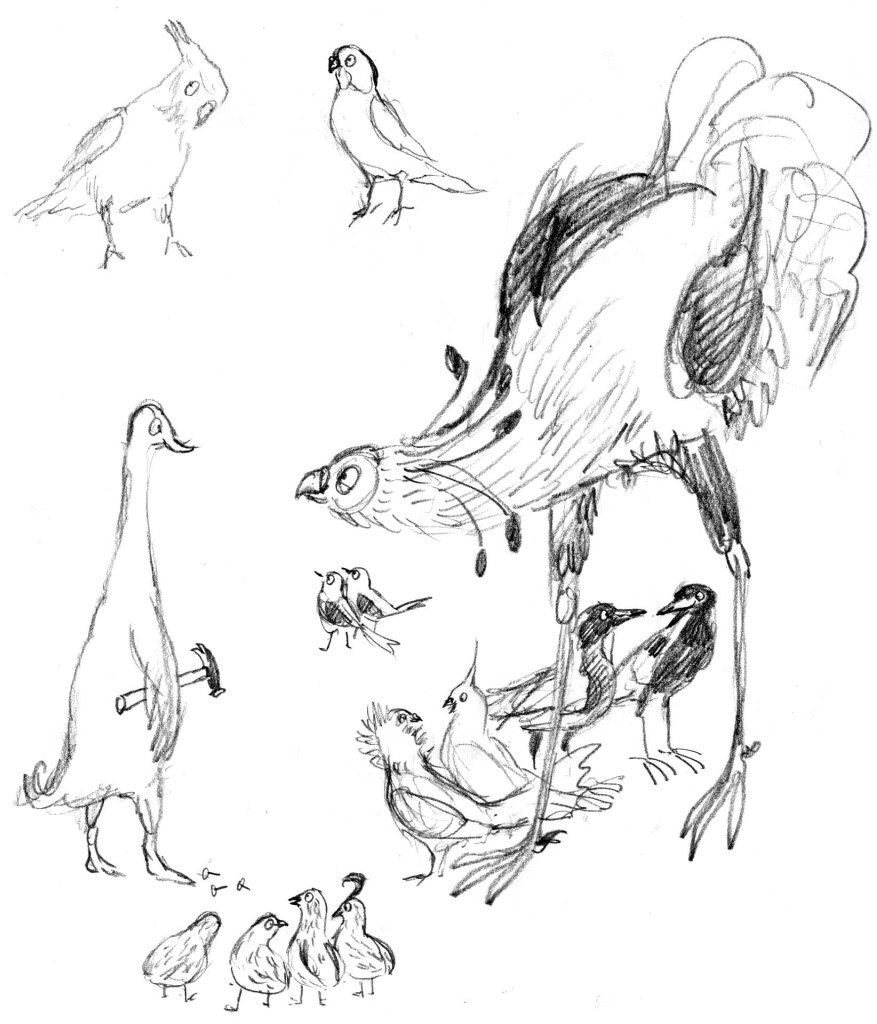
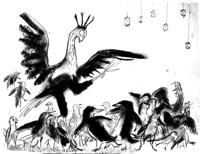
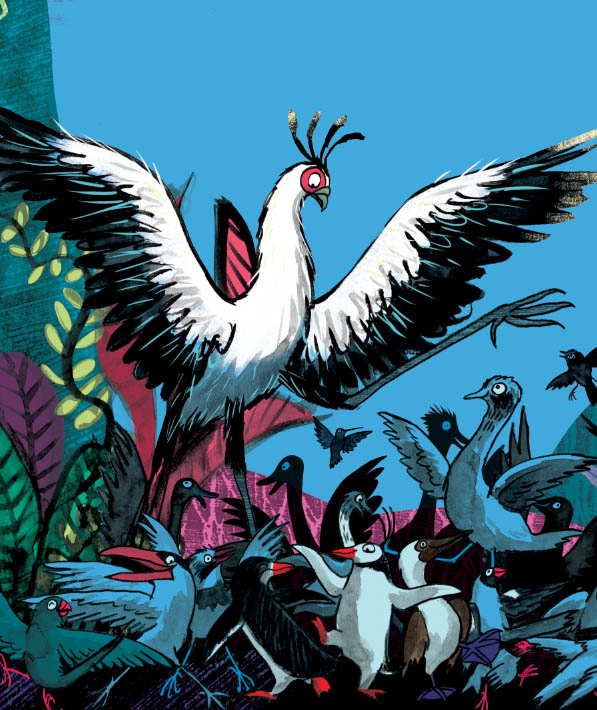
This means that I often approach the end of an illustration project and look through it to find that I have not one leading character, but several variations on that character. Sometimes it bothers me and I change the artwork if time allows. Leonard is pretty variable throughout Leonard Doesn’t Dance, sometimes thicker or thinner and his beak varies from one page to the next. Sometimes he has enormous wings, and other times, they’re stubby. Does it bother me? Nope. He’s still the same gawky, tender-hearted, enthusiastic and loyal fellow throughout. And his feelings are written large on his face and in his body language. I’m happy with that.

Sad, sad Leonard. Here, the beak says less. Although it does have a downward turn. The wings, crest, eye, tail and body posture all say ‘MISERABLE’.
An early sketch for page 25. The wings and foot outstretched, express Leonard’s discomfort. He needs to look out of place in both in scale and mood.
Detail of final art for page 25. Leonard’s wings and raised leg have been even further exaggerated, although his face and head size has been brought further into line with other illustrations.

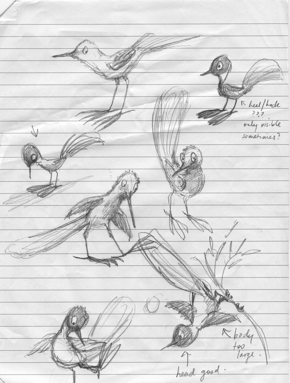
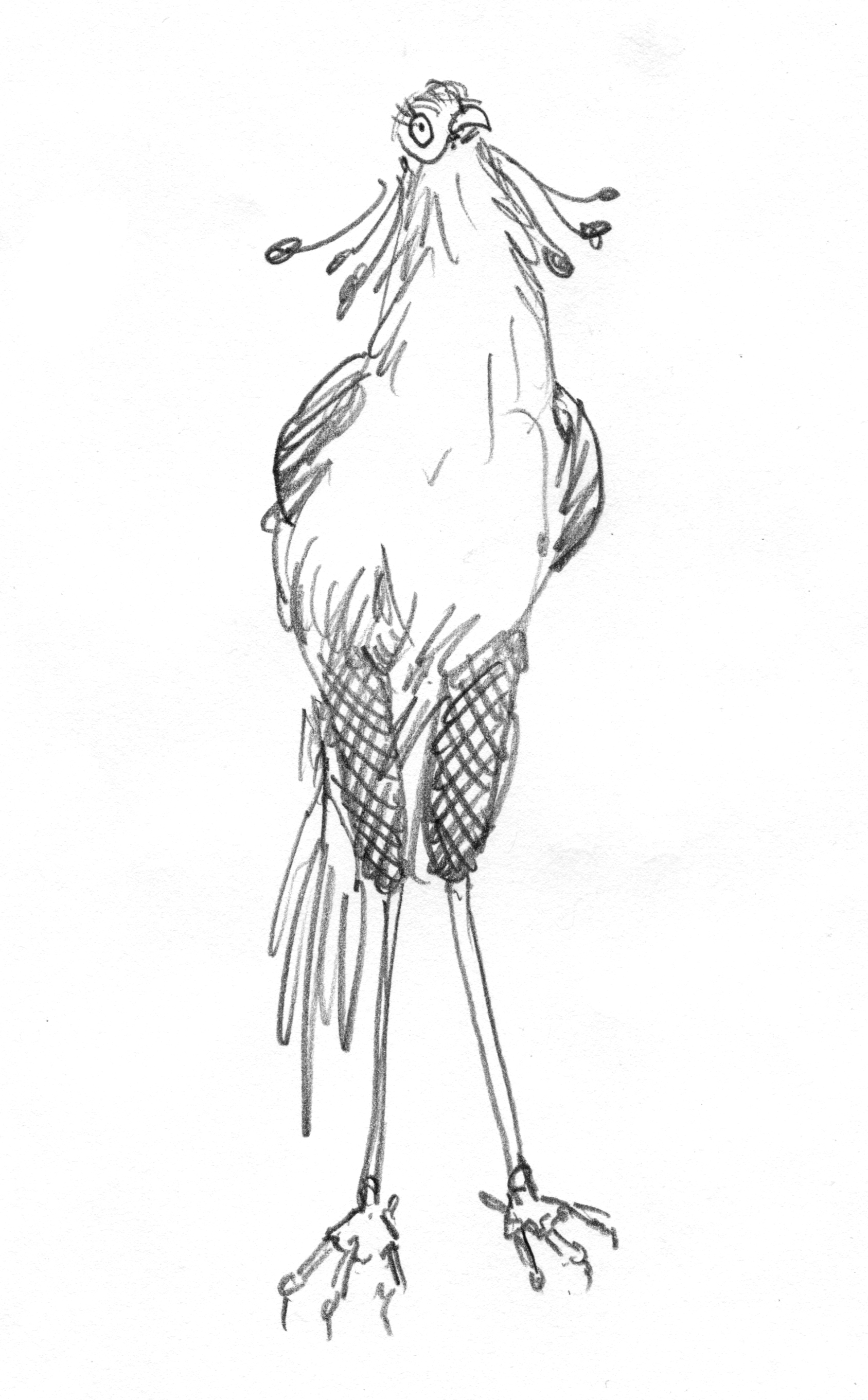
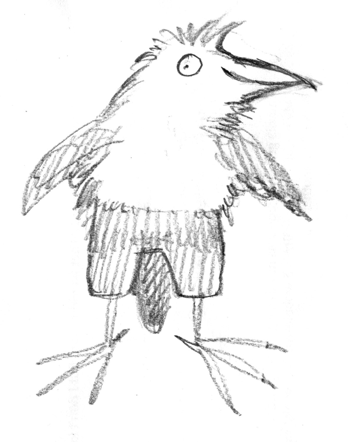
Late in the process of illustrating Leonard, I noted a few pictures that could do with tweaking, to make Leonard more consistent. One of them was this image of Leonard just out of bed, reading a notice about the Big Beaky Bird Ball.

Detail from page 4 of Leonard Doesn’t Dance, published 2019 by ABC Books

The drawing for this one had been done early on, (see the sketch at the top) and my ‘Leonard shorthand’ had developed since then. Later on, he had a longer, narrower neck, looser curves on his toes (yes, I actually think about those things) a smaller body and bolder black and white contrast – he looks less fuzzy and soft in later illustrations.

The later Leonard, less fuzzy, less smudgy. A smaller head and a slinky neck.

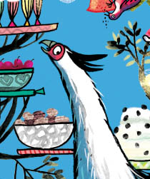
I really loved my page four Fuzzy Leonard, but I redrew him. I killed my darling. I lengthened his neck and made other tweaks. I finished the illustration and went back to other edits for other pages.

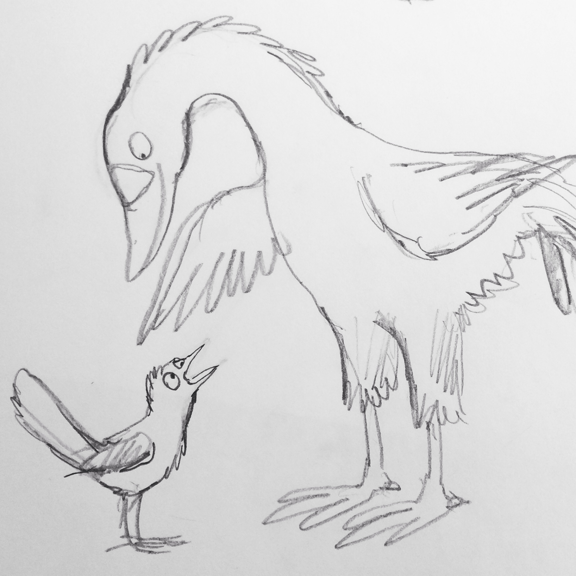
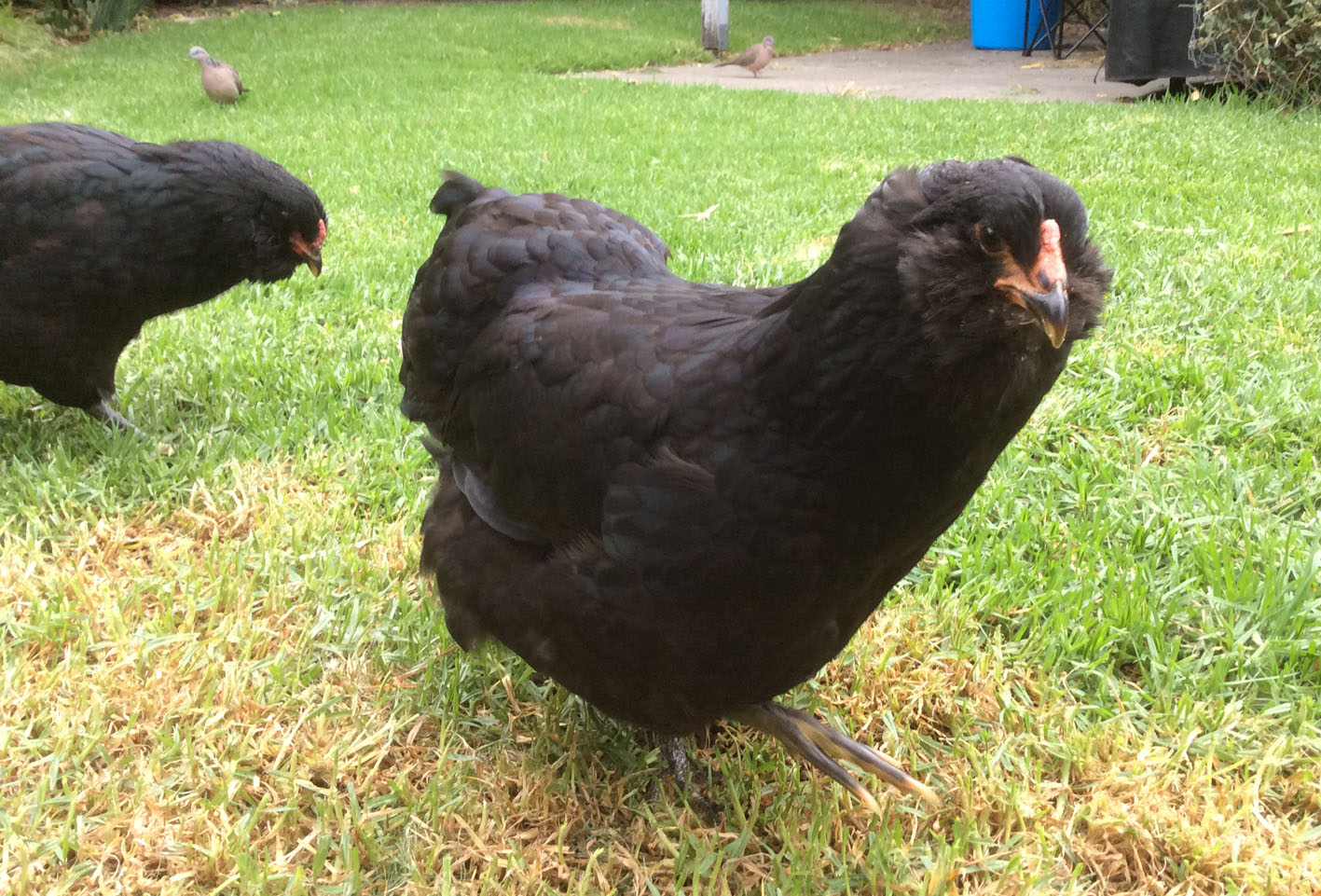
Finally, I came back to page 4 and looked at it. I had loved this scene. It had made me feel so warm and fond of Leonard. He reminded me of a 3 year old in pyjamas, just out of bed with his hair all fluffy and squashed and his face all soft and sleepy.

Somehow, though the character was now more consistent with other pages, the joy was gone. Somehow, the Leonard I loved was no longer there. At the eleventh hour I raised Fuzzy Leonard from the dead. I must have very fine necromancy skills because he was just as loveable as I remembered him to be, and he didn’t show any zombie tendencies at all.

Character continuity…
I’m conflicted about it.
I do realise that if I found it easy I wouldn’t be conflicted about it…
Did Charles Schultz ever have these problems?

Leonard galumphs into bookshops

I nearly wrote ‘Leonard dances into bookshops’. But then I remembered that Leonard Doesn’t Dance… or does he?

Leonard doesnt dance detail.jpg

I’m very fond of that great galumphing bird. I relate to him very much. The initial enthusiasm, the self doubt, the impulse to hide away in a thorny tree, the desire to be with my friends that usually draws me out of the tree. And like Leonard, I have some fabulous friends.

My thanks to the team at Harper Collins and to Frances Watts, for patiently waiting for Leonard as he put one lanky leg in front of another (tripping over several times) and eventually became finished art; now a book.

This lovely cover was designed by Hannah Janzen.

I had been initially drawn to a white cover, because black ink on white paper was a signature part of making the artwork. There was a lot of ink involved. Brushed on, drawn on, printed, wiped and smudged onto white paper. Big broad strokes, and fine textured marks. So my original idea was to have an inky black and white cover, with a pop of red on Leonard’s face, and a scattering of brilliantly coloured birds flung around it like a double handful of lollies, and wrapping around both covers.

The team at Harper Collins didn’t think the white design was indicative of what was inside: a rampant world of jungly colour. This was perfectly true, and is why editors are so great! and Hannah did a fabulous job of designing something rich and celebratory.

Here are some of the lolly birds from the white cover design. Some of them found their way onto the new cover anyway. Perhaps you can spot them.

I visited the Grade Sixes at Derinya Primary School a few weeks back and we had a great time talking about Leonard Doesn’t Dance, story arcs, tension and making storyboards for picture books. There is just so much to talk about! A two hour session went by in a flash. I will be signing up with Creativenet Speakers’ Agency very shortly, so if any schools or groups of lovely librarians within Cooee of Melbourne would like to book a workshop and talk with me, that will be the place to go.

I have another book released this month as well! A very leafy book about cicadas. More on that soon. Enjoy your week!

Bird Immersion

Sorry I haven’t been around in Blog Land.

20-21 Leonard with 2 heads


Happily, this is mainly because I’ve been so busy drawing my roughs for Leonard, (and turning 50, and looking after an extra child because we have an overseas student staying with us at the moment).

I have to say, despite the fact that I’m multi-tasking like crazy (bad) Leonard is really fun (good!).

I can’t show you very much (bad). Many of the roughs describe the finished image. And this book, true to Frances Watts’ Style, will be brimming with humour (good!). So by showing you the full page roughs, I would be giving away all the gags (terribly, terribly bad).

But I can share with you bits and snippets and here-and-there touches.

chickens lightened.jpg

It’s interesting that the roughs have reverted to pencil, maybe my most natural medium. And this will pose its own challenges when it comes time to make the final art with broad paint strokes. The roughs began as large paintings, then switched to charcoal, and finally, to pencil.

singing

swingin Leonard

And something I’m excited about is my new light box! Wowsers! It’s so cool.

But I’m going to leave this and write more later.

I’m multi-tasking, remember?


Brain Doodles (for want of a better name)

After my last post, I went away for the weekend. I had a great time, and made lots of things that may or may not be finished at a later date. Mostly I had a lot of fun with papier mâché and wire. I’ll put pictures up here when I have a chance to photograph them.

Then I came home to a house full of sickies and then I got sick and then I jiggered my back. So here I am at last back in the saddle (chair) and getting up every few minutes to make sure I don’t jigger it again. But it’s all looking good. I’ve picked up the pencil again. And the rain has been falling, and the birds are swooping around outside like mad and some of them tapping on the windows and jousting with their reflections, because it’s spring. And those reflections might steal their girlfriends.

Getting back in the (drawing or painting) saddle for me is always a bit tricky, (and I know it is for a lot of other people as well). I have to make it as fun and easy as possible, because if I try to do something excellent, it will all end in disappointment. But in truth, I’ve been drawing and looking at drawings for so many years, that the warm-up period doesn’t take long any more. There’s generally a little swirl, a dark, bold line, a smudgy bit or a light feathery touch that I really like in each drawing, even if the overall image is not a total success. And I love art enough that those little lines or smudges are enough to make my day.

Last night I picked up a pencil and started doing brain doodles. Doodles of animals from inside my head; animals who bear not a whole lot of anatomical resemblance to live animals.

In another variation on doodling in old books (fun and not scary) or making art from blobs (marvellously fun and not the least scary) I used second-hand computer paper from Scott’s work with those cute little rectangular grab-holes along the edges. Some of them had messages or notes scribbled on them already. How completely friendly and un-scary can you get?

And then I started with drawing chickens, went on to horses, then dogs and finally a couple of arty-farty-non-picture-bookish Leonards.

brain doodle chicken

brain doodle horse

brain doodle horses

brain doodle dark horse single

brain doodle horse single pale moving

I'm putting this one in sideways because I like the message about back for lunch!

This brain doodle horse is appearing on his side because I like the back-for-lunch message!

brain doodle dog with soft mouth

This brain doodle dog is not meant to be unhappy or cringing. It was more about the shapes and curves. It started with its head up, and then I wanted the bowed head because it’s a curling up figure. And the dog reminds me of our old Hungarian Vizsla with the soft mouth, that would curl in a spongy smile when she was pleased to see us.

brain doodle dog sleeping

This brain doodle dog has a large head. Or a small body. It doesn’t matter.

brain doodle Leonard with word tail

A brain doodle Leonard with plant species notes under his tail feathers.

brain doodle Leonard swishy movement

A brain doodle Leonard with swishy bits.

Happy doodling, all.

Leonard Chooses His Hues

I have given the medium for Leonard Doesn’t Dance a lot of thought over the last few months. I knew that I wanted the style to be very different from Thunderstorm Dancing, quicker, looser, lighter in touch and for some reason sherberty… Ahem. Don’t ask me why.

And during my time in Italy, I was immersed in so much illustration at the Bologna Children’s Book Fair that it was the perfect time to consider what I did and didn’t want to do, and what was already done too many times elsewhere.

Ann James and I talked about illustration styles, strengths and weaknesses too. She told me that the key to good illustration is authenticity. When she looks at a folio of work, if the expression of line or character feels genuine, as though it really comes from the illustrator’s inner self, then technical weaknesses don’t matter so much. You can see the kernel of the artist in the work and it’s good. I’m re-phrasing of course, because I can’t remember the exact words that either of us used. But this is the gist of it.

So where does that leave me as a wandering artist, prone to changes of style? What is my kernel?

I came to the conclusion that I am very comfortable with my pencil, and my line is probably most expressive of my style or styles. Most me. I had decided that I would use pencil or fine liner (for the lightness of touch), white backgrounds on most pages, and colour the drawings swiftly and joyously in bright, (sherberty) digital colour.

Here are some old artworks for the sake of discussion of medium. None of them were drawn for Leonard Doesn’t Dance

parrot purr judywatsonart lores

fine liner with quick sherberty digital colour. (originally drawn for 52 Week Illustration Challenge – theme WORDS)

Perhaps this parrot cartoon isn’t a perfect example of what I had in mind, but it’s me, and it has the fine line that I want, the simple, swift colour and the white background. And it’s playful. Playfulness is key to this book.

new hat judywatsonart colour lores

loose lines with digital colour (originally drawn for 52 Week Illustration Challenge theme – LINE)

This continuous line drawing is a little heavier in line (a thicker fine liner) and heavier in tone too, on the cream background of a vintage book which was the very thing that inspired the work for Thunderstorm Dancing. But even so, it is me at my most comfortable with a wandering line… making it up as I go along.

So there I was. All decided.

Then the discussion of clothes came up with the Frances Watts and the publishing team.

Do these birds wear any clothes? Should Leonard be wearing those breeches? Or should he not?

During the course of this (somewhat cheeky) discussion I whizzed through some ‘Trouserbirds’ as evidence of the way my bird drawings had been going in recent times. Most of them were wearing trousers. The examples I sent were from my series of blob birds; all painted by starting with a pale grey washy blob, and then transforming it into wacky creatures with watercolour.

stork seaside 2

Fine liner, white background, sherberty. Paint instead of digital colour… (a blob experiment from 2014)

blob birds lores

fine liner, watercolour, trousers… why not? (These blob experiments from last year are darker in tone, but that is mostly about the shade of grey used in the original blob. Partly too about their wintery clothes which seemed to ask for deeper, more tweedy tones.)

Frances Watts was taken with the watercolour. Which gave pause for thought. Because I really enjoyed making these blobs and was already planning a book for them of my own. But there’s no reason why they couldn’t launch with Leonard…

More soon.

Leonard Doesn’t Dance: A Bird of Character

In between racing around madly organising for our auction this coming Saturday, (I refrained from using hysterical capitalisation there. Did you notice?) I have REALLY enjoyed (emphatic, enthusiastic capitalisation) doing a few character sketches for Leonard.

Leonard is the main character for my upcoming picture book with Frances Watts, to be published by HarperCollins next year. Just to put you ever so quickly into the loop, Leonard started in my head as a little fellow with a disastrously swishy tail, inspired by our Australian Willy Wagtails, who swish their tails from side to side constantly.

Leonard Doesn't Dance

The colour sketch I drew for a spontaneous cover, the first day I received the manuscript

Leonard doodles2 judywatsonart lores

further tail wagging doodles drawn during a HarperCollins Author workshop

Then I found out that Frances had only one request: that Leonard be a bigger, galumphing kind of bird, and not a little tweety-bird type. So this sent me off in other directions and I did some galumphing doodles over a period of time while I was finishing Thunderstorm Dancing.

I continued with my doodles while I was travelling in Italy during April.

In the back of my mind there was a memory of a wonderful, lanky bird from Africa called the Secretary Bird. I looked him up and found him to be wonderfully elegant, wearing short black breeches to below the ‘knee’ and a fancy headdress (from which he got his name) and a wonderful set of wings for flying to bird parties.

His beak is quite different from the one I had imagined. I thought I might alter him to make him a unique bird bearing only a partial resemblance to the Secretary Bird. But as sketches continued, I found I enjoyed him very much, just the way he is.

Leonard

Leonard  1 Leonard  2 Leonard  3 Leonard  4 Leonard  5 Leonard  6

If he won’t work on the page for me with all those smaller birds, I may have to re-think him, but I am quite attached to him already.

More on this process soon, and I will tell you about the decisions about my medium.

Flying by the Seat of my Pants

A Fleering Cat, painted in the bath

Fleering … Shakespearian for grinning. Who would have thought? Do you know that you can paint in the bath using your ArtGraf water-soluble graphite block in its handy tin and a brush. Just add bathwater. 

My apologies for my long absence from posting. I have been flying, not fleering.

The Bologna Children’s Book Fair was an eye-opening and fabulous experience. More on that later.

Elizabeth Honey, Ann Haddon and Judy Watson enter The Fair

Elizabeth Honey, Ann Haddon and Judy Watson enter The Fair

Puglia was beautiful, and the trulli were as lovely as I could wish them to be. More on that later too.

trullo with red doors and grapevines

trullo with red doors and grapevines

While I was flying to Italy, my husband Scott bought a house for us at auction and when I returned home two weeks later, I was thrown into a whirlwind of preparation for the sale of our current house. Whirlwind notwithstanding and with our auction two weeks away, it’s back to work today. And this is a marker post!

Leonard here I come.

Doodle Galumphers at the Swimming Pool

I’m not sure why my book projects seem to happen at the swimming pool. Pippa who modelled for Thunderstorm Dancing was at the pool, and many of the sketches I did at the pool while the boys were having swimming lessons fed into the book.

Here are some from that time, that have been posted before.

20131002-143740.jpg

drybrush sketches in the bombing zone of the local swimming pool. Ink on vintage book page.

Today I took the boys to the pool because it was pelting rain and they were stuck indoors. And there I happily began doodling for Leonard Doesn’t Dance, my new picture book project for HarperCollins, written by Frances Watts.

In truth, I set out to re-read the manuscript and ponder layouts, but I got as far as the first two lines and found I had to turn over the paper and doodle birds on the back. I think it was because Leonard was groaning. ‘Groaning’ is a very suggestive word. It conjures all sorts of pained expressions, and it wouldn’t wait.

Galumphing bird doodles judywatsonart lores

The first bird at the top is about to groan. Or has just groaned. He may have been groaning for some time. But after this, the others became more cheerful. I’m not worrying about style at the moment. Just going for Galumphing. That is my brief. It’s a brief brief.

It’s not hard to see the inspiration for these particular Galumphers.

Rose in the foreground... just in case the camera is edible.

Rose in the foreground… just in case the camera is edible.

Lily looking for something to step in

Lily looking for something to trip over

Here are Rose and Lily, the Terrible Pteranodon Twins (Araucanas) and Lily in particular, is the most impossibly clumsy bird you could ever meet. If you were to put a champagne glass in the middle of a football field and let Lily go and graze in that field, the first thing she would do would be to trip over the glass and spill the champagne. Here she looks like she is marching, but she is really galumphing.

My Leonard bird will, I hope, not be any species of bird in the real world. There will be plenty of those in the book, but Leonard I think may dispense with such restrictions.

In the next drawings I started to exaggerate the trousers on the bird, a thing that I’ve done before with my blob birds. It occurs to me now that if we choose to make Leonard a young bird person, his trousers might be shorts. These three fellows seem to be older bird persons.

Galumphing bird doodle2 judywatsonart lores

Here is a younger bird person wearing short trousers. And that is not a codpiece. (The bird tails might be tricky in some instances…)

Galumphing bird doodle 3 judywatsonart lores

And this drawing raises the question of whether Leonard ought to be more of a Bird Person, or a Person Bird. He will have to fly at one point, but he prefers cupcakes to cockroaches. He’s a multi-layered Bird Person. I’m sure there will be many more bird doodles in the coming weeks.

By the way, my advance copy of Thunderstorm Dancing arrived on my doorstep while we were at the pool. How appropriate, given that the rain had been bucketing down all day. We have all been looking through it with pleasure this evening. It is a very advance copy though. The book won’t be in the shops until April, I believe.

A Thundery book in the cloudy evening light.

A Thundery book in the cloudy evening light.

Leonard Doesn’t Dance and Trudy loves Dodds.

I’m excited to have two new projects to work on over the summer. One is another picture book with Frances Watts called Leonard Doesn’t Dance. The other is the beginnings of my own picture book with the working title Trudy and Dodds.

I’ll be posting here about both of them as I go along. Leonard will be about birds… something I shouldn’t have too much trouble loving! I’ve posted a couple of very early ideas about Leonard already. And you can follow the images alone if you want on my Pinterest page here. The more wordy stuff will be on my blog. (…rambling, rambling…)

Leonard Doesn't Dance

Trudy and Dodds was a concept I had just come up with at the time I was offered Thunderstorm Dancing and to my surprise, I received a grant from the Australia Council to get the project started. But I found I could only focus on the one big (Thunder) project, and so Trudy and Dodds was put on hold. Now is the time to revisit it, and I’m really excited to be booked into a masterclass in mid February with editing maestros Jane Godwin (Penguin) and Erica Wagner (Allen & Unwin) along with book design maestro Sandra Nobes. I’ll be taking my dummy book and manuscript along to that masterclass as a part of my grant project to get some feedback and help.

So, in the meantime, on with birds and…. dog-monster-thingees. Probably.