
(a Cornish Rex of course)
Work in progress (a fragment) for page 8/9 spread of Thunderstorm Dancing.

(a Cornish Rex of course)
Work in progress (a fragment) for page 8/9 spread of Thunderstorm Dancing.
Here’s a fragment of a spread with brindly-blue whippet. (I am so into whippets at the moment. Shame my chickens wouldn’t be.)

Answer… no.
Ha ha. Oh, well. We’re getting closer…
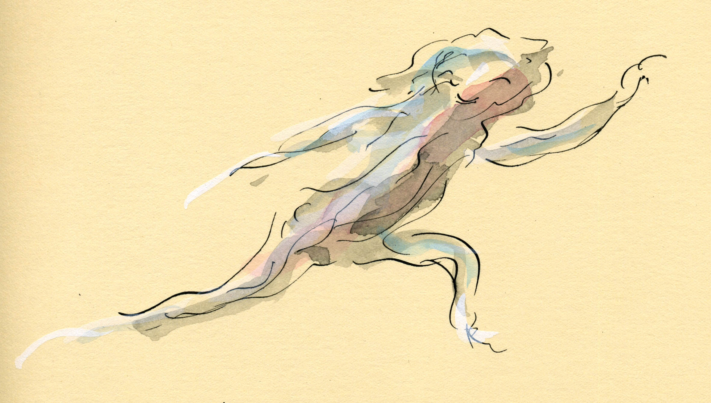
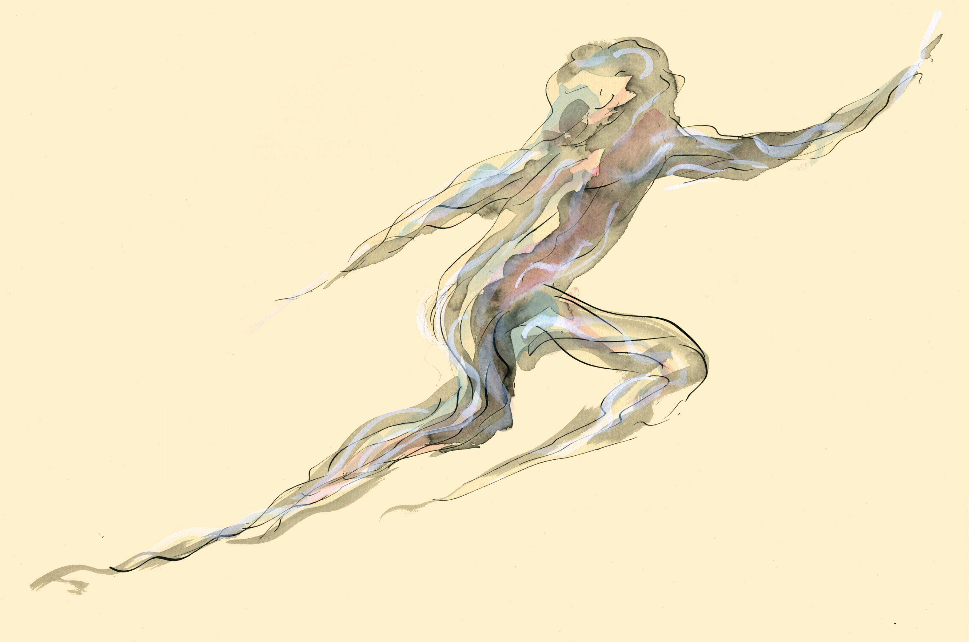
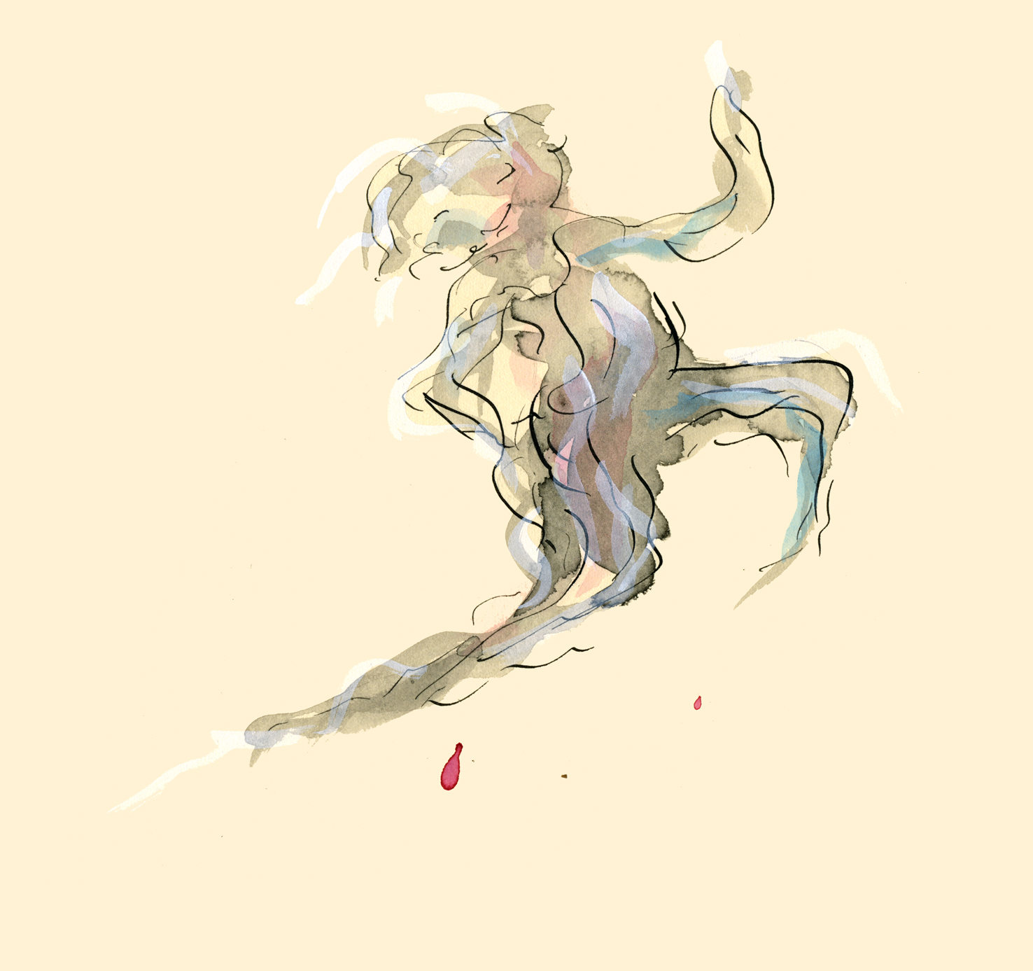
These probably won’t be used in Thunderstorm Dancing, but some may…
A family of whispy people, including a rather chubby child, proving you can be both chubby and whispy at the same time. I note that the dictionary prefers the spelling ‘wisp’ but allows ‘whisp’. To me the ‘h’ helps enormously with the whole whispy airy thing. How can you float through the air without an ‘h’ I ask you?
And I know this because cranky Miss Lee at my Primary School was fond of explaining how to correctly pronounce ‘wh’. You should sound as though you are blowing out a candle…
causing a whisp of smoke to rise perhaps….

And these little weather fragments and waves were nice to draw and paint. This book has been an interesting adventure that has led me all kinds of places.
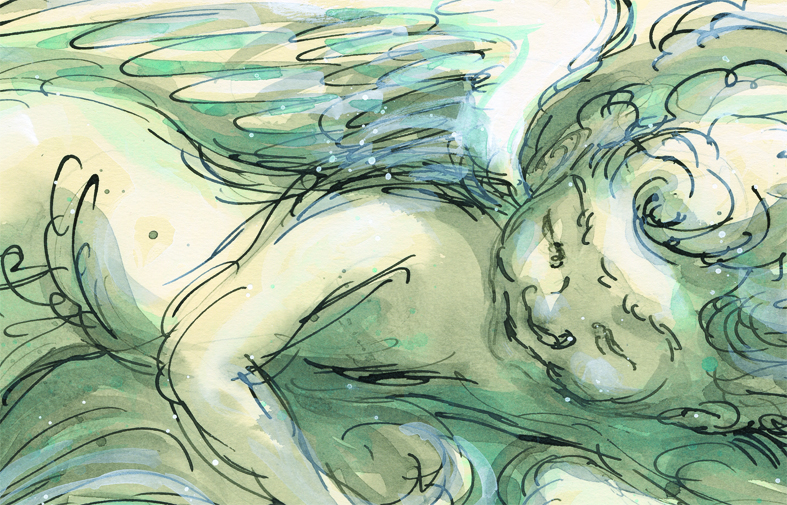
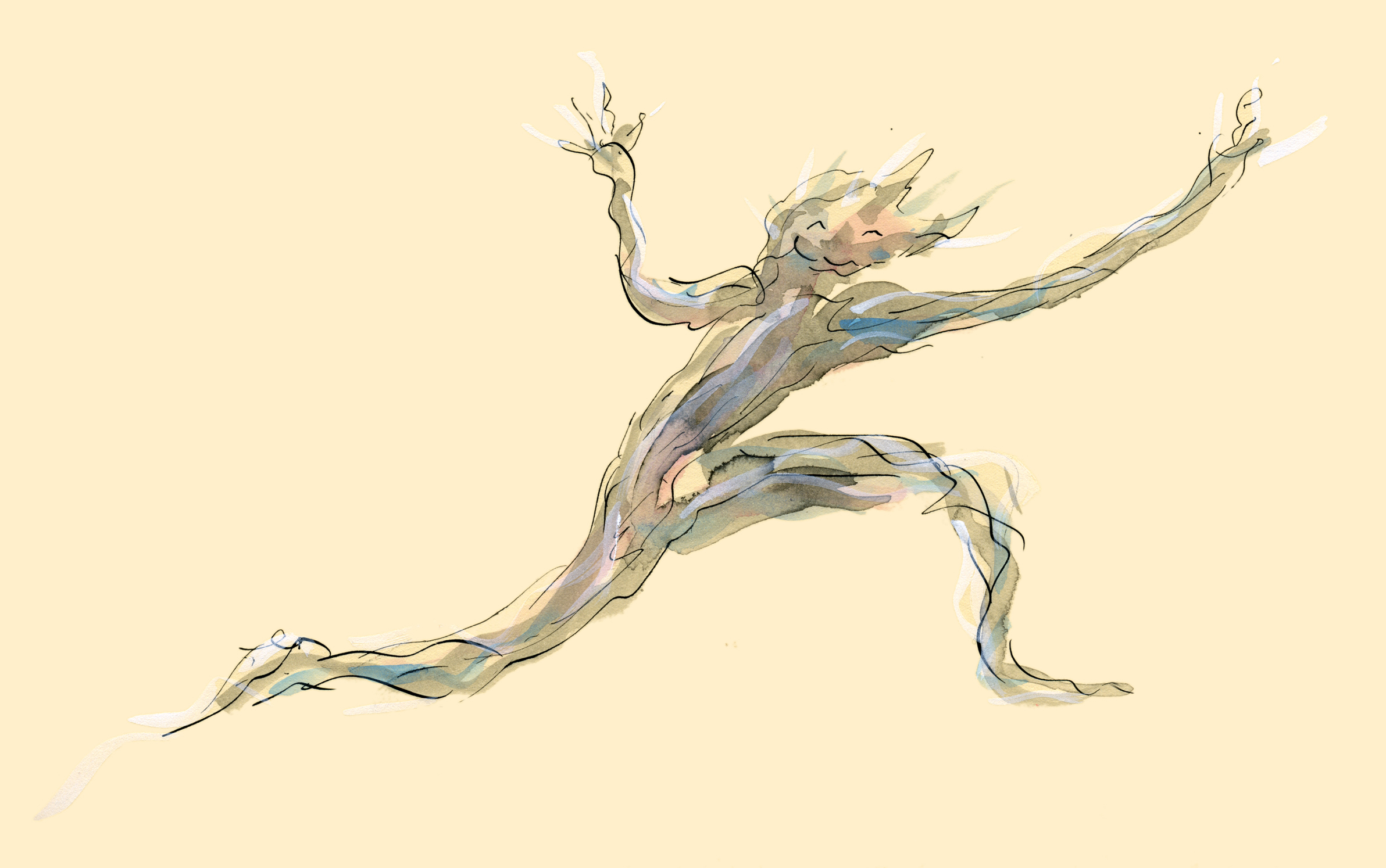
Here’s a section of the putto for one of the Thunderstorm Dancing spreads. He will have digital layers added and be incorporated into a spread design, but this is how he looks before all that happens to him.
A short while ago, I had to get a bit organised before going colour for Thunderstorm Dancing. Getting organised goes completely against my grain with any of my art. It’s a kind of superstitious thing. So much of my better work is on bits of scrappy paper, drawn in eyeliner or using a waitress’s pen, and so much of the work I like less (that’s for those of you who will kindly reprimand me for not liking some of my work ;-) is on expensive paper using the very best of materials… well it becomes a self-fulfilling prophecy. I only need to pick up a bit of expensive paper to get so uptight that I can’t draw to save my life. My lovely art teacher at school, Cecily Osborn, identified this problem about 30 years ago. (OMG!)
This is a little sidetrack really…. what I was going to say is that I drew (in a wonderfully organised way :-) a little menu of characters showing which watercolours I mixed to make the various characters’ skin and hair tones. I sketched a couple of options for each character to begin with and then got impulsive and drew only one of each. (From this you will know that I very logically started on the right and worked left. Ahem.)

Here it is, ink smudges and all.
Of course, in-spite-of / because-of the fact that these characters took two seconds each to draw and are imperfect, I immediately liked them more than some of the painstaking images I have drawn for the book.
This doesn’t surprise me one bit.
However, I know as well as anyone who has attempted it, how hard it is to draw a character in two seconds and get it right first go. In my case, practically impossible. Only one in about 12 drawings will look remotely right. Put eight characters together on the one illustration (dancing together) and you have a logistical challenge. Devon, you can do the maths maybe ;-)
So… interesting times. I am not, in reality illustrating the book with two-second-characters. But I am loosening the style up a bit as I go along. It has its challenges. And its rewards.
p.s. Bella may notice that I have two different skin options for Pippa. One much warmer than the other. Possibly the one on the left is a Soft Summer, the one on the right a Cool Summer. I can make his outrageous statement only because she has dot eyes, right Bella? The Pippa on the left has brown eyes, the one on the right blue eyes… in my imagination. I think I am going the warmer, Soft Summer. I may be going mad too, but that’s nothing new :-) Last time we went here, Bella was giving excellent colour advice on a family of mice...
Seems like a decade ago.

Working hard, drawing and painting Katrina Germein’s picture book Thunderstorm Dancing. I might post some random weather fragments occasionally but can’t show you much until it’s finished…. and I’ll come out from under that cloud ;-) hopefully very soon.
Wish me luck!

Alice gets in on the action – sneak peek at one corner of spread 22-23
Funny how when you draw something upside down, your eye can lose its usual sense of proportion. This is the last in a series of head-stand sketches for Thunderstorm Dancing. In some of the earlier sketches, when I turned the picture the other way up after drawing, (so that the child was seen with with head upwards) I was amused to find that her head was enooooormously too large, and sometimes her body was extremely shortened.
However, I didn’t try drawing this picture the other way up. I felt the only way to get the right balance, weight and feeling was to draw her as she is to be seen on the page.

The cat is becoming more baleful by the minute. But who can blame it when the only dry place is indoors… but indoors everybody has gone mad with dancing , banging and clanging? I have a vision of it being a sort of smudgy thing in each spread, somewhere amid the linework. So it might be black, if that works.
I think it might have to be a longhaired moggie. If there’s anything more uncomfortable looking than a cat that has been caught in the rain, it’s a long-haired cat that has been caught in the rain. Poor puss. I think perhaps this cat’s name is Thunder :-) That seems infinitely appropriate.

But I am thinking I will give it a treat at the end of the book. I think it might get a delicious fishy. One that was imaginary, but might, just might, not be imaginary…
Is Thunder a boy or girl cat? Somebody tell me. So impolite to call it ‘IT’.

Lucy the whippet gets in on the action…

Poor Poppy. As I have a thumping headache at the moment due to a cold, I sympathise with his predicament :-)

Often it’s the quickest pictures that have the most life… And often the quickest pictures are pictures of dogs… Ahem

This needs to be re-worked and then ‘unworked’! But I’m trying for that look that Hugo gets when he is squirming with glee, half crushing whatever he is holding, and throwing his legs about from a safe vantage point… not quite ready to join in… The cat is getting closer to the right baleful and disgusted expression :-)
I’d better tell you right now that I don’t have all the answers to this. But I have some ideas that grow (and will no doubt change) as I go along.
This cover is from the wonderful Will Schofield’s blog 50 Watts.
Two days ago I was working on Thunderstorm Dancing at the library. I decided to concentrate on the cover. The recurring challenge for the day was to find a clean simple arrangement of four main elements: title (longish), two creator names, two leading characters in upbeat active pose (is that really two elements?), suggestion of approaching storm preferably including a big, dark cloudy area.
Thoughts on book covers


Great contrast and clarity but still has texture and painterliness.
A complicated image, but still clear to take in. Possibly helps that the book is HUGE.

A contemporary style. I might have skipped the white drop shadow on the title text. I love the texture on the bird and the string and how the string leads us to the title.
This is a copy of the original, and the hand lettering has been replaced by fake hand lettering. A pity, but it still works!

Also a copy, but so completely delicious! look at that colour contrast and all that ‘white’ space!
This might have been helped by a bit of extra contrast somewhere, but they’re going for soft and that’s okay. It’s not ground-breaking, but one of those tried and true working formulae.

Perfection. Again, a re-hashed concept. See the latest reprints of Goscinny & Sempé’s Nicholas books (Phaidon) for something very similar. But it’s so good, why not? This book, by the way, is a divine thing. It is like a meshing of Sempé and William Steig (Pete’s a Pizza). I’m buying a copy.
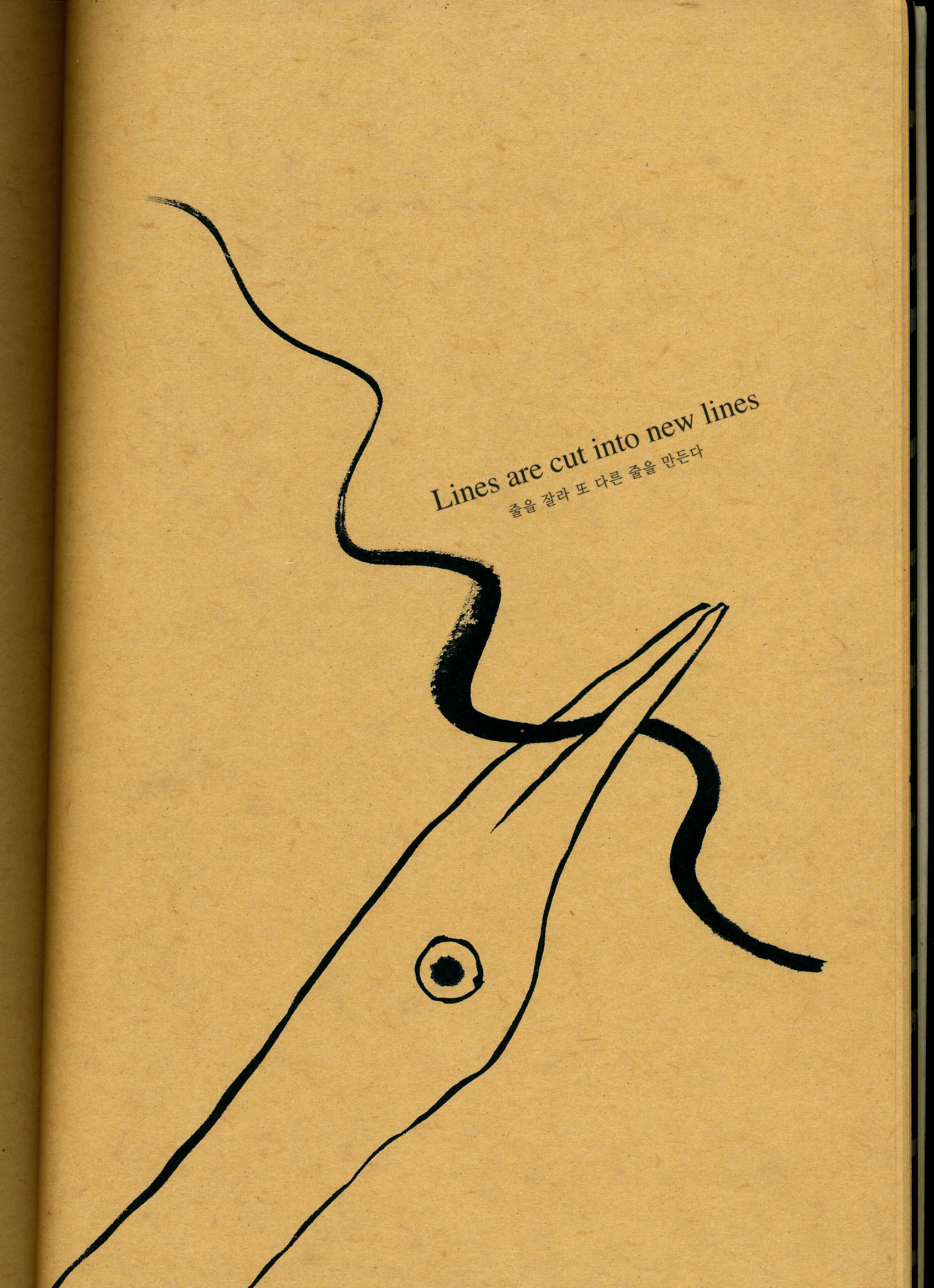
So that was my work day at the library. Yesterday I got home from an appointment to find a parcel on my doorstep with a book by Kang Woo Hyon called ‘Point Story’. Reading that clarified my book cover thoughts even further, with regards to simplicity, contrast and the beauty of the painter’s mark. So I am filled with ideas to move forward now!

From ‘Point Story’ by Kang Woo Hyon from NAMIbooks.
Also from Point Story. Go here to see more about NAMI books and Nami Island.
Sorry this was so long (and WordPress seems to be cramping all my paragraphs together. That’s not a good look).
Cheers!
