Tag Archives: colour

The Kick-About #13 ‘Ersilia’

The prompt for Kick-About #13 is an excerpt from Italo Calvino’s Invisible Cities.

Ersilia, from Italo Calvino’s Invisible Cities.

This had me really thinking. It led me in all sorts of directions.

One of my ideas was a weird and very complex dot-to-dot image that would be different for every person who embarked upon it because the connections between numerals would be created by answering a series of questions about family, friends and neighbours. The end result would be a deeply personal web of lines in different colours. But given the shortness of time I have for making art for art’s sake, it felt like a laborious task. I drew the dots though. :-)

My next idea involved painting some areas of adjacent colour, each area representing a member of my immediate family. I intended to overlay those colour areas with lines connecting the people, each line representing an interaction. I was interested to see how this would look and began a practice run on paper, while I prepared a large wood panel in the garage for painting.

However when I went to paint the wood panel over the weekend, that painting took off in its own direction and turned into something about grasslands rather than family. (More on that later, but here’s what the unfinished painting in the garage looks like in case you wanted to know.)

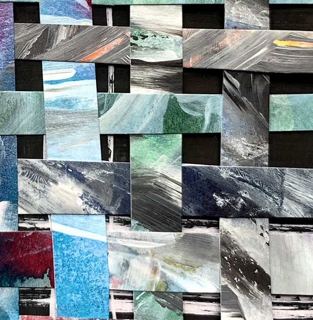
Well, I thought of opting out for this fortnight, but then I remembered the unfinished practice run on paper. I chopped it into strips and collected my family into eight piles. Two teens, myself, Scott, and all four grandparents. Although one of them isn’t with us any more, he is already deeply woven into the fabric of our family.

Then I took up a discarded piece of work from an earlier kick-about and began weaving the strands of the family together.

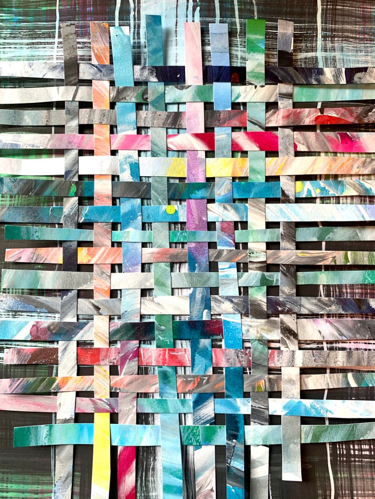
So this is my family. Though separated by space, and even time, we are woven inextricably. Our colours harmonise and clash depending on the day and on which other threads are adjacent, but we strengthen each other over all. And a tug on one thread, will summon help from several other threads.

Chopping sections off into small interludes was a fun follow up. Here are some mini family interactions.

Dromana beach weekend
toddler birthday party (strong double grandmother presence)
teen birthday party
In the garden at Camperdown
First day of school.

Christmas Day

Christmas day after lunch

Covid-19 Isolation

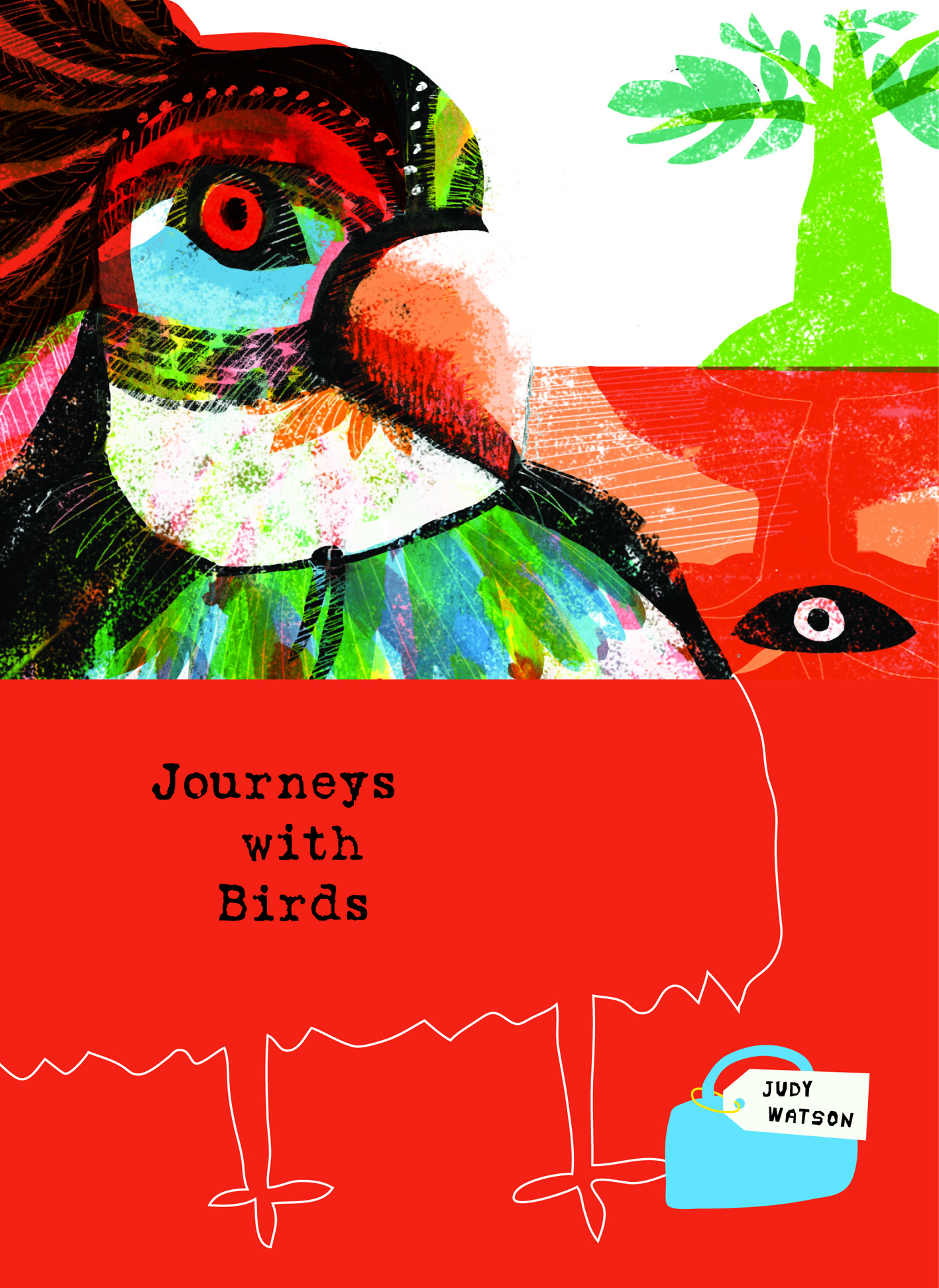
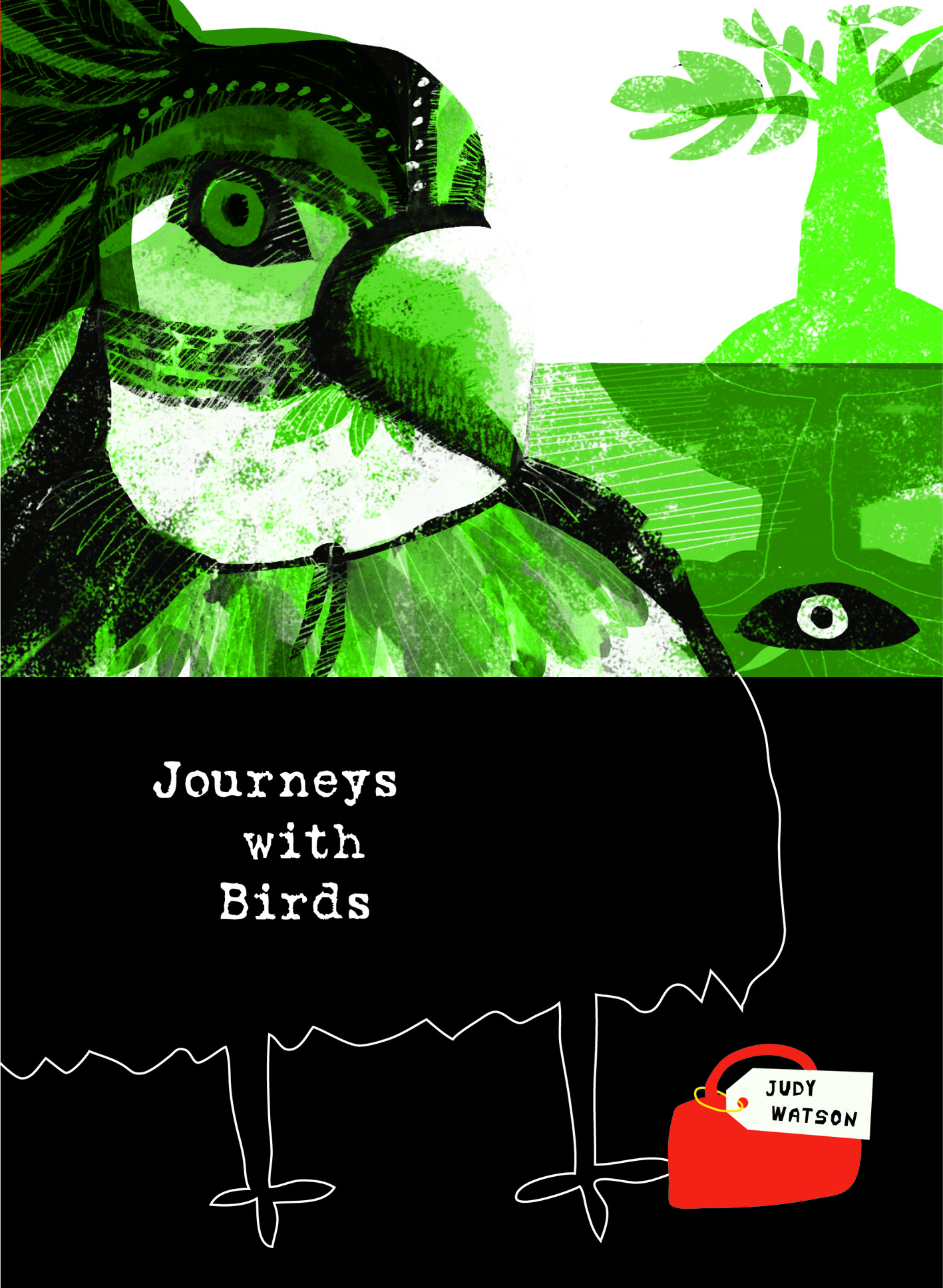
Thanks again, Phil! So much fun to join in.

An Intoxication of Elements

(or Kill Your Darlings)

Poor dangling darlings

When I’m illustrating a page for a picture book, I sometimes find that I capture a mood that expresses the meaning of the text in a very rough form. It feels right, but it’s just a framework. When I work on the final art for that scene, I add layers of detail, making decisions as I go along, and at some point, the juxtaposition of colours and shapes becomes intoxicating.

Once intoxicated, I find myself off on my own little adventure, with my eyes open in wonder at all the pretty colours, textures and shiny things. And then at a certain point, (often when I place the image into the layout to check the flow of the narrative) I find I am hit with a bucket of cold water.

Sober up, Sister. All the shiny things are beautiful. But they don’t work on the page.

Or they don’t work with the text anymore, or they don’t work with the sequence of illustrations. The original truth has been lost under the shiny things. And then it’s time to kill off my darlings. That phrase applies to illustration just as much as writing.

For example, this week, I’ve been making a ghost ship for my current picture book project When You’re Older by Sofie Laguna. It’s my first ghost ship, in my first enchanted lagoon, with my first ghost pirate. The ship is fun. I’ll need to paint it again, because it isn’t there yet but I can see it’s going to work. Yay! Under the ghost ship, there is a mermaid swimming. Yay! And everything is all blue and green and wet and shimmery and deep looking. But to make it truly ghostly it needs some heavy weed and barnacles and stuff hanging from the hull in a dark, spooky but beautiful way, right? Of course, right.

This is where I got intoxicated.

Oh boy! You should see what happens when you start layering up seaweed under a black ship in a turquoise sea! You seriously can lose your head!

These were my building blocks.

I started with this.
Then I made some smaller embellishments. The wet one was key. I wasn’t so chuffed with the one on the right. But we’ll see. Mmmmm.
I’m looking for that HEAVY draped look. So heavy, the ship is just drifting slowly, groaning, becalmed.
Wait, I might want the weed to drape deeper, and and to curl forwards to enveloping the mermaid. So here are some wild and woolly tentacle-weeds.

Then I put them on the image, with the ship and a few mermaids. (This is a corner detail.)

There are already too many mermaids, but the weed is making me tipsy.
Deep dark squelchy, wet bits contrasting with hard, branchy drawn bits
Oooh, that purple is going crazy in there.

My psychedelic dream here came to an end. The page needed a rock or island in front of all this weed, in order to give a sense of the waterline, and to visually anchor the image on the page. With the weed visible in the bottom right hand corner of the spread, all the energy was leaking off the page. No, not leaking …pouring torrentially.

Besides this, was all this weed adding anything to the mood, the action or the experience of the main characters? No.

So I have killed some darlings. I’ve taken it all back to serene. Sorry. You can’t see that yet.

But I’ve added a skeleton. But not one of those up top. And some palm trees… Yay!

Leonard galumphs into bookshops

I nearly wrote ‘Leonard dances into bookshops’. But then I remembered that Leonard Doesn’t Dance… or does he?

Leonard doesnt dance detail.jpg

I’m very fond of that great galumphing bird. I relate to him very much. The initial enthusiasm, the self doubt, the impulse to hide away in a thorny tree, the desire to be with my friends that usually draws me out of the tree. And like Leonard, I have some fabulous friends.

My thanks to the team at Harper Collins and to Frances Watts, for patiently waiting for Leonard as he put one lanky leg in front of another (tripping over several times) and eventually became finished art; now a book.

This lovely cover was designed by Hannah Janzen.

I had been initially drawn to a white cover, because black ink on white paper was a signature part of making the artwork. There was a lot of ink involved. Brushed on, drawn on, printed, wiped and smudged onto white paper. Big broad strokes, and fine textured marks. So my original idea was to have an inky black and white cover, with a pop of red on Leonard’s face, and a scattering of brilliantly coloured birds flung around it like a double handful of lollies, and wrapping around both covers.

The team at Harper Collins didn’t think the white design was indicative of what was inside: a rampant world of jungly colour. This was perfectly true, and is why editors are so great! and Hannah did a fabulous job of designing something rich and celebratory.

Here are some of the lolly birds from the white cover design. Some of them found their way onto the new cover anyway. Perhaps you can spot them.

I visited the Grade Sixes at Derinya Primary School a few weeks back and we had a great time talking about Leonard Doesn’t Dance, story arcs, tension and making storyboards for picture books. There is just so much to talk about! A two hour session went by in a flash. I will be signing up with Creativenet Speakers’ Agency very shortly, so if any schools or groups of lovely librarians within Cooee of Melbourne would like to book a workshop and talk with me, that will be the place to go.

I have another book released this month as well! A very leafy book about cicadas. More on that soon. Enjoy your week!

Pecking Order

I’m feeling rather exhausted this evening. So I drew our chickens to give myself a lift. I started the beginnings of a pecking order diagram. I’m quite fascinated by how this might be done, because the order is not linear in any clear sense. Below is the Official Order. But there are weird aberrations in the middle where certain chickens are scared of other chickens. And there’s one vicious triangle… Hmmm.

Those two devilish looking youngsters at the bottom will grow larger than all the rest. I have therefore introduced them to the flock as babies so that their elders can keep them in their place before they grow unwieldy in size. (According to what I have read, pecking orders rarely change once established… unless the circumstances are unusual and special and particularly particular…)

But according to what I have read, pecking orders follow a simple linear hierarchy.

In my experience this is not the case.

chicken pecking order colour flat

On a secondary note, I’m sure you will be pleased to know that I have now had all my chickens expertly colour analysed by an image consultant. So they will never, NEVER be seen looking anything but their best when they go out to parties. I can vouch for this without a doubt.

Vita, surprisingly, is a summer. But we did not establish which kind of summer. This is because, as Annabel pointed out, the rules of colour may be different for chickens! Well that’s awkward! Now we’ll have to write a book about it!

Hilda is a deep winter, Poppy is a warm autumn, Stella is a deep autumn, Storm is a soft summer and so is Nora. The Terrible Pteranodon Twins are cool winters. Their legs are green and so will be their eggs one day.

The Bird Lover


Okay, this post came down. Now it’s going up again because I hear some people have linked to it. Sorry about that. Decided I wasn’t keen on it. But here it is again. Have posted plenty of warts-and-all experimental doodles before now, so why not this one?

the bird lover2 judywatsonart lores

Strange little doodle fellow with a Tove Jansson Groke nose…

For my bird loving Mum. (I know your nose doesn’t look like this, Mum.)

Furthermore… (in for a penny, in for a pound) here’s the earlier version of this pic. Which I decided was too dark. But it has a different, more raw and slightly spooky quality. Kids could have a go at something similar to this combining scraper board techniques with collage.

the bird lover judywatsonart lores


Week 32: PSYCHEDELIC


Cat trouble again

Cat trouble again

I don’t know if the cat is directly responsible for this little dog’s trippy bad dream, but she is certainly doing her best to mozz him.

Mood Blobs (experiments with blobs – part 5)

I could’t help noticing that these blobs painted late last night when feeling tired and a little low, all have one thing in common.

Despite the fact that they all were generated from random colour blobs, they all look downward to the bottom right of the page.

contemplative cassowary

contemplative cassowary

Scott pointed out that this fellow looks Muppetish. A compliment :-)

pondering purple  person

pondering purple person

preoccupied parrot

preoccupied parrot

Ptentative Pterododal

Ptentative Pterododal

No wonder this Ptreposterous Pterododal is Ptentative… His wings are ridiculously inadequate for his size. I’d stay on the ground, if I were he.


Experiments with Blobs (part 3)

Well here they are! Some mixed results. drama colour blobs comp levels I will include a few close-ups of the more interesting ones. suitcase lady B4after girl on buffalo B4after People blobs! Can you believe it? smiling creature B4after seamonster B4after Assorted terrestrial and aquatic monster blobs. sad rabbit dad A sad rabbit blob round bird B4after predator B4after  flying handbag bird B4after flecked duck B4after elephant bird B4after And a range of birds in varying degrees of preposterousness. Including the rare elephant bird. Are you sick of blobs yet? I don’t think I am quite. Here is a sheet of blobs done during the kids’ drama class on Wednesday evening. A ran out to the car with a page of still wet blobs to play with when we got there. It is quite a stimulating way of spending a few minutes, and more fun than sudoku for me :-) blobs from drama lesson comp levels lores The dogs were the things that worked best here I think. I extrapolated a lot more than I have previously too. Because some of the blobs suggested just part of a face.

Journeys with Birds – playing with colour

ImageImage

Image

The mad colour theme continues this evening. It’s the last day of the school and Easter holidays proper. (Although the school has a curriculum day tomorrow so the boys will be home for one more day.)

This is another bit of playing around for the 52 Week illustration Challenge. It’s not a very serious endeavour and I didn’t try to make anything perfect. I think it’s great to have the chance to do this every now and then, because the pressure is definitely on to get the paid work perfect. (By this I mean that I pressure myself, not that author, editor or anyone else pressures me.) So this kind of play is quite enriching and definitely relaxing. Although the red version was the one I posted, I think it’s the one I like least now.

This is probably more interesting if you see the original daggy drawing (below) that I manipulated into the book covers, with an hour of twiddling in PhotoShop and then Illustrator. Although I drew this unremarkable little bird doodle, even I have trouble seeing the resemblance between the original and the resulting bird. It’s like that shameless re-making that advertisers do with fashion models.

But I do appreciate the flexibility of the software tools I have to hand, especially now that I have plenty of good paint-and-mess time at the drawing board as well. I miss it badly if I’m not getting messy in the paint.

Image