Category Archives: Uncategorized

Dancing Eucalyptus Sprite

In a cruciform posture…

eucalyptus leaf sprite judywatsonart lores

Well I finished Thunderstorm Dancing today. Hooray!

But the marketing department want a completely different cover. Not hooray!

I didn’t feel like celebrating this evening. But I was determined to get a last minute picture into the 52 Week Illustration Challenge, which finishes each theme on a Tuesday with a new one starting the next day. I’d had the idea of leaf rubbings making a dress earlier in the week. But I wasn’t going to render it like this. This just came out of somewhere… But I’m really pleased with it.

It’s the colour palette from Thunderstorm Dancing. And it’s dancing. But the everything else is very different. It’s a nice change for me. I noticed the cruciform shape when I found I wanted to highlight the hands and feet.


Dogs from the past

Looking at Liz King-Sangster‘s blog the other day, I so enjoyed her lovely paintings of her everyday surroundings. And it reminded me of a time when I used to paint with oils several evenings each week. That was long ago, when I was living in Brixton, London in a shared house, and working in the Aldwych Theatre box office.

During the evenings in the shared flat, comprising two floors above a lawyer’s office (and without a fire escape), wine flowed, cheese was consumed, friends chatted while I painted. Sometimes friends posed for my paintings. Many of those paintings ended up in the skip in the back yard of the rented property, before I caught a plane home to Australia. Some paintings came home by ship, and some went to the people who had posed for portraits.

That habit of painting continued after my return to Australia for a little while. Then work and circumstances called a halt. At the moment, while I am indulged enough by my family to have the largest bedroom of the house as my studio, (we sleep in the smallest bedroom) and there is space enough for computer equipment, drawing board and shelves, there is not room enough to paint at an easel, or even on the floor.

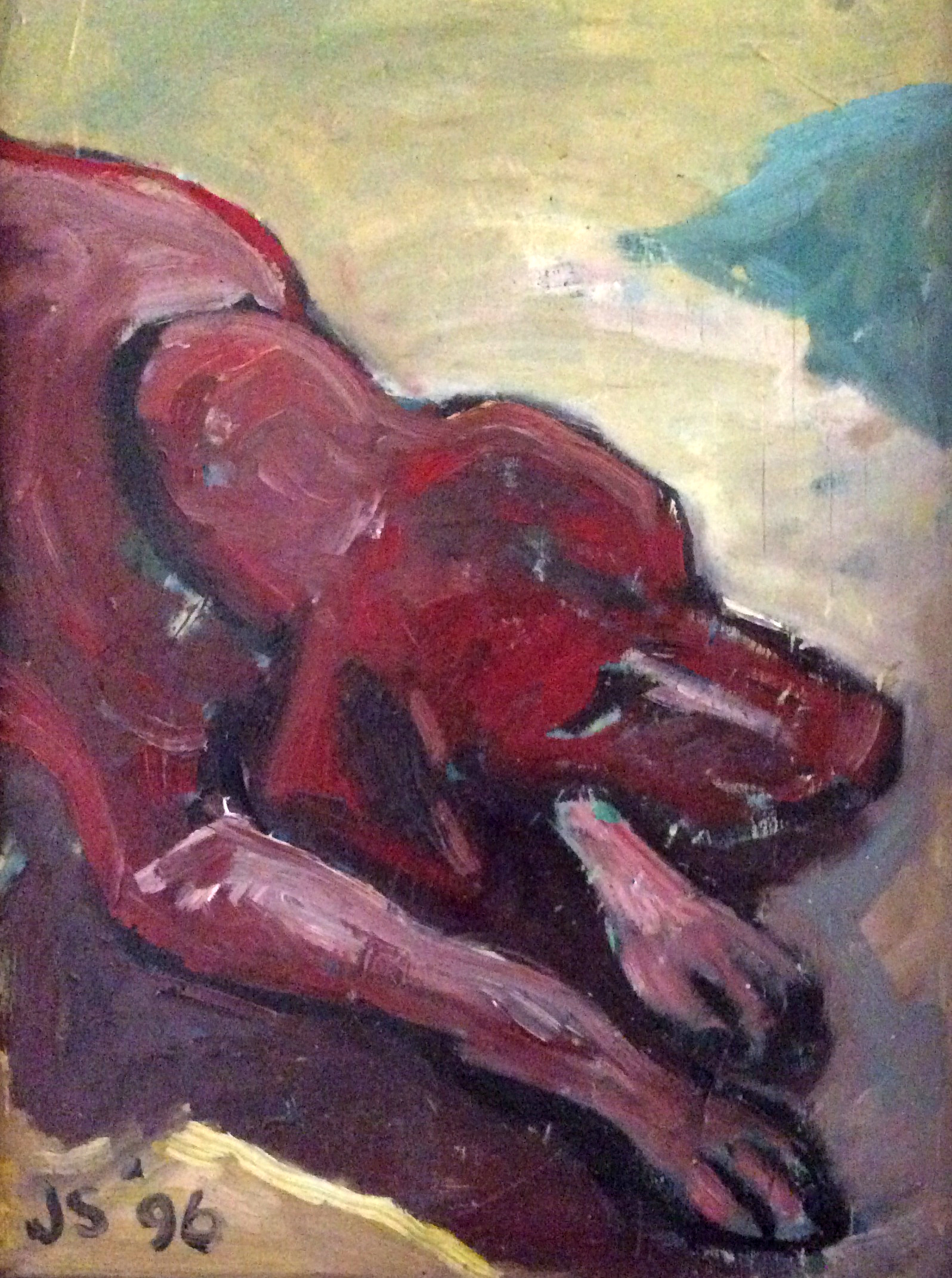
Looking at these two oil sketches of our dog Giddy the Hungarian Vizsla, painted not long after my return to Australia, I notice that it is nearly 20 years since I painted in oils! My goodness, I miss it, despite the fun I have with other media. I remember too, that these were painted after seeing some mid 1990s paintings of dogs done by David Hockney. No, don’t go and compare mine with his! Don’t!

Oh, damn.

You will.

Well, anyway, I loved it that he chose such a domestic subject as a dachshund and honoured it in oils. And I enjoyed capturing our beloved dog in oils in the same way that I had painted my friends in London. Note that the sleeping version is more ‘finished’ and see if you can work out why… Never work with children or animals they used to say in the theatre, but in my experience, they are some of the most rewarding to work with.

Red Giddy

Red Giddy

Blue Giddy

Blue Giddy

These two sketches are painted on wooden trays purloined from the science room of the old Banyule High School which was awaiting demolition at the time that I worked for Greening Australia in a renovated wing. The lip of the trays forms the frame of the paintings; a cheap alternative to proper framing. It’s time I took them to be framed properly. They remind me of the dog and the time.

And it’s also time I found a way to paint again.

Cartoon Cornish

Comic Cornish Judy Watson Art lores

The Scribble Cornish of yesterday, became a fully drawn and painted Cartoon Cornish after dinner last night. I started out to do an inky depiction, with wet edges, to suggest the fuzz, as per all of my work this year really. Fast and loose… But strangely I found myself taking the unprecedented step of using a sharpened Prismacolour pencil to draw in some detail, as the Prismacolour Artstick was frustrating me by going off rather too wildly on its own tangents.

And although, this picture is not exactly as I would want it, I have to say, I quite enjoyed being careful… relatively careful… for a few moments :-)

Anyway, Mr Cornish salutes you.


Swirling and Swinging

P24 Lachie judywatsonart lores

This afternoon I finished the second last illustration for Thunderstorm Dancing, which I should add is yet to be approved as the editor is not in the office today.

All being well, I’m now working on the last illustration for the book. I can hardly believe it. Wish me luck!

scribble cornish judywatsonart lores

This is not from Thunderstorm Dancing. This is a scribble-of-joy.

Okay… so this Scribble Cornish may exhibit some slight exaggerations of conformation… but the rest is true :-)


Cornish Cat working on the weekend :)

profile alice cat judywatsonart loresPhew! That’s half the spread fixed.

I spent a day on Thursday working on this page, and was really unhappy with the results at the end of the day, so it was back to the drawing board and a re-work of this character group. It might not have mattered so much if it were a busy page. But this is a section of the still page. It has to be right…

err… now I’m looking and finding a few things I might tweak… But not today. Time to spend time with my boys.

So the page 25 Cat-Called-Thunder and Alice are working to my satisfaction. I’ve just got to finish off the seven other members of the family! (laughs hysterically)


Cornish clock-watching

cornish watching fish judywatsonart loresNo time to talk today. Here’s the Cat Called Thunder watching a flying fish… or is he watching the clock?

Two pictures to complete and then all is done!


Less is More : More is More

Less is More in many things, and in picture books for the young, this is often the case.

With books for the very young, there are good reasons for this, relating to a small child’s ability to focus, learn and enjoy their experience of a book. For older readers, it can be more about style and composition.

piano stool colour sketch

piano stool colour sketch

Many of the pages in Thunderstorm Dancing will have complex layering. Often this is about providing a contrast with the more spare, dramatic, or still places in the spreads. This piano stool for instance, rough-hewn as it is, has a pleasing simplicity for me, but it will barely be seen amid the deliberate clutter of an interior scene in Thunderstorm Dancing. On this spread, the left hand clutter will contrast the right hand spareness, and mark a transition from real world to fantasy world.

Hopefully all this will work in the finished book. But I also look forward to a time in the near future when I can make a book that stops here; with the stool and the scrubby smear of shadow, the flash of colour. All on a plain or very minimal background. Something about this kind of simplicity works so well with the printed word on the page, and picture books are one of the few places where we can enjoy this bold, sweet and simple effect. It’s a big part of why I love picture books so much.

Title Page complete

Yes! I have just delivered the title page illustration for Thunderstorm Dancing.

It’s not the last picture to finish, but it feels significant.

cornish cats in the grass judywatsonart lores

Here are some Cornish Rex cats in the grass; working sketches for the title page group.

Tommy title page snippetAnd a fragment of the finished image. Tommy, bucket in hand, off to play on the sand dunes with brother, sister, dog and cat!

It’s understood that only picture book Cornish Rex cats and Whippets will play on the sand dunes in windy weather with a storm on the horizon.

Thanks goodness for my hard-earned Picture Book Licence. :-)


Pecking Order

I’m feeling rather exhausted this evening. So I drew our chickens to give myself a lift. I started the beginnings of a pecking order diagram. I’m quite fascinated by how this might be done, because the order is not linear in any clear sense. Below is the Official Order. But there are weird aberrations in the middle where certain chickens are scared of other chickens. And there’s one vicious triangle… Hmmm.

Those two devilish looking youngsters at the bottom will grow larger than all the rest. I have therefore introduced them to the flock as babies so that their elders can keep them in their place before they grow unwieldy in size. (According to what I have read, pecking orders rarely change once established… unless the circumstances are unusual and special and particularly particular…)

But according to what I have read, pecking orders follow a simple linear hierarchy.

In my experience this is not the case.

chicken pecking order colour flat

On a secondary note, I’m sure you will be pleased to know that I have now had all my chickens expertly colour analysed by an image consultant. So they will never, NEVER be seen looking anything but their best when they go out to parties. I can vouch for this without a doubt.

Vita, surprisingly, is a summer. But we did not establish which kind of summer. This is because, as Annabel pointed out, the rules of colour may be different for chickens! Well that’s awkward! Now we’ll have to write a book about it!

Hilda is a deep winter, Poppy is a warm autumn, Stella is a deep autumn, Storm is a soft summer and so is Nora. The Terrible Pteranodon Twins are cool winters. Their legs are green and so will be their eggs one day.

Swinging in the rain

Tommy storm fragment

Sent off a spread this afternoon. Finishing details on another now.

Closer, closer, inch by inch.