Tag Archives: digital colour

Bookplates – just for fun (part 2)

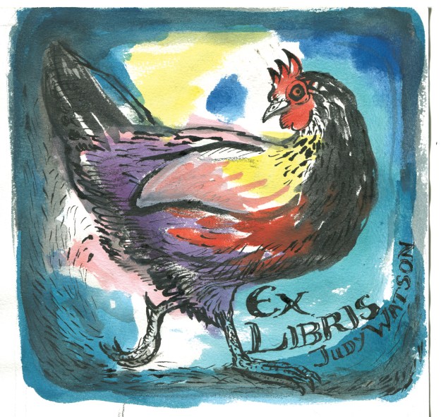
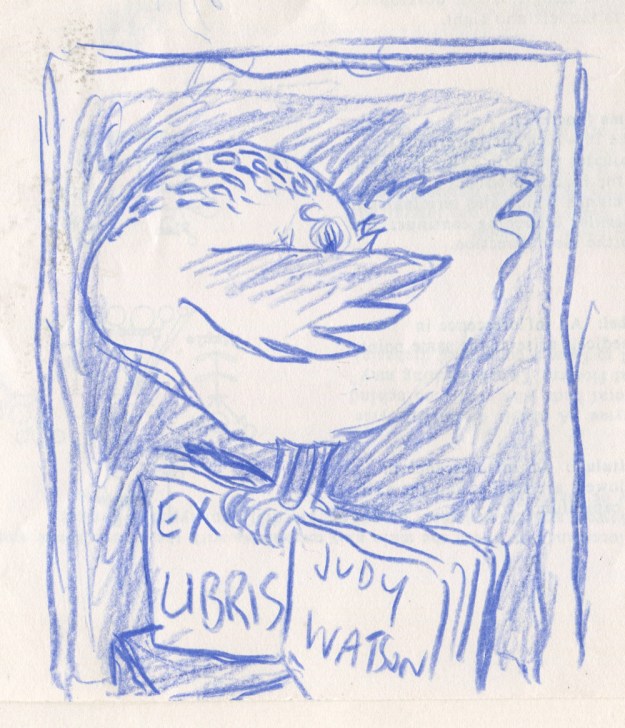
So here are my two quick bookplate designs. Unlike Hugo, my preliminary work was limited to one doodle in blue pencil. I then progressed straight into ‘make it up as you go along’, my strongest medium.

bookplate prelimiinary doodle judywatsonart

Wanting to play quite loosely with patches of colour, I used watercolour without any particular structure or organisation. Then I added ink with brush and dip pen, acrylic (to cover up the bits I didn’t like on the wing) and went for it with some lettering. I left it scanning while I started on a second one.

Bookplate2 judywatsonart stage 1

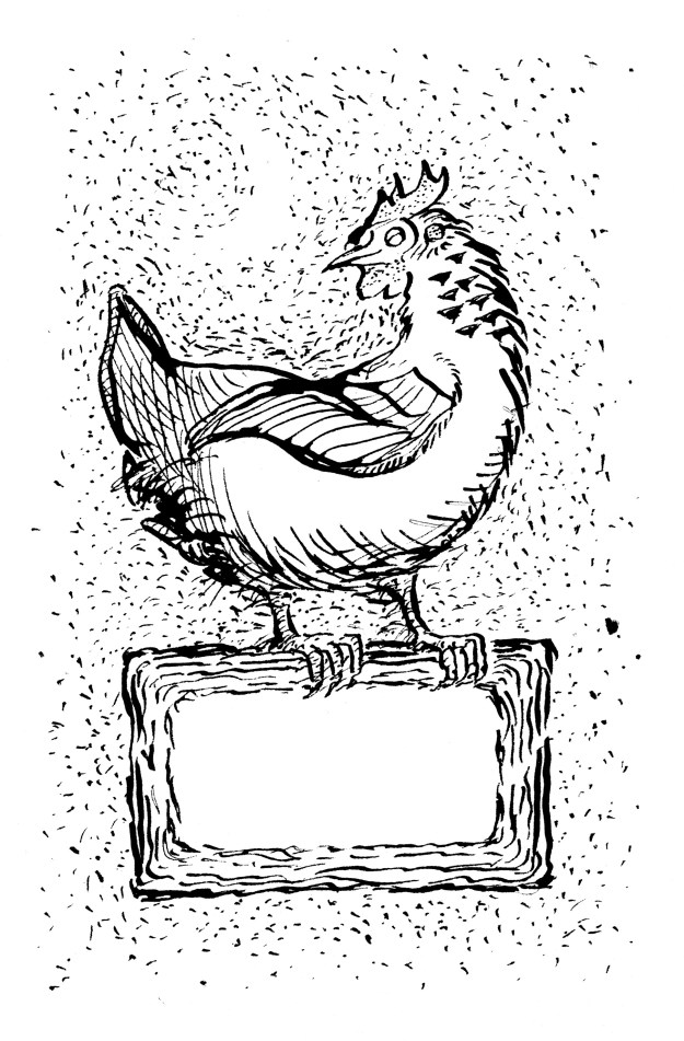
The second one was only black ink and dip pen with lots of splodgy bits. I scanned it before adding more texture, to give myself a way of going back. undo. (Am I the only one who mentally presses Command Z when I miss a turn off in the car? It doesn’t work.)

Bookplate judywatsonart stage 1

Then I took it back to the drawing board and added some very important dots and scratchy bits. (Chickens scratch. It’s symbolic, right?) Then I scanned it again. (undo)

Bookplate judywatsonart stage 2

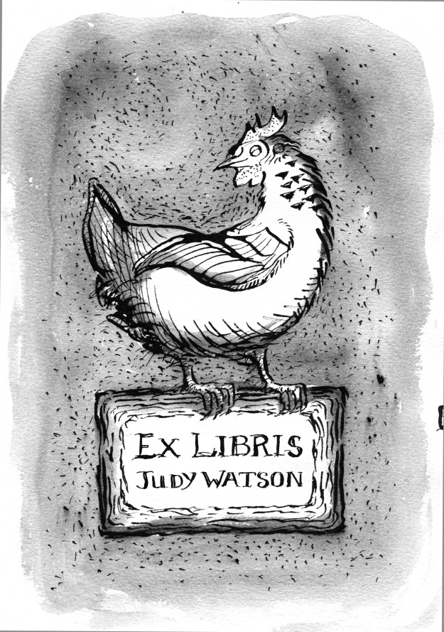
Then I took it back to the drawing board for some wash, and scanned it a third time. (Actually, I blow-dried it first, and then scanned it and found it was wobbly, and then put it in the book press for 2 hours while I drove to school and back and then scanned it again, but that’s probably too much detail.)

Bookplate judywatsonart stage 3

Then I took it into PhotoShop and added some colour. Although it may have been better in black and white, it was too much fun not to add colour. (This process involved lots of undos.)

Bookplate judywatsonart tonal chookie

Then I went back to my first chicken; all loose and free and doing her own arty-farty, happy thing. And I had to mess with her. Cramp her style.

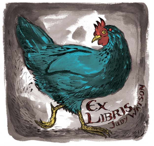
I desaturated her, taking her back to a sepia tone, then added very limited digital colour. She squawked in protest, but I took no notice. I told her firmly, ‘less is more… sometimes… Not when it comes to eggs, you understand.’ She gave me that bright beady-eyed look and then we sent the bookplates off to print.

The other chicken had been asleep through the whole process.

sepia chicken judywatsonart lores

Catching up

Hello! I’ve been a bit absent! Thunder is finished and off to the printers! I’m looking forward to seeing an advance copy in early January. It’s taken a few weeks to just get myself into drawing again. That’s not something I anticipated. And there are a lot of other things that I need to catch up with now that I’ve finished that mammoth project… including Christmas!

I had a great day with Ann James and Justine Alltimes last Monday, designing a poster for Jackie French, our Australian Children’s Laureate. Her project Share a Story will revolve around the ideas on the poster/calendar which will be available for free download by Christmas.

Ann James is a well known and skilled Australian children’s illustrator. Justine Alltimes is one of the hardworking and capable Laureate Project Managers. When the three of us get together, the ideas ping about like pinballs. After Ann had drawn and painted some images, I was able to alter them digitally to make new, and hopefully intriguing combinations, that will work well together on the poster and spark the storytelling imaginations of children, teachers and parents. The challenge was to avoid the literal interpretations of words like Slurp a Story and instead to come up with images that were open-ended or suggestive. We want starting points for stories, not stories in themselves.

More on Share a Story when the poster is released.

Other work in progress includes an illustration of Phar Lap for the front cover of a colouring book for the Melbourne Museum to match the dinosaur one I did a couple of years ago. As always with work done for Museum Victoria, I learn heaps along the way as I research the topic! Glad to find out that Phar Lap was probably not deliberately or even accidentally poisoned. Not that it made much difference to the poor horse, but he most likely died of colic related to a rare disease of the intestinal tract.
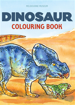
MMDinoColBk_FRONT.jpg

The 52 Week Illustration Challenge forges on towards the finish, but will return next year. I wasn’t feeling like drawing for this either, for a couple of weeks. So I’ve missed Week 47 New York, but I may go back to that. Although drawing New York itself holds little attraction for me, the New Yorker and its famous cartoons hold enormous appeal for me. So I think I need to do a New Yorker style cartoon. But of what?…

Tim and Tig New Yorker

A page from ‘Tim and Tig’

Above is an illustration I did for Aussie Nibble – Tim & Tig many years ago. I illustrated Tim and Tig just after receiving a copy of the Complete Cartoons of the New Yorker; a fantastic book that had a powerful influence on my drawing! Many of the illos in Tim and Tig, I’d wish to do again and much better, but this one I still like.

Now that I think of it, I did do some quick doodles for Week 46 Circus. (Oh dear. What a rambling post.)

The Twisted Princess tidies her tresses

The Twisted Princess tidies her tresses

This doodle was on the bottom of a Thunder illustration. You may see a wee peek of the washy water top right, and it ran completely off the page. It started as a doodle and then I got mesmerised by the leotard pattern. Actually, this led my mind off in the direction of a series of paintings I’d like to do…

This brings me to last week’s theme. Week 48 Fox. In a shocking twist of fate, I found that the topic had long ago been changed from Chicken to Fox! Horrors!

I did some fox doodles while I was waiting for the kids to get out of drama class and below you can see them.

Deadly Maggie

Deadly Maggie

This was a fennec sketch in an old book. I added some digital colour experimentally (even though fennecs are creamy in colour). It’s not entirely successful but there are elements of it that I like, including the scratching into top layers of colour; a Thunder habit that may continue for some time. Perhaps lead into interesting new areas.

fox cub judywatsonart lores

A very innocent young blob fox.

By contrast, this little blob fox is not deadly. This was my protest on behalf of my chickens.

Contortionist fox

Contortionist fox

I liked the tail hatching on this one, and also the two tone retro feel, but it was certainly rushed. Not what you’d call finished work.

The Fox with the No.6 Tattoo

The Fox with the No.6 Tattoo

Lastly, this fellow. The fox with the No. 6 Tattoo. I liked his eyes and expression. He seems to have a canny and sophisticated air about him. I added some very flat colour panels in Photoshop trying to keep it sympathetic to his stylised and simple form and I like the result.


I am not a toy!

2 poodle sizes judywatsonart lores


More of my doodles (not all poodles) for the 52 Week Illustration Challenge here.

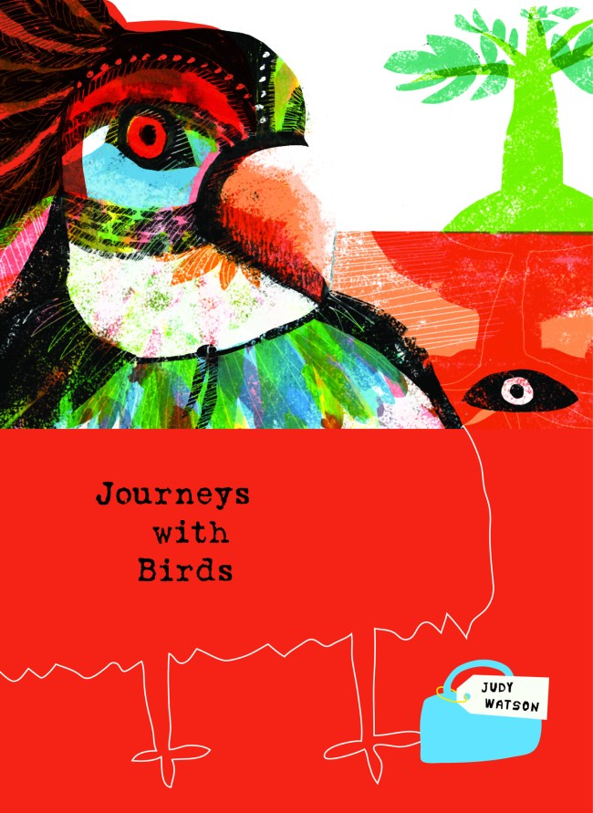
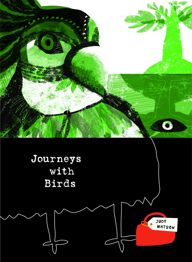
Journeys with Birds – playing with colour

ImageImage

Image

The mad colour theme continues this evening. It’s the last day of the school and Easter holidays proper. (Although the school has a curriculum day tomorrow so the boys will be home for one more day.)

This is another bit of playing around for the 52 Week illustration Challenge. It’s not a very serious endeavour and I didn’t try to make anything perfect. I think it’s great to have the chance to do this every now and then, because the pressure is definitely on to get the paid work perfect. (By this I mean that I pressure myself, not that author, editor or anyone else pressures me.) So this kind of play is quite enriching and definitely relaxing. Although the red version was the one I posted, I think it’s the one I like least now.

This is probably more interesting if you see the original daggy drawing (below) that I manipulated into the book covers, with an hour of twiddling in PhotoShop and then Illustrator. Although I drew this unremarkable little bird doodle, even I have trouble seeing the resemblance between the original and the resulting bird. It’s like that shameless re-making that advertisers do with fashion models.

But I do appreciate the flexibility of the software tools I have to hand, especially now that I have plenty of good paint-and-mess time at the drawing board as well. I miss it badly if I’m not getting messy in the paint.

Image


The Wrestler

Beards are back in fashion, right?

I know the background pattern could be so much better. But any drawing is done rapidly around here at the moment or not at all. Perhaps I will edit him later on. It would be easy enough, as he is coloured digitally.

I was feeling inclined towards strong, flat poster colour when I set out to colour him. In fact, the original choice was for a plain red background, which looked good, in a more serene way.

…But then I really liked the combination of manly strength, curling beard and floral pattern.

He’s originally inspired by a cabinet card photograph of a wrestler with a much more realistic beard. But this illo was done quickly for the 52 Week Illustration Challenge on the topic of DETAIL. I felt I should have a go, even though detail is really contrary to my natural habits. But it didn’t take me long to do this.


Weather fragments

weather fragment 2 weather fragment

What a rocky road this picture book has been for me. It looks like it is coming together at last though. Here are some weather fragments to make you feel lucky to be indoors, out of the rain.