Tag Archives: Sofie Laguna

Endpapers (part one)

Endpapers are a particular favourite of mine, both old and new. I love to create the ends for the books that I illustrate. They’re wonderfully freeing, because they’re not required to go alongside an author’s text, nor do they need to follow along in the exact same style or medium as the other illustrations. They need to feel as though they belong in the same family as the rest of the book, but they can fly off in all sorts of playful directions, and frequently do.

Sometimes it’s lovely to take a purely decorative approach, using whatever medium seems complementary to the book, without direct reference to the story at all. Decorative endpapers may just be stripes, spots or splashes and can look beautiful, as though the reader is opening a brightly wrapped present – which in a way they are!

Mostly, I am so involved with the text that I can’t resist linking the ends to what’s inside. Sometimes I like to refer to a repeating motif in the book such as seagulls, and a little black cat as we see in Thunderstorm Dancing. Or I refer to the setting of the story, such as the forest in Leonard Doesn’t Dance. Sometimes I like to tell a bonus story without words, so that when the book has been read and the story is over, there is somewhere to linger and to imagine our characters in their next adventure or in their everyday lives.
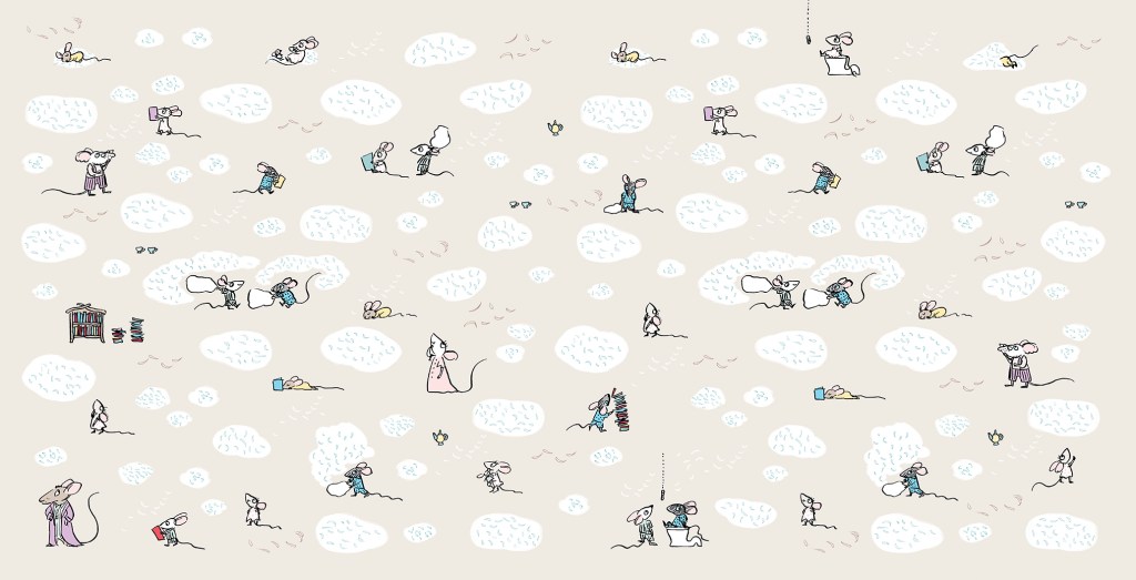
Endpapers for Goodnight, Mice! by Frances Watts and Judy Watson.

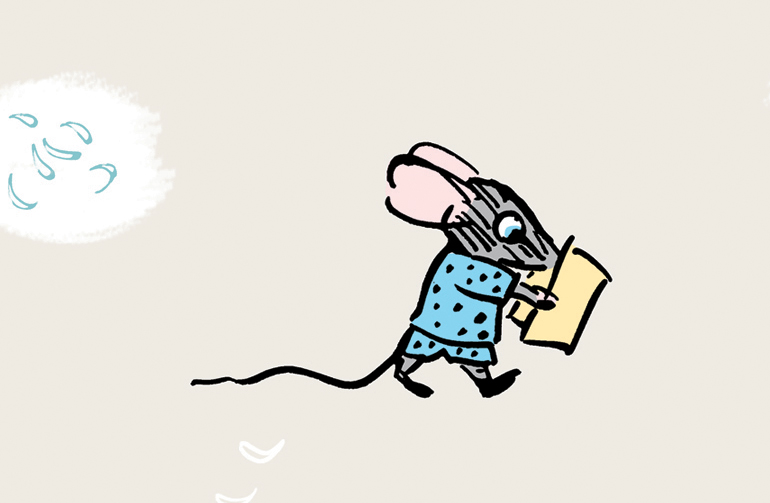
Goodnight, Mice! is a bedtime book, so the ends are muted in colour and evocative of a pyjama pattern. But I really wanted to play around a little further with these sweet mice, so I made tiny, simplified sketches of all of the family members. It was fun creating shorthand versions of each of the characters. The twins of course, are causing mayhem with a pillow fight, and there are stylised feathers floating everywhere (made by pressing down hard with my poor, mistreated dip-pen nib).

Mitzi and Billy – up to mischief as usual.
I feel that Clementine will not be happy about this.
Books and bedtime go together like cheese and… mice. So I put lots of books on the ends as well.
I really hope Billy is not going to flush before Mitzi gets off the loo…
This is the original family from the internal illustrations. Still loose, but more fully formed. (That was not a toilet joke.)

The endpapers for Thunderstorm Dancing were originally to have been printed in two colours, which is why I set them up in black and blue, (black and red for the rear ends) but Allen and Unwin decided to print in four colour process instead. In the internal illustrations, I had sneaked in a playful visual gag where the cat is greedily eyeing off all the fish. I thought it only fair that he got to eat his fish in the end. So below you see him washing up after his meal. (The seagulls are not amused.) In this case, I decided to do the reverse of what I had done for Goodnight, Mice! Instead of shrinking and simplifying the characters from the book, I enlarged them and made them more naturalistic in style.

Front endpapers for Thunderstorm Dancing by Katrina Germein and Judy Watson.
Rear endpapers for Thunderstorm Dancing.
This is a detail of the cat as it appears, quite small, in one of the internal illustrations.
Front endpapers for Leonard Doesn’t Dance by Frances Watts and Judy Watson
Rear endpapers for Leonard Doesn’t Dance.

The ends for Leonard Doesn’t Dance are mostly decorative, but they also set the scene for the story. I wanted them to be sumptuous, because I enjoyed making Leonard’s forest world so much. The front and back ends are continuations of the same setting, except that the moon is lower in the sky after the birds have been partying all night. The party lights can be seen in the distance.
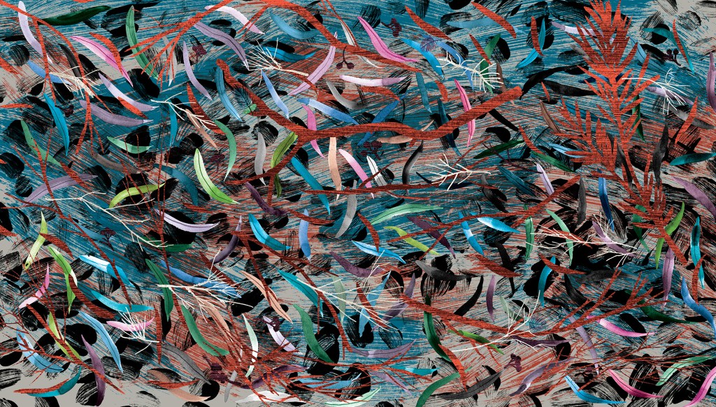
Endpapers from Searching for Cicadas by Lesley Gibbes and Judy Watson

These ends are mostly decorative too, but they hint that in this story we will be looking closely at the forest floor. They were a delight to make, involved a lot of glorious inky mess, and they have their very own classroom activity. You can find it here.

Now we get to my latest endpapers – the ends for When You’re Older.

When I was thinking about what kind of endpapers would be best for When You’re Older, one of my ideas included origami sea creatures, and one of them included a paper crown. They looked like this.
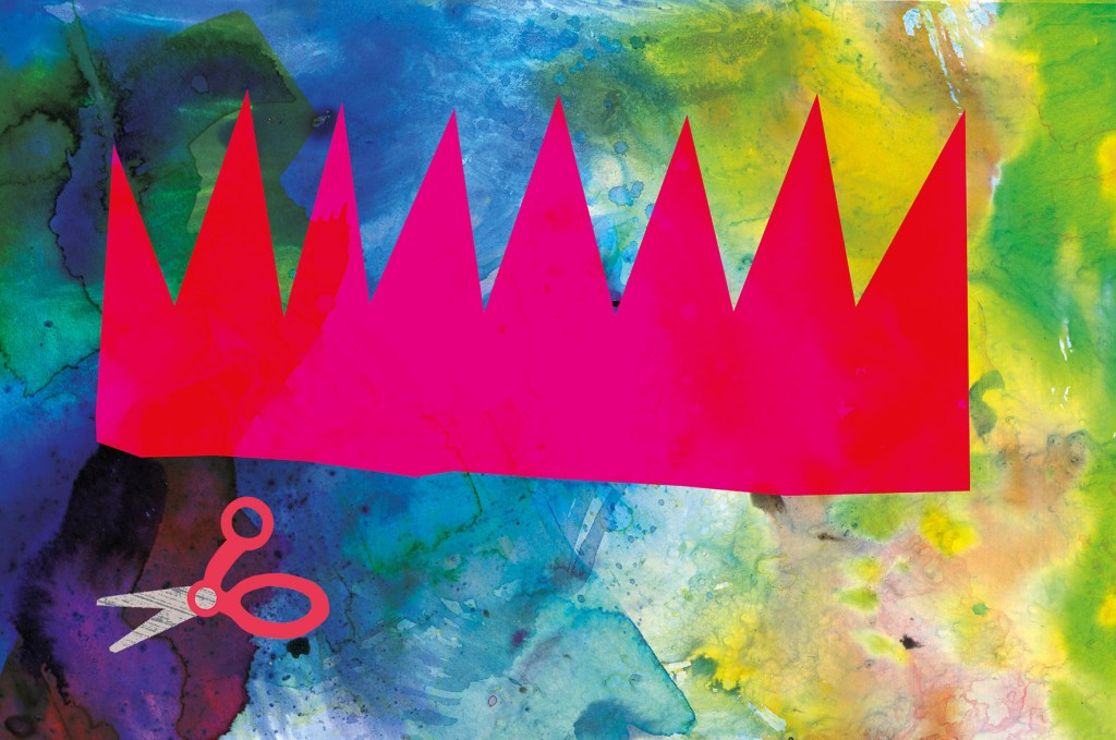
There were a few reasons why these ideas might have been fun and effective:

• Firstly, they are bright and cheerful and the scale of the images is large, which made a nice contrast with the fine detail of much of the book.

• Secondly, they are an easy way to communicate to someone choosing a book, that the story is suitable for a young child.

• Thirdly, they help set the opening scene in the homely world of the brother who is enjoying some paper craft. The crown concept shows us a close-up of what he is doing on the title and half title pages. The origami concept gives us an example of something he might do on a different day. And it leads the reader into the theme of sea creatures that repeats throughout the story.

In the end we decided that the treasure hunting scene (below) would be best, because it is truly dreamlike, and hints that we will be entering a world of the imagination. It reflects the illustration style of the adventure part of the book; full of detailed vegetation, creatures real and imagined and with our boys painted in silhouette. But it is subtly different, in that it is rainbow hued and uses blue instead of black for the details of the ship and characters. The blue has a hazy feel and helps to suggest the dream state. The feel of the endpapers is decorative, but it is really a ‘bonus story’.

Endpapers for When You’re Older by Sofie Laguna and Judy Watson

I had a second idea for a bonus story and I hoped to have different ends front and back, telling two dream adventure tales. But it would have taken too long to complete. I hope to make the second illustration as a standalone, and if I do it will be available as a print. (It involves a giant squid, deep sea diving and more treasure!)
Musings on drawing and architecture from a non-straight-liner

From Tansy Magill by Carol Ann Martin

Some people can draw any building or interior with a sensitivity that invests it with warmth and personality. I truly admire them. For me, all those straight lines are problematic. I don’t feel any love for drawing architectural shapes, even though I love architecture itself. I prefer the outdoors and organic forms, including people and animals. The surface textures, the curved lines and the movement of figures or landscape are much easier for me to successfully express.

Most illustrated books require at least some built spaces to be drawn, and I’ve dealt with this in different ways for different book projects. Here are a few of them.

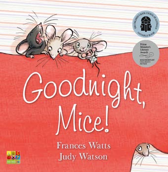
Cover design by Sandra Nobes for ABC Kids (HarperCollins). I remember getting emotional when the publisher suggested the mice could be printed with a spot varnish. I felt that being soft and velvety creatures, they shouldn’t be made hard and shiny! I get quite attached to all the characters in my books and become a bit protective. Embarrassing, but true.

In Goodnight, Mice! By Frances Watts, I made the house organic, the walls, doorways and furniture curved. I took my inspiration from straw bale homes, wattle and daub homes, and hand-crafted furniture. Using a dip pen and ink, there was little opportunity to be overly fussy. Drawing with a dip pen sometimes feels like trying to control a half wild pony that’s running away with me.

The opening scene from Goodnight, Mice! showing a very small house with an enviable chimney.
Getting ready for bed, and selecting a book from a rather quirky bookcase.
The kind of bed that inspired the mousy furniture. (The mice must have used much smaller sticks!)
Sandra Nobes also designed this cover, for Allen and Unwin.
The book has just been re-released in paperback. Hooray!

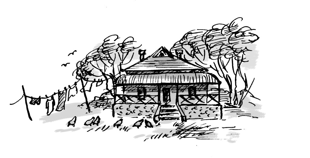
With Thunderstorm Dancing by Katrina Germein, I was happy with the small drawing I did for the back cover (below). Perhaps it worked for me because of the loose lines of the dip pen but especially because of the small size. There’s no room to fuss with a 30mm wide building. Snuggling the building into the hill and embedding it in a stormy sky helps to give it a certain ‘rightness’. It takes on the personality of its surroundings.

A small windswept beach house and matching chook shed for the back cover of Thunderstorm Dancing.

The veranda was perhaps not as successful as I would have liked, being rather stiff, but I made the focus the stormy lighting; the contrast between dark clouds and the golden late afternoon glow of the beach and figures. I added texture to soften it a little. Eep!

A lot of straight lines for a non-straight-liner! Hopefully the focus remains firmly on the atmosphere.
An interior that had to look warm and cosy, yet storm-lit. My selection
of furniture reflects again my need to put curves in wherever possible! And it is funny to me
to see how often my colour scheme is a soft, bright red and a greenish teal.
This lovely cover design is by Amanda Tarlau, for Walker Books.

My garden shed from Searching for Cicadas by Lesley Gibbes, was created in a similar way. Mostly pencil and wash, but with added texture and digital colour. (Note the soft red and greenish teal colour scheme!) My architecture leaves room for improvement, but hopefully the warmth of the characters on the page, the light, foliage and pets set the right tone. And on the next page, we happily marched off into the bushland away from human structures! Phew!

Another black cat. I have a one-eyed black foster cat climbing over my drawing board as I’m typing this
and my three-legged dog Noodle appears in the illustration, proudly flourishing four entire legs.
Off into the natural world.

I also have an unpublished project, where the my buildings again reject straight lines. Based on the trulli of the Puglia region in Italy, they have lovely domed roofs and soft curving interiors. I even stayed in a glorious trullo here, and did some research for my illustrations.

Trulli from a dummy book
Trulli homes in Ostuni, Italy.

But it was exciting to take a different approach to the house in When You’re Older by Sofie Laguna. Here I used the straight lines of the room and other man-made objects to my advantage. I accentuated them, taking inspiration from the marvellous Ezra Jack Keats and pared them back to simple blocks of colour that mimic paper collage. Now they acted as a foil to the scenes beginning on the next page, where the story moves into the imagination and benefits from a strong contrast in style.

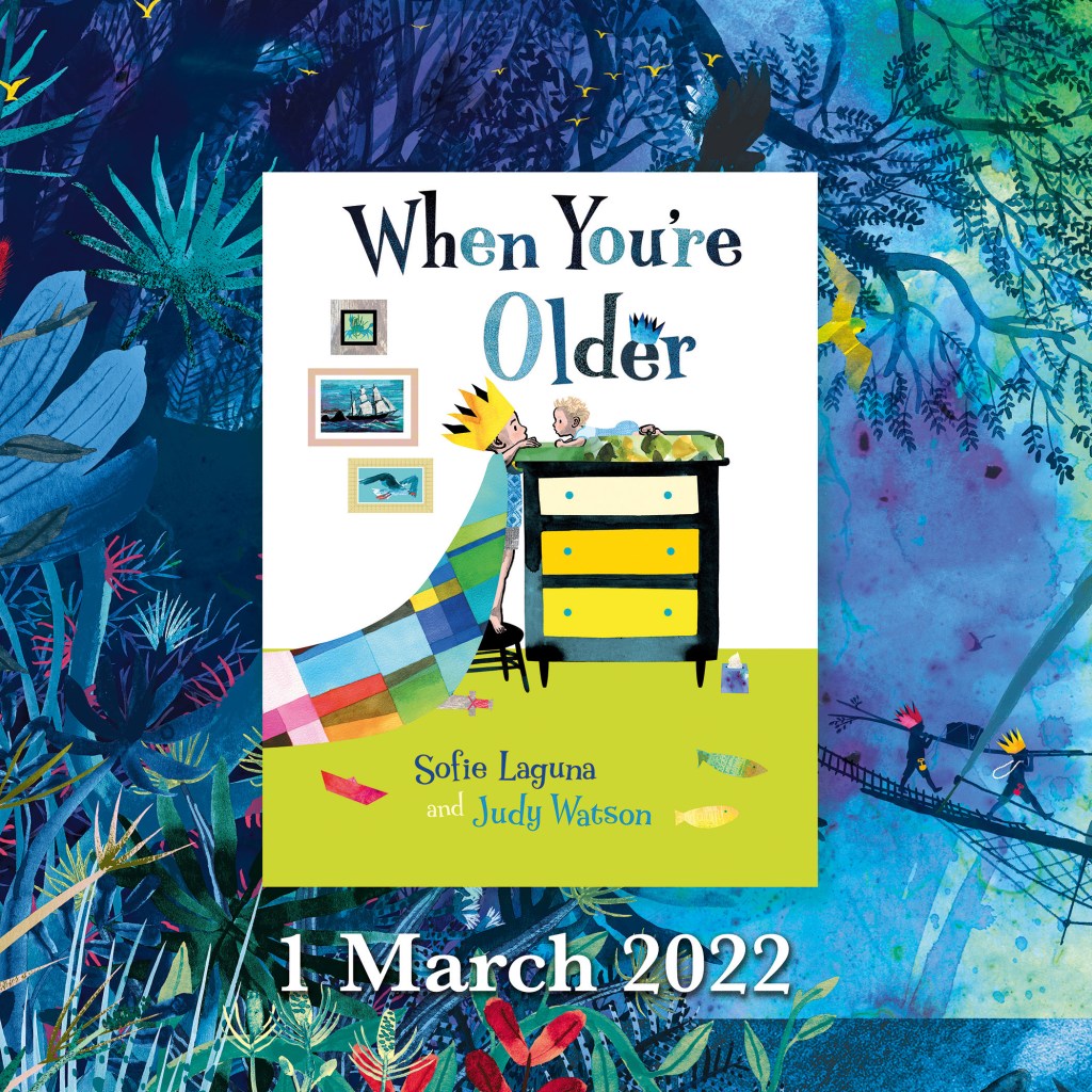
I know you’ve seen it already, but here is the cover of When You’re Older,
designed by Sandra Nobes for Allen and Unwin. Out 1 March 2022.
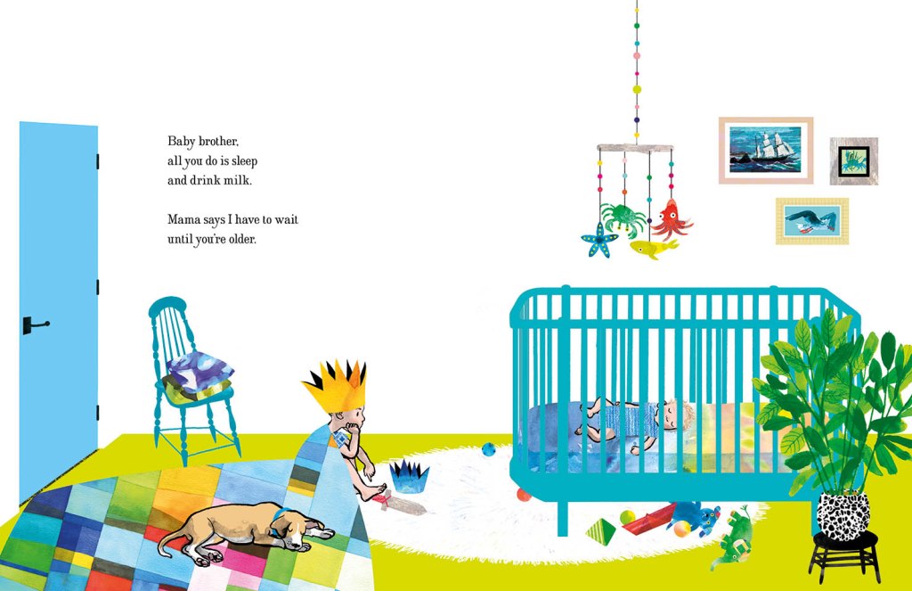
Straight lines, no regrets. The opening bedroom illustration in When You’re Older.

In the bedroom at the start of the narrative, we have animals and ships on wild seas contained in frames that have been reduced to a series of rectangles with no attempt to suggest a hook or a natural hanging angle. The boy too is sitting, waiting in a rectangular room like the paintings in their frames. But the small animals dotted around the room, the houseplant and the two kinds of boat (origami and painted) have fed his prodigious imagination which breaks loose as we turn the page.

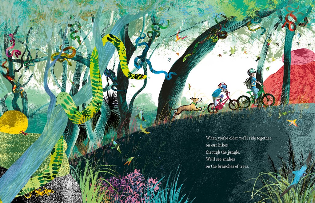
Rampant curves and movement take over the book from here. (Do I spy soft red and greenish teal?)

Here everything has broken out of its containment and we see the beginning of an undulating landscape, teeming with life and with an exaggerated forward slant like a slingshot that has just been released to propel our characters forward into the world.

I’ve used the solid graphic shapes here and there through the book, most often for man-made things like bikes, ladders, tents, and the fanciful double-ringed shape that suggests a view  through binoculars. So the contrast between rampant texture and solid graphic shapes continues. But on the pages dedicated to the immense power of nature, it is not really in evidence at all, and expressive brushstrokes set the entire scene until we return at last to our original bedroom.

Upcoming events to celebrate When You’re Older

Wednesday 23 March to Tuesday 19 April
Colour, Line and Collage: Mixed media works in and around books.
Exhibition of original works including the patchwork paintings featured in When You’re Older. Some prints of the illustrations will also be available to order.
At Streamline Publishing and Gallery
22 Commercial Place, Eltham 3095
Open Wednesday to Saturday 11am – 4pm, Every second Sunday 1pm – 4pm.
Enter from the Town Square.
Above Eltham Bookshop

Saturday 26 March – kids’ drawing / collage workshops and signed book sales.
Frankston Library
60 Playne Street, Frankston
Phone 03 9784 1020

Sunday 3 April WORKSHOP 2.30pm – 5.30pm
STORYBOARDING – taking a text and moulding its shape on the page.
A book illustration workshop for adults and young adults.
This three hour workshop will be hosted by
Eltham Bookshop and held at Streamline Publishing and Gallery
22 Commercial Place, Eltham 3095 (Above the bookshop)
To coincide with the launch of When You’re Older and the exhibition
Colour, Line and Collage: Mixed media works in and around books.
I will take participants through my process: How I responded to Sofie Laguna’s text and, together with the publishing team, brought her words together with my ideas to create finished art for the book. After a short break, participants will use a sample text to create a storyboard of their own.
Entry $80 includes a signed copy of the book, light refreshments and all materials.
Bookings can be made through Eltham Bookshop
Tel: (03) 9439 8700
Email: books@elthambookshop.com.au

When You’re Older

In stores from 1 March, 2022.

On the first of March When You’re Older will be in bookshops. Hurrah! And I’ll be in two of them on the same day, decorating the windows to celebrate the release of the book. I’ll be starting out at The Little Bookroom and then zipping across to Readings Kids.

I’m really happy with the cover. We went all over the place exploring cover options, including under the sea and up a tree. But this one feels right. The focus is squarely on those two faces. They’re the heart and soul of the book. (I admit I’m a bit infatuated with the chest of drawers, too.)

Book designer Sandra Nobes did an amazing job with the typography. Her title lettering expresses the tall and short of our two characters, complete with small crown. And her selection of typeface for the creator names took inspiration from my hand-drawn letters and is a near perfect match with a few less curls. (You can see my curly writing above, with a baby seemingly floating over it!)

If you’re thinking the book is about nappy changes, don’t be fooled by the box of tissues, although you might need one yourself. Perhaps, like me when I first picked up the manuscript, you’re thinking that the book will be about sibling rivalry. It’s not.

Inspired by hopes for her own two children and interestingly by the imprisonment of journalist Peter Greste in 2013, Sofie Laguna’s words are about love and about brothers looking out for each other. About a big imagination. A big world. A big adventure and big danger.

There are also lots of tiny things.

One of the great joys of parenting small children for me, was the experience of reading aloud to them. I loved to witness their immersion in the world of each picture book; their interaction with the page as well as the story, fingers keenly pointing out the important parts, and often the tiny details. So while I was working on When You’re Older, I imagined little hands holding the book and little fingers pointing. Every lizard, butterfly and bird was made for this purpose. Every footprint in the snow.

I think there will be much counting! How many birds can you find? How many bats? Ducks, lizards, butterflies? These small things are only footnotes to the main story, I know. But I am so looking forward to seeing some real fingers exploring the book.

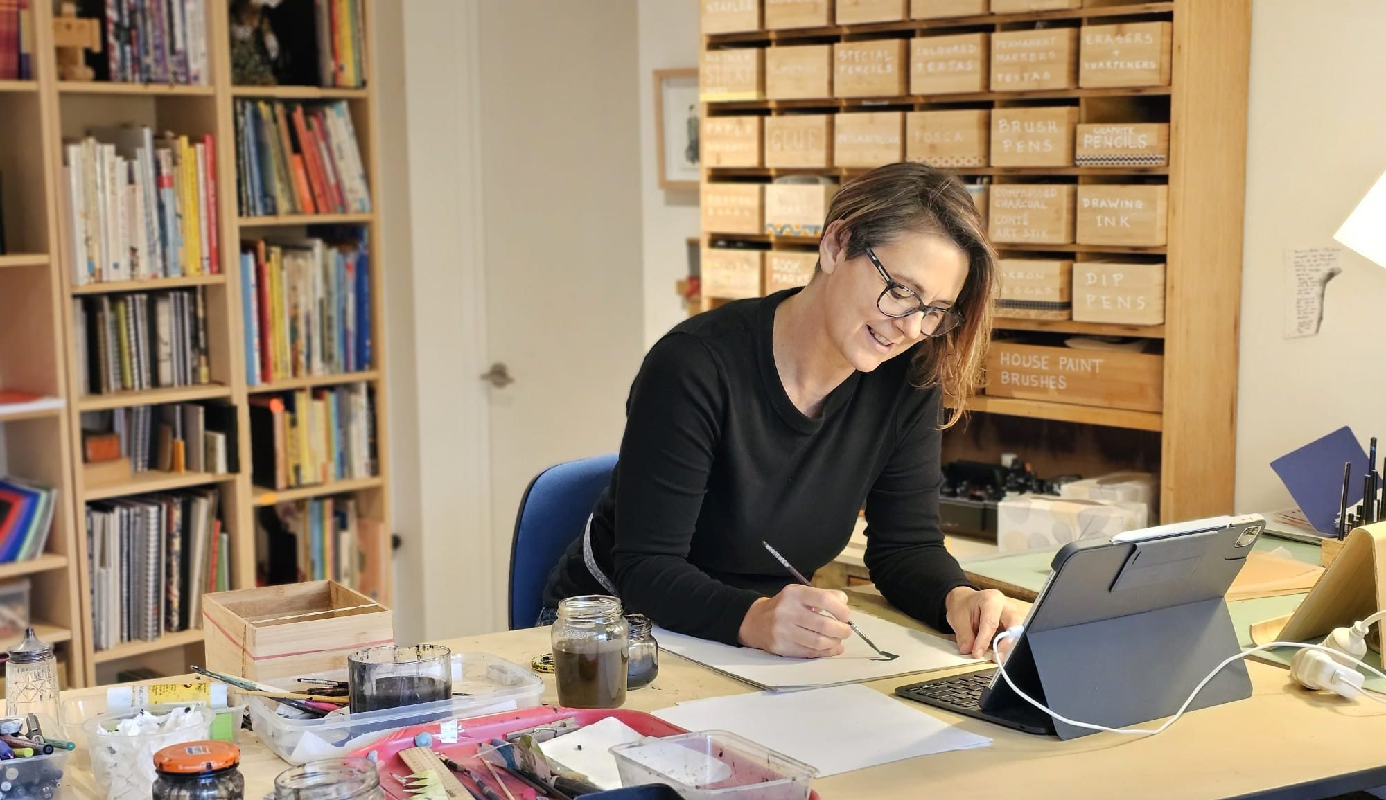
Please pop in and say hello if you’re in Melbourne on 1 March or in Mornington on 4 March. There will be signed books available to purchase. I’ll be the one with the paintbrushes and Posca pens, decorating the windows. And I look more or less like this.

How many fishes can you spot?