
Lunch break bird blobs.
Felt tip, watercolour pecking and white acrylic flecking.

Lunch break bird blobs.
Felt tip, watercolour pecking and white acrylic flecking.
I could’t help noticing that these blobs painted late last night when feeling tired and a little low, all have one thing in common.
Despite the fact that they all were generated from random colour blobs, they all look downward to the bottom right of the page.

contemplative cassowary
Scott pointed out that this fellow looks Muppetish. A compliment :-)

pondering purple person

preoccupied parrot

Ptentative Pterododal
No wonder this Ptreposterous Pterododal is Ptentative… His wings are ridiculously inadequate for his size. I’d stay on the ground, if I were he.
Here are some of the coloured blobs from a week ago.
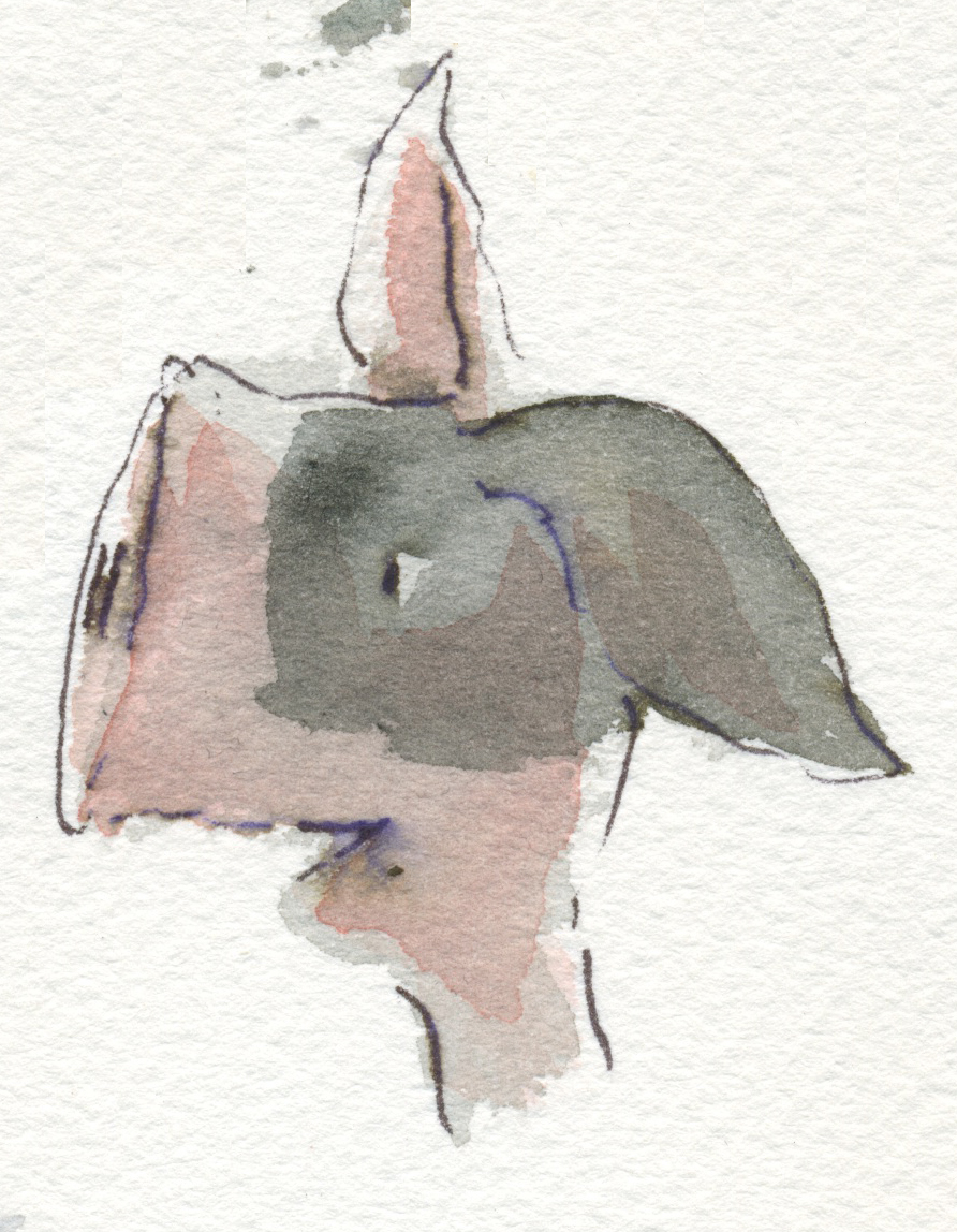
An assortment of mutts, birds and abominations.

Sickeningly Girly Mutt

Disappointed Mutt
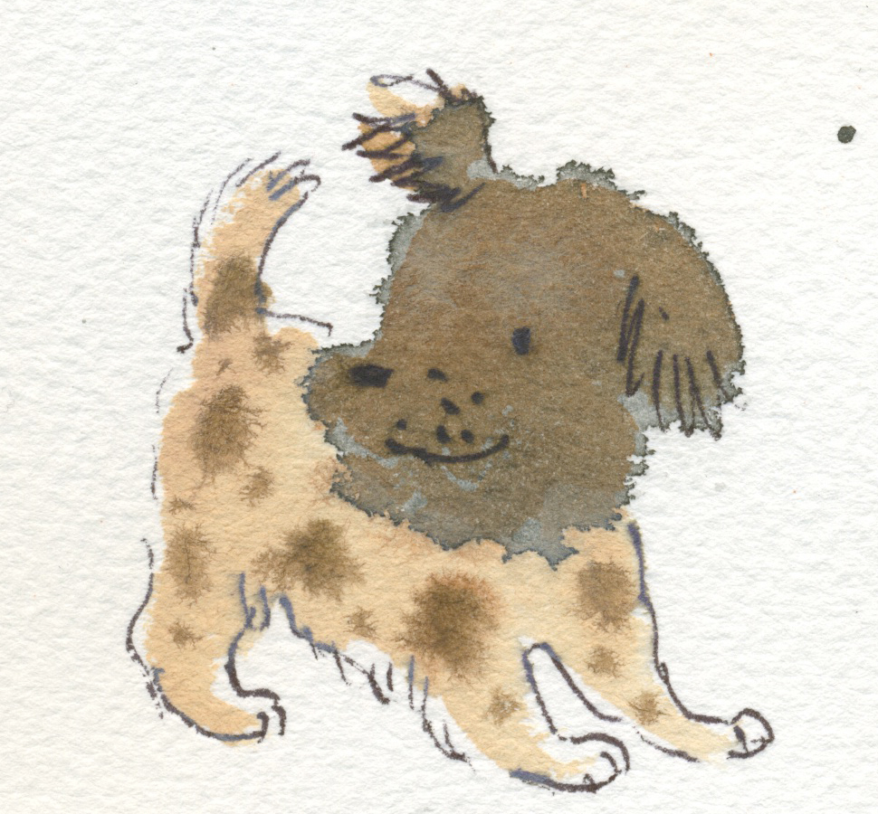
Cheery Puppy Mutt

Gloomy Mutt

Sniffy Mutt

Wiry Mutt

Cheery Bird

Moulting Bolting Bird
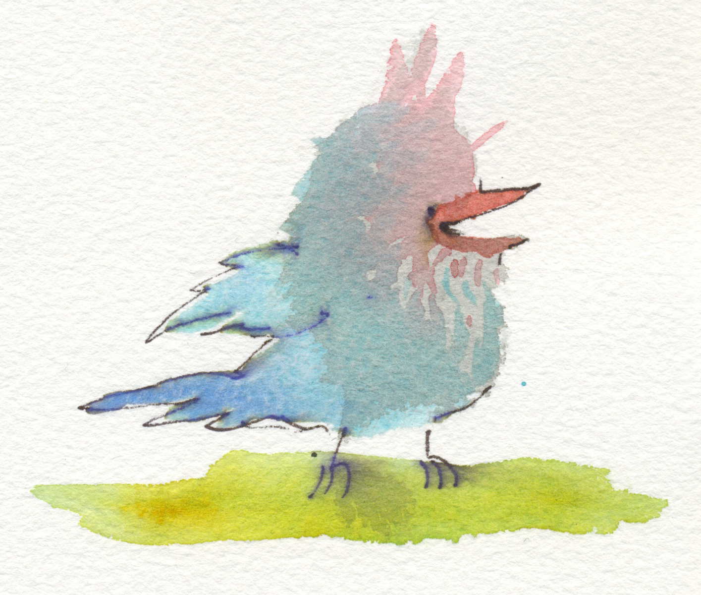
Silly Bird (Hugo’s favourite)
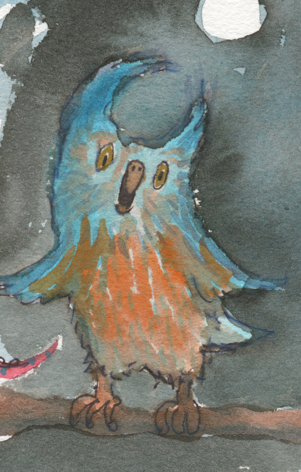
Opera Owl

Salvador Snail
Political Pig

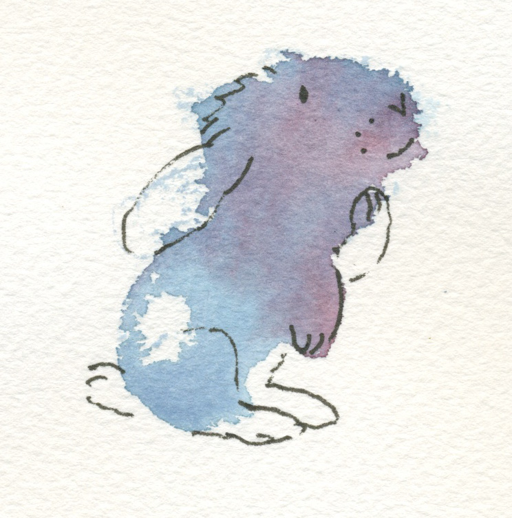
Bunny in a Box

Our old boy, who sleeps with his tongue hanging out now. (But not with his eyes open…)
Pencil sketch with digital wash.

Time for a 2 minute Big Blob. Not on watercolour paper, and hence no fuzzy edges.
Well here they are! Some mixed results.  I will include a few close-ups of the more interesting ones.
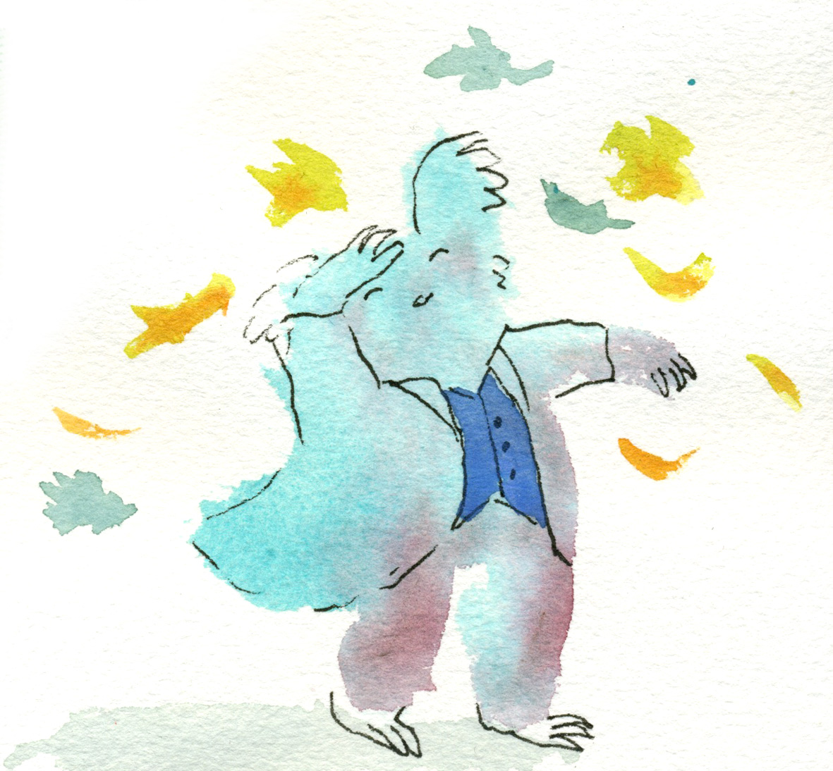
 People blobs! Can you believe it?
 Assorted terrestrial and aquatic monster blobs.
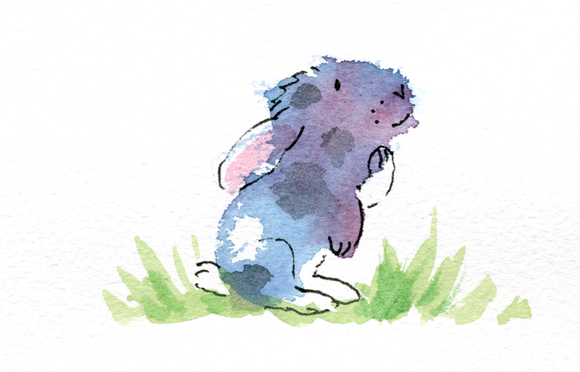
  A sad rabbit blob


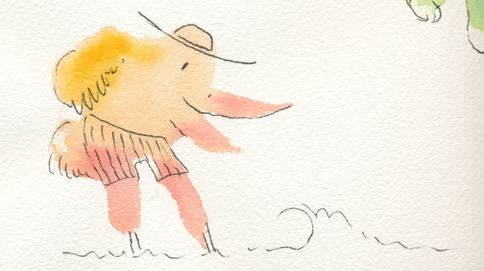
 And a range of birds in varying degrees of preposterousness. Including the rare elephant bird. Are you sick of blobs yet? I don’t think I am quite. Here is a sheet of blobs done during the kids’ drama class on Wednesday evening. A ran out to the car with a page of still wet blobs to play with when we got there. It is quite a stimulating way of spending a few minutes, and more fun than sudoku for me :-)
  The dogs were the things that worked best here I think. I extrapolated a lot more than I have previously too. Because some of the blobs suggested just part of a face.
Here are the ‘second pass’ blob creatures. There are also a couple that didn’t make the grade with the first pass and are now so much improved that they are going up after the second pass.

This dino is as corny as ever :-)

Little Elephant is messier but richer for his second layer of colour, I think.

I like Little Bird much better for his red head and little tail feathers.

Stork looks much better now to me. He’s having a ball at the beach.
Thoughtful bunny was not a success to my mind. The patches were a mistake, but you never know until to try.
I like this guy now he has some autumn leaves bothering him. Lots of movement now. I could have painted his coat actually…

This funny little beckoning dog didn’t go up first time. He’s better with a bit of shadow. (Do you recognise the cloud over Stork and the autumn leaf here? They are all close neighbours on the same page)

Finally, a parrot who didn’t make the first cut. I like his feathering now that he has a bit more colour. Ticking in feathers or fur really does something for me. I love it.

And here, to finish up, a whole page of weird new blobs. We shall see what happens when I add a touch of colour to some of them. It’s a different effect of course, over grey; the colours are subtler, less pure. But this is what I did with the bookmarks originally.
And now it’s back to my Thunder work for the day.
Naturally, after playing with the grey blobs on the weekend, I was tempted to whip up some colour ones late last night to squeeze some in for the 52 Week Illustration Challenge – week’s theme ‘Colour’ before the new theme today. (Themes change each Wednesday.)
It really was late at night. So these were ‘one pass’ illos. I nearly didn’t bother scanning them because I wanted to go to bed, but the photos were too awful. Here they are in their scanned, and unedited state.
Stork on holidays at the beach.

Dramatic bear… koala… creature? (someone suggested music conductor)

Elephant unsuccessfully pulling on trousers.

Little bird

A sentimental dinosaur. I actually thought this was a bit too corny. Don’t know what came over me. Maybe Facebook-Peer-Pressure!
A thoughtful baby rabbit. I love the way the fuzzy edges and curves of the blobs can just summon a character into my head… if a character doesn’t appear fully formed in my mind’s eye beforehand, it generally doesn’t turn out well on the page. Of course the fuzzy edges on this coarse watercolour paper are quite suggestive of animals because they look a little hairy. But let’s admit it… there’s a bias there anyway!!
Today, I spent half an hour doing a second pass with more colour to enrich them… and to experiment of course. Some were improved and some were ruined by the second pass. I’ll see if I can find time to scan these and post them tomorrow or the next day.
Last weekend was the Warrnambool Books Children’s Book Festival in celebration of the bookshop’s 30th anniversary. I was a guest illustrator on Friday and did a school visit at St Joseph’s Primary School before a book signing at the family owned bookshop.
While I was there, I decided to mix up two ideas from other clever illustrators. I have seen Jude Rossell giving out bookmarks with small illustrations on them at illustrator events. And Alexis Deacon has described his fun practice of painting or drawing blobs and then turning them into something here and here and most awesomely here.
I was just after something simple and quick to do in between signing books, so mine were pretty basic but the kids loved them. Here are some of the bookmarks I did the next day at home, simply because they were so much fun. In fact it was rather hard to stop!


They take about one minute each.
• First paint a pale grey-brown blob with some interesting projections and bumps.
• Then paint a few more while the first one dries.
• Go back to the dry blob and add a few lines with a felt tip pen to turn it into whatever springs to mind.
• Finally, add a touch of colour if you want to. (I didn’t do this to many of them in the bookshop. They were very simple.)
My two boys joined in with great enthusiasm and did some fabulous ones. It is a good activity to do with kids, and taps into their wonderful imaginations. In the case of my two boys, it was fun to see how they formed an alliance whereby Arthur would paint the blobs, and then after they dried, would ask Hugo what the blob should be. Hugo, with barely a split second’s hesitation would say: ‘That’s a pig blowing a trumpet. That’s a fish with legs. That’s a cow shouting.’ And so on. Arthur happily drew them after that.
Like me, they found it hard to stop once started :-)
I recently looked up the correct usage of fish vs. fishes. I was pleased to see that fishes is the correct term when referring to different varieties. There’s something nice about the word fishes and it goes nicely with swishes and wishes.
If you happened to be a fisherman and you caught 25 fish they would all have to be of the same species.
These fishes are not of the same species. Some might say they were not drawn by the same artist.
Sometimes I worry that I should have a single, recognisable style; that all my work should be instantly recognisable, like a trademark. You can always recognise a Quentin Blake, a Mondrian, a Mitch Vane, (to take a more local example).
Other times, I say to myself… whatever comes out, comes out. Art is a lot about the process of discovery, the process of play, imagination, exploration, invention. And when I wander into new territory, with an insatiable curiosity for (and delight in) new artistic approaches, I am glad to be a wandering artist… I learn new things all the time and that is a great thing to find in life.
Detailed, or static styles are not, and never will be my strong point. I’m too impatient (and ambivalent) to invest much time in details, so my ‘detailed’ work never stands up by comparison with the work of those who specialise in that area. But every now and then I come back to it, and play around and there’s something satisfying in the process, even if the result lacks both the liveliness of my quicker work and the detail that would seem to be required. Often the honesty of the piece redeems it.
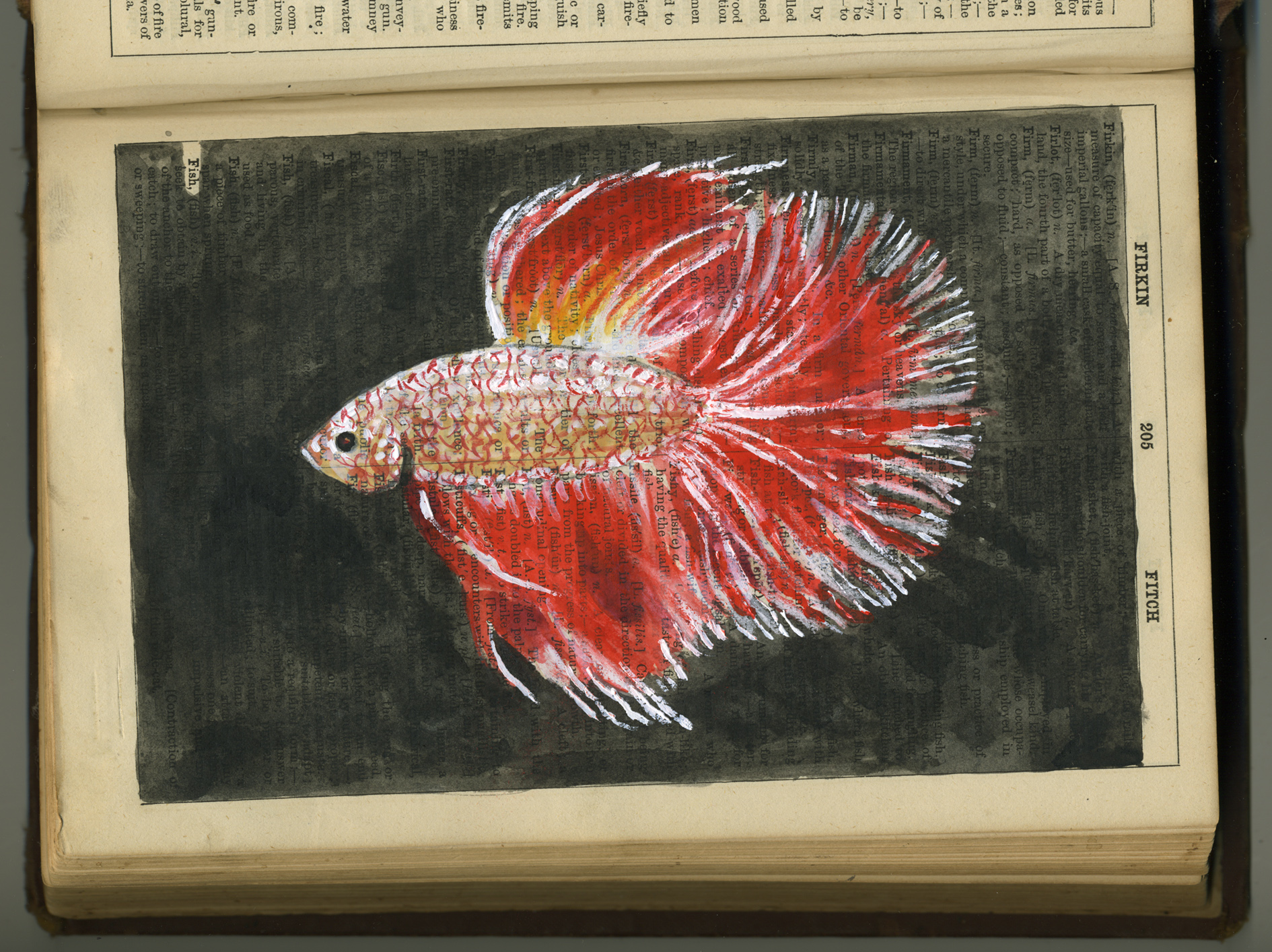
In this case, the vintage Collins Dictionary (with pages disintegrating and falling out) seemed to ask for a static approach. I think the single artwork above is unremarkable. But if I were to fill the book in a similar manner with various artworks, the book itself may become a thing to treasure one day. The fish will be swallowed by the larger beast.

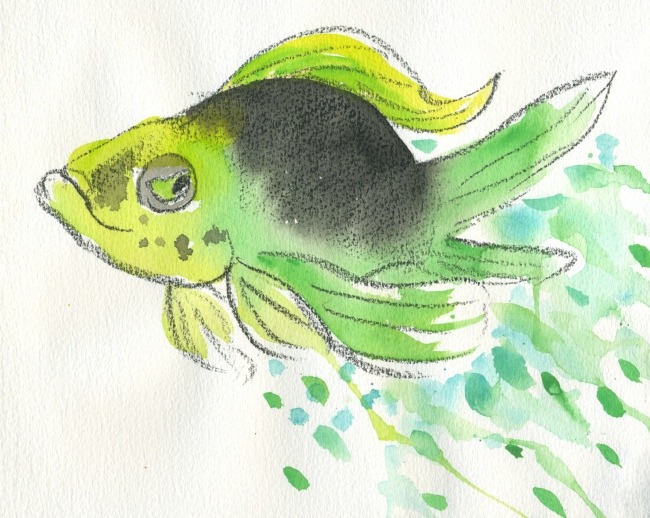
Here is a return to my much quicker approach. The prismacolour artstick strikes again. It may be partly inspired by political weariness… the idea of the dangling lure… leading to what?…
But mainly it was a very rapid experiment in the power of transforming a sketch with PhotoShop colour. I’ll be using this technique in my next book, so why not?
Finally, a very quick sketch with watercolour. The first watercolour experiment I did (not shown here) was deader than a doorknob. This was a 10 minute exercise in proving to myself that I could do the same fish with a bit of life. Not sure what he is up to. I think he may have the same kind of determined expression I adopted when drawing him…
