At the start of the school holidays, I was invited by artist Rosalie Street to participate in a blog tour… which means answering some questions (below) and getting some other people to do the same next.
Here is Rosalie’s interview response. A visit to her blog to enjoy her lush canvases and delightful merchandise is well worth your while.

Gold Leaf – by Rosalie Street
The blog tour topic is The Writing/ Drawing Process. Since as yet, I have found little time to work on my writing projects and instead have been madly drawing, I’ll answer the questions in the context of my artwork.
The first bit (the questions)
1. What am I working on ?
Thunderstorm Dancing, a picture book by Katrina Germein
At the moment I am in the late stages of final art for a picture book by Katrina Germein to be published by Allen & Unwin. The book is called Thunderstorm Dancing and it has been over two years since I first starting mulling over the project.
As soon as I read the manuscript, I thought it would be both a great text and a very difficult text to illustrate. It has indeed proven difficult for me, but I also realise that I suffered from the internal pressure that comes from winning an award; this will be the first of my work to be published since that award and my inner self told me very sternly that it will have to be good. But I now move towards the completion of the book and I’m looking forward to seeing it in print.

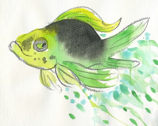
An unused sketch for ‘Thunderstorm Dancing’
There have been many sketches made for this book. A decision on medium was elusive for a while. But it came along in the end, and I’ve really enjoyed the layering and scratching in PhotoShop combined with the earthy texture of the real paint and pencil on Litho paper.
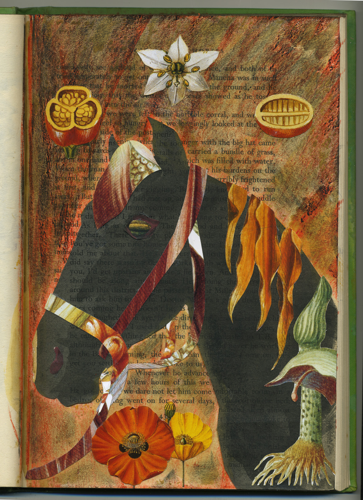
A small fragment of one final illustration from Thunderstorm Dancing
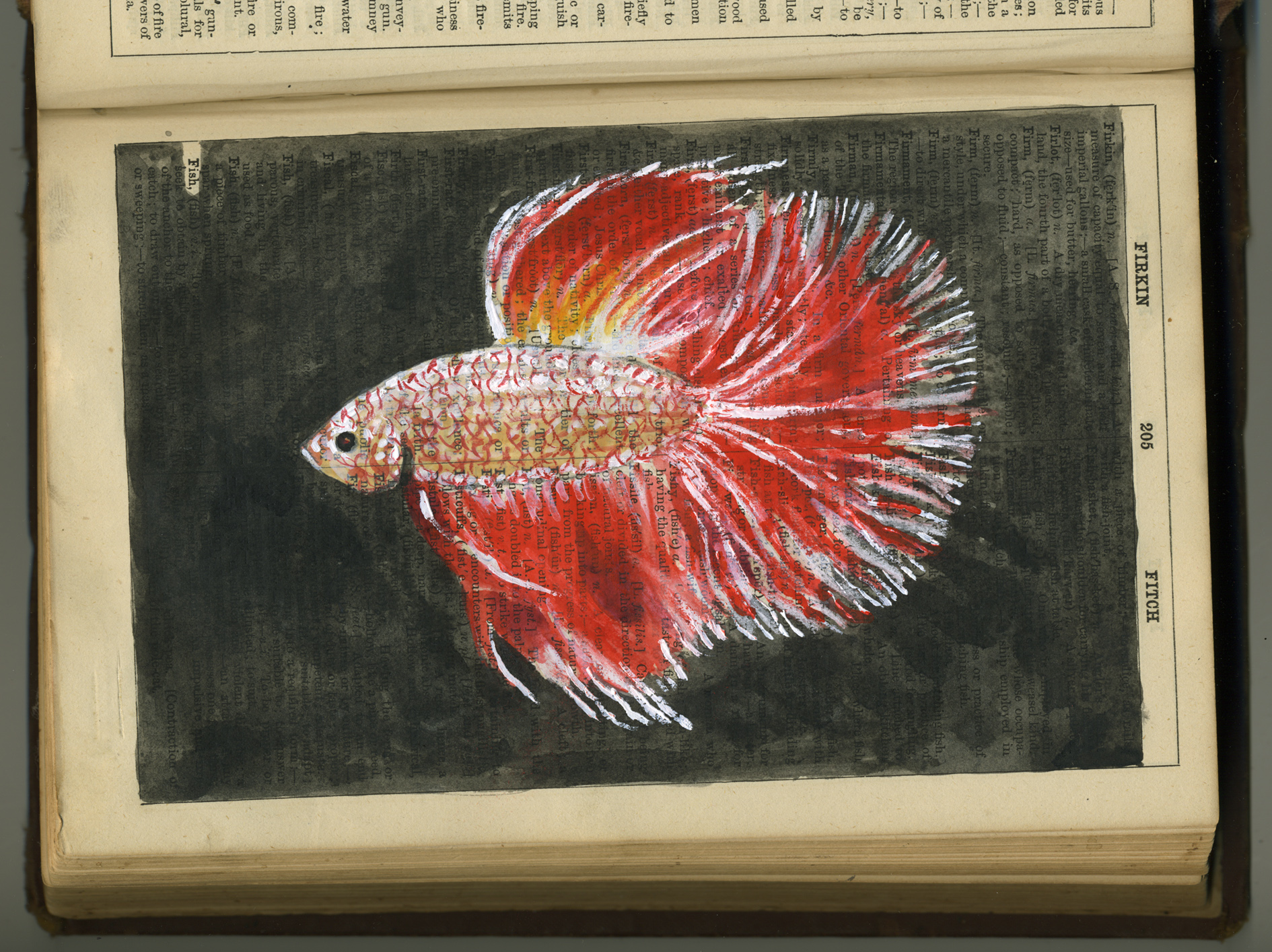
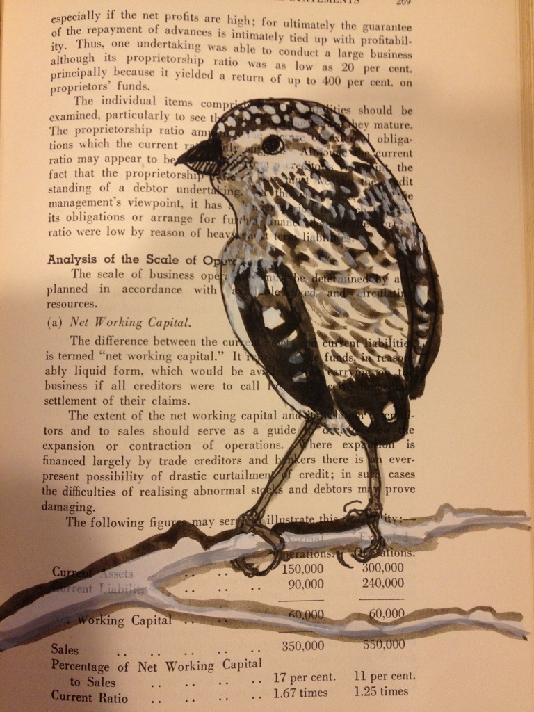
Altered book art
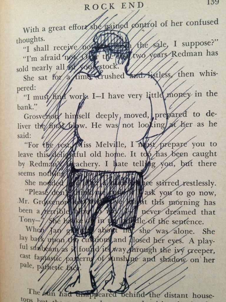
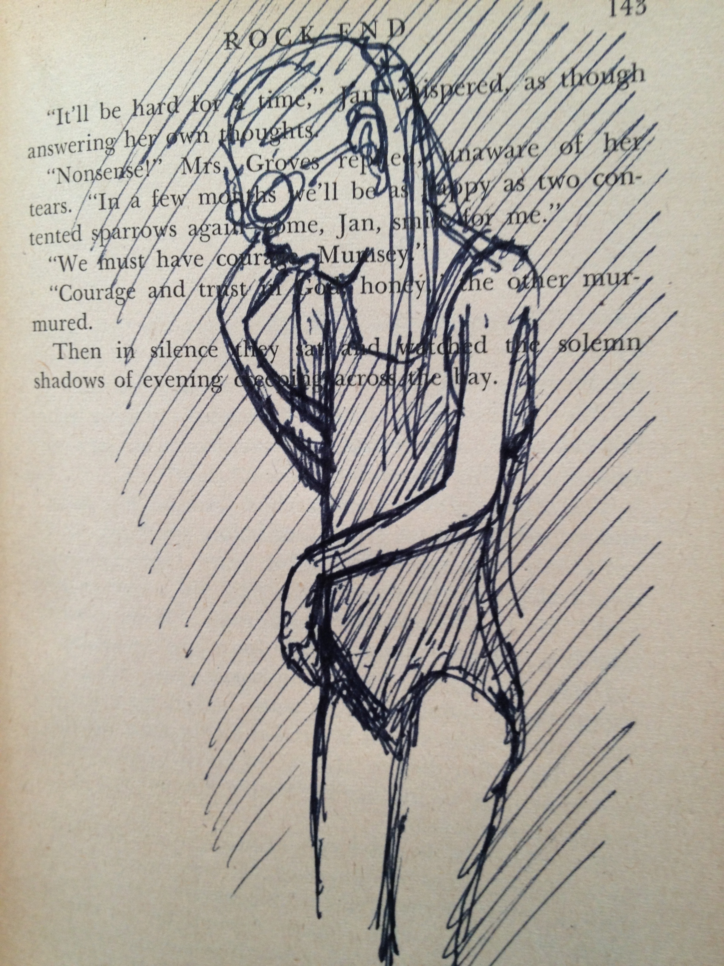
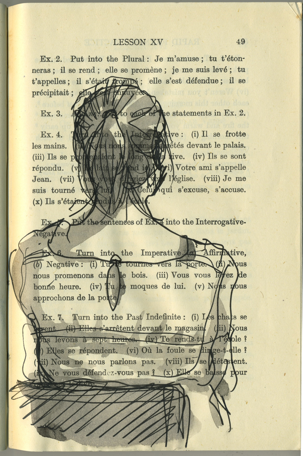
Last year, while struggling to progress with the picture book, I almost accidentally began sketching in old books as a form of relaxation. I say almost accidentally, because I have admired altered book art and found poetry for quite some time, and had always intended to try it. But starting was not a deliberate step into something new. It was a gentle bit of play, while watching my children in their swimming lessons.

drybrush sketches in the bombing zone of the local swimming pool. Ink on vintage book page.
I began sketching them and other children. And I really loved the effect of the drawn image on the printed page. It also helped me with Thunderstorm Dancing, because I had decided early on that the family in the story would be at a beach house, and the main characters all in swimming cosies.
Altered book art continues to be one of my favourite activities, and I intend to do much more of it, and to explore new ways of using it in art projects.
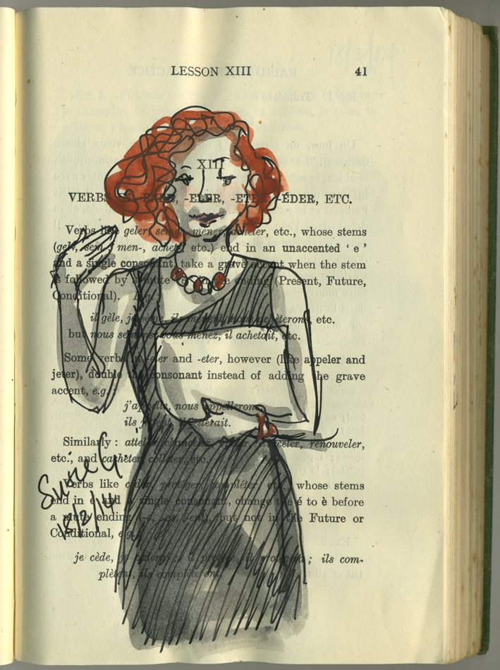
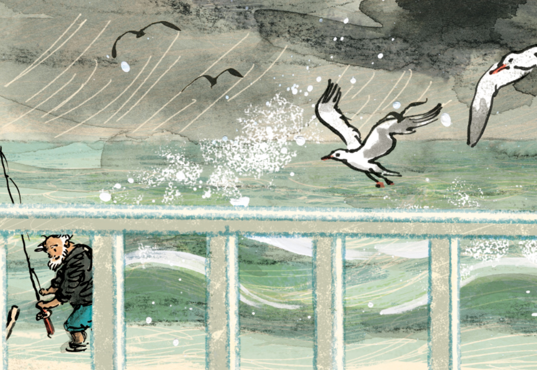
52 Week Illustration Challenge
The 52 Week Illustration Challenge, dreamed up by Tania McCartney, was something I joined early this year. It requires participants to produce artwork to a given theme that changes each Wednesday, and then post them on the 52 Week Illustration Challenge FaceBook page.

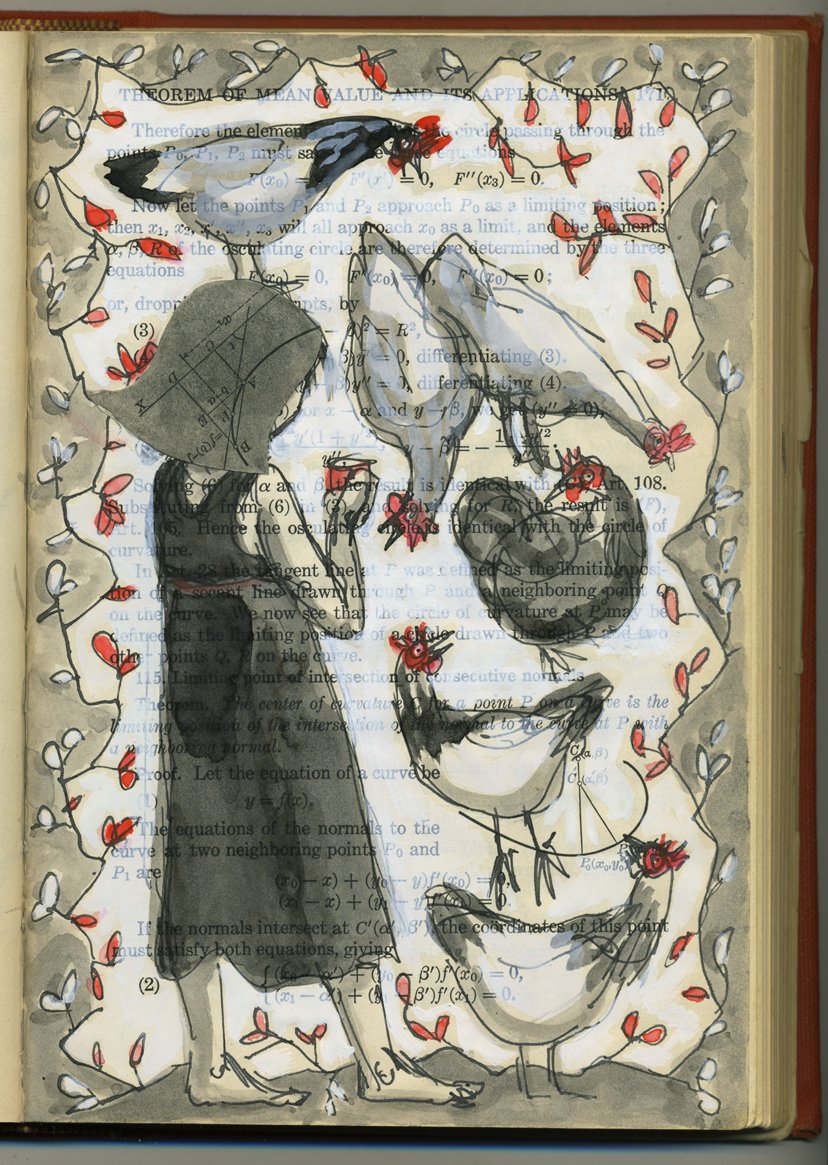
52 Week Illustration Challenge: Week 14: simplicity.
This was a really enjoyable experiment with ink and watercolour
One of the things I loved about it was that the community of people involved were from varied backgrounds and were supportive and kind to one another. Since early this year the group has grown to over 2000 members, many being expert practising artists and the standard of work has I think, sadly frightened many of the less skilled artists away, but the mood of generosity remains. And it is surprisingly good to have a theme to work to each week… often themes that I find very unappealing until they lead me off into some fun experimentation.
I have deliberately kept this challenge as a low-profile task for myself. I never spend long on anything I do for The Challenge and never worry too much if the work is imperfect or not my best. This, along with blogging imperfect work, has been a really healthy learning experience, and a great way to keep producing lots of other work and exploring as an artist, as well as doing my book project.
Clive Hicks-Jenkins’ Puppet Challenge
This is an on-line exhibition organised and curated by Clive Hick-Jenkins along with Peter Slight. I’ve not done so well with this one. In contrast to the other challenge, I have allowed this to become larger than life and daunting. I also failed to come to a decision over subject and medium, although my lightbulb moment came today in the shower (they often do happen there) when I may be too late to make it. So I’m not sure if that counts as something I’m working on or not…

Appropriately perplexed looking sketch of Greyfur the kangaroo who was my original subject matter for the puppet challenge
Graphic design work
Periodically I take up graphic design work if it is not too time consuming. I enjoy this work very much, but too often lately I have had to decline offers of work due to the unfinished book and lack of time. Some of my favourite work is with the Australian Children’s Laureate support team who produce various publications and branding items every now and then. In this context I enjoy using other artists’ work and modifying it to use as part of a design. Ann James drew the magpie who became the Australian Children’s Laureate logo and I have used him in lots of ways.
The Australian Children’s Laureate logo in one of its formats
School children from around Australia made artwork that I used in silhouette for the pitch for Boori Monty Pryor’s Storykeepers documentary.


Family life
This project of course doesn’t belong down the bottom here. It’s a very big part of my life – too big to summarise here. So I’ll simply say that I keep myself busy with two much loved youngsters Arthur and Hugo, husband Scott, the dog Dexter and chickens Hilda, Emily, Poppy, Storm, Stella and Vita.

Vita – Queen of the Backyard
My own writing projects
This gets a wee mention at the bottom. In fact there are several projects I’m very keen to get on to, that are waiting in line for me to find a bit of space and time. I look forward to launching into them.
2. How does my work differ from others of this genre/ style?
Watch this space
3. Why do I draw/ paint what I do ?
Watch this space too
4. How does my drawing process work ?
Hmmmm…