Lunch break bird blobs.
Felt tip, watercolour pecking and white acrylic flecking.

Lunch break bird blobs.
Felt tip, watercolour pecking and white acrylic flecking.
I could’t help noticing that these blobs painted late last night when feeling tired and a little low, all have one thing in common.
Despite the fact that they all were generated from random colour blobs, they all look downward to the bottom right of the page.

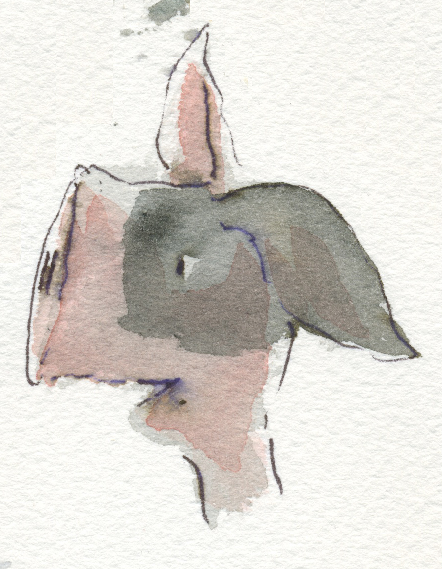
contemplative cassowary
Scott pointed out that this fellow looks Muppetish. A compliment :-)

pondering purple person

preoccupied parrot

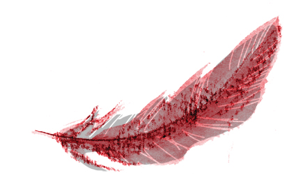
Ptentative Pterododal
No wonder this Ptreposterous Pterododal is Ptentative… His wings are ridiculously inadequate for his size. I’d stay on the ground, if I were he.
Here are some of the coloured blobs from a week ago.
An assortment of mutts, birds and abominations.

Sickeningly Girly Mutt

Disappointed Mutt
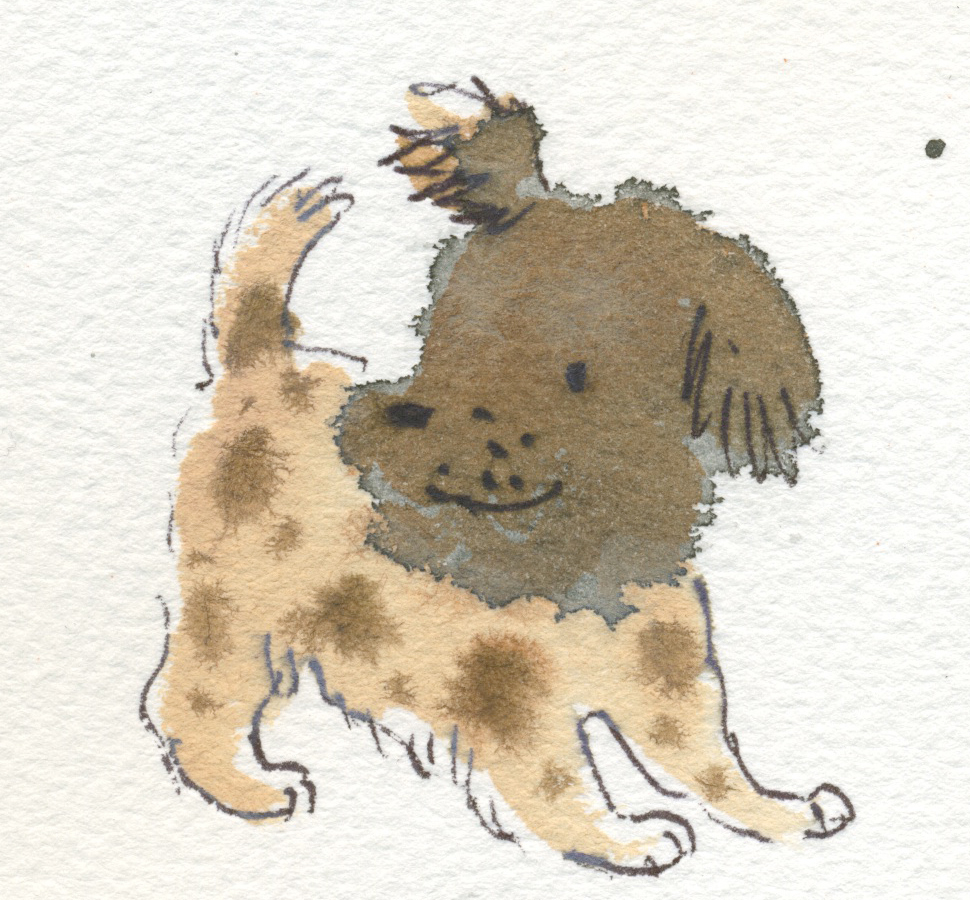
Cheery Puppy Mutt

Gloomy Mutt

Sniffy Mutt

Wiry Mutt

Cheery Bird

Moulting Bolting Bird
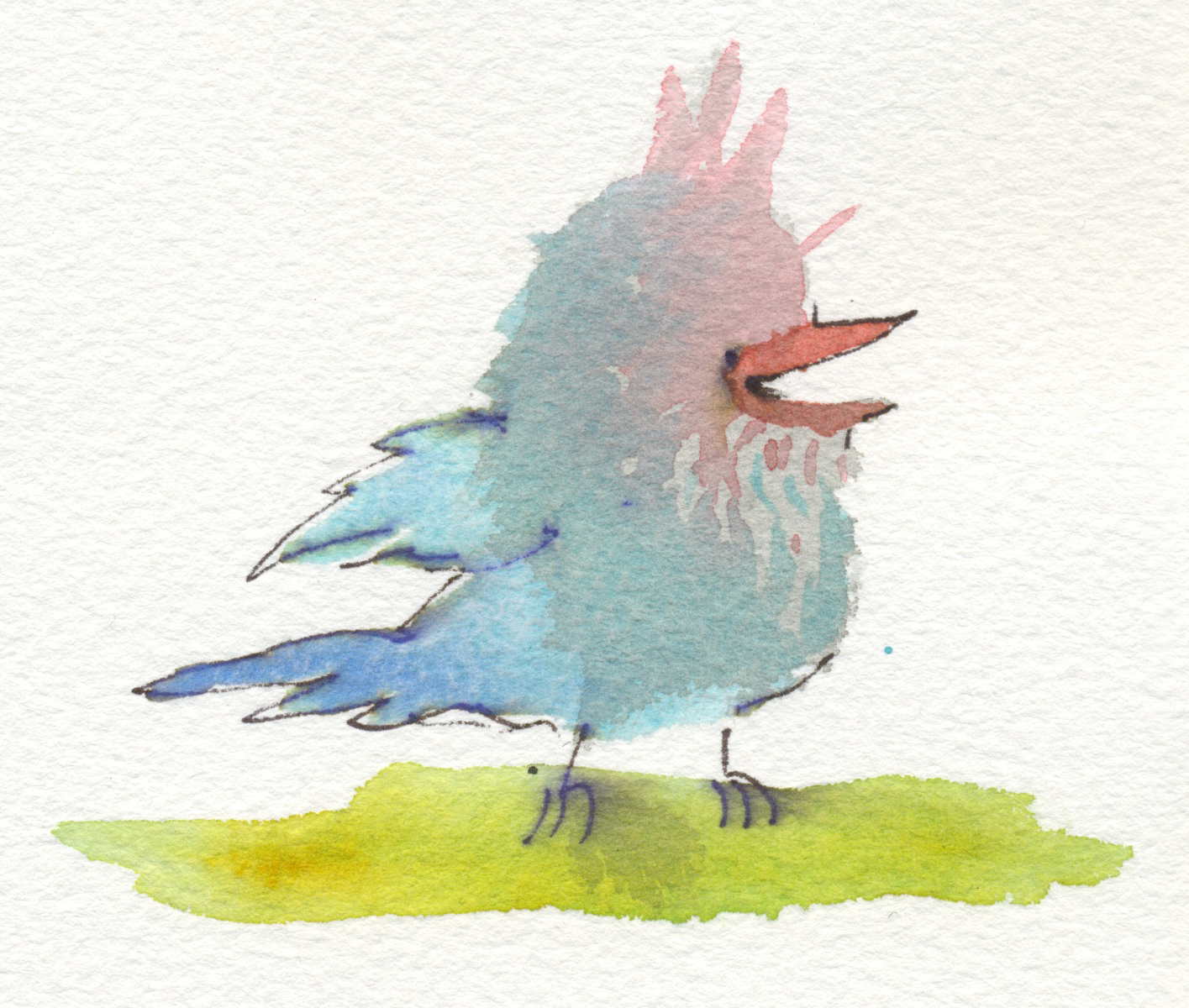
Silly Bird (Hugo’s favourite)
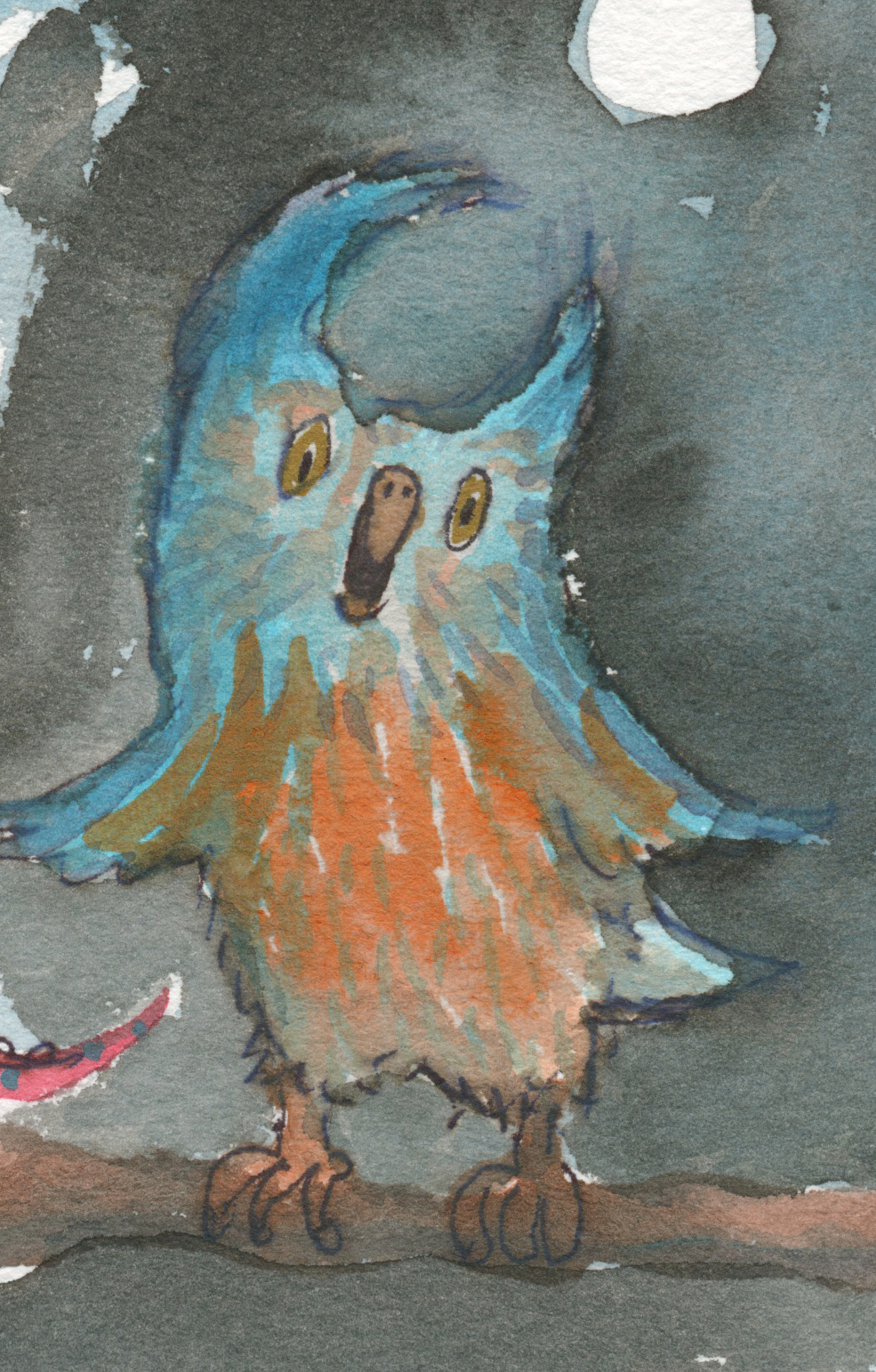
Opera Owl

Salvador Snail
Political Pig

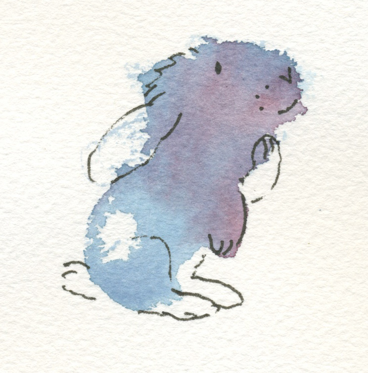
Bunny in a Box

Time for a 2 minute Big Blob. Not on watercolour paper, and hence no fuzzy edges.
Well here they are! Some mixed results.  I will include a few close-ups of the more interesting ones.
 People blobs! Can you believe it?
 Assorted terrestrial and aquatic monster blobs.
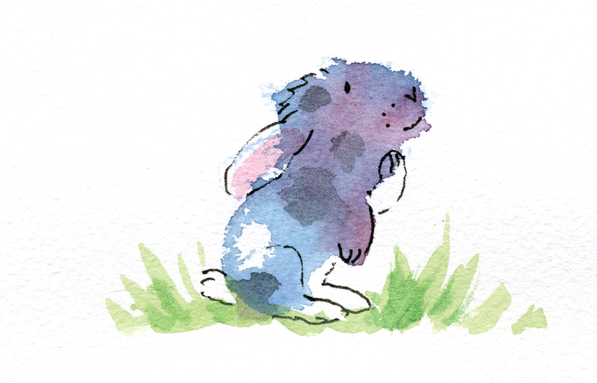
  A sad rabbit blob


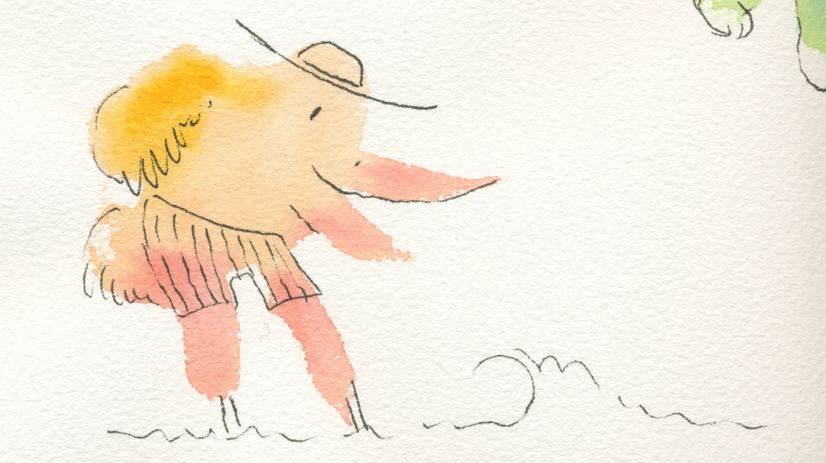
 And a range of birds in varying degrees of preposterousness. Including the rare elephant bird. Are you sick of blobs yet? I don’t think I am quite. Here is a sheet of blobs done during the kids’ drama class on Wednesday evening. A ran out to the car with a page of still wet blobs to play with when we got there. It is quite a stimulating way of spending a few minutes, and more fun than sudoku for me :-)
  The dogs were the things that worked best here I think. I extrapolated a lot more than I have previously too. Because some of the blobs suggested just part of a face.
Here are the ‘second pass’ blob creatures. There are also a couple that didn’t make the grade with the first pass and are now so much improved that they are going up after the second pass.

This dino is as corny as ever :-)

Little Elephant is messier but richer for his second layer of colour, I think.

I like Little Bird much better for his red head and little tail feathers.

Stork looks much better now to me. He’s having a ball at the beach.
Thoughtful bunny was not a success to my mind. The patches were a mistake, but you never know until to try.
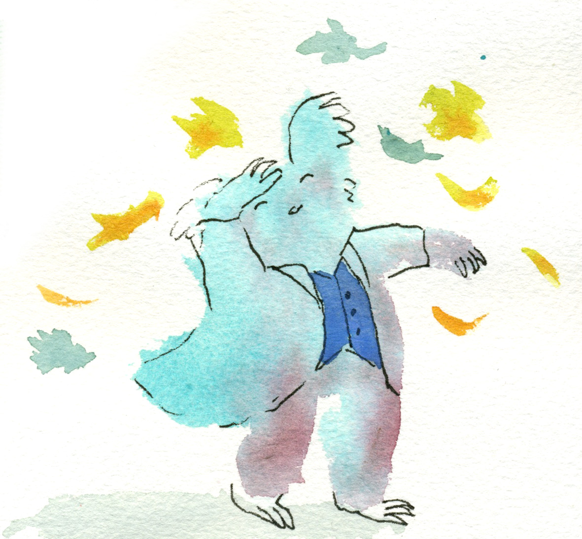
I like this guy now he has some autumn leaves bothering him. Lots of movement now. I could have painted his coat actually…

This funny little beckoning dog didn’t go up first time. He’s better with a bit of shadow. (Do you recognise the cloud over Stork and the autumn leaf here? They are all close neighbours on the same page)

Finally, a parrot who didn’t make the first cut. I like his feathering now that he has a bit more colour. Ticking in feathers or fur really does something for me. I love it.

And here, to finish up, a whole page of weird new blobs. We shall see what happens when I add a touch of colour to some of them. It’s a different effect of course, over grey; the colours are subtler, less pure. But this is what I did with the bookmarks originally.
And now it’s back to my Thunder work for the day.
Naturally, after playing with the grey blobs on the weekend, I was tempted to whip up some colour ones late last night to squeeze some in for the 52 Week Illustration Challenge – week’s theme ‘Colour’ before the new theme today. (Themes change each Wednesday.)
It really was late at night. So these were ‘one pass’ illos. I nearly didn’t bother scanning them because I wanted to go to bed, but the photos were too awful. Here they are in their scanned, and unedited state.
Stork on holidays at the beach.

Dramatic bear… koala… creature? (someone suggested music conductor)

Elephant unsuccessfully pulling on trousers.

Little bird

A sentimental dinosaur. I actually thought this was a bit too corny. Don’t know what came over me. Maybe Facebook-Peer-Pressure!
A thoughtful baby rabbit. I love the way the fuzzy edges and curves of the blobs can just summon a character into my head… if a character doesn’t appear fully formed in my mind’s eye beforehand, it generally doesn’t turn out well on the page. Of course the fuzzy edges on this coarse watercolour paper are quite suggestive of animals because they look a little hairy. But let’s admit it… there’s a bias there anyway!!
Today, I spent half an hour doing a second pass with more colour to enrich them… and to experiment of course. Some were improved and some were ruined by the second pass. I’ll see if I can find time to scan these and post them tomorrow or the next day.

Cornish drops in for a birdie, after an afternoon of thrashing about in bunkers.
A friend’s kids have started up a blog about sport. My boys have blogs about art. Not that they chat about it. We just post their own art on it for fun. But thinking of the two different blog subjects got me thinking about sport and art.
Then on the weekend, Dad came home from lawn bowls and told me about how he played. Sometimes he plays well; sometimes less well. And he tries all kinds of different experimental methods seeking that elusive, perfect technique. It was the same when he played golf. The frustration, the elation… the never knowing why or how one day’s performance was better than another. On a rare occasion, he’s ‘in the zone’ and the ball goes wherever he puts it.
Tell me, if you can do that on one occasion, why can’t you always? There’s no doubt that practice makes a big difference to how you perform, but nevertheless not many people can hit a hole in one.
It’s really a lot like art. One big difference is that in sport it’s easier to agree on the score. In art, everyone has a different set of goalposts…
A little pick-me-up / warm-up session this morning for Tania McCartney’s 52 Week Illustration Challenge.
(funny how sometimes my post headings don’t show up… It could be just at my end. Who knows? Now that I have typed the heading into the body of the post, no doubt it will come up as a double heading. Oh well :-)A short while ago, I had to get a bit organised before going colour for Thunderstorm Dancing. Getting organised goes completely against my grain with any of my art. It’s a kind of superstitious thing. So much of my better work is on bits of scrappy paper, drawn in eyeliner or using a waitress’s pen, and so much of the work I like less (that’s for those of you who will kindly reprimand me for not liking some of my work ;-) is on expensive paper using the very best of materials… well it becomes a self-fulfilling prophecy. I only need to pick up a bit of expensive paper to get so uptight that I can’t draw to save my life. My lovely art teacher at school, Cecily Osborn, identified this problem about 30 years ago. (OMG!)
This is a little sidetrack really…. what I was going to say is that I drew (in a wonderfully organised way :-) a little menu of characters showing which watercolours I mixed to make the various characters’ skin and hair tones. I sketched a couple of options for each character to begin with and then got impulsive and drew only one of each. (From this you will know that I very logically started on the right and worked left. Ahem.)

Here it is, ink smudges and all.
Of course, in-spite-of / because-of the fact that these characters took two seconds each to draw and are imperfect, I immediately liked them more than some of the painstaking images I have drawn for the book.
This doesn’t surprise me one bit.
However, I know as well as anyone who has attempted it, how hard it is to draw a character in two seconds and get it right first go. In my case, practically impossible. Only one in about 12 drawings will look remotely right. Put eight characters together on the one illustration (dancing together) and you have a logistical challenge. Devon, you can do the maths maybe ;-)
So… interesting times. I am not, in reality illustrating the book with two-second-characters. But I am loosening the style up a bit as I go along. It has its challenges. And its rewards.
p.s. Bella may notice that I have two different skin options for Pippa. One much warmer than the other. Possibly the one on the left is a Soft Summer, the one on the right a Cool Summer. I can make his outrageous statement only because she has dot eyes, right Bella? The Pippa on the left has brown eyes, the one on the right blue eyes… in my imagination. I think I am going the warmer, Soft Summer. I may be going mad too, but that’s nothing new :-) Last time we went here, Bella was giving excellent colour advice on a family of mice...
Seems like a decade ago.