Tomorrow I’m lucky enough to have a spot in the Faber Writing Academy Picture Book Masterclass. I’ll be taking Trudy and Dodds, roughly formed as they are, to have a little work out.
To recap on Trudy and Dodds, this is a picture book project that I received a grant to develop back in mid 2012. The grant was part of a new Children’s Picture Book Illustrators’ Initiative managed by the ASA and funded by the Literature Board of the Australia Council for the Arts.

One of the images I included with my grant submission. A little pen and ink sketch with digital colour. (Trudy in a purple shirt. Dodds on the billy cart.)
I drew dogs as the characters at that time because I have been drawing dogs (with and without clothes) for as long as I can remember. Has anyone else read The Lives of the Monster Dogs? But all along I really thought, I’d rather they were doggish than dogs: doggish, because dogs are part of human history, and if we aren’t mortally afraid of them, most of us love them. But not exactly dogs, because… just because. They are human really.
Unfortunately for Trudy and Dodds, the grant came just after I had accepted the manuscript for Thunderstorm Dancing and they got caught up in a delay of nearly three years! (Thank you to Lucie Stevens at the ASA for her patience in extending my timelines several times.)
But NOW, it’s time to move forward. And I’m excited about the masterclass tomorrow, and a little nervous. Not nervous about writing, because I love writing. But nervous about sharing my writing aloud for the first time since I left school back in the ’80s. Ahem!
So this week I…
• Had lots of ideas about the medium, style and setting.
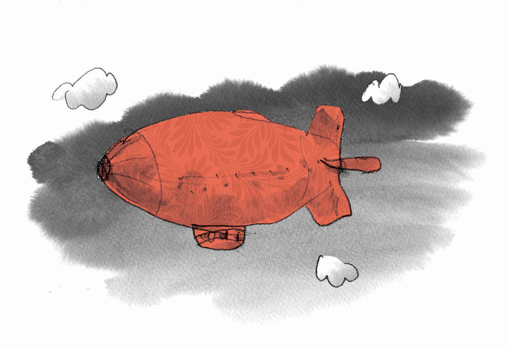
And got lots of inspiration for the architecture and setting from looking at Puglia and the trulli there. (See my earlier post on those here.) The architecture and setting are very important to me for this story, and were a big part of the original concept that I submitted to the Australia Council way back at the start of 2012. At that time, my inspiration was Mexico. But now! I’m going to be researching and recording the setting while I visit my friend David Capon in Puglia during April. I am so looking forward to it.

Trulli in a rough scene to open Trudy and Dodds
• FINALLY finished the first draft of the manuscript. (Hooray!)
I was having a lot of trouble getting the last quarter to work, even though I knew what was to happen at the end. What I didn’t want was a story that leaps into action and then sort of… peters out…. blaah. Yeah well… so then… hmmm…
• Started a DUMMY book for it.
I had my usual problems with this. I have trouble drawing the loose, loose, rough things to begin with that show the shapes on the page. I need somebody to stand over me tapping their foot when I am doing this, and looking at their watch. That actually works. If I don’t have a timekeeper I get all distracted with details in the pictures. And then… well then you need to change something because THAT isn’t going to happen on THIS page anymore. And then you go… errm… why did I draw that in so much detail? Doh!
For a glimpse at how it’s supposed to be done, go here!
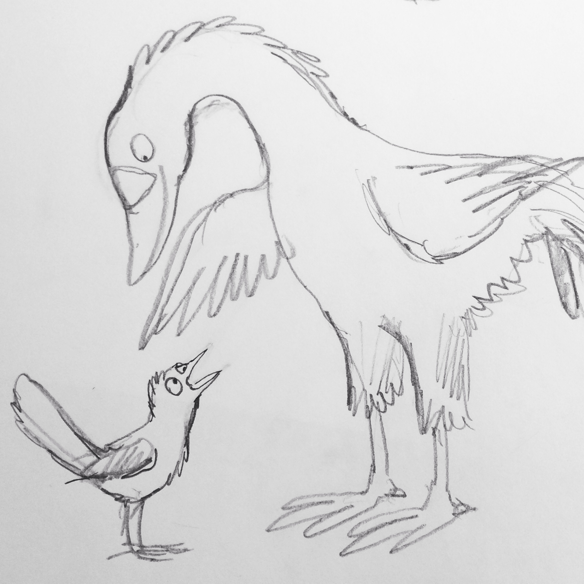
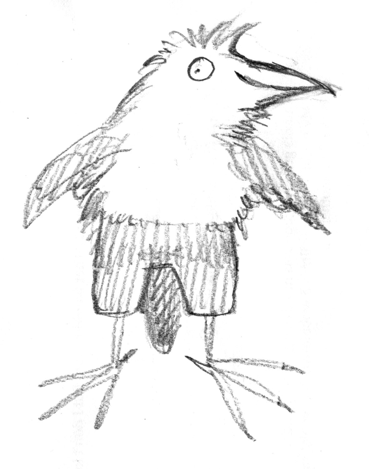
• Started making rough models for Dodds
And then bounced off those to make drawings for Dodds.
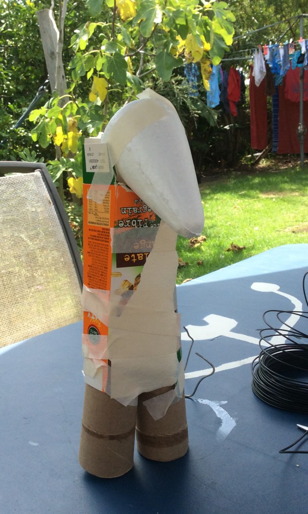
Dodds – Take 1

Dodds Take 2 – skeleton and sinew (of sorts). Is this a karate pose?

Dodds 1 and Dodds 2
Dodds found his smile when the paper jaw went on.

Dodds with paper bag trousers added

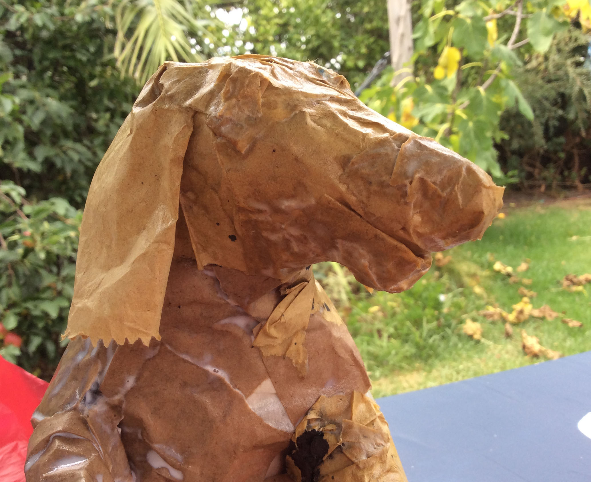
An initial sketch of the model. Finding my way

Dodds sketch with the nose, jaw and gentle expression starting to settle into place. He’s a gentle giant. I looked at Wrestlers from the 1940s for inspiration.
Tell you later, how we get on at class.