Leonard dances on (part 2)

Having had a lot of fun with my digital collage and brushwork, I picked up the dip pen and filled my inkwell once more to explore Option One.

pen and ink crooner judywatsonart

Dip pen and ink with real wash. 

Having fuddled around with birds for some weeks, I felt warmed up. My drawing hand was in action again. I was feeling a bit racy. The big brushy birds were fairly cumbersome in terms of getting the dance action going, and I wanted to see how these birds might actually look dancing; particularly in pairs or groups.

So here’s where my trusty dip pen came in. I used the same one for the whole of Thunderstorm Dancing and I’m not sure what I’ll do when this particular ratty nib gives up the ghost. It’s pointy and twitchy and zippy and once the pen hand is warmed up, the quicker the drawing, the better.

In my first sketches, I referred to pictures of people dancing. The birds looked rather hilariously like people in bird costumes.

pen and ink crazy peoplebirds lores

pen and ink ridiculous birds

Seriously, what???!! Must be stuffy in those bird costumes…

pen and ink person to bird lores

Here you see me trying to figure out how to turn a human dance pose into the equivalent bird pose. Doesn’t work. The bird’s leg joints are so different that when forced into a corresponding pose, they become stiff and awkward. 

pen and ink john travolta lores

John Travolta? 

They were terrible. After that I put Fred and Ginger aside. Phooey! Better to just look at birds and make their gestures approximately dancelike. Despite my lack of dance expertise, I could put more of an expressive spin on a bird drawing without scrutinising a real dance move.

Then it became more fun. These birds were attending an imaginary ball. I gave them names. Just because.

pen and ink tiara

Spotted at the ball this evening – Miss Ophelia Oriole in yellow cape and tiara.

pen and ink orange pair

Melva and Gene Shufflebottom set the dance floor on fire this evening. Luckily, no one was hurt. (That’s from Thomas the Tank Engine. Some of you will recognise it.)

pen and ink blue green pair judywatsonart

Sparking rumours this evening at the ball, Adele Coiffe and Thomas Furle were inseparable on the dance floor. 

pen and ink cindermallard

A Mysterious Mallard wowed the guests at this evening’s festivities, but departed hurriedly at midnight, leaving behind a puddle of water. 

pen and ink crooner judywatsonart

A starling vocal performance was given this evening by Steve Brash, with backing vocals by the Fluffies. (not shown.)

Lastly, I spend about 40 minutes whipping up a page spread in this style to see how I’d go with drawing a crowd. It wasn’t so great, but it was good enough to act as a sample for discussions with the editorial team at Harper Collins.

pen and ink rough spread judywatsonart lores.jpg

This sketch is coloured digitally, so that I could get a quick idea of how it might look. It’s very rough, and fairly energetic. I like the energy. It reminded me of a picture I’d done for the Ernie and Maud series years ago. Particularly the duck in the middle, waving to a friend. (There was an excellent hot air ballooning duck in that story.)

Greatest Sheep in History judywatsonart lores


I’ll be interested to hear what treatment you would have chosen. But I have to say voting has closed and the team at Harper Collins voted unanimously for….

drum roll…

BRUSHY!

brushy green bird

Let the games begin!

pen and ink rats lores

Was it the shoes? Too much?

Leonard dances on

Well, enough of that frivolous sewerage stuff for now. Time to get back to Leonard because I’ve got some roughs to complete! (Sorry to those who were enjoying  my inexpert comics doodles. I’ll try to fill you in on the end of the story at some stage. Evil snigger.)

woodpecker colour flat

Option B. Read on…

Now where did we leave off? I think I was drawing finches in all sorts of styles.

After that, I drew a few more birds of other kinds… That’s rather offhand, isn’t it? I’m skipping over about 16 species without even excusing myself…

And then I spent a day or so researching and downloading images of various dances. I am much more familiar with birds than I am with dances. Seriously, you should see me try to dance. But what a great excuse to get a book about Fred Astaire and Ginger Rogers out of the library.

Then I spent a day drawing birds dancing, putting it together. And all the while my days and nights were filled with mullings and musings about medium. That’s just too much, right?

I am a person who could spend a long time making up my mind. So I wrote this shortlist.

shortlist worksheet

There was a third option but since it had a difficulty rating of 5/5 it soon dropped off. 

The fabulousness ratings are important for me because I don’t feel there’s any point in making a picture book if I don’t at least attempt to make it fabulous. But they’re hypothetical, and of course totally subjective.

So. Being me, I started with Option Two. 

Brush and wash with digital blocks of colour. 

I have to thank Clive Hicks-Jenkins for accidentally reminding me of the brush and wash option. He posted my bookplate blog post on his FaceBook page. And when I looked at the bookplate again, I remembered how much I had enjoyed painting that chicken with brush and ink and how the digital editing changed it into something I rather liked, with very simple blocks of flat colour over the painted image. It was easy to do and retained the painterly look, which many digital treatments do not. But it wasn’t something I had considered as a treatment for Leonard.

sepia chicken judywatsonart lores

This particular image would be rather dark and heavy in a picture book. But it’s really just the background that makes it heavy. With a different background treatment and a lot of white space, it could work. I had a vision with lots of white space but with some painted plants strategically placed, in paler tones than those of the birds.

With the chicken bookplate, I converted the original art to a sepia colour; still very inky looking. But I could make the brushwork any colour that harmonises with the overlaid colour blocks. Indeed each bird need not be treated the same way.

I made some quick mock-ups.

finch flap lores

unhappy secretary bird photo

brushy sketch

unhappy secretary bird test

brushy sketch with flat colour


several finches with flattened background 2 col copy

a digital collage with brushy finches, a woodpecker and digitally applied colour wash

These brushy bird paintings were large. Nearly A4 size for each individual bird, so I wondered if I might be able to work at a smaller scale using a pencil for details like eyes. And made this quick  sample. I think I prefer the brush alone, but it will depend how practical this giant size proves, when working on entire page compositions.

bluebird test judywatsonart

brush and pencil bluebird with digitally applied colour wash

And I made a few brushy background vegetation sketches. I could have a lot of fun with these, adding some colour and layering. We could go a little 1970s…

feathery tester loresfruity tester loresginkoish tester loresgrassy tester lores

flower tester levels loresjointed flower tester levels

I think that will have to do for tonight. Option One tomorrow!


Wet Weekend (part 2)

Here is part two. In the meantime, Leonard is progressing the background and I will write about that next.

Just so you know, I am not currently wearing pyjamas. (Clarifying. I am wearing clothes!)

my sunny wet weekend-2 loresjudywatsonart

Wet Weekend

Yes, last weekend was sublimely sunny. A perfect summer weekend. But here, our experience had rather a wet theme.

This was how it began.

my sunny wet weekend-1 loresjudywatsonart


To be continued…?

I will say this though. This morning started in a very similar way. Me in pyjamas answering a knocking at the front door. But this morning it was a school morning, I had slept through the alarm, and the kids were due to leave for school in 15 minutes.

Comics seemed the only way to express my feelings for the way our weekend went.


Midsummer Monotypes

IMG_7310

Bonneted girl in too many frills. (From a vintage cabinet card portrait photo)

Over the summer school holidays, I had the pleasure of pulling out all the monotype equipment, unused for many months, and taking it for an outing to the back garden of the new house. There is a space under the decking that’s perfect for fine weather art activities. The boys and I set up two trestle tables there and had a lovely afternoon of printing in the warm air.

IMG_7179IMG_7180

While the boys printed an assortment of monsters, animals and fancy lettering (most of which they remembered to reverse as they drew), I printed chickens, dogs and portraits of them drawing. They were mostly autonomous because they had printed before and are old enough to manage on their own, but my focus was divided between my own drawings and theirs, so I came back a few days later and had another go on my own.

Author Ann Martin had kindly posted me her collection of cabinet card photos after my last post on vintage clothing (here) and I decided to use these as the basis for my monotypes. I had also been admiring one of my favourite books Detour Art.

I LOVE that book, (one of my favourite Christmas presents ever!) and browsing through it again led me to look up and explore further the work of Thornton Dial Sr. who died only last month. You can see the video A Day With Thornton Dial Sr. here. 

Thornton Dial Senior

Thornton Dial’s work ranges between sculpture using found objects through to several dynamic painting styles. One of his loose drawing styles made me itch to print some monotypes and add either dry pastel or watercolour to them. I love the way his rapid line work dances with the limited colours he adds.

Below are some of Thornton Dial’s works that make my heart race!

As you will see, my own work is nothing like his whatsoever. As with most artistic adventures, the artwork takes on a life of its own, and mine were no exception. They were mostly drawn using a continuous single line, using a heavy crayon pressed firmly on the back of the paper. I was seeking a heavy line with bleed but also a loose line, and was mostly successful in this.

IMG_7316

Bearded man – first take. The original did not look as heavy as this darkened photo and I increased the pressure when drawing the subsequent images.

IMG_7318

Bearded man – second take. (These were drawn from the same photo, so you can see that I was not attempting to achieve a likeness.) This is the image that I was most pleased with. I have an irresistible urge to add an off yellow background and pink to his tie, so he may yet be ruined, but I have taken the precaution this morning of gluing him to a cardboard backing in order to prevent buckling when I take paint to him.

IMG_7315

This chap had a rather ridiculous face in the original photo. And my rendition made him possibly more ridiculous. But he does rather remind me of an idiotic version of Jude Law. (sorry Jude Law.)

After completing a few other prints, including the frilly little lass at the top of the post, I brought the prints indoors to dry so that I could add colour. I started with the first bearded man, because the outline was too weak to stand alone and I thought that by adding colour I’d either ruin it (and not mind) or redeem it.

IMG_7325IMG_7320

Actually, I did neither.

The paper buckled a little but not too much as it is a heavy weight paper. I solidified some of the outlines and I had an absolute ball throwing the colour on. But I’m not overly excited about him. And I didn’t leave enough white space for him to breathe. He may have been better on a white background.

IMG_7326

I then added colour to clown-like ‘Jude Law’. By golly it was fun to slosh the paint on a large piece of paper! I stopped after that. The girl would not benefit from colour and the other bearded man, being my favourite, deserved some thought and a backing board before proceeding, if at all.

I’ve now done the backing board, and I must decide his fate!


Leonard’s Friends (part 2)

the finch who has forgotten the next step

Yikes! It seems there is a lot going on quite quickly, and I haven’t been keeping up with my blog posts. By the time I find a few minutes to write, I have a backlog of several things to write about and most of them are out of date!

Ah well. One step at a time. Or perhaps one Two-Step at a time in the case of Leonard Doesn’t Dance.

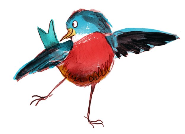
I seem to remember promising to post more on my visual exploration of the bird species of Leonard Doesn’t Dance; the finch being next bird on the wire. So here they are first.

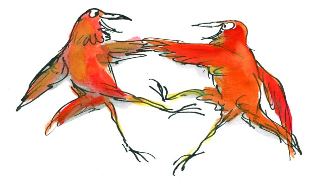
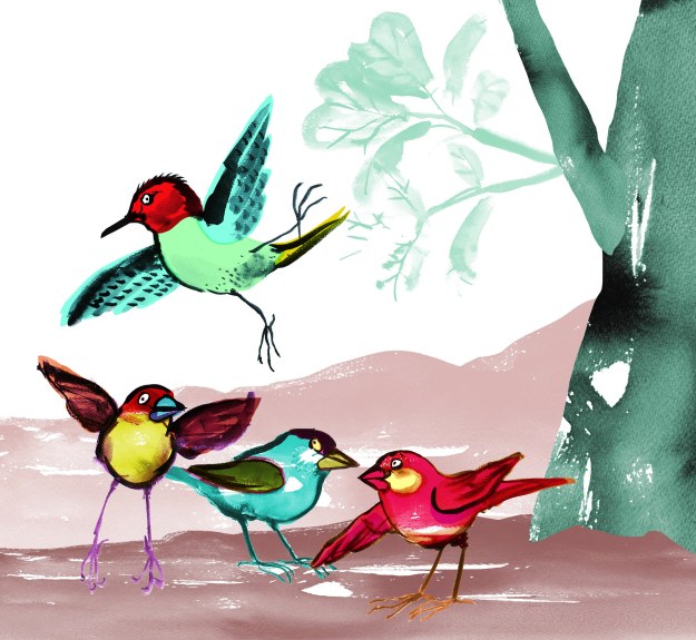
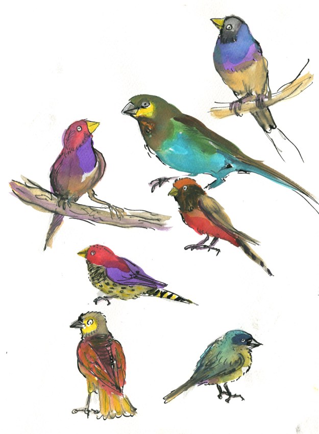
I think the page of coloured birds below was my very first page of finches. I was sketching quickly, trying to keep loose and have fun, while getting the general idea of their shape. The ink was water soluble, which bled into the very saturated colour I was using, and the effect is not so great, especially in a group. It’s a bit like an over-cooked rainbow stew. Or perhaps something that a child might create with a mud pie and food colouring…

saturated finches

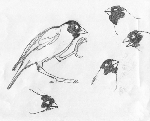
Another notable point about learning to draw finches is their beaks. They have a particularly fierce strength about them. They remind me very much of a crescent wrench or adjustable wrench. In this first page of finches, I had not yet cottoned on to the beak thing.

adjustable wrenchcrescent wrench

Wrenches. Distinctly finch-like. Compare with the two top right-hand images below.

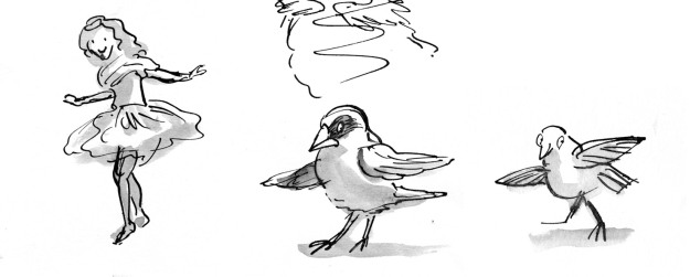
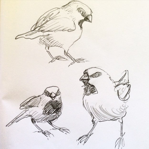
Here you see where I cottoned on to the beaks. I did a series of head sketches, playing with character, expression and finchy beaks. I was pleased with this page. I think at this point I was also pondering whether Leonard might have a little finch buddy who is a more confident dancer than he. A non-speaking role. A kind of Cyd Charisse.

finch faces

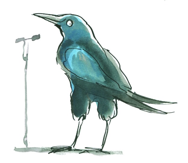
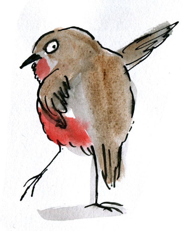
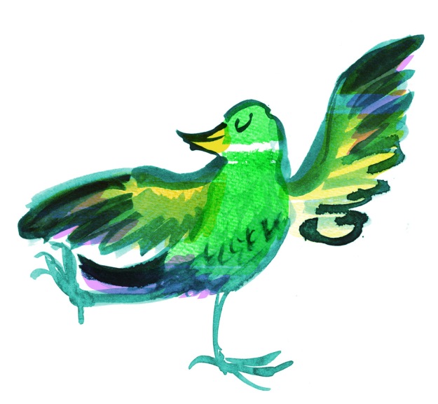
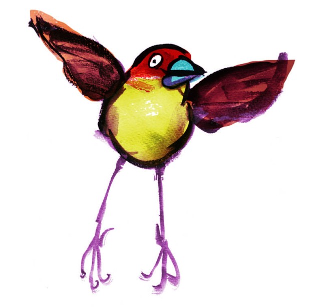
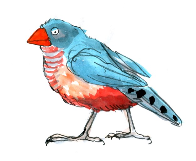
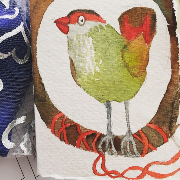
I then went on to exaggerate the beak further, and added some wash over the pencil sketches. I drew this stolid fellow below. (That amused me, drawing a stolid finch.) And then the finch at the top of this blog post, who is more lively, and still with that lethal looking tool on the front.

the stolid finch

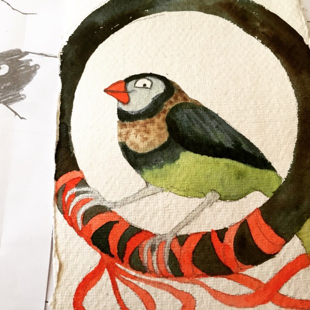
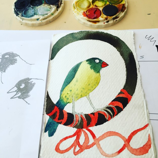
Next up, Christmas happened! Determined to wrestle every possible bit of finch drawing out of daily life, I painted finch Christmas cards for family and friends. Using a faint pencil guideline, I avoided all conflict between watercolours and inks.

IMG_8415IMG_8425

I think I liked this smiling chap best (above). You can see he came directly out of the head sketches I drew earlier.

IMG_8423

Now we move on to another day in late January where I took my sketching materials to the yacht club to get some work done while keeping an eye on the boys in the water. I didn’t have any of my earlier sketches with me and Christmas and New Year had completely erased my memory.

(…) That’s what it looked like inside my brain.

I had only a very soft graphite pencil and a red pencil with me. I started by drawing this fellow, starting with the beak. He looks horribly fierce, mostly because of the dark shading above his rather narrow eye.

I had moved on from beaks and was experimenting with a simplified way of drawing the feet. I’m not really wanting to get too anatomical with my birds’ feet; I think that would become a distraction for me while drawing, and for the reader while reading. So I need to find a shorthand for them, that expresses the bird (and the dance) and doesn’t evoke a biology book.

IMG_7202

These chaps were next.

IMG_1574

I added red pencil over the beaks, on a whim. The red pencil did not like the soft pencil. More rainbow pie.

IMG_7204

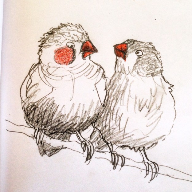
Euwww! Is that egg on your chin?

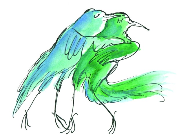
By this time, I was noticing that many of the finches in the reference photos sported black eye-makeup and red cheek patches. What was I to think? They looked a little clownish.

pencil finch clowns

But wait! Maybe they are superheroes?

pencil finch superheroes

Posting these now, I notice that the clown finches have more weight on their cheeks and bodies with not much forehead; it’s a sagging, comical shape. The superhero finches have a more compact, athletic shape and more cranial space. They look speedier and sharper. I’m not sure how much of that was conscious, and how much unconscious. (…)

I was pretty comfy at the yacht club, and I continued on with some puffins (deplorable) and some woodpeckers (passable).

But enough for now!

pencil woodpeckers


Yeee haa!

It’s the sailing season. (Some might say it’s always the sailing season.) Last weekend our boat club had a social night characterised by cowboys, cowgirls, Indian food and very loud music.

They needed a horse and some cactus plants… to go with all the yachting paraphernalia (ahem)… and I was your go-to paintbrush-wielding club member. I may not sail, but I can produce cardboard horses to order. Especially when there is a table tennis table box in the garage that has been hanging around since Christmas.

The pictures tell the story. It was really good fun to paint a life-size Quarter Horse and below you can see him standing behind the drums tolerating the noise as well as any police horse. His final proportions weren’t perfect but not too bad. His head could have been a little bigger, and his quarters a trifle smaller. But who cares?

little ones watch band.JPG1 boxes.JPG

Stage One: Starting with some handy pieces of cardboard; nicely aged… about a month and a half is optimal…but not too mangled.

charcoal rough.JPG

Stage Two: Moving on to charcoal sketching, which graduated to soft pastel when the charcoal wore away to nothing.

head with ink.JPG

Stage Three: Indian ink outline using mostly a Chinese brush. And adding watercolour for some skewbald patches. (a multicultural horse)

Dexter on stairs.JPG

Stage Four: evict the dog several times because he keeps walking on the inky horse. (He goes no further than halfway up the stairs, because I have a packet of biscuits open downstairs. And stares at me.)

saddle and chest.JPG

Stage Five: Saddle the horse. (No girth. Bad luck rider.)

head saddle cloth.JPG

Stage Six: Don’t forget the saddle cloth. Don’t want any saddle sores.

front leg complete.JPG

Stage Seven: Add hind quarters to the Quarter Horse and some front legs. (new piece of cardboard.) And hack off some bits of unwanted cardboard around the completed parts.

Note: As with the artwork for Thunderstorm Dancing, I found it pleasing to apply the white acrylic over the brown base colour. It must be a chemical attraction of sorts.

back legs close.JPG

Stage Eight: Add hind legs.

dark floor full horse.JPG

Stage Nine: Stand back and check the horse is not too deformed to perform his function. More hacking.

horse with uncoloured cactus plants.JPG

Stage Ten: Stage Coach! Make some quick cactus plants and try to fit everything into a very small car along with kids’ cowboy costumes.

cowboys on the beach at sunset.JPG

Some young cowboys on the beach just before sunset.

kids gather to watch band.JPG

The kids all gathered chairs and lined up expectantly before the band began playing.

Yeeeehaa!

Some victims of ‘fancy dress’

As I’m on holidays for another couple of weeks, and I was doing some art in the garden with the kids this afternoon, I kept going and made a few tiny images for the start of this year’s 52 Week Illustration Challenge on Facebook.

Week 1 is Fancy Dress.

I went naturally to my cabinet card portrait collection where there are plenty of people in both fancy dresses and in ‘fancy dress’ in the sense of costume.  There I saw lots of kids who had been hauled, strapped, tied or stuffed into their best clothes for portraits; many of them looking dubious about the whole experience. So I thought I’d borrow their misery for a few little ink and wash drawings.

W1 fancy dress unwilling suit boy judywatsonart lores

A little boy in fancy dress, from a cabinet card portrait. It was hard to say if he was in his best clothes or in costume. The clothes are somewhat smart but also very oversized, especially the hat!

W1 fancy dress unwilling girl judywatsonart lores

A little girl who would rather be playing with her dog in the garden

W1 fancy dress - scottish judywatsonart lores

A little Scottish lad in fancy dress looking very miserable

Sketching at the Trampolining Centre

It’s school holidays, we’ve moved house recently, and I’m working on one of my most important projects: connecting my kids with new local friends before school starts at the end of the month. Today… PLAY DATE.

For those who think they have mastered sketching people at the swimming pool (hysterical laughter) the next challenge is obviously to sketch at Gravity Zone, one of Melbourne’s trampoline play centres where children and the occasional energetic adult bounce around in a state of perpetual motion and happy exuberance. So I took my sketch materials to the play date.

One of the children vomited as I was watching, but I didn’t sketch that. Luckily it was not on a trampoline but in the café area…

Below are a few of the more finished sketches of the morning. (I notice that I was using the same book for sketching as the one I had used a year ago at Sorrento in the Christmas holidays. How tidy!)

Gravity Zone sketch 3

two boys getting ready to leap into the pit

Gravity Zone sketch 2

Hugo stopping to pant after much bouncing with a basketball

Gravity Zone sketch 1

a tweenager bouncing in a crop top

Gravity Zone sketch

a tweenager having an argument with a friend on the other side of the floor

Gravity Zone sketch 4

a Mum reading in the café

Gravity Zone sketch 5

Another mum reading in the café

You will, I’m sure, have noticed a striking and curious thing. Only one of the sketches actually depicts a person in mid bounce!

I have a lot of work to do to get up to sufficient speed.


Old World Monsters

I went away with some good friends in the September holidays for a long weekend, and began a range of art and craft projects which I promised to post here. I’ve been too busy until now to look at them further but now it’s Christmas holiday time, and I had a great time the other day, getting things out to play with in the studio! Hooray!

As part of my continuing fascination with vintage cabinet card portraits, I had drawn at  some children from old photos and added shadowy blob shapes of old world beasts and imaginary creatures into their formal poses. I hadn’t by any means fully thought out the ideas I was exploring, and I still haven’t. But I added some watercolour detail with a fine brush the other day and scanned them. So here they are.

I will probably do some more with this, and see where it goes. I think monsters take time to form properly. These are only partly menacing, and it’s unclear whether the children are aware of them or not. They may be allies, or the monsters may even be generated by the children themselves.

old world new world wolf boy JudyWatsonArt

old world new world hat JudyWatsonArtold world new world bench beast JudyWatsonArtold world new world chair and hat JudyWatsonArt