Category Archives: books and reading

Big, Little and Middle Siblings

The Three Billy Goats Gruff reminded me of these illustrations I did for Frances Watts’ book The Middle Sheep. It was one of the books I most enjoyed illustrating. I’m not a middle animal, but I’m one of three siblings. Possibly not as cute as I should have been. Ha ha!

Here are some of the sibling animals who featured in the book.

Siblins snails: sensible big sibling snail, cute little sibling snail and poor, overlooked middle snail.

Sibling snails: sensible big sibling snail, cute little sibling snail and poor, overlooked middle snail.

sibling rabbits

sibling rabbits

sibling mice: some siblings are too disgustingly cute.

sibling mice: some siblings are too disgustingly cute.

sibling goldfish: it's not easy being the middle of seven sibling goldfish.

sibling goldfish: it’s not easy being the middle of seven sibling goldfish.

Maud's sensible big sister Doris

Maud’s sensible big sister Doris

Maud's cute little sister Mavis

Maud’s cute little sister Mavis (here pictured on Nanna Gail and Pa Ray’s front doorstep)

A Middle Sheep can get very frustrated

Here’s Maud, in a spat with Ernie. A Middle Sheep can get very frustrated.

Middle Animal Superhero Sidekick tryouts, run by Maud

Middle Animal Superhero Sidekick tryouts, run by Maud

Cover art for The Middle Sheep

Cover art for The Middle Sheep

The Middle Sheep is suitable for the six to nine-year-old age group (give or take a birthday) and can be purchased online here or here or ordered in by your favourite local bookseller.


The writing/drawing process July 2014

At the start of the school holidays, I was invited by artist Rosalie Street to participate in a blog tour… which means answering some questions (below) and getting some other people to do the same next.

Here is Rosalie’s interview response. A visit to her blog to enjoy her lush canvases and delightful merchandise is well worth your while.

gold leaf by Rosalie Street

Gold Leaf – by Rosalie Street

The blog tour topic is The Writing/ Drawing Process. Since as yet, I have found little time to work on my writing projects and instead have been madly drawing, I’ll answer the questions in the context of my artwork.

The first bit (the questions)

1. What am I working on ?

Thunderstorm Dancing, a picture book by Katrina Germein

At the moment I am in the late stages of final art for a picture book by Katrina Germein to be published by Allen & Unwin. The book is called Thunderstorm Dancing and it has been over two years since I first starting mulling over the project.

As soon as I read the manuscript, I thought it would be both a great text and a very difficult text to illustrate. It has indeed proven difficult for me, but I also realise that I suffered from the internal pressure that comes from winning an award; this will be the first of my work to be published since that award and my inner self told me very sternly that it will have to be good. But I now move towards the completion of the book and I’m looking forward to seeing it in print.

An unused sketch for 'Thunderstorm Dancing'

An unused sketch for ‘Thunderstorm Dancing’

There have been many sketches made for this book. A decision on medium was elusive for a while. But it came along in the end, and I’ve really enjoyed the layering and scratching in PhotoShop combined with the earthy texture of the real paint and pencil on Litho paper.

A small fragment of one final illustration from Thunderstorm Dancing

A small fragment of one final illustration from Thunderstorm Dancing

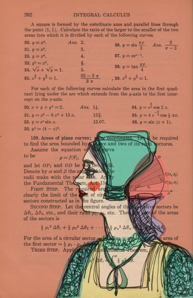
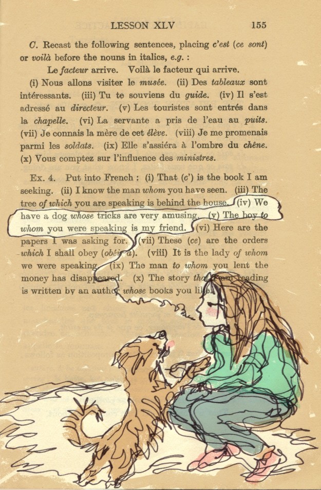
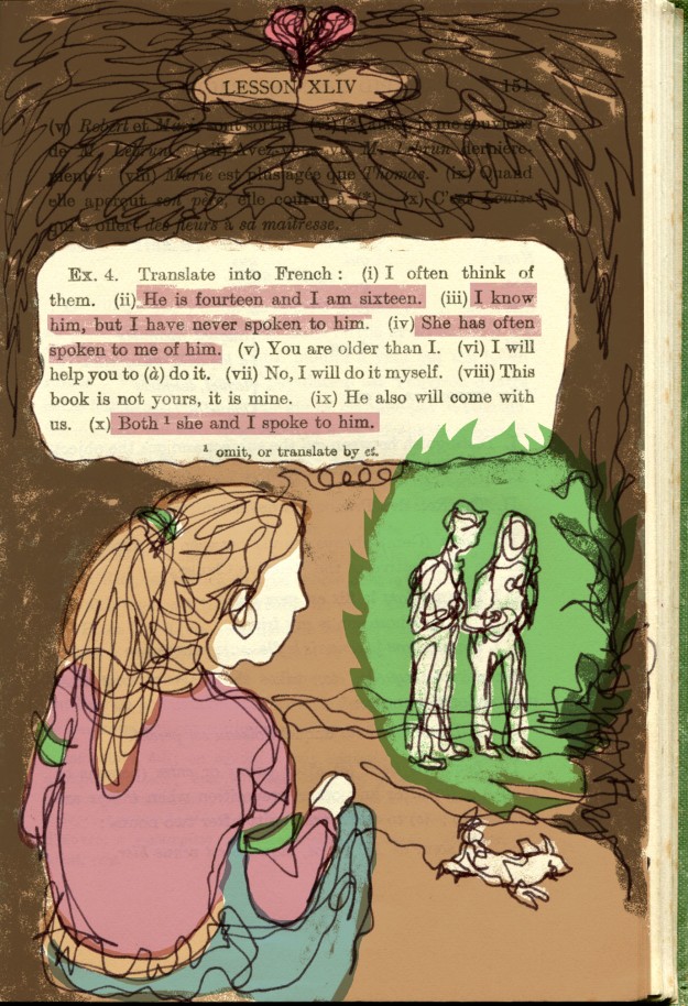
Altered book art

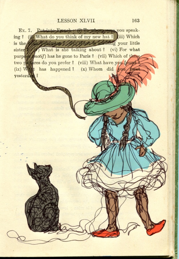
Last year, while struggling to progress with the picture book, I almost accidentally began sketching in old books as a form of relaxation. I say almost accidentally, because I have admired altered book art and found poetry for quite some time, and had always intended to try it. But starting was not a deliberate step into something new. It was a gentle bit of play, while watching my children in their swimming lessons.

drybrush sketches in the bombing zone of the local swimming pool. Ink on vintage book page.

drybrush sketches in the bombing zone of the local swimming pool. Ink on vintage book page.

I began sketching them and other children. And I really loved the effect of the drawn image on the printed page. It also helped me with Thunderstorm Dancing, because I had decided early on that the family in the story would be at a beach house, and the main characters all in swimming cosies.

Altered book art continues to be one of my favourite activities, and I intend to do much more of it, and to explore new ways of using it in art projects.

52 Week Illustration Challenge

The 52 Week Illustration Challenge, dreamed up by Tania McCartney, was something I joined early this year. It requires participants to produce artwork to a given theme that changes each Wednesday, and then post them on the 52 Week Illustration Challenge FaceBook page.

Week 14: simplicity. This was a really enjoyable experiment with ink and watercolour

52 Week Illustration Challenge: Week 14: simplicity.
This was a really enjoyable experiment with ink and watercolour

One of the things I loved about it was that the community of people involved were from varied backgrounds and were supportive and kind to one another. Since early this year the group has grown to over 2000 members, many being expert practising artists and the standard of work has I think, sadly frightened many of the less skilled artists away, but the mood of generosity remains. And it is surprisingly good to have a theme to work to each week… often themes that I find very unappealing until they lead me off into some fun experimentation.

I have deliberately kept this challenge as a low-profile task for myself. I never spend long on anything I do for The Challenge and never worry too much if the work is imperfect or not my best. This, along with blogging imperfect work, has been a really healthy learning experience, and a great way to keep producing lots of other work and exploring as an artist, as well as doing my book project.

Clive Hicks-Jenkins’ Puppet Challenge

This is an on-line exhibition organised and curated by Clive Hick-Jenkins along with Peter Slight. I’ve not done so well with this one. In contrast to the other challenge, I have allowed this to become larger than life and daunting. I also failed to come to a decision over subject and medium, although my lightbulb moment came today in the shower (they often do happen there) when I may be too late to make it. So I’m not sure if that counts as something I’m working on or not…

Appropriately perplexed looking sketch of Greyfur the kangaroo who was my original subject matter for the puppet challenge

Appropriately perplexed looking sketch of Greyfur the kangaroo who was my original subject matter for the puppet challenge

Graphic design work

Periodically I take up graphic design work if it is not too time consuming. I enjoy this work very much, but too often lately I have had to decline offers of work due to the unfinished book and lack of time. Some of my favourite work is with the Australian Children’s Laureate support team who produce various publications and branding items every now and then. In this context I enjoy using other artists’ work and modifying it to use as part of a design. Ann James drew the magpie who became the Australian Children’s Laureate logo and I have used him in lots of ways.

The Australian Children's Laureate logo in one of its formats

The Australian Children’s Laureate logo in one of its formats

School children from around Australia made artwork that I used in silhouette for the pitch for Boori Monty Pryor’s Storykeepers documentary.

storykeeprs sample page storykeeprs sample page2 storykeeprs sample page3

Family life

This project of course doesn’t belong down the bottom here. It’s a very big part of my life – too big to summarise here. So I’ll simply say that I keep myself busy with two much loved youngsters Arthur and Hugo, husband Scott, the dog Dexter and chickens Hilda, Emily, Poppy, Storm, Stella and Vita.

Vita - Queen of the Backyard

Vita – Queen of the Backyard

My own writing projects

This gets a wee mention at the bottom. In fact there are several projects I’m very keen to get on to, that are waiting in line for me to find a bit of space and time. I look forward to launching into them.

2. How does my work differ from others of this genre/ style?

Watch this space

3. Why do I draw/ paint what I do ?

Watch this space too

4. How does my drawing process work ?

Hmmmm…

I have taken waaaay too long answering the first question, so I’m going to split this up and post my answer to the other questions later. Cheerio for now!
More feathers

It’s been a feathery kind of day today. Starting sadly.

A small starling with a completely broken beak was in our back yard this morning, desperately trying to share the chickens’ breakfast but unable to pick up any food and clearly starving to death. I amazed myself by catching it, but it was obviously desperate to eat and too weak to fly far. Before I could take it to be euthanised, it escaped with extraordinary skill from a closed box on our front porch where it was wrapped in a towel, and it hasn’t been seen since. I feel very sad for it whenever I think of it.

Late this afternoon, I felt like doing a last minute non-blob feather picture for the Challenge and did the Blue-footed Booby (at bottom) which was only a partial success, but the partial success was enough to whet my appetite for another go and I followed up with the emu below who’s a little better perhaps. The glued on shreds of paper were an enjoyable new aspect for me that I’ll play with more in the future.

emu - indian ink, watercolour, white gouache and collage on book page

emu – indian ink, watercolour, white gouache and collage on book page

Blue-footed Booby - indian ink, watercolour, white gouache and collage on vintage book page

Blue-footed Booby – indian ink, watercolour, white gouache and collage on vintage book page

Putting Thunder Cats into Perspective

cat sketches for veranda spread lores redHere’s a little peep into the book illustration process for Thunderstorm Dancing as roughs are edited on the fly while final art is being produced. For this spread, the Cat Called Thunder, needed to be inserted into the veranda scene, and I played around with various poses and movements until I found one that had the right character and jaunty expression.

…I realise Cornish Rex cats are not really characterised by jauntiness in the face of a thunderstorm. But this particular one is a Picture-Book-Cornish-Rex. And they are a specialised breed.

The problem was that the little fellow I liked is in full profile, and the illustration required him to be viewed partly from above. This can be a tricky adjustment to make (especially with drawings of people). But I usually give it a whirl by dotting in some rough suggestions of where the skeleton and joints might be, and take it from there. It puts the character into a three dimensional space in my mind.

My improvised sketch to alter the viewer's angle of Thunder and my guesses at the location of the joints. I was wrong about the shoulder as I found out later.

My improvised sketch to alter the viewer’s angle of the Cat Called Thunder and my guesses at the location of the joints. I was wrong about the shoulder as I found out later.

Here’s what I came up with to shift the view point. And I was happy enough with that to move on to inking stage, and to add in any further detail during inking.

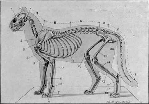
A cat skeleton showing the position of the shoulder joint at the front of the cat, rather than up around the area we would call the 'withers' in a horse.

A cat skeleton showing the position of the shoulder joint at the front of the cat, rather than up around the area we would call the ‘withers’ in a horse.

Looking at the skeleton above you will see that my shoulder joints were in the wrong spot, but as it happens it didn’t really affect the drawing. My made-up shoulders took a shortcut from the top of the scapula through to the elbow joint, skipping the humerus. (Very efficient, methinks;-)

The Cat Called Thunder struts across the decking as the storm approaches.

The Cat Called Thunder trots across the decking as the storm approaches.

Here’s the Cat Called Thunder redrawn in ink and in position against the un-inked veranda. I think he’s sufficiently jaunty for the most demanding of viewers, despite his overbite which would make orthodontists blanch.

Brian the greyhound with an overbite

Brian, the greyhound with an overbite

Here’s Brian with a similar jaw. I think the overbite gives these two a bit of an ‘oops’ expression.

Lucy

I’m drawing whippets over and over again until I get the expression just right for final art.

Sometimes, when I’ve drawn the dog several times over in the ‘pose’ (for want of a better word) required for the illustration, I still can’t get it right. Low growl.

Then I sometimes draw the dog (or cat, or person) in another way entirely and it gets my brain out of the gridlock.

Here’s Lucy telling me to play ball and chill out sister.

Lucy with winning expression

Ball anyone?

I’m still here.

Fragment of Sky

It’s a funny thing. When this book is finished, there will be tiny little fragments of it, like this one, only about 3 cm long, that I will really like. I think this is my favourite part of the book so far.

It has fat scribble and thin scribble, dancing together. They cross over each other in opposite directions.

I love scribble. And layering. And paint splatters. I wish all of the book were as loose as this. But it’s not.

Onward.

The Feast

or

The Fast

or

The Curse of the Black Tongue

This evening was the Drama Class night, when I take my two plus one more to a drama lesson at a big leisure centre. We always enjoy the evening despite the slightly rushy nature of eating early straight after school and then getting to the class on time, when nobody can find their shoes, or their book for the car or remember to go to the toilet until we are about to drive away… the usual stuff. They are a happy bunch of three and I enjoy their nutty company. I also enjoy the slightly-less-than-one-hour of free time at the centre when I can draw just for fun.

This week’s 52 Week Illustration Challenge theme is ‘feast’. It’s not a theme that lends itself to time poor folk because it conjures up mental images of banqueting tables, rife with imaginative and mouth watering detail. Forget that.

Having grabbed the nearest half-stocked ‘art backpack’ as I went out the door with the mad ones, I found that I had limited supplies with me. (You were wondering what that subtitle The Fast was all about, weren’t you?) I had a vintage book to draw in and a box with pencils, fine point felt tips losing their inkiness, a brush tip black pen (also fading), one deep terracotta red crayon and a small paintbrush but no water receptacle.

Thinking I’d hopefully find a pithy quote to illustrate in the vintage book – something that brimmed with feastiness, or failing that, feistiness –  I found it was all about a family during the Gold Rush and that Hugo had used the first half to practice scribbling with thick black texta.

Image

Not to be deterred, I found a page with a description of an extravagant breakfast. I set to work illustrating it using a pencil and the first subject that came to mind: a chicken serving breakfast. Unfortunately the chicken was so long and elegant of neck that she obscured the text she was illustrating, so I swiftly moved on.

I found the page above and quickly drew Mrs Pym in her kitchen with the fading brush tip. She’s okay. But remembering that the brush tip is water soluble I found I hankered to deepen the tone with a bit of water. No water. Aha! Yes! You guessed it. The Curse of the Black Tongue!

I confess I glanced around me to see that nobody was deeply offended, as I proceeded to use the nearest clear liquid to hand… or mouth.

I had half a drama class still to use… what could I find? After a few minutes of fruitless searching, I gave up on wasting time looking for food references in the vintage book. I thought I’d draw a pelican with a border of fish leaping around him on the page. And so I did. But the fine point markers kept running out on me as I drew, so I kept changing, keeping to a .5 or below.

FEAST pelican lores


Although a real pelican  would be more likely to feature blue legs I think, the red crayon came in handy here. And once complete, I was just left thinking how much I’d like one more colour to highlight the fish with. If only!

Oh happy pelican! As I resorted to the Black Tongue again in a not-very-hopeful kind of way, thinking that this time, the ink was waterproof, I found to my delight that all but the bird’s body and one wing were drawn in fine point markers that were water soluble and which when wet became green!

I am quite pleased with my pelican page. But I can still taste that ink on my tongue.


Experiments with Blobs (part 2)

Here are the ‘second pass’ blob creatures. There are also a couple that didn’t make the grade with the first pass and are now so much improved that they are going up after the second pass.

dino 2

This dino is as corny as ever :-)


elephant trousers 2

Little Elephant is messier but richer for his second layer of colour, I think.

little bird2

I like Little Bird much better for his red head and little tail feathers.

stork seaside 2

Stork looks much better now to me. He’s having a ball at the beach.

Untitled-1

Thoughtful bunny was not a success to my mind. The patches were a mistake, but you never know until to try.

windy creature 2


I like this guy now he has some autumn leaves bothering him. Lots of movement now. I could have painted his coat actually…

beckoning dog 2

This funny little beckoning dog didn’t go up first time. He’s better with a bit of shadow. (Do you recognise the cloud over Stork and the autumn leaf here? They are all close neighbours on the same page)

parrot 2

Finally, a parrot who didn’t make the first cut. I like his feathering now that he has a bit more colour. Ticking in feathers or fur really does something for me. I love it.

grey blob creatures composite levels lores

And here, to finish up, a whole page of weird new blobs. We shall see what happens when I add a touch of colour to some of them. It’s a different effect of course, over grey; the colours are subtler, less pure. But this is what I did with the bookmarks originally.

And now it’s back to my Thunder work for the day.


Blobby bookmarks

Last weekend was the Warrnambool Books Children’s Book Festival in celebration of the bookshop’s 30th anniversary. I was a guest illustrator on Friday and did a school visit at St Joseph’s Primary School before a book signing at the family owned bookshop.

While I was there, I decided to mix up two ideas from other clever illustrators. I have seen Jude Rossell giving out bookmarks with small illustrations on them at illustrator events. And Alexis Deacon has described his fun practice of painting or drawing blobs and then turning them into something here and here and most awesomely here.

I was just after something simple and quick to do in between signing books, so mine were pretty basic but the kids loved them. Here are some of the bookmarks I did the next day at home, simply because they were so much fun. In fact it was rather hard to stop!

photo 1

photo 3

photo 2

photo 2-1

photo 1-1

They take about one minute each.

• First paint a pale grey-brown blob with some interesting projections and bumps.

• Then paint a few more while the first one dries.

• Go back to the dry blob and add a few lines with a felt tip pen to turn it into whatever springs to mind.

• Finally, add a touch of colour if you want to. (I didn’t do this to many of them in the bookshop. They were very simple.)

My two boys joined in with great enthusiasm and did some fabulous ones. It is a good activity to do with kids, and taps into their wonderful imaginations. In the case of my two boys, it was fun to see how they formed an alliance whereby Arthur would paint the blobs, and then after they dried, would ask Hugo what the blob should be. Hugo, with barely a split second’s hesitation would say: ‘That’s a pig blowing a trumpet. That’s a fish with legs. That’s a cow shouting.’ And so on. Arthur happily drew them after that.

Like me, they found it hard to stop once started :-)

Thunder Gulls

A fragment of a Thunder endpaper.

Prismacolour artsticks are great to use. I’m enjoying the corners and flat sides to get sharp and gravelly effects, all rather rough and imprecise, which is a good thing when you have a tendency to over-detail things as I do, in the context of illustration work.