Category Archives: books and reading

Peter, Moonlight and Greyfur, from Alan Marshall‘s classic Australian fairy tale ‘Whispering in the Wind‘.
Thinking of my puppet characters again, but also a final horse for the 52 Week illo challenge.
Equine Soliloquy (continued)
2 Replies
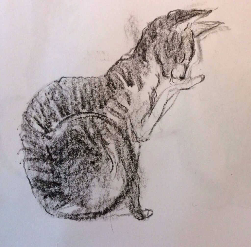
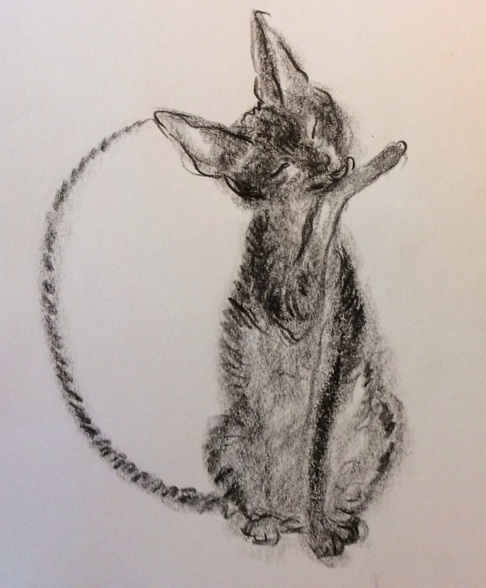
I haven’t touched this project for a while. But the 52 Week Illustration Challenge theme for this week is ‘horse’ so it seemed a good reason to do some more doodles in the horse book. Most of these were done in brush pen during the hour of the kids drama class, but I’ve worked them up a little more at home today.
The front horse was drawn with photographic reference in front of me. The rear two emerged on their own. I like the freer, more pattern-like quality of the rear two horses, but quite like the very typical attitude of the foreground horse’s head. The two types don’t really go together but it’s a point of interest for me.
I enjoy this squiggle style of drawing. I find I do it more and more. It’s fun to let my hand (seemingly) control itself and wander very rapidly all over the page.
This is the brush pen I used quite a bit for the Cornish Soliloquy. I must buy a couple more. They are very interesting to work with. The ink doesn’t flow very quickly so they tend to get a bit affronted by my drawing style. I draw pretty quickly and the ink flow goes on strike and demands a breather every minute or so.
I was really pleased with the way this little sketch worked out. I strangely like the way the gutter interferes with the horse’s hind quarters, and I liked the cream, blue, burnt umber colour palette.
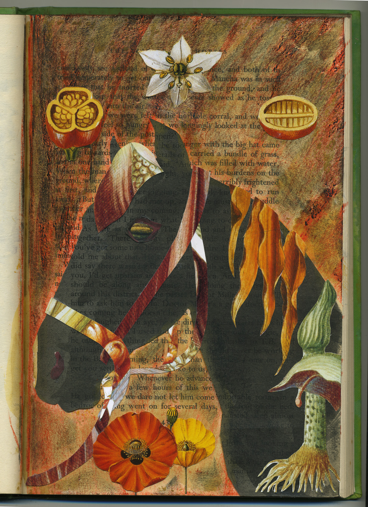
This was an accident really. I was dissatisfied with the original sketch on the left hand side of the skeleton horse spread, and cut this black horse silhouette out very quickly to place over it. In the meantime, I painted out some protruding bits on the other page to give myself a fairly blank canvas. But this led to a new sketch on that page, and hence no need for the cutout horse.
So he went onto a new page, and I started randomly embellishing him. I started with the halter, but war horses and Anzac Day were at the back of my mind and I started putting tassels and other structures into the picture (from an outdated botanical diary). Before I knew it the background had gone smokey, fiery and the final touches were some poppies and botanical bombs in the air. The bombs also remind me of a holy trinity of sorts, but since I am not religious, they are primarily bombs… or just fruit.
I seem to have returned to muted tones for the time being.
Journeys with Birds – playing with colour
The mad colour theme continues this evening. It’s the last day of the school and Easter holidays proper. (Although the school has a curriculum day tomorrow so the boys will be home for one more day.)
This is another bit of playing around for the 52 Week illustration Challenge. It’s not a very serious endeavour and I didn’t try to make anything perfect. I think it’s great to have the chance to do this every now and then, because the pressure is definitely on to get the paid work perfect. (By this I mean that I pressure myself, not that author, editor or anyone else pressures me.) So this kind of play is quite enriching and definitely relaxing. Although the red version was the one I posted, I think it’s the one I like least now.
This is probably more interesting if you see the original daggy drawing (below) that I manipulated into the book covers, with an hour of twiddling in PhotoShop and then Illustrator. Although I drew this unremarkable little bird doodle, even I have trouble seeing the resemblance between the original and the resulting bird. It’s like that shameless re-making that advertisers do with fashion models.
But I do appreciate the flexibility of the software tools I have to hand, especially now that I have plenty of good paint-and-mess time at the drawing board as well. I miss it badly if I’m not getting messy in the paint.
A Field Guide to Birds of the Universe
I finished a spread for Thunder today, so it was fun to sit down this evening and splash around some watercolour paint to create a cheerful parrot (not of this world) and put him onto a book cover for the 52 Week Illustration Challenge. The theme this week is BOOK COVER. It’s a subject close to my heart, and normally I would spend longer than this on it… lovingly tweaking and twiddling each letter and feather. But a quick job is a good job until I am up-to-date in all areas. So here it is.
I don’t think I’ve got that craving for colour out of my system yet… who knows where it might lead…
The Three Demon Cats
If you mentally rotate this 90 degrees anticlockwise, and imagine the faint grey wash without the black ink details, you will be seeing what I painted a few weeks ago for page 14 of Thunderstorm Dancing. They were shadows on the floor for the cat I’m calling Thunder.
I picked up the piece of paper with three grey blobs on it today and looked at it in bemusement. ‘What are those three weird, rounded-yet pointy-blobs? They kind of remind me of something, but I’m not sure what…’
After working out what they were for, and given they are no longer needed, it seemed a shame to waste a piece of perfectly good paper. So I turned them into demon cats.
I could have turned them into nice cats. But their shape was somehow not really wholesome… more gothic. But don’t be alarmed. I will keep them in an iron-bound book and they will be unable to escape. (A small nod there to The Hounds of the Morrigan by Pat O’Shea.)
Those demon cats may be related to the storm cat below. He kind of accidentally appeared when I was drawing storm tendrils… or whisps… or wisps.
Small reader
Wet waiting again
I’m waiting for the boys at their last swimming lesson for the term.
As usual, a freeze ray would come in handy. but in the absence of one of those (perhaps for my birthday?) here are: a goggled boy about to jump in the deep end, a Chinese dad with his gleeful baby in the pool and two kids with very different body types.
Another cat called Thunder
I’m revising roughs on the run. This puddy was a Maine Coon in the rough and needed converting to Rex before inking.
It would be nice to have an auto-conversion button, but actually it’s quite a nice part of my work. The Maine Coon was a bit cranky. The Rex is more comical and sweet. So the pose/attitude needs to change accordingly.
Now for the ink.


