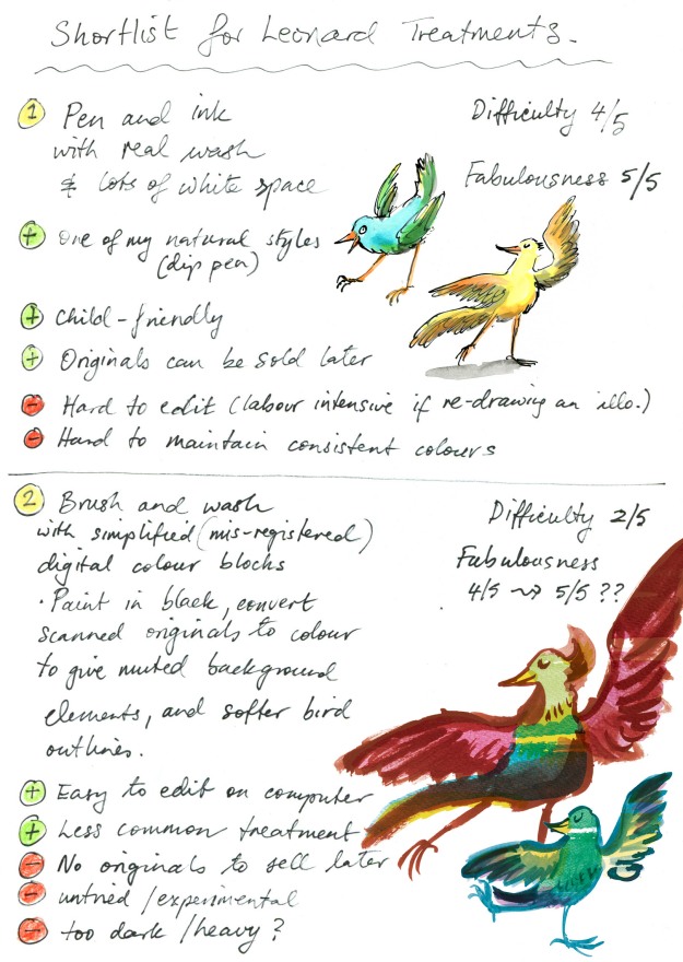
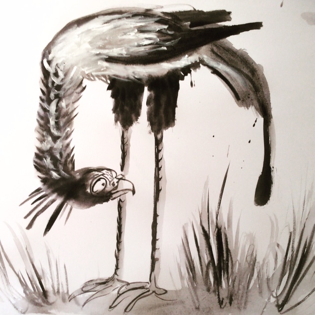
Having had a lot of fun with my digital collage and brushwork, I picked up the dip pen and filled my inkwell once more to explore Option One.
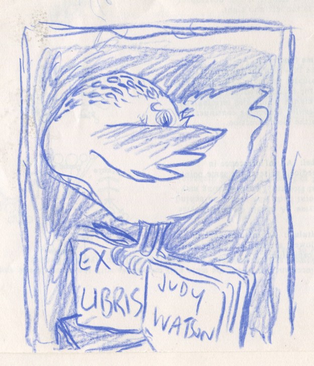
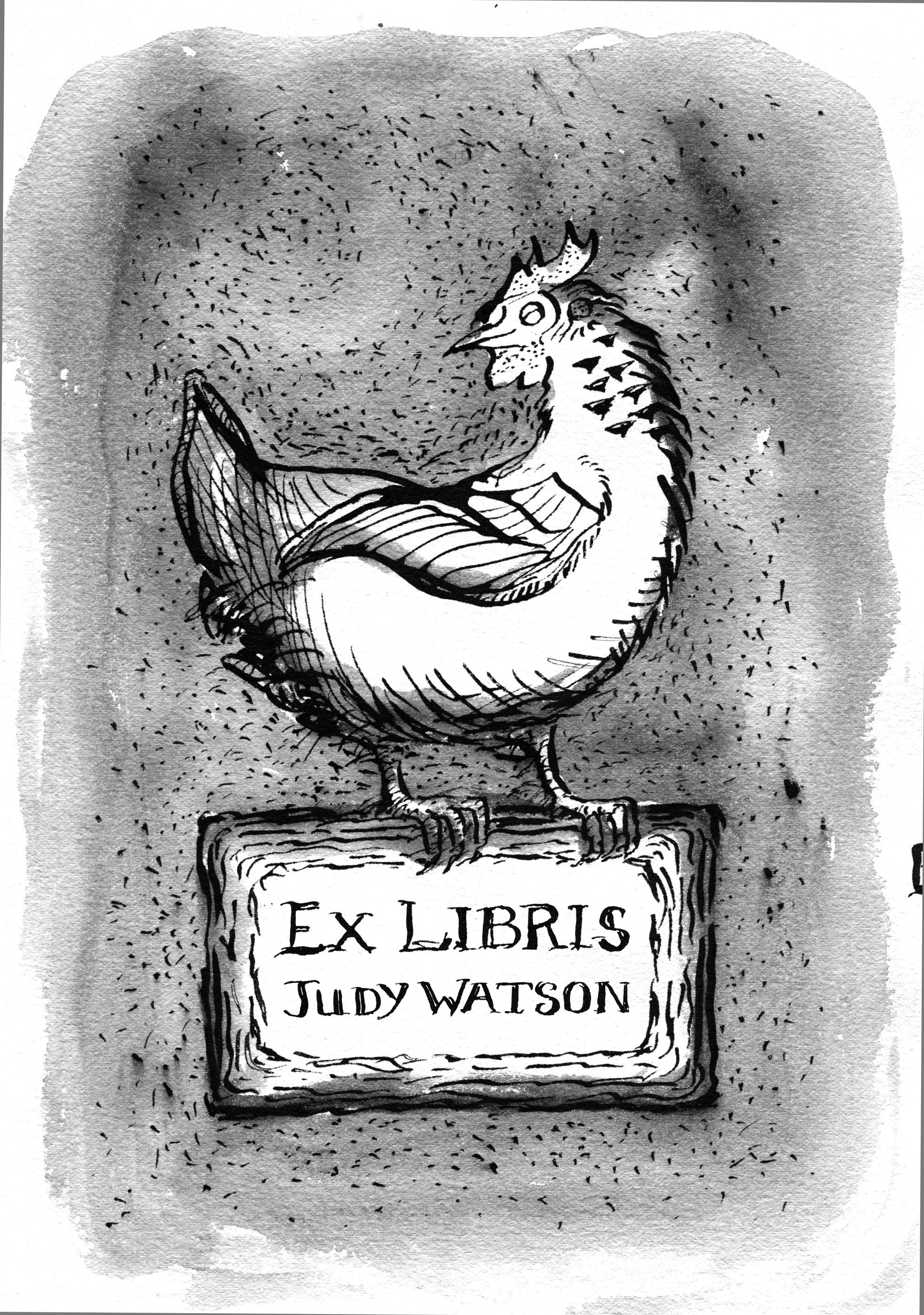
Dip pen and ink with real wash.
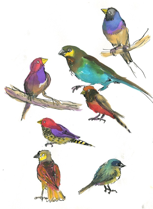
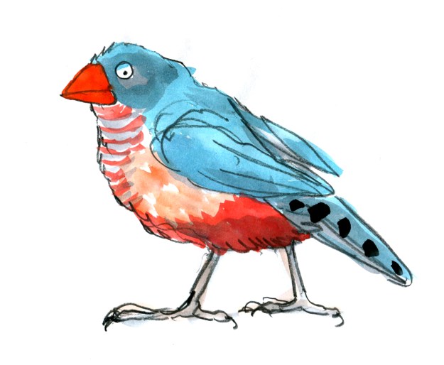
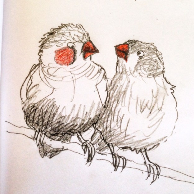
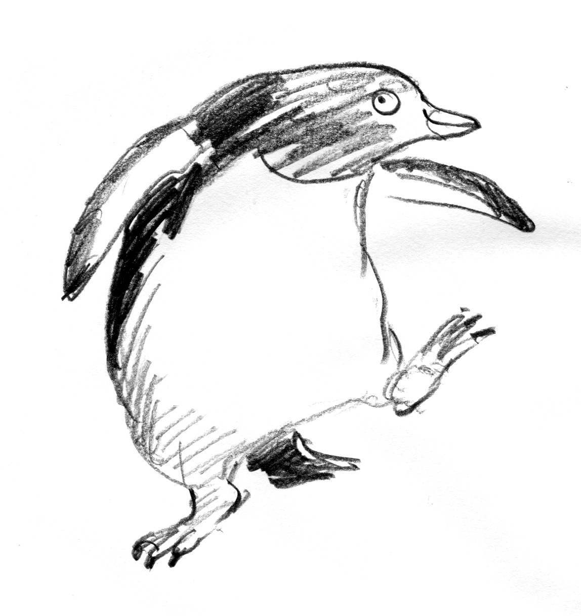
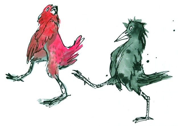
Having fuddled around with birds for some weeks, I felt warmed up. My drawing hand was in action again. I was feeling a bit racy. The big brushy birds were fairly cumbersome in terms of getting the dance action going, and I wanted to see how these birds might actually look dancing; particularly in pairs or groups.
So here’s where my trusty dip pen came in. I used the same one for the whole of Thunderstorm Dancing and I’m not sure what I’ll do when this particular ratty nib gives up the ghost. It’s pointy and twitchy and zippy and once the pen hand is warmed up, the quicker the drawing, the better.
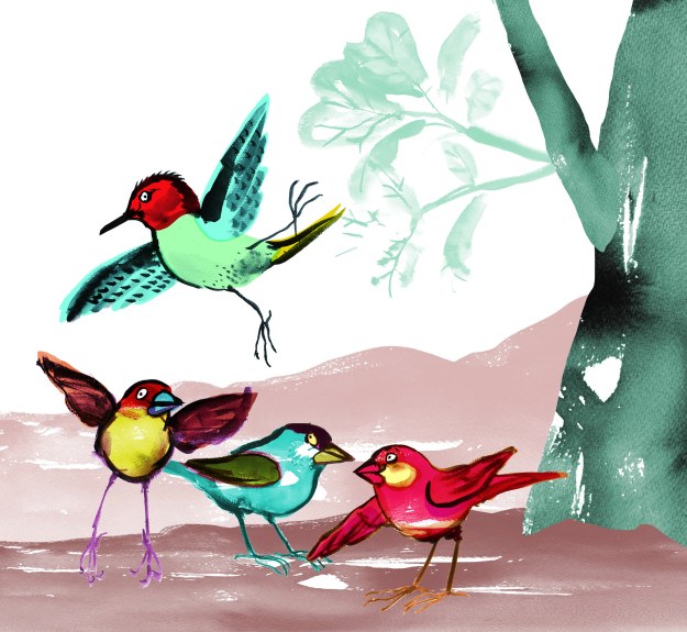
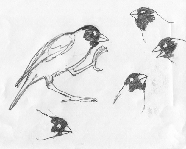
In my first sketches, I referred to pictures of people dancing. The birds looked rather hilariously like people in bird costumes.
Seriously, what???!! Must be stuffy in those bird costumes…
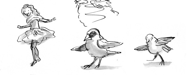
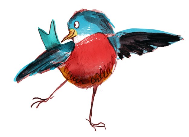
Here you see me trying to figure out how to turn a human dance pose into the equivalent bird pose. Doesn’t work. The bird’s leg joints are so different that when forced into a corresponding pose, they become stiff and awkward.
John Travolta?
They were terrible. After that I put Fred and Ginger aside. Phooey! Better to just look at birds and make their gestures approximately dancelike. Despite my lack of dance expertise, I could put more of an expressive spin on a bird drawing without scrutinising a real dance move.
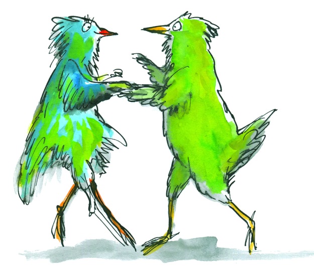
Then it became more fun. These birds were attending an imaginary ball. I gave them names. Just because.
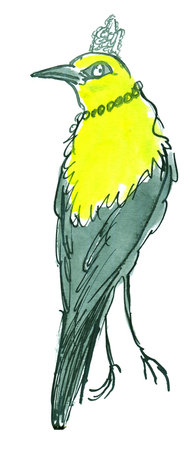
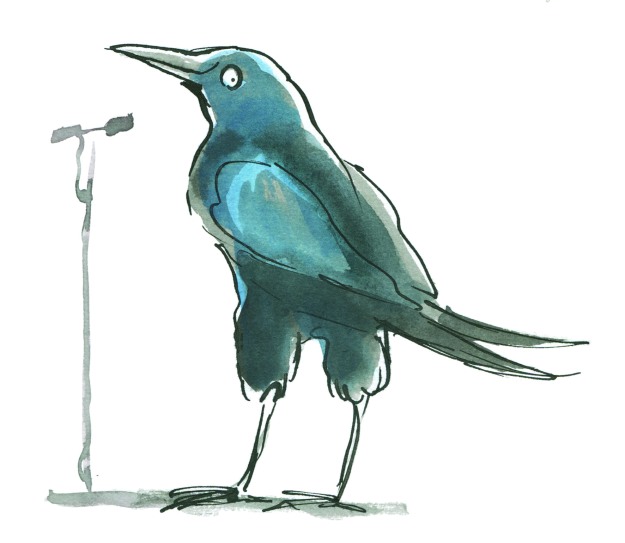
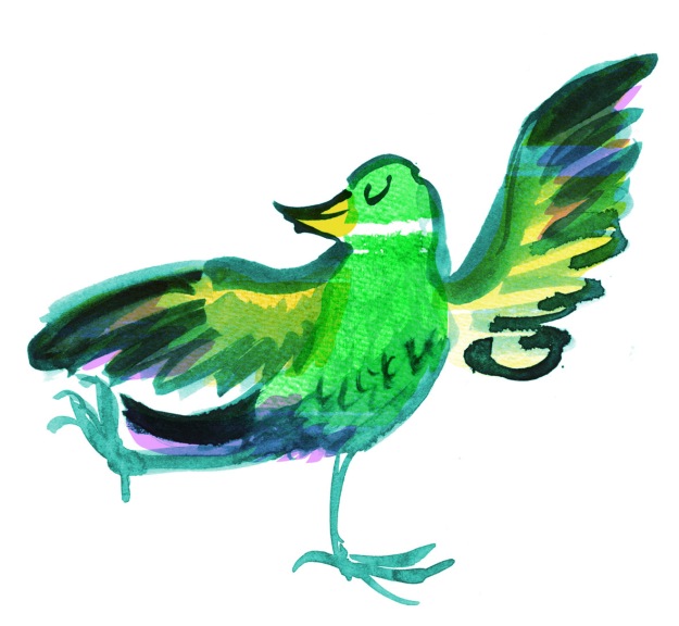
Spotted at the ball this evening – Miss Ophelia Oriole in yellow cape and tiara.
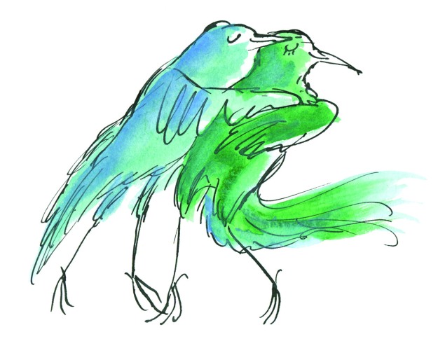
Melva and Gene Shufflebottom set the dance floor on fire this evening. Luckily, no one was hurt. (That’s from Thomas the Tank Engine. Some of you will recognise it.)
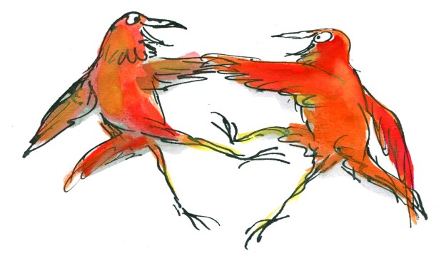
Sparking rumours this evening at the ball, Adele Coiffe and Thomas Furle were inseparable on the dance floor.
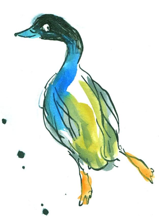
A Mysterious Mallard wowed the guests at this evening’s festivities, but departed hurriedly at midnight, leaving behind a puddle of water.
A starling vocal performance was given this evening by Steve Brash, with backing vocals by the Fluffies. (not shown.)
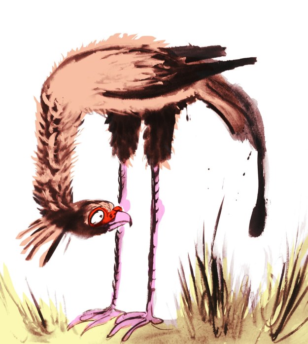
Lastly, I spend about 40 minutes whipping up a page spread in this style to see how I’d go with drawing a crowd. It wasn’t so great, but it was good enough to act as a sample for discussions with the editorial team at Harper Collins.
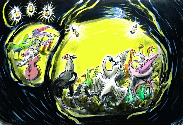
This sketch is coloured digitally, so that I could get a quick idea of how it might look. It’s very rough, and fairly energetic. I like the energy. It reminded me of a picture I’d done for the Ernie and Maud series years ago. Particularly the duck in the middle, waving to a friend. (There was an excellent hot air ballooning duck in that story.)
I’ll be interested to hear what treatment you would have chosen. But I have to say voting has closed and the team at Harper Collins voted unanimously for….
drum roll…
BRUSHY!
Let the games begin!
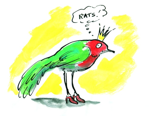
Was it the shoes? Too much?