This year, while I’ve been lurking in my home studio during Melbourne’s lock-down, two of my picture books have been going around all over the place doing things without me.
CBCA Book Week 2020
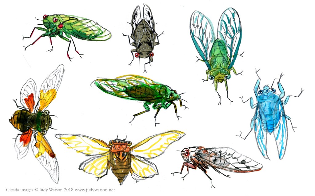
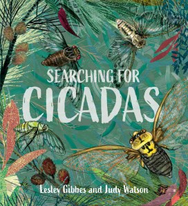
Searching for Cicadas has given me a wonderful inside look at the CBCA awards this year, by being shortlisted for the Eve Pownall award. I was intending to get out to schools this Book Week to enjoy the buzz among teachers and students, but due to the lock-down, any school visits would have been via Zoom, and that’s a bridge too far for this phone-phobic introvert. (Although I don’t rule it out later on.)


But I enjoyed the Book Week buzz on line – the costumes, the amazing books, the teachers doing their thing. I loved the YouTube video presentation of awards. It featured insightful comments from school students of all ages and intimate presentations from book creators; all the more special because of their personal setting in people’s homes. Indigenous Australia—both the people and the land—had a strong and resonating voice. You can view the entire thing here. The judges’ report and a description of all the winning, honour and shortlisted books can be downloaded here. Thankyou CBCA, for the sterling work you do.
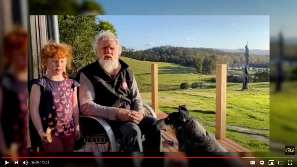

Above, Bruce Pascoe talks about Young Dark Emu, a Truer History which won the Eve Pownall Award, and about Australia, our children and the future.
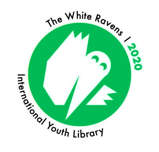
White Ravens 2020

A couple of weeks ago, a rather different bit of recognition came my way and I confess to feeling a bit emotional about it when I heard. Far from here, in Obermenzing in the western part of Munich, is a castle full of books. It’s called Blutenburg Castle and is the home of the Internationale Jugendbibliothek, the International Youth Library. It was founded in 1949 by Jella Lepman and it has become an internationally recognised centre for children’s and youth literature. Its central purpose is to ‘promote global children’s and youth literature of high aesthetic and literary quality and of significance for cultural literacy.’ And each year a team of experts select books from all over the world to be named White Ravens and to be presented at the Bologna Children’s Books Fair and the Frankfurt Book Fair.
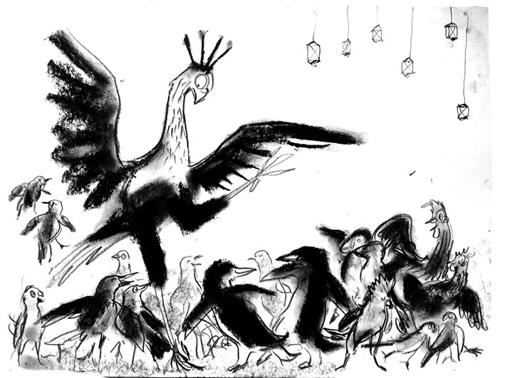
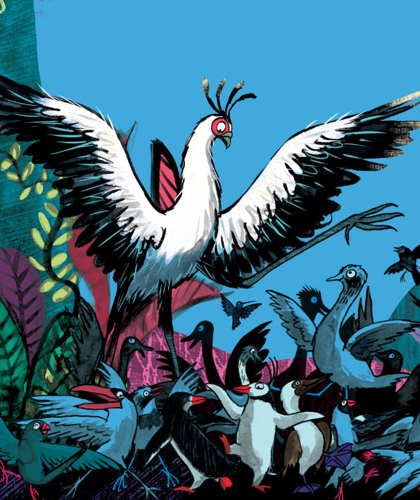
Of five books from Australia to be named in 2020 The White Ravens – A Selection of International Children‘s and Youth Literature one is Leonard Doesn’t Dance! I’m deeply happy that this warm story by Frances Watts and me has received some recognition. And since Leonard is to dancing, what ravens are to singing, it brings some delightful images to mind…


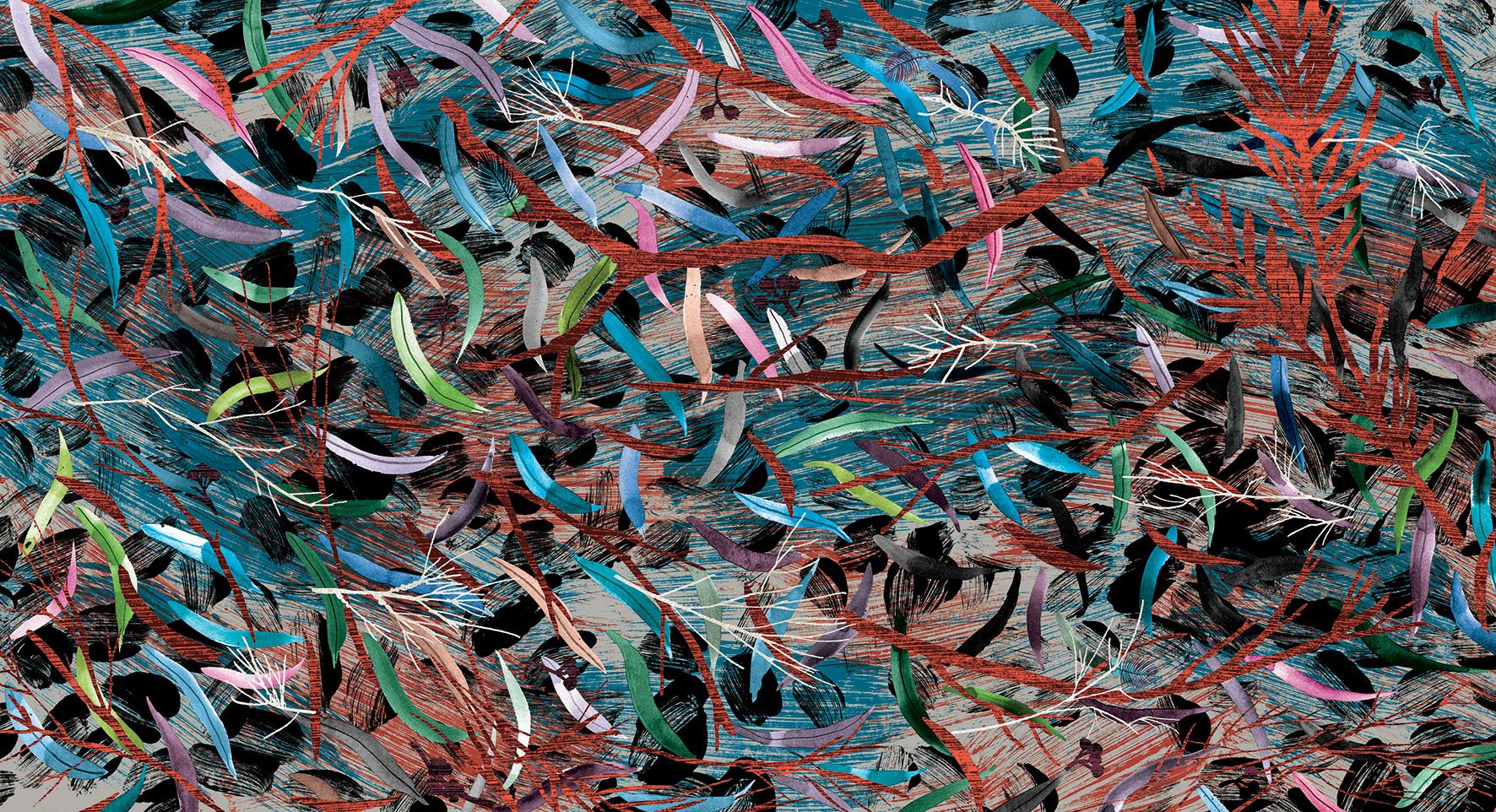
The gorgeous artwork on the cover of the White Ravens catalogue is by Emma AdBåge. You can see more of her work here.

Royal Zoological Society of NSW Whitley Awards 2020
Oh boy! What is a RZS, NSW Whitley award? It’s a celebration of all things nerdy and naturalist. That sounds like my husband. But nope. It’s a book award, this time from the Royal Zoological Society of NSW. ‘Awarded annually, the Whitley Awards are presented for outstanding publications that profile the unique wildlife of the Australasian region.’
I’m happy to say that Searching for Cicadas is a recipient of the award in the children’s story category. You can find the full list here. The beautiful sticker features a sugar glider, who would probably eat my cicadas, but that’s a price I’m prepared to pay. Thank you Royal Zoological Society of NSW.