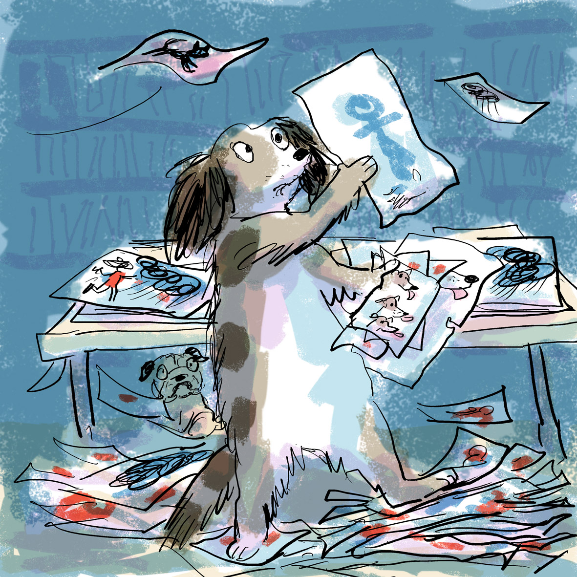
Me, my work and The Undrawn Pug, hiding under the drawing table

Me, my work and The Undrawn Pug, hiding under the drawing table
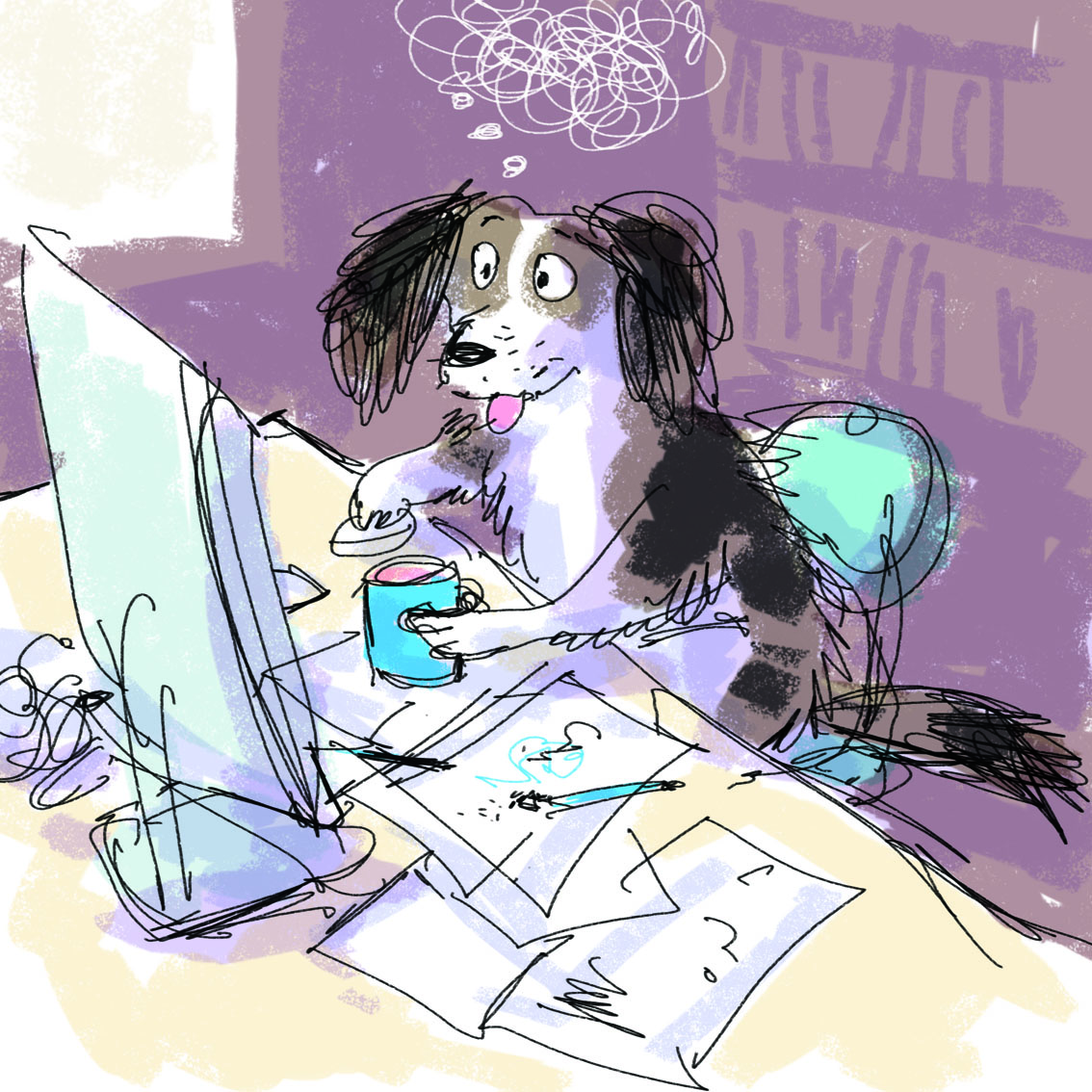 I need another cup of tea.
My bottom is becoming chair shaped.

You may laugh. Oh, yes you may. But I have just spent about 45 minutes working on a tongue for this dog.
The eyes may be crucial for a book character’s expression, but with a dog, the tongue is almost as important. I have just been deciding on which tongue of six options is the best for this tender lick.
Tongue down (start of lick… looks a bit like a raspberry), tongue forwards (mid lick… too flat), tongue up (reaching for kiss… chose the best of 4 of these!) I am reminded of my school art teacher showing us slides of classical statues and paintings and explaining how the artist chose a moment for the pose that suggested both what came before and what came after, to give a sense of the full movement and life of the subject… I’ll bet Myron in the 5th Century BC never thought his Discus Thrower would influence the state of Lucy the Whippet’s tongue for Thunderstorm Dancing in the year 2014.
Thunderstorm inking is in progress this afternoon. I stopped to paint a cat on a discarded piece of paper (a piece of paper with two eyes cut out of it for Greyfur the puppet and a great deal of splodgy ink). This is actually a glorified-blob drawing. The blob suggested the Cornish Rex, and then I finished it off and put some shadow play in the background, experimenting with tone and shape in the way that I want to much more in the future. The Greyfur eye holes (bottom right) can be seen but have been filled in with a collaged piece of watercolour paper behind.
But here’s the thing. The original hard copy looks like this (below).

I’m reasonably pleased with this picture as a start. But it needs more tonal contrast and more definition in some areas I think. I shaded those blue areas over the top of this image in PhotoShop, almost without thinking, because I’m using PhotoShop so much to edit and enhance illustration work at the moment. I wanted to see what would happen if I added a further layer of colour and shape.
Now I can go back and add this over the real image if I want to. Or in a different colour and pattern. It’s a handy experiment that I hadn’t thought of before that might be quite helpful with my painting practice sometimes.

Weaselly Wolves – painted in 2013 for ‘One Word One Day’
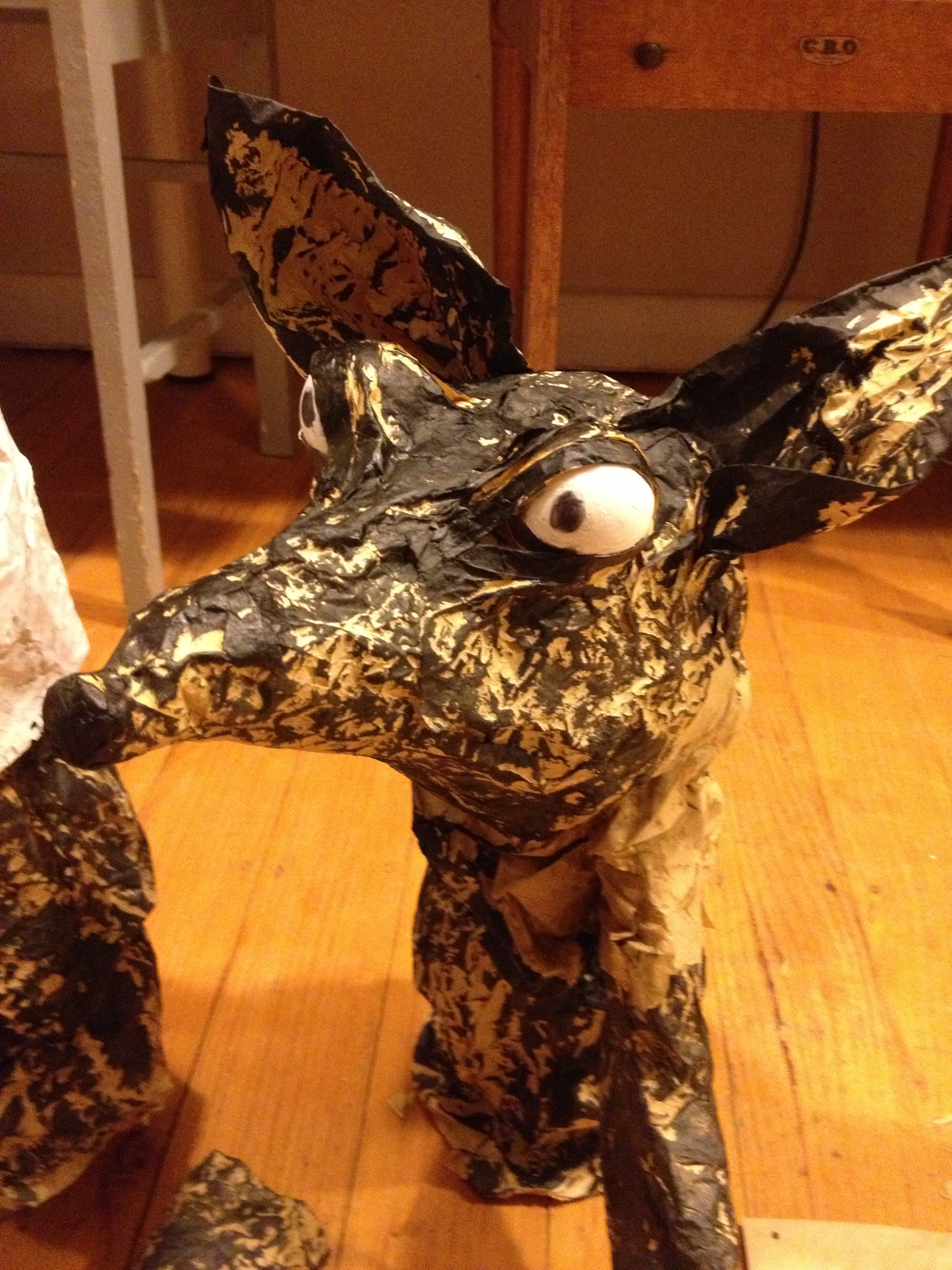
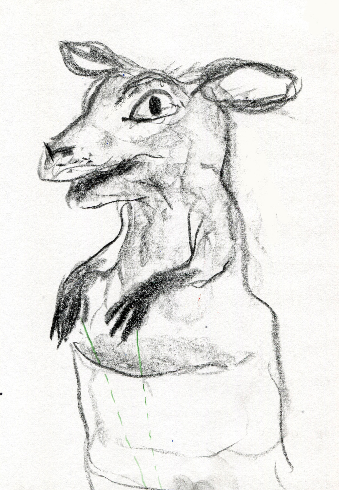
Finding myself trying to make Greyfur too anatomically kangarooish was making my puppeting challenge hard. Indeed, my son asked me if the incomplete Greyfur face was a dog or a deer.
Other subjects I’d earlier considered making for the Puppet Challenge had included the following. All have been covered by other puppet challengers as it turns out.
The Big Bad Wolf
The Big Bad Wolf is a favourite topic of mine, as I’ve been a fan of Angela Carter’s writing for many years, but he’s not a local myth like Greyfur. I also find wolves pretty easy to draw because along with their doggishness is the fact that the BBW is now such an icon, that he is recognisable in any kind of shorthand format and is way above any kind of need for anatomical realism.


Wolfish types (above), bearing little resemblance to Canis Lupus.
Puss in Boots
Puss is also not a local tradition. Angela Carter does a fabulous rendition of this fairy tale too. And as I seem to be obsessed with Cornish Rex cats at the moment, my Puss in Boots sketches were distinctly Cornish in flavour; black, big-eyed, big-eared, narrow-framed.

This one was for the 52-week Illustration challenge, but I was thinking about Puss in Boots for the puppet challenge at the time.
first sketch, always too naturalistic, but he almost captures the devil-may-care nonchalant cat personality I was going for.

shadow puppet perhaps? I liked the idea of the sail-like ears being semi-transparent and the rest being solid black card.

a further attempt to get whole figure on the page!
marionette? With Yarn body and wooden boots?

black yarn knitted or crocheted body?

Back to the shadow puppet idea. I drew the shadow puppet ogre and the mouse that he turns into, foolish fellow. I also drew the king and had a couple of goes at the lad.
Troll with Billy Goats Gruff
We live by a creek with a bridge so this had some local relevance. And this was the first one that I considered using the crumpled paper for. I had it in my mind that the curling horns of the goats would look great if made out of crumpled and twisted paper. And I was intrigued about the challenge of making three goat characters and capturing the varying ages and personalities of the three (a theme I had a lot of fun with in The Middle Sheep by Frances Watts.)
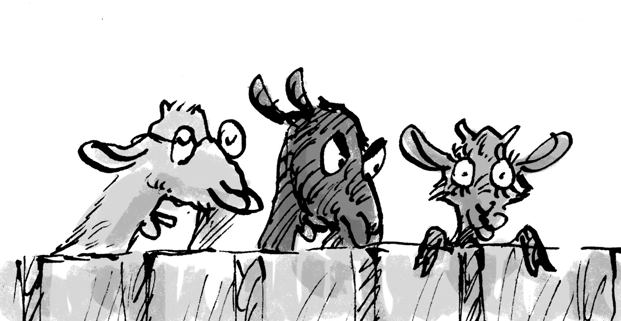
Three goat siblings I drew for ‘The Middle Sheep’ by Frances Watts
I seem to have misplaced my puppet goat sketches. They’ll turn up somewhere unlikely one day…
Greyfur the Kangaroo
A couple more sketches I found while I was looking for the goats!
So anyway… I went back to the wolves in the picture at the top of this post! These two rather weaselly looking wolves are plotting mischief together. Below are some photos of the fun and messy creative process the other night on my kitchen floor. The boys were having a fantastic time for much of the evening, playing with a sack full of puppets that I had tipped out onto the floor. Puppets really do inspire all sorts of creative play.
Two (Big, Bad) Wolf Brothers
starting point

eyeballs
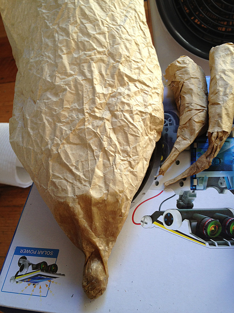
one weaselly nose and some fingers with claws drying in front of the fan heater

three toes before strapping together to make a hand. I was careful this time to make the outside and inside fingers the right length.

strapping together to make a hand

adding a thumb
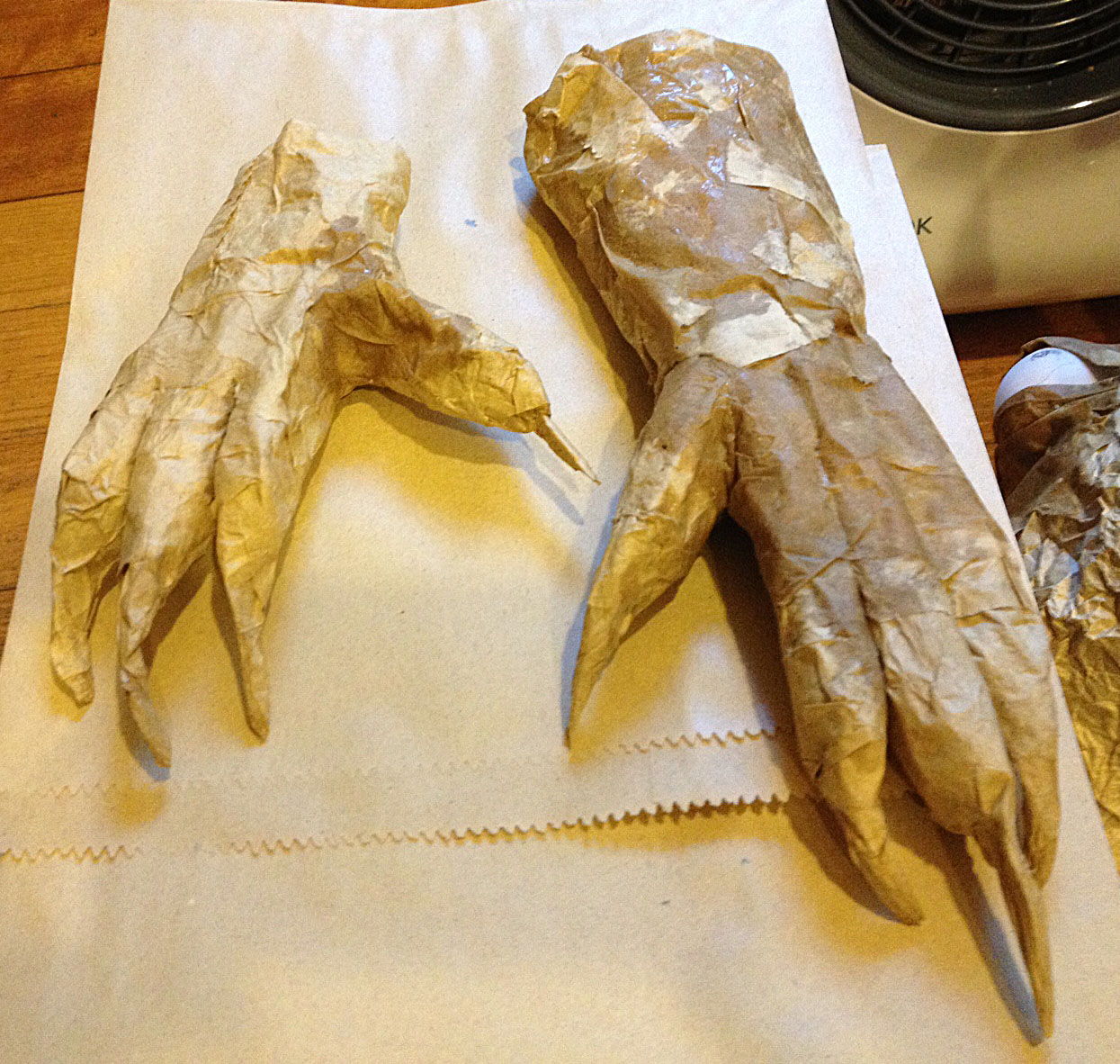
two hands, one with a wrist

two hands with wrists
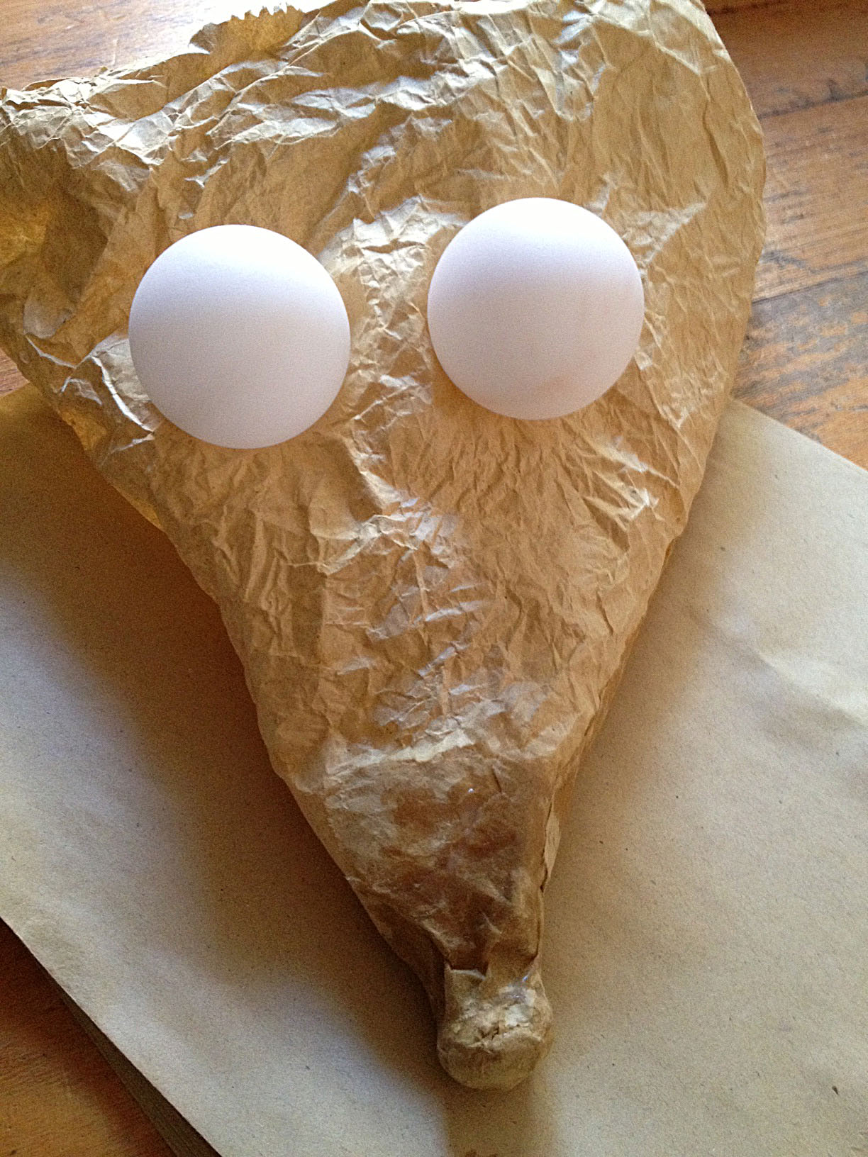
positioning some eyeballs!

adding eyelids (with rough dots for pupils)

time for some teeth after the lower jaw added


I wanted the teeth to be very crooked and uneven
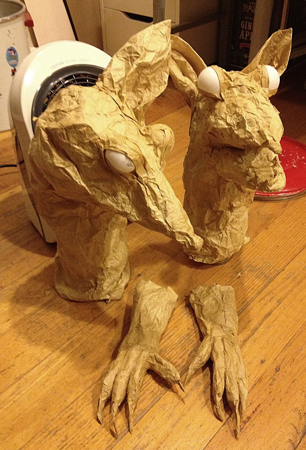
both with eyes and with ears under way

All ears connected. The Brains (left) has narrower eyes to make him look more sly. Brawn will have the lolling tongue.

Indian ink on crumpled paper. A very satisfying process

Black paint on. I may add more later.
This guy is just asking for a tongue now.


tongue ready to attach. Teeth and eyes with some white added. Brains will have moving hands. Brawn will have a moving mouth. (This is probably rather counter-intuitive but there ya go!)

with tongue, painted mouth, bloodshot eyes and Granny’s bonnet.

Would you buy a used car from these two?
This is where I had to stop. If I have time Brawn (Actually, I think his name is Willy) will get a nightdress slightly stained with blood on the front, and lacy sleeves from which will protrude his long, black claws over the bed clothes.
Brains (Hmmm… Ernest, perhaps, because he’s anything but earnest) will have working arms, but I’m not really happy with the high attachment I’ve started here. I think he’d be more impressive without such a distorted scale. I might give him long arms and move them with rods instead so that they can creep in from the side in a lurking sort of way. I think these two should look rather long and rangy like their original drawing, rather than dwarfed versions of themselves.
I’d love to add whiskers, but not sure where to get those twirly feathers from that people use on puppets. I could modify some of my chickens’ feathers I guess… But I’ll have to leave these rascals for now.
Brawn and Brains Inc. relax in front of the fan heater, gathering strength for the coming battle with Red Riding Hood, Grandma and the woodcutter.

<a
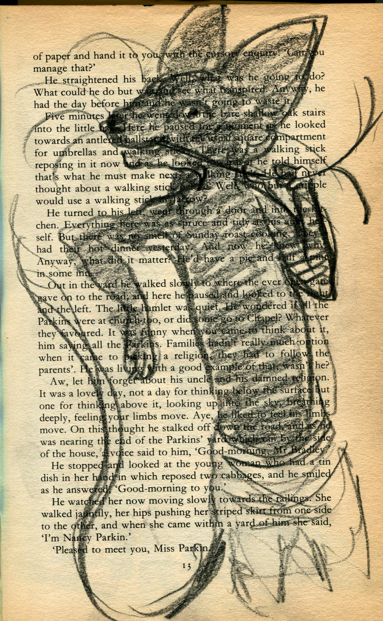
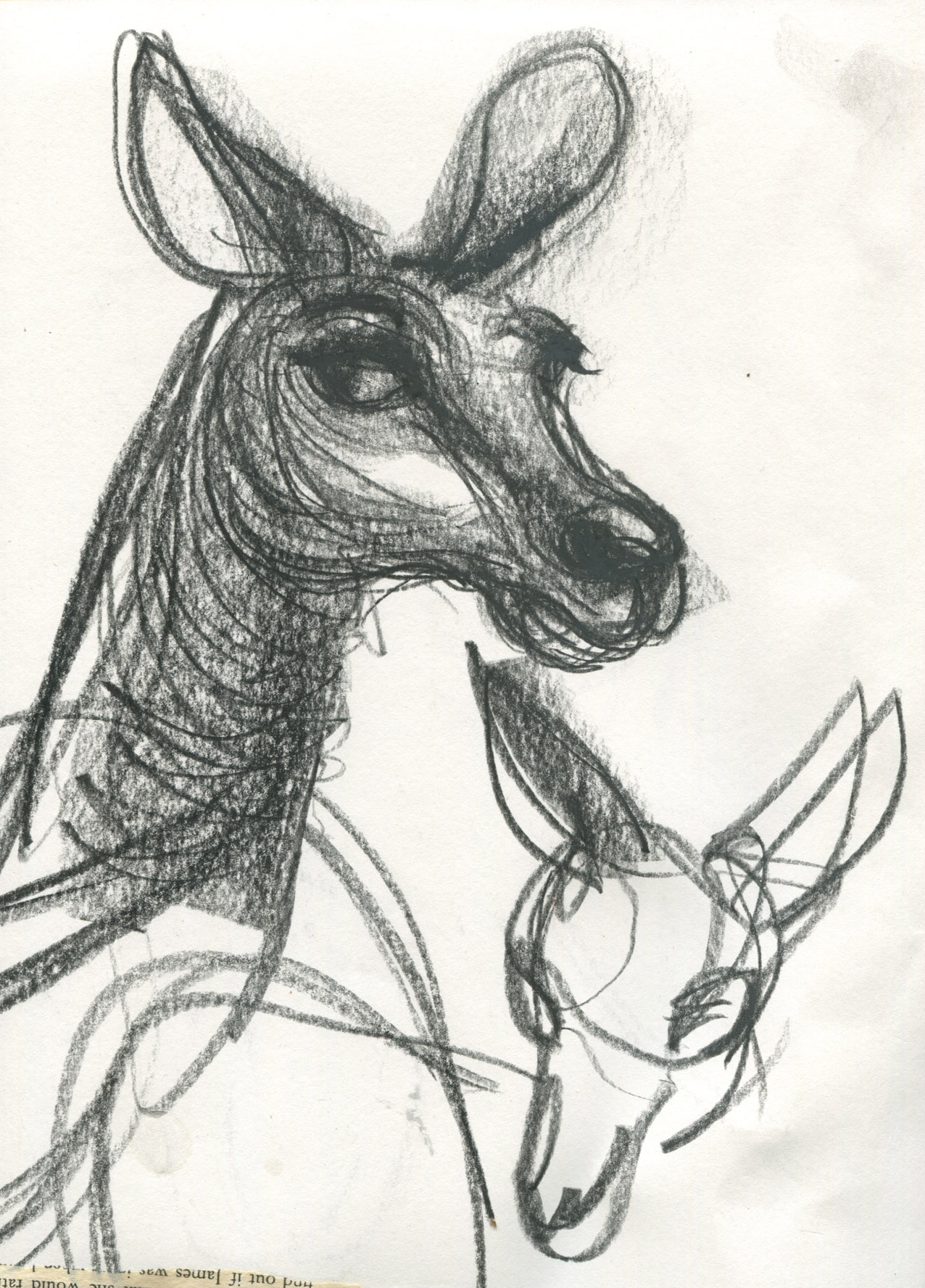
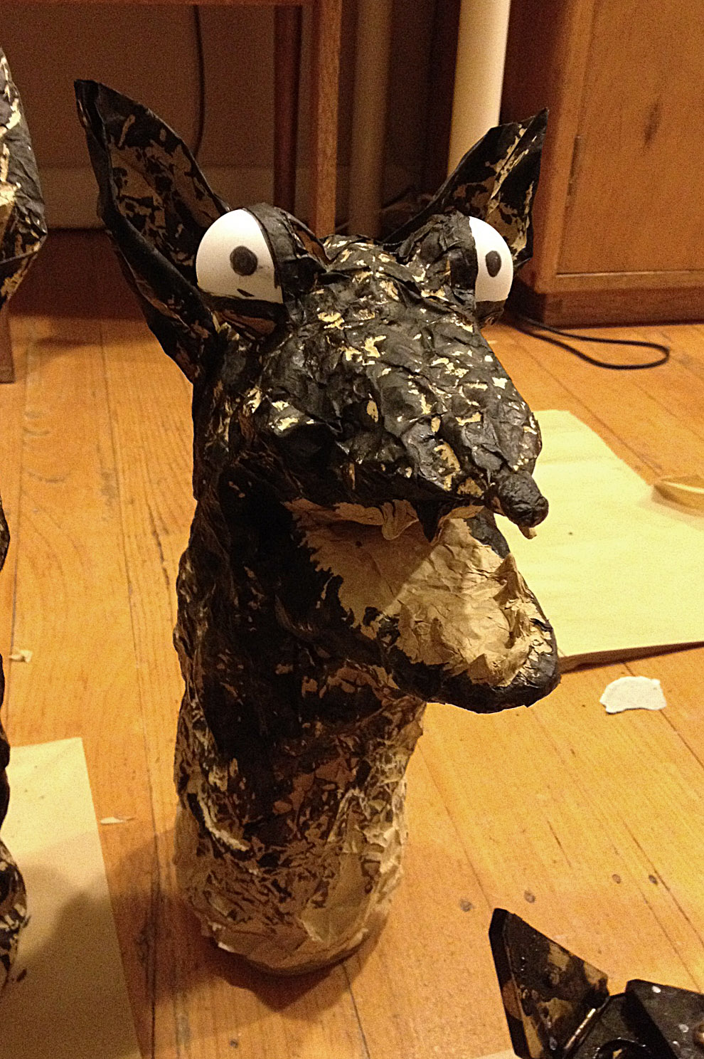
Here’s Greyfur the Kangaroo from Alan Marshall’s Australian fairytale Whispering in the Wind. I drew some sketches of her a while back as a beginning to my concept for a puppet for Clive Hicks-Jenkins’ Puppet Challenge.

Here’s another, later head portrait I did for Greyfur
I always imagined my Greyfur would have a moving mouth but also needed moving front arms so that she could pull things out of her magic pouch. It would also make sense for a kangaroo to have prominent hind legs. Since a marionette is beyond my technical skill without the investment of many hours of learning, I was a bit stumped as to what kind of puppet she might be. I love shadow puppets, but they’re not right for this character. Glove puppets generally work by concealing or omitting the legs… hmmm
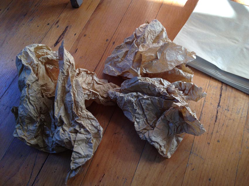
My stumped feeling, along with my other work demands have made postponement the only thing I’ve come up with for this challenge. So during a recent stay with my parents-in-law in Camperdown in the school holidays, I decided a now-or-never approach might be best (especially as the first instalment of the Puppet Challenge had already been published on Clive’s site!) So I threw myself into a crumpled paper concept that had been lingering in my head for months but which I had never properly thought out.

crumpled paper – ready to begin!
I am always attracted to working with paper, especially if it’s not pure white and pristine. Paper is forgiving and fixable and as my approach has by choice a rough-finished aesthetic, many tearings and glueings would not matter. I have also always loved the floppy, rough expressive quality of an ordinary sock puppet, that comes to life in the hand of anyone, no matter how young. My vague thought was that the puppet would be a crumpled paper sock-puppet with personality rather than anything else.
Gail kindly lent me the use of her sun-filled studio and I set to work with no kind of method at all. 
The first thing I found was a kangaroo nose in a corner of the paper. I coloured it black below and then folded.

I painted her eyes as per the portrait.

made a couple of ears
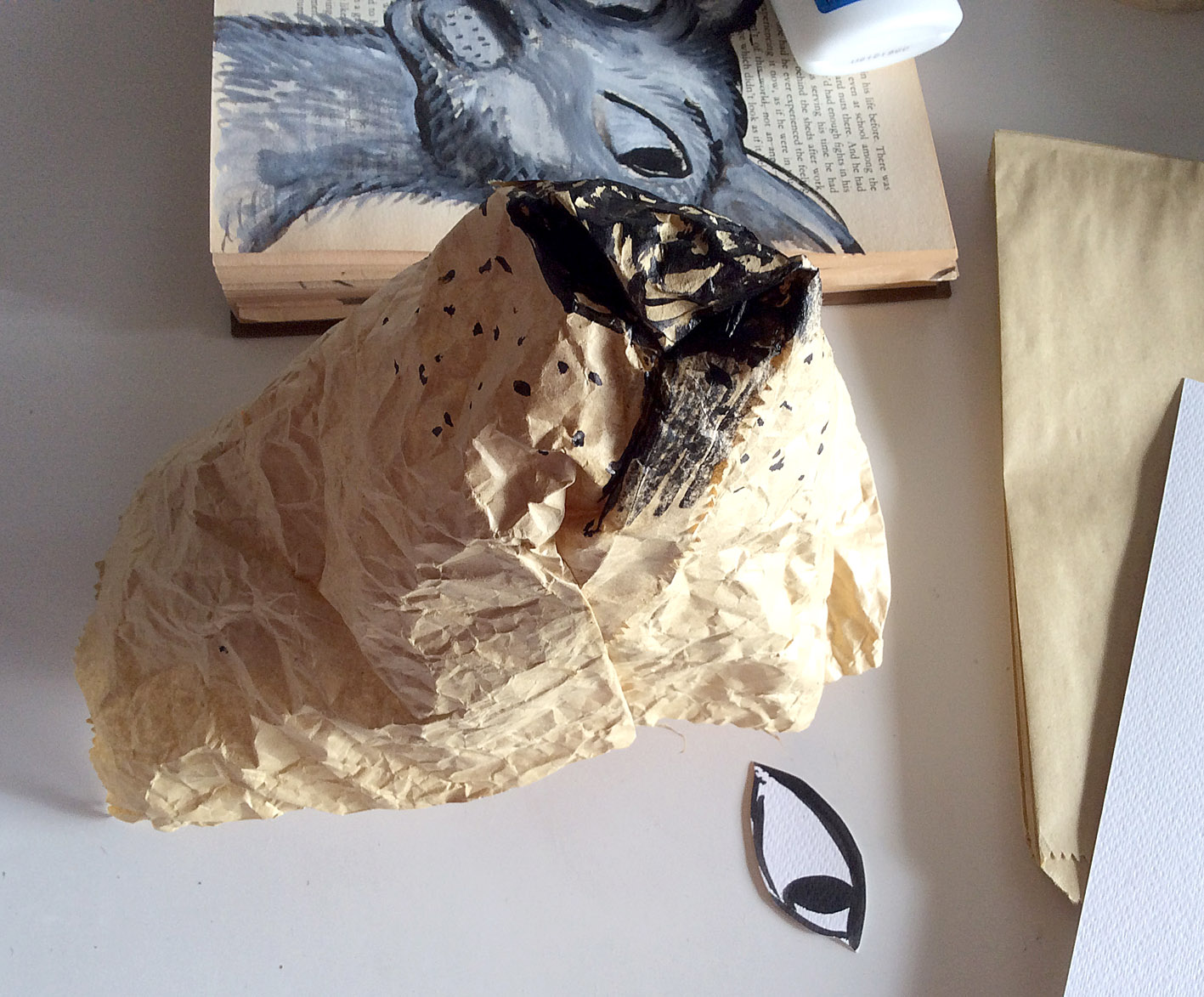
Nose in a very rough shape. I could see this was going to be interesting to shape without any underlying structure. I didn’t want too much shape (the sock-puppet floppy roughness was what I was after) but I didn’t want total shapelessness either. She had to have a kangarooishness. A Greyfurness.

I glued on the eyes. I knew this would be the clincher in the end. The eyes are everything to me. They make or break any character I am creating.

Ears next. Greyfur has no brow. No ‘stop’ as the dog people would say, and this doesn’t work for her. I’ll need to find a way around this.

Attempting to add a separate brow. A new plane to change the direction of the puppet. In the meantime I noticed that she was getting too big for a glove puppet.

I added an internal strut from eye to eye to see if this would hold her head and eye position to keep her from flattening out.

The strut did work partly. Here it is holding the width of the head roughly in shape but she still had no brow and no narrowing muzzle. I’m aware that anything can be fixed with cutting or tearing and re-gluing, but it will all be pretty random, as I don’t have pattern making skills!

Still not the right shape. The eye shape and position was the biggest problem. At this point, Greyfur was pretty wet in a range of areas and needed to spend some time toasting in front of the fan heater, so I turned to the paws.

Here we go! Paper, glue, bits of paper towelling, adrenalin, cup of tea.
taking shape

Four claws. Looking ferocious.

Curl the paper and glue. stuff with a little paper wadding. Paint the nails.

The second paw I painted beforehand so that I could paint flat. I really love this distressed dry-brush effect on the paper. It is great for suggesting the fur on marsupials. Often the fur has black roots and grey tips so where the coat parts a downy darkness shows.

A finished paw from above. Although the outer claws and toes are longer than the middle ones which is not ideal, I like the overall effect.

Finished paw from the side. One thing I like about this is that it looks so Australian. The black-dipped toes are characteristic of our mammals but also suggestive of the look of trees after a bushfire, with burned branches at the top of partially charred trunks.

Eastern Grey Kangaroo
Well, I can’t show you a finished puppet, because we left for Melbourne when I got to that point. I’m not sure whether to try to finish this one or start again with a smaller one. I’ve also thought about how I would operate the puppet. I had some idea that I might need two hands to work it, one for the mouth and one to operate one or two paws, but it would be a little awkward.
However I could do this.
One hand could operate the mouth, and the paws could be operated by rods inside the pouch. They could be drawn down into her pouch to retrieve something, and a fishing line suspended above could draw out a silk handkerchief as a distraction, or indication of magic in operation whilst a new puppet is quickly brought onto the scene apparently pulled from the pouch. With the aid of a child’s imagination, this might work.
Here is Rosalie’s interview response. A visit to her blog to enjoy her lush canvases and delightful merchandise is well worth your while.

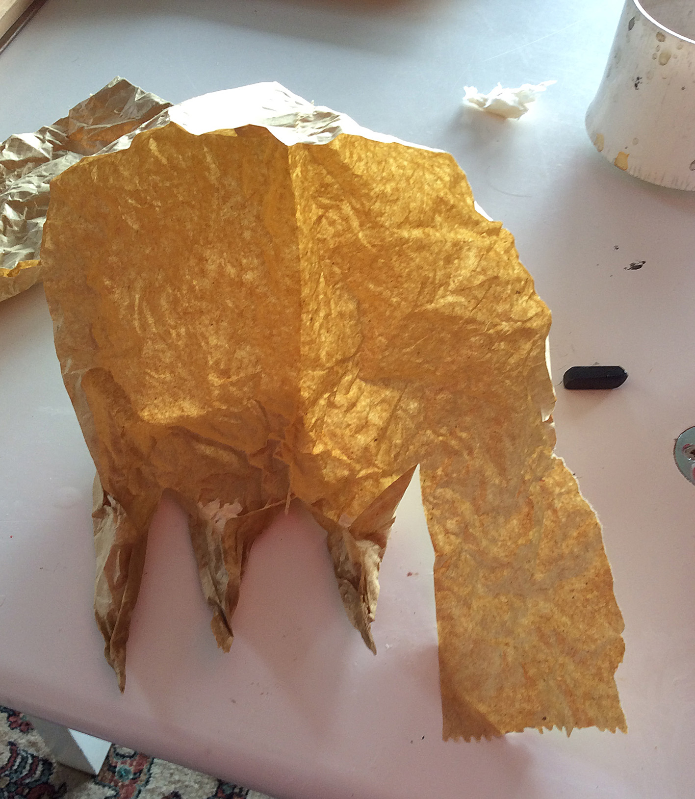
Gold Leaf – by Rosalie Street
The blog tour topic is The Writing/ Drawing Process. Since as yet, I have found little time to work on my writing projects and instead have been madly drawing, I’ll answer the questions in the context of my artwork.
At the moment I am in the late stages of final art for a picture book by Katrina Germein to be published by Allen & Unwin. The book is called Thunderstorm Dancing and it has been over two years since I first starting mulling over the project.
As soon as I read the manuscript, I thought it would be both a great text and a very difficult text to illustrate. It has indeed proven difficult for me, but I also realise that I suffered from the internal pressure that comes from winning an award; this will be the first of my work to be published since that award and my inner self told me very sternly that it will have to be good. But I now move towards the completion of the book and I’m looking forward to seeing it in print.

An unused sketch for ‘Thunderstorm Dancing’
There have been many sketches made for this book. A decision on medium was elusive for a while. But it came along in the end, and I’ve really enjoyed the layering and scratching in PhotoShop combined with the earthy texture of the real paint and pencil on Litho paper.
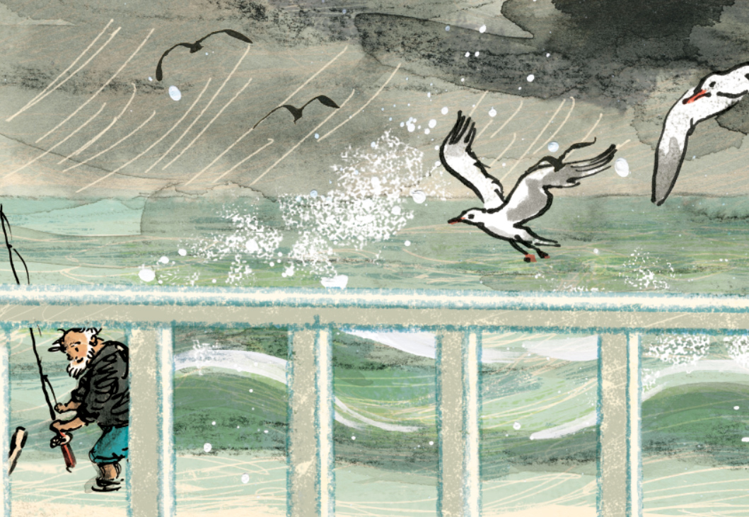
A small fragment of one final illustration from Thunderstorm Dancing
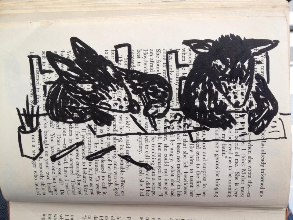
Last year, while struggling to progress with the picture book, I almost accidentally began sketching in old books as a form of relaxation. I say almost accidentally, because I have admired altered book art and found poetry for quite some time, and had always intended to try it. But starting was not a deliberate step into something new. It was a gentle bit of play, while watching my children in their swimming lessons.

drybrush sketches in the bombing zone of the local swimming pool. Ink on vintage book page.
I began sketching them and other children. And I really loved the effect of the drawn image on the printed page. It also helped me with Thunderstorm Dancing, because I had decided early on that the family in the story would be at a beach house, and the main characters all in swimming cosies.
Altered book art continues to be one of my favourite activities, and I intend to do much more of it, and to explore new ways of using it in art projects.
The 52 Week Illustration Challenge, dreamed up by Tania McCartney, was something I joined early this year. It requires participants to produce artwork to a given theme that changes each Wednesday, and then post them on the 52 Week Illustration Challenge FaceBook page.

52 Week Illustration Challenge: Week 14: simplicity.
This was a really enjoyable experiment with ink and watercolour
One of the things I loved about it was that the community of people involved were from varied backgrounds and were supportive and kind to one another. Since early this year the group has grown to over 2000 members, many being expert practising artists and the standard of work has I think, sadly frightened many of the less skilled artists away, but the mood of generosity remains. And it is surprisingly good to have a theme to work to each week… often themes that I find very unappealing until they lead me off into some fun experimentation.
I have deliberately kept this challenge as a low-profile task for myself. I never spend long on anything I do for The Challenge and never worry too much if the work is imperfect or not my best. This, along with blogging imperfect work, has been a really healthy learning experience, and a great way to keep producing lots of other work and exploring as an artist, as well as doing my book project.
This is an on-line exhibition organised and curated by Clive Hick-Jenkins along with Peter Slight. I’ve not done so well with this one. In contrast to the other challenge, I have allowed this to become larger than life and daunting. I also failed to come to a decision over subject and medium, although my lightbulb moment came today in the shower (they often do happen there) when I may be too late to make it. So I’m not sure if that counts as something I’m working on or not…

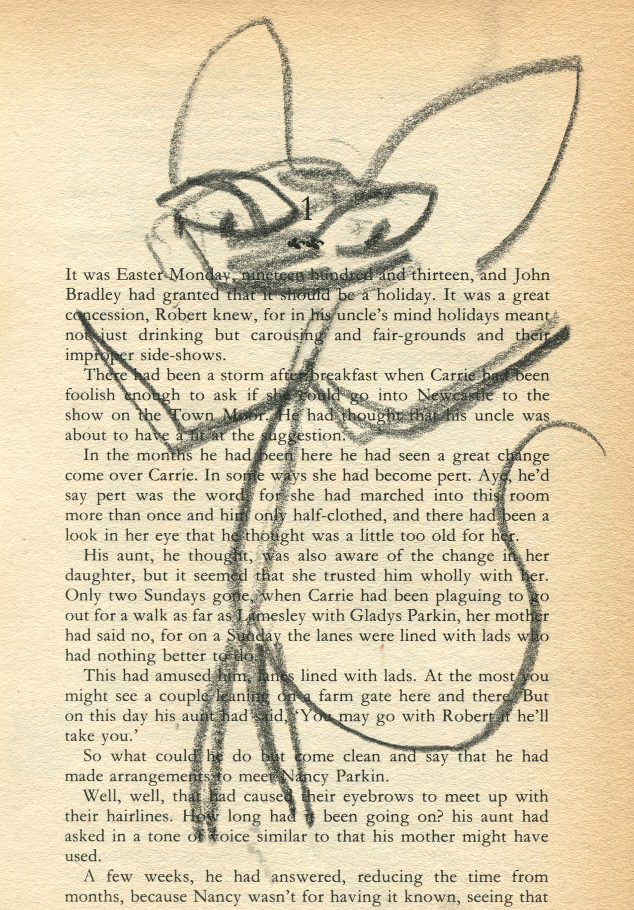
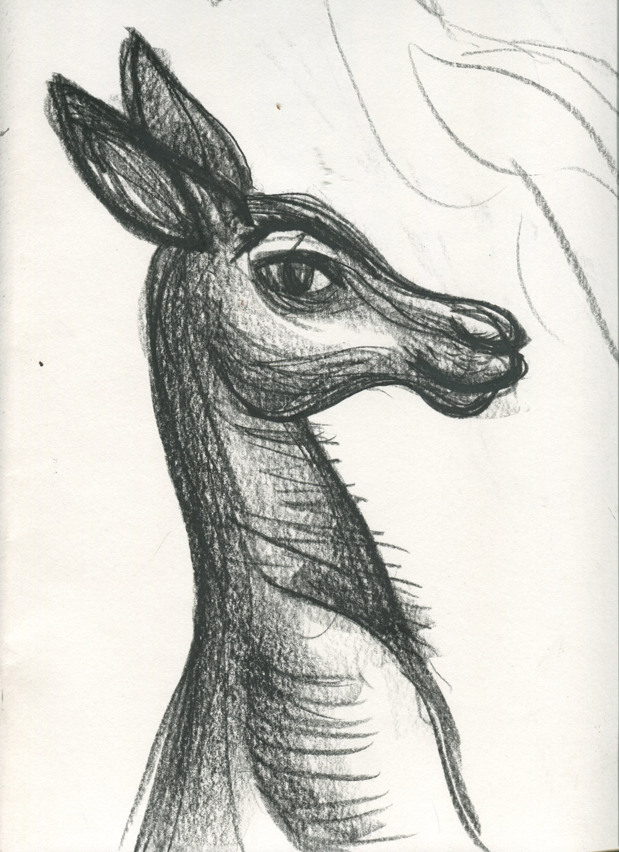
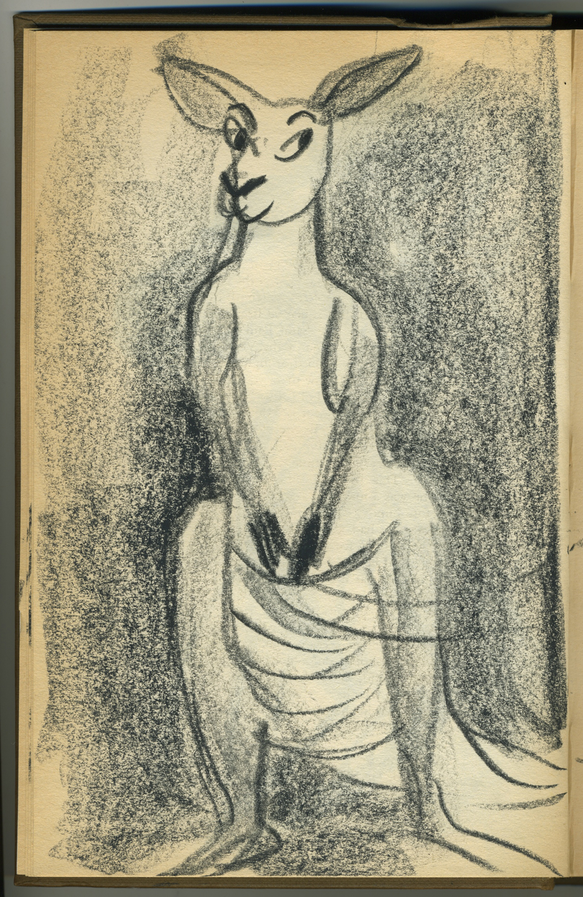
Appropriately perplexed looking sketch of Greyfur the kangaroo who was my original subject matter for the puppet challenge
Periodically I take up graphic design work if it is not too time consuming. I enjoy this work very much, but too often lately I have had to decline offers of work due to the unfinished book and lack of time. Some of my favourite work is with the Australian Children’s Laureate support team who produce various publications and branding items every now and then. In this context I enjoy using other artists’ work and modifying it to use as part of a design. Ann James drew the magpie who became the Australian Children’s Laureate logo and I have used him in lots of ways.
The Australian Children’s Laureate logo in one of its formats
School children from around Australia made artwork that I used in silhouette for the pitch for Boori Monty Pryor’s Storykeepers documentary.


This project of course doesn’t belong down the bottom here. It’s a very big part of my life – too big to summarise here. So I’ll simply say that I keep myself busy with two much loved youngsters Arthur and Hugo, husband Scott, the dog Dexter and chickens Hilda, Emily, Poppy, Storm, Stella and Vita.

Vita – Queen of the Backyard
This gets a wee mention at the bottom. In fact there are several projects I’m very keen to get on to, that are waiting in line for me to find a bit of space and time. I look forward to launching into them.
Watch this space
Watch this space too
Hmmmm…

Cornish drops in for a birdie, after an afternoon of thrashing about in bunkers.
A friend’s kids have started up a blog about sport. My boys have blogs about art. Not that they chat about it. We just post their own art on it for fun. But thinking of the two different blog subjects got me thinking about sport and art.
Then on the weekend, Dad came home from lawn bowls and told me about how he played. Sometimes he plays well; sometimes less well. And he tries all kinds of different experimental methods seeking that elusive, perfect technique. It was the same when he played golf. The frustration, the elation… the never knowing why or how one day’s performance was better than another. On a rare occasion, he’s ‘in the zone’ and the ball goes wherever he puts it.
Tell me, if you can do that on one occasion, why can’t you always? There’s no doubt that practice makes a big difference to how you perform, but nevertheless not many people can hit a hole in one.
It’s really a lot like art. One big difference is that in sport it’s easier to agree on the score. In art, everyone has a different set of goalposts…
Lovely to have a day off yesterday, and to spend it with Dad and the boys, (as well as Scott when he wasn’t on board his yacht admiring seals in the bay). Dad suggested we do some monotypes, and we finally got around to it in the late afternoon. It was really pleasant in the garden, and we could use the hose to easily clean off our plates without messing up the bath as I usually do at home. Boy, you should see it after a printing session!
We didn’t get too fussed about what we drew, and we were mostly messing about trying to find a paper that would take the monotype process and a bit of ink added afterwards.
Unfortunately I didn’t get a photo of Dad’s pictures, but he probably wouldn’t have let me post them anyway!
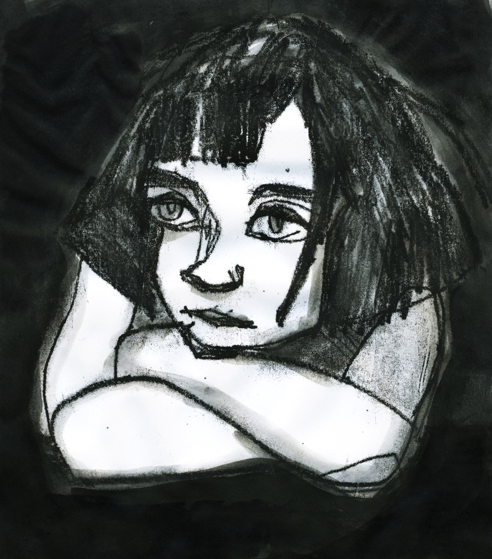
This little dark girl was taken from a photo and was an experiment in drawing with big, angular shapes and using high contrast. It’s so tricky to draw children without the results looking sentimental, because the subject of children is so heavily laden with very strong human emotion, and many pictures of children actively seek to communicate those emotions. This drawing probably looks sentimental too, just because the child is thoughtful or pensive. She certainly wasn’t meant to look like she’d left her favourite teddy in the park. I just loved her blocky haircut and the shapes her interlocking arms made. Oh, and the reason I was drawing a child (on my day off, ha ha!) was because I decided to join in a Facebook group with a weekly illustration topic, just for fun. This week’s topic was ‘children’.
The paper was medium weight, and was fine with the monotype process, but didn’t cope with the ink wash afterwards. Buckled all over the place. Earlier, we tried with 300 gsm watercolour paper and couldn’t get an ink impression because it was too stiff. Wetting the paper didn’t work too well either, because our block printing ink is water based. (I think the ink used in intaglio printing onto wet paper is oil based. Somebody tell me if I’m wrong.)

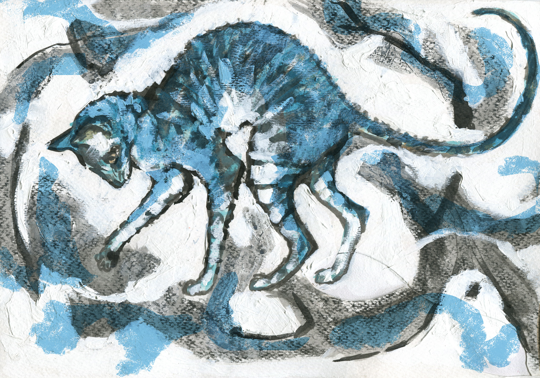
The cat was a bit of fun for me as I suddenly had the happy thought that I could combine altered book art with monotype. Although the page was rudely removed from the book, as you can see, it did cope perfectly with the ink, and also coped rather well with the wash afterwards. Strangely, it has a fine, sparkly thing happening in the dark areas when I hold it to the light. It must be to do with the paper, as it isn’t the ink, I’m sure.

This little guy was done on very lightweight paper and the monotype line is rather delicate because there was not a heavy load of ink on the plate. I added chinese ink, Prismacolour artstick and soft pastel afterwards to give him a bit of contrast, and the original monotype line is barely there. The paper of course, buckled.
Thanks for an enjoyable afternoon, Dad!
