Category Archives: books and reading

Bookplates – just for fun (part 2)

So here are my two quick bookplate designs. Unlike Hugo, my preliminary work was limited to one doodle in blue pencil. I then progressed straight into ‘make it up as you go along’, my strongest medium.

bookplate prelimiinary doodle judywatsonart

Wanting to play quite loosely with patches of colour, I used watercolour without any particular structure or organisation. Then I added ink with brush and dip pen, acrylic (to cover up the bits I didn’t like on the wing) and went for it with some lettering. I left it scanning while I started on a second one.

Bookplate2 judywatsonart stage 1

The second one was only black ink and dip pen with lots of splodgy bits. I scanned it before adding more texture, to give myself a way of going back. undo. (Am I the only one who mentally presses Command Z when I miss a turn off in the car? It doesn’t work.)

Bookplate judywatsonart stage 1

Then I took it back to the drawing board and added some very important dots and scratchy bits. (Chickens scratch. It’s symbolic, right?) Then I scanned it again. (undo)

Bookplate judywatsonart stage 2

Then I took it back to the drawing board for some wash, and scanned it a third time. (Actually, I blow-dried it first, and then scanned it and found it was wobbly, and then put it in the book press for 2 hours while I drove to school and back and then scanned it again, but that’s probably too much detail.)

Bookplate judywatsonart stage 3

Then I took it into PhotoShop and added some colour. Although it may have been better in black and white, it was too much fun not to add colour. (This process involved lots of undos.)

Bookplate judywatsonart tonal chookie

Then I went back to my first chicken; all loose and free and doing her own arty-farty, happy thing. And I had to mess with her. Cramp her style.

I desaturated her, taking her back to a sepia tone, then added very limited digital colour. She squawked in protest, but I took no notice. I told her firmly, ‘less is more… sometimes… Not when it comes to eggs, you understand.’ She gave me that bright beady-eyed look and then we sent the bookplates off to print.

The other chicken had been asleep through the whole process.

sepia chicken judywatsonart lores

Bookplates – just for fun

A few weeks ago I noticed on an artists’ noticeboard that there was an Australian Bookplate Design Award coming up. Not being sure what a bookplate actually was, I read with interest. I quickly concluded that it was just my cup of tea. Books, cups of tea and small, quirky collectible artworks go together perfectly. If you’re interested, try searching the internet or Pinterest with the search terms ‘artist bookplate’ or ‘ex libris’. There are some amazing ones out there, and they are so wonderfully varied in style.

Best of all, there were several categories for entry into the competition, including one for primary school students. We have two of those in the house.

Arthur (12) drew his bookplate about ten minutes after I flagged the idea, without any preliminary work apart from a little research into the meaning of his name and his sun sign. In keeping with the traditional model of a bookplate (the coat of arms of the book owner), he came up with a kind of avatar for himself; a heraldic creature with roots in the notion of courage, and I suspect some DNA from Chewbacca of Star Wars fame. See below.

Arthur's heraldic beast bookplate

Arthur’s heraldic beast bookplate

Hugo (10) decided at the last minute to join in, and only because he was home from school with a cold at the time and looking for a quiet activity. His process was admirably logical, beginning with a warm up, and ending with a bookplate. See below. 

hugo bookplate working 1

Stage One: loosening up, exploring ideas 

hugo bookplate working 2

Stage Two: brainstorming birds and books

Hugo working drawings Bookplate award 3

Stage Three: I love this. From top to bottom, working out the composition and the gag.

Bookplate Hugo Watson

Stage 4: The final bookplate.

I made my two entries in a rush on the final day as well, thereby cleverly avoiding thinking out what my perfect bookplate design would be… ahem. I’ll show you my bookplates in the next post.

We sent them off to be digitally printed and trimmed, then raced them to the post office the next day for last minute delivery into the competition. This involved the boys signing each of their bookplates with very sharp pencils in very small writing at the post office; a fun and exciting process in itself!

Finally, on the weekend, we tested out our bookplates on real books! Which was SUPER fun, even though some were a bit crooked, and as you will see below, some interesting questions came up about the hierarchy of ownership. For instance if your big cousin wrote her name in the book in 2002 with silver pen on the right hand side, do you trump that with your own hand designed bookplate pasted into the left hand side in 2015?

And does that depend on how big your cousin is?

IMG_6630 IMG_6633

Bear’s campfire story

Here’s Bear with Boy.

Bear and Boy came about when I was working on the Share A Story poster with the team from the Australian Children’s Laureate.

bear campfire temp

Ann James and I were initially scribbling away at the same time, tossing ideas around for ways to illustrate themes like ‘grow a story’, ‘hunt a story’, ‘hear a story’. We had few preconceived ideas about how we were going to make the poster concept work and we were playing for all we were worth. During this process I drew Bear and Boy, which I later coloured, because I liked the sketch, but I didn’t bother finishing it off perfectly.

But I was primarily the designer for this job, and it quickly became obvious that for the sake of visual cohesion, Ann’s illustrations would look better throughout; not mixed with some of mine. I moved to the computer and started colouring and experimenting with pattern, until we found something that was starting to work. Justine Alltimes and Ann Haddon provided invaluable insight and art direction.

Asking Ann to produce all sorts of obscure drawings on demand was like popping coins into the Best-Ever-Slot-Machine, and watching exciting and unexpected treats pop out. At speed. So much fun!

While from Ann’s point of view, it was fun to watch her drawings merge with colour and pattern and start to form a composition on the poster.

Ann James' Red Riding Hood and friend wolf (with mysterious dark figure looming behind!)

Ann James’ Red Riding Hood and Friend Wolf (with mysterious dark figure looming behind!) © Ann James 2015

Add classic vintage Australian Stamps

Add classic vintage Australian Stamps

Merge using a bit of digital magic along with some V&A pattern.

Merge using a bit of digital magic along with a V&A pattern in the background. Voila!

Being a fan of blobs, I liked the original inky halo around Mr Wolf. But the consensus was that there was not enough contrast to identify his shape against the background patterning, so he had to have a digital bath… or perhaps shave.

If you’d like to download the Share A Story free poster-calendar, conceived by Laureate Jackie French and illustrated by Ann James, go here. It is a great, open-ended way to engage your children with stories.

Share a Story poster final art web

Federation Square drawing and chatting tomorrow (13th June)

I might see you at Federation Square, if you are Melbourne based. Please say hi, if you are in the area. I’d love to see you.

I’m bringing a small number of limited edition prints to sell at the book stall along with signed books.

Below are some prints from the actual book, that will be for sale. And following them you’ll see some altered book prints which show the inspiration for the medium that was used in the book. But they also show the difference between the artificially created cream and the natural vintage book parchment.

My chance to sing lores JudyWatsonArt Ready Set Go lores JudyWatsonArt Thunder imprint page boat lores JudyWatsonArt Thunder opening spread seascape lores JudyWatsonArt

The parchment is naturally a much dirtier colour… which appeals to my inky nature, but the Allen & Unwin book designer Sandra Nobes very rightly recommended a clean cream for the book itself, and this is where PhotoShop was my ally. Thanks Sandra and PhotoShop.

tabby kitten lores JudyWatsonArt Cornish library tick cat lores JudyWatsonArt

Book Signing Phobia

Here’s a lesser known part of the job of being a drawing machine. When we sign books for people, it  is a nice thing for them if the signature comes with a little doodle, drawn for them, right before their very own eyes. And it’s nice to be able to do that for them. It makes us happy too. If it works.

But the inscription is done in pen and can’t be rubbed out or corrected.

And when we draw during the usual course of our day, we usually do many drafts of any illustration before we get it right.

And if we mess up our inscription doodle we have the problem of either sending a deplorable doodle out into the world defacing the otherwise pristine title page of a newly purchased book, or replacing the book with a new one… which we might also mess up.

Now remember that some of us are very temperamental drawing machines, the kind whose engines won’t start unless the key is turned in just the right particular way, may never run very well on a Tuesday, and if the oil runs low we are likely to smoke. You will now realise that the aforementioned anxieties at the back of our minds can cause a little fumble in the fingers; a wobble in the wrist; a twitch in the felt-tip… and then…

Doom!

That is why I am practising my book signatures today.

With Best Fishes

With Best Fishes – practising my book signing today and this is page four. Ahem. 

I have spoken to illustrators who say they won’t do it any more. They will write anything but won’t draw. (And I’m not even going to discuss the issue of spelling difficult names correctly… or easy names for that matter.)

I have spoken to illustrators who say ‘it’s important to make the mark.’

I have watched with awe, some illustrators who sign and doodle with ease.

I have watched with awe, one illustrator who was CLEVER enough to get a rubber stamp made up in advance! (Yes, OtherJude, that was very clever!)

And I have used my bookmark giveaways to circumvent this problem with some success. (It’s much less stressful to draw on a bookmark, than a $25 book.)

photo 1

Anyway, see you at the next book signing!

I’m ready.

I think.

Enjoy your bookmark!

Enjoy your bookmark!

Little Cats (or patience is a virtue)

I was led off the trail of birds this afternoon. I had an important task to complete that was overdue. Lisa S contacted me many months ago to ask about my Cornish Rex artwork and she has been waiting patiently in New York for a signed copy of Thunderstorm Dancing for a long time. Boy is she tired!

Because she has been waiting so long, she got some little bonuses in her bundle. Some Cornish doodles. Lisa has two Cornish Rex cats. One is black (Nigel). One is white (Finley).

Check out Finley with my Cornish Soliloquy drawing from last year.

Cornish Soliloquy cat

Here’s the title page from The Cornish Soliloquy

Finley

Here’s adorable Finley!

Today, I have finally wrapped up a signed copy of Thunderstorm Dancing for Lisa and it will go into the post tomorrow, bedecked with cats.

Tucked into the book:

White Cornish Rex on Endpapers JudyWatsonArt lores

A little white Cornish sketch painted on the endpapers of ‘The Book of British Villages’. I was going to paint him on a map of Cornwall, but I got engrossed in this one instead.

Black cat white cat

The little white cat with his friend the black cat, drawn on a (terrible) 1980s dress pattern

Thunderstorm Dancing all wrapped up:

wrapped copy of Thunderstorm Dancing

Ready for the post bag

And finally, a doodle on the envelope:

cat parcel awaiting stamps

parcel ready for stamps

When I was at the post office a few days ago, the only stamps they had were husky dogs… That’s not going to go down well! Fingers crossed there are some stamps there tomorrow that are more feline friendly.

Leonard Chooses His Hues

I have given the medium for Leonard Doesn’t Dance a lot of thought over the last few months. I knew that I wanted the style to be very different from Thunderstorm Dancing, quicker, looser, lighter in touch and for some reason sherberty… Ahem. Don’t ask me why.

And during my time in Italy, I was immersed in so much illustration at the Bologna Children’s Book Fair that it was the perfect time to consider what I did and didn’t want to do, and what was already done too many times elsewhere.

Ann James and I talked about illustration styles, strengths and weaknesses too. She told me that the key to good illustration is authenticity. When she looks at a folio of work, if the expression of line or character feels genuine, as though it really comes from the illustrator’s inner self, then technical weaknesses don’t matter so much. You can see the kernel of the artist in the work and it’s good. I’m re-phrasing of course, because I can’t remember the exact words that either of us used. But this is the gist of it.

So where does that leave me as a wandering artist, prone to changes of style? What is my kernel?

I came to the conclusion that I am very comfortable with my pencil, and my line is probably most expressive of my style or styles. Most me. I had decided that I would use pencil or fine liner (for the lightness of touch), white backgrounds on most pages, and colour the drawings swiftly and joyously in bright, (sherberty) digital colour.

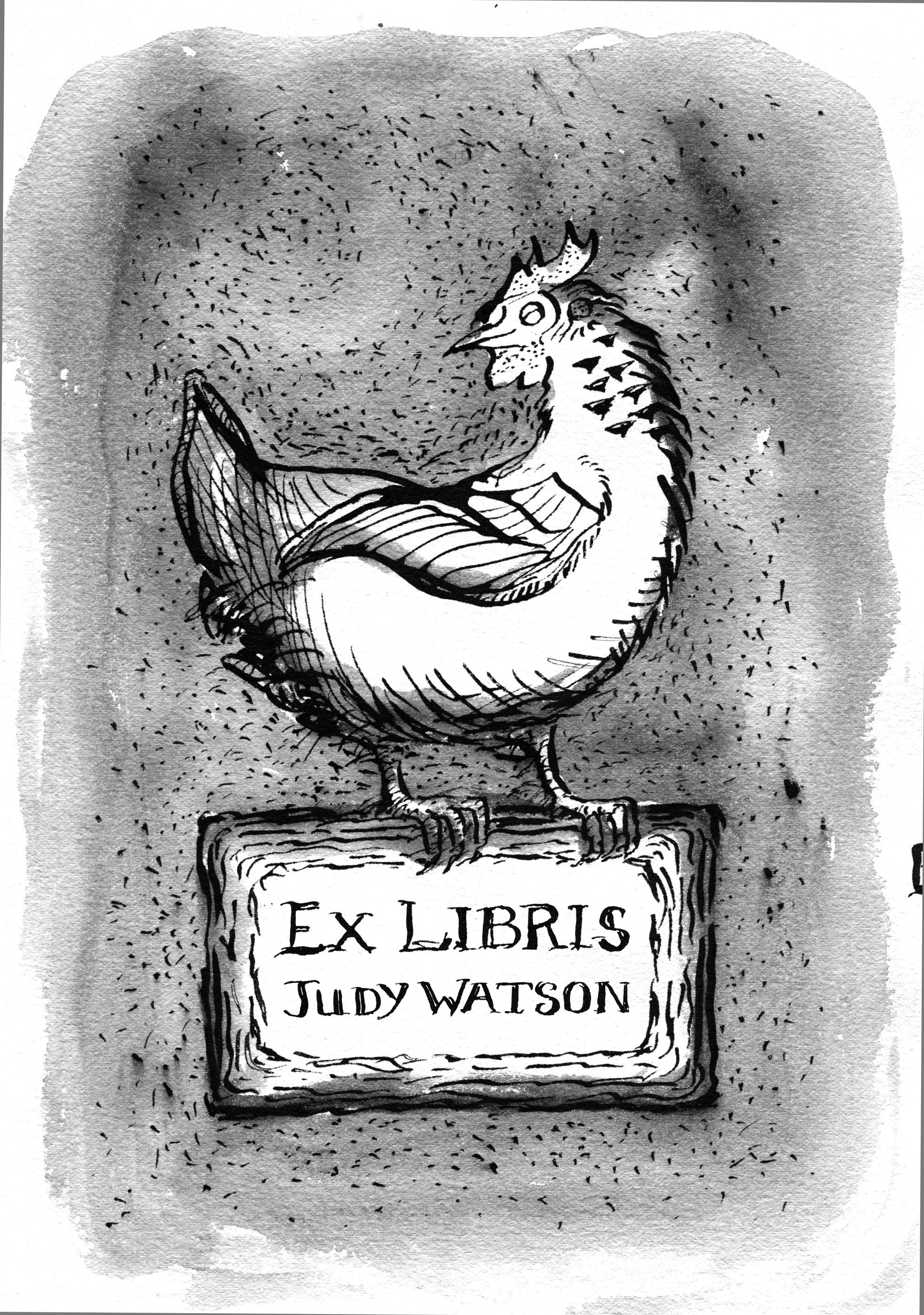
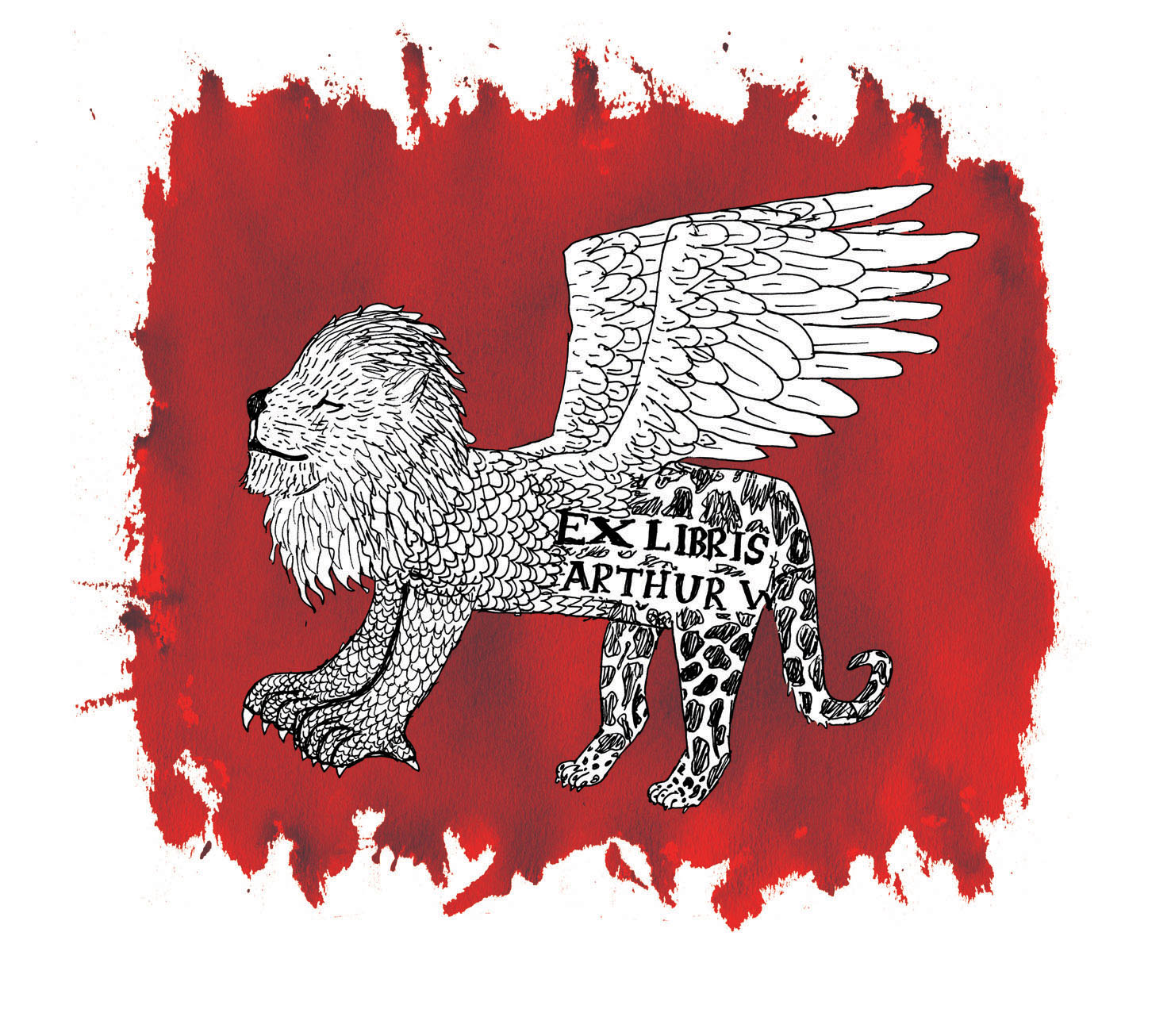
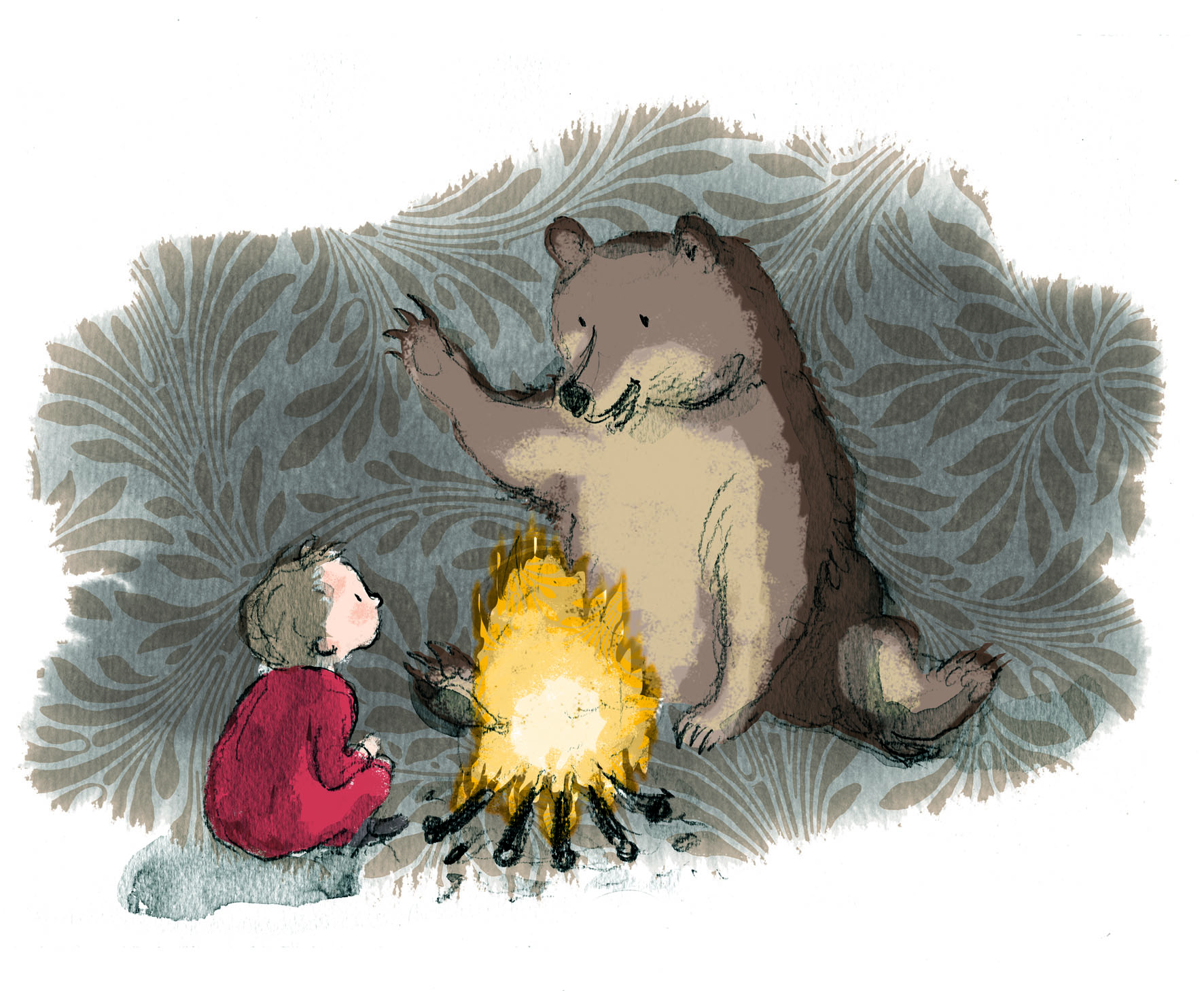
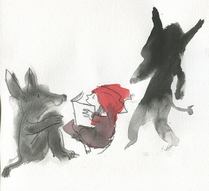
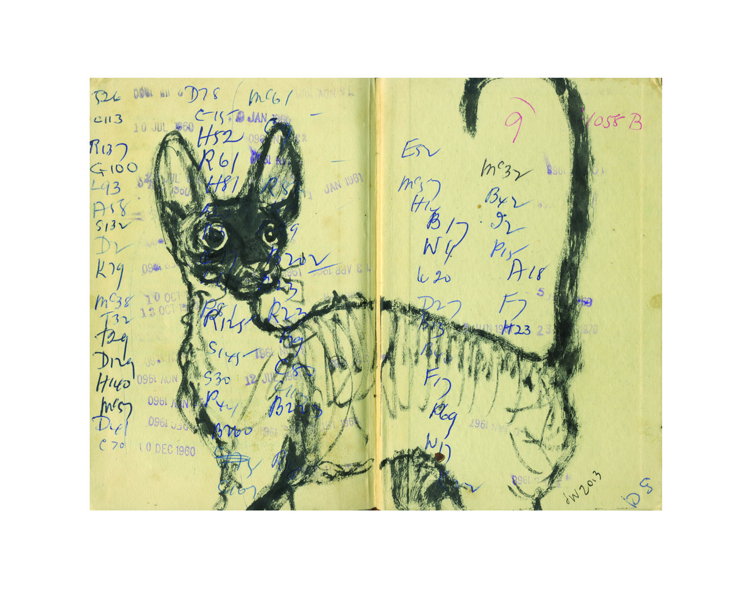
Here are some old artworks for the sake of discussion of medium. None of them were drawn for Leonard Doesn’t Dance

parrot purr judywatsonart lores

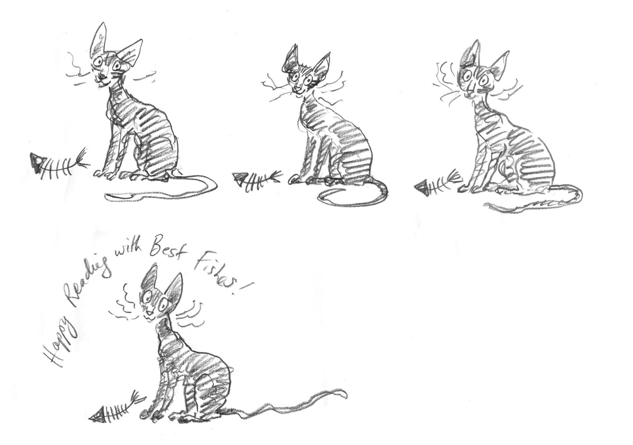
fine liner with quick sherberty digital colour. (originally drawn for 52 Week Illustration Challenge – theme WORDS)

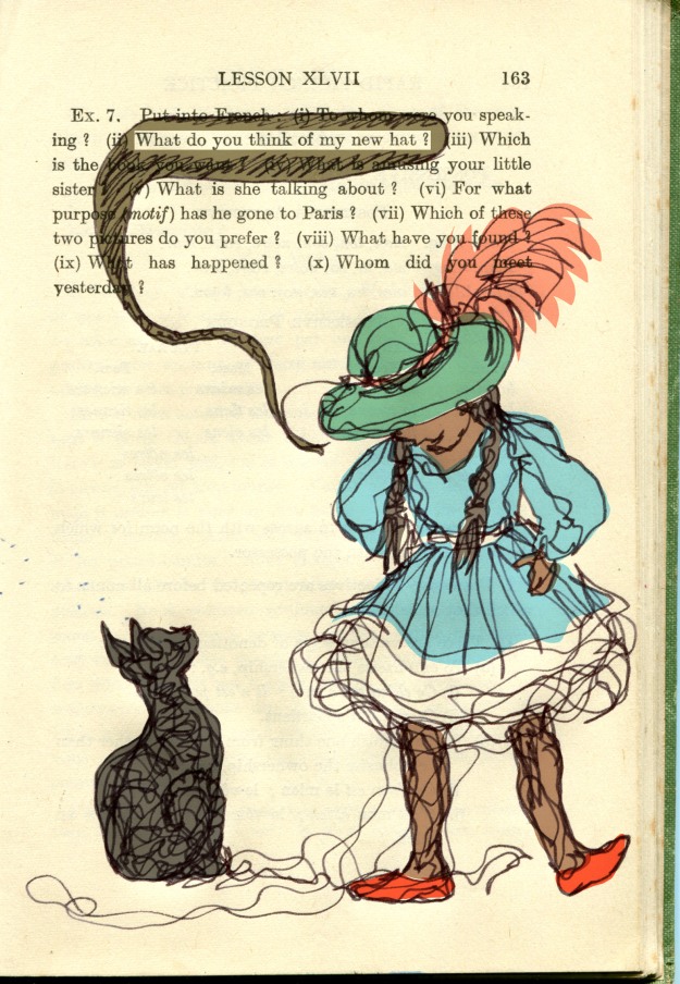
Perhaps this parrot cartoon isn’t a perfect example of what I had in mind, but it’s me, and it has the fine line that I want, the simple, swift colour and the white background. And it’s playful. Playfulness is key to this book.

new hat judywatsonart colour lores

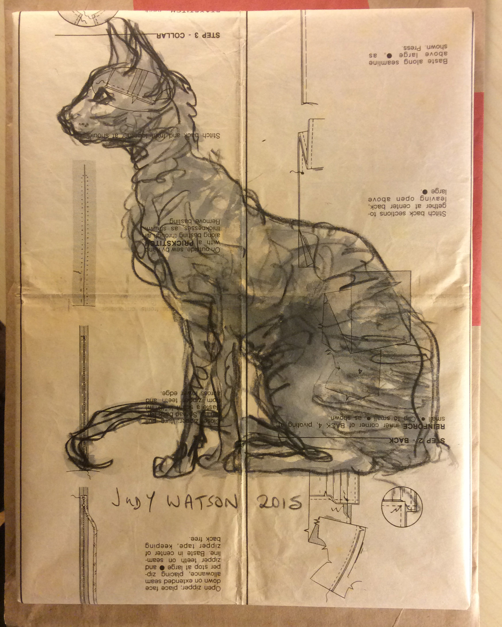
loose lines with digital colour (originally drawn for 52 Week Illustration Challenge theme – LINE)

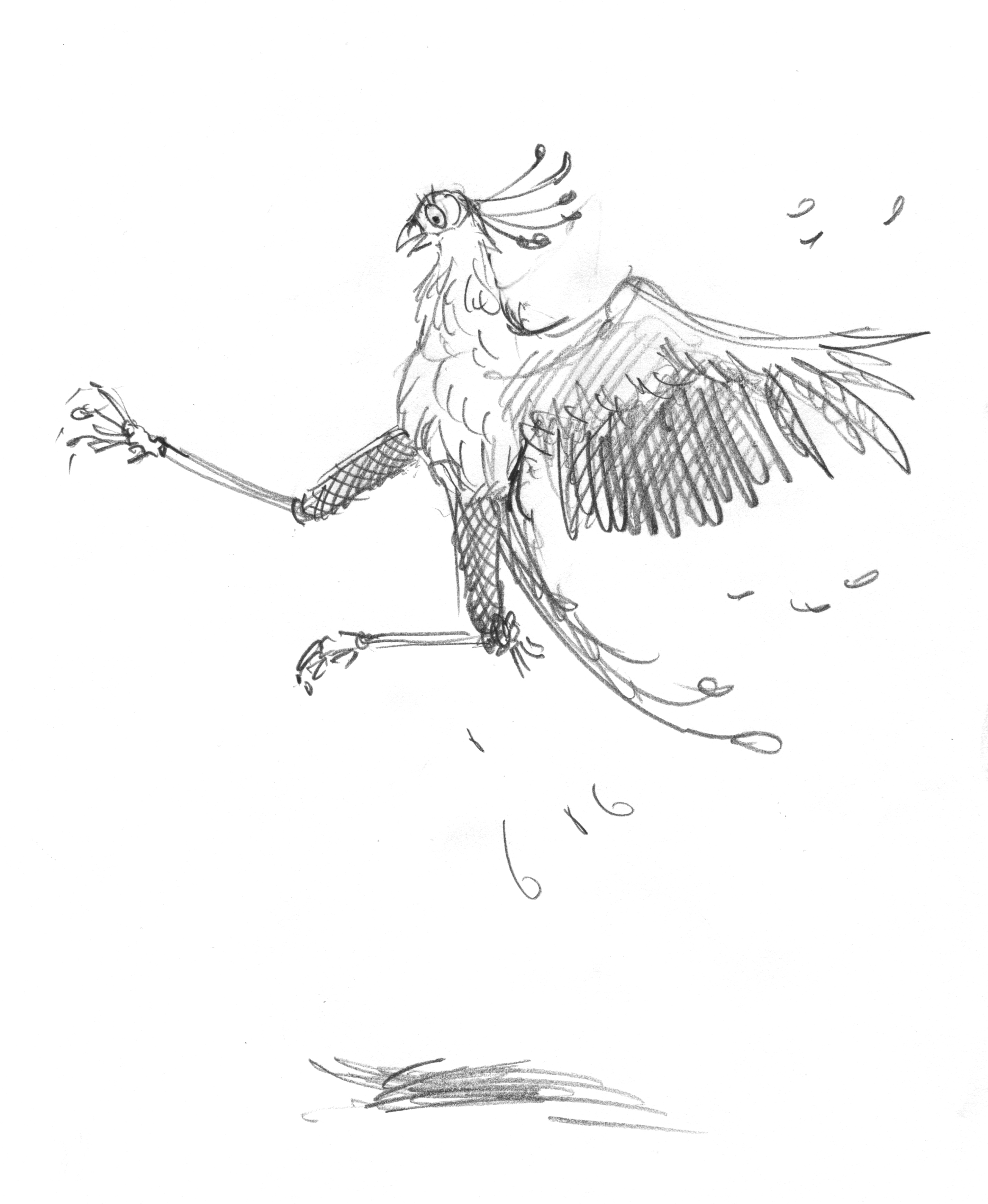
This continuous line drawing is a little heavier in line (a thicker fine liner) and heavier in tone too, on the cream background of a vintage book which was the very thing that inspired the work for Thunderstorm Dancing. But even so, it is me at my most comfortable with a wandering line… making it up as I go along.

So there I was. All decided.

Then the discussion of clothes came up with the Frances Watts and the publishing team.

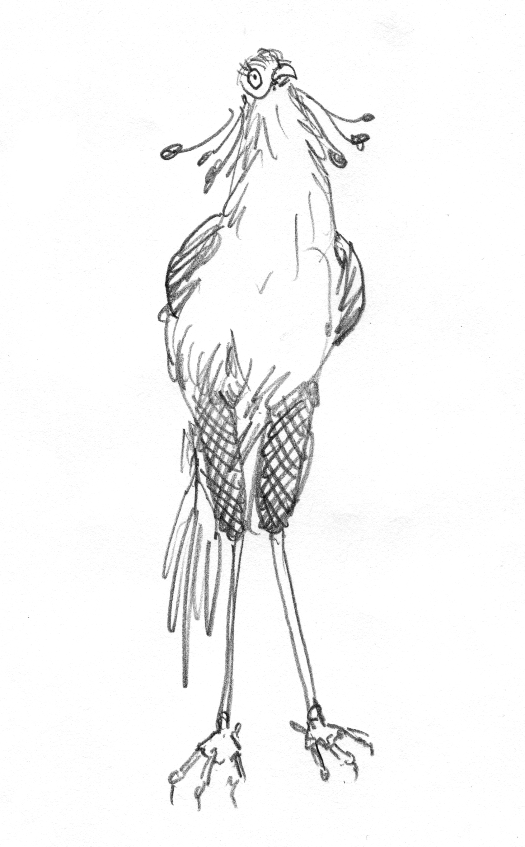
Do these birds wear any clothes? Should Leonard be wearing those breeches? Or should he not?

During the course of this (somewhat cheeky) discussion I whizzed through some ‘Trouserbirds’ as evidence of the way my bird drawings had been going in recent times. Most of them were wearing trousers. The examples I sent were from my series of blob birds; all painted by starting with a pale grey washy blob, and then transforming it into wacky creatures with watercolour.

stork seaside 2

Fine liner, white background, sherberty. Paint instead of digital colour… (a blob experiment from 2014)

blob birds lores

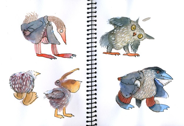
fine liner, watercolour, trousers… why not? (These blob experiments from last year are darker in tone, but that is mostly about the shade of grey used in the original blob. Partly too about their wintery clothes which seemed to ask for deeper, more tweedy tones.)

Frances Watts was taken with the watercolour. Which gave pause for thought. Because I really enjoyed making these blobs and was already planning a book for them of my own. But there’s no reason why they couldn’t launch with Leonard…

More soon.

Leonard Doesn’t Dance: A Bird of Character

In between racing around madly organising for our auction this coming Saturday, (I refrained from using hysterical capitalisation there. Did you notice?) I have REALLY enjoyed (emphatic, enthusiastic capitalisation) doing a few character sketches for Leonard.

Leonard is the main character for my upcoming picture book with Frances Watts, to be published by HarperCollins next year. Just to put you ever so quickly into the loop, Leonard started in my head as a little fellow with a disastrously swishy tail, inspired by our Australian Willy Wagtails, who swish their tails from side to side constantly.

Leonard Doesn't Dance

The colour sketch I drew for a spontaneous cover, the first day I received the manuscript

Leonard doodles2 judywatsonart lores

further tail wagging doodles drawn during a HarperCollins Author workshop

Then I found out that Frances had only one request: that Leonard be a bigger, galumphing kind of bird, and not a little tweety-bird type. So this sent me off in other directions and I did some galumphing doodles over a period of time while I was finishing Thunderstorm Dancing.

I continued with my doodles while I was travelling in Italy during April.

In the back of my mind there was a memory of a wonderful, lanky bird from Africa called the Secretary Bird. I looked him up and found him to be wonderfully elegant, wearing short black breeches to below the ‘knee’ and a fancy headdress (from which he got his name) and a wonderful set of wings for flying to bird parties.

His beak is quite different from the one I had imagined. I thought I might alter him to make him a unique bird bearing only a partial resemblance to the Secretary Bird. But as sketches continued, I found I enjoyed him very much, just the way he is.

Leonard

Leonard  1 Leonard  2 Leonard  3 Leonard  4 Leonard  5 Leonard  6

If he won’t work on the page for me with all those smaller birds, I may have to re-think him, but I am quite attached to him already.

More on this process soon, and I will tell you about the decisions about my medium.

Meet me at Federation Square

If anyone is in the vicinity of Melbourne on Sat 13 June, I’ll be drawing at the Books Illustrated stall in Federation Square Book Market and the fabulous Ann Haddon will be selling signed copies of Thunderstorm Dancing by Katrina Germein, illustrated by me. Some of my other books will also be on sale.

drawing and signing at Bologna Children's Book Fair

Drawing and signing at Bologna Children’s Book Fair (In front with the green scarf, the lovely Sonia who has been attending the fair every year since she was a child.) 

Come and say hello. I’d love to meet you! I love people to talk to me when I’m drawing… not sure what I’ll be drawing… but it’ll be something. And I’ll try to bring along some stormy craft sheets for you to take away and use to have some arty fun with your little ones… or by yourself. I’m all for that too.

Sketch for dancing scene with Poppy, from Thunderstorm Dancing by Katrina Germein

Sketch for dancing scene with Poppy, from Thunderstorm Dancing by Katrina Germein

At this stage it looks like I’ll be starting at around 1pm and drawing for a couple of hours, but I’ll try to remember to update you on that a little closer to the time.

Strong words

Proving that I’m back.

Another doodle from the bathtub on Saturday afternoon. Here’s a note from the back of a vintage Pitt Press Shakespeare edition of Julius Caesar.

Amaz’d is not the only word that was a stronger word then than now. Words and Christmas stocking fillers have suffered from inflation over the years.

Amaz'd - A stronger word then than now

Amaz’d – A stronger word then than now