Tag Archives: picture books

The Kick-About #125 ‘the Rorschach Test’ (part 1)

Most people are familiar with the Rorschach Test invented in 1921 by Hermann Rorschach. It‘s so often used as a gag in a cartoon or a sitcom that even youngsters get the general idea. It’s a psychological test, where a patient looks at the ink blot and describes what they see in it – often an animal, face or scene.

By Hermann Rorschach (died 1922)

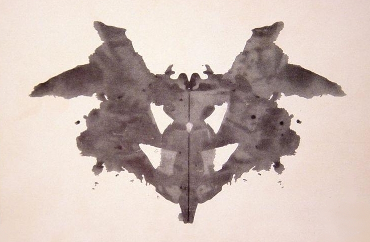
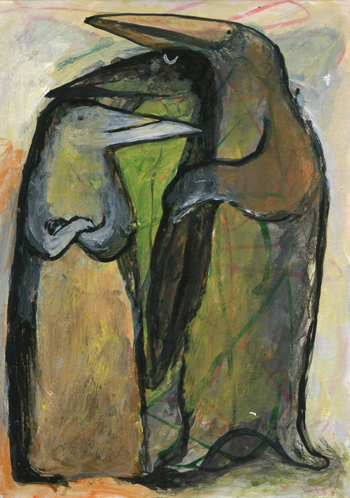
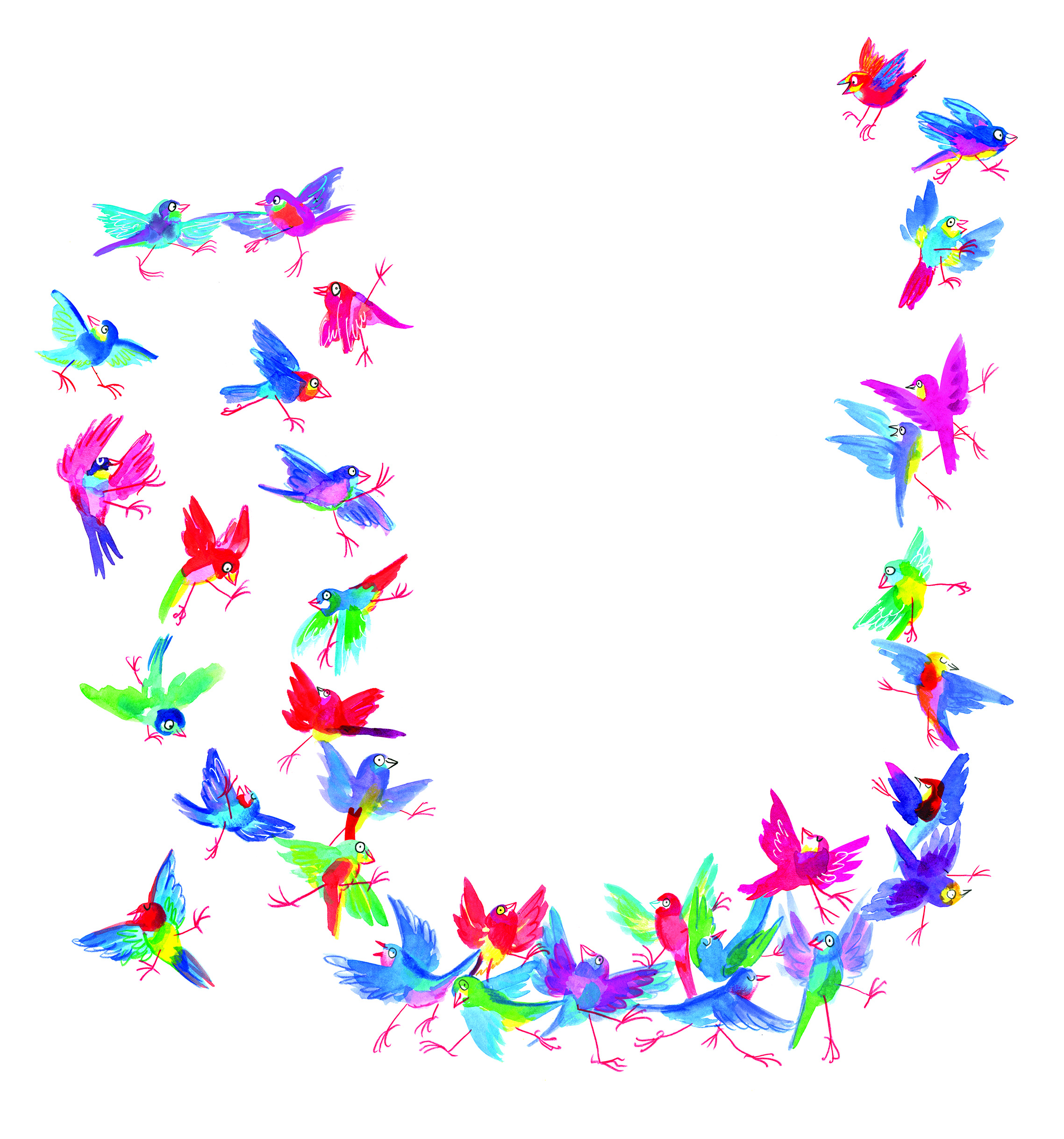
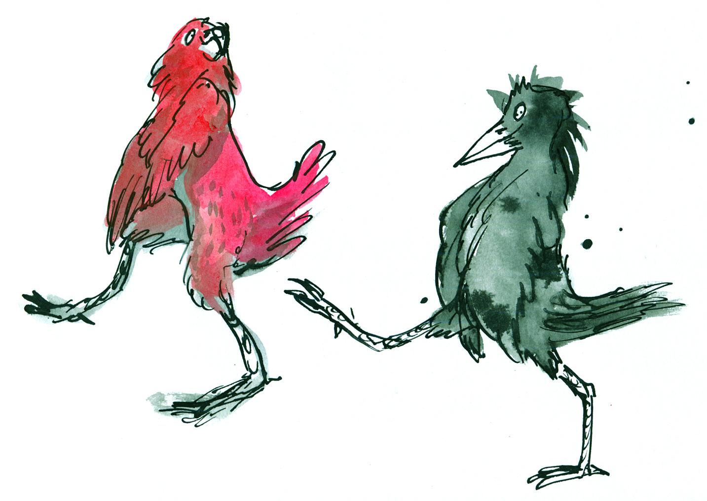
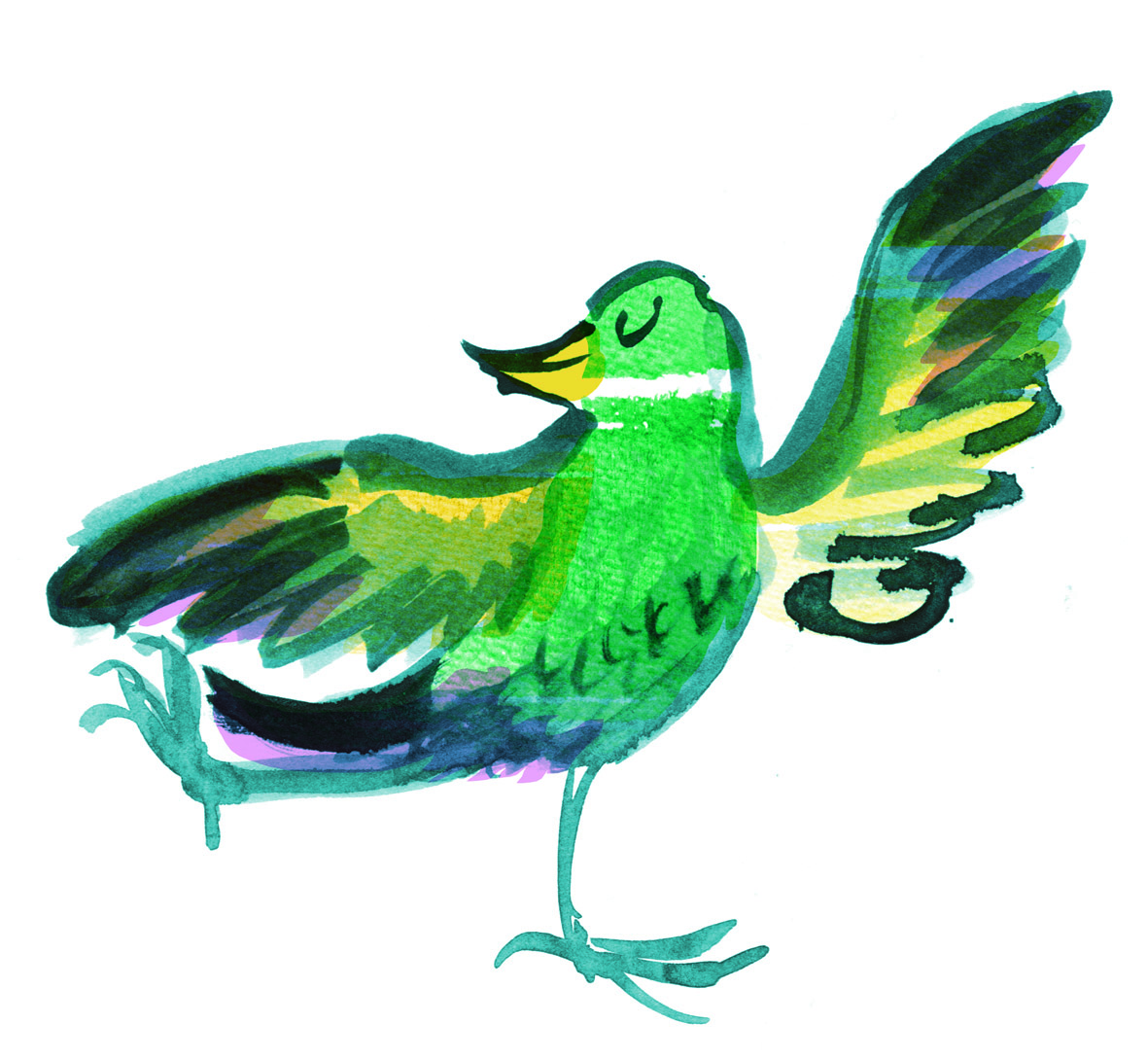
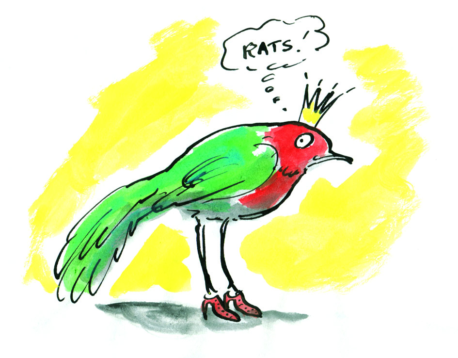
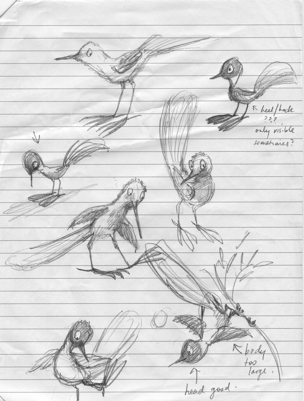
But I wasn’t aware that Klecksography was a thing in the late 19th century. Making images from ink blots, it’s an activity that I often enjoy as a warm-up exercise for drawing, and to create new characters. I usually call it blob drawing, which isn’t nearly as fancy, but I suppose my blobs are a bit more blobby in shape than blotty, and they lack the symmetry too.

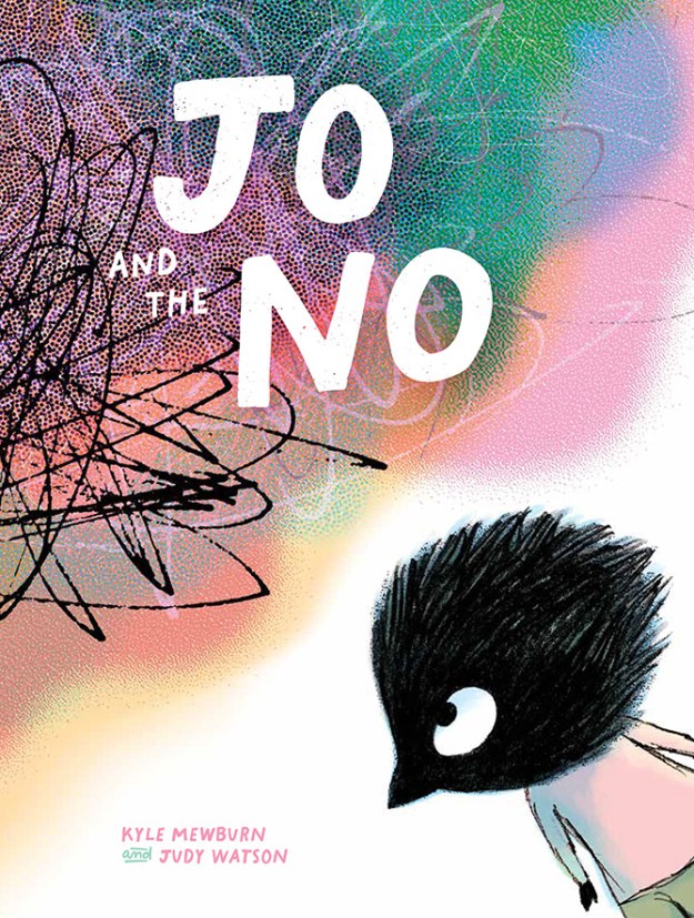
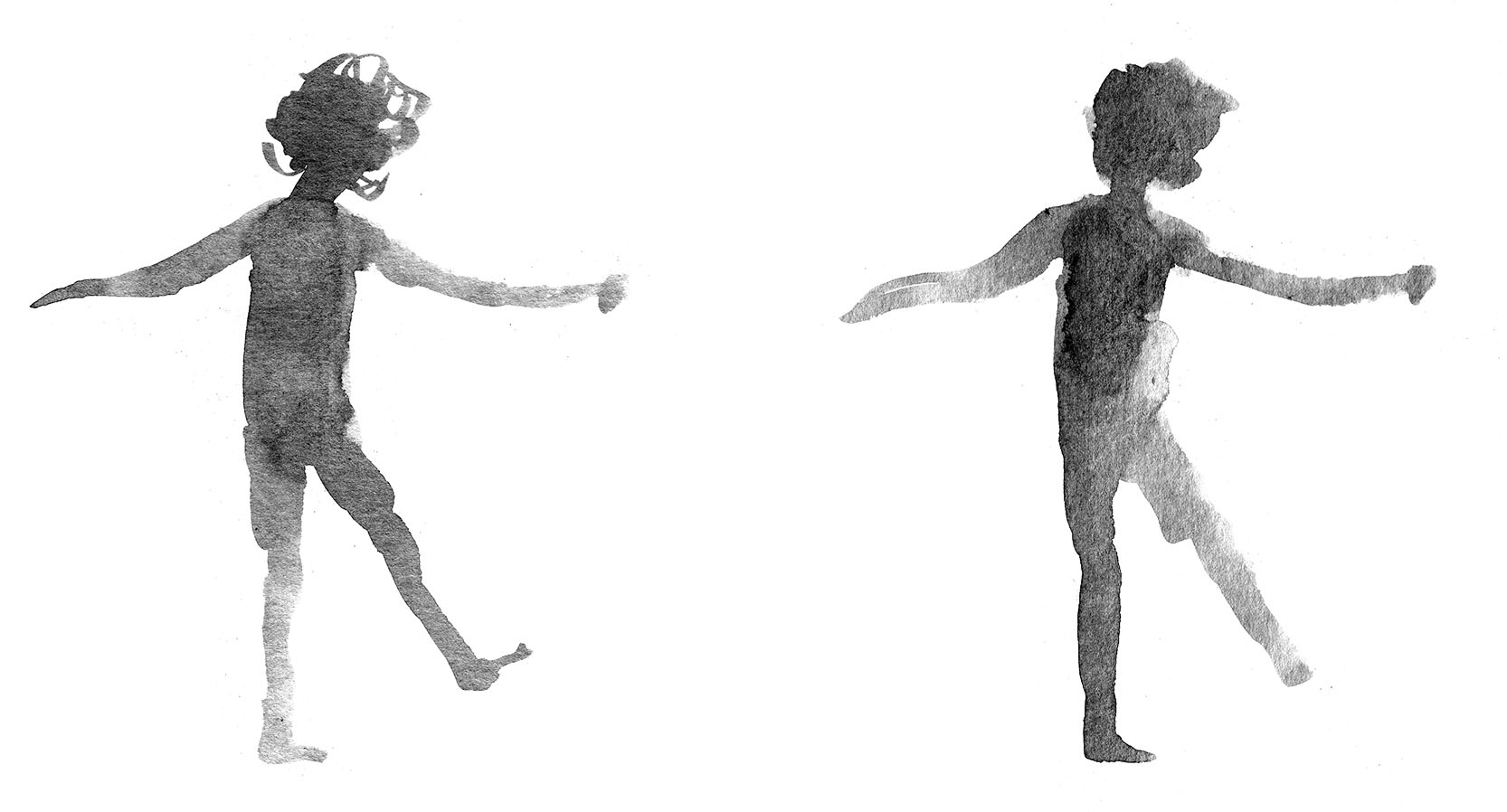
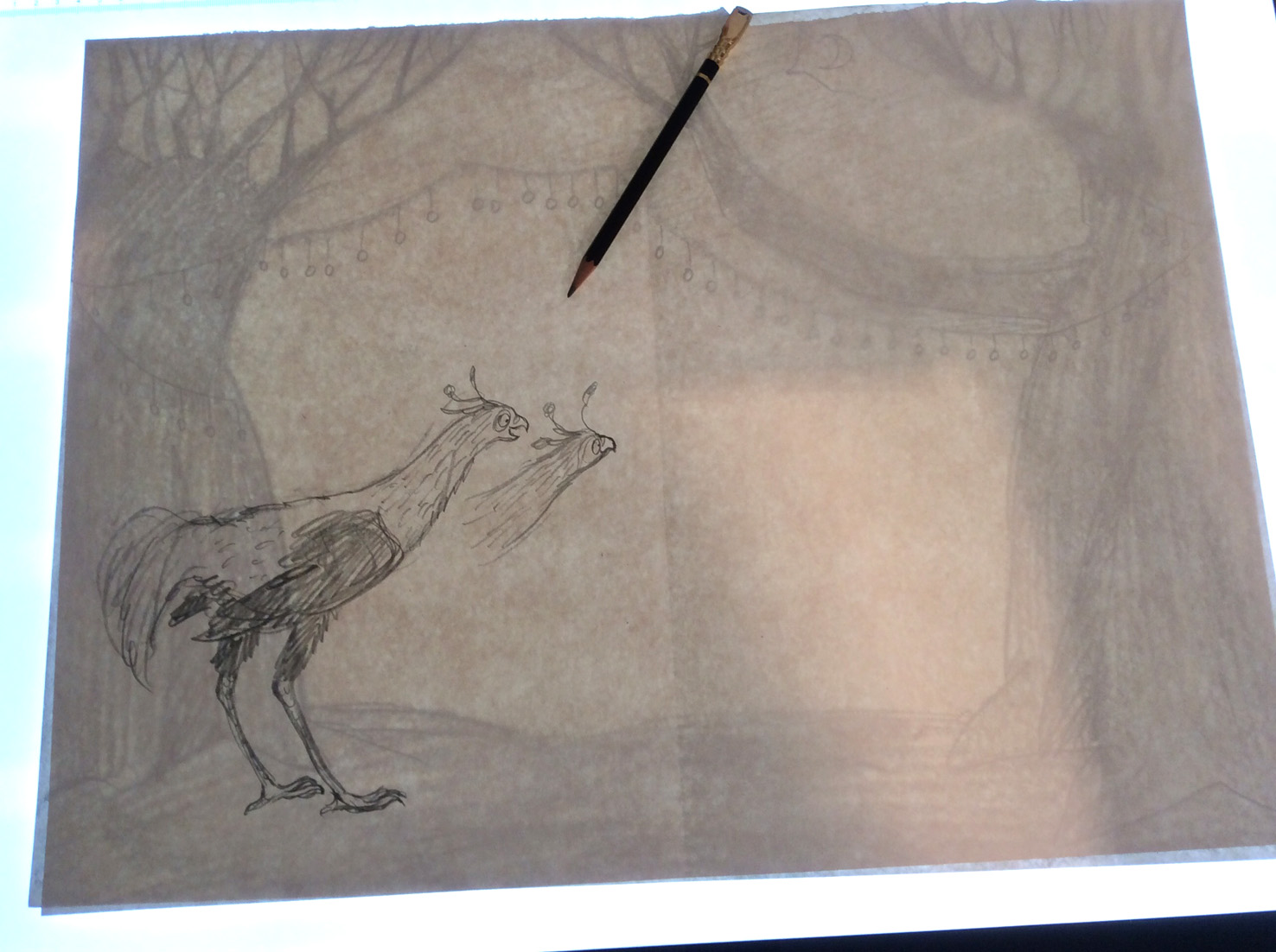
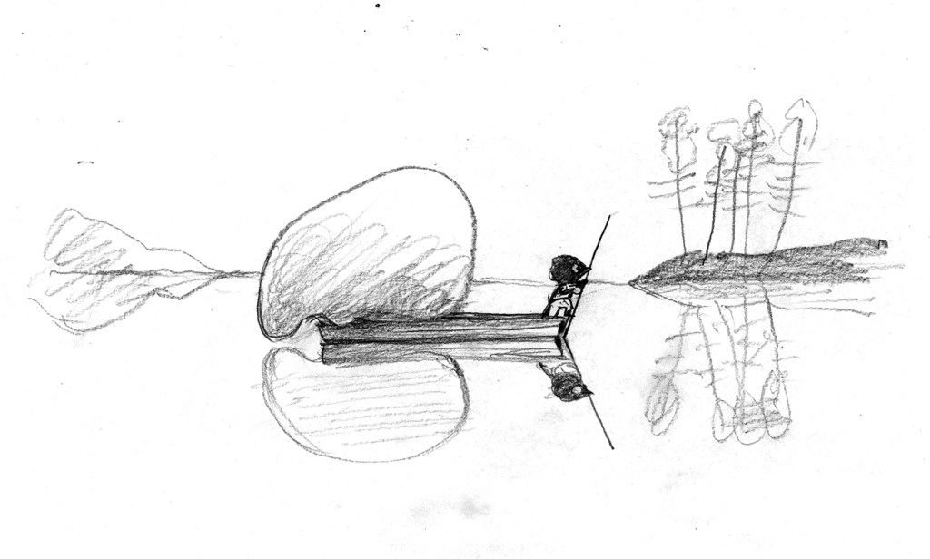
I thought this prompt was a great opportunity to join in the Kick-About again, because I already have some artwork to begin with, and it’s not my collection of blob drawings. It’s this illustration (below) from my upcoming picture book with Kyle Mewburn, Jo and the NO. In this illustration, Jo traverses ‘lakes as still as mirrors’. So creating background mountains and their reflections from Rorschach-style inkblots seemed like a good idea.

Here the NO in the back of the punt seems to be observing itself in the still waters because I wanted to suggest self reflection as well as the physical reflection of the scenery. You’d think it would be easy to whip up a few inkblots and plonk them into the image. But it was surprisingly hard to get from the successful rough illustration (below) to a successful final illustration.

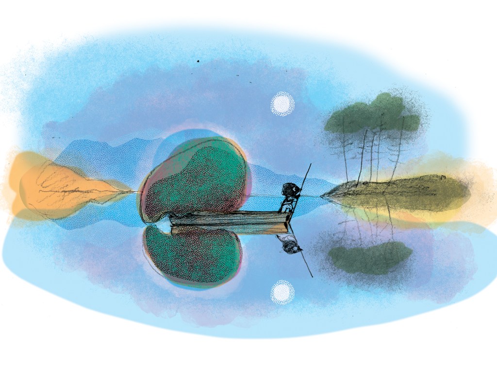
The original sketch started as a thumbnail drawing, intended to share a double page spread with three other vignettes. But when we decided that the book was going to 40 pages this scene acquired a double page spread of its own with the impediment of the gutter down the middle of the illustration. So getting the balance of the illustration to work again in a different format was a challenge. The enlarged range of mountains and trees when loaded together on the page, very quickly distracted from and overwhelmed our protagonists, instead of highlighting them and giving significance to them.

Also I didn’t want my reflections to be perfect, because imperfect things are always more interesting and have more visual energy. But I found that if they were too interesting, they became distracting. So there was a lot of trial and error involved with recreating the transparent freshness of the rough sketch within a new framework.

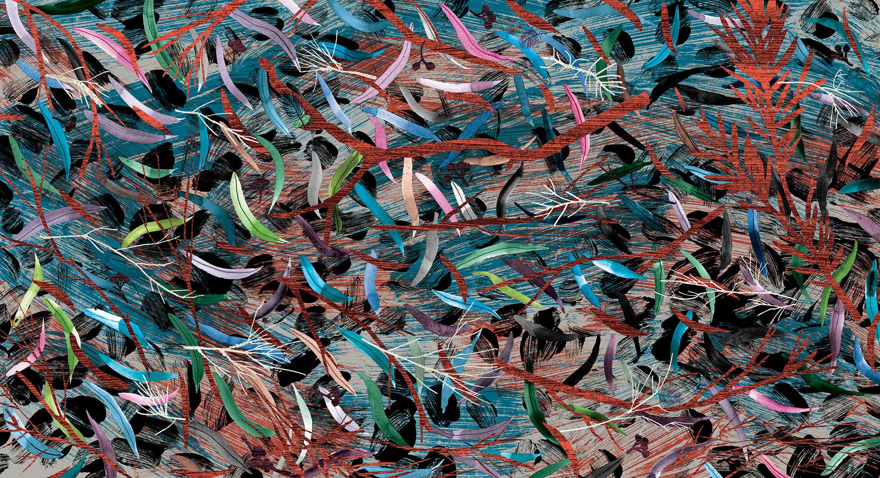
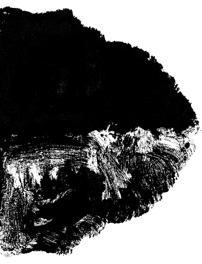
Below are a few of the monotypes I produced to create islands and mountains for the background. I painted a loose shape, suggestive of an island with vegetation, and then folded the paper in half for the reflection.

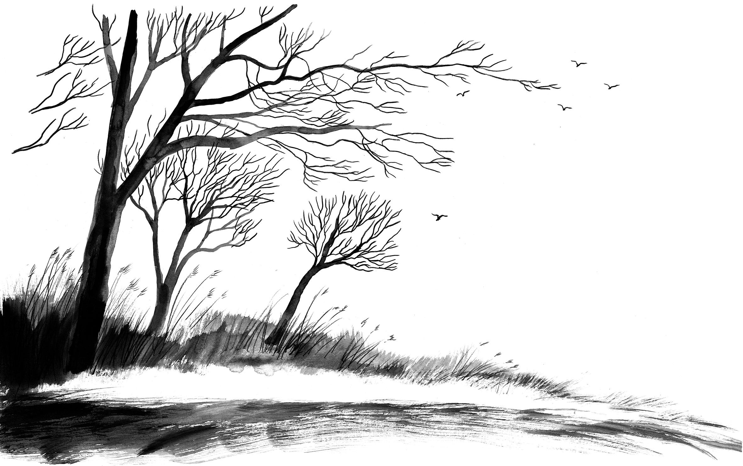
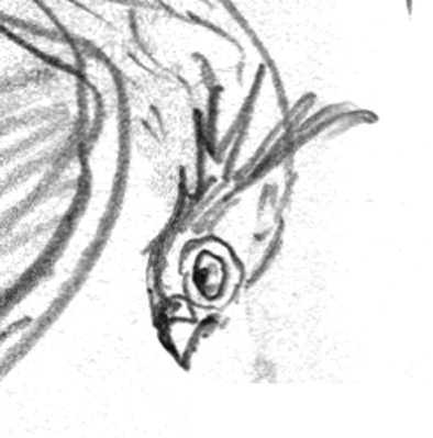
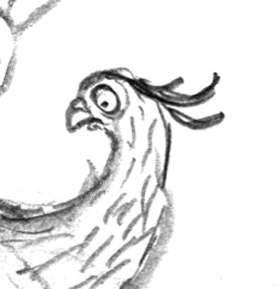
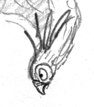
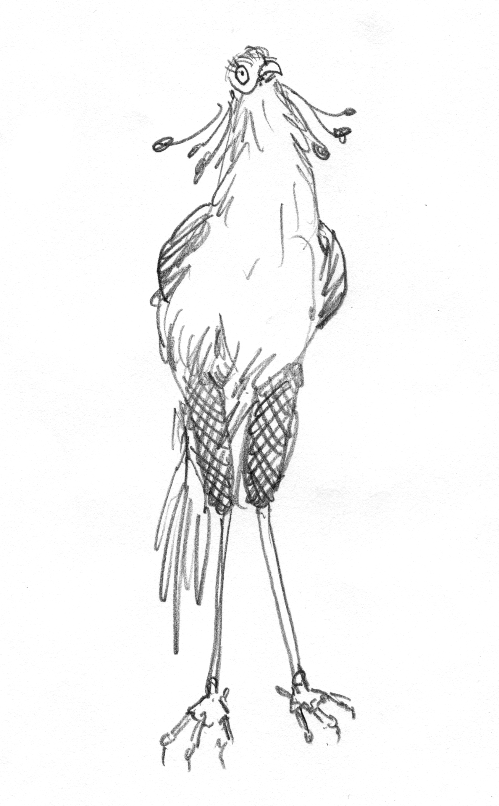
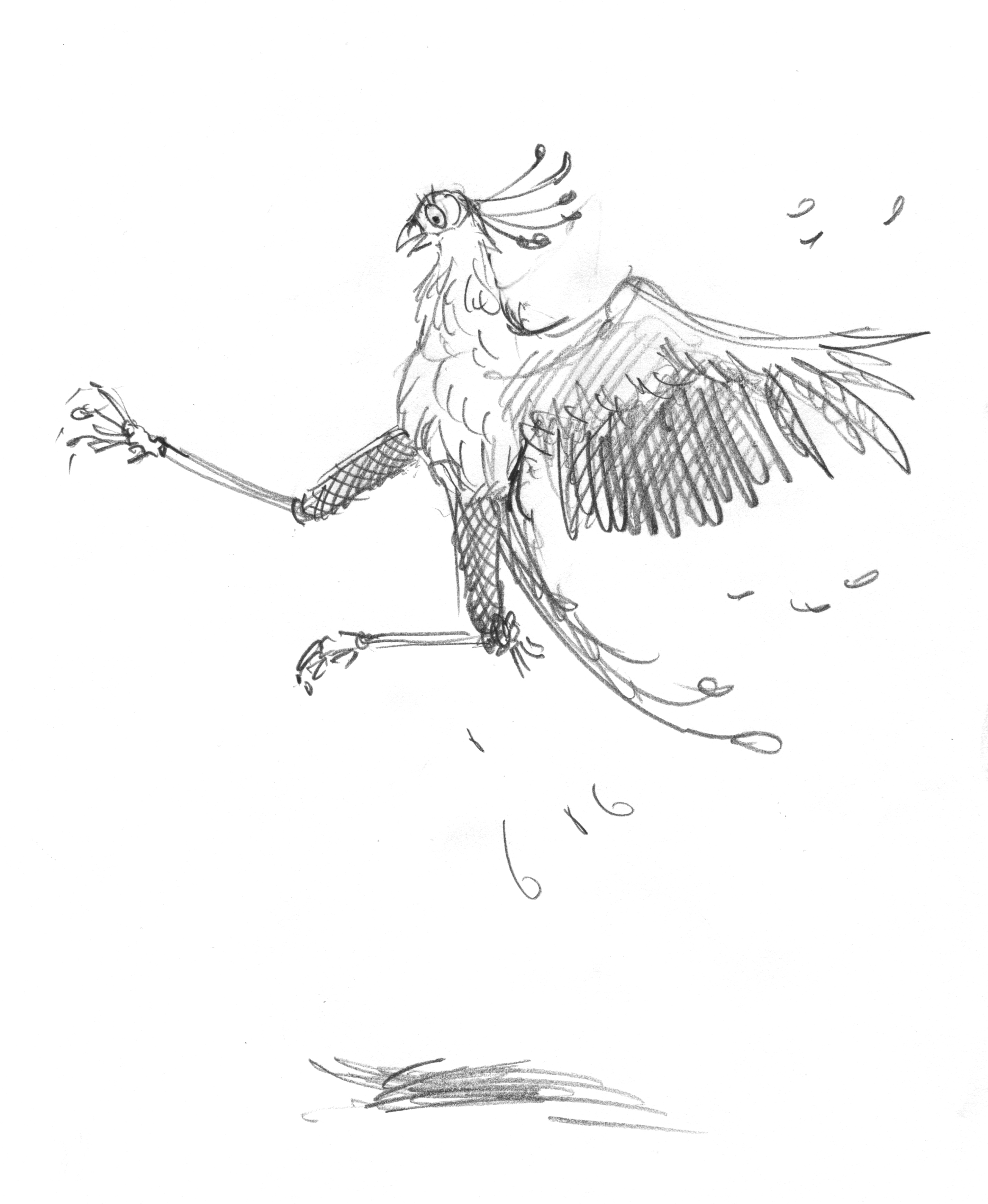
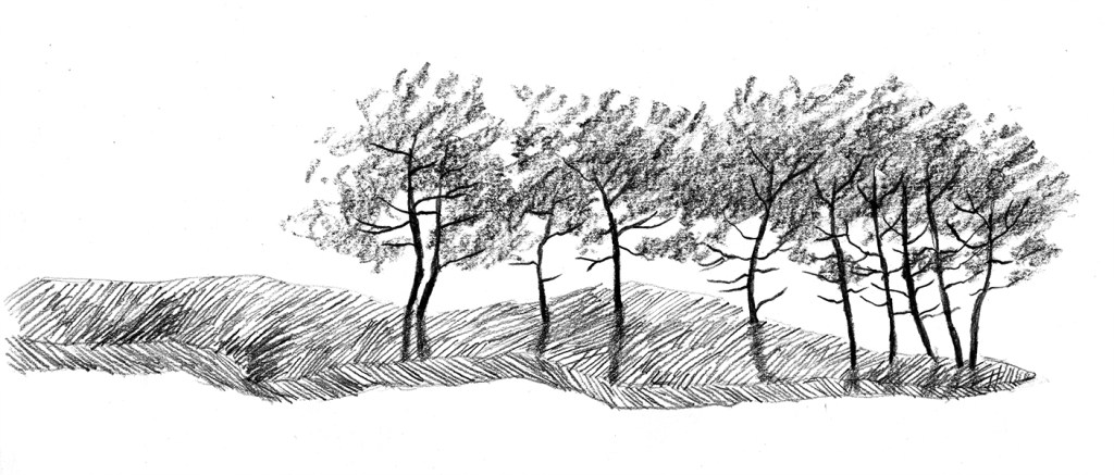
Below are some of the more detailed experiments, testing out graphite instead of paint. These fell into the too distracting category. There are always countless illustrations made for a picture book (some of them very time consuming) that don’t make the final cut. But they may be interesting in their own right.

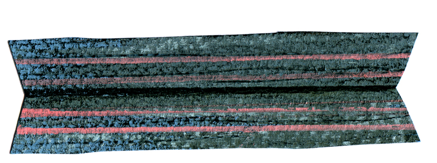
And I have to include the other hand-made element – a little collage boat made from Ingres paper and soft pastels. It’s so nice and wonky. One of my favourite bits.

For the final art, I did end up using a digital reflection for some elements, and those reflections did become ‘perfect’. But most of the tree reflections were drawn by hand and so they don’t perfectly match their right-side-up counterparts. (This brings about a nice effect used by landscape architects, where a repeating pattern with small variations is pleasing but never monotonous.) Embracing these inconsistencies was part of my journey of letting go of hard rules.

More on Rorschach ink blots in the next post. In the meantime, anyone who is interested in pre-ordering Jo and the NO, please click here or on the cover image below.

Three things

Hello gentle followers. It’s been a while.

Firstly, an update. I’m fortunate enough to be in Adelaide for the month of July courtesy of the May Gibbs Children’s Literature Trust to undertake a Creative Time Residential Fellowship. I was awarded a Mary Wilson Fellowship, and was supposed to undertake it last year, but we had a few serious health and wellbeing issues in our family at that time and the Trust was kind enough to squeeze me in for this year instead. The Fellowship is named after Mary Wilson, a patron of the trust who has been involved since its inception in 1989 and is passionate about our natural environment, so projects undertaken should have a significant environmental theme. My original intention was to write a non-fiction picture book about an Australian animal, but things have shifted slightly since my application back in May 2022, and instead I find myself writing a verse novel about tadpoles.

One of my other projects is a picture book with a climate theme, but I’m a bit scared of that one. Last time I worked on it the most devastating ear worm attacked me with a doggerel rhythm, and I couldn’t shake it off. I’m scared the worm will attack again, so I’m postponing that project until I’ve gained some writing muscle over the next week or so. I’ve been doing all sorts of keyboard push-ups in preparation. If that worm attacks I will be prepared.

I also made this note for myself and stuck it on the wall. It hasn’t completely worked yet.

The colour photo is by Melisa Savickas

I’ll be doing a bit of teaching while I’m in Adelaide. This workshop is at the State Library.
If you’re local to Adelaide, you can click the image to read more about it or make a booking. Below is the delightful Norwood Library. I scooted out to join it the day after I arrived. I can’t survive without a library membership.

So that’s the first thing. The second is that my son Hugo is creating a website for me – a task I have been meaning to get to for years. So this blog will jump across to the website when it’s ready.

I suspect that readers who have subscribed with their email address will be transported across the techno-wilderness and stay on the mailing list. Those WordPress users who follow using the WordPress follow function will probably drop off. So if you still want to hear from me and you haven’t subscribed with an email address, you can do that now, or do it later on at my new website.

I’m planning on having two options. My blog will be about things I have been working on. My newsletter will be occasional notifications of upcoming book releases or exhibitions, for those who are interested in purchasing or attending.

Which brings me to the third thing. For those of you who are in the vicinity of Sydney, the Incognito Art Show is coming up very soon! I am quite envious of those who can visit this show in person. It looks like quite an occasion, judging from photos of previous years. And having gone through the artwork on-line (which takes a while!) I can attest that there are STACKS of fantastic postcard sized artworks up for grabs. They are all at the one price of $100. The screenshots below from the Incognito Instagram account give you an idea of what the walls will look like.

Screenshot
Screenshot

The fun part is that all works are incognito until after purchase. You can read all about it here. And you can register your name on the website to create a wishlist of your favourites here. The best thing of all is that all proceeds go to supporting artists living with a disability.

I’ve currently got over 150 saved in my wishlist, so that says a lot about my inability to make decisions, but also a lot about the gloriousness of the artwork. And I’m not telling ANYONE what my favourites are, because the people who attend in person get first dibs, and I’ll only be in with a chance when the online sale goes live after the in person sale days.

I have three artworks in the show. I can’t show you what they look like of course. But for those who like puzzles, I am including a greyed out version of my artworks with little windows cut into the grey. If you can work out which art is mine from this, you are nothing short of a genius. I’ve only been able to find one of mine on the website so far, and I know what they look like.

Mystery artwork 1
Mystery artwork 2

13/7/24 I’ve updated to add the actual artwork for this one which has just sold. Titled Family Group. Mixed media A5 size. So many bird people. Where do they all come from?

Mystery artwork 3

Believe it or not, I will post again tomorrow, because today I took a day off writing and made some art with limited materials, for the Kickabout! But also because I miss my blog, and I’m a bit disheartened by social media. Cheerio until tomorrow!

Here’s a bonus dog-bird doodle. My dog people and bird people finally met in the middle.

Searching for Cicadas

A book about summer and family… and cicadas of course

Two books in one year is outrageous for me. I’m a slow cooker of books. Especially picture books. Each one is for me such a journey of discovery and striving and learning and change. So they emerge slowly.

Portrait of the artist as a very young person, before I illustrated this book.

But speaking of emergence, this is a book about cicadas… cicadas emerge slowly too! Some of them spend several years underground in their nymph form. One species spends seventeen years underground, which is longer than I have ever taken to illustrate a book… thankfully. Then they dig their way up into the light, shed their outer casing, dry their wings and sing a song to the summer. The boys do, anyway. And I’ll bet not many people know that they cover their ears when they are singing so that they don’t deafen themselves. Lesley taught me that.

The skeletal pencil and ink background of a spread from Searching for Cicadas
Ghostly shadows of the child figure for the same spread
The spread with colour and characters added

There are so many bits of fascinating information in Lesley Gibbes‘s text. And there are more than insects here too. There’s a narrative featuring a grandfather and child who go looking for cicadas on an overnight camping trip. And that is what I call fun.

Dirt and pine needles between the toes. Nothing beats bare feet.

Cicadas, summer and grandparents go together like cheese and biscuits. There’s something about these wonderfully noisy creatures (the cicadas, not the grandparents) that fascinates adults and children alike, and while we are sharing our fascination, we share a time, that later becomes a treasured memory. It did for me. I remember holding cicadas on my hand and collecting the empty shells (exoskeletons) and attaching them to the front of my clothes by their hooky little feet. They looked very decorative, along with the ripe cherry earrings hanging from my ears.

summer days in the country with my brother and Mum. I have no cherry earrings on in this photo.
Soundtrack: cicadas, magpies

I consider myself lucky to have been offered the opportunity to illustrate a Nature Storybook for Walker Books. It’s a series that I’ve admired for a long time. It features a double layer of text; story and scientific fact alongside one another in a child-friendly format. There are quite a few in the series, all beautiful. (I’d love to own an original painting from Dingo by Claire Saxby and Tannya Harricks. And check out Tannya’s dog paintings!)

Camping with Pa: bliss!
Soundtrack: cicadas, magpies

A few years ago I did quite a bit of illustration work for Museum Victoria where I got a taste for illustrating New Things That I Knew Nothing About. You research, scribble, take notes, panic, draw, draw again until you get it right… or right enough. (It’s never perfect.) This was a bit like that. It was really satisfying to learn to draw a cicada. I’m not confident I’d be able to draw a convincing one now, but for a few moments in time, I could do it.

This was my favourite cicada. He didn’t make the cut. I think it was because he had just a bit too much personality for a non-fiction title. He is my little friend.

And best of all was illustrating the Australian bush and the leaf litter. It made me want to make great big paintings of leaf litter.

Me with my grandfather, the irrepressible Pop Worrall who wasn’t with us for long enough. We never went camping but we did lots of swimming together.

Leonard galumphs into bookshops

I nearly wrote ‘Leonard dances into bookshops’. But then I remembered that Leonard Doesn’t Dance… or does he?

Leonard doesnt dance detail.jpg

I’m very fond of that great galumphing bird. I relate to him very much. The initial enthusiasm, the self doubt, the impulse to hide away in a thorny tree, the desire to be with my friends that usually draws me out of the tree. And like Leonard, I have some fabulous friends.

My thanks to the team at Harper Collins and to Frances Watts, for patiently waiting for Leonard as he put one lanky leg in front of another (tripping over several times) and eventually became finished art; now a book.

This lovely cover was designed by Hannah Janzen.

I had been initially drawn to a white cover, because black ink on white paper was a signature part of making the artwork. There was a lot of ink involved. Brushed on, drawn on, printed, wiped and smudged onto white paper. Big broad strokes, and fine textured marks. So my original idea was to have an inky black and white cover, with a pop of red on Leonard’s face, and a scattering of brilliantly coloured birds flung around it like a double handful of lollies, and wrapping around both covers.

The team at Harper Collins didn’t think the white design was indicative of what was inside: a rampant world of jungly colour. This was perfectly true, and is why editors are so great! and Hannah did a fabulous job of designing something rich and celebratory.

Here are some of the lolly birds from the white cover design. Some of them found their way onto the new cover anyway. Perhaps you can spot them.

I visited the Grade Sixes at Derinya Primary School a few weeks back and we had a great time talking about Leonard Doesn’t Dance, story arcs, tension and making storyboards for picture books. There is just so much to talk about! A two hour session went by in a flash. I will be signing up with Creativenet Speakers’ Agency very shortly, so if any schools or groups of lovely librarians within Cooee of Melbourne would like to book a workshop and talk with me, that will be the place to go.

I have another book released this month as well! A very leafy book about cicadas. More on that soon. Enjoy your week!

Studies in blue

Today I have been working on the mid section of roughs for Leonard Doesn’t Dance. It’s a difficult time for poor Leonard.

As I was drawing, in search of the right feeling in his posture and expression, I thought it might be interesting to picture book enthusiasts to see some of the thought that go into each illustration. So here we go.

Leonard RHS studies lores

An A2 sized page of studies for a vignette on page 15. (8 scans later, boy do I wish I had an A2 sized scanner!) I have numbered my drawings in order in case you are interested to see the progression of ideas.

I’m not sure if you’ll be able to read my notes on the page. Leonard is feeling sorrow, resignation, defeat, regret, longing. Expressions I want to avoid include alarm, fear, guilt, anxiety or furtiveness.

Those who draw will know how a tiny variation in the curve of an eye or eyebrow, or the tilt of a head may change an intended sorrow into an accidental horror.

L sad 3

No.3. The heavy line at 10 o’clock on the eye gives the expression wretchedness. Otherwise the large, round eye looking backwards might have indicated a fear of pursuit.


L sad 4

No.4. This is my preferred facial expression. It says best what I think Leonard is feeling.

L sad 1.jpg

No. 1. The expression seems a mix between extreme mortification and horror, with a bit of disgust thrown in. The up-curving neck shows too much energy. I want Leonard to look a little defeated. 

L sad 6.jpg

No. 6 Although I like the body posture with raised wings, the face here is not quite as good as  that of No.4. The head tilt is less submissive, more head-butt. The crest is more raised, the eye less miserable.

L sad 2

No.2. Utter dejection with 1920s silent movie era eye makeup! Leonard is not even looking back, just downwards. I think I’d rather he looks wistfully backwards as it indicates a suppressed longing to join in. I don’t want our boy to be completely bereft of spirit. Poor lad.

Sometimes a thing like this can be positively excruciating if you can’t get it right. But today I enjoyed it. Leonard is  very accommodating.

In Leonard’s case, I have the eye to work with and also the caruncle (a patch of coloured skin) around his eye, which acts as an eyebrow or an underscore for the expression in his eye. And living with a flock of chickens has taught me what a sick or miserable chicken looks like; the hunch, the fluffed up feathers, and sometimes the dropped wings.

L dejected.jpg

But with Leonard’s crest I depart from the nature of birds. A fluffed up crest in the real world might indicate bird misery, but I’m using Leonard’s crest more in the way of ears like a dog, that drop when miserable, raise when interest is sparked. That is probably a language more readily identifiable to children, since more have dogs than chickens… in Australia at least.

So that covers the face. What about the body?

dejected posture.jpg

He’s retreating, so he’s best drawn partly from behind. The fluffed up hunched shoulders, I mentioned earlier. He should look clumsy, so I experimented with leg postures. He has just alighted so I need to suggest the flight just finished. And he’s walking away and downwards, so I have to suggest the forward downwards movement as well.

One challenge is the wings. Raised wings (6) could suggest a certain lifting of spirits. Spread wings look nicely clumsy (5) but tend to get in the way of the main subject (his lowered face). Lowered wings (2, 4) may be best for misery but are not so good for movement and flight. (In 2 he looks positively beaten. It’s a bit much.)

wings raised.jpg

Today as I was working on this, I once again remembered my fabulous school art teacher Cecily Osborn. I remember her explaining how artists can seek to depict movement in a motionless work of art. She used the ancient Greek sculpture of a discus thrower Discobolus by Myron as an example. The sculpture doesn’t depict any real life movement employed by an athlete whilst throwing a discus, but instead attempts to creatively suggest the movement that came before as well as hinting at the movement to follow the instant in time depicted by the sculpture. The sculptor borrows our imagination to evoke a movement that he can’t create in reality.

roman bronze reduction discus_thrower_Myron

A Roman bronze reduction of Myron’s discus thrower. The original artwork was made around 450BC.

“The potential energy expressed in this sculpture’s tightly wound pose, expressing the moment of stasis just before the release, is an example of the advancement of Classical sculpture from Archaic.” (says Wikipedia)

I’m very serious today, aren’t I? Do you think I am overthinking this?

I don’t think so. These thoughts take longer to describe than they do to think. All this and more goes through an illustrator’s head as he or she is drawing. And a lot of it is subconscious too. But it’s part of what makes the pictures work, it’s part of observing our world, and how the experiences of life feed into an artist’s work. I love that about my job.

But here are a couple of over-excited woodpeckers, because I wasn’t just drawing misery today.

Cheerio!

woodpecker black and white judywatsonartwoodpecker judywatsonart

Hello studio, hello birds, hello autumn.

It’s the second week of the school holidays and I’m back in the studio today after a busy week with the family. The boys are visiting with their grandparents in the country all this week. And I have no work to show you yet, so I thought I’d just say hi.

I really love the autumn in Victoria. The light is soft and warm with honey tones like a dessert wine. (yum.) It’s the best time of year for closing your eyes and lying in the sun,

Hugo shaking apples down.JPG

for shaking apples from the apple tree,

last water fight of the season.JPG

or for having the Last Great Water Fight of the season.


But in the midst of this mellow finale, the wild birds have been rowdy today for some reason, as they were back in the spring when they were fighting for nesting sites and mates and eating each other’s babies!

This afternoon I saw a kookaburra nearly stun itself by attacking its reflection in our lounge room window, as a grey butcherbird watched closely, waiting for an opportunity. While the kookaburra sat on a branch recovering its composure, the butcherbird (3 flights up) dived down and audibly clouted it on the top of the head. Is that adding insult to injury, or injury to injury? The kookaburra raised its head feathers in lieu of a comb or a finger and looked outraged and rumpled but didn’t pursue.

Our chicken girls weren’t rowdy though. In fact, they were a little alarmed by the swooping and noises in the trees around them when I let them out this afternoon.

chicken conference in driveway.jpg

A chicken conference under the sheokes.

Takara spots a kookaburra.jpg

Takara demonstrates her funky chicken dance as three kookaburras overhead cause some concern with their noisy display. 

fluff balls eating south african food.jpg

Our two Salmon Faverolles, Takara and Cressida Cowell eating peanuts in the driveway. Takara (on the left) has started laying and hence the big, red comb. Cressida is a late bloomer and a big, fat baby who galumphs about tripping over her ugg boots. She is by far our largest and heaviest chicken and at the bottom of the pecking order. It’s amusing to watch tiny Storm scold her whilst barely reaching up to Cressida’s fluffy chin at full stretch. 


Meanwhile, back in the studio, for want of new artwork to show you today, here are some of the musicians that didn’t make it through the auditions recently.

They don’t mind. They have a regular gig down at The Swamp on Thursday nights.

swing band.jpg

Here are a pair of cockatoos do-si-doing. They are going to try to squeeze into a spread for Leonard Doesn’t Dance tomorrow.

20-21 dancers 3.jpeg

My drawing board now that the sun has gone down,

drawing board.jpg

My black Cornish Rex inkwell,

Cornish Rex ink well.jpg

and last of all, something that isn’t here yet. The Squirrel. A wood fired stove that will soon be warming my studio. Woohoo! 

morso-1430.jpg


Bird Immersion (2)

This is another quickie post. It’s all terribly busy around here.

Even the birds are looking a bit concerned.

call duck

I’ve often seen ‘Call Ducks’ advertised when I have been browsing the chickens-for-sale ads (as some of us do). I feel this may be what they look like.


worried galah

And this galah barely knows which way to turn.

light box in action

I’m still excited about my new light box. It’s much bigger than the trusty old one. It gets brighter or dimmer if you hold your finger on the power button! Sometimes I do that just for fun.

You may be able to see that one spread looks rather a lot like the (empty) stage of a theatre. It’s not a stage, but I quite like that it looks like one. And I like that I can sketch the characters freely on a separate sheet of paper over the top of the scene. I suppose this is what animators used to do all the time.

20-21 muso initial sketches

These are my first drumming bird sketches. It’s been interesting to work out how the bird might play the instrument and how much to simplify or modify the instruments from those in the real world. I liked the bounce in the woodpecker trio at top left but I came up with a much better drawing later. The first one I drew here was the duck and that drum looks most unstable. I’m not sure it’s even three dimensional!

I worked out a great plan (my 25th) for the cover of Leonard Doesn’t Dance in the shower the other day. I often draw Leonard covers on the shower screen. It is an important part of my process and one of the more literal interpretations of bird immersion. Luckily I have imprinted the idea almost perfectly on my brain, because when I went back to the bathroom to photograph the cover design, it had melted away….

That reminds me, I need to buy another back-up hard drive for my computer.

And lastly, for those of you who are interested in bird immersion in general, (you may be the kind who browse the chickens-for-sale ads) did you know that some chickens can swim? Go here to see the most gorgeous Buff Orpingtons in a swimming pool.

It should be added at this point, that we had to rescue Stella from the fish pond a few weeks ago as she fell in and did not seem to have the required flotation skills.

(Why does ‘floatation’ look wrong?)


Leonard dances on (part 2)

Having had a lot of fun with my digital collage and brushwork, I picked up the dip pen and filled my inkwell once more to explore Option One.

pen and ink crooner judywatsonart

Dip pen and ink with real wash. 

Having fuddled around with birds for some weeks, I felt warmed up. My drawing hand was in action again. I was feeling a bit racy. The big brushy birds were fairly cumbersome in terms of getting the dance action going, and I wanted to see how these birds might actually look dancing; particularly in pairs or groups.

So here’s where my trusty dip pen came in. I used the same one for the whole of Thunderstorm Dancing and I’m not sure what I’ll do when this particular ratty nib gives up the ghost. It’s pointy and twitchy and zippy and once the pen hand is warmed up, the quicker the drawing, the better.

In my first sketches, I referred to pictures of people dancing. The birds looked rather hilariously like people in bird costumes.

pen and ink crazy peoplebirds lores

pen and ink ridiculous birds

Seriously, what???!! Must be stuffy in those bird costumes…

pen and ink person to bird lores

Here you see me trying to figure out how to turn a human dance pose into the equivalent bird pose. Doesn’t work. The bird’s leg joints are so different that when forced into a corresponding pose, they become stiff and awkward. 

pen and ink john travolta lores

John Travolta? 

They were terrible. After that I put Fred and Ginger aside. Phooey! Better to just look at birds and make their gestures approximately dancelike. Despite my lack of dance expertise, I could put more of an expressive spin on a bird drawing without scrutinising a real dance move.

Then it became more fun. These birds were attending an imaginary ball. I gave them names. Just because.

pen and ink tiara

Spotted at the ball this evening – Miss Ophelia Oriole in yellow cape and tiara.

pen and ink orange pair

Melva and Gene Shufflebottom set the dance floor on fire this evening. Luckily, no one was hurt. (That’s from Thomas the Tank Engine. Some of you will recognise it.)

pen and ink blue green pair judywatsonart

Sparking rumours this evening at the ball, Adele Coiffe and Thomas Furle were inseparable on the dance floor. 

pen and ink cindermallard

A Mysterious Mallard wowed the guests at this evening’s festivities, but departed hurriedly at midnight, leaving behind a puddle of water. 

pen and ink crooner judywatsonart

A starling vocal performance was given this evening by Steve Brash, with backing vocals by the Fluffies. (not shown.)

Lastly, I spend about 40 minutes whipping up a page spread in this style to see how I’d go with drawing a crowd. It wasn’t so great, but it was good enough to act as a sample for discussions with the editorial team at Harper Collins.

pen and ink rough spread judywatsonart lores.jpg

This sketch is coloured digitally, so that I could get a quick idea of how it might look. It’s very rough, and fairly energetic. I like the energy. It reminded me of a picture I’d done for the Ernie and Maud series years ago. Particularly the duck in the middle, waving to a friend. (There was an excellent hot air ballooning duck in that story.)

Greatest Sheep in History judywatsonart lores


I’ll be interested to hear what treatment you would have chosen. But I have to say voting has closed and the team at Harper Collins voted unanimously for….

drum roll…

BRUSHY!

brushy green bird

Let the games begin!

pen and ink rats lores

Was it the shoes? Too much?

Leonard Doesn’t Dance: A Bird of Character

In between racing around madly organising for our auction this coming Saturday, (I refrained from using hysterical capitalisation there. Did you notice?) I have REALLY enjoyed (emphatic, enthusiastic capitalisation) doing a few character sketches for Leonard.

Leonard is the main character for my upcoming picture book with Frances Watts, to be published by HarperCollins next year. Just to put you ever so quickly into the loop, Leonard started in my head as a little fellow with a disastrously swishy tail, inspired by our Australian Willy Wagtails, who swish their tails from side to side constantly.

Leonard Doesn't Dance

The colour sketch I drew for a spontaneous cover, the first day I received the manuscript

Leonard doodles2 judywatsonart lores

further tail wagging doodles drawn during a HarperCollins Author workshop

Then I found out that Frances had only one request: that Leonard be a bigger, galumphing kind of bird, and not a little tweety-bird type. So this sent me off in other directions and I did some galumphing doodles over a period of time while I was finishing Thunderstorm Dancing.

I continued with my doodles while I was travelling in Italy during April.

In the back of my mind there was a memory of a wonderful, lanky bird from Africa called the Secretary Bird. I looked him up and found him to be wonderfully elegant, wearing short black breeches to below the ‘knee’ and a fancy headdress (from which he got his name) and a wonderful set of wings for flying to bird parties.

His beak is quite different from the one I had imagined. I thought I might alter him to make him a unique bird bearing only a partial resemblance to the Secretary Bird. But as sketches continued, I found I enjoyed him very much, just the way he is.

Leonard

Leonard  1 Leonard  2 Leonard  3 Leonard  4 Leonard  5 Leonard  6

If he won’t work on the page for me with all those smaller birds, I may have to re-think him, but I am quite attached to him already.

More on this process soon, and I will tell you about the decisions about my medium.

Meet me at Federation Square

If anyone is in the vicinity of Melbourne on Sat 13 June, I’ll be drawing at the Books Illustrated stall in Federation Square Book Market and the fabulous Ann Haddon will be selling signed copies of Thunderstorm Dancing by Katrina Germein, illustrated by me. Some of my other books will also be on sale.

drawing and signing at Bologna Children's Book Fair

Drawing and signing at Bologna Children’s Book Fair (In front with the green scarf, the lovely Sonia who has been attending the fair every year since she was a child.) 

Come and say hello. I’d love to meet you! I love people to talk to me when I’m drawing… not sure what I’ll be drawing… but it’ll be something. And I’ll try to bring along some stormy craft sheets for you to take away and use to have some arty fun with your little ones… or by yourself. I’m all for that too.

Sketch for dancing scene with Poppy, from Thunderstorm Dancing by Katrina Germein

Sketch for dancing scene with Poppy, from Thunderstorm Dancing by Katrina Germein

At this stage it looks like I’ll be starting at around 1pm and drawing for a couple of hours, but I’ll try to remember to update you on that a little closer to the time.