Tag Archives: children’s books

Leonard dances on

Well, enough of that frivolous sewerage stuff for now. Time to get back to Leonard because I’ve got some roughs to complete! (Sorry to those who were enjoying  my inexpert comics doodles. I’ll try to fill you in on the end of the story at some stage. Evil snigger.)

woodpecker colour flat

Option B. Read on…

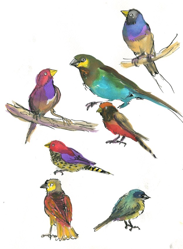
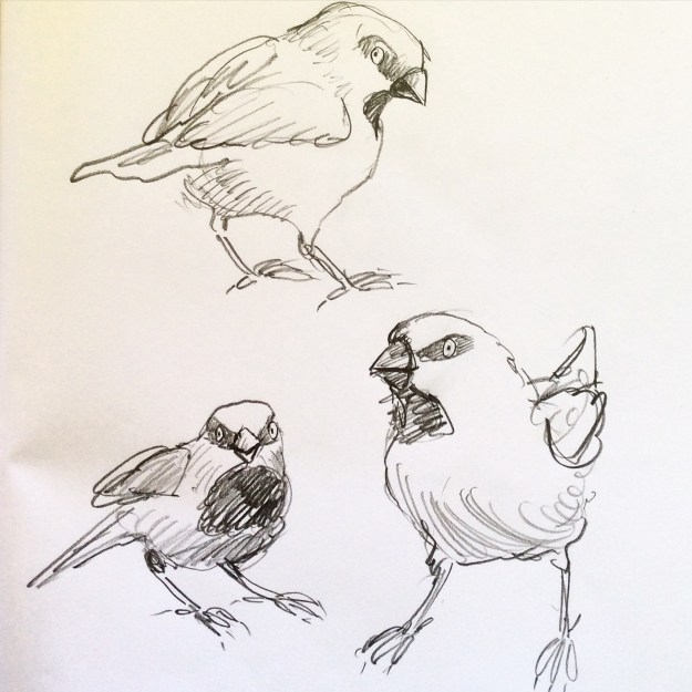
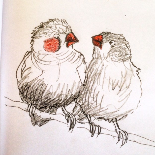
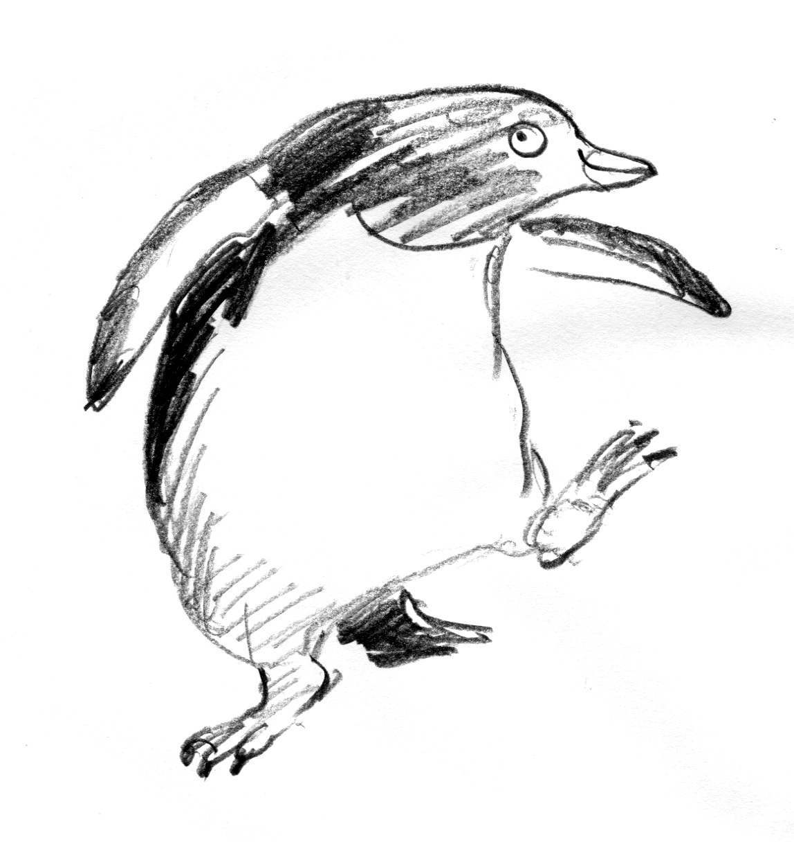
Now where did we leave off? I think I was drawing finches in all sorts of styles.

After that, I drew a few more birds of other kinds… That’s rather offhand, isn’t it? I’m skipping over about 16 species without even excusing myself…

And then I spent a day or so researching and downloading images of various dances. I am much more familiar with birds than I am with dances. Seriously, you should see me try to dance. But what a great excuse to get a book about Fred Astaire and Ginger Rogers out of the library.

Then I spent a day drawing birds dancing, putting it together. And all the while my days and nights were filled with mullings and musings about medium. That’s just too much, right?

I am a person who could spend a long time making up my mind. So I wrote this shortlist.

shortlist worksheet

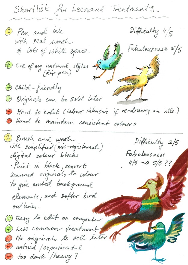
There was a third option but since it had a difficulty rating of 5/5 it soon dropped off. 

The fabulousness ratings are important for me because I don’t feel there’s any point in making a picture book if I don’t at least attempt to make it fabulous. But they’re hypothetical, and of course totally subjective.

So. Being me, I started with Option Two. 

Brush and wash with digital blocks of colour. 

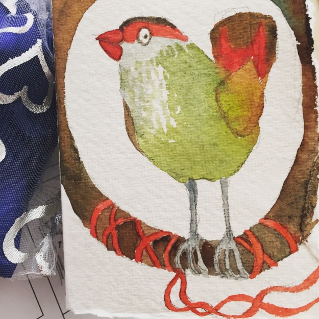
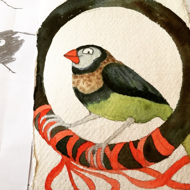
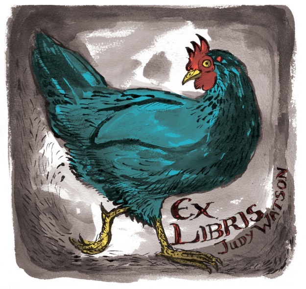
I have to thank Clive Hicks-Jenkins for accidentally reminding me of the brush and wash option. He posted my bookplate blog post on his FaceBook page. And when I looked at the bookplate again, I remembered how much I had enjoyed painting that chicken with brush and ink and how the digital editing changed it into something I rather liked, with very simple blocks of flat colour over the painted image. It was easy to do and retained the painterly look, which many digital treatments do not. But it wasn’t something I had considered as a treatment for Leonard.

sepia chicken judywatsonart lores

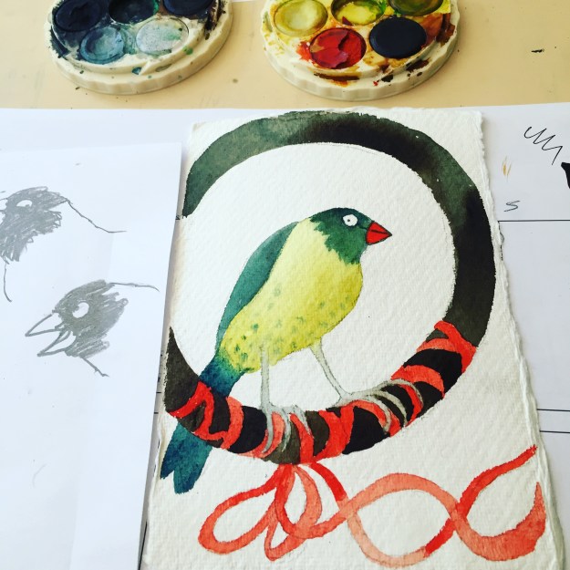
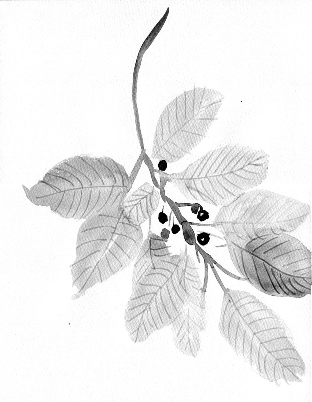
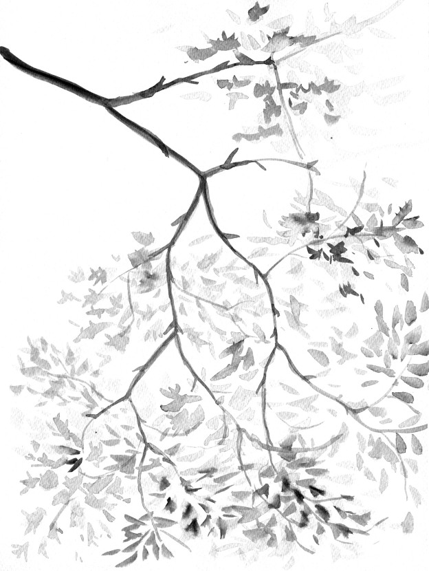
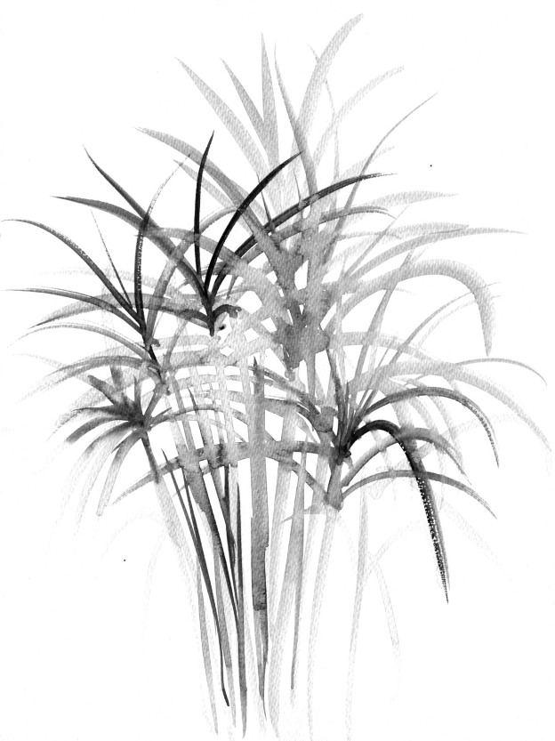
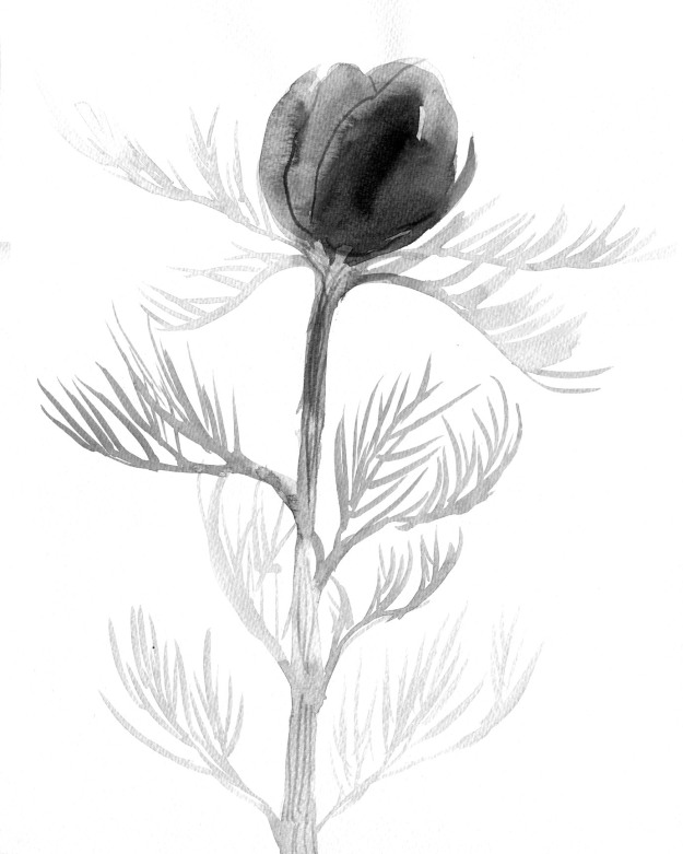
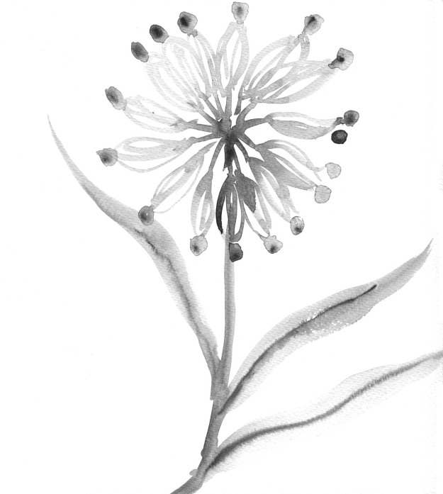
This particular image would be rather dark and heavy in a picture book. But it’s really just the background that makes it heavy. With a different background treatment and a lot of white space, it could work. I had a vision with lots of white space but with some painted plants strategically placed, in paler tones than those of the birds.

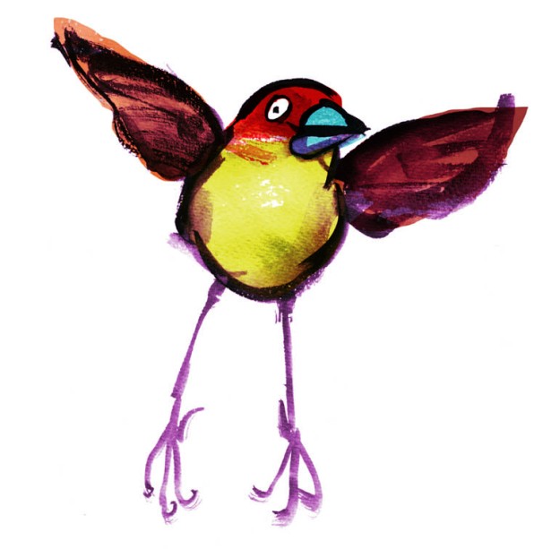
With the chicken bookplate, I converted the original art to a sepia colour; still very inky looking. But I could make the brushwork any colour that harmonises with the overlaid colour blocks. Indeed each bird need not be treated the same way.

I made some quick mock-ups.
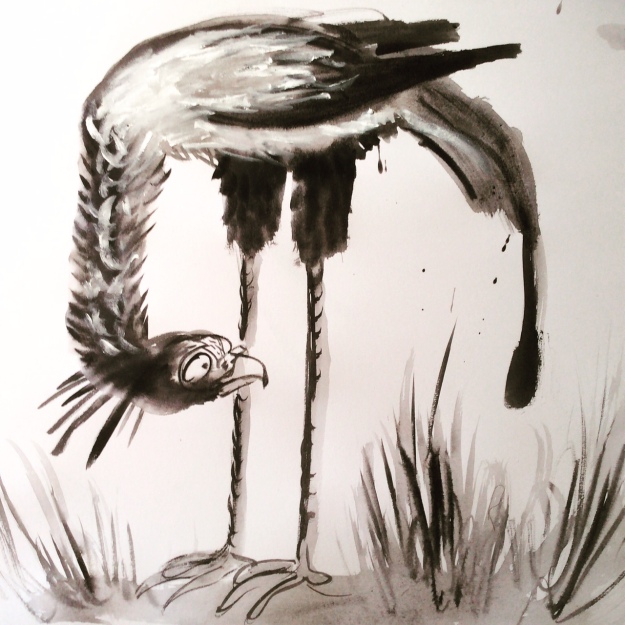
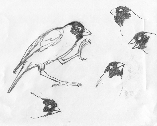
finch flap lores

unhappy secretary bird photo

brushy sketch

unhappy secretary bird test

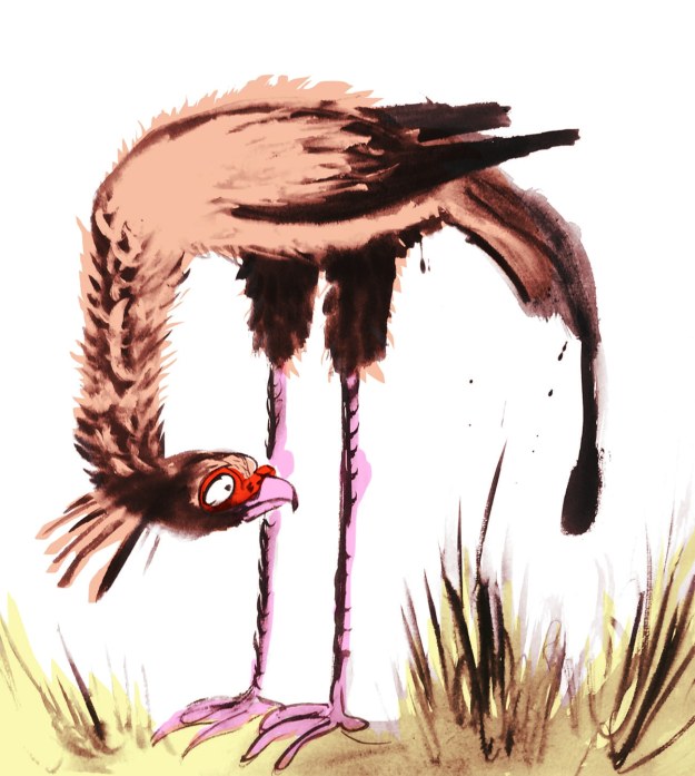
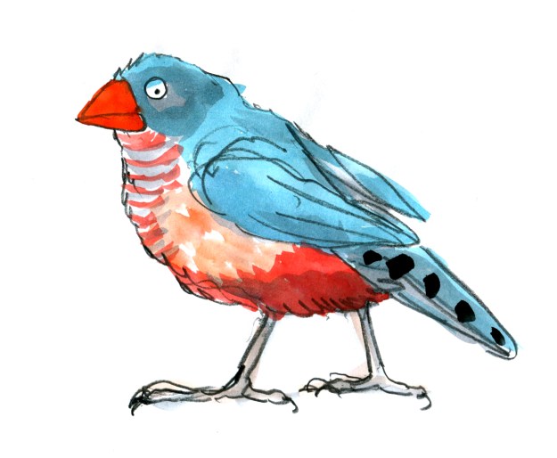
brushy sketch with flat colour


several finches with flattened background 2 col copy

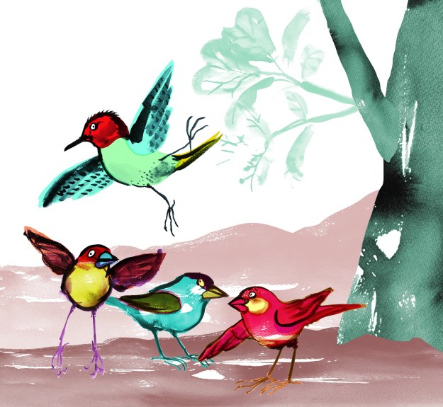
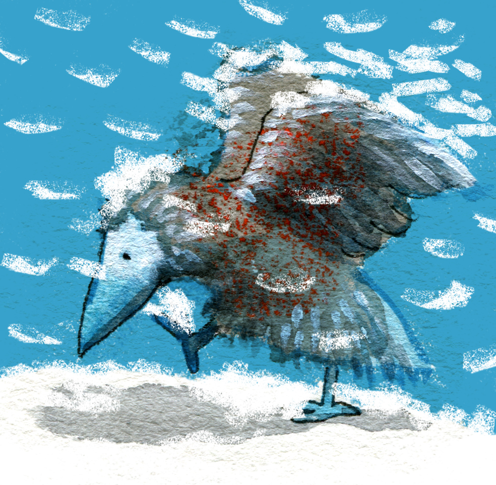
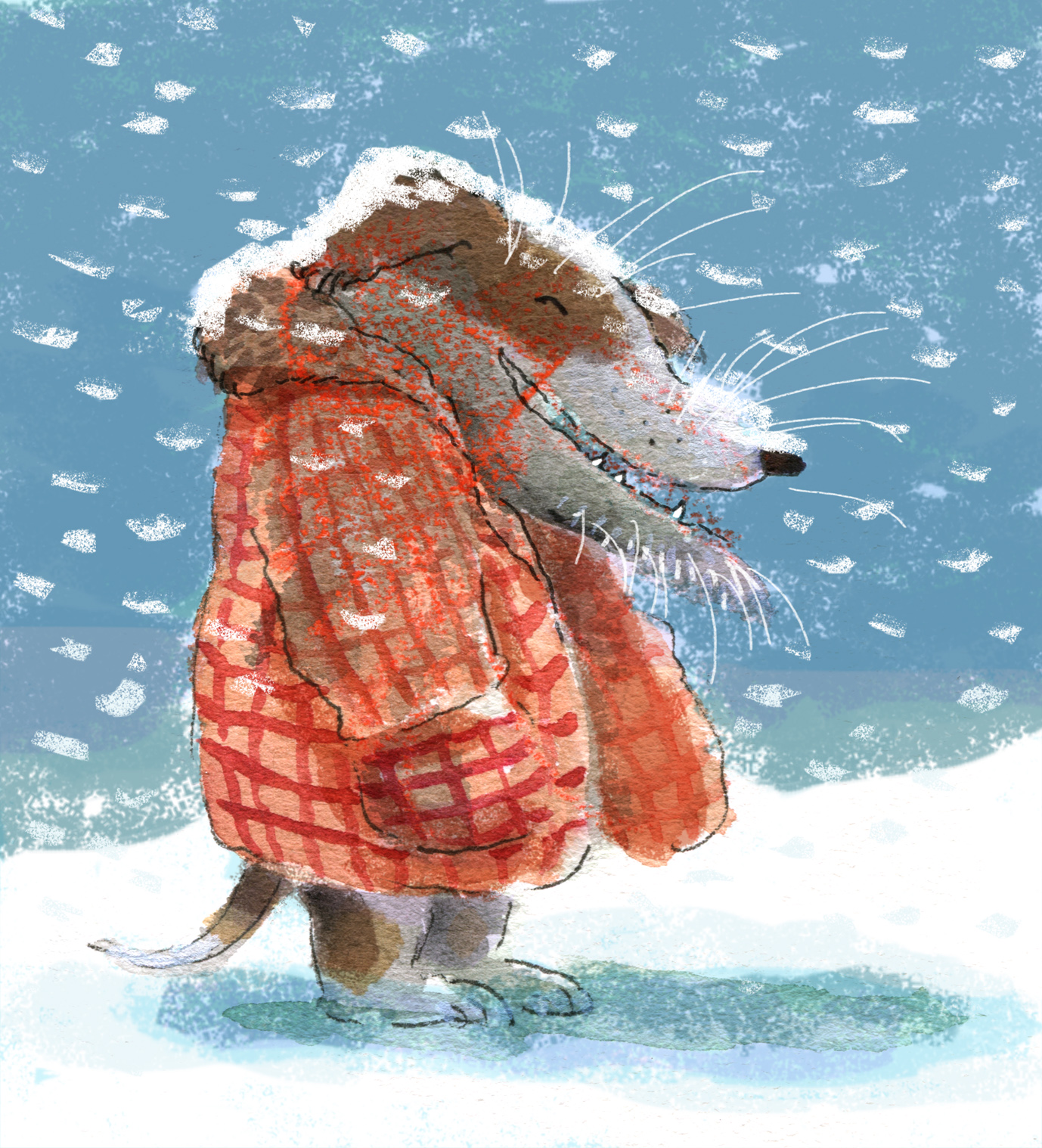
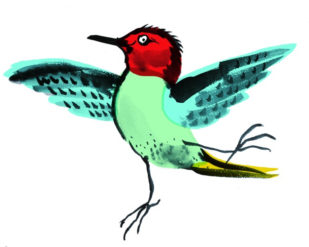
a digital collage with brushy finches, a woodpecker and digitally applied colour wash

These brushy bird paintings were large. Nearly A4 size for each individual bird, so I wondered if I might be able to work at a smaller scale using a pencil for details like eyes. And made this quick  sample. I think I prefer the brush alone, but it will depend how practical this giant size proves, when working on entire page compositions.

bluebird test judywatsonart

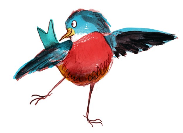
brush and pencil bluebird with digitally applied colour wash

And I made a few brushy background vegetation sketches. I could have a lot of fun with these, adding some colour and layering. We could go a little 1970s…

feathery tester loresfruity tester loresginkoish tester loresgrassy tester lores

flower tester levels loresjointed flower tester levels

I think that will have to do for tonight. Option One tomorrow!


Leonard’s Friends (part 2)

the finch who has forgotten the next step

Yikes! It seems there is a lot going on quite quickly, and I haven’t been keeping up with my blog posts. By the time I find a few minutes to write, I have a backlog of several things to write about and most of them are out of date!

Ah well. One step at a time. Or perhaps one Two-Step at a time in the case of Leonard Doesn’t Dance.

I seem to remember promising to post more on my visual exploration of the bird species of Leonard Doesn’t Dance; the finch being next bird on the wire. So here they are first.

I think the page of coloured birds below was my very first page of finches. I was sketching quickly, trying to keep loose and have fun, while getting the general idea of their shape. The ink was water soluble, which bled into the very saturated colour I was using, and the effect is not so great, especially in a group. It’s a bit like an over-cooked rainbow stew. Or perhaps something that a child might create with a mud pie and food colouring…

saturated finches

Another notable point about learning to draw finches is their beaks. They have a particularly fierce strength about them. They remind me very much of a crescent wrench or adjustable wrench. In this first page of finches, I had not yet cottoned on to the beak thing.

adjustable wrenchcrescent wrench

Wrenches. Distinctly finch-like. Compare with the two top right-hand images below.

Here you see where I cottoned on to the beaks. I did a series of head sketches, playing with character, expression and finchy beaks. I was pleased with this page. I think at this point I was also pondering whether Leonard might have a little finch buddy who is a more confident dancer than he. A non-speaking role. A kind of Cyd Charisse.

finch faces

I then went on to exaggerate the beak further, and added some wash over the pencil sketches. I drew this stolid fellow below. (That amused me, drawing a stolid finch.) And then the finch at the top of this blog post, who is more lively, and still with that lethal looking tool on the front.

the stolid finch

Next up, Christmas happened! Determined to wrestle every possible bit of finch drawing out of daily life, I painted finch Christmas cards for family and friends. Using a faint pencil guideline, I avoided all conflict between watercolours and inks.

IMG_8415IMG_8425

I think I liked this smiling chap best (above). You can see he came directly out of the head sketches I drew earlier.

IMG_8423

Now we move on to another day in late January where I took my sketching materials to the yacht club to get some work done while keeping an eye on the boys in the water. I didn’t have any of my earlier sketches with me and Christmas and New Year had completely erased my memory.

(…) That’s what it looked like inside my brain.

I had only a very soft graphite pencil and a red pencil with me. I started by drawing this fellow, starting with the beak. He looks horribly fierce, mostly because of the dark shading above his rather narrow eye.

I had moved on from beaks and was experimenting with a simplified way of drawing the feet. I’m not really wanting to get too anatomical with my birds’ feet; I think that would become a distraction for me while drawing, and for the reader while reading. So I need to find a shorthand for them, that expresses the bird (and the dance) and doesn’t evoke a biology book.

IMG_7202

These chaps were next.

IMG_1574

I added red pencil over the beaks, on a whim. The red pencil did not like the soft pencil. More rainbow pie.

IMG_7204

Euwww! Is that egg on your chin?

By this time, I was noticing that many of the finches in the reference photos sported black eye-makeup and red cheek patches. What was I to think? They looked a little clownish.

pencil finch clowns

But wait! Maybe they are superheroes?

pencil finch superheroes

Posting these now, I notice that the clown finches have more weight on their cheeks and bodies with not much forehead; it’s a sagging, comical shape. The superhero finches have a more compact, athletic shape and more cranial space. They look speedier and sharper. I’m not sure how much of that was conscious, and how much unconscious. (…)

I was pretty comfy at the yacht club, and I continued on with some puffins (deplorable) and some woodpeckers (passable).

But enough for now!

pencil woodpeckers


Leonard’s Friends

Leonard 6

As some will know, my current book project is a picture book by Frances Watts to be published next year by HarperCollins. Leonard Doesn’t Dance is the title, and it will feature a cast of feathered friends of many species.

Leonard and his friends have been forming on the page but I’ve yet to definitely decide on the medium that will best suit the book. As a way of exploring options, I’ve begun getting to know this list of species.

Magpies
Ducks
Pigeons / Doves
Rosellas
Galahs
Woodpeckers
Flamingos
Swans
Chickens
Turkeys
Quails
Bluebirds
Finches
Penguins
Puffins

First on the list, penguins. (Yes, I’m not even reliably back-to-front.)

Penguins come in several shapes and sizes and are attired in formal to smart casual. Their posture is generally upright, and they are fond of water sports. Some are tall and imposing. Some are small and wiry. Some are round, cuddly and ridiculously cute. Possibly too cute. (What kind of a kill-joy book illustrator am I? Too cute?)

penguin very first pencil sketch

A warm-up penguin. I liked to think I was channelling William Kentridge with my deft use of the eraser… but really, this is just a warm-up penguin. My eraser was employed in deftless ways.

penguin pencil and wash early 1

A second warm-up penguin. Sometimes the warm-up process temporarily takes one backwards.  (Watercolour and brush on smooth watercolour paper.)

the rather dull small fluffy penguin

See what I mean? (Noodler’s ink, watercolour and gouache on watercolour paper.)

the rather dull penguin

A half-warmed up penguin, using a soft pencil and watercolour. I need to bond with penguin feet. They are thick and sturdy and look like lumps of pink putty. These are not right. But I like the head.

penguin pencil and wash later

A tighter line. Testing the look of a more stylised shape. This penguin is quite athletic. I didn’t  realise that some penguins have rather long legs. Even if much of the leg appears to be inside their body. Rather like walking around inside a large pillowcase with your toes in the corners… Or not. I do like the watercolour over the textured pencil.

tighter penguin

A tighter outline again with an exaggerated shape. But still with a loose hatching technique. I don’t do tidy hatching. I associate it with things like ironing shirts. A useful skill that I don’t have the patience for.

penguin pencil sketch

Looser? Almost the same head. But loose and with added dance steps.

twin penguins

Looser with ink. I think this is a combination of the last two. Or three.

A question arising is the ink. This ink is water soluble. I often enjoy this, because it’s rather scrumptious to see the line dissolve under the watercolour brush to do unexpected things. I mostly like unexpected things. But would I like unexpected things to happen on my final artwork? Maybe not.

Also, it’s hard to lay clean colour over dissolving black ink. I will want some of my colours to be clean. I will have a try with water-fast ink later. But there are other ways around this. I could do the black part with water soluble ink and print out the illustrations onto fresh watercolour paper before adding colour. But all this can get rather complicated and size can become a limitation. There is much to ponder over the next few weeks.

I will share some finches with you soon.


Bear’s campfire story

Here’s Bear with Boy.

Bear and Boy came about when I was working on the Share A Story poster with the team from the Australian Children’s Laureate.

bear campfire temp

Ann James and I were initially scribbling away at the same time, tossing ideas around for ways to illustrate themes like ‘grow a story’, ‘hunt a story’, ‘hear a story’. We had few preconceived ideas about how we were going to make the poster concept work and we were playing for all we were worth. During this process I drew Bear and Boy, which I later coloured, because I liked the sketch, but I didn’t bother finishing it off perfectly.

But I was primarily the designer for this job, and it quickly became obvious that for the sake of visual cohesion, Ann’s illustrations would look better throughout; not mixed with some of mine. I moved to the computer and started colouring and experimenting with pattern, until we found something that was starting to work. Justine Alltimes and Ann Haddon provided invaluable insight and art direction.

Asking Ann to produce all sorts of obscure drawings on demand was like popping coins into the Best-Ever-Slot-Machine, and watching exciting and unexpected treats pop out. At speed. So much fun!

While from Ann’s point of view, it was fun to watch her drawings merge with colour and pattern and start to form a composition on the poster.

Ann James' Red Riding Hood and friend wolf (with mysterious dark figure looming behind!)

Ann James’ Red Riding Hood and Friend Wolf (with mysterious dark figure looming behind!) © Ann James 2015

Add classic vintage Australian Stamps

Add classic vintage Australian Stamps

Merge using a bit of digital magic along with some V&A pattern.

Merge using a bit of digital magic along with a V&A pattern in the background. Voila!

Being a fan of blobs, I liked the original inky halo around Mr Wolf. But the consensus was that there was not enough contrast to identify his shape against the background patterning, so he had to have a digital bath… or perhaps shave.

If you’d like to download the Share A Story free poster-calendar, conceived by Laureate Jackie French and illustrated by Ann James, go here. It is a great, open-ended way to engage your children with stories.

Share a Story poster final art web

Flying by the Seat of my Pants

A Fleering Cat, painted in the bath

Fleering … Shakespearian for grinning. Who would have thought? Do you know that you can paint in the bath using your ArtGraf water-soluble graphite block in its handy tin and a brush. Just add bathwater. 

My apologies for my long absence from posting. I have been flying, not fleering.

The Bologna Children’s Book Fair was an eye-opening and fabulous experience. More on that later.

Elizabeth Honey, Ann Haddon and Judy Watson enter The Fair

Elizabeth Honey, Ann Haddon and Judy Watson enter The Fair

Puglia was beautiful, and the trulli were as lovely as I could wish them to be. More on that later too.

trullo with red doors and grapevines

trullo with red doors and grapevines

While I was flying to Italy, my husband Scott bought a house for us at auction and when I returned home two weeks later, I was thrown into a whirlwind of preparation for the sale of our current house. Whirlwind notwithstanding and with our auction two weeks away, it’s back to work today. And this is a marker post!

Leonard here I come.

Thunderstorm Dancing – nearly a book

Thunderstorm Dancing cover lores


Here it is! the finished cover and what you will see in the shops from next April. Currently it is away being made into a book, with paper and ink and all that stuff we like.

As with childbirth… all the grunting and groaning is fading away, and soon I won’t remember that it was difficult at all :-)


Cornish Cat working on the weekend :)

profile alice cat judywatsonart loresPhew! That’s half the spread fixed.

I spent a day on Thursday working on this page, and was really unhappy with the results at the end of the day, so it was back to the drawing board and a re-work of this character group. It might not have mattered so much if it were a busy page. But this is a section of the still page. It has to be right…

err… now I’m looking and finding a few things I might tweak… But not today. Time to spend time with my boys.

So the page 25 Cat-Called-Thunder and Alice are working to my satisfaction. I’ve just got to finish off the seven other members of the family! (laughs hysterically)


Dog with balloon

balloon dog judywatsonart lores

Inspired by one of my greatest illustrator heroes, Tomi Ungerer. Indian ink and watercolour. With digital string as a bit of a cheat. (my last little offering for Week 37: balloons)

The Bird Lover


Okay, this post came down. Now it’s going up again because I hear some people have linked to it. Sorry about that. Decided I wasn’t keen on it. But here it is again. Have posted plenty of warts-and-all experimental doodles before now, so why not this one?

the bird lover2 judywatsonart lores

Strange little doodle fellow with a Tove Jansson Groke nose…

For my bird loving Mum. (I know your nose doesn’t look like this, Mum.)

Furthermore… (in for a penny, in for a pound) here’s the earlier version of this pic. Which I decided was too dark. But it has a different, more raw and slightly spooky quality. Kids could have a go at something similar to this combining scraper board techniques with collage.

the bird lover judywatsonart lores


Week 27: Snow (experiments with blobs part 6)

These first two are grey blobs with red crayons scribbles in the middle of them. I have found they are harder to turn into things. The red crayon scribble is quite distracting! Who would have thought?

blue bird plays in the snow judywatsonart lores

Blue Booby Baby Blob Bird Playing in the Snow.

Ink, red crayon, felt tip, watercolour, white acrylic, digital layering.

Old dog in the snow judywatsonart lores

Old Dog in the Snow.

Also ink, red crayon, felt tip, watercolour, white acrylic, digital layering.

searchandrescue dog judywatsonart lores

Search and Rescue Dog in the Snow. 

This one has no digital layering. Thought I’d see what the white acrylic paint could do with the snow all by itself. I also skipped the red crayon scribble. Instead, this time I did a grey ink background wash with a red watercolour blob in the middle The red watercolour blob was what suggested the shape of the dog character and the rest followed from there.

I didn’t think I’d come up with anything for the ‘snow’ theme actually. It isn’t something I have much experience with. But blobs are a good way to start when you don’t know where to start. Then, just add some warm winter woollies and snow.